Fear and hate in redesign
We explore what affects the distance between the letters, why change one blue to another and how to make a redesign once and for a long time.
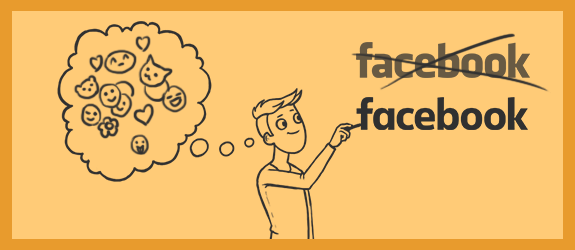
In 2015, Facebook introduced a new logo design, which is only slightly different from the old one. The year before, Google had moved two letters per couple of pixels in its logo, and Visa had changed the color of the corner. Why do companies spend money so that designers move letters and change fonts, if the old design looks more familiar and looks good?


')
Redesign or restyling is carried out when there is a need to “refresh” the image of the company, without losing the old audience. Redesign - significant changes in the visual part of the brand, restyling - cosmetic editing of a couple of parts.
Redesign is commonplace for companies, which occurs every 5-10 years. Determine whether to sprinkle ashes on your old logo and run to the designers for a new one by answering simple questions.
1. Is your logo modern enough?
There is hardly a company or application that uses the CD as a logo, but this is the most obvious example. A font that seemed fashionable to you at the beginning of 2010 may look like a tasteless relic of the past in a couple of years. Not to mention the use of local memes, which you loved with all my heart, but which lost all meaning in a week. A logo that looks outdated makes your company look outdated. Especially if competitors do not make such a mistake and “polish” their design if necessary.

2. Does the logo reflect the development of your company?
Perhaps you ordered a logo when you just started a business together with a former classmate and rented an office in which only one table was placed. If over time you have become a group of companies or expanded spheres of influence, the logo will have to be changed. The logo reflects your company at a specific point in time and evolves with it.

3. Is the workflow unchanged?
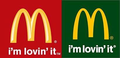
A couple of years ago you created an application for teenagers, but it turned out to be much more popular among women over forty? Did your technologists discover a new, environmentally-friendly formula that is used only by you? Tell consumers about it through the logo. Communicate with those who choose the product, tell them why you are better and how to solve their problems. The terms "friendly font" or "eco-friendly green" may seem meaningless, but still work. Therefore, Facebook rounds the letters, and McDonald's makes a green logo for Europe, stating that the ingredients are natural.
4. Does your logo adapt easily?
Did you use the family coat of arms or what you give out for it as a logo? Did you insist that the designer make the logo more complicated so that you can see what you paid for? Congratulations, you received a character that only looks good in full size and will look awful on business cards, on the site and in general everywhere. Complex logos do not look more original and are remembered worse than competitors.
5. Do customers and employees like your logo?
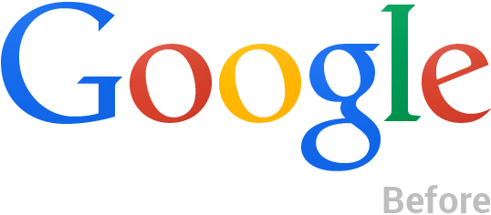
If employees shamefully hide badges with corporate identity, and customers restrain laughter when they see your business card? I have bad news for you. In 2014, Google made subtle changes to its logo, finally responding to complaints about unequal spacing between letters.
The more often you answer “no” to these questions, the sooner it is worth refreshing your logo.
If there are three basic “do & don't” rules to be followed by updating the logo.
"Yes":
- Simplify. The simpler your logo, the easier it is to remember, learn and use it. Simple logos become obsolete more slowly and can be used for a company that is changing and growing.
- Invest meaning. First, formulate what will reflect the logo, and then look for its creators.
- Versatility is more important than trends. If the font or style today is used on every sign, it does not mean that it will look just as good in a couple of years.
"Not":
- Do not change the logo, just because you want. Do not repair something that is not broken.
- Do not change the logo completely. Consumers and the logo of their relationship, resembling human. It is difficult to trust an old acquaintance with a completely new face, especially if he tells you that he has not changed at all. This option is valid only if you are rebranding, in order to get rid of the old image.
- Do not forget the opinion of consumers. If customers have been telling you for ten years that your logo has crooked letters and a disgusting shade of yellow - it’s worth changing.
As a homework, I propose to think about why the Wikimart redesign does the task better than Reebok.

In 2015, Facebook introduced a new logo design, which is only slightly different from the old one. The year before, Google had moved two letters per couple of pixels in its logo, and Visa had changed the color of the corner. Why do companies spend money so that designers move letters and change fonts, if the old design looks more familiar and looks good?
')
Redesign or restyling is carried out when there is a need to “refresh” the image of the company, without losing the old audience. Redesign - significant changes in the visual part of the brand, restyling - cosmetic editing of a couple of parts.
Redesign is commonplace for companies, which occurs every 5-10 years. Determine whether to sprinkle ashes on your old logo and run to the designers for a new one by answering simple questions.
1. Is your logo modern enough?
There is hardly a company or application that uses the CD as a logo, but this is the most obvious example. A font that seemed fashionable to you at the beginning of 2010 may look like a tasteless relic of the past in a couple of years. Not to mention the use of local memes, which you loved with all my heart, but which lost all meaning in a week. A logo that looks outdated makes your company look outdated. Especially if competitors do not make such a mistake and “polish” their design if necessary.
2. Does the logo reflect the development of your company?
Perhaps you ordered a logo when you just started a business together with a former classmate and rented an office in which only one table was placed. If over time you have become a group of companies or expanded spheres of influence, the logo will have to be changed. The logo reflects your company at a specific point in time and evolves with it.
3. Is the workflow unchanged?
A couple of years ago you created an application for teenagers, but it turned out to be much more popular among women over forty? Did your technologists discover a new, environmentally-friendly formula that is used only by you? Tell consumers about it through the logo. Communicate with those who choose the product, tell them why you are better and how to solve their problems. The terms "friendly font" or "eco-friendly green" may seem meaningless, but still work. Therefore, Facebook rounds the letters, and McDonald's makes a green logo for Europe, stating that the ingredients are natural.
4. Does your logo adapt easily?
Did you use the family coat of arms or what you give out for it as a logo? Did you insist that the designer make the logo more complicated so that you can see what you paid for? Congratulations, you received a character that only looks good in full size and will look awful on business cards, on the site and in general everywhere. Complex logos do not look more original and are remembered worse than competitors.
5. Do customers and employees like your logo?
If employees shamefully hide badges with corporate identity, and customers restrain laughter when they see your business card? I have bad news for you. In 2014, Google made subtle changes to its logo, finally responding to complaints about unequal spacing between letters.
The more often you answer “no” to these questions, the sooner it is worth refreshing your logo.
If there are three basic “do & don't” rules to be followed by updating the logo.
"Yes":
- Simplify. The simpler your logo, the easier it is to remember, learn and use it. Simple logos become obsolete more slowly and can be used for a company that is changing and growing.
- Invest meaning. First, formulate what will reflect the logo, and then look for its creators.
- Versatility is more important than trends. If the font or style today is used on every sign, it does not mean that it will look just as good in a couple of years.
"Not":
- Do not change the logo, just because you want. Do not repair something that is not broken.
- Do not change the logo completely. Consumers and the logo of their relationship, resembling human. It is difficult to trust an old acquaintance with a completely new face, especially if he tells you that he has not changed at all. This option is valid only if you are rebranding, in order to get rid of the old image.
- Do not forget the opinion of consumers. If customers have been telling you for ten years that your logo has crooked letters and a disgusting shade of yellow - it’s worth changing.
As a homework, I propose to think about why the Wikimart redesign does the task better than Reebok.
Source: https://habr.com/ru/post/293748/
All Articles