Developer Summary Guide
We have long believed that the first step towards dream work is a good summary. This statement is almost universal for people of any age and any profession. But today we decided to single out the developers as a separate group and tell them what their ideal summary should be:

')
// Template from any job site
// Table
// Standard resume in doc format
// Neat, original resume in PDF format
// Idea solves
// Show your code
//A few examples:
// A little bit of humor
- Poorly
')
// Template from any job site
Well, here you understand everything. No personality, nothing new and interesting. It is unlikely that such a resume will be able to interest anyone.
// Table
The table is cool: visual, structural and rigorous. And still very boring.
// Standard resume in doc format
Nobody forbids you to choose the font Times New Roman (or Comic Sans, if you like to hurt people) to write down your name / first name / phone number and other important information. But just think about it - Gena will have the same resume, which is arranged by a truck driver and Lenochka, a secretary with extensive experience. Do not you want to stand out?
+ Good
// Neat, original resume in PDF format
Forget crazy infographics - let's leave it to designers and other creatives. You need a template in which all your achievements, programming languages known to you, projects and interests fit. Do not forget to put a link to github.com and to your blog, if there is one.
// Idea solves
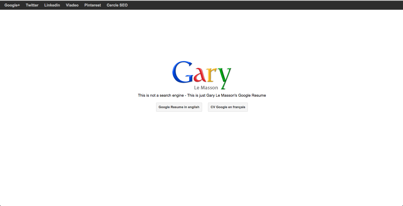
If you know exactly which company you want to work with - use the experience of our American colleagues and make a resume in their style. It will be spectacular and very, very clear. Well, do not you become a resume in the style of Google in Yandex send? Although…
So Gary wanted to get a job in Google and ... we don’t know how it ended there, but it turned out quite well
// Show your code
The ideal version of the developer’s resume is, of course, the site. Yes, we don’t intend to open America here, but let us remind you once again: the site should have as much useful information as possible about you. Resume, portfolio, interests. The structure, design and even the code of the site should reflect you as completely as possible.
//A few examples:
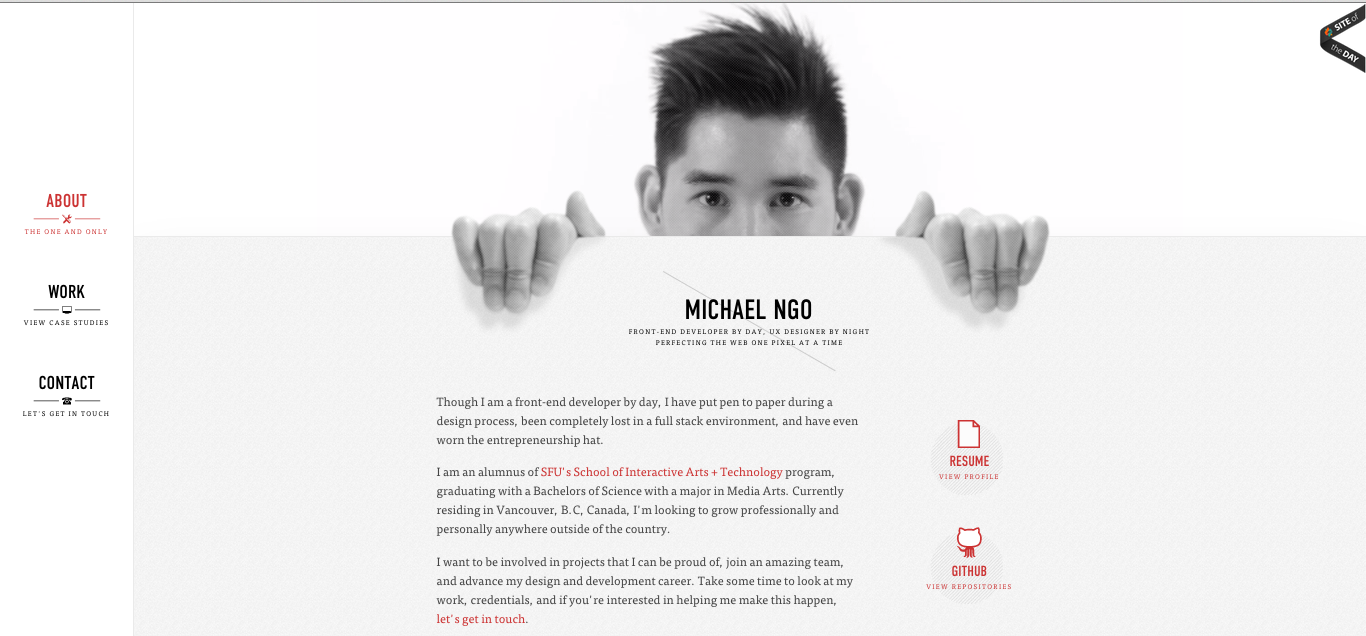
A neat monochrome site of a Canadian front-end vendor (he holds a page with his hands and even blinks):
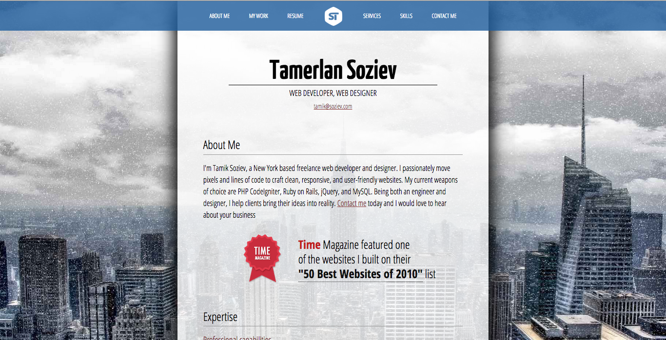
A simple landing page from an ordinary Russian guy (as a background for New York for some reason):
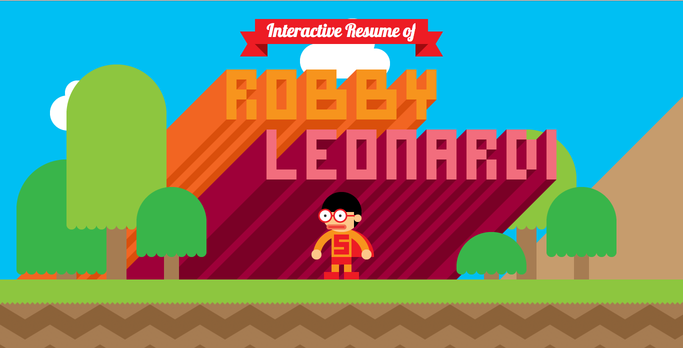
Glorious button accordion. Well, just the most colorful, interesting and exciting summary ever:
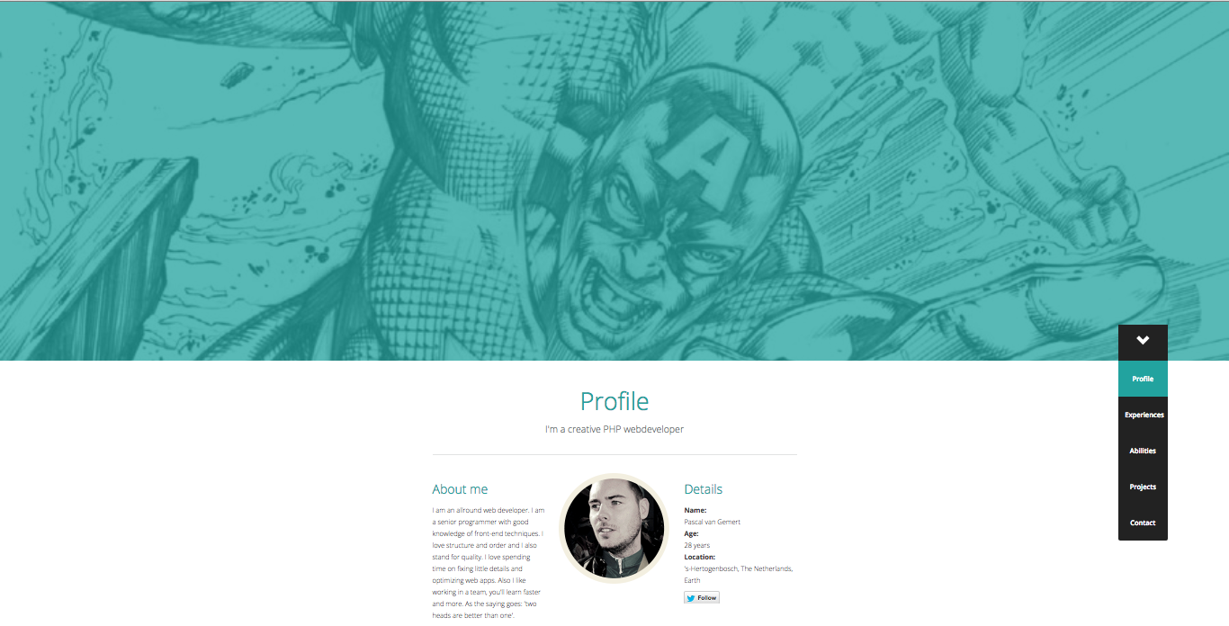
Here is a superhero landing page from a Dutch web developer:
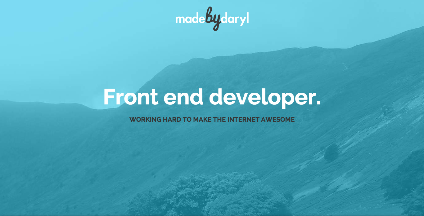
Perhaps the last landing page (a bit too much for them) from the British front-end vendor, who “Works hard to make the Internet cool”:
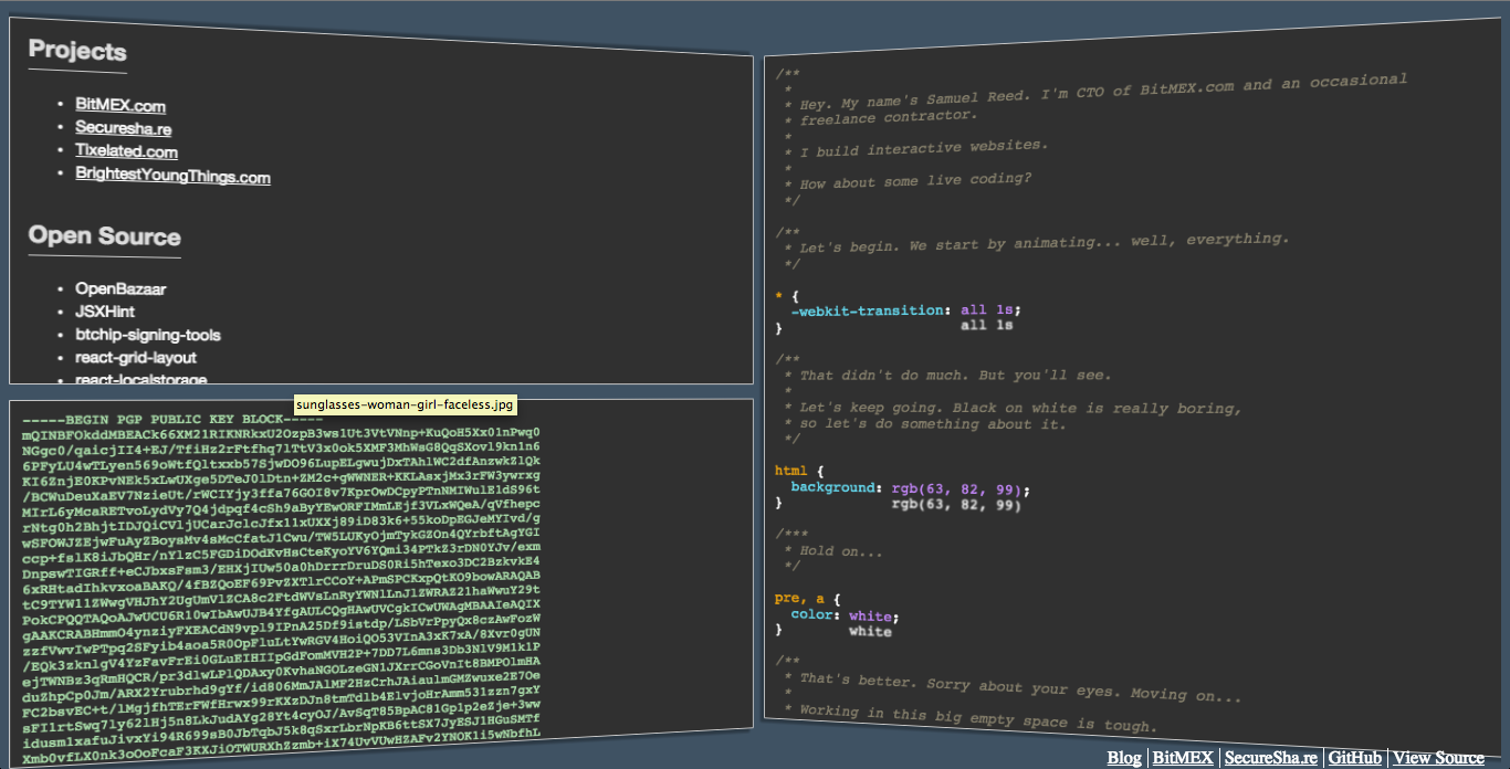
And finally, the coolest resume site is right here. A site that writes code that teaches code writing. And do not even argue, it's just gorgeous:
// A little bit of humor
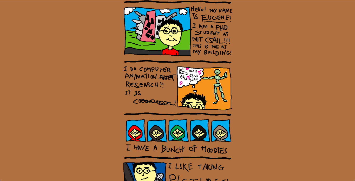
Do not be afraid to laugh at yourself. A sense of humor is said to be an indicator of intelligence. So make humor with your weapon. For example, Eugene, a student at the Massachusetts Institute of Technology drew a website for himself in paint. It looks awesome cool:
Our explosive infographics “Top 10 words that can destroy your resume” will also help you in compiling your resume .
Source: https://habr.com/ru/post/293476/
All Articles