New Google Analytics functionality: cohort analysis
World-renowned web analytics expert Avinash Kosik laments in his blog that the 80/20 rule works, alas, for analytics as well. 80% of users use only 20% of the tools available. Have you ever thought that perhaps the most powerful web-analytics system is available absolutely free of charge? Moreover, along with it, a lot of expertise is available in Russian and English, which will help to get used to the tool and create an analytical system, “sharpened” just for your business. Working with analytics is one of the key activities in the company. It is important to raise the question correctly, to see signs of a problem in a timely manner, to collect as much information as possible and only then to make a decision based on the analysis. Even if there are no problems and you are happy with the dynamics of absolutely all indicators, you should not stop - you need to learn about the reasons for success in order to consolidate it.
Google Analytics constantly releases new features that make the work even clearer and more useful. Recently, trends are shifting following the global user preferences - many innovations occur in the field of mobile analytics and YouTube analytics. It seemed that with the release of Universal Analytics, one could wait for a long break, but soon the functionality was once again seriously updated.
Recently, there have been many changes related to enhanced e-commerce, metrics and estimates. From this series, a feature that was previously lacking is highlighted: a cohort analysis. This tool is useful to anyone who has a website, regardless of whether you are conducting e-commerce or not. Despite the difficult name, this function is understandable to anyone who has tried to segment users at least once.
')
Professionals who spend most of their time working with the Google Analytics interface have learned how to build cohorts through segmentation. Particularly reverent to graphical representations built the entire cohort analysis mechanism using Excel tools. Such stubbornness is explained by the fact that the cohort analysis is in demand by marketers and business owners. It allows you to segment users in a special way and build clusters - special groups of users united by one property (for example, who came to the site from a tablet from July 2 to 5, when a coupon for a 50% discount was valid). A cohort analysis allows you to see the behavior (duration of visits, views, visits, profitability) of such users in each time interval. This is especially valuable for determining the return on regular / new customers in the online store.
In Google Analytics, there is only one type of cohort - by the date of the first visit. However, the interface in the form of a drop-down list leaves hope for the appearance of other built-in types. The size of a cohort is determined by days, weeks and months. Based on the given units of time, you can set the date range:
It is worth stopping here and explaining why such intervals are set and how to choose your own. Suppose, if we are talking about an online store of a hand tool, it makes sense to choose weeks and months - buyers come for durable goods and the interest is whether they have bought something for the first purchase or have shown interest in additional items. But if you are a portal that provides entertainment content or a news feed, you should look through the shortest intervals - users will contact you daily and the cohorts will give an understanding of the number of regular visitors and see the moment the interest decays.
Indicators for cohorts can be calculated by the results. Session duration, goals achieved, revenue, number of users in a cohort after n days, page views, sessions, transactions are calculated. As you can see, a large enough layer of indicators familiar to Google Analytics users. It is easy to see that cohorts can have different sizes: for example, in the usual period it is 100 thousand visitors to the site, in the promotional period - 250 thousand people. In this case, it is better to normalize the data in the cohorts — for this, it is necessary to take into account the size of the cohort and measure the data at time points as a ratio of the indicator to the number of members. In the current version of Google Analytics, this is thought out - all indicators are considered both in absolute terms and per user.
You can also separately calculate customer retention rate - the ratio of the number of users from a cohort who returned n-th time in a selected period of time to the total number of users in a cohort. This is a new factor that can be useful both for forecasting indicators and for preparing events aimed at retaining customers.
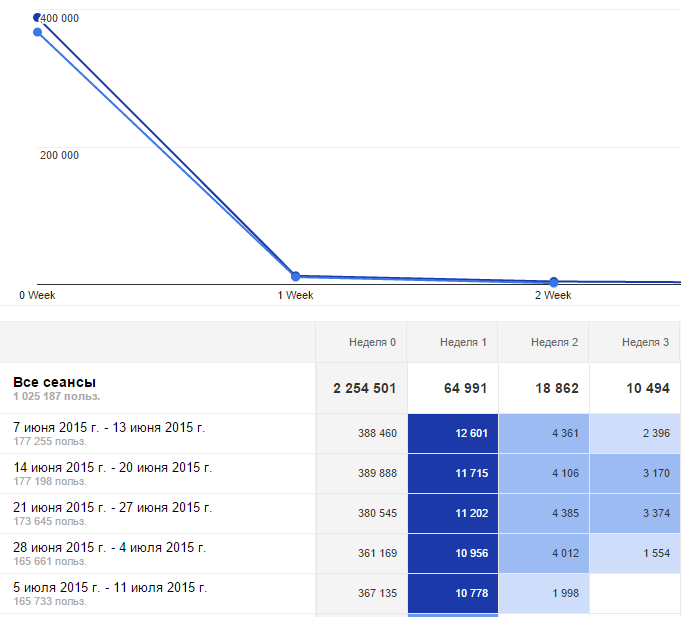
All indicators are presented on the graph - thus, up to four different cohorts can be compared over time. This is especially convenient when cohorts have completely different indicators and at a glance you can see which group has the best indicators.
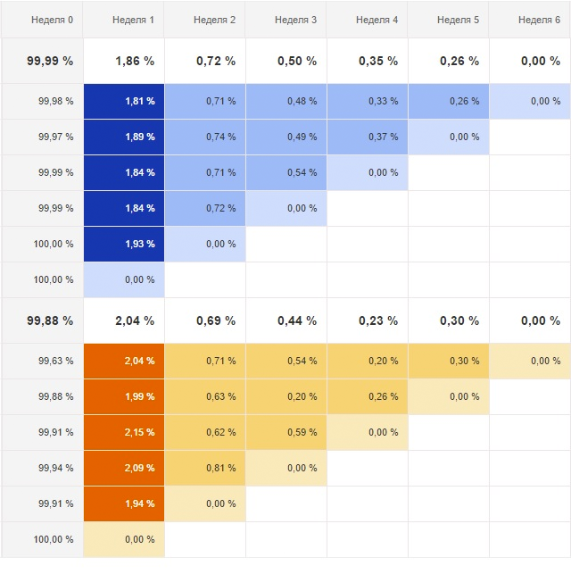
Cohort analysis in Google Analytics also allows you to add segments and collect indicators by segment. In the graphic implementation, the cohort of segments will be under the main cohorts, which in some cases will allow to compare different data and draw conclusions. Segmentation can be performed by a number of attributes, built-in and custom (created by a user of Google Analytics): by device type, traffic type, by customers who have made a purchase or have reached the goal, and so on. An example of segments you can see in the figure (blue - retention factors by cohorts, all traffic, orange - mobile traffic):
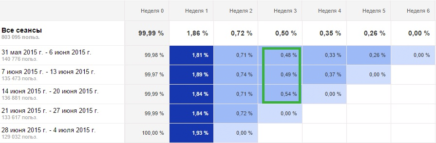
By the way, if we talk about comparison in the cohort analysis, then it is worth comparing the cohorts as of the same day. Let's explain with an example. From June 14 to June 20, an action took place for users of our virtual site and we are interested in its long-term effect. Indeed, if we compare the retention rate in the third week with the retention rate in the third week for other cohorts, it is slightly higher. At the same time, it is necessary to understand that the 3rd week for all three cohorts are different dates, and not the same period.
A cohort analysis helps predict, segment, calculate approximate metrics of the effectiveness of future advertising campaigns, highlight successful actions, periods, and so on ... As soon as you start using this functionality, you immediately want to get even more. Most likely, the Google Analytics team will take into account the sharp popularity of cohort analysis and soon we will see new built-in cohort types and will be able to create custom ones.
At the largest marketing conference in Seoul, AdWords CEO Jerry Dischler outlined a new buying path — micro moments, during which spontaneous buying decisions may occur. Indeed, the reality is changing quite quickly and the task of business intelligence is to manage to respond to the challenges of the external environment. To do this, it is important to keep track of updates to the tools and make corporate data a reliable basis for making management decisions.
Google Analytics constantly releases new features that make the work even clearer and more useful. Recently, trends are shifting following the global user preferences - many innovations occur in the field of mobile analytics and YouTube analytics. It seemed that with the release of Universal Analytics, one could wait for a long break, but soon the functionality was once again seriously updated.
Recently, there have been many changes related to enhanced e-commerce, metrics and estimates. From this series, a feature that was previously lacking is highlighted: a cohort analysis. This tool is useful to anyone who has a website, regardless of whether you are conducting e-commerce or not. Despite the difficult name, this function is understandable to anyone who has tried to segment users at least once.
')
Cohort analysis: work on hold
Professionals who spend most of their time working with the Google Analytics interface have learned how to build cohorts through segmentation. Particularly reverent to graphical representations built the entire cohort analysis mechanism using Excel tools. Such stubbornness is explained by the fact that the cohort analysis is in demand by marketers and business owners. It allows you to segment users in a special way and build clusters - special groups of users united by one property (for example, who came to the site from a tablet from July 2 to 5, when a coupon for a 50% discount was valid). A cohort analysis allows you to see the behavior (duration of visits, views, visits, profitability) of such users in each time interval. This is especially valuable for determining the return on regular / new customers in the online store.
In Google Analytics, there is only one type of cohort - by the date of the first visit. However, the interface in the form of a drop-down list leaves hope for the appearance of other built-in types. The size of a cohort is determined by days, weeks and months. Based on the given units of time, you can set the date range:
- for days - these are 7.14, 21, 30 last days
- for weeks - last week, 3, 6, 9, 12 last weeks
- for months - the last, 2, 3 last months.
It is worth stopping here and explaining why such intervals are set and how to choose your own. Suppose, if we are talking about an online store of a hand tool, it makes sense to choose weeks and months - buyers come for durable goods and the interest is whether they have bought something for the first purchase or have shown interest in additional items. But if you are a portal that provides entertainment content or a news feed, you should look through the shortest intervals - users will contact you daily and the cohorts will give an understanding of the number of regular visitors and see the moment the interest decays.
Indicators for cohorts can be calculated by the results. Session duration, goals achieved, revenue, number of users in a cohort after n days, page views, sessions, transactions are calculated. As you can see, a large enough layer of indicators familiar to Google Analytics users. It is easy to see that cohorts can have different sizes: for example, in the usual period it is 100 thousand visitors to the site, in the promotional period - 250 thousand people. In this case, it is better to normalize the data in the cohorts — for this, it is necessary to take into account the size of the cohort and measure the data at time points as a ratio of the indicator to the number of members. In the current version of Google Analytics, this is thought out - all indicators are considered both in absolute terms and per user.
You can also separately calculate customer retention rate - the ratio of the number of users from a cohort who returned n-th time in a selected period of time to the total number of users in a cohort. This is a new factor that can be useful both for forecasting indicators and for preparing events aimed at retaining customers.
All indicators are presented on the graph - thus, up to four different cohorts can be compared over time. This is especially convenient when cohorts have completely different indicators and at a glance you can see which group has the best indicators.
Cohort analysis in Google Analytics also allows you to add segments and collect indicators by segment. In the graphic implementation, the cohort of segments will be under the main cohorts, which in some cases will allow to compare different data and draw conclusions. Segmentation can be performed by a number of attributes, built-in and custom (created by a user of Google Analytics): by device type, traffic type, by customers who have made a purchase or have reached the goal, and so on. An example of segments you can see in the figure (blue - retention factors by cohorts, all traffic, orange - mobile traffic):
By the way, if we talk about comparison in the cohort analysis, then it is worth comparing the cohorts as of the same day. Let's explain with an example. From June 14 to June 20, an action took place for users of our virtual site and we are interested in its long-term effect. Indeed, if we compare the retention rate in the third week with the retention rate in the third week for other cohorts, it is slightly higher. At the same time, it is necessary to understand that the 3rd week for all three cohorts are different dates, and not the same period.
A cohort analysis helps predict, segment, calculate approximate metrics of the effectiveness of future advertising campaigns, highlight successful actions, periods, and so on ... As soon as you start using this functionality, you immediately want to get even more. Most likely, the Google Analytics team will take into account the sharp popularity of cohort analysis and soon we will see new built-in cohort types and will be able to create custom ones.
At the largest marketing conference in Seoul, AdWords CEO Jerry Dischler outlined a new buying path — micro moments, during which spontaneous buying decisions may occur. Indeed, the reality is changing quite quickly and the task of business intelligence is to manage to respond to the challenges of the external environment. To do this, it is important to keep track of updates to the tools and make corporate data a reliable basis for making management decisions.
Source: https://habr.com/ru/post/292932/
All Articles