$ 29 million logo

Logosine's unscientific research on how the perception of a logo depends on its price, how much one letter can cost, and for which the design studios are still paid by millions.
We have already written that the cost of the logo cannot be determined “by sight”, but now we have tested it by experience on the best audience - the subscribers of our group .
During the month we conducted eight surveys, each of which needed to choose which of the logos cost millions, and which cost one and a half thousand rubles.
The statistics of victories and defeats is as follows: only two times out of eight subscribers have guessed the cost, proving that the price of the logo is not determined by the principle “it looks expensive / cheap”.
For example, the Belfast logo for $ 280,000 was liked by readers less than the $ 30 logo.
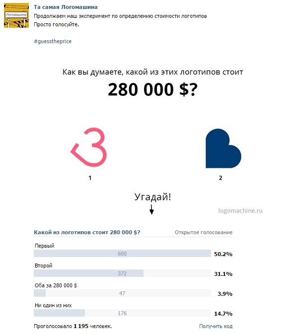
')
In the comments, they noticed that the symbol resembles the English B - it is on this that the whole new identity of the city is built for $ 280,000. .
The new logo should reflect the changes that have occurred in the city in recent years, be simple, but show the diversity of the faces of Belfast.
Designers of the year investigated the perception of the city in different areas of life, and the way business, culture, tourism and media representatives would like to see it.
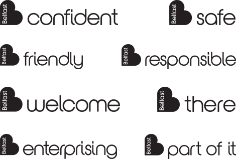
The result was a symbol not directly connected with the city, but showing the peaceful mood of the Irish and the willingness to say goodbye to the militant past.
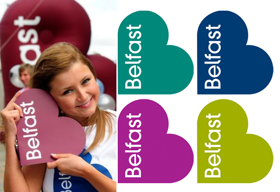
This example well reflects that the cost of a logo does not consist of the complexity of working on a picture, but of the qualifications and work of experts, compliance with the objectives and specification of the project, the time spent on work, and the breadth of application. Cities and large companies spend millions on simple logos that evoke an instant memory of a brand and replace thousands of words of advertising text. First of all, it is the recognition that the logo embodies is paid for - even if it looks like a colored heart with the name inside. As long as this heart printed on T-shirts and posters is associated with Belfast, as an open and pleasant city, it costs its $ 280,000.
In a couple of surveys, we offered to choose between two cheap logos, just to see if you can guess about the cost of the work done, not knowing its purpose. Here this letter R, which actually costs $ 29, subscribers have estimated at $ 29 600 000.
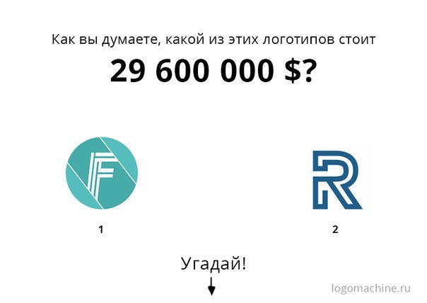
Honestly, we do not know what guided the subscribers who chose the first or second option. Our designers voiced several options at once, from choosing the color for the letter R to incomplete and unbalanced F. It can be said for sure that by paying $ 29 dollars for the logo, you get just a picture that does not cause emotions or associations and carries nothing but relative recognizability. This logo is not bad, but at the very beginning it is worth nothing - it has no history or impressions connected with it. Creating and developing the image of a company, an idea that comes to mind when you look at one letter at first, is a job that costs much more than fifteen hundred rubles. The fact that Nike is now worth much more than the $ 35 that paid for it is due not to the complexity of the logo itself, but to the ideas and recognition associated with it.
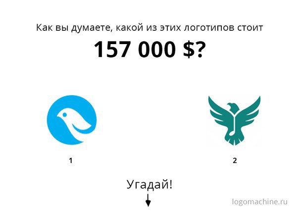
If you suddenly missed our surveys and now regret it, we suggest joining the research group now: choose a logo that you would appreciate at $ 157,000 and tell us in the comments why, in your opinion, it’s worth the money.
Source: https://habr.com/ru/post/292878/
All Articles