Stop making regular sites. Adaptive is not scary
How many times have you not been able to find a card with their office on the company's website? How many times have you clicked on the screen, hoping to get the link you need? How many times have you cursed site owners for not being able to read the text? And all these problems could have been avoided if the developers had provided an adaptive version of the site.
Today I want to tell you how to calculate an adaptive site, about which it is important not to forget, so that later it would not be painfully painful. Information is mainly for managers and their sympathizers.
If you don’t know what a responsive site is and work as an Internet project manager, I’m truly sorry for you. You are far behind life, urgently run into Google. I will not waste time even on copy-paste from wikipedia.
')
Lyrical digression
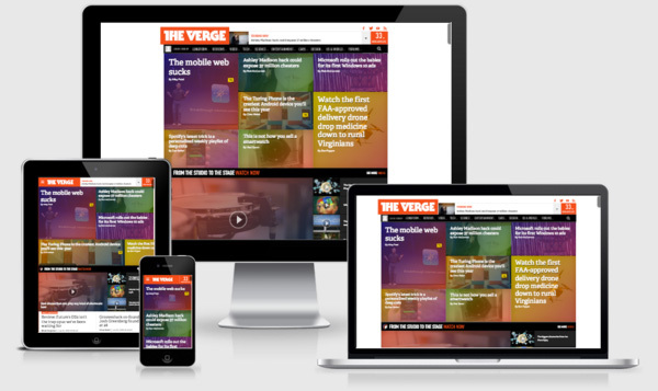
I did not consider a separate mobile version of the site in the article, because I believe that this format was born dead. Devices are growing every year, changing the ratio of screens, the number of pixels per inch and so on. A separate mobile version will not withstand all these marginal cases or will require an unreasonably large support budget.
Also, often the mobile version is done on a subdomain, which is bad for seo with the same content, and the further development of such a decision causes only headaches.
Also, often the mobile version is done on a subdomain, which is bad for seo with the same content, and the further development of such a decision causes only headaches.
Why and who needs it?
You want to have a loyal customer and some money? Then urgently run to customers and sell adaptive. Adaptive is useful e-commerce, as more and more people fall into the trap of their phones and make purchases from them. Adaptive is needed by simple companies (corporate site) so that potential clients, employees and just couriers do not have problems finding the phone number and address on your site. And you, my favorite bloggers, need an adaptive so that users of mobile devices can comfortably read articles in any conditions.
Not enough arguments to sell? Then know that Google is lowering in the issuance of sites that are not “mobile friendly”. And where Google, there and other search engines will catch up.
And here we are at the client
We are sitting with you in the comfortable armchair of the office of our beloved client, we talk about adaptability and are waiting for a decision. If you are a rare lucky, the client says, "You know, I have long wanted to update the site design, and it would do well to make it convenient for all users to use it." At this point, you kiss the client and leave satisfied to count.
If you are unlucky, do not be upset. The client may say, "I like my current site, but the adaptive is cool and fun, let's do it." There is nothing wrong with this, the main thing is to convey to the client that the site may change a little bit, since the adaptive must obey certain rules, but you, of course, will do everything to make the site like it as before.
Estimate
Let's take into account that you have some kind of basic estimate, according to which you make a CP for a client. Obviously, the base estimate depends on the complexity of the project.
So ...
How do the estimates differ when creating a site from scratch with and without responsive design?
It all depends on how you calculate the initial estimate. From experience, I can say that a professional frontend developer will spend a little more time on adaptive, the main thing is to build his work correctly. If to take my experience, then in the base estimate there were such changes:
- In designing time increased by 30%. This fully covered the time to create an adaptive prototype.
- Added line "Description of the behavior of active elements on gadgets - 3h";
- In the layout, the time of each layout increased 1.5 times + the risks were adjusted;
- Testing of the layout also increased by 1.5 times + the risks were corrected;
- Debugging layout increased by 2 times.
As you can see, the estimate has grown, but not by much. I think it will not be difficult for you to explain to the client why the price increase occurred.
With the site from scratch everything is quite clear, but what if the client does not want to change a large version of the site?
- First, keep calm;
- Secondly, to explain to the client that the technological process will be from scratch, since the layout must be completely redone;
- Thirdly, if the client is very picky, then you need to explain that the large version will change a little, since it will be necessary to bring it to the new grid.
Now back to the estimate for such a project.
I have already said that you will have to go through almost the entire technological process, as when creating the site from scratch. Estimates strongly depend on which way of adaptation you decide to go. On average in the hospital, the estimate will change as follows:
- The designer must create a prototype, taking into account the structure of the current site, and build blocks so that the logic does not break when rebuilding. Feel free to increase the time by 2 times the base estimate. Remember, the designer here does the most responsible work.
- Designer. Here you can put the design of two permissions on one page into the budget, but then it will be difficult to approve, and not very professionally it :) I recommend laying the designer’s work on tasks like “Drawing icons in SVG” (you use it, right? 21st century in the courtyard), “Drawing additional site elements” (for example: the appearance of a gallery for phones, menus, form hints, etc.).
- In the layout and further, everything is like in the project “from scratch” (see above).
Development process
Adaptive makes some changes to the site development process.
Most importantly, the designer, designer and frontend-developer agreed on the project grid at the very beginning. Otherwise, it will then be painfully painful to redo everything. For sites in which the design of a large version is ready, I advise you to use 24 columns, since it will be much easier to pull the current site under the grid.
Design
As I said above, the designer must make an adaptive prototype. We have no problems with this, we use Axure RP in our work, it allows you to make several layouts. The designer must also decide what the user will see at a resolution of 1024.
Problem 1024
There are still users who sit with monitors 1024 px wide. Agree, to show them the version for tablets (for example, an iPad in a horizontal position has 1024 px) is somehow illogical. In theory, such users should see the PC version. But then you decide.
According to the statistics of the projects I encountered, the percentage of users with a 1024px monitor was negligible, and we simply neglected them.
According to the statistics of the projects I encountered, the percentage of users with a 1024px monitor was negligible, and we simply neglected them.
Design
If you choose the option of drawing all layouts, the design process does not change very much, it just takes much longer. But if you choose partial rendering, then you have to work hard not to miss anything. To begin with, make a list of page elements that most often repeat around the site, let's call it the widget page. Be sure to show how buttons, input fields, forms error messages, headers, and so on change from screen size, I think you understand. After that, draw a menu for mobile devices to accurately understand how it will look and work. Do not forget about vector icons and other small graphics that will need to be removed in the sprite. If you have an e-commerce project, then after this stage you can return to the design and make changes to the prototype. So you better understand how users will interact with the site.
Frontend development
There are almost no changes here. Frontender uses the previously agreed grid and is guided by the principle of "Mobile first".
In the task, the performer should receive from you the following set:
- Prototype (helps to focus on the behavior of the blocks);
- Design (widgets and text description of changes during resize);
- Check list of features to consider.
Speaking of features, I mean such things as:
- By tapu to a phone number, a person must go to the dialer application;
- In inputs, where only numbers can be entered, the numeric keypad should open;
- Mobile user should not suffer and download pictures of 2 megabytes;
- If there is a functionality that cannot be implemented on mobile platforms, do not forget to make a clear stub for users;
- Pages must adequately pass the test from Google ( https://developers.google.com/speed/pagespeed/insights/?hl=ru ).
Programming
The presence of an adaptive site has almost no effect on the programming process.
There are several cases in which a programmer will need to be more attentive:
- There is a case when a large table for smartphones takes the form of a list. This usually means that the output will be in two different layouts.
- It is found that the site menu (burger menu) is an anchor to the bottom of the page, where the items are located. In this case, the programmer will also need to ensure that the two layouts are always connected and work the same way.
findings
Adaptive design is easy and not expensive. By increasing the project budget by an average of 30%, you keep your head in order and in the future you will not encounter problems with mobile users.
I hope that my article has helped you overcome your fears, and you can sell responsive design to clients. It would be desirable, that the sites were convenient to all and from everywhere.
PS
Universal joy will come when we can solve the problem of left-handers. The problem is contrived mostly, but still it is a pity that there are no tools to determine whether the user is left-handed to adjust the interface.
Source: https://habr.com/ru/post/292846/
All Articles