Why horrible web design gives more conversions?

Surely you still see sites looking at which you want to exclaim: "And as soon as they do such misery!" The feeling that they were made by computer "genius" from high school 10 years ago.
At the same time, we are in a hurry to surprise you greatly: sites with an ugly design sometimes bring in more conversions than works by Artemy Lebedev’s studio. We understand what's the matter with examples from the publication of experts CrazyEgg.
Before you invest ... thousands of rubles in the redesign of your site, it is worth analyzing whether it is so important for your users. What elements really convert them to customers?
What do all high conversion sites have in common?
')
Without this item, visitors “flow away” from the site like water from a leaky bucket. We are talking about value proposition.
For example, Google offers relevant search results for any keyword or phrase you are looking for. The service of dynamic content Yagla offers to increase the return on contextual advertising with the same budget. And so on. The stronger the value proposition, the higher the conversion, and the less users pay attention to the design.
3 conversion factors even with terrible design
This is the so-called LIFT conversion analytics model:
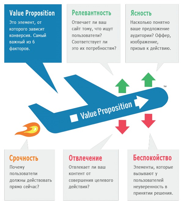
Clarity and relevance determine the return of a value proposition, the response of the target audience. And, on the contrary, any incomprehensible things "kill" the conversion. It is easier for the user to reject than to accept the offer.
Nothing personal, ordinary psychology: we critically perceive everything new. Therefore, the benefit should be many times higher than the objections. Finally, urgency is a jet fuel, without which value proposition will stall.
Web design affects only 3 of these elements:
1) Clarity
2) Anxiety
3) Distraction
A visual can both emphasize the essence of a sentence, or add chaos.
Other elements - urgency and relevance depend mainly on how the offer is presented, this is pure copywriting.
Steep and unsuccessful examples of Value proposition, we are considering in this article.
How design affects clarity and distractions
The conversion site clearly guides the site visitors to the target action. The opposite situation - when users are forced to wade through the "thickets" of incomprehensible texts, links. If the site causes a “what do they want?” Reaction, then the matter is bad.
Well, the “classics of the genre”: sliders, gifs, bright background images. Even if they are made with high quality, it is very distracting. Beauty does not equal sale. What do you need from visitors: so that they stare at beautiful pictures or leave bids?
The more complex the functionality, the more confusion and misinterpretation. Of course, we are talking about selling sites, where the goal - calls, orders, orders.
"Ugly sites" often just contain a minimum of distractions. In fact, there are no images, just text on a white background. At the same time they work.
How design increases or decreases anxiety
Relevant elements: trust stamps, guarantees, blocks with reviews and certificates, as well as a “general feeling”. Believe it or not, simple-minded sites often cause more trust than parallax effect and other frills. Perhaps the bells and whistles subconsciously perceived as a manipulation.
3 examples of sites with terrible design
They have different goals, but they all cope with them perfectly.
1. Craigslist
Craigslist is similar to Avito and is in the TOP 100 of Alexa's ranking (list of the most visited sites in the world). Given that its design is a la “hello from the 90s,” it has remained almost unchanged since its inception.
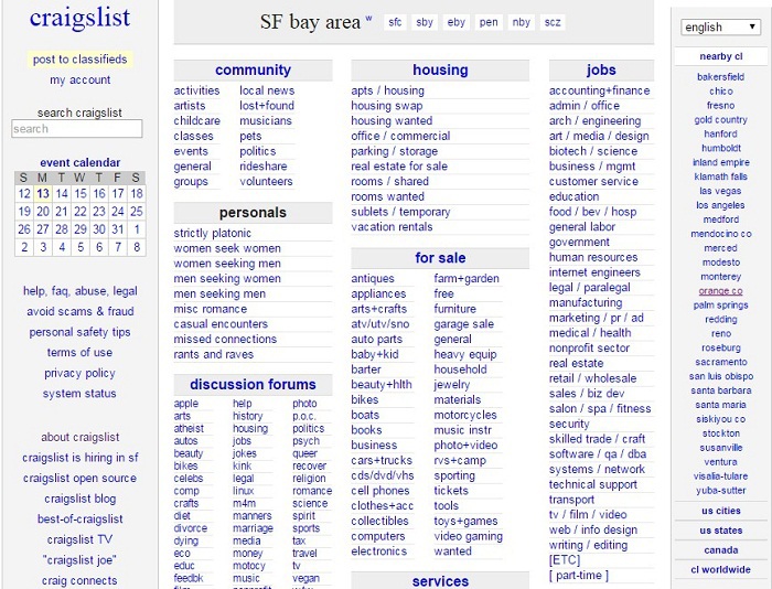
What is worth noting: rubricator with clear names of categories (work, sale, real estate, etc.), as well as with subcategories in alphabetical order. If the user does not find information through them, the search string and the list of cities in the right sidebar help. No images and color background. Only links. It is simple and super efficient in terms of functionality and user experience.
2. DMOZ
This is a directory of sites that are used by 200,000 unique visitors per month.
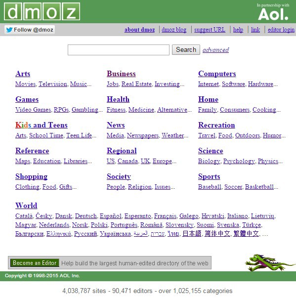
The DMOZ design is even simpler than Craigslist. The most simplified navigation: the user selects a category and then “digs” deep into a specific topic. Again, 0 distractions, all attention to the category links, which are the main value of the site.
3. wiseGEEK
This is one of the first question-answer sites. Despite the primitive design, it does not lose popularity.
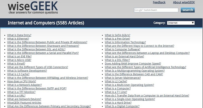
The vast majority of traffic comes from search engines for specific issues. If the answer does not suit you, the Google search bar is located in the top bar. Nothing amazing, but it works.
The list goes on. Until recently, many users would call the terrible design of the largest eBay marketplace. In a very austere style, Google design is made, and so on.
Commentary by the head of Yagla.ru Alexander Alimov
Instead of arguing how cute or awful the site design is with our clients, we measure its conversion. Because both simple and premium images can give a high conversion equally. If you are not satisfied with something, do not rush to do a major redesign. We recommend checking the first screen: it is associated with 90% of the success of the landing page.
With the help of the Yagla service , you can make a substitution of the original image for users' requests from contextual advertising. Without any redesign.
For example, the transport company, at the request of “cargo Perm - Moscow,” set up a display of a photo of Moscow, and under the request of “cargo Perm - Yekaterinburg” - a photo of Yekaterinburg on the first screen. In conjunction with the unique offers for these requests, this brought a 66.5% increase in conversion over 4 weeks.
Source: https://habr.com/ru/post/292390/
All Articles