Large online store on a cloud platform. Readiness 15%
Megamind, hello! We have the first report on the development plan for a large online store on the cloud platform Digistr.ru. More about the idea was in the last publication . Thank you for your constructive criticism and suggestions! We take this into account, thank you and continue to work.
There is a lot of text and photos under the cut.
')
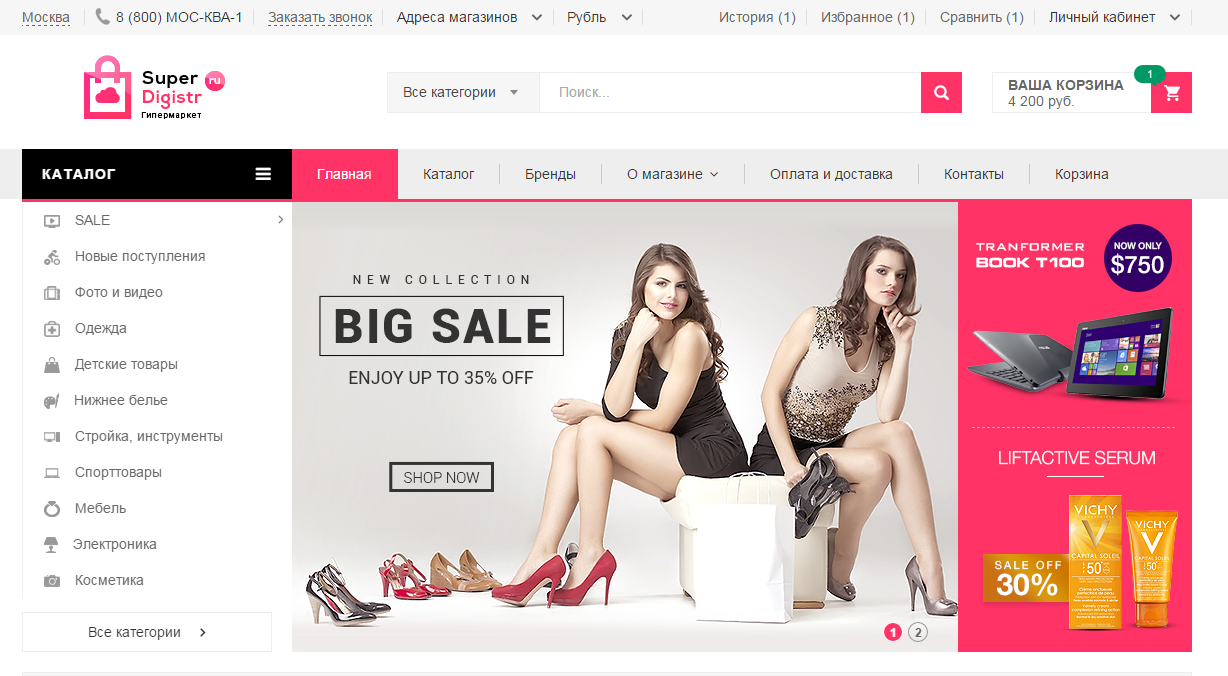
For those who do not immediately master all the material, or do not plan to study it, we will briefly tell what we have done. Today, according to our plan, we have the introduction of a common layout and main page. We chose the modules of large online stores and connected them to our platform.
While only the main page is available, the catalog templates and product cards will be updated next Monday. You can watch here super.digistr.ru . Sorry for the indiscretion, but in our plans to make a super online store :)
1. Select a region. When you select popular regions, the phone changes (if it is listed for a region). Cities only RF.
2. Order a call - the standard widget sending a request.
3. Store locations - shown for popular cities. In Moscow there are two stores, in the rest one by one. In unpopular (within the demo) cities are not shown, since they are not.
4. History, favorites, compare - you can already add products to these lists when you hover on a product. For the history you need to click on the product, a blank page will open, but the product will be “recorded”. These lists will be in the next section when displaying the product catalog.
5. The personal account authorizes via the social network (Loginza.ru), if you log in via Vkontakte, it will not work yet, since it will request an e-mail additionally (VC will not transmit it). But these templates will be in one week in the section "Orders and personal account".
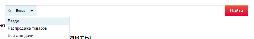
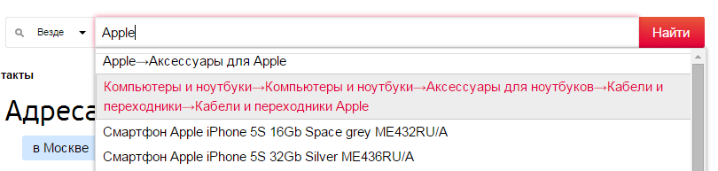
6. The search will be in the development of the catalog, you can view it by entering the query "SALE". More on this in the next chapter and in SEO.
7. Catalog menu with a banner for each category. On the right is the usual drop-down menu, where we will gradually add information sections.
8. Slideshow standard and banner area to the right of him. Any number of banners is loaded in the admin panel.
9. Next, everything is standard - different product lists, banners, brands, new categories and a basement.
Next Monday we will open access to the admin panel of this store so that you can see how the catalog is arranged. As new sections are added, the home page will be updated.
Further, our study of the top online stores, what opportunities we have found, their explanation and our recommendations. Enjoy learning!
In this article we will learn how online store layouts are organized and what information is most often found on the store's main page.
Scenarios for getting to the main page can be different: they saw offline advertising; by recommendation; regular customer or waiting for your order came to check the status; according to general or branded queries in a search engine or contextual advertising, when a visitor does not fall into the desired category or product immediately, etc.
This is the most visited section of the site and, in the general case, visitors get here who are not really knowing exactly what it will buy at this time. Therefore, the task of the main page is to make a good impression and direct where the sellers need to count. As mentioned earlier, the definition of what exactly is needed and how to try to send people in each case is the responsibility of designers and designers. In general, you need to study the target audience, introduce the characters of the store and try to guess what they need. There is no exact answer to this question without statistics and testing, all only guesses will be.
Hereinafter we will do the maximum capacity to cover all the possible functionality of the store. The main page will be viewed from top to bottom, so we get its layout with common elements for other pages.
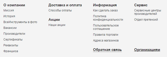
Each section of an online store consists of common parts: the upper part (for developers it is: header, header, header), left / right side columns (sidebar, sidebar), the content of the page itself (the content or main part of the section) and the basement (footer, footer). The upper part is often divided into two components: the top plate (topbar) and the main part. Similarly, the basement is sometimes divided into two parts: the prefooter and the basement itself. Unfortunately, it’s not possible to come up with human names for these parts of the layout yet.
The upper part of the cap (topbar die) is usually a thin strip with semi-sensitive information. She is important (otherwise they would have hidden her) and not so much, since she was given little space. Sometimes the header transforms when scrolling down the page and also goes down, in a fixed form. Distributing the elements of the cap between the plate, the general cap and the fact that it will go down is a matter of design and design. Similarly, with the adaptive layout for mobile devices - the header changes the design of its content. Consider all the elements of the caps.
In addition to the main menu, which usually displays directory sections, there is an additional menu. Most often, these are links to various information pages of the site. May be dropdown or normal.
Sometimes it contains captions for sections.

And sometimes is a catalog of goods.
It is important that this is usually links to other sections of the site, and not any block that works on the current page, as will be in some options below. For development, this means that it is very easy to insert a link (2-3 minutes), but the section itself, if it is not a text page, is not so easy to do (many hours).
The content of the menu is the task of designing the sections of the store. In your case, you need to build on the sections of your store.
These can be links, similar to a menu, or a drop-down box with an input form.

There are various options when the link to enter, register or restore a password is a separate page or also opens in the window. Registration can be by mail, phone or through social networks. When registering, you can specify who registers: an individual or a company.
The most comprehensive and detailed version is implemented in Ulmart. It is full of the fact that it allows you to choose the type of registration and choose between the method of entry: by phone or e-mail. Usually only one option.
It is important for social networks that they can be implemented in two ways: connect each network individually, or using services like Loginza.ru. The authorization aggregator by the time of implementation is like the introduction of authorization through one social network, but all are available at once. But those who do not want to pass their customers through third-party services, do their own integration. Each subsequent integration, after the first, takes about half the time to develop.
Registration, of course, pushes the first buyers. If the store does not enjoy authority yet, perhaps this will be superfluous. If you collect a customer base and build work with regard to repeat sales, the loss on the number of first orders can be compensated by repeat sales. More information about this will be in the section "Orders and personal account".
Upon delivery to a large number of regions, the visitor is offered to choose his region when he first visits the site. From this will depend on the cost and delivery time. The delivery calculation module itself will be described in detail in the “Services, Integration, Automation” section; behind a simple window of choice, very complex delivery counting processes can be hidden.
Selecting a region can be a simple list of popular cities, with or without the ability to enter your city in the text field with auto-completion.
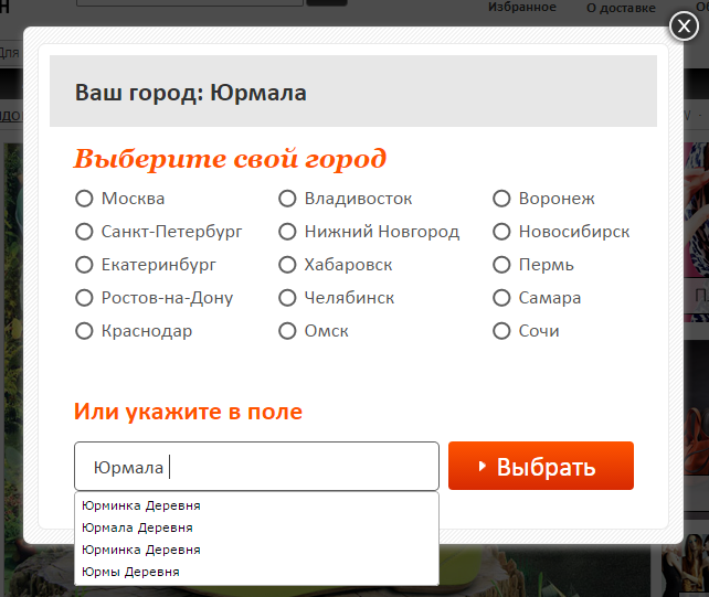
Please note, here the name is determined by part of the name. Found all where indicated "jurm". Perhaps the search deletes the end or the last few letters.
If this list of cities is large, it can be divided by alphabetical search and / or by region. For international projects - by country. Below is an example of the most complete option (but without countries) with a stamp of issue points and popular cities in the region.
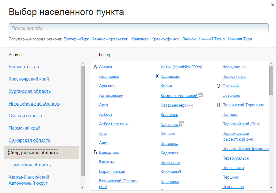
If there are a lot of regions, you can make a search by their layout. When developing, it’s important that this list be loaded onto a page only when clicking on a region-select link, and not immediately upon loading the page, otherwise its size will greatly increase with unnecessary data.
At the first visit to the site, the platform determines the visitor's city by its IP address and asks for confirmation next to the choice of region
or more persistently in a popup window
For the development of this is not significant and is done with the design layout.
Which option is suitable in your case, you need to evaluate between the significance of the region (how many percent of the orders it sends to it) and the convenience of choosing a region. If a million people account for 80-90% of orders, then it may be worth making a simplified list of popular cities.
Usually it is only a matter of design, which contacts are posted on the site. But it may be the case when contacts depend on the city.


There are two additional features of this block - this is "Order a callback" or "Call from the site." Can be called differently, but the essence is the same. “Order a call” is the development of a separate opportunity when creating a store, and “Online call” is connecting a separate service to the site (similarly as a attendance counter or an online consultant). These services will be discussed in detail later, they have no effect on the development and the installation of such a service takes 10-15 minutes.
Pay attention to the block with the code, which is sometimes found next to the contacts. Each visitor has their own random code. When you call the store, the manager asks for your code and, based on the internal analytics system, determines which pages you viewed and where you came from (from a search engine, from contextual advertising, etc.). This monitors the effectiveness of advertising. Sometimes this code is attributed to the product number on the site, when you order it by phone, you are asked to name the product number. The manager knows that part of the article is your code and determines where you came from.
Sometimes contacts make a drop-down window and place links to additional sections of the site, where the visitor can find the answers to their questions.
Additionally, you can place any contacts (several phones, Skype, store address, etc.), links to sections of the site and social networking icons with links to branded pages. This is a matter of design and the necessary data for publication on the site. As previously mentioned in the section on the “Menu”, the placement of links is a matter of 5-15 minutes, and the creation of the relevant sections in the working form can take hours and days.
In our case, we make contacts dependent on the region and call order. E-mail for call order messages and work schedule will also depend on the region. We do not do the visitor code, because currently there are services that perform this task much better. More on this in the services section.
Shopping cart, favorites, comparison, browsing history - these are four different possibilities for the store. Details about them will be in the relevant sections, and for the website header the basket can be one of two options: a link to the basket section on the website itself and / or a drop-down window with goods. All options with the amount of goods and order amount.
Sometimes these links are placed in the floating bar at the top, bottom, or side of the page.

Comparison, favorites and history can be placed in the "login / registration" block as elements of the personal account of the store.
All these options are the same for development, if there are appropriate sections of the store. Only the drop-down window requires additional development, so that the data baskets are on all pages of the store. It happens that the other lists of products are displayed on each page.
Please note that on some sites there is the possibility to add to bookmarks. It may not be your favorites, but browser bookmarks when the site you plan to visit is saved. This is done by layout and does not affect the development.
A pop-up window in which you can specify the order number and get information about its status. Details on this will be in the "My Account" section, where the history of customer orders is stored. The general window on all pages allows you to specify your phone and / or e-mail to check the status, where the message will automatically come with the necessary information.
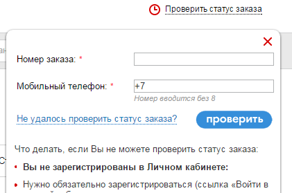
Sometimes the service is done without a contact field, the data is taken from the order itself or displayed directly in the window.
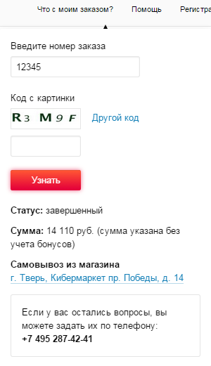
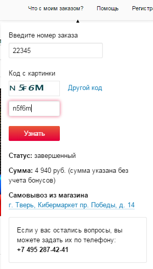
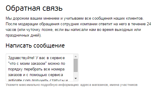
As you can see, even the leaders make shortcomings, when you can see their status by order numbers. And not complicated manipulations with services for the selection of codes from images to get a list of all orders of the store with their value and status. We will write about this in support through a scanty field for the text of the message so that we can fix it before the publication of this article.
Next to the line can be placed a list of categories for which you need to search and a list of additional sections, if such are present in the store.
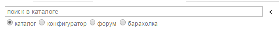
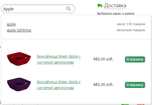
To search, the main requirement during development is the implementation of autocompletion. It can be a simple search by category and product.
Photos and other information can be added to the goods, the quantity of goods is indicated next to the categories.
More information about the search will be in the section “SEO when developing a store”; in our case, not only categories and products will be displayed here, but also sections of the site specially created for promotion.
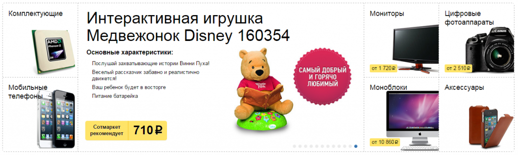
Most often, this is a direct product catalog. It can be placed in the side column of the site, be horizontal or collapsed into one link and open with a click.
All this does not affect the development, since the same product catalog is displayed. An additional possibility may be placement of banners or certain goods in the menu sections.
Some blocks of information that are placed in the side columns of one store can be placed in the basement of another store. And vice versa: someone has information in the basement, others have a side column. Therefore, we consider them together.
In the basement is usually placed service information, repeat store navigation or information from the top of the layout. The main requirement for the development here is that all the posted information can be edited in the admin panel of the store.
Most often, the placement of this information does not affect the development of the store, since all these elements are plain text, graphics or widgets of other services. Similarly for informational sections, menus or special offers of the catalog, if there are corresponding sections in the store.
All this is about the same possibilities for placing information on the site. When developing, the main thing to consider is what needs to be able to edit for the elements of such a section. For example, for news headlines, dates and descriptions are enough. Articles additionally need a photo and abstract. If we add comments and headings to the articles, we get a blog.


Displays the latest viewed products and a link to the entire history.
We make a block of the history of views and the entire history of a separate section.
All this information is usually located in the basement.

Social networks can be regular links to groups, buttons, or widgets to subscribe to the community.


Mobile application buttons are links to sites where they can be downloaded.

Mailing can be from one field - e-mail, or with a name. The difference in development between them is not significant.
Sometimes when you subscribe to a visitor, they will know their gender in order to send targeted emails.

Duplicate navigation or links to service information sections are most often located in the basement.


As mentioned earlier, the goal of the main page is to direct the visitor to the desired scenario. Therefore, usually, stock banners are placed on the main page in order to actively sell the desired product. New and special offers serve the same purpose.
Let's see what information the top online stores of the RuNet are placed on their main pages and post the same in our store. In the future, we will analyze what information turned out to be useful, what kind of superfluous, and what might be worth adding.
Usually, a slideshow contains several banners that change each other. So we attract visitors to all our shares. Banner zone is a part of the page where banners are placed. In one zone there can be many banners, and they can be displayed according to the necessary principle (by chance, in turn, all at once).
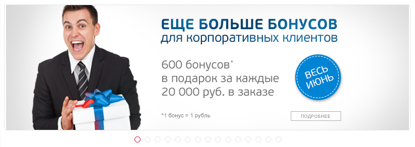
Effects when displaying banners can be any, as well as elements for viewing them (arrows and buttons), but all banners have a common structure: a photo; link to the detailed description of the promotion or section of the store; sometimes place a few lines of text to the banner.
Sometimes other banner zones are placed next to the slide show.
Banners can also be considered blocks of store benefits.

When developing it is important to determine in which parts of the design there should be banner zones. After that, they can be edited in the store's control panel.
Here, the main thing in development is to determine the terminology and principles by which products will be displayed in these blocks.
For example, new items can be displayed by the date the goods arrive at the warehouse, by the date they are added to the catalog, or manually assigned by the administrator. The most universal option is manual assignment, when the administrator, when editing a product, puts the “New” checkbox on it.When displaying this block on the site itself, it does not matter how the products are displayed in this block. The main thing is that, if necessary, to show the goods on the date of receipt at the warehouse - this information was correctly filled by the administrator or came from the warehouse program with which the store is integrated.
Similarly, sales hits or popular products can be hits by the number of orders or are just popular now among buyers (in this case, the store does not identify trends and you need to specify this data manually). Popularity can also be considered the number of views of the goods.
Promotions, discounts, sales - this is also a question of terminology and how exactly each unit should work .The promotion may be a discount, and the discount may be on a related product with a certain amount, etc.
In small stores, manual control of these blocks is most often used, since the product itself does not often change, or the counters of orders for a certain product do not have large values. Then, using these blocks, sellers simply draw attention to products that they want to sell more actively.
In general, it is not important how to call these blocks, the main thing is to determine the logic by which products are displayed in this block, and to ensure their correct filling. And the display itself is the same everywhere. It may be just a list of products. Or "carousel" with scrolling goods. Sometimes these are tabs, where several types of products are displayed within one block.
In these blocks may be the division into categories of goods. By the same principle, different badges are placed near the goods. Inscriptions, as a rule, are purely advertising. We should also mention the action with a timer, because it stands out from the usual display of the list of products. For such goods, it is important to have a separate page with a list of all sales items and their history: when will the next promotion begin, how long does the current one last, what were the previous shares.


It can only be the main categories of the store, with or without photos. Or simply marked as "popular categories". Sometimes this is a list with subcategories. Or a combination of these two options. There is no difference in development between them. The main thing to consider is that the category may have an additional photo for this purpose. On the same principle as the "New Products", the "New Categories" blocks work.


Sometimes it is displayed in the basement, sometimes only on the main page. Usually, these are brand logos with links to pages with their description and products. Similar to the categories of goods. This may be a regular list. Or "carousel". Pay attention to the "brand leaders." Usually, this is an advertising-only lead; it is unlikely that this list is formed on the basis of order statistics for these brands. These two methods are the same in development, but the method of dividing brands into categories is a bit more complicated.


Any information from the available sections can be placed on the main page, if this is considered necessary during the design of the store.
These may be blocks of benefits. News, blog, video reviews, photo gallery Please note that the ability to "add photos" is usually not standard for the store. Customer reviews, recommendations In general, any textual and graphical information that will help build trust and / or direct a visitor to the site according to the desired scenario. Similar to the links at the top of the site and the basement: it is easy to place information in the design layout, and the creation of the corresponding section and its management takes considerable time.


After analyzing the Forbes Top20 online stores, we see that they are all very similar. Of course, this is only the outer visible and a very small part of the iceberg. Making the platform is not so difficult, but to provide it with correct data, logistics, accounting for a warehouse, etc. - this is much more difficult. Therefore, in the end, we get a very powerful online store, which will add very powerful entrepreneurs.
Who read to the finals - incredible! :)
In the next article we will examine in detail all the elements of the search and selection of products: categories, filters, comparisons, product cards, etc.
There is a lot of text and photos under the cut.
')
For those who do not immediately master all the material, or do not plan to study it, we will briefly tell what we have done. Today, according to our plan, we have the introduction of a common layout and main page. We chose the modules of large online stores and connected them to our platform.
While only the main page is available, the catalog templates and product cards will be updated next Monday. You can watch here super.digistr.ru . Sorry for the indiscretion, but in our plans to make a super online store :)
Briefly about done and features
1. Select a region. When you select popular regions, the phone changes (if it is listed for a region). Cities only RF.
2. Order a call - the standard widget sending a request.
3. Store locations - shown for popular cities. In Moscow there are two stores, in the rest one by one. In unpopular (within the demo) cities are not shown, since they are not.
4. History, favorites, compare - you can already add products to these lists when you hover on a product. For the history you need to click on the product, a blank page will open, but the product will be “recorded”. These lists will be in the next section when displaying the product catalog.
5. The personal account authorizes via the social network (Loginza.ru), if you log in via Vkontakte, it will not work yet, since it will request an e-mail additionally (VC will not transmit it). But these templates will be in one week in the section "Orders and personal account".
6. The search will be in the development of the catalog, you can view it by entering the query "SALE". More on this in the next chapter and in SEO.
7. Catalog menu with a banner for each category. On the right is the usual drop-down menu, where we will gradually add information sections.
8. Slideshow standard and banner area to the right of him. Any number of banners is loaded in the admin panel.
9. Next, everything is standard - different product lists, banners, brands, new categories and a basement.
Next Monday we will open access to the admin panel of this store so that you can see how the catalog is arranged. As new sections are added, the home page will be updated.
Further, our study of the top online stores, what opportunities we have found, their explanation and our recommendations. Enjoy learning!
Online store development: home page and general layout
In this article we will learn how online store layouts are organized and what information is most often found on the store's main page.
Scenarios for getting to the main page can be different: they saw offline advertising; by recommendation; regular customer or waiting for your order came to check the status; according to general or branded queries in a search engine or contextual advertising, when a visitor does not fall into the desired category or product immediately, etc.
This is the most visited section of the site and, in the general case, visitors get here who are not really knowing exactly what it will buy at this time. Therefore, the task of the main page is to make a good impression and direct where the sellers need to count. As mentioned earlier, the definition of what exactly is needed and how to try to send people in each case is the responsibility of designers and designers. In general, you need to study the target audience, introduce the characters of the store and try to guess what they need. There is no exact answer to this question without statistics and testing, all only guesses will be.
Hereinafter we will do the maximum capacity to cover all the possible functionality of the store. The main page will be viewed from top to bottom, so we get its layout with common elements for other pages.
Each section of an online store consists of common parts: the upper part (for developers it is: header, header, header), left / right side columns (sidebar, sidebar), the content of the page itself (the content or main part of the section) and the basement (footer, footer). The upper part is often divided into two components: the top plate (topbar) and the main part. Similarly, the basement is sometimes divided into two parts: the prefooter and the basement itself. Unfortunately, it’s not possible to come up with human names for these parts of the layout yet.
Site header
The upper part of the cap (topbar die) is usually a thin strip with semi-sensitive information. She is important (otherwise they would have hidden her) and not so much, since she was given little space. Sometimes the header transforms when scrolling down the page and also goes down, in a fixed form. Distributing the elements of the cap between the plate, the general cap and the fact that it will go down is a matter of design and design. Similarly, with the adaptive layout for mobile devices - the header changes the design of its content. Consider all the elements of the caps.
Short menu
In addition to the main menu, which usually displays directory sections, there is an additional menu. Most often, these are links to various information pages of the site. May be dropdown or normal.
Sometimes it contains captions for sections.
And sometimes is a catalog of goods.
It is important that this is usually links to other sections of the site, and not any block that works on the current page, as will be in some options below. For development, this means that it is very easy to insert a link (2-3 minutes), but the section itself, if it is not a text page, is not so easy to do (many hours).
The content of the menu is the task of designing the sections of the store. In your case, you need to build on the sections of your store.
Personal account block (login / registration)
These can be links, similar to a menu, or a drop-down box with an input form.
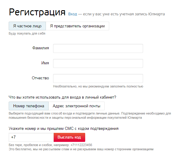
There are various options when the link to enter, register or restore a password is a separate page or also opens in the window. Registration can be by mail, phone or through social networks. When registering, you can specify who registers: an individual or a company.
The most comprehensive and detailed version is implemented in Ulmart. It is full of the fact that it allows you to choose the type of registration and choose between the method of entry: by phone or e-mail. Usually only one option.
It is important for social networks that they can be implemented in two ways: connect each network individually, or using services like Loginza.ru. The authorization aggregator by the time of implementation is like the introduction of authorization through one social network, but all are available at once. But those who do not want to pass their customers through third-party services, do their own integration. Each subsequent integration, after the first, takes about half the time to develop.
Registration, of course, pushes the first buyers. If the store does not enjoy authority yet, perhaps this will be superfluous. If you collect a customer base and build work with regard to repeat sales, the loss on the number of first orders can be compensated by repeat sales. More information about this will be in the section "Orders and personal account".
Select the region of the buyer and addresses of stores
Upon delivery to a large number of regions, the visitor is offered to choose his region when he first visits the site. From this will depend on the cost and delivery time. The delivery calculation module itself will be described in detail in the “Services, Integration, Automation” section; behind a simple window of choice, very complex delivery counting processes can be hidden.
Selecting a region can be a simple list of popular cities, with or without the ability to enter your city in the text field with auto-completion.
Please note, here the name is determined by part of the name. Found all where indicated "jurm". Perhaps the search deletes the end or the last few letters.
If this list of cities is large, it can be divided by alphabetical search and / or by region. For international projects - by country. Below is an example of the most complete option (but without countries) with a stamp of issue points and popular cities in the region.
If there are a lot of regions, you can make a search by their layout. When developing, it’s important that this list be loaded onto a page only when clicking on a region-select link, and not immediately upon loading the page, otherwise its size will greatly increase with unnecessary data.
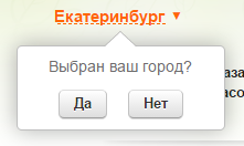
At the first visit to the site, the platform determines the visitor's city by its IP address and asks for confirmation next to the choice of region
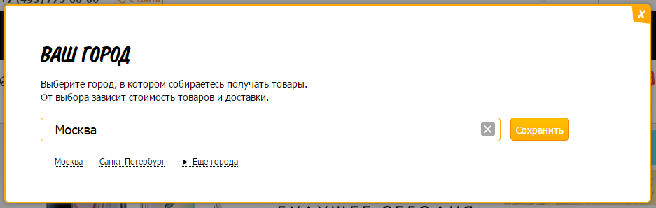
or more persistently in a popup window
For the development of this is not significant and is done with the design layout.
Which option is suitable in your case, you need to evaluate between the significance of the region (how many percent of the orders it sends to it) and the convenience of choosing a region. If a million people account for 80-90% of orders, then it may be worth making a simplified list of popular cities.
Contacts, work schedule, social networks
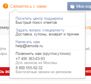
Usually it is only a matter of design, which contacts are posted on the site. But it may be the case when contacts depend on the city.
There are two additional features of this block - this is "Order a callback" or "Call from the site." Can be called differently, but the essence is the same. “Order a call” is the development of a separate opportunity when creating a store, and “Online call” is connecting a separate service to the site (similarly as a attendance counter or an online consultant). These services will be discussed in detail later, they have no effect on the development and the installation of such a service takes 10-15 minutes.
Pay attention to the block with the code, which is sometimes found next to the contacts. Each visitor has their own random code. When you call the store, the manager asks for your code and, based on the internal analytics system, determines which pages you viewed and where you came from (from a search engine, from contextual advertising, etc.). This monitors the effectiveness of advertising. Sometimes this code is attributed to the product number on the site, when you order it by phone, you are asked to name the product number. The manager knows that part of the article is your code and determines where you came from.
Sometimes contacts make a drop-down window and place links to additional sections of the site, where the visitor can find the answers to their questions.
Additionally, you can place any contacts (several phones, Skype, store address, etc.), links to sections of the site and social networking icons with links to branded pages. This is a matter of design and the necessary data for publication on the site. As previously mentioned in the section on the “Menu”, the placement of links is a matter of 5-15 minutes, and the creation of the relevant sections in the working form can take hours and days.
In our case, we make contacts dependent on the region and call order. E-mail for call order messages and work schedule will also depend on the region. We do not do the visitor code, because currently there are services that perform this task much better. More on this in the services section.
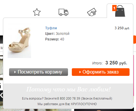
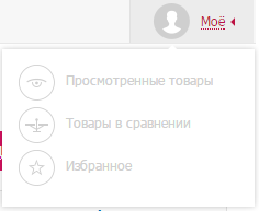
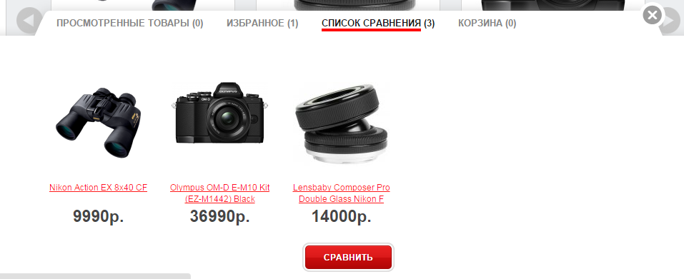
Product selection - cart, favorites, comparison, history
Shopping cart, favorites, comparison, browsing history - these are four different possibilities for the store. Details about them will be in the relevant sections, and for the website header the basket can be one of two options: a link to the basket section on the website itself and / or a drop-down window with goods. All options with the amount of goods and order amount.
Sometimes these links are placed in the floating bar at the top, bottom, or side of the page.
Comparison, favorites and history can be placed in the "login / registration" block as elements of the personal account of the store.
All these options are the same for development, if there are appropriate sections of the store. Only the drop-down window requires additional development, so that the data baskets are on all pages of the store. It happens that the other lists of products are displayed on each page.
Please note that on some sites there is the possibility to add to bookmarks. It may not be your favorites, but browser bookmarks when the site you plan to visit is saved. This is done by layout and does not affect the development.
Check order status
A pop-up window in which you can specify the order number and get information about its status. Details on this will be in the "My Account" section, where the history of customer orders is stored. The general window on all pages allows you to specify your phone and / or e-mail to check the status, where the message will automatically come with the necessary information.
Sometimes the service is done without a contact field, the data is taken from the order itself or displayed directly in the window.
As you can see, even the leaders make shortcomings, when you can see their status by order numbers. And not complicated manipulations with services for the selection of codes from images to get a list of all orders of the store with their value and status. We will write about this in support through a scanty field for the text of the message so that we can fix it before the publication of this article.
Search line
Next to the line can be placed a list of categories for which you need to search and a list of additional sections, if such are present in the store.
To search, the main requirement during development is the implementation of autocompletion. It can be a simple search by category and product.
Photos and other information can be added to the goods, the quantity of goods is indicated next to the categories.
More information about the search will be in the section “SEO when developing a store”; in our case, not only categories and products will be displayed here, but also sections of the site specially created for promotion.
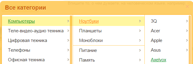
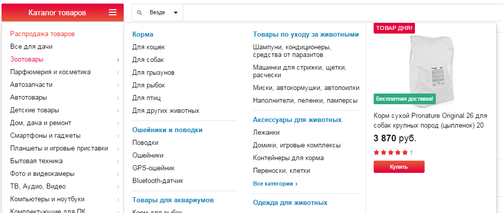
Main store menu
Most often, this is a direct product catalog. It can be placed in the side column of the site, be horizontal or collapsed into one link and open with a click.
All this does not affect the development, since the same product catalog is displayed. An additional possibility may be placement of banners or certain goods in the menu sections.
Side speakers and basement
Some blocks of information that are placed in the side columns of one store can be placed in the basement of another store. And vice versa: someone has information in the basement, others have a side column. Therefore, we consider them together.
In the basement is usually placed service information, repeat store navigation or information from the top of the layout. The main requirement for the development here is that all the posted information can be edited in the admin panel of the store.
Most often, the placement of this information does not affect the development of the store, since all these elements are plain text, graphics or widgets of other services. Similarly for informational sections, menus or special offers of the catalog, if there are corresponding sections in the store.
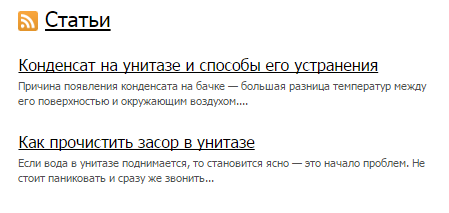
News, articles, blog, reviews, promotions
All this is about the same possibilities for placing information on the site. When developing, the main thing to consider is what needs to be able to edit for the elements of such a section. For example, for news headlines, dates and descriptions are enough. Articles additionally need a photo and abstract. If we add comments and headings to the articles, we get a blog.
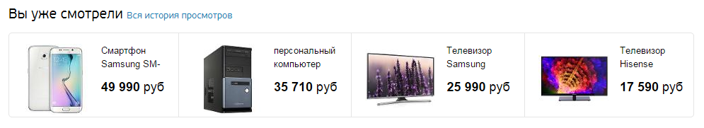
Browsing history
Displays the latest viewed products and a link to the entire history.
We make a block of the history of views and the entire history of a separate section.
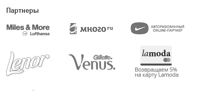
Payment systems, counters, partner logos
All this information is usually located in the basement.
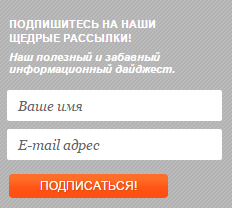
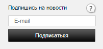
Social networks, newsletter, mobile applications
Social networks can be regular links to groups, buttons, or widgets to subscribe to the community.
Mobile application buttons are links to sites where they can be downloaded.
Mailing can be from one field - e-mail, or with a name. The difference in development between them is not significant.
Sometimes when you subscribe to a visitor, they will know their gender in order to send targeted emails.
Menu catalog and site
Duplicate navigation or links to service information sections are most often located in the basement.
Contacts and addresses of shops
Online Store Homepage
As mentioned earlier, the goal of the main page is to direct the visitor to the desired scenario. Therefore, usually, stock banners are placed on the main page in order to actively sell the desired product. New and special offers serve the same purpose.
Let's see what information the top online stores of the RuNet are placed on their main pages and post the same in our store. In the future, we will analyze what information turned out to be useful, what kind of superfluous, and what might be worth adding.
Banners and Slideshows
Usually, a slideshow contains several banners that change each other. So we attract visitors to all our shares. Banner zone is a part of the page where banners are placed. In one zone there can be many banners, and they can be displayed according to the necessary principle (by chance, in turn, all at once).
Effects when displaying banners can be any, as well as elements for viewing them (arrows and buttons), but all banners have a common structure: a photo; link to the detailed description of the promotion or section of the store; sometimes place a few lines of text to the banner.
Sometimes other banner zones are placed next to the slide show.
Banners can also be considered blocks of store benefits.
When developing it is important to determine in which parts of the design there should be banner zones. After that, they can be edited in the store's control panel.
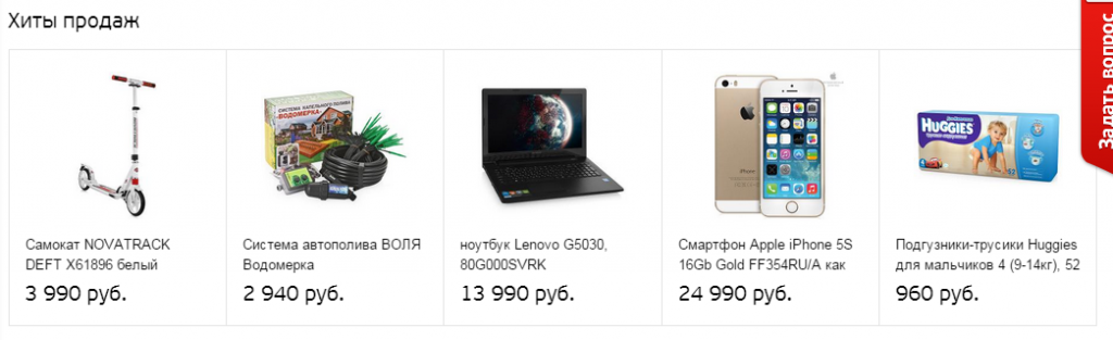
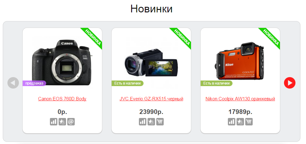
Hits, new items, they buy from us, we recommend, others watch, etc.
Here, the main thing in development is to determine the terminology and principles by which products will be displayed in these blocks.
For example, new items can be displayed by the date the goods arrive at the warehouse, by the date they are added to the catalog, or manually assigned by the administrator. The most universal option is manual assignment, when the administrator, when editing a product, puts the “New” checkbox on it.When displaying this block on the site itself, it does not matter how the products are displayed in this block. The main thing is that, if necessary, to show the goods on the date of receipt at the warehouse - this information was correctly filled by the administrator or came from the warehouse program with which the store is integrated.
Similarly, sales hits or popular products can be hits by the number of orders or are just popular now among buyers (in this case, the store does not identify trends and you need to specify this data manually). Popularity can also be considered the number of views of the goods.
Promotions, discounts, sales - this is also a question of terminology and how exactly each unit should work .The promotion may be a discount, and the discount may be on a related product with a certain amount, etc.
In small stores, manual control of these blocks is most often used, since the product itself does not often change, or the counters of orders for a certain product do not have large values. Then, using these blocks, sellers simply draw attention to products that they want to sell more actively.
In general, it is not important how to call these blocks, the main thing is to determine the logic by which products are displayed in this block, and to ensure their correct filling. And the display itself is the same everywhere. It may be just a list of products. Or "carousel" with scrolling goods. Sometimes these are tabs, where several types of products are displayed within one block.
In these blocks may be the division into categories of goods. By the same principle, different badges are placed near the goods. Inscriptions, as a rule, are purely advertising. We should also mention the action with a timer, because it stands out from the usual display of the list of products. For such goods, it is important to have a separate page with a list of all sales items and their history: when will the next promotion begin, how long does the current one last, what were the previous shares.
Catalog
It can only be the main categories of the store, with or without photos. Or simply marked as "popular categories". Sometimes this is a list with subcategories. Or a combination of these two options. There is no difference in development between them. The main thing to consider is that the category may have an additional photo for this purpose. On the same principle as the "New Products", the "New Categories" blocks work.
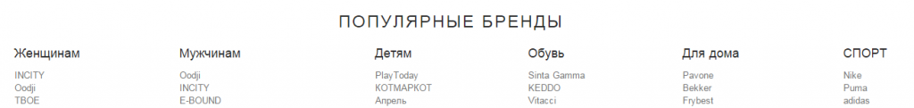
List of brands
Sometimes it is displayed in the basement, sometimes only on the main page. Usually, these are brand logos with links to pages with their description and products. Similar to the categories of goods. This may be a regular list. Or "carousel". Pay attention to the "brand leaders." Usually, this is an advertising-only lead; it is unlikely that this list is formed on the basis of order statistics for these brands. These two methods are the same in development, but the method of dividing brands into categories is a bit more complicated.
Content of information sections
Any information from the available sections can be placed on the main page, if this is considered necessary during the design of the store.
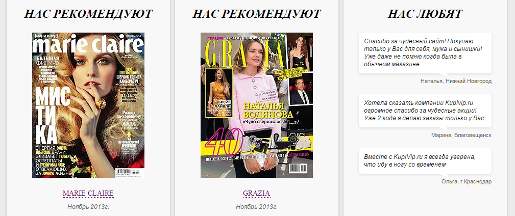
These may be blocks of benefits. News, blog, video reviews, photo gallery Please note that the ability to "add photos" is usually not standard for the store. Customer reviews, recommendations In general, any textual and graphical information that will help build trust and / or direct a visitor to the site according to the desired scenario. Similar to the links at the top of the site and the basement: it is easy to place information in the design layout, and the creation of the corresponding section and its management takes considerable time.
As output on main page
After analyzing the Forbes Top20 online stores, we see that they are all very similar. Of course, this is only the outer visible and a very small part of the iceberg. Making the platform is not so difficult, but to provide it with correct data, logistics, accounting for a warehouse, etc. - this is much more difficult. Therefore, in the end, we get a very powerful online store, which will add very powerful entrepreneurs.
Who read to the finals - incredible! :)
In the next article we will examine in detail all the elements of the search and selection of products: categories, filters, comparisons, product cards, etc.
Source: https://habr.com/ru/post/291806/
All Articles