What is the difference between mobile reading and desktop?
If you are already preparing to release a mobile application, you probably thought about how to adapt your content for the mobile user experience. How to start?
Communicate with users effectively
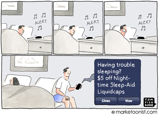
No one likes annoying push notifications, so watch out for their frequency. Each notification should be valuable to the mobile experience, the user himself or your product. As a rule, messages in push-notifications are informative or entertaining.
')
Build user-oriented functionality
Remember about the small screen, a wide range of technical features of mobile devices, the inaccessibility of the Internet in certain areas, as well as features of finger scrolling. The priority should be content that is especially valuable in terms of using the mobile application. For example, you can add a click-to-call link to your support telephone numbers in the contacts section. If a certain functionality simply does not fit in your mobile application, do not worry, you can always send your customers to the site or to another appropriate channel.
Improve the appearance of your content
Remember that your users may prefer horizontal reading to vertical, because it is more familiar to them from previous desktop experience. Probably, you heard about the rule of three clicks, which emphasizes the need to reduce the number of clicks and finger presses to a minimum.
The study of User Interface Engineering shows that users do not necessarily leave the application after three clicks, but they still need to have a clear understanding that they are closer to completing the task. The most valuable content that you really want to show to users should be located as close as possible to the start page and even on it.
Work on the navigation
Users always need a clear “beacon” that tells them exactly where they are in the application, how they can go back or to the beginning and how they can move on - make sure that they can get anywhere, anywhere, and back to the application.
Development for a mobile screen involves certain difficulties, so take care of space and time using simple and universal icons (for example, a house for Home or a left and right arrow for moving back and forth). Navigation links and elements should have short and clear descriptions.
Involve users with good content.
Depending on the specifics of your product or service, the mix of content presented in your mobile application should be balanced and include support, product guide, contact information, marketing materials and instructions if necessary. Remember that multimedia content (especially with a movement that distracts the user) is more suitable for entertaining or giving instructions.
Give users control over sound and video. Make sure your images are scaled for small screens and have sufficient resolution for Retina screens. Most likely, on the move, mobile users will not be able to read well into the content, so the main ideas should be presented briefly and clearly.
Rebuild mobile design for easy reading.
It's funny that so far a message appears on the websites of some top brands requesting to install Flash to view content on iPhone. Your formats and design should become a really deep rethinking of your desktop version. As a designer, your main goal is to provide users with good opportunities to scan content and get their attention with a clear hierarchy of elements and clarity of presentation. Colors and styles should match the ones you use on your site and other marketing channels. Visual transition elements (gradients, transparency, arrows and contrast) can serve as tips for the user so that you can fully control their line of movement within the application.
Mobile reading as a concept is still evolving, and you can beat the competition by putting yourself in the user's place as much as possible. No doubt this list can be continued. I will wait for your additions in the comments!
What else would you suggest for creating a truly good mobile experience?
Communicate with users effectively
No one likes annoying push notifications, so watch out for their frequency. Each notification should be valuable to the mobile experience, the user himself or your product. As a rule, messages in push-notifications are informative or entertaining.
')
Build user-oriented functionality
Remember about the small screen, a wide range of technical features of mobile devices, the inaccessibility of the Internet in certain areas, as well as features of finger scrolling. The priority should be content that is especially valuable in terms of using the mobile application. For example, you can add a click-to-call link to your support telephone numbers in the contacts section. If a certain functionality simply does not fit in your mobile application, do not worry, you can always send your customers to the site or to another appropriate channel.
Improve the appearance of your content
Remember that your users may prefer horizontal reading to vertical, because it is more familiar to them from previous desktop experience. Probably, you heard about the rule of three clicks, which emphasizes the need to reduce the number of clicks and finger presses to a minimum.
The study of User Interface Engineering shows that users do not necessarily leave the application after three clicks, but they still need to have a clear understanding that they are closer to completing the task. The most valuable content that you really want to show to users should be located as close as possible to the start page and even on it.
Work on the navigation
Users always need a clear “beacon” that tells them exactly where they are in the application, how they can go back or to the beginning and how they can move on - make sure that they can get anywhere, anywhere, and back to the application.
Development for a mobile screen involves certain difficulties, so take care of space and time using simple and universal icons (for example, a house for Home or a left and right arrow for moving back and forth). Navigation links and elements should have short and clear descriptions.
Involve users with good content.
Depending on the specifics of your product or service, the mix of content presented in your mobile application should be balanced and include support, product guide, contact information, marketing materials and instructions if necessary. Remember that multimedia content (especially with a movement that distracts the user) is more suitable for entertaining or giving instructions.
Give users control over sound and video. Make sure your images are scaled for small screens and have sufficient resolution for Retina screens. Most likely, on the move, mobile users will not be able to read well into the content, so the main ideas should be presented briefly and clearly.
Rebuild mobile design for easy reading.
It's funny that so far a message appears on the websites of some top brands requesting to install Flash to view content on iPhone. Your formats and design should become a really deep rethinking of your desktop version. As a designer, your main goal is to provide users with good opportunities to scan content and get their attention with a clear hierarchy of elements and clarity of presentation. Colors and styles should match the ones you use on your site and other marketing channels. Visual transition elements (gradients, transparency, arrows and contrast) can serve as tips for the user so that you can fully control their line of movement within the application.
Mobile reading as a concept is still evolving, and you can beat the competition by putting yourself in the user's place as much as possible. No doubt this list can be continued. I will wait for your additions in the comments!
What else would you suggest for creating a truly good mobile experience?
Source: https://habr.com/ru/post/291668/
All Articles