Study of the design methodology of IP: "The blade should not meet the blade"
This article is full of the deepest samurai wisdom, due to the extreme concentration of which, we will finally understand the difference of the process from the result, learn in passing how children play and what is their main difference from adults. Well, at the very end we will present you a unique and extremely profitable method of designing information systems.

The main difference between children's mind and adult thought processes is the lack of awareness of goals, that is, a weak causal connection. The child simply imitates any behavior he likes, copying all movements or words, while not fully aware of why and what for it does. The child is always entertained by the process itself, he in a playful way comprehends what set of actions to perform in certain situations, as if ritualizing the solution of each of his tasks. If it happens that the human mind never grows up, then instead of a qualitative design and a sound assessment of the situation with him, only imitation, cargo cult, empty rituals and frank simulation, including workflow, remain for the rest of his life.
I remember well my childhood, as we fought on wooden swords in the courtyards, imitating at the same time musketeers, knights and pirates. The whole essence of fencing for us then was to ensure that our swords constantly and with the loudest sound would collide in the air, creating as much noise as possible. “To get on an opponent’s stick” - so in all seriousness we formulated the main task of the battle for ourselves and evaluated precisely this criterion of the best yard fencers: who most beautifully and loudly can bludgeon with their sword in fights. In my opinion, there is no more successful allegory for describing the current state of affairs in the design of today's interfaces: characters - bryak-bryak, controls - bzdyn-bzdyn, flat-tenyushki and virtuoso fonts - bang-bang, patterns, trends, dribbles - clats-clats . Beautiful, bright, fascinating, the audience applauded, applauded.

')
How much time has passed, but I remember very well even the only adequate child in our yard - his name was Lech and with his toy sword he really tried to stab any opponent, to truly defeat him, and not stupidly bang on his stick for hours. Of course, such a mentally healthy child, our yard team quickly burped out of himself, and no one ever played with him again. For Lech incorrectly parodied the activities of adults, going straight from the stupid process and merry fuss to solving the ultimate problem. This for us was considered not at all funny and not beautiful. And now, 30 years have passed, and in the understanding of many more well-known designers and designers about how entertainment differs from deliberate targeted actions - things are still there.
It's time to get to the bottom of the new methodology. To get started, please review this episode at least 3 times. He will give you more about understanding the difference between a noisy visual design and a real design of your path to achieving a goal:
Surely I will not make a great discovery for you if I say that saving resources and maximum efficiency are the fundamentals of any design. Throughout its history, mankind has conducted such an enormous number of wars, in which such a mass of people were involved, that making all weapons high-quality, durable, and therefore super-expensive, simply no one would have had enough time and energy. In real life, very often people armed themselves in a hurry, with what they did, and then in combat, the priority was not the quality of the instrument of murder, but the mind of its owner. If so, it turns out that not all the blades in the world were made from high-quality material and were tempered properly, if it comes to the understanding that not every sword or sword was forged in secret smelters by secret great masters, then the key factor for success and personal survival becomes first of all, save your weapon from unnecessary damage, and the fighter (that is to say) yourself - from unnecessary movements with him.
It was under such unfavorable conditions that a certain ingenious mind came up with a perfect usability-axiom: “A blade should not meet a blade”. This phrase tells us that we need to remember every second - why did you draw the sword; it is necessary to take into account that each time you collide with another blade, your weapon will only lose in quality - getting dents, bends and even microcracks. And with every extra movement, swing, blow - strength is wasted, endurance flows away, and the goal of destroying the enemy is getting farther and not closer. The real sword master performs no more than one action in a duel, and then sheathes the sword. Because he immediately aims to interact with the body of the enemy, and not with his sword. The master does not see the sword of others as an object of interaction - for him it is simply a factor of danger that must be avoided. I will not argue that this is a purely Japanese invention, and perhaps the great Achilles gained fame and greatness for himself precisely because he also understood the simple truth perfectly well: “A blade should not meet a blade”.
In the design of interfaces, everything turns out to be the same - every extra movement, click, bzdyn, loading a beautiful picture - takes the user away from the ultimate goal: to kill, buy, understand information. The sharpness of the blade of his mind is becoming increasingly blunt, he exhales, he becomes disoriented, he forgets about what he came for, just starting to imitate activity, playing, interacting with the interface itself as a separate entity, and not with its original purpose.

Further practice will go, as the basic theoretical calculations have already been completed. As you know, absolutely any design technique is essentially the process of setting up neurons of one’s own brain to a certain wave in order for the brain to take an abstract view of the task, twist it from different angles and start generating various entities around the primary goal: potential problems, barriers and internal motives of fictional people. Then, having imagined all this abstract image with the help of any stimulating scheme or tablet, the designer’s brain should start devising workarounds, slyly offering the potential user of the system the same standard set of letters and buttons in such a unique sequence that magically enchants an imaginary person and gives he has a feeling of empathy and even euphoria from what is happening. In this sense, this methodology will not be an exception to the general rules for usability-thinking stimulants, because any Flying Logic, Customer journey map, and whatever it is, works according to a single recipe: a certain goal is determined and successive steps are formed through which required to go to achieve it. In fact, all this can be visually fixed even as Chapay - on potatoes, but this level of Zen, of course, is not given to every interface designer. So, physiologically, it is not so important to your mind when designing a new information system, what to do with yourself - whether to invent whole novels about the relationship of fictional characters with the projected system, whether to look for the best words to name the arrows in mindmand or just blindly copy successful templates of similar systems from competitors .
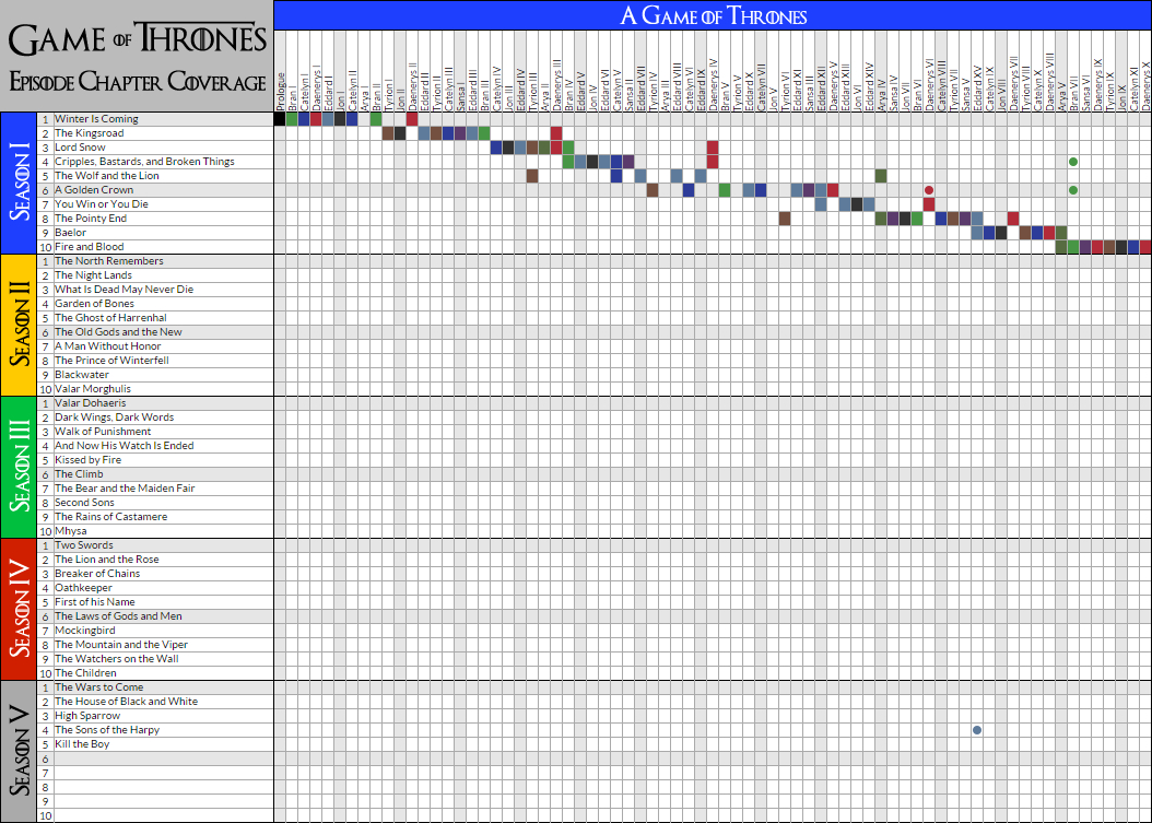
By the way, I really remember once designing a web resource resulted in a process that is largely similar to writing a continuation of the novel Game of Thrones: dozens of characters appeared and died, users fell in love or began to hate our system, each invented user decided some selfish questions, hiding behind reflections on nobility and courage, and co-customers once in 3 days radically changed the plot. No, no, without having written at least a couple of my amateur novels - it’s better not even to take on designing)))
The essence of the methodology presented today is to first imagine that the user's mind is one blade, and your future interface is another blade. And the whole direction of further thoughts needs to be focused on how the real user can survive and achieve his goal without encountering all of these select, input, checkbox, etc.
For example, we need to design a job page for a company site. This is the most standard and empty “bzdyn” to nowhere, which takes only the time, effort and money of the customer, but if the designer has the skills to perfectly imitate a hectic activity, he begins to throw his thoughts:
And how many jobs will there be? What categories we divide them? Do I need a feedback form or just email? Describe in detail all the requirements? Do I need information about the prestige of the company and the available buns? Should you give a block with the contact information of all personnel department specialists on the right, or is it better to stick an advertisement there? Do we write a salary there? From the side, it even looks like the right questions from the gurus of their cause, then the output is of amazing beauty, gray layouts are strictly on the grid, so everyone diligently shredded their weapons and went their separate ways. And then the customer after six months at the next conference complains about the personnel shortage, armed with arguments that in six months no sensible expert responded to his super-vacancies on the site, created by all usability canons. And even, they say, split testing did not help.

What's wrong? Not so estimated initial needs. Companies need to hire several professionals in their field, and all those who are already known to her as worthy specialists are already busy and receive much more substantial money from competitors. And to get such employees you need to personally “lead” him for at least six months, constantly recalling all the advantages that a well-known employee will receive if he leaves his current employer. And here, targeted ads and accurately positioned advertising on social networks are much better suited than the hope that such a super-employee you need goes on a daily basis to update your vacancy page.
Consider another version of the need for a job page - you need to urgently get a young, motivated, but already experienced expert out of nowhere. In the American sports leagues in the players' draft, such luck is called steal and occurs every few years, not more often. The likelihood of such an unemployed guru visiting the pages of your site, alas, is also vanishingly small. He would rather be interested in an article about your successes on professional portals, stumble upon you at conferences and symposia, where all novice pros, who have a lot of free time who still exceed the volume of important work, love to go. And even just the presentation of their achievements in the specialized universities can give a much greater effect than the use of ultra-modern material-design on anyone not visited page of vacancies on their site. The main thing is no unnecessary gestures, lighttracking, and clinking with unnecessary operations: you need a good employee — you should follow him yourself, without grinding hundreds of empty interviews and portfolios of random individuals who send out their resumes at random wherever they meet the vacancy section. So, the decision of the designer in the style of “a blade should not meet a blade” will sound like this: instead of the vacancies page on the site, a separate promotional site “From Baumanka — go to us, we are around the corner!”
Consider another task of another kind: you need to create from scratch a site for sale, for example, handmade dishes. How does the standard approach work?
Of course, we need an online store, with a header, a catalog, a basket, a stock page, delivery, discounts for regular customers - all according to the precepts of WordPress templates. Draw a menu, snippets, callback, bzdyn-bzdyn, klats-klats. After 5 minutes, everyone has already forgotten what they started with, because senseless activity inspires: 10 pages, 20, 50, buttons everywhere, input forms, “oh, if you couldn’t forget about seo text” - the human mind loves to move along the gauge it’s more convenient , more comfortable and consumes fewer calories.
Well, what will happen if you include the methodology "the blade should not touch the blade"? What if for every extra “bzdyn” drawn on the screen - the designer himself must withdraw his money from the wallet and deprive himself of the legitimate evening smoothie? Here the brain is activated and launches reserve, usually peacefully slumbering in the subconscious, resources. The understanding of the basic model of the information system comes instantly: the ultimate goal is to exchange goods for money, not the number of pages viewed, not the number of days until return; then the scheme of pre-delivery of goods by subscription with post payment, after choosing the most suitable of several options, is much easier. The problem is. What is difficult to convince the buyer to agree on the delivery of goods? - do not convince, deliver immediately, with several sets of dishes to choose from, without unnecessary bryak-bryak on the keys. If the buyer was not satisfied with all the dishware he received, then he must return them to the store on his own, otherwise the cost of the entire purchase will be removed from his bank card.
There are real examples of the viability of such a model: in Uber, such a scheme “first service - only then money” has been working quite successfully for a long time, but why only there? A subscription to the delivery of new models of phones or women's accessories, seasonal collections of clothes of the right size directly to the house to the buyer and constantly new sets of toys for children - this is what gives us a new samurai technique of respect for the blade. Do you think it will not work, and you should not try? Well, let's imagine a situation, how did you bring two movie tickets to your home, put you in your hand - would you give up the chance to entertain yourself in the evening? No, you will instantly find both free time and a girl for the company - just so as not to miss the opportunity to visit the film, otherwise the tickets will “disappear”. Almost no one returns tickets for entertainment and leisure, how can you deny yourself a party? - never! This is a property of our weak character - first people hold the product in their hands, get used to it, call their own, even break it - and only then they pay for it or return it, tearing away the already familiar thing from their hearts. So what is the site needed in this situation? That's right - with the form of subscription to the service “Deliver all”: address, bank card, and no extra bzdyn-pages. No, this is not at all advanced design thinking, which has been taught for years in all branches of foreign special schools for the elite. This is simply a respect for the sharpness of the blade of the mind of your user.
If you are still not convinced of the magic of the method of designing websites and mobile applications “A blade should not meet a blade” - let's consider another example from a completely different area. Let's say this will be a site for selection by foster parents of children from shelters. Here, the standard approach gives a very weak effect, because it offers to take something completely new in its life, which was not there before, without which the potential parent had previously lived, coped, rejoiced and went to success. Subconsciously, any changes always scare, violation of the stable course of things always and everyone causes discomfort, and therefore the usual catalogs of orphans with filters by age, eye color and hair, sex, height and weight do not work - this is not an online store . Why do we have children offer as shoes or a new book? - and the standard libraries that sat down in the heads of designers, guidelines, templates, and trends are to blame - they create the feeling that smart people have thought of everything for us, and now just take it and write it off. The psychology of Losers, erected in the axiom of design: “steal the pier as an artist,” it is better to be mistaken - but make a mistake with everyone. err fashionable by beauty.
The understanding of such an interesting fact that every person first of all dreams of restoring disturbed justice in relation to himself and loves stability - the concept of adopted children should be presented in a completely opposite context: a certain villain (state, Cthulhu or Psaki - to choose from) took away your legitimate initially the right to take any two children. Your fundamental rights have been violated, the traditions of the ancestors, who have always adopted two children each, are violated, the feelings of believers are offended. And immediately, the social security departments in all cities of our country will have queues and pickets, rallies and handouts of leaflets demanding that their legitimate two children be returned to each family. What website is needed to stimulate this struggle to restore justice? - a simple test on the phone will suffice “in your past life you also had children”, where with the help of simple questions the system suddenly realizes that these homeless children Petya and Masha are embodiments of your past children from 38 rebirths, who are now hidden by the evil forces of the State Department in the Vologda orphanage. And then there is information that by returning them to the family now - you will improve the chakras, correct your karma and get +100 mana. This will already be enough, no more benefits, incentives from the budget, megaportals for searching - who will refuse the chance to restore the foundations of Rod from the previous rebirth and thereby stop the Mahayana wheel?
Further, all the same, each parent will have a super-heavy quest for six months or a year with the collection of documents. In the end, this quest will still push aside from the initial desire to 99% of all those involved, but this is no longer a problem of the site, but the general awkwardness of the bureaucratic machinery of the state. Well, to make the user's blade never meet this car, devouring matter-time (I mean paper and your free minutes) - the task is not for mere mortal usazers.
At the beginning of the article I mentioned the possibility of monetizing this method of assessing real-world tasks and designing viable information systems. Indeed, for large web agencies, usability teams or design burea, there’s a way - you just need to enter a simple rule, where for each new drawn control, element, page, table - the designer puts in a common bank, say, 500 rubles from his pocket. it is he who, with his superfluous action, leads the user away from the original goal, leaving an extra barb on his blade. So it is very easy to determine the effectiveness of each employee in the state: if by the end of the month one has 15-20 thousand rubles in a bank, and the other has only one and a half thousand, then it is obvious who of the two is a real master and leads his students directly to the final action, without imitations of hectic activity and infinite multiplication of entities.
Of course, all the above examples look a bit abstract, and therefore primitive; and now in the comments the experts are already preparing to inform that in fact the goals of all the tasks mentioned are much wider and deeper, bigger and more global. But the scale does not matter, any identified goal can be either the true interest of the user, or contrived "bzdyn." And the sooner your blade ceases to strum beautifully - the more often it will hit the real target, because the point always comes into the flesh of the edge.
First, a little about children
The main difference between children's mind and adult thought processes is the lack of awareness of goals, that is, a weak causal connection. The child simply imitates any behavior he likes, copying all movements or words, while not fully aware of why and what for it does. The child is always entertained by the process itself, he in a playful way comprehends what set of actions to perform in certain situations, as if ritualizing the solution of each of his tasks. If it happens that the human mind never grows up, then instead of a qualitative design and a sound assessment of the situation with him, only imitation, cargo cult, empty rituals and frank simulation, including workflow, remain for the rest of his life.
I remember well my childhood, as we fought on wooden swords in the courtyards, imitating at the same time musketeers, knights and pirates. The whole essence of fencing for us then was to ensure that our swords constantly and with the loudest sound would collide in the air, creating as much noise as possible. “To get on an opponent’s stick” - so in all seriousness we formulated the main task of the battle for ourselves and evaluated precisely this criterion of the best yard fencers: who most beautifully and loudly can bludgeon with their sword in fights. In my opinion, there is no more successful allegory for describing the current state of affairs in the design of today's interfaces: characters - bryak-bryak, controls - bzdyn-bzdyn, flat-tenyushki and virtuoso fonts - bang-bang, patterns, trends, dribbles - clats-clats . Beautiful, bright, fascinating, the audience applauded, applauded.
')
How much time has passed, but I remember very well even the only adequate child in our yard - his name was Lech and with his toy sword he really tried to stab any opponent, to truly defeat him, and not stupidly bang on his stick for hours. Of course, such a mentally healthy child, our yard team quickly burped out of himself, and no one ever played with him again. For Lech incorrectly parodied the activities of adults, going straight from the stupid process and merry fuss to solving the ultimate problem. This for us was considered not at all funny and not beautiful. And now, 30 years have passed, and in the understanding of many more well-known designers and designers about how entertainment differs from deliberate targeted actions - things are still there.
The true master will know already on the rack
It's time to get to the bottom of the new methodology. To get started, please review this episode at least 3 times. He will give you more about understanding the difference between a noisy visual design and a real design of your path to achieving a goal:
Surely I will not make a great discovery for you if I say that saving resources and maximum efficiency are the fundamentals of any design. Throughout its history, mankind has conducted such an enormous number of wars, in which such a mass of people were involved, that making all weapons high-quality, durable, and therefore super-expensive, simply no one would have had enough time and energy. In real life, very often people armed themselves in a hurry, with what they did, and then in combat, the priority was not the quality of the instrument of murder, but the mind of its owner. If so, it turns out that not all the blades in the world were made from high-quality material and were tempered properly, if it comes to the understanding that not every sword or sword was forged in secret smelters by secret great masters, then the key factor for success and personal survival becomes first of all, save your weapon from unnecessary damage, and the fighter (that is to say) yourself - from unnecessary movements with him.
It was under such unfavorable conditions that a certain ingenious mind came up with a perfect usability-axiom: “A blade should not meet a blade”. This phrase tells us that we need to remember every second - why did you draw the sword; it is necessary to take into account that each time you collide with another blade, your weapon will only lose in quality - getting dents, bends and even microcracks. And with every extra movement, swing, blow - strength is wasted, endurance flows away, and the goal of destroying the enemy is getting farther and not closer. The real sword master performs no more than one action in a duel, and then sheathes the sword. Because he immediately aims to interact with the body of the enemy, and not with his sword. The master does not see the sword of others as an object of interaction - for him it is simply a factor of danger that must be avoided. I will not argue that this is a purely Japanese invention, and perhaps the great Achilles gained fame and greatness for himself precisely because he also understood the simple truth perfectly well: “A blade should not meet a blade”.
In the design of interfaces, everything turns out to be the same - every extra movement, click, bzdyn, loading a beautiful picture - takes the user away from the ultimate goal: to kill, buy, understand information. The sharpness of the blade of his mind is becoming increasingly blunt, he exhales, he becomes disoriented, he forgets about what he came for, just starting to imitate activity, playing, interacting with the interface itself as a separate entity, and not with its original purpose.
Further practice will go, as the basic theoretical calculations have already been completed. As you know, absolutely any design technique is essentially the process of setting up neurons of one’s own brain to a certain wave in order for the brain to take an abstract view of the task, twist it from different angles and start generating various entities around the primary goal: potential problems, barriers and internal motives of fictional people. Then, having imagined all this abstract image with the help of any stimulating scheme or tablet, the designer’s brain should start devising workarounds, slyly offering the potential user of the system the same standard set of letters and buttons in such a unique sequence that magically enchants an imaginary person and gives he has a feeling of empathy and even euphoria from what is happening. In this sense, this methodology will not be an exception to the general rules for usability-thinking stimulants, because any Flying Logic, Customer journey map, and whatever it is, works according to a single recipe: a certain goal is determined and successive steps are formed through which required to go to achieve it. In fact, all this can be visually fixed even as Chapay - on potatoes, but this level of Zen, of course, is not given to every interface designer. So, physiologically, it is not so important to your mind when designing a new information system, what to do with yourself - whether to invent whole novels about the relationship of fictional characters with the projected system, whether to look for the best words to name the arrows in mindmand or just blindly copy successful templates of similar systems from competitors .
By the way, I really remember once designing a web resource resulted in a process that is largely similar to writing a continuation of the novel Game of Thrones: dozens of characters appeared and died, users fell in love or began to hate our system, each invented user decided some selfish questions, hiding behind reflections on nobility and courage, and co-customers once in 3 days radically changed the plot. No, no, without having written at least a couple of my amateur novels - it’s better not even to take on designing)))
The essence of the methodology presented today is to first imagine that the user's mind is one blade, and your future interface is another blade. And the whole direction of further thoughts needs to be focused on how the real user can survive and achieve his goal without encountering all of these select, input, checkbox, etc.
For example, we need to design a job page for a company site. This is the most standard and empty “bzdyn” to nowhere, which takes only the time, effort and money of the customer, but if the designer has the skills to perfectly imitate a hectic activity, he begins to throw his thoughts:
And how many jobs will there be? What categories we divide them? Do I need a feedback form or just email? Describe in detail all the requirements? Do I need information about the prestige of the company and the available buns? Should you give a block with the contact information of all personnel department specialists on the right, or is it better to stick an advertisement there? Do we write a salary there? From the side, it even looks like the right questions from the gurus of their cause, then the output is of amazing beauty, gray layouts are strictly on the grid, so everyone diligently shredded their weapons and went their separate ways. And then the customer after six months at the next conference complains about the personnel shortage, armed with arguments that in six months no sensible expert responded to his super-vacancies on the site, created by all usability canons. And even, they say, split testing did not help.
What's wrong? Not so estimated initial needs. Companies need to hire several professionals in their field, and all those who are already known to her as worthy specialists are already busy and receive much more substantial money from competitors. And to get such employees you need to personally “lead” him for at least six months, constantly recalling all the advantages that a well-known employee will receive if he leaves his current employer. And here, targeted ads and accurately positioned advertising on social networks are much better suited than the hope that such a super-employee you need goes on a daily basis to update your vacancy page.
Consider another version of the need for a job page - you need to urgently get a young, motivated, but already experienced expert out of nowhere. In the American sports leagues in the players' draft, such luck is called steal and occurs every few years, not more often. The likelihood of such an unemployed guru visiting the pages of your site, alas, is also vanishingly small. He would rather be interested in an article about your successes on professional portals, stumble upon you at conferences and symposia, where all novice pros, who have a lot of free time who still exceed the volume of important work, love to go. And even just the presentation of their achievements in the specialized universities can give a much greater effect than the use of ultra-modern material-design on anyone not visited page of vacancies on their site. The main thing is no unnecessary gestures, lighttracking, and clinking with unnecessary operations: you need a good employee — you should follow him yourself, without grinding hundreds of empty interviews and portfolios of random individuals who send out their resumes at random wherever they meet the vacancy section. So, the decision of the designer in the style of “a blade should not meet a blade” will sound like this: instead of the vacancies page on the site, a separate promotional site “From Baumanka — go to us, we are around the corner!”
Consider another task of another kind: you need to create from scratch a site for sale, for example, handmade dishes. How does the standard approach work?
Of course, we need an online store, with a header, a catalog, a basket, a stock page, delivery, discounts for regular customers - all according to the precepts of WordPress templates. Draw a menu, snippets, callback, bzdyn-bzdyn, klats-klats. After 5 minutes, everyone has already forgotten what they started with, because senseless activity inspires: 10 pages, 20, 50, buttons everywhere, input forms, “oh, if you couldn’t forget about seo text” - the human mind loves to move along the gauge it’s more convenient , more comfortable and consumes fewer calories.
Well, what will happen if you include the methodology "the blade should not touch the blade"? What if for every extra “bzdyn” drawn on the screen - the designer himself must withdraw his money from the wallet and deprive himself of the legitimate evening smoothie? Here the brain is activated and launches reserve, usually peacefully slumbering in the subconscious, resources. The understanding of the basic model of the information system comes instantly: the ultimate goal is to exchange goods for money, not the number of pages viewed, not the number of days until return; then the scheme of pre-delivery of goods by subscription with post payment, after choosing the most suitable of several options, is much easier. The problem is. What is difficult to convince the buyer to agree on the delivery of goods? - do not convince, deliver immediately, with several sets of dishes to choose from, without unnecessary bryak-bryak on the keys. If the buyer was not satisfied with all the dishware he received, then he must return them to the store on his own, otherwise the cost of the entire purchase will be removed from his bank card.
There are real examples of the viability of such a model: in Uber, such a scheme “first service - only then money” has been working quite successfully for a long time, but why only there? A subscription to the delivery of new models of phones or women's accessories, seasonal collections of clothes of the right size directly to the house to the buyer and constantly new sets of toys for children - this is what gives us a new samurai technique of respect for the blade. Do you think it will not work, and you should not try? Well, let's imagine a situation, how did you bring two movie tickets to your home, put you in your hand - would you give up the chance to entertain yourself in the evening? No, you will instantly find both free time and a girl for the company - just so as not to miss the opportunity to visit the film, otherwise the tickets will “disappear”. Almost no one returns tickets for entertainment and leisure, how can you deny yourself a party? - never! This is a property of our weak character - first people hold the product in their hands, get used to it, call their own, even break it - and only then they pay for it or return it, tearing away the already familiar thing from their hearts. So what is the site needed in this situation? That's right - with the form of subscription to the service “Deliver all”: address, bank card, and no extra bzdyn-pages. No, this is not at all advanced design thinking, which has been taught for years in all branches of foreign special schools for the elite. This is simply a respect for the sharpness of the blade of the mind of your user.
If you are still not convinced of the magic of the method of designing websites and mobile applications “A blade should not meet a blade” - let's consider another example from a completely different area. Let's say this will be a site for selection by foster parents of children from shelters. Here, the standard approach gives a very weak effect, because it offers to take something completely new in its life, which was not there before, without which the potential parent had previously lived, coped, rejoiced and went to success. Subconsciously, any changes always scare, violation of the stable course of things always and everyone causes discomfort, and therefore the usual catalogs of orphans with filters by age, eye color and hair, sex, height and weight do not work - this is not an online store . Why do we have children offer as shoes or a new book? - and the standard libraries that sat down in the heads of designers, guidelines, templates, and trends are to blame - they create the feeling that smart people have thought of everything for us, and now just take it and write it off. The psychology of Losers, erected in the axiom of design: “steal the pier as an artist,” it is better to be mistaken - but make a mistake with everyone. err fashionable by beauty.
The understanding of such an interesting fact that every person first of all dreams of restoring disturbed justice in relation to himself and loves stability - the concept of adopted children should be presented in a completely opposite context: a certain villain (state, Cthulhu or Psaki - to choose from) took away your legitimate initially the right to take any two children. Your fundamental rights have been violated, the traditions of the ancestors, who have always adopted two children each, are violated, the feelings of believers are offended. And immediately, the social security departments in all cities of our country will have queues and pickets, rallies and handouts of leaflets demanding that their legitimate two children be returned to each family. What website is needed to stimulate this struggle to restore justice? - a simple test on the phone will suffice “in your past life you also had children”, where with the help of simple questions the system suddenly realizes that these homeless children Petya and Masha are embodiments of your past children from 38 rebirths, who are now hidden by the evil forces of the State Department in the Vologda orphanage. And then there is information that by returning them to the family now - you will improve the chakras, correct your karma and get +100 mana. This will already be enough, no more benefits, incentives from the budget, megaportals for searching - who will refuse the chance to restore the foundations of Rod from the previous rebirth and thereby stop the Mahayana wheel?
Further, all the same, each parent will have a super-heavy quest for six months or a year with the collection of documents. In the end, this quest will still push aside from the initial desire to 99% of all those involved, but this is no longer a problem of the site, but the general awkwardness of the bureaucratic machinery of the state. Well, to make the user's blade never meet this car, devouring matter-time (I mean paper and your free minutes) - the task is not for mere mortal usazers.
We summarize
At the beginning of the article I mentioned the possibility of monetizing this method of assessing real-world tasks and designing viable information systems. Indeed, for large web agencies, usability teams or design burea, there’s a way - you just need to enter a simple rule, where for each new drawn control, element, page, table - the designer puts in a common bank, say, 500 rubles from his pocket. it is he who, with his superfluous action, leads the user away from the original goal, leaving an extra barb on his blade. So it is very easy to determine the effectiveness of each employee in the state: if by the end of the month one has 15-20 thousand rubles in a bank, and the other has only one and a half thousand, then it is obvious who of the two is a real master and leads his students directly to the final action, without imitations of hectic activity and infinite multiplication of entities.
Of course, all the above examples look a bit abstract, and therefore primitive; and now in the comments the experts are already preparing to inform that in fact the goals of all the tasks mentioned are much wider and deeper, bigger and more global. But the scale does not matter, any identified goal can be either the true interest of the user, or contrived "bzdyn." And the sooner your blade ceases to strum beautifully - the more often it will hit the real target, because the point always comes into the flesh of the edge.
Source: https://habr.com/ru/post/291436/
All Articles