When conversion increase rules don't work: 7 grand dips

There are dozens of ways to increase conversion. Some of them are considered almost "sacred":
- Get rid of the sliders - they are distracting;
- Make the landing page as short as possible - users do not like "footwoman";
- Just increase the size of the CTA button, and you will be happy.
')
And many more “rules”, “laws”, “strategies”.
Yes, they are not taken from the air, but on the basis of practice and testing. But what works for the majority may not work for you. In this case, we are so accustomed to some provisions that the opposite result is perceived as a sensation.
In this article, we made a translation of a compilation from ConversionXL experts - this is a template gap, 7 incredible examples, when the results of a / b tests refute the most “iron” methods of increasing conversion.
Different sites and landing pages have different goals. Therefore, you cannot use the same strategy.
There is one serious drawback to using other people's cases. We pay attention to the sign of success, not the reason. And the following examples show how, as a result of blindly following “best practices”, an advertising budget can be “merged”.
Myth number 1: Down with the sliders
This is the most criticized interface element. Sliders are despised by all conversion optimization experts. But despite 999 proofs, there are situations when the slider works. In the DeviceMagic example, he showed a conversion of 30% higher than the video version on the first screen.
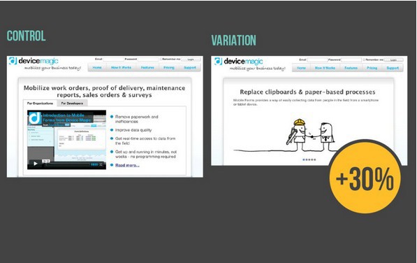
Why didn't the rule work?
Usually, the sliders distract from the main content of the page. But in this case, visually, it is simpler and more understandable than the original, where there is congestion due to the video, the long title and bullet list. And clarity is the first step to convincing users. In addition, the version with the slider faster (in 10 seconds instead of 4 minutes) delivers the necessary information.
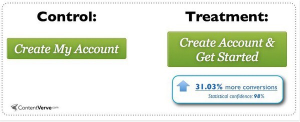
Myth # 2: Big buttons convert better.
In theory, the larger the CTA (call-to-action) button, the higher the conversion. In the following example, increasing the size reduced the conversion by 10%. Because the matter is not in size and not in color, but in a signature, a call to action. Proof - a 31% increase in conversion after changing the wording (“Create an account and get to work” instead of “Create your account”):
Why didn't the rule work?
The size itself does not matter. The visual hierarchy is determined by the user experience. There are so-called "Waiting areas" - places that users pay attention to first. For example, on the landing page of the VWO service, a smaller button was clicked 3 times more often:

The secret is simple: users are accustomed to the fact that the demo version button is in the upper right corner.
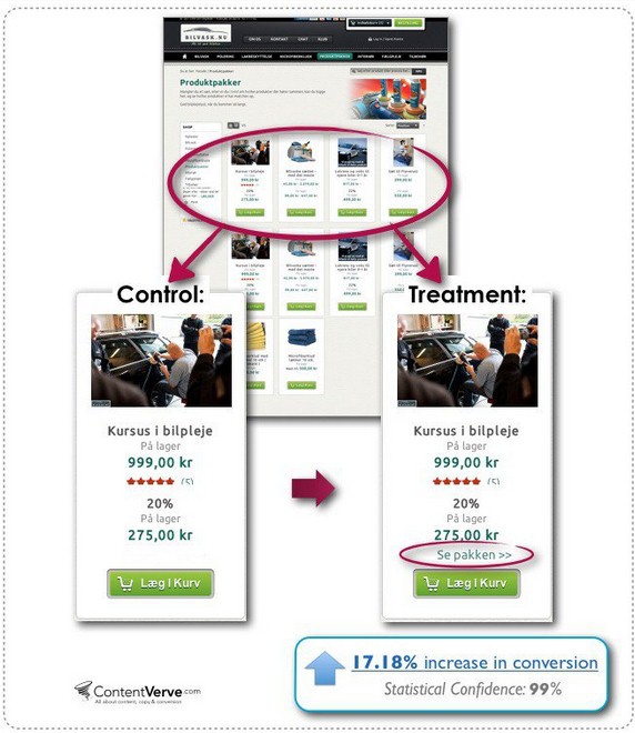
Myth # 3: Only one targeted action.
Any marketer will say: “multiple CTA options distract users”. However, one of the Danish online stores received a 17.2% more conversions to an order after adding the second CTA in the product card:
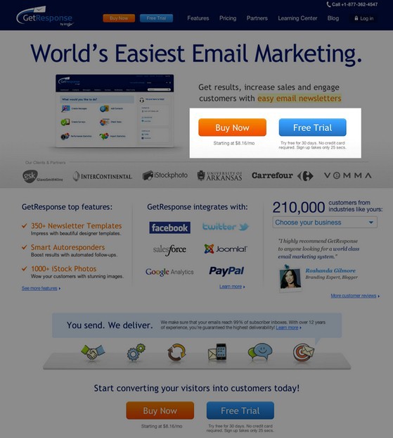
Similarly, the Get Response email service increased the number of registrations by 158% when it placed the Free Trial button (free limited version) next to the call for purchase.
Why didn't the rule work?
The traffic to the landing page is not always targeted: different groups of users with different needs come. And each of the visitors is at his stage sales funnel. Thanks to the alternative offer, you can "close" those who are not yet ready to purchase. At the same time, visually separate one CTA from another.
And in this material, we show how to sell 10,000 products on one landing page. Given that this does not violate the rule “One page - one offer”
Myth number 4: Use the images of people on the first screen
Even photos of beautiful girls can lose a simple image of the goods. An example of the Felix + Iris optics store:
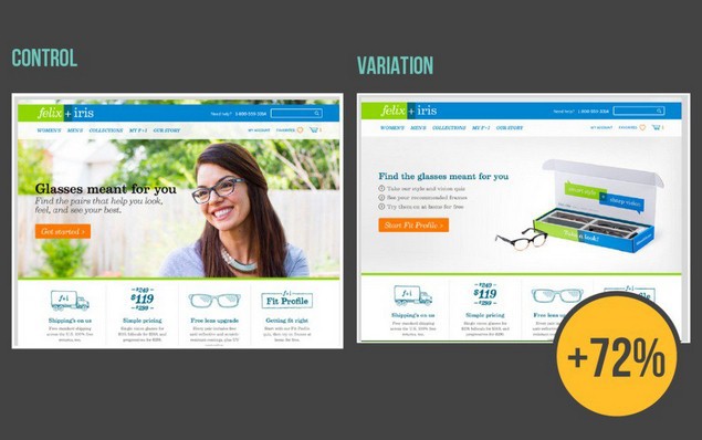
Why didn't the rule work?
The human brain processes visual information in thousandths of seconds, 60,000 times faster than text. A high-quality photos of children and women (depending on the niche) have a positive effect on the emotional level, respectively, increase the response of users. But this advantage is often lost due to the wrong accent. A person may distract from the product or target action.
The results of the light tracking on the Sunsilk page:
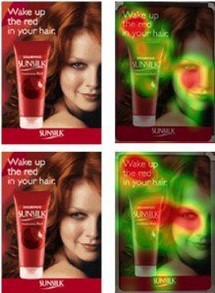
Studies show that users are following the gaze of a person in an image.
Another interesting test, where the gaze of the heroine in the direction of the CTA button consistently showed a higher conversion:

At the same time, the effect is achieved not with the help of a correct view, but due to the relevance of the image with the product offer.
In the example of Felix + Iris, a photo of a girl did not add anything to the conviction of users and delayed attention.
Myth number 5: The shorter the form, the higher the conversion.
The theory of conversion friction says: "The fewer fields the users have to fill in, the more loyal they are to the need to leave contacts."
However, in the following example, a shorter form collapsed the conversion by 29%
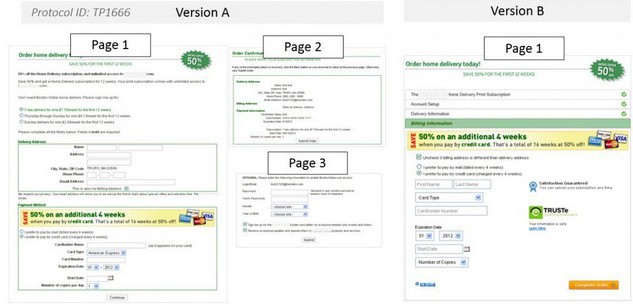
According to Fogg's behavioral model, people do something when the desire to achieve a goal outweighs the possible barriers. Therefore, the short form does not always mean less friction.
In this example, several short forms were visually perceived easier (therefore, the path to the target action is simpler) than version B. The total number of fields decreased, but visually it turned out to be more complex.
Myth number 6: Short Landings give more leads.
Experts believe that the conversion depends on the length of the landing page. Of course, not in favor of the "sneakers". At the same time, the CrazyEgg service due to the long landing page is 363% (!) More conversions. And see how much longer the modified version:

Why didn't the rule work?
Some products need more details, more time to convince users. In the case of high-tech service one screen is clearly not enough.
You should also consider awareness: the length of the page should be directly related to the level of knowledge of your audience. How much information is needed for a clear understanding of the properties and benefits of the product, and do so many screens.
Yes, CrazyEgg used the "clothe" at the beginning of their work, when users had no idea what it was and why they needed it (heat map analytics service). Subsequently, it was greatly reduced:
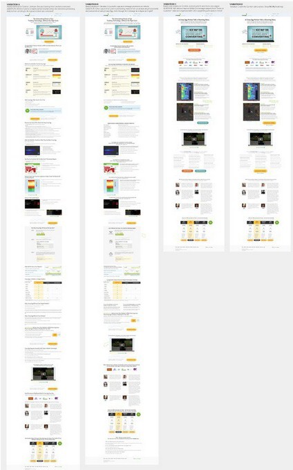
The more complex or expensive the product, the more information to make a decision.
Myth number 7: CTA necessarily above the "fold line" (on the first screen)
In the following example, moving the CTA button down the page brought a conversion increase of 304%.
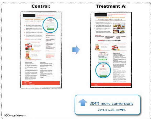
Why didn't the rule work?
If users have no motivation to act, they will not become leads. Well-known marketer Michael Ogard notes: “CTA works where visitors to your site are ready to make a decision.” He also derived a correlation between the complexity of the product and the position of call-to-action. CTA below the “fold line” works more efficiently on the pages of complex products.
What is the advantage of the approach? The linear process of persuasion gradually increases the motivation of the user and eliminates the congestion of the first screen, where developers often try to shove a lot of information.
Commentary by the head of Yagla.ru Alexander Alimov
Successful practice of other businesses does not work in 100% of cases. Even if you have a similar product, similar sales offer, test any idea or hypothesis. From the title to the color of the CTA button.
With the help of the Yagla service , you can simultaneously test dozens of headings, subtitles, form captions, images, and CTA. Yagla "on the fly" replaces the site content with requests from contextual advertising, and automatically compares the conversion of each substitution with the original version.
Source: https://habr.com/ru/post/291426/
All Articles