The smallest marketing tool

When the task is to stand out and be remembered, do not miss the slightest opportunity, even if this opportunity fits in a square of 16x16 pixels. A simple favicon is quite capable of benefiting if you approach its creation wisely.
Minute cognitive information.
')
Favicons with us since 1999. At first, they were used only in the bookmarks panel and made it possible to quickly distinguish sites from each other. Over time, the icons crawled into the left corner of the browser tab to make our stay on the Internet more comfortable. In an age when people prefer to consume information in the most concise and accessible form, it is a sin not to take advantage of the advantages of a simple icon. The image is read by the brain much faster than any inscription, and you instantly understand what you are dealing with.
Let's do some research using a regular browser. To get started, just look at the bookmarks bar.

One can guess for what reasons the captions have been preserved alongside some of the icons. This clearly does not benefit these sites. Lack of memorable icons can slow down the work and confuse. You must agree that we all often have so many pages open at the same time that the favicon becomes the only means of differentiating them. Not cool when the site looks like an empty tab.

Not surprisingly, a faceless, ill-conceived or completely missing favicon can reduce the number of repeat visits to the site. In addition, it will be more difficult to find among the search query results. It's funny that a bunch of pixels can influence such things.

Also, do not forget that the favicon is a tool for building brand awareness. This is the same carrier of corporate identity as a business card. And here, too, there are some general rules. According to statistics, most favicons do not contain inscriptions, letters or numbers. If letters are used, then most often not more than two. In order for the icon to be readable and more visible, the image must occupy at least 50% of its area.
Most often, the favicon is a smaller version of the logo:


Unfortunately, this cannot be considered a universal solution. For complex logos with a lot of details, this solution may not be suitable. Most likely, the logo will have to be optimized for the favicon format, and not to leave it as it is.
Although it has not stopped anyone yet:


Second way: take as a icon some recognizable element of the logo, for example, the letter:


The third option is to use some kind of abstract character that will be associated with the brand:


Once you have decided what exactly you want to see as a favicon, you can begin to choose the most convenient tool. The most obvious option: download / buy ready. For example, such:

Okay, okay, not all finished icons look like this. But the nicer the picture, the greater the chance that she liked someone else. But not the very same draw, in fact. Here you will come to the aid services favicon generators. See how the Tinkoff Bank logo looks after processing with such a program. So close. If you want to call on a graphic editor, then this is not all smooth.
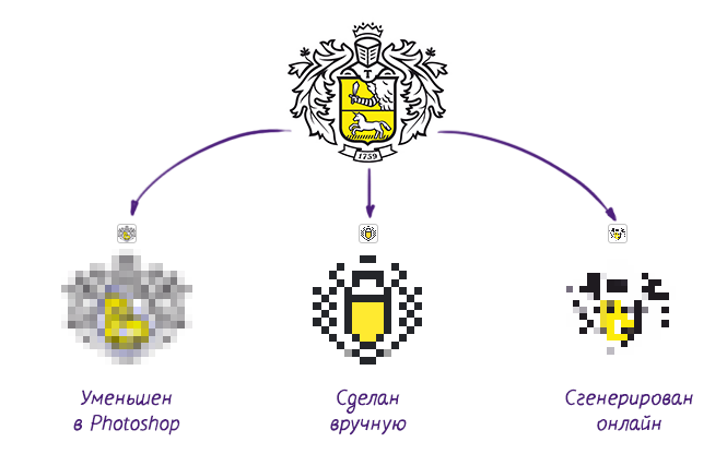
Of course, you can edit the burnt scrambled eggs, which will offer you an online icon generator. But why then need such a tool, if the necessary result will have to be achieved manually. In some situations, the completion of the file icon will be minimal, but there are no guarantees that it can be avoided. All this brings us to the third unexpected way to get a favicon: designer assistance.
That's all guys!

Source: https://habr.com/ru/post/291404/
All Articles