How we increased A / B conversion by testing and what came of it
Hello Megamind! After reading a lot of articles about A / B testing, where it is almost always indicated as a must have tool, a means of increasing conversion, a guarantee of happiness, and in general, we decided to share our modest experience. Before creating Rocket Callback , we manually engaged in increasing conversions, and at some point we realized that we were doing everything wrong. In addition, we fully agree with this statement from this article:
Big changes will give changes to the product itself, its price, methods of payment and delivery, positioning. The meaning of changing the texts on the site is not to try a different headline, but to better convince the audience, better show it the advantages. Show what is important, not what is already clear.
Somehow, after analyzing 78 sites, we saw that changing the color of the buttons, the layout of the text, the size of the fonts, and so on never works. More precisely, there is a certain percentage of growth, but there have been no significant changes. Figuratively speaking, it was the same as if we were trying to save the Titanic by moving chairs on its deck.
')

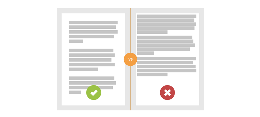
We have seen that minor changes on the site lead to minor successes. And even more so - not long-term success. And all because we were trying to "double the conversion", and not to increase it. Let's say you have a conversion on the site of 2%, we doubled it, and now it is 4%. It would seem cool, the growth is 2 times, but the overall figure is still negligible, the company is still an outsider. The following picture is often cited as a problem solving, but it is not:
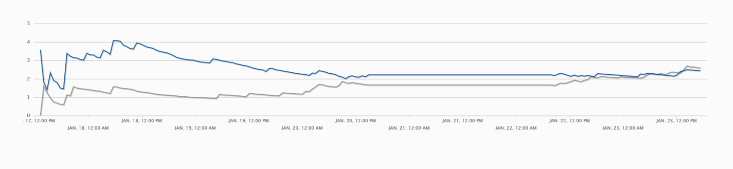
Somehow, for one of our clients, A / B testing was conducted. He had powerful traffic, so we prepared 2 variants of the landing page and periodically changed their places. That's what we got about:
We looked at other indicators, and everywhere was almost the same situation. Changing the color of the buttons, selling slogans, all these calls to action, etc. brought us to a dead end. In English, even there is a special term - "premature testing dilemma". This is what a short-term change, due to the novelty, is taken as the correct option for the long term.
So we realized that we need to change something. We decided to take the risk and try to play big. There were several loyal customers who gave us a carte blanche, which we took advantage of without shame.
Law firm site. As a bonus, they offered a free consultation, it would seem cool, but the same was offered by all their competitors.
We solved this problem by the fact that instead of a free consultation, the company began to offer free support of the whole process. And only by phone, if you need a presence in the offline, then it is already paid. The number of customers from the site increased by 37%. People trusted their affairs to these lawyers, they were up to date, and then, at the stage when the presence of a lawyer became necessary, bought their services.
The site of a software development and sales company for accounting. A cool thing that didn’t sell very well, because in order to download it, you had to register in the system and fill out a whole questionnaire.
We decided this by the fact that now the software could be downloaded for free, but after installation it was necessary to purchase it. The offer popped up in a week. Strange as it may sound, but sales did indeed grow, and by 42%. We associate this with the fact that a person came to the site, became interested, bought, installed (it took 10-15 minutes), and then, willy-nilly, I acquired software.
The site of the company engaged in processing visas in the UAE. There was an online consultant on the site, instead of it they put a self-written callback form (at that time, Rocket was not ready yet). Calls began, the number of closed transactions increased by 65%.
Paint Holly site. Added numbers, added warranty, broke everything into points. True, we were not allowed to change the color. But even without this, we were able to increase the conversion rate by 28%.
Every time we changed only the text, the description and the color of the button - nothing happened. There was growth, but premature. Perhaps this is our cant, but when we made larger changes, the result was better.
That's all we can say about theVietnam War is how we increased the A / B conversion rate by testing.
Thank you for reading us. Subscribe to our blog .
Do not forget to visit our site .
Big changes will give changes to the product itself, its price, methods of payment and delivery, positioning. The meaning of changing the texts on the site is not to try a different headline, but to better convince the audience, better show it the advantages. Show what is important, not what is already clear.
Somehow, after analyzing 78 sites, we saw that changing the color of the buttons, the layout of the text, the size of the fonts, and so on never works. More precisely, there is a certain percentage of growth, but there have been no significant changes. Figuratively speaking, it was the same as if we were trying to save the Titanic by moving chairs on its deck.
')
We have seen that minor changes on the site lead to minor successes. And even more so - not long-term success. And all because we were trying to "double the conversion", and not to increase it. Let's say you have a conversion on the site of 2%, we doubled it, and now it is 4%. It would seem cool, the growth is 2 times, but the overall figure is still negligible, the company is still an outsider. The following picture is often cited as a problem solving, but it is not:
Somehow, for one of our clients, A / B testing was conducted. He had powerful traffic, so we prepared 2 variants of the landing page and periodically changed their places. That's what we got about:
We looked at other indicators, and everywhere was almost the same situation. Changing the color of the buttons, selling slogans, all these calls to action, etc. brought us to a dead end. In English, even there is a special term - "premature testing dilemma". This is what a short-term change, due to the novelty, is taken as the correct option for the long term.
So we realized that we need to change something. We decided to take the risk and try to play big. There were several loyal customers who gave us a carte blanche, which we took advantage of without shame.
Changed the bonus to the offer
Law firm site. As a bonus, they offered a free consultation, it would seem cool, but the same was offered by all their competitors.
We solved this problem by the fact that instead of a free consultation, the company began to offer free support of the whole process. And only by phone, if you need a presence in the offline, then it is already paid. The number of customers from the site increased by 37%. People trusted their affairs to these lawyers, they were up to date, and then, at the stage when the presence of a lawyer became necessary, bought their services.
Changed the registration form
The site of a software development and sales company for accounting. A cool thing that didn’t sell very well, because in order to download it, you had to register in the system and fill out a whole questionnaire.
We decided this by the fact that now the software could be downloaded for free, but after installation it was necessary to purchase it. The offer popped up in a week. Strange as it may sound, but sales did indeed grow, and by 42%. We associate this with the fact that a person came to the site, became interested, bought, installed (it took 10-15 minutes), and then, willy-nilly, I acquired software.
Changed the form of communication
The site of the company engaged in processing visas in the UAE. There was an online consultant on the site, instead of it they put a self-written callback form (at that time, Rocket was not ready yet). Calls began, the number of closed transactions increased by 65%.
Changed not the location of the text, but the text itself.
Paint Holly site. Added numbers, added warranty, broke everything into points. True, we were not allowed to change the color. But even without this, we were able to increase the conversion rate by 28%.
Every time we changed only the text, the description and the color of the button - nothing happened. There was growth, but premature. Perhaps this is our cant, but when we made larger changes, the result was better.
That's all we can say about the
Thank you for reading us. Subscribe to our blog .
Do not forget to visit our site .
Source: https://habr.com/ru/post/290144/
All Articles