The story of a failed case: How we poured alcohol
In this article, using the example of a single unsuccessful case, we consider how excellent design thinking and creative skills, the use of bright ideas combined with the user-centered design methodology were used in the design of a foreign elite online alcohol store. The article will not only describe everything that happened as inevitable, but will also attempt to carry out "work on the mistakes."

It is well known that the method of fictional characters is good only for completing test tasks for admission to provincial web studios, and in these expensive projects, analysts prefer to rely on real data collected when observing specific people, rather than on their own ideas about the life of invented characters. That is why the first stage of graphic sketches in the design was preceded by a stage of long-term data collection. According to its results, the following main theses were identified:
• At the moment there is a very weak version of the site, where you can neither correct the headers, nor increase the snippets, nor unload the database of goods. We need a new site from scratch.
• The online store will operate in Indonesia,
• Indonesia - a Muslim country with a negative attitude towards alcohol among the conservative part of buyers,
• Main target audience: visiting tourists and local hipsters (representatives of the local creative class),
• Women, even the most advanced, do not buy alcohol at all,
• Alcohol buyers in real stores always try to quickly hide the bottle from their eyes, disguise the buying process itself, for fear of judging looks,
• Online payments - while rather exotic. Almost everyone will pay in cash;
• Alcohol is not even the most elite brands in the country is extremely expensive.
There were thousands of little things found during preliminary marketing research, which now makes sense to omit.
')
So, the main task from the owners of the company was set as blurry as possible: to invent and implement not just a typical store on a template, but to make a loud Internet statement about the dominant leader in this area. The site was supposed to strike at the ego of competitors and become a model and object to be followed throughout the country.
As it was necessary: in the Evo methodology used by me today there is no time for beautiful abstractions and hypothetical slogans. It was necessary to set a clear goal for Stage 1: after 3 days, place an online storefront template on any platform that is flexible for editing, and gradually place about 2 thousand items. So far without registration and basket, without payment systems, etc. - it was necessary to just take a place on the hosting, where the girl will be bringing pictures of the bottles and prices for several weeks. So it would be possible to significantly parallelize processes.
In general, evolution does not approve of sudden changes in design, but offers the “one thousand steps of daily improvements” technique of the old site without shocks of user experience with sudden bright innovations.
Before designing, several European similar sites were analyzed, a kind of mindboard was compiled. Simply put, the customer clearly identified the region of the search for ideas with his definition of “sites that please”. Every 3 days the circle of favorite sites changed dramatically, which added a spark to the process.
The team adopted the concept of a “progressive jeep”, when first of all the initial idea and the general structure of the site are defined in the sketches (mocap), and then the block sizes and pixels are polished using it. So began to appear variants of prototypes: first, second, fifth, twenty-fifth. Indonesian partners, as partisans in Belarus, easily derailed one concept after another due to lack of creative approach. Since the designers had a time-based rate, it was even a plus for everyone, and no one really tried to force the events. Immediately, I’ll make a reservation that in this article, at the urgent request of the partner, there will be no final versions of the page design “for final finishing”, but only the initial prototypes in Axure, showing the essence of ideas in the bud:
It was obvious to the store owners that this was all completely different, because the rows and columns of standard bottles didn’t differ from each other except a small label - and therefore they didn’t create any “Ah” and “Wow”.
From the side of the shop representatives, three designers worked tirelessly, two Russian designers were also alternately connected from our side, but the boring bottles still looked like bottles and didn’t want to turn into “beautiful princesses”. Designers painted prototypes in every way, testing was carried out, a lot of information was accumulating that people prefer one block to another, and three columns of bottles - four. But the steady stereotype of the wholesale base website could not go a single step. For example, at one time we were inspired by the concept of an application for Amazon for Windows 8:

Then we were more inspired by the Ebay app for iOS, and then something else. In short, one thing was clear to everyone - no one really understands what needs to be done and what numbers from the conducted research should be used to get a stunning effect. There were just piles of papers, words, figures, hypotheses, opinions and gigabytes of pictures - but this did not form a single semantic picture.
As it was necessary : evolution teaches us that it is foolish to expect juicy fruits - without dropping seed into the ground. It is foolish to expect the first “Agu” from a child without conceiving it. So, without launching any of the rejected prototypes into service operation, without at least conducting rigorous testing on ten ordinary Indonesians - the site owners only lost money and potential profits on our fruitless agony of creative search. Any site without any design at all would have already sold the goods, collected calls and requests, increased the range of products presented. Even a simple ordinary landing page without a catalog at all - all this time could increase the audience of future buyers at the expense of an interesting campaign.
But alas, small successes were not interesting to anyone - everyone wanted to immediately get explosive growth and a viral effect for Russian tourists on the Zuckerberg Calls portal from a fully finished website, bypassing all the preliminary stages of development and evolution of the information system being created.
Then one day at the end of the second month of searching for the killer concept of megaddesign, it dawned on us - why do we actually impose on people the images of bottles, setting them up in every way - if buyers in Indonesia are embarrassed by them, hide them, don't want to see them at all?
So at last, the only right idea was found - to sell a person his emotions, memories, feelings of a holiday. The following is an excerpt from a document entitled “The Art Concept of the Site”:
The main idea of the site - we sell emotions, not bottles. Initially, past sites looked very sad because of the monotonous pictures of bottles, with the same color of liquids, on which it was impossible to disassemble the text on the label. Visually, without reading the text - it was impossible for a novice buyer to understand the difference between the goods in the adjacent columns. Therefore, it was decided to post photos of people - at parties, parties, socializing, smiling, relaxing, loving. A stencil in the shape of a bottle, its price and name, as well as a brief explanation of the taste, alcohol content and aroma are superimposed on these ordinary photographs of real emotions of people. So we will give people not the product itself (glass and water), but the end result - the feelings that they would like to experience with us.
The prototype of the idea was based on horizontal paging of the cards of potential emotions. So, choosing the most suitable emotion for themselves, the user chose the product itself.
Home Page:
The card of the product itself - here is not only emotions, but also the history of the creation of a drink, and suitable dishes, and a generator of memes, anything:
According to our idea, people just had to initially like to look at our photos, and then they should come to grips with the fact that the product itself is not so bad. Someone especially exalted has already offered the working title to our site as “the lookbook of your moods”.
Reveling in delight, exactly at the end of the second month of design, we brought our stunning design to the board of directors of the store owners and ... got just a barrage of negatives. Briefly describe the list of comments to the concept, they looked like this:
• Alcohol in the catalog will be too much. Where do people get so much emotion?
• On the site in the user profile they require to indicate the age of the buyer, which is an unforgivable mistake and a direct insult to the buyer,
• Too little space is left everywhere for the text - search engines will not appreciate this “photo stock”,
• This concept is not like a typical template store. But after all, the majority of people are stupidly impassable, and they will not understand what they are expecting to buy from here,
• There is no space for Facebook and Instagram icons,
• A horizontal scroll everywhere would be replaced with more obvious “Next” buttons,
• Fonts are not from Google (which will reduce the speed of the site in Indonesia at times),
• Page 404 generally caused unreasonable wild laughter in the hall.
Claims seem to you strained and strange? The thing is that no one has ever conducted large-scale testing of the latest design for the target audience by the Indonesian team, and the company's board of directors is simply tired of constant endless spending (after all, revenues from an already working and developing site haven't It was, but the salaries of the leading designers were quite “Western”). Unfortunately, we all relied too much on our own genius, took “expert opinion” at the forefront and neglected the desire to gradually develop the project. Having wished for “everything and at once” and showed unhealthy teenage maximalism, as a result, our team simply took away the entire budget for any further actions, asked to throw out all the accumulated design samples and closed the project. Here is a story.
No customer himself never knows which particular site he wants. This is where the usual associative thinking works - that’s where they said it’s cool, these people wrote about those, and others at the same time made a profit. These initial plans are akin to the attempts of particularly hyperactive parents to choose a profession for a newly born child and think over their entire career in advance. So you can spend on such dream months and years, but when the time comes, you will surely find that no one has been able to foresee all the real circumstances, restrictions and requirements.
It is better to give your project as a beloved child only what it needs right now - food, love and freedom for independent learning and development. It would be worth not fencing off thousands of extra demands with thousands — letting go of the open space with an infinitely rich set of chances and just carefully analyze it — and we ourselves would have noticed which direction should be directed and correct growth to meet an increasing number of users.
Until the child sits at the piano - no one will notice that it contains the talent of a pianist. While your simplest site has not collected the first hundred orders, the first ten calls with questions, the first reviews and suggestions - never decide for your customers from the other end of the globe about what they need from your site and in what form.
Getting Started: Data Collection
It is well known that the method of fictional characters is good only for completing test tasks for admission to provincial web studios, and in these expensive projects, analysts prefer to rely on real data collected when observing specific people, rather than on their own ideas about the life of invented characters. That is why the first stage of graphic sketches in the design was preceded by a stage of long-term data collection. According to its results, the following main theses were identified:
• At the moment there is a very weak version of the site, where you can neither correct the headers, nor increase the snippets, nor unload the database of goods. We need a new site from scratch.
• The online store will operate in Indonesia,
• Indonesia - a Muslim country with a negative attitude towards alcohol among the conservative part of buyers,
• Main target audience: visiting tourists and local hipsters (representatives of the local creative class),
• Women, even the most advanced, do not buy alcohol at all,
• Alcohol buyers in real stores always try to quickly hide the bottle from their eyes, disguise the buying process itself, for fear of judging looks,
• Online payments - while rather exotic. Almost everyone will pay in cash;
• Alcohol is not even the most elite brands in the country is extremely expensive.
There were thousands of little things found during preliminary marketing research, which now makes sense to omit.
')
So, the main task from the owners of the company was set as blurry as possible: to invent and implement not just a typical store on a template, but to make a loud Internet statement about the dominant leader in this area. The site was supposed to strike at the ego of competitors and become a model and object to be followed throughout the country.
As it was necessary: in the Evo methodology used by me today there is no time for beautiful abstractions and hypothetical slogans. It was necessary to set a clear goal for Stage 1: after 3 days, place an online storefront template on any platform that is flexible for editing, and gradually place about 2 thousand items. So far without registration and basket, without payment systems, etc. - it was necessary to just take a place on the hosting, where the girl will be bringing pictures of the bottles and prices for several weeks. So it would be possible to significantly parallelize processes.
In general, evolution does not approve of sudden changes in design, but offers the “one thousand steps of daily improvements” technique of the old site without shocks of user experience with sudden bright innovations.
Designing: seeking inspiration
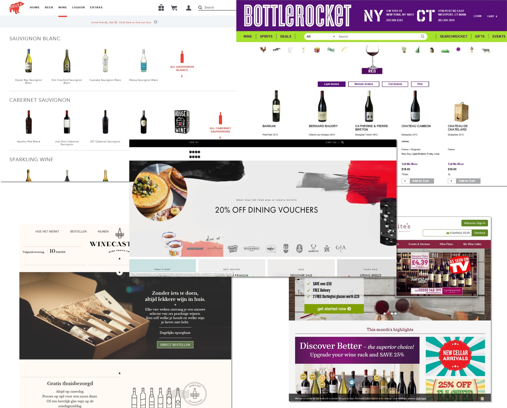
Before designing, several European similar sites were analyzed, a kind of mindboard was compiled. Simply put, the customer clearly identified the region of the search for ideas with his definition of “sites that please”. Every 3 days the circle of favorite sites changed dramatically, which added a spark to the process.
The team adopted the concept of a “progressive jeep”, when first of all the initial idea and the general structure of the site are defined in the sketches (mocap), and then the block sizes and pixels are polished using it. So began to appear variants of prototypes: first, second, fifth, twenty-fifth. Indonesian partners, as partisans in Belarus, easily derailed one concept after another due to lack of creative approach. Since the designers had a time-based rate, it was even a plus for everyone, and no one really tried to force the events. Immediately, I’ll make a reservation that in this article, at the urgent request of the partner, there will be no final versions of the page design “for final finishing”, but only the initial prototypes in Axure, showing the essence of ideas in the bud:
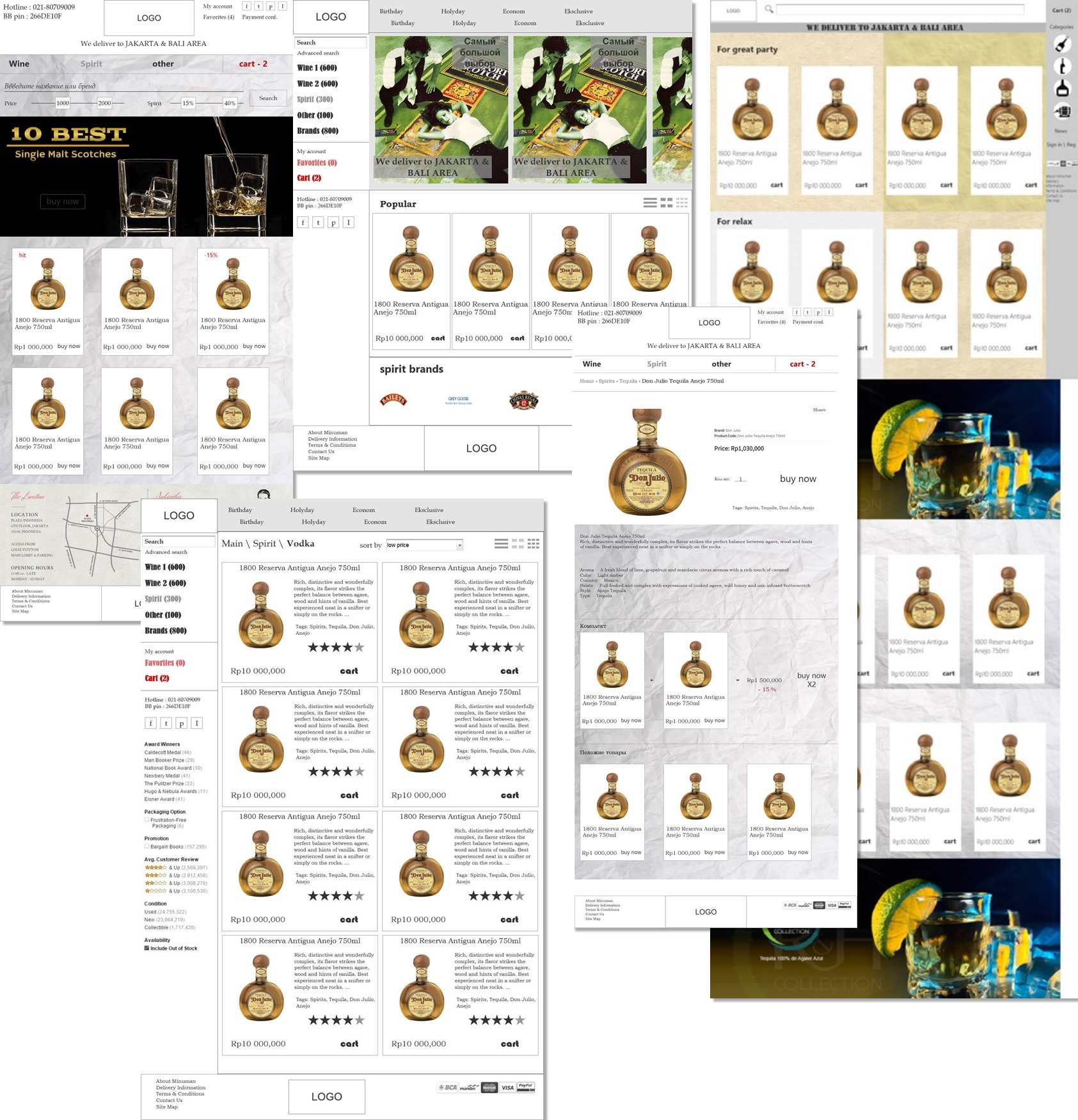
It was obvious to the store owners that this was all completely different, because the rows and columns of standard bottles didn’t differ from each other except a small label - and therefore they didn’t create any “Ah” and “Wow”.
From the side of the shop representatives, three designers worked tirelessly, two Russian designers were also alternately connected from our side, but the boring bottles still looked like bottles and didn’t want to turn into “beautiful princesses”. Designers painted prototypes in every way, testing was carried out, a lot of information was accumulating that people prefer one block to another, and three columns of bottles - four. But the steady stereotype of the wholesale base website could not go a single step. For example, at one time we were inspired by the concept of an application for Amazon for Windows 8:
Then we were more inspired by the Ebay app for iOS, and then something else. In short, one thing was clear to everyone - no one really understands what needs to be done and what numbers from the conducted research should be used to get a stunning effect. There were just piles of papers, words, figures, hypotheses, opinions and gigabytes of pictures - but this did not form a single semantic picture.
As it was necessary : evolution teaches us that it is foolish to expect juicy fruits - without dropping seed into the ground. It is foolish to expect the first “Agu” from a child without conceiving it. So, without launching any of the rejected prototypes into service operation, without at least conducting rigorous testing on ten ordinary Indonesians - the site owners only lost money and potential profits on our fruitless agony of creative search. Any site without any design at all would have already sold the goods, collected calls and requests, increased the range of products presented. Even a simple ordinary landing page without a catalog at all - all this time could increase the audience of future buyers at the expense of an interesting campaign.
But alas, small successes were not interesting to anyone - everyone wanted to immediately get explosive growth and a viral effect for Russian tourists on the Zuckerberg Calls portal from a fully finished website, bypassing all the preliminary stages of development and evolution of the information system being created.
Breakthrough: a million idea
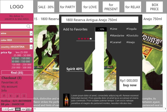
Then one day at the end of the second month of searching for the killer concept of megaddesign, it dawned on us - why do we actually impose on people the images of bottles, setting them up in every way - if buyers in Indonesia are embarrassed by them, hide them, don't want to see them at all?
So at last, the only right idea was found - to sell a person his emotions, memories, feelings of a holiday. The following is an excerpt from a document entitled “The Art Concept of the Site”:
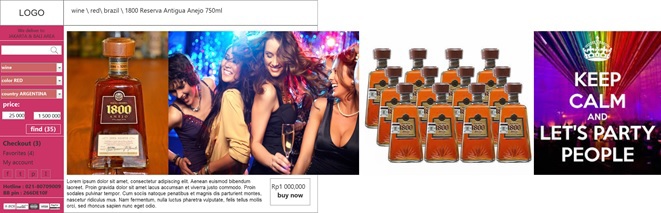
The main idea of the site - we sell emotions, not bottles. Initially, past sites looked very sad because of the monotonous pictures of bottles, with the same color of liquids, on which it was impossible to disassemble the text on the label. Visually, without reading the text - it was impossible for a novice buyer to understand the difference between the goods in the adjacent columns. Therefore, it was decided to post photos of people - at parties, parties, socializing, smiling, relaxing, loving. A stencil in the shape of a bottle, its price and name, as well as a brief explanation of the taste, alcohol content and aroma are superimposed on these ordinary photographs of real emotions of people. So we will give people not the product itself (glass and water), but the end result - the feelings that they would like to experience with us.
The prototype of the idea was based on horizontal paging of the cards of potential emotions. So, choosing the most suitable emotion for themselves, the user chose the product itself.
Home Page:
The card of the product itself - here is not only emotions, but also the history of the creation of a drink, and suitable dishes, and a generator of memes, anything:
According to our idea, people just had to initially like to look at our photos, and then they should come to grips with the fact that the product itself is not so bad. Someone especially exalted has already offered the working title to our site as “the lookbook of your moods”.
Reveling in delight, exactly at the end of the second month of design, we brought our stunning design to the board of directors of the store owners and ... got just a barrage of negatives. Briefly describe the list of comments to the concept, they looked like this:
• Alcohol in the catalog will be too much. Where do people get so much emotion?
• On the site in the user profile they require to indicate the age of the buyer, which is an unforgivable mistake and a direct insult to the buyer,
• Too little space is left everywhere for the text - search engines will not appreciate this “photo stock”,
• This concept is not like a typical template store. But after all, the majority of people are stupidly impassable, and they will not understand what they are expecting to buy from here,
• There is no space for Facebook and Instagram icons,
• A horizontal scroll everywhere would be replaced with more obvious “Next” buttons,
• Fonts are not from Google (which will reduce the speed of the site in Indonesia at times),
• Page 404 generally caused unreasonable wild laughter in the hall.
Claims seem to you strained and strange? The thing is that no one has ever conducted large-scale testing of the latest design for the target audience by the Indonesian team, and the company's board of directors is simply tired of constant endless spending (after all, revenues from an already working and developing site haven't It was, but the salaries of the leading designers were quite “Western”). Unfortunately, we all relied too much on our own genius, took “expert opinion” at the forefront and neglected the desire to gradually develop the project. Having wished for “everything and at once” and showed unhealthy teenage maximalism, as a result, our team simply took away the entire budget for any further actions, asked to throw out all the accumulated design samples and closed the project. Here is a story.
How would we do it today
No customer himself never knows which particular site he wants. This is where the usual associative thinking works - that’s where they said it’s cool, these people wrote about those, and others at the same time made a profit. These initial plans are akin to the attempts of particularly hyperactive parents to choose a profession for a newly born child and think over their entire career in advance. So you can spend on such dream months and years, but when the time comes, you will surely find that no one has been able to foresee all the real circumstances, restrictions and requirements.
It is better to give your project as a beloved child only what it needs right now - food, love and freedom for independent learning and development. It would be worth not fencing off thousands of extra demands with thousands — letting go of the open space with an infinitely rich set of chances and just carefully analyze it — and we ourselves would have noticed which direction should be directed and correct growth to meet an increasing number of users.
Until the child sits at the piano - no one will notice that it contains the talent of a pianist. While your simplest site has not collected the first hundred orders, the first ten calls with questions, the first reviews and suggestions - never decide for your customers from the other end of the globe about what they need from your site and in what form.
Source: https://habr.com/ru/post/289422/
All Articles