Increase the conversion of an online store. A / B testing widgets with testimonials and "Secure Buy" mark
Hello everyone, my name is Ilya.
Since 2013 I have been working at KupiVIP holding.
In addition to the online store KupiVIP.ru, the company has a unit KupiVIP E-Commerce Services (hereinafter KupiVIP ECS), which is engaged in the creation and development of online stores for fashion brands. The holding also supports the Reliable Purchase service, the purpose of which is to increase customer confidence in online stores and online trading in general.
Since 2013, “Reliable purchase” has been conducting A / B tests of its service on websites created by the KupiVIP ECS division (Online stores for brands: MEXX, TOM TAILOR, ALBA).
')
In 2013, 6 A / B tests were conducted. From the end of 2014 to the beginning of 2015, 3 A / B tests were conducted.
The post will be devoted to the description of the tests conducted and the findings.
I consider it important to acquaint the audience ofHabr Megamind with the results of these tests for the following reasons:
In accordance with the rules of Megamind, I do not indicate in this post links to the sites of online stores themselves. Actual examples of widgets you have to google.
You can read about how AB tests are for what they are needed and how they are carried out: "A / B test is easy . "
Information about the methodology of conducting A / B tests, checking their reliability level, examples of other similar tests can be found at the end of this post.
For the first time, the “Safe Purchase” sign was tested 1.5 years ago. Tests were conducted on the websites of online stores MEXX and TOM TAILOR
Below is a brief description of these tests. Tests of 2014 I will describe in more detail.
Below is an example of placing a “Reliable purchase” sign on the MEXX brand site in 2013 tests.
Only the “Secure purchase” sign was used, since at that time there was no feedback functionality. When you click on the sign, a pop-up appears with a store certificate.
Placing a mark on the pages: registrations, baskets, etc. - should increase conversion by increasing confidence in the site's services (the so-called decision pages, where the user decides whether to move further or not)
More information about what a “reliable purchase” sign can be found on the service website.
MEXX
Testing period: November 2 - 14, 2013 (13 days)
The use of the mark increased the conversion of all visitors to orders by 25%. From 0.61% for the control group to 0.77% for the group using the “Safe purchase” sign on the basket. The confidence level was 99%.
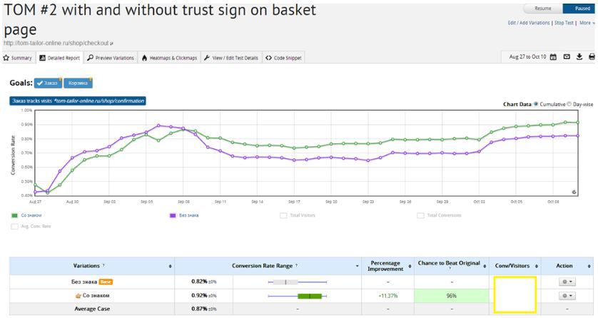
TOM TAILOR
Testing period: August 27 - October 9, 2013 (44 days)
Unfortunately, I can not publish absolute figures about visitors and transactions on the site of the brand TOM TAILOR, but I can still show the percentage of changes:
The use of the sign gave the project an increase in conversion by 11% (from all visitors to orders). From 0.82% for the control group to 0.92% for the group using the sign on the Recycle Bin. The confidence level was 96%.
Screenshot from the personal account of the Visual Website Optimizer (information about orders was hidden at the request of the partner).
Conclusion: A / B tests showed a significant increase in the conversion in the basket for user groups that saw the “Safe Purchase” sign:
+ 25% increase in conversion on the MEXX website
+ 11% on the website TOM TAILOR
Based on the results, our team began to use the Mark on all of our partners' websites, including the main project of the holding, the KupiVIP shopping club. In parallel, colleagues from the Reliable Shopping team began to develop a feedback service.
The service has undergone a number of changes (reviews and widgets have appeared) not significantly, but the e-commerce market has changed (fast delivery throughout Russia, customer service has improved) the buyer has changed (more regular customers on the Internet)
Below I will give examples of widgets that have been used on the websites of our partners since the middle of 2014, and will indicate the pages on which they were located.
When you click on the widget either in a new window or in a pop-up, a page with all the reviews of the store is shown.
In total, the service has 15 widgets, including horizontal widgets, but taking into account the design of the sites I tested those that were most suitable.
The team decided to introduce new elements on the sites gradually, using the main principle of any changes - not to harm.
The fact that the assumptions that are true at first glance are often mistaken can be read, for example, in this article: habrahabr.ru/company/witget/blog/229507
New A / B tests were carried out taking into account previous findings and new hypotheses.
To date, A / B tests have been completed for three online stores:
All sites tested the reviews widget and the Reliable Purchase Sign on the following pages:
On the websites of the TOM TAILOR and ALBA brands also on the pages:
On the website of the brand MEXX, due to the peculiarities of the design and structure of the site, the widget was tested in the footer of all pages (instead of the pages of the catalog and the product card page).
As part of the A / B test, 3 hypotheses were tested:
I will describe only the most interesting and important in my opinion test results. I posted more complete data (about all variants with a large number of digits) in a separate file in google documents. Link to them at the end of this article.
The test showed a fairly significant increase in the conversion in the Registration for the page where the review widget and the Sign of Secure purchase was displayed.
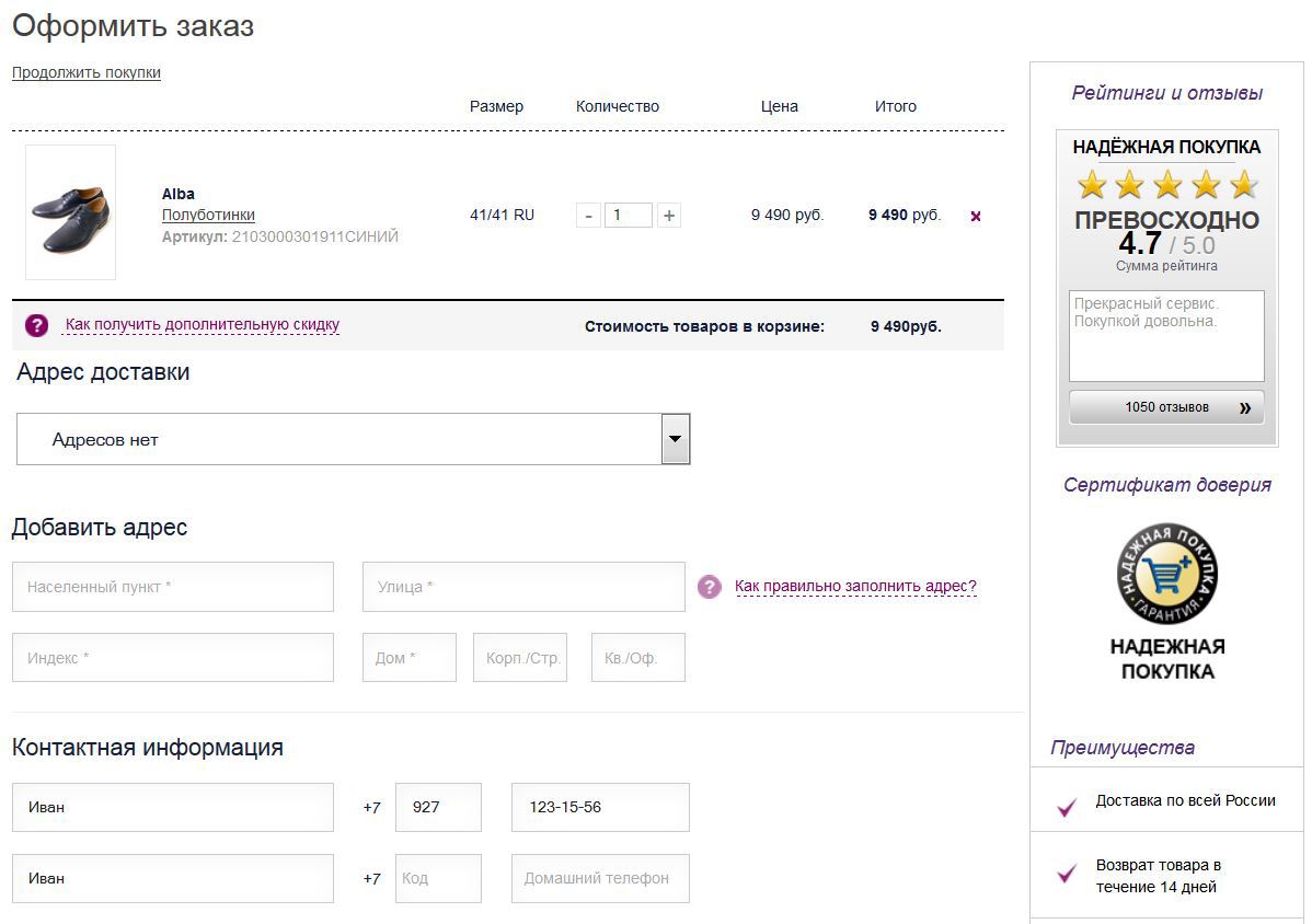
A sign and a widget on the right side of the cart page (similar to the registration page)

A sign on the cart page (shopping)
Widget on the shopping cart page
Widget and Badge on the cart (purchase) page
The test showed that the use of the Sign or the Reliable Purchase widget increases our conversion by about 5-8%. The confidence level was 90-95%. But what is interesting, with the simultaneous use of the Mark and the widget, there was no improvement - the conversion was the same as without using the Mark and the widget.
Footer site widget
Using the widget in the Footer site did not give a positive effect. The conversion turned out to be the same (0.83% lower for the variant with the widget, but this difference is completely unreliable, so it can be argued that there is no statistical difference between the two options at all).
The following tests were conducted on the ALBA brand website:
Catalog and product card pages

When placing the widget on the product and catalog pages, we got exactly the same total conversion into the order as without placing the widget on these pages.
Cart page (all visits, reviews widget)
Cart page (all visits, Badge)
Cart page (all visits, reviews widget and sign)
On the Recycle Bin page, all the options (various combinations of the widget and the Sign) showed a higher conversion than the option without these blocks. The maximum improvement among all options was shown by the option with the widget, the conversion increase was 16.25% for all visits.
testing period: October 31, 2014 - December 15, 2014 (46 days)
I cannot provide detailed test results on the TOM TAILOR brand site, since By agreement with the client, absolute numbers cannot be disclosed.
Therefore, here I just briefly list the main results.
The widget on the catalog page did not give a significant improvement: a change of 5% at a significance level of 75%.
On the shopping cart page for the TOM TAILOR store site, interesting data was obtained. For all traffic, the placement of the widget and the Sign gave a conversion improvement of 6% at a confidence level of 70%, while for new visitors the improvement was already 31% at a confidence level of 95%.
Such a difference in the results for new and returning users on the TOM TAILOR store site can be explained by the fact that it already has a fairly large core of loyal customers who no longer require additional confirmation of the site’s reliability. At the same time, the TOM TAILOR brand leads an active advertising campaign aimed at attracting new audiences from various sources, and for this audience the effect was already significant. For other projects, there was not so much difference for New / Old users due to the different structure of traffic channels.
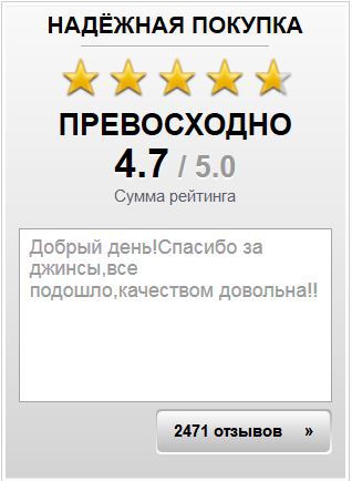
Separately, you can say a few words about the clickability of the Mark and the reviews widget.
(MEXX website data)
Obviously, the reviews widget attracts much more attention than the Token.
I also compared the conversion for those who saw, but did not click on the widget, with those who clicked on it:
(ALBA data, from visits to the item card)
It is clearly seen here that users who saw the full content of the widget (all reviews, and not just one on the widget) are more likely to make a purchase.
Additionally, I plan to analyze in more detail the impact of the following factors on the A / B test results: browser used, region of residence, advertising platform from which the buyer came, etc.
The results suggest the need for a more accessible display of feedback received from customers. It is not enough just to have this content on the site, placing it on a separate page in the footer or another inconspicuous page of the site, you need to show your customers the opinion of those who have already made a purchase on your site. The widget should be a noticeable element of the site, stand out from the main design, attract attention.
Recommendations:
Be sure to test the solutions of different services, including your own ideas, one of these services can significantly increase the turnover of your store. For example, for an average store with the following monthly indicators:
a 10% conversion increase will give a total sales increase of 500,000 rubles a month. A substantial amount to find a solution that is right for you and test it.
As an example of what can be tested in the near future, I will present a thesis plan from colleagues.
Based on the data obtained, it is planned to significantly refine the functionality of the service, namely:
Instead of a conclusion, I suggest you familiarize yourself with other articles on tests of similar elements. If you write more in comments, add to this list.
ps As promised, I post a link to a file with more detailed data:
docs.google.com/spreadsheets/d/1bjKgLFM0ph3ltgk4WdARfcEBghO5bmdCalKstYX2C-0/edit?usp=sharing
Since 2013 I have been working at KupiVIP holding.
In addition to the online store KupiVIP.ru, the company has a unit KupiVIP E-Commerce Services (hereinafter KupiVIP ECS), which is engaged in the creation and development of online stores for fashion brands. The holding also supports the Reliable Purchase service, the purpose of which is to increase customer confidence in online stores and online trading in general.
Since 2013, “Reliable purchase” has been conducting A / B tests of its service on websites created by the KupiVIP ECS division (Online stores for brands: MEXX, TOM TAILOR, ALBA).
')
In 2013, 6 A / B tests were conducted. From the end of 2014 to the beginning of 2015, 3 A / B tests were conducted.
The post will be devoted to the description of the tests conducted and the findings.
I consider it important to acquaint the audience of
- A / B test results are useful for stores that want to increase customer confidence in their online store and increase conversions, especially for new site visitors;
- I will give recommendations on the use and placement of reviews, it does not matter whether you collect them yourself or with the help of external services (besides the Reliable Purchase service, you can find 2-3 more Russian counterparts with their own specifics)
- I will show the real numbers of the A / B tests of 2013 and 2014/15 that I received, including all the positive and negative results found
- I would like to receive feedback on similar tests, perhaps some of you have already conducted similar analytics, for example, investigated the best places for “trust” (trusting) elements on the site (widgets, blocks with reviews, signs of trust, etc. d.)
In accordance with the rules of Megamind, I do not indicate in this post links to the sites of online stores themselves. Actual examples of widgets you have to google.
You can read about how AB tests are for what they are needed and how they are carried out: "A / B test is easy . "
Information about the methodology of conducting A / B tests, checking their reliability level, examples of other similar tests can be found at the end of this post.
A / B tests conducted in 2013
For the first time, the “Safe Purchase” sign was tested 1.5 years ago. Tests were conducted on the websites of online stores MEXX and TOM TAILOR
Below is a brief description of these tests. Tests of 2014 I will describe in more detail.
Layout format
Below is an example of placing a “Reliable purchase” sign on the MEXX brand site in 2013 tests.
Only the “Secure purchase” sign was used, since at that time there was no feedback functionality. When you click on the sign, a pop-up appears with a store certificate.
| Basket page with the Sign | Popup by clicking on the sign |
|---|---|
 | 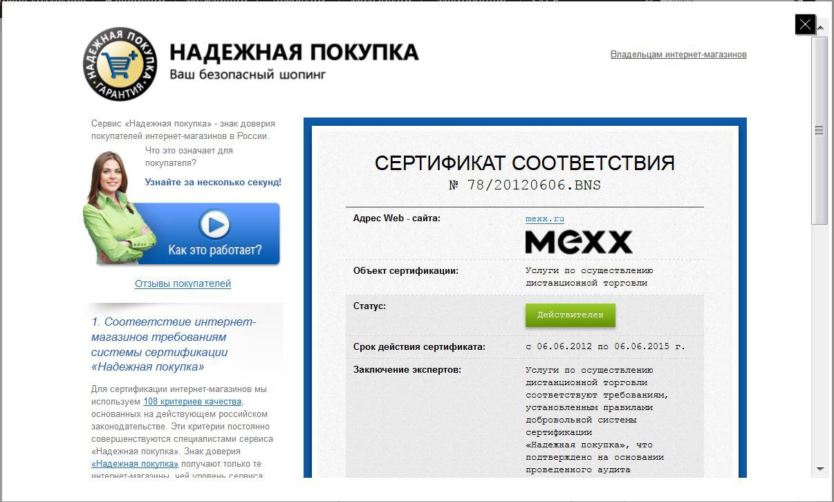 |
Test hypothesis:
Placing a mark on the pages: registrations, baskets, etc. - should increase conversion by increasing confidence in the site's services (the so-called decision pages, where the user decides whether to move further or not)
More information about what a “reliable purchase” sign can be found on the service website.
Results:
MEXX
Testing period: November 2 - 14, 2013 (13 days)
| No Sign | Sign | ||||||
|---|---|---|---|---|---|---|---|
| Sessions | Purchases | Conversion | Sessions | Purchases | Conversion | Change in conversion,% | Reliability,% |
| 28,688 | 176 | 0.61% | 28 205 | 217 | 0.77% | + 25.41% | 99% |
TOM TAILOR
Testing period: August 27 - October 9, 2013 (44 days)
Unfortunately, I can not publish absolute figures about visitors and transactions on the site of the brand TOM TAILOR, but I can still show the percentage of changes:
The use of the sign gave the project an increase in conversion by 11% (from all visitors to orders). From 0.82% for the control group to 0.92% for the group using the sign on the Recycle Bin. The confidence level was 96%.
Screenshot from the personal account of the Visual Website Optimizer (information about orders was hidden at the request of the partner).
Conclusion: A / B tests showed a significant increase in the conversion in the basket for user groups that saw the “Safe Purchase” sign:
+ 25% increase in conversion on the MEXX website
+ 11% on the website TOM TAILOR
Based on the results, our team began to use the Mark on all of our partners' websites, including the main project of the holding, the KupiVIP shopping club. In parallel, colleagues from the Reliable Shopping team began to develop a feedback service.
Changes to the service "reliable purchase" in the period from 2013 to 2014
The service has undergone a number of changes (reviews and widgets have appeared) not significantly, but the e-commerce market has changed (fast delivery throughout Russia, customer service has improved) the buyer has changed (more regular customers on the Internet)
Below I will give examples of widgets that have been used on the websites of our partners since the middle of 2014, and will indicate the pages on which they were located.
| Footer | Catalog and card | Cart option 1 | Cart option 2 |
|---|---|---|---|
 |  |  |  |
When you click on the widget either in a new window or in a pop-up, a page with all the reviews of the store is shown.
In total, the service has 15 widgets, including horizontal widgets, but taking into account the design of the sites I tested those that were most suitable.
The team decided to introduce new elements on the sites gradually, using the main principle of any changes - not to harm.
The fact that the assumptions that are true at first glance are often mistaken can be read, for example, in this article: habrahabr.ru/company/witget/blog/229507
New A / B tests were carried out taking into account previous findings and new hypotheses.
A / B tests conducted at the end of 2014 - the beginning of 2015
To date, A / B tests have been completed for three online stores:
- Clothing store brand TOM TAILOR
- Clothing store brand MEXX
- Shop shoes brand ALBA
Layout format
All sites tested the reviews widget and the Reliable Purchase Sign on the following pages:
- authorization / registration
- on the cart page (on the KupiVIP ECS sites a one-page ordering process is used)
On the websites of the TOM TAILOR and ALBA brands also on the pages:
- catalog
- Card Product
On the website of the brand MEXX, due to the peculiarities of the design and structure of the site, the widget was tested in the footer of all pages (instead of the pages of the catalog and the product card page).
Tested hypotheses
As part of the A / B test, 3 hypotheses were tested:
- the influence of the Mark and the widget on the conversion in registration
- the influence of the Mark and the widget on the conversion of the visitor into the buyer for new / old / all users
- clickable widget (check user interest)
results
I will describe only the most interesting and important in my opinion test results. I posted more complete data (about all variants with a large number of digits) in a separate file in google documents. Link to them at the end of this article.
MEXX
Testing period: November 10 - March 4 (114 days)Impact on Registrations
Registration page| Right block: Nothing shown | Right block: Displayed widget and icon | ||||||
|---|---|---|---|---|---|---|---|
| Sessions | Registration | Conversion | Sessions | Registration | Conversion | Change in conversion,% | Reliability,% |
| 1,825 | 433 | 23.73% | 1,909 | 517 | 27.08% | + 14.15% | 99% |
The test showed a fairly significant increase in the conversion in the Registration for the page where the review widget and the Sign of Secure purchase was displayed.
Impact on purchases
Two locations of the Reliable Purchase service on the MEXX website were tested:- Widget and Badge on the right side of the Recycle Bin page
- footer site widget
A sign and a widget on the right side of the cart page (similar to the registration page)
A sign on the cart page (shopping)
| Basket: Nothing shown | Basket: Signed | ||||||
|---|---|---|---|---|---|---|---|
| Sessions | Purchases | Conversion | Sessions | Purchases | Conversion | Change in conversion,% | Reliability,% |
| 187,252 | 1,296 | 0.69% | 188,734 | 1,422 | 0.75% | + 8.86% | 97.5% |
Widget on the shopping cart page
| Basket: Nothing shown | Trash: Displayed widget | ||||||
|---|---|---|---|---|---|---|---|
| Sessions | Purchases | Conversion | Sessions | Purchases | Conversion | Change in conversion,% | Reliability,% |
| 187,252 | 1,296 | 0.69% | 189 460 | 1,382 | 0.73% | + 5.39% | 90% |
Widget and Badge on the cart (purchase) page
| Basket: Nothing shown | Basket: Displayed Sign and Widget | ||||||
|---|---|---|---|---|---|---|---|
| Sessions | Purchases | Conversion | Sessions | Purchases | Conversion | Change in conversion,% | Reliability,% |
| 187,252 | 1,296 | 0.69% | 185 908 | 1,286 | 0.69% | -0.05% | uncertain |
The test showed that the use of the Sign or the Reliable Purchase widget increases our conversion by about 5-8%. The confidence level was 90-95%. But what is interesting, with the simultaneous use of the Mark and the widget, there was no improvement - the conversion was the same as without using the Mark and the widget.
Footer site widget
| FUTER: Nothing showed | FUTER: Displayed widget | ||||||
|---|---|---|---|---|---|---|---|
| Sessions | Purchases | Conversion | Sessions | Purchases | Conversion | Change in conversion,% | Reliability,% |
| 360 447 | 2,595 | 0.72% | 390 907 | 2,791 | 0.71% | -0.83% | uncertain |
ALBA
testing period: November 16, 2014 - December 27, 2014 (42 days)The following tests were conducted on the ALBA brand website:
- Widget with reviews on the pages of the catalog and product card
- Sign and widget reviews on the basket page
Catalog and product card pages
| catalog / card: Nothing shown | catalog / card: Displayed widget | ||||||
|---|---|---|---|---|---|---|---|
| Sessions | Purchases | Conversion | Sessions | Purchases | Conversion | Change in conversion,% | Reliability,% |
| 110,899 | 695 | 0.63% | 112,156 | 704 | 0.63% | 0.16% | 51% |
When placing the widget on the product and catalog pages, we got exactly the same total conversion into the order as without placing the widget on these pages.
Cart page (all visits, reviews widget)
| Trash: did not show anything | Trash: showed widget | ||||||
|---|---|---|---|---|---|---|---|
| Sessions | Purchases | Conversion | Sessions | Purchases | Conversion | Change in conversion,% | Reliability,% |
| 53 994 | 309 | 0.57% | 53,209 | 354 | 0.67% | 16.25% | 95% |
Cart page (all visits, Badge)
| Trash: did not show anything | Basket: Signed | ||||||
|---|---|---|---|---|---|---|---|
| Sessions | Purchases | Conversion | Sessions | Purchases | Conversion | Change in conversion,% | Reliability,% |
| 53 994 | 309 | 0.57% | 58,209 | 375 | 0.64% | 12.57% | 90% |
Cart page (all visits, reviews widget and sign)
| Trash: did not show anything | Trash: Displayed Widget and Sign | ||||||
|---|---|---|---|---|---|---|---|
| Sessions | Purchases | Conversion | Sessions | Purchases | Conversion | Change in conversion,% | Reliability,% |
| 53 994 | 309 | 0.57% | 57,643 | 361 | 0.63% | 9.43% | 85% |
On the Recycle Bin page, all the options (various combinations of the widget and the Sign) showed a higher conversion than the option without these blocks. The maximum improvement among all options was shown by the option with the widget, the conversion increase was 16.25% for all visits.
TOM TAILOR
testing period: October 31, 2014 - December 15, 2014 (46 days)
I cannot provide detailed test results on the TOM TAILOR brand site, since By agreement with the client, absolute numbers cannot be disclosed.
Therefore, here I just briefly list the main results.
The widget on the catalog page did not give a significant improvement: a change of 5% at a significance level of 75%.
On the shopping cart page for the TOM TAILOR store site, interesting data was obtained. For all traffic, the placement of the widget and the Sign gave a conversion improvement of 6% at a confidence level of 70%, while for new visitors the improvement was already 31% at a confidence level of 95%.
Such a difference in the results for new and returning users on the TOM TAILOR store site can be explained by the fact that it already has a fairly large core of loyal customers who no longer require additional confirmation of the site’s reliability. At the same time, the TOM TAILOR brand leads an active advertising campaign aimed at attracting new audiences from various sources, and for this audience the effect was already significant. For other projects, there was not so much difference for New / Old users due to the different structure of traffic channels.
Widget clickability
Separately, you can say a few words about the clickability of the Mark and the reviews widget.
(MEXX website data)
- The CTR of the widget on the basket page was 1.99%
- CTR of the Mark on the cart page was 0.32%
Obviously, the reviews widget attracts much more attention than the Token.
I also compared the conversion for those who saw, but did not click on the widget, with those who clicked on it:
(ALBA data, from visits to the item card)
- Average conversion of those who saw, but did not click on the widget: 1.36%
- Average conversion for those who clicked on the widget: 4.5%
It is clearly seen here that users who saw the full content of the widget (all reviews, and not just one on the widget) are more likely to make a purchase.
Interpretation of results
Common to all projects:
- The effect on registration was noticeable only on the MEXX brand project, this may be due to both the duration of the test (on the MEXX website, the test lasted more than 3 months) and the peculiarity of the audience. In the future, our team plans to abandon a separate registration page, leaving only special landing pages. Reliable Purchase also plans to make a special widget for such pages and test it.
- There are also significant differences in the test results of 2013 and 2014-2015. for example, in 2013 only the Mark for the MEXX brand project gave a greater increase in conversion. This can be interpreted as follows:
- on the tested projects, the advertising strategy has changed significantly, the focus from the amount of traffic and the number of purchases has shifted to high-quality promotion channels and orders that are beneficial to the store (i.e., the amount of the check, the goods in the order, the city of delivery, etc. are monitored) for which signs of trust could play a prominent role
- In 2013, the MEXX brand project also included active work with retail stores. The site was passed by people who learned about the site of an online store in a retail store. These people were less experienced online shoppers, Signs of trust had a greater impact on them.
Additionally, I plan to analyze in more detail the impact of the following factors on the A / B test results: browser used, region of residence, advertising platform from which the buyer came, etc.
MEXX
- Did not get an obvious positive effect from the feedback widget located in the footer of all pages.
- Got a conversion increase when using a Sign or a Reliable Shopping widget on the shopping cart page.
ALBA
- I did not get an improvement in conversion from placing the widget on the pages of the catalog and products.
One of the obvious reasons is that the widgets used do not quite fit into the structure of the site. Our team is planning to re-test with the new widgets, which will appear closer to mid-2015. - Positive effect from both the widget and the Token on the cart page.
TOM TAILOR
- Did not get the expected effect on conversion in registration.
The same plans as for the project of the MEXX brand - to abandon a separate registration page and develop a special widget for such pages, after which to carry out repeated tests; - I received an ambiguous increase in the conversion rate in the Basket, namely, for new visitors, the improvement is noticeable, and for old visitors it is no longer so obvious. The explanation I gave above is a possible reason for the project’s auditorium and its advertising strategy.
Online Shopping Recommendations:
The results suggest the need for a more accessible display of feedback received from customers. It is not enough just to have this content on the site, placing it on a separate page in the footer or another inconspicuous page of the site, you need to show your customers the opinion of those who have already made a purchase on your site. The widget should be a noticeable element of the site, stand out from the main design, attract attention.
Recommendations:
- If you already have content, try to test its placement on the decision-making pages (pages where you expect a further action from the user) of the product catalog, item card or basket page (you can post reviews on the pre-checkout pages if they are you have a);
- for more compact placement of content, you can prepare some simple widgets (pictures) by clicking on which all available reviews will be shown to the buyer;
- Be sure to publish all reviews, including negative ones, without forgetting to react competently to them and solve problems that the buyer has informed you about;
- if you are not collecting feedback from customers, then you definitely need to start doing it
Be sure to test the solutions of different services, including your own ideas, one of these services can significantly increase the turnover of your store. For example, for an average store with the following monthly indicators:
- 100,000 visitors
- 1% conversion
- 1000 orders
- 5000 rubles average check
a 10% conversion increase will give a total sales increase of 500,000 rubles a month. A substantial amount to find a solution that is right for you and test it.
Plans for the development of the service from “Reliable purchase”
As an example of what can be tested in the near future, I will present a thesis plan from colleagues.
Based on the data obtained, it is planned to significantly refine the functionality of the service, namely:
- make a set of universal widgets that can fit into any site, including a widget with all the reviews on the store page (all reviews will be shown on the store pages, without going to the service site)
- visually change the page with all reviews, make it more convenient and informative for the buyer. Add reviews filters, search for reviews and more information about the buyer;
- ask the buyer for more information about the experience of the purchase, for example, to provide an opportunity for the buyer to apply special tags to his review, formalizing his own experience. This will allow filtering reviews not only by estimates, but also by subject.
Interesting articles about similar A / B testing:
Instead of a conclusion, I suggest you familiarize yourself with other articles on tests of similar elements. If you write more in comments, add to this list.
- Widget with reviews when selling watches, the stated increase in conversion by 58%: vertising.ru/vidzhet-s-otzyvami-klientov-mozhet-uvelichit-obemy-prodazh-na-58-29
- The same A / B test (with the clock), but publication on the website Visual Website Optimizer: vwo.com/blog/ecommerce-optimization-customer-reviews-increases-sales
- Another test on the VWO website: vwo.com/blog/adding-customer-reviews-increases-sales
- Another interesting test is blog.trustpilot.com/split-test-with-customer-reviews
ps As promised, I post a link to a file with more detailed data:
docs.google.com/spreadsheets/d/1bjKgLFM0ph3ltgk4WdARfcEBghO5bmdCalKstYX2C-0/edit?usp=sharing
Source: https://habr.com/ru/post/289226/
All Articles