Usability and design of electronic journals

In my previous post I wrote about the electronic computer magazine "i" . There were many questions and complaints about the design of the magazine. We listened to the opinion of habrochitelei and reworked the main sections of the magazine, which we present to you in the new issue on November 15 Thanks to the feedback from habrochiteli we get a lot of experience in this new area of online media development, in an area that is currently very little studied and the study of which with the use of practical experience can provide very important information for future publishers and publications. That is why I would like to introduce you to another of our projects - Degustate.me - a magazine about delicious food and restaurants. His topic is not quite suitable for Habr and this blog (I want to apologize in advance to the topic for readers to whom it gives unpleasant moments), but the format itself and the issues it raises refer to this blog in the most direct way, so I will be very grateful to you for the constructive criticism. Read about the features of design and usability of the electronic magazine Degustate.me under the cut.
Attention! Traffic!
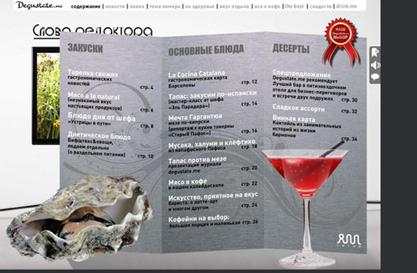
Already starting with the journal’s table of contents, an experiment begins with, it seems, the standard content of the journal. The content of Degustate.me is made in the form of a menu for full immersion in the surroundings. It is logical that by clicking on the menu item, you can immediately get to the section of interest. Very large selection, but pay for nothing. It is very interesting to find out if this functionality is intuitively understandable.
')

If there is some more important drink for Moscow than coffee, then I don’t know about its existence. Coffee is what drives a huge metropolis, like gasoline or electricity. At the same time, the coffee culture in the capital is not so well developed - what is not Milan or Vienna is felt from the first sip. Degustate.me magazine provides readers with a tour of the varieties, subspecies, coffee houses, and even allows you to look behind the counter, looking at coffee from the point of view of barista, a profession that has become popular and irreplaceable in the blink of an eye.
We used quite a lot of video to create the appropriate mood and illusion for the senses, but this, of course, raises a big question: what quality / weight ratio does the video use, and is it advisable to use video in modern conditions or should it be abandoned at this stage ?

The format of the electronic journal opens up a large field for experiments with methods of presenting materials. For example, on the page of the “Coffee Kaleidoscope” we tried to realize an interesting visual effect, thanks to which the reader in an unusual form can immediately get a brief visual overview of the material without yet reading the heading and introductory text. And only if the eye “hooked” on an interesting object, you can click on the inscription “CLICK” and go, in fact, to get acquainted with the information of interest. It is very interesting to find out whether the reader is ready for such an unusual presentation, is there a future for such experiments with the form?
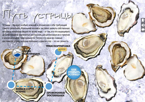
At the “Path of Oysters” page , we decided to experiment with the gradual presentation of the material in short blocks step by step and turn reading into a similarity of a journey with the details and additional interesting facts that appear along the way. If you don’t get bored along the way, by the end of the trip you will become a “pro oyster”. Is this a convenient way to feed the material? Has it become more structured?
Of course, you can fully feel the atmosphere of the “Old Port of Paphos” only when you are there personally, but “in the absence of a stamp, we write in idle time”: we placed a panorama of this wonderful place on a spread to make the reader feel in Cyprus. To what extent we succeeded, again I would like to see in your comments.
“Nested turns” is another experiment: the text does not come in endless columns with sparse photographs, but hides behind objects and layout elements corresponding to it. For example, the reader will not immediately find, on the “Sweet Assorted” page , the best anti-h overworm of the last century, the “Sobriety” candy, but having unearthed such an artifact would be pleasantly surprised. Does the right to life have such an entertaining format, or should all the information on the magazine page be immediately visible?
We are waiting for your comments, suggestions and critics!
Source: https://habr.com/ru/post/288230/
All Articles