Meet - Tim Ambler's Technique
The fantastic take-off of the Magic project has taught all of us that it turns out that it’s not at all the design or the behavior of users on the website’s page - they rule in today's era, but the right business model. So, you can safely throw away all those thousands of audits and checklists, which strictly states: how many users will not find the link without underlining, how many pixels should separate the logo from the menu, what font should say “callback” and others sucked from the finger of truth.
It turns out that man is still a biological being, and no matter how much we all dreamed of, it’s not yet possible to create a programmable shopping machine out of it. Yes, there are thousands of people that they pray every day only that tomorrow we all would get up in the morning, and seeing the large headline H1, the bright orange call-to-action button with the correct roundings, would start to buy uncontrollably everything that fell. But alas, while this does not happen, the human subconscious is much stronger than programmed marketing techniques, and each time it reacts in a very special way to what is seen on the site, generating very special emotions. It is the impact on the emotions, sensations, and peculiarities of human perception that turns out to be in practice a thousand times more important than the mechanical following of “Kovodstvo”, Nielsen’s heuristics, or copying a successful project.
This is where the Tim Abler technique comes to our rescue. It is of course damn subjective, like any other way to understand human satisfaction, empathy, and so on, but its use for a group of people provides a unique opportunity to evaluate not so much the visible interface of an information system as to understand the general level of subconscious attractiveness or rejection of the overall concept.

')
Suppose there are several radically different designs of a single promotional site that have not yet been launched. It is necessary to estimate not only the number of future clicks and the time of sticking to the logo, but also the general affection of the product and leaving the desired aftertaste of the information received in the long-term memory.
Since any sale is always carried out between two people, no analytical data, graphs and figures will disguise the simple fact that people are emotionally making a purchase decision or are disappointed. People are not always fair, rational, ingenious, patient and grateful - that is why even the most huge train of the most sophisticated reports so hard and awkwardly decodes the usual human “well, I don’t want everything”.
Ambler's methodology is based on the representation of any website as a real store offering to purchase a specific product. In the virtual store, just as the buyer comes from somewhere with his thoughts and desires, evaluates the banner above the entrance and the level of cleanliness inside, studies the windows and price tags with the available offers, reads the booklets, communicates with the sellers and makes a purchase.
Moreover, any person always makes his choice subconsciously, the consciousness serves only to substantiate the choice already made (he looks for justification for the decision already taken). Therefore, the most important thing for any site striving for maximum efficiency is the formation of the right subjective impression, image.
Any site in this methodology is evaluated on a five-point scale in the following nine categories:
1. Assessment of client perception
As you know, any site is not useful by itself - as a set of pixels and code, but only through human awareness and perception. In a world from which people disappear - sites instantly lose all meaning. They will not become a home or food for animals, will not decompose into components - by giving force to new plants, they will not be able to change the speed of rotation of astronomical bodies (and there are sites sometimes just as if all this can). So, only a person, getting on a new site - is already the first impression, which has a huge impact on the decisions made by him in the future and even on the style of his behavior and communication with the staff. And a person, as we know, thinks associatively - which means we need first of all a clear understanding: what this site is associated with. Correct me if I am mistaken, but in Yandex.Metrica I have not met a report showing the ability of visitors to link the site they have seen with similar images and previous personal experience. But without this, no number makes sense.
1.1. Contact emotion
We all like the openness, the opportunity at any time to engage in dialogue, ask a question or go to the free box office. That is why here users subjectively evaluate the impression of how ready for interaction the interface of the landing page they see looks. Phone numbers and addresses of branches, directions and callback order, icons on the pages in social networks - all these are beacons, indicating readiness to help a potential client by any convenient means.
1.2. Emotion from visual design
Impressions of visual design are only one of the secondary assessments in this method. It is here that the user gives an assessment of the impression, fashion, animation dribbloobraznosti and other pleasant fichechkam. Combinations of colors, logo, serifs, kerning, rounding - it's all here.
1.3. Emotion from the first acquaintance
It consists of areas, looking at which the person, who first came to the site, evaluates and tries to start exchanging information with the system. First of all, this is the site header and the first screen that answers the simple questions of any visitor:
• Who is it?
• What do they offer?
• How does this suit me?
What exactly do you offer, on what conditions, why do you need to call and how convenient will the next 5 years work with you - from the point of view of usability, the main page of the site should give clear answers to exactly these questions.
1.4. Benevolence - tension
Any amount of tension on the website can create anything: poorly chosen “stop words”, an inconvenient form to fill in, incorrect wording and broken links. In this metric you do not need to try to embrace the immense, try to find out here the main thing that creates unnecessary obstacles and delays on the user's way to the final goal (or at least on the way to understanding it). For example, it may be news from the last year or an appeal to the “You” to the target audience.
2. Evaluation of cleanliness
Unfortunately, if in a real grocery store it stinks of rotten fish, or in the office there are heaps of garbage everywhere, and at the reception in the hotel you are met by a sleepy battered aunt with greasy hair - then such a business will not save even a logo from Lebedev. Alas, but on the web, everything is exactly the same; the human brain does not make a division into virtual and real cleanliness here either.
2.1. Hygiene
The "hygiene" includes requirements for spelling, grammar and typography; also this category includes minor design and layout flaws, which do not create tension one by one, but in the aggregate create the cumulative effect of disorder and pofigism of developers.
2.2. Sanitation
But these flaws are already fraught with in reality already serious injuries or even illnesses. As for the site - here any sanitation error leads to instant care. Poor adaptability for mobile devices, problems with cross-browser compatibility and slow loading are all here.
2.3. Illumination
In addition to cleanliness and security, you also need good lighting - that is, good visibility of all the most important, key, critically necessary on your web page. Popular innovations and a notable search, high-quality photos and intelligible arguments, fluttering the last doubts before the deal - all this is a plus when evaluating page lighting.
3. Accessibility Assessment
A product or service can be beautiful on its own, but how easy is it to get it? How many clicks do you need to select a product, how many calls to a manager, fill in electronic forms, search for delivery services on third-party sites or pass identifications you need to make to a person to achieve what you want? There is no single recipe, one is too many and three clicks, while others agree on 20-30 page breaks. That is why the subjective assessment of each user is so important here, because it demonstrates the perception of accessibility in this particular case. However, dry analytics data can also be placed in this section, since it is by the actions taken that your buyers can try to get to the desired order.
4. Evaluation of merchandising
Only high-quality snippets and product cards, the quality of banners presenting services, as well as the skillful handling of arguments - give a score of 5 points here.
4.1. Showcase
How is it submitted, is it efficiently designed, is it convenient to examine the goods from all sides? So far, many web designers do not think that the answers to these questions have a much stronger effect on the adoption of the final decision than the successful gradient on the button.
4.2. Display
Here, the user must, again, expressly emotionally answer the following questions: Is there a space between the goods or is everything piled up in one pile? Does the calculation feel a single order, or does the chaotic style of calculation appear in irregular iterations? Does the seller himself (the site) know what and where he is and is ready to quickly find it for a potential client? Standing in line for payment - does the buyer show additional goods, accessories to the main purchase? Are they also putting a gift, a bonus, a discount coupon in the shopping basket?
4.3. Convenience
Is it possible to effortlessly reach out to any goods services on a virtual shelf, weigh in your hand, examine it from all sides, try it out, return it to its place? If there is nothing like it on the most beautiful site, there is zero points here. Poor navigation and the lack of a site map, the lack of translation prompts or constant pop-up windows are also evaluated here.
5. Pricing Evaluation
Everything is simple here: is the price affordable for this particular user, how does it differ from its competitors, are there any calculators for quick estimation of the approximate cost of a set of services with delivery?
6. Evaluation of the range
Very often, large online stores win a small race for a customer just because they have a much larger assortment. After all, it is always more convenient to complete one large order and immediately receive a box of gifts for all friends for the new year, rather than keep in mind a whole table of dates, places of delivery, and a list of sites for a large order. A smart businessman always tries to offer not only the product itself, but everything that can be at hand, even such abstract things as additional warranty, insurance, a loyal customer card, and the like.
7. Evaluation of taste
Unfortunately, it’s not the taste of the art director who approved this design, but the taste of working with reviews on the website or in the app store. Do not forget for a second: business, cooperation, any sales - always occur only between people. Sites themselves, without the participation of people, are not yet able to make bulk orders or form a supply plan. That is why the presence of images of your potential buyers, a visual appeal to them, recommendations of a well-known media person is a mandatory requirement for any “tasty” website. Sometimes even a small peppercorn to spice up a site is better than an absolutely bland and sluggish “dish” of your products. The aftertaste greatly affects the return of customers and the desire to tell your friends and acquaintances about the site. Unfortunately, no analytics in the world is yet able to accurately assess how many new colleagues each new customer is capable of advising a “tasty site”.
8. Evaluation of the format of the service
It evaluates the work of the designer of this site to create and implement a customer journey map. We analyze what the data transfer format requirements were - whether you need e-mail, a phone number, a filled profile with an address, a channel with a bandwidth of at least 10 Mbit in order to gain access to the desired product. Is it possible to visit the seller personally and pick up the goods at a convenient time, or you need to ask for leave at work and sit all day at the door, like the faithful Hachiko - waiting for the measurer. What other tools are available to ensure security and confirm the reliability of the site? Yes, many of these parameters go beyond the actual site, but the buyer does not see in the online store just a set of html pages. A person sees your business, interacts with the business and brings money to the business too.
9. Staff assessment
Here, again, everything is simple - buyers called, asked around, offered to replace the purchased product, asked about someone else’s negative feedback found on the social network - and made up their own impression about the adequacy of the staff. Your staff is the most important part of the business for customers, which cannot be hidden behind a beautiful slider.
Results
Then, after setting all the ratings, they are summarized in a single table. Some metrics are key, while others are secondary and are needed only to put the average score for a certain category:
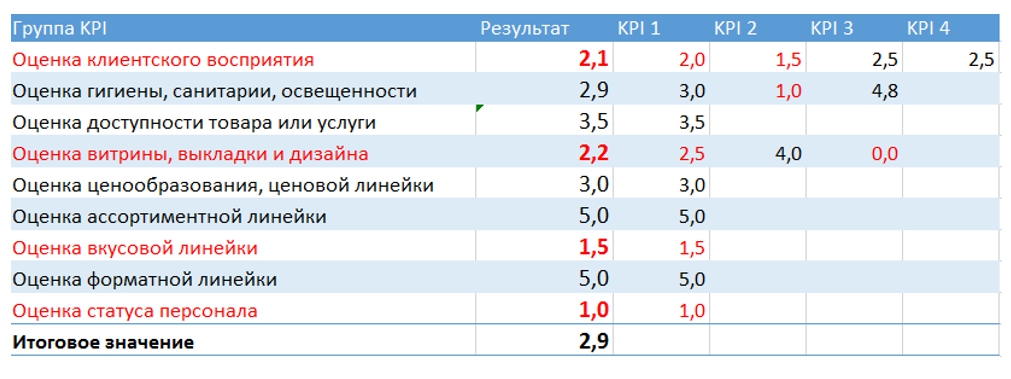
When evaluating any of the nine points below 3 points, the positive decision is usually not accepted by the user. The user, faced with at least one of these problems, may decide to leave the site and not use the services of the company.
With a total site rating below three points, the only obvious solution is to order a complete redesign of the information system and replace a marketing and even strategic approach to the resource that represents your business on the Internet.
Of course, this article does not dare to assert that this methodology can be a panacea for identifying all the problems of the site. The analyst and Webvisor have not got anywhere, you just need to understand that all of them are not able to get into the head of a person and correctly evaluate and interpret his impressions, images caused by associations. Ambler's technique is quite capable of identifying most of your hidden conversion problems and low profits.
In principle, it is not necessary to represent the site in the form of a large store or a small shop. As I have repeatedly said: all the interactions anyway occur at the level of person-to-person, and in the next 20-50 years it will not go anywhere. One person will evaluate, order and pay, the other will sell, package, deliver and service. Therefore, instead of the method of Ambler, you can easily use the method of Nemerov, when the site is estimated approximately as a woman evaluates a real man: in appearance, voice, lips, perfume, shoes and hands in the first seconds of acquaintance and immediately defines a clear place in his personal table. about ranks: “just a friend”, “well, maybe only by drunk”, “oh my God what a man”, etc. Learn more about my transformation of Ambler's technique in a future article.
It turns out that man is still a biological being, and no matter how much we all dreamed of, it’s not yet possible to create a programmable shopping machine out of it. Yes, there are thousands of people that they pray every day only that tomorrow we all would get up in the morning, and seeing the large headline H1, the bright orange call-to-action button with the correct roundings, would start to buy uncontrollably everything that fell. But alas, while this does not happen, the human subconscious is much stronger than programmed marketing techniques, and each time it reacts in a very special way to what is seen on the site, generating very special emotions. It is the impact on the emotions, sensations, and peculiarities of human perception that turns out to be in practice a thousand times more important than the mechanical following of “Kovodstvo”, Nielsen’s heuristics, or copying a successful project.
This is where the Tim Abler technique comes to our rescue. It is of course damn subjective, like any other way to understand human satisfaction, empathy, and so on, but its use for a group of people provides a unique opportunity to evaluate not so much the visible interface of an information system as to understand the general level of subconscious attractiveness or rejection of the overall concept.
')
Suppose there are several radically different designs of a single promotional site that have not yet been launched. It is necessary to estimate not only the number of future clicks and the time of sticking to the logo, but also the general affection of the product and leaving the desired aftertaste of the information received in the long-term memory.
Since any sale is always carried out between two people, no analytical data, graphs and figures will disguise the simple fact that people are emotionally making a purchase decision or are disappointed. People are not always fair, rational, ingenious, patient and grateful - that is why even the most huge train of the most sophisticated reports so hard and awkwardly decodes the usual human “well, I don’t want everything”.
Ambler's methodology is based on the representation of any website as a real store offering to purchase a specific product. In the virtual store, just as the buyer comes from somewhere with his thoughts and desires, evaluates the banner above the entrance and the level of cleanliness inside, studies the windows and price tags with the available offers, reads the booklets, communicates with the sellers and makes a purchase.
Moreover, any person always makes his choice subconsciously, the consciousness serves only to substantiate the choice already made (he looks for justification for the decision already taken). Therefore, the most important thing for any site striving for maximum efficiency is the formation of the right subjective impression, image.
Any site in this methodology is evaluated on a five-point scale in the following nine categories:
1. Assessment of client perception
As you know, any site is not useful by itself - as a set of pixels and code, but only through human awareness and perception. In a world from which people disappear - sites instantly lose all meaning. They will not become a home or food for animals, will not decompose into components - by giving force to new plants, they will not be able to change the speed of rotation of astronomical bodies (and there are sites sometimes just as if all this can). So, only a person, getting on a new site - is already the first impression, which has a huge impact on the decisions made by him in the future and even on the style of his behavior and communication with the staff. And a person, as we know, thinks associatively - which means we need first of all a clear understanding: what this site is associated with. Correct me if I am mistaken, but in Yandex.Metrica I have not met a report showing the ability of visitors to link the site they have seen with similar images and previous personal experience. But without this, no number makes sense.
1.1. Contact emotion
We all like the openness, the opportunity at any time to engage in dialogue, ask a question or go to the free box office. That is why here users subjectively evaluate the impression of how ready for interaction the interface of the landing page they see looks. Phone numbers and addresses of branches, directions and callback order, icons on the pages in social networks - all these are beacons, indicating readiness to help a potential client by any convenient means.
1.2. Emotion from visual design
Impressions of visual design are only one of the secondary assessments in this method. It is here that the user gives an assessment of the impression, fashion, animation dribbloobraznosti and other pleasant fichechkam. Combinations of colors, logo, serifs, kerning, rounding - it's all here.
1.3. Emotion from the first acquaintance
It consists of areas, looking at which the person, who first came to the site, evaluates and tries to start exchanging information with the system. First of all, this is the site header and the first screen that answers the simple questions of any visitor:
• Who is it?
• What do they offer?
• How does this suit me?
What exactly do you offer, on what conditions, why do you need to call and how convenient will the next 5 years work with you - from the point of view of usability, the main page of the site should give clear answers to exactly these questions.
1.4. Benevolence - tension
Any amount of tension on the website can create anything: poorly chosen “stop words”, an inconvenient form to fill in, incorrect wording and broken links. In this metric you do not need to try to embrace the immense, try to find out here the main thing that creates unnecessary obstacles and delays on the user's way to the final goal (or at least on the way to understanding it). For example, it may be news from the last year or an appeal to the “You” to the target audience.
2. Evaluation of cleanliness
Unfortunately, if in a real grocery store it stinks of rotten fish, or in the office there are heaps of garbage everywhere, and at the reception in the hotel you are met by a sleepy battered aunt with greasy hair - then such a business will not save even a logo from Lebedev. Alas, but on the web, everything is exactly the same; the human brain does not make a division into virtual and real cleanliness here either.
2.1. Hygiene
The "hygiene" includes requirements for spelling, grammar and typography; also this category includes minor design and layout flaws, which do not create tension one by one, but in the aggregate create the cumulative effect of disorder and pofigism of developers.
2.2. Sanitation
But these flaws are already fraught with in reality already serious injuries or even illnesses. As for the site - here any sanitation error leads to instant care. Poor adaptability for mobile devices, problems with cross-browser compatibility and slow loading are all here.
2.3. Illumination
In addition to cleanliness and security, you also need good lighting - that is, good visibility of all the most important, key, critically necessary on your web page. Popular innovations and a notable search, high-quality photos and intelligible arguments, fluttering the last doubts before the deal - all this is a plus when evaluating page lighting.
3. Accessibility Assessment
A product or service can be beautiful on its own, but how easy is it to get it? How many clicks do you need to select a product, how many calls to a manager, fill in electronic forms, search for delivery services on third-party sites or pass identifications you need to make to a person to achieve what you want? There is no single recipe, one is too many and three clicks, while others agree on 20-30 page breaks. That is why the subjective assessment of each user is so important here, because it demonstrates the perception of accessibility in this particular case. However, dry analytics data can also be placed in this section, since it is by the actions taken that your buyers can try to get to the desired order.
4. Evaluation of merchandising
Only high-quality snippets and product cards, the quality of banners presenting services, as well as the skillful handling of arguments - give a score of 5 points here.
4.1. Showcase
How is it submitted, is it efficiently designed, is it convenient to examine the goods from all sides? So far, many web designers do not think that the answers to these questions have a much stronger effect on the adoption of the final decision than the successful gradient on the button.
4.2. Display
Here, the user must, again, expressly emotionally answer the following questions: Is there a space between the goods or is everything piled up in one pile? Does the calculation feel a single order, or does the chaotic style of calculation appear in irregular iterations? Does the seller himself (the site) know what and where he is and is ready to quickly find it for a potential client? Standing in line for payment - does the buyer show additional goods, accessories to the main purchase? Are they also putting a gift, a bonus, a discount coupon in the shopping basket?
4.3. Convenience
Is it possible to effortlessly reach out to any goods services on a virtual shelf, weigh in your hand, examine it from all sides, try it out, return it to its place? If there is nothing like it on the most beautiful site, there is zero points here. Poor navigation and the lack of a site map, the lack of translation prompts or constant pop-up windows are also evaluated here.
5. Pricing Evaluation
Everything is simple here: is the price affordable for this particular user, how does it differ from its competitors, are there any calculators for quick estimation of the approximate cost of a set of services with delivery?
6. Evaluation of the range
Very often, large online stores win a small race for a customer just because they have a much larger assortment. After all, it is always more convenient to complete one large order and immediately receive a box of gifts for all friends for the new year, rather than keep in mind a whole table of dates, places of delivery, and a list of sites for a large order. A smart businessman always tries to offer not only the product itself, but everything that can be at hand, even such abstract things as additional warranty, insurance, a loyal customer card, and the like.
7. Evaluation of taste
Unfortunately, it’s not the taste of the art director who approved this design, but the taste of working with reviews on the website or in the app store. Do not forget for a second: business, cooperation, any sales - always occur only between people. Sites themselves, without the participation of people, are not yet able to make bulk orders or form a supply plan. That is why the presence of images of your potential buyers, a visual appeal to them, recommendations of a well-known media person is a mandatory requirement for any “tasty” website. Sometimes even a small peppercorn to spice up a site is better than an absolutely bland and sluggish “dish” of your products. The aftertaste greatly affects the return of customers and the desire to tell your friends and acquaintances about the site. Unfortunately, no analytics in the world is yet able to accurately assess how many new colleagues each new customer is capable of advising a “tasty site”.
8. Evaluation of the format of the service
It evaluates the work of the designer of this site to create and implement a customer journey map. We analyze what the data transfer format requirements were - whether you need e-mail, a phone number, a filled profile with an address, a channel with a bandwidth of at least 10 Mbit in order to gain access to the desired product. Is it possible to visit the seller personally and pick up the goods at a convenient time, or you need to ask for leave at work and sit all day at the door, like the faithful Hachiko - waiting for the measurer. What other tools are available to ensure security and confirm the reliability of the site? Yes, many of these parameters go beyond the actual site, but the buyer does not see in the online store just a set of html pages. A person sees your business, interacts with the business and brings money to the business too.
9. Staff assessment
Here, again, everything is simple - buyers called, asked around, offered to replace the purchased product, asked about someone else’s negative feedback found on the social network - and made up their own impression about the adequacy of the staff. Your staff is the most important part of the business for customers, which cannot be hidden behind a beautiful slider.
Results
Then, after setting all the ratings, they are summarized in a single table. Some metrics are key, while others are secondary and are needed only to put the average score for a certain category:
When evaluating any of the nine points below 3 points, the positive decision is usually not accepted by the user. The user, faced with at least one of these problems, may decide to leave the site and not use the services of the company.
With a total site rating below three points, the only obvious solution is to order a complete redesign of the information system and replace a marketing and even strategic approach to the resource that represents your business on the Internet.
Of course, this article does not dare to assert that this methodology can be a panacea for identifying all the problems of the site. The analyst and Webvisor have not got anywhere, you just need to understand that all of them are not able to get into the head of a person and correctly evaluate and interpret his impressions, images caused by associations. Ambler's technique is quite capable of identifying most of your hidden conversion problems and low profits.
In principle, it is not necessary to represent the site in the form of a large store or a small shop. As I have repeatedly said: all the interactions anyway occur at the level of person-to-person, and in the next 20-50 years it will not go anywhere. One person will evaluate, order and pay, the other will sell, package, deliver and service. Therefore, instead of the method of Ambler, you can easily use the method of Nemerov, when the site is estimated approximately as a woman evaluates a real man: in appearance, voice, lips, perfume, shoes and hands in the first seconds of acquaintance and immediately defines a clear place in his personal table. about ranks: “just a friend”, “well, maybe only by drunk”, “oh my God what a man”, etc. Learn more about my transformation of Ambler's technique in a future article.
Source: https://habr.com/ru/post/286710/
All Articles