Use the 6 most powerful calls to action
Today we want to share with you the translation of Neil Patel's article. As it seems to us, it will be useful for those who want to use the full potential of their project. After all, sometimes calls to action on a resource are not effective enough, or they are not there at all. As a consequence, a product or service that is worthy of attention and necessary, remain unclaimed. We hope that the information presented here will allow you to achieve real success.
A call to action is the ability of your blog to make a profit. All possible ideas, research, texts, editing and posting articles are reduced to one thing - a call to action. If the blog doesn't have one, it won't be as profitable as it could be. It's time to start making money on your blog. In this article, we talk about the six most powerful methods of drawing up a call to action. And each of them has both a lot of advantages and a couple of drawbacks. We tried to be as honest as possible, and openly describe each of these techniques.
Calls to action on blogs are very important and have their own characteristics. Unfortunately, many mistakenly believe that they do not need to be posted on blogs. This is mistake! On the contrary, blogs are the most important platform on which to call for action.
')
What does a call to action look like and sound like on a blog? How is it different from the selling page? Where to post it? What does it consist of?
1. Permanent Headline - Call to Action
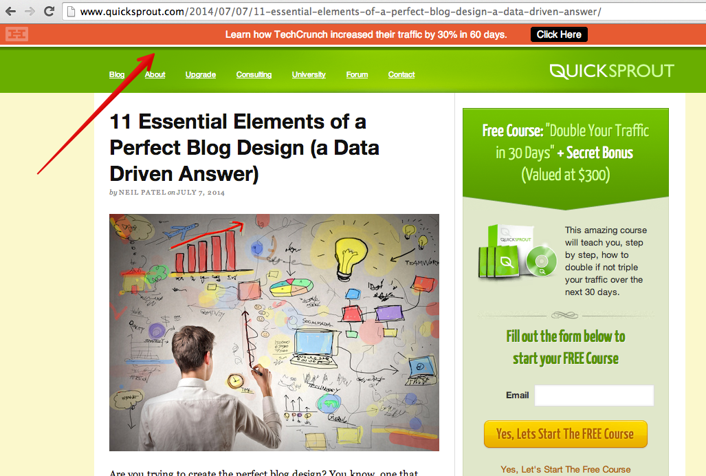
Permanent heading is one of the favorite ways to create a call to action. In fact, this is a regular bar that appears at the top of the page. Its main advantage is that it always stays there, even if the user scrolls down the page. As one of the tools, you can use the HelloBar by Crazy Egg to set up such a line.
Pros:
- The line is unobtrusive. Constantly being on the page, it does not bother the user.
- The line is well marked. It is made in contrast to the main color of the blog tint, so it stands out well against the general background. Moreover, it is easy to read.
- The line is well placed from a strategic point of view. User attention studies have shown that the top of the page, and more precisely, the topmost line, is the most visible place on the page. This means that the permanent title is the most viewed and most often clicked on it.
- The line will never disappear. It is a very good idea to keep a call to action on the page while the visitor is reading the article. If at any time he wants to click on it, then with a permanent title it is easy to do.
Minuses:
- Little space for a great deal.
- Limited design features.
- If the user goes to the page again, the permanent title becomes less noticeable.
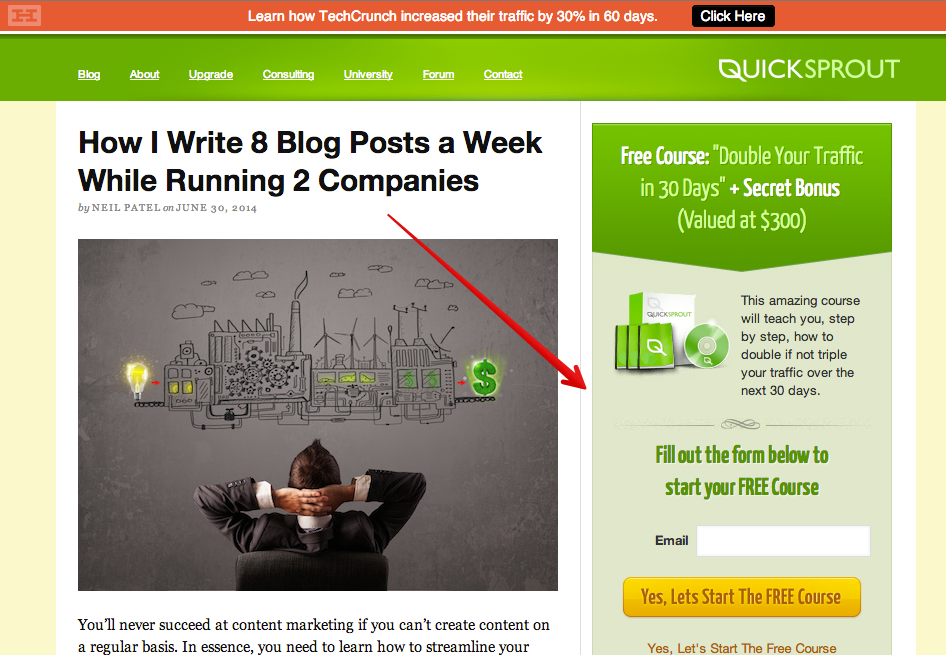
2. Capture form at the top of the page
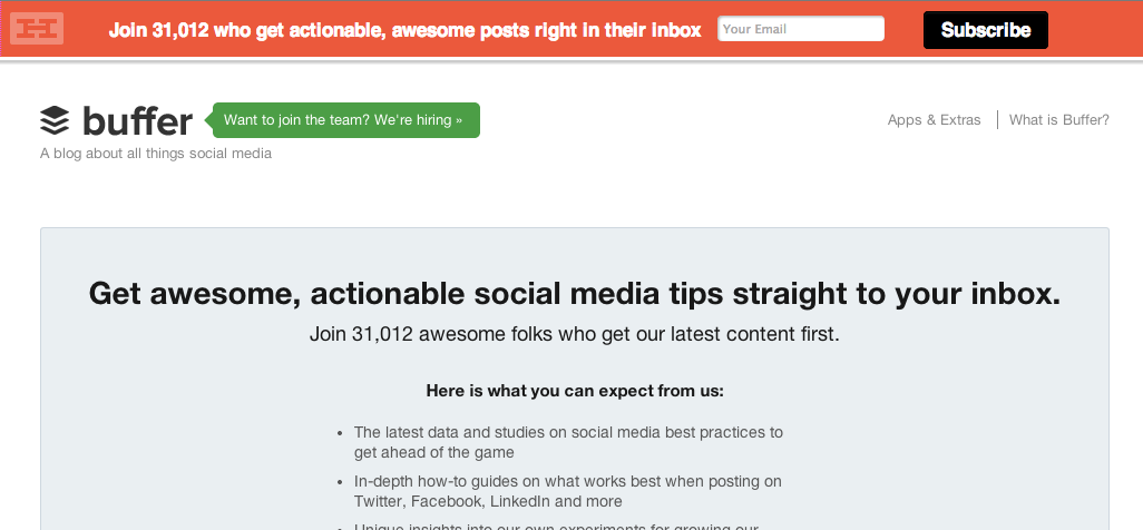
Any blog must contain at least one form of capture. For example, there are three of them in the Quicksprout blog. At the very least, place at least one capture form at the top of the page so that it is visible to the user before scrolling down.
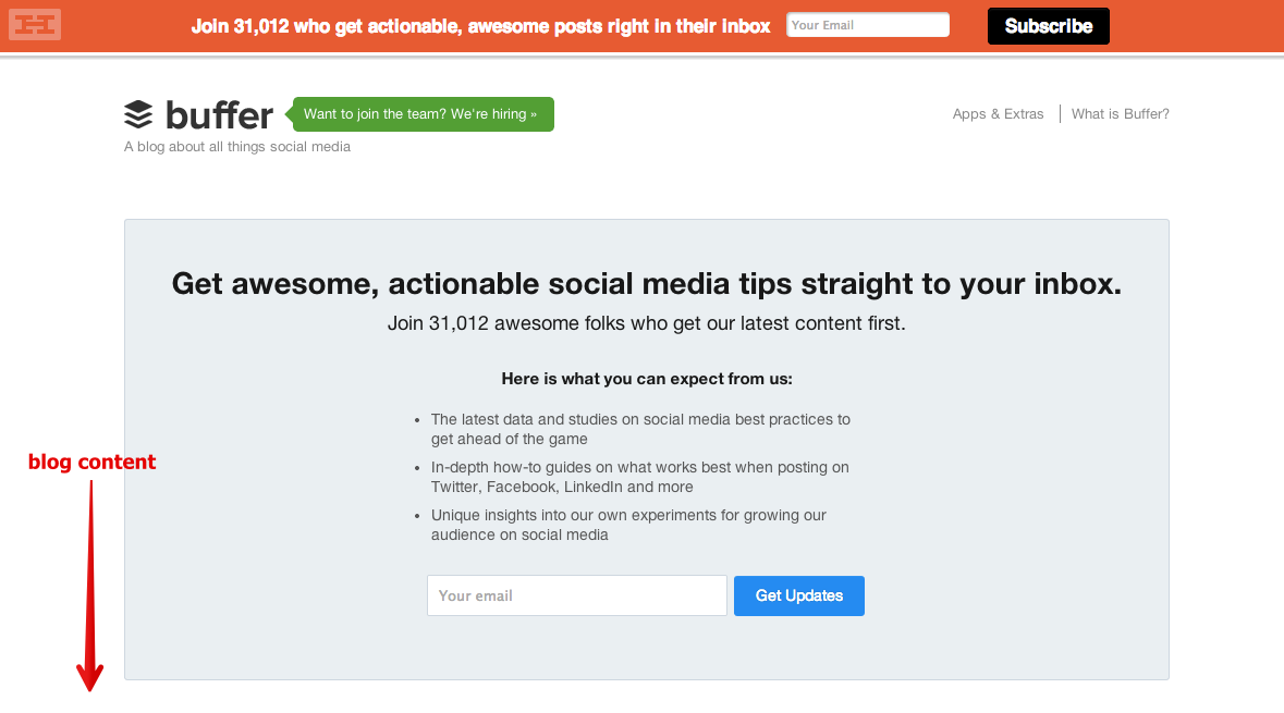
The capture form on the main page before scrolling differs from similar forms on the sidebar (example below), as it appears in the main part of the content - in the place of the article itself.
The very popular blog Buffer contains one huge form of capture that appears before scrolling down the page. The user can see the article itself only after filling in the capture form.
Pros:
- The capture form creates a short delay in viewing the article, which can increase conversion.
- The capture form is a simple and direct way to improve the conversion rate.
- The capture form is fully interconnected with the context.
Minuses:
- For visitors who want to read the article, the capture form can become an unpleasant barrier, because they will have to scroll down the page to skip it.
- The capture form appears in front of the content itself, so it may not have the desired result after the user becomes familiar with the content of the blog.
3. Capture forms on the side panel
On Funnelenvy.com, a call to action that provides a newsletter subscription is posted on the blog’s sidebar.
The sidebar of the site is another ideal place to place a call to action. For greater efficiency, it is worth placing at the top of the page, so that it is visible before scrolling down. Moreover, the form of capture should have an extremely simple structure.
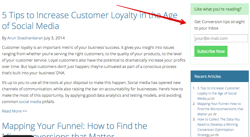
Service Conversion XL uses a call to action - a capture form for a subscription.
Pros:
- The call to action on the sidebar is designed as a simple form of capture, thus creating a short path from reading the blog itself to the time of the start of the conversion.
- This call to action is appropriate, as it goes well with the content that the user reads.
- The call to action is placed in an area that is perfectly visible to the user.
- He does not distract the reader.
- The sidebar is easily customizable using a regular WordPress plugin or sidebar widget.
- The side panel opens the door to designer creativity. For her, you can use color design with titles, images, descriptions, a call to action and a window to fill in the email address. Bonus: to achieve maximum conversion, the author uses yellow color for a call to action.
Minuses:
- When the user scrolls down the page, the call-to-action ability to increase conversion decreases.
- The capture form can get few views, because, unknowingly, users try not to pay attention to similar advertising elements of the page.
4. Sidebar Ads
If you place paid advertisements on your blog, you reduce the amount of user interaction with the site and probably destroy the entire optimization system. Moreover, who needs to advertise outside the site? The income that you receive from these ads does not justify the risk of their placement.
Instead, advertise your own products or services. Such ads are more suitable for a blog and they make your product or service a source of income.
In his blog, the author uses several such ads:


This is what the Buffer blog ads look like:

Pros:
- The ad saves traffic to the site.
- The announcement can be made in any way. The examples use portraits of real people to create greater visibility. The photo turned out creative and gives rise to curiosity.
- Ads are easy to create and add to the site. You only need a little help from the designer and WordPress to upload ads to the blog.
Minuses:
- Advertising takes less visible place in the blog. Usually it is placed in the page scroll zone, so the user does not see it constantly. Although this fact does not seem to us a big problem. What is better: advertising with conversion potential or empty space? Better to advertise!
Tip Bonus: You can create a permanent ad in the sidebar, as is the case with the permanent title.
5. Contextual advertising after the text
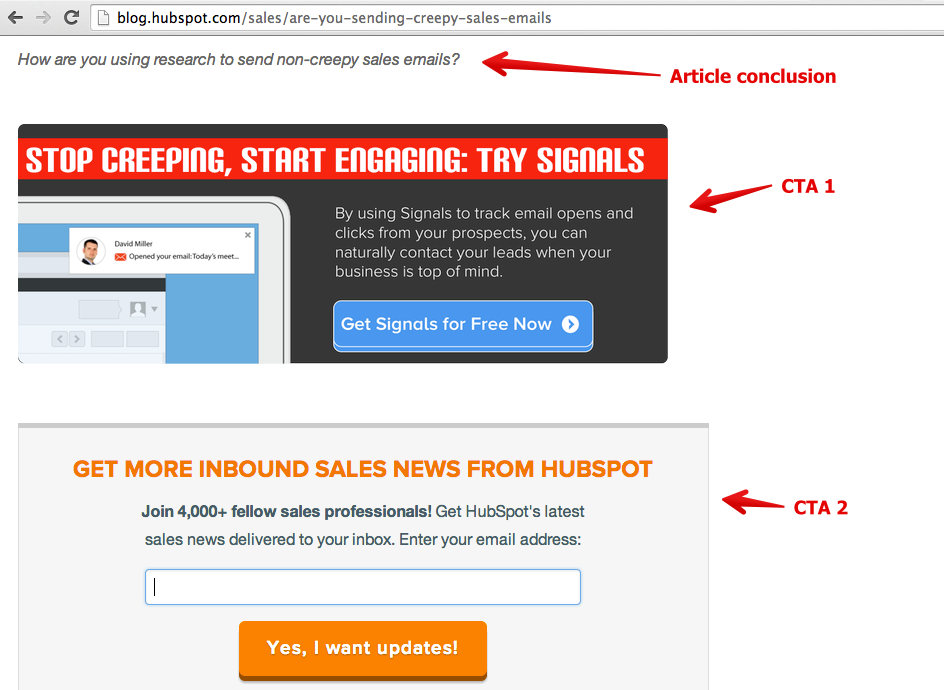
The whole essence of contextual advertising lies in its location. That is why we advise you to place contextual advertising after the main text. This is a call to action that appears immediately after the article. If a visitor to your blog has read the article to the end, he is extremely involved in the conversion process and can become your client. Before comments and other details it is worth placing a powerful call to action. It is also the largest volume contextual advertising with voluminous text.
One of the reasons why this call-to-action form on the site is so valuable is its ability to possess several properties. It contains trust signals, anti-spam policy, capture form, value proposition, picture, title, powerful call-to-action button, etc. This is your chance to use all the power of conversion.
This is what this technique looks like:
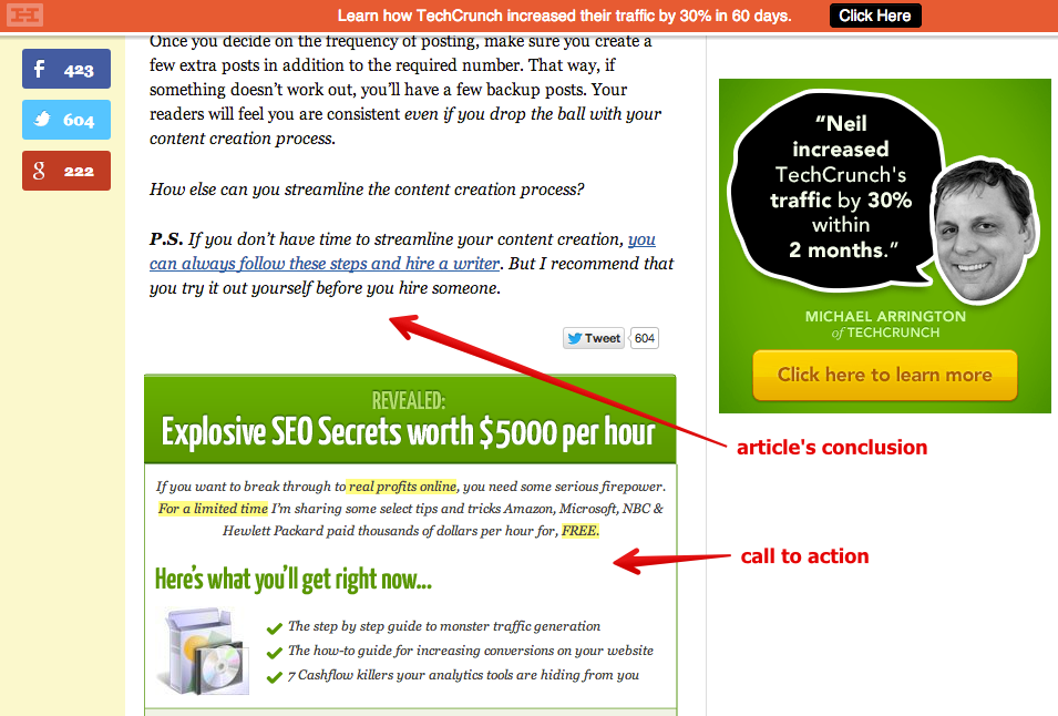
Hubspot service uses a similar call to action in almost all of its blogs after the last sentence in the article. Usually they use two calls to action!
Pros:
- Advertising can be any size. More often adhere to a large format, as it gives the blog weight. In addition, this is the last opportunity to calculate the conversion.
- Visitors who have reached this place, in all likelihood, are very interested blog, so they can easily become your customers.
- In the capture form, you can arrange the fields to fill in both the user name and his email address.
Minuses:
- Such a call to action can annoy users who want to read only comments.
- The reader may stop at the end of the article and not read all the ads. However, according to the test conducted by the author, most visitors scroll the page to read it.
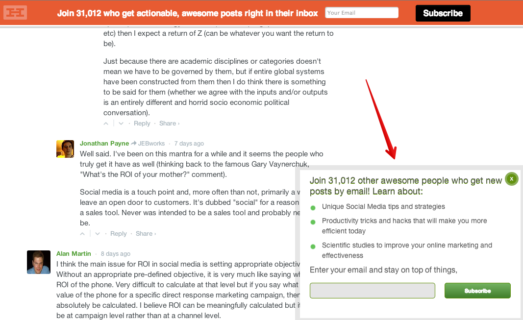
6. Popup capture form or slider
Slides are a great way to capture leads, visualize and increase conversion. The capture form in the form of a slider (or pop-up window) appears in a certain place on the screen automatically, so that the user can notice it while scrolling the page down. A window may appear in the middle of the page, at the end of the article, or at the very bottom of the page.
A call to action on the Buffer site appears on the screen as you scroll through the page to read the comments:
Conversion XL website capture form:

Pros:
- This window is attractive to the user, especially if you try with the design.
- The pop-up window attracts attention well. The slider moves on the screen, so it can not be ignored.
- The form can accommodate a large amount of text and a powerful call to action.
Minuses:
- The window can annoy the user.
- If you do not know how to create sliders yourself, they can cost you quite a lot.
Conclusion
The most successful blogs contain several calls to action. They appear at the very beginning, in the middle and at the end of the content. The essence of a blog is not just to post some information, but to engage users in your brand, product or service. To do this, calls to action are needed. Of course, there is no need to use on the site all kinds of calls to action listed in this article. Adopt a few of them, otherwise, you will lose a huge source of profit.
Source: https://habr.com/ru/post/285706/
All Articles