7 Landing Types to Hook Your Website Visitors
[ translation of the article by Sony Jobson, the original is available by reference ]
As you know, landing pages are an ideal tool for drawing the attention of one of the target traffic segments to a single target action . But most sites seriously under-use landings as a tool to convert daily traffic into leads, subscribers, fans, and (even more involved) customers.
The problem is:
')
On most sites there are “leaks”, or zones, where the most obvious next visitor action on the site is “leave the site”. For you, this is not the best course of events, since in most cases in these areas there is still an opportunity to lure the visitor further.
The solution to this problem is a dedicated landing page for each type of traffic. These Landings will appeal directly to each type of visitors to your site — whether they come from social media, Google, product pages, a blog post, or from somewhere else — and offer them a customized next step that will keep them involved in your website and business.
We have identified 7 types of landing pages, which you can use to make your site more catchy:
1. Landings for the collection of e-mail base
Did you know that one of the most effective places to place a form with an e-mail address request is not the main page of your site, not the sidebar or your blog? (Although the request forms for e-mail addresses in these places are also useful).
The most efficient place to put these forms is the dedicated landing page.
Landing to collect e-mail addresses allows you to explain to your users the benefits of providing you with their contact information.
This means that you can concentrate all the attention of the site visitor on the registration and, by eliminating any unnecessary distractions (for example, navigation) , you will force him to make a choice - to register or to miss the opportunity offered.
Here is an example of a working landing page for collecting an e-mail database (from LKRSocialMedia.com ):
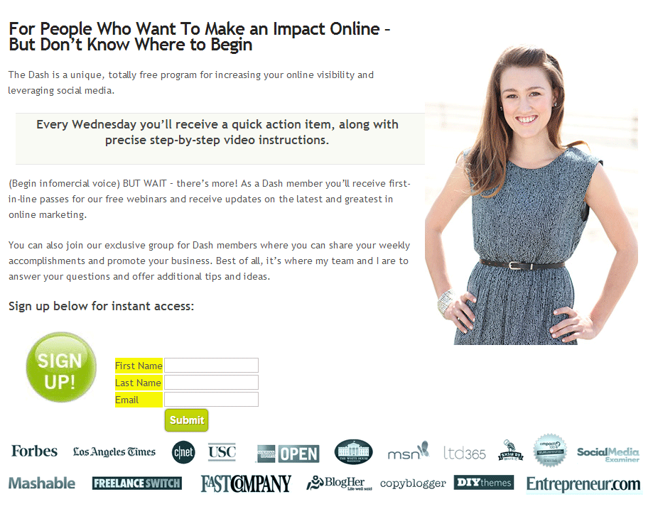
How to organize:
Making an effective landing page for collecting e-mail databases is quite simple.
Start with an attractive headline — descriptions of the benefits you are going to offer.
Then you want to give details: what will people receive in exchange for their e-mail? Will they receive a weekly newsletter (as in the example above)? Or maybe you offer to download some free content, for example, an e-book or an industry review?
If you offer to download free content, make a special picture for it (“digital packaging”) to give the page a special visual appeal.
And finally, the most important part is your registration form.
For best results, your form should be short and simple. The fewer fields you include in the form, the usually higher the conversion of your site *. It is also important to give a strong call-to-action to your “Register” button - try to come up with something different from “Subscribe”. Try other options instead, such as: “Get a free e-book right now” or “Send me materials.”
* There are cases when a more detailed form of subscription increases your conversion, so it is very important to test everything.
2. Landing - website content guide
Inbound marketing, like any regular online marketing now, is content.
If you run a blog / video blog or create free info products for your target audience, you can get even more benefit from your content by organizing a guide on it on a separate landing page.
Think about it: your blog is a great place to post your posts, and sometimes it has a special option to search for specific topics of interest to the reader. But a large amount of your interesting content from the past may have become a little dusty due to the lack of attention to it.
You can easily “cure” this problem and provide your visitors with an upscale tour of your best posts by creating landings to structure content by topic.
Here is an example of a content landing page from FirepoleMarketing.com that structures all their content by gamification:
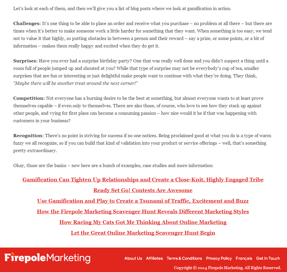
How to organize:
This is probably one of the simplest types of landing.
Determine which topics you want to draw attention to, then create a landing page for each of them. Give a brief description of the topic, and then post links to each post / video / content to download on this topic.
That's all. Now promote your content landings by posting them on your website, on social networks and email-newsletters.
3. Landing "Start from this page"
Your website solves many problems of your business: it tells people about your brand, allows them to contact you, provides information, sells your products and services, etc. Therefore, when a visitor gets to your site for the first time, he has a lot of ways in which he can go.
But the path that he chooses is not always the best. He can get on information that he is not interested in, or get on an offer that is not relevant to him (for now).
But what if you create a customized experience for visitors coming to you for the first time? An experience that will give them an optimal first impression of you, and allow them to find all the necessary information and links and get the most out of their first visit.
Landing like “Start from this page” allows you to do all this.
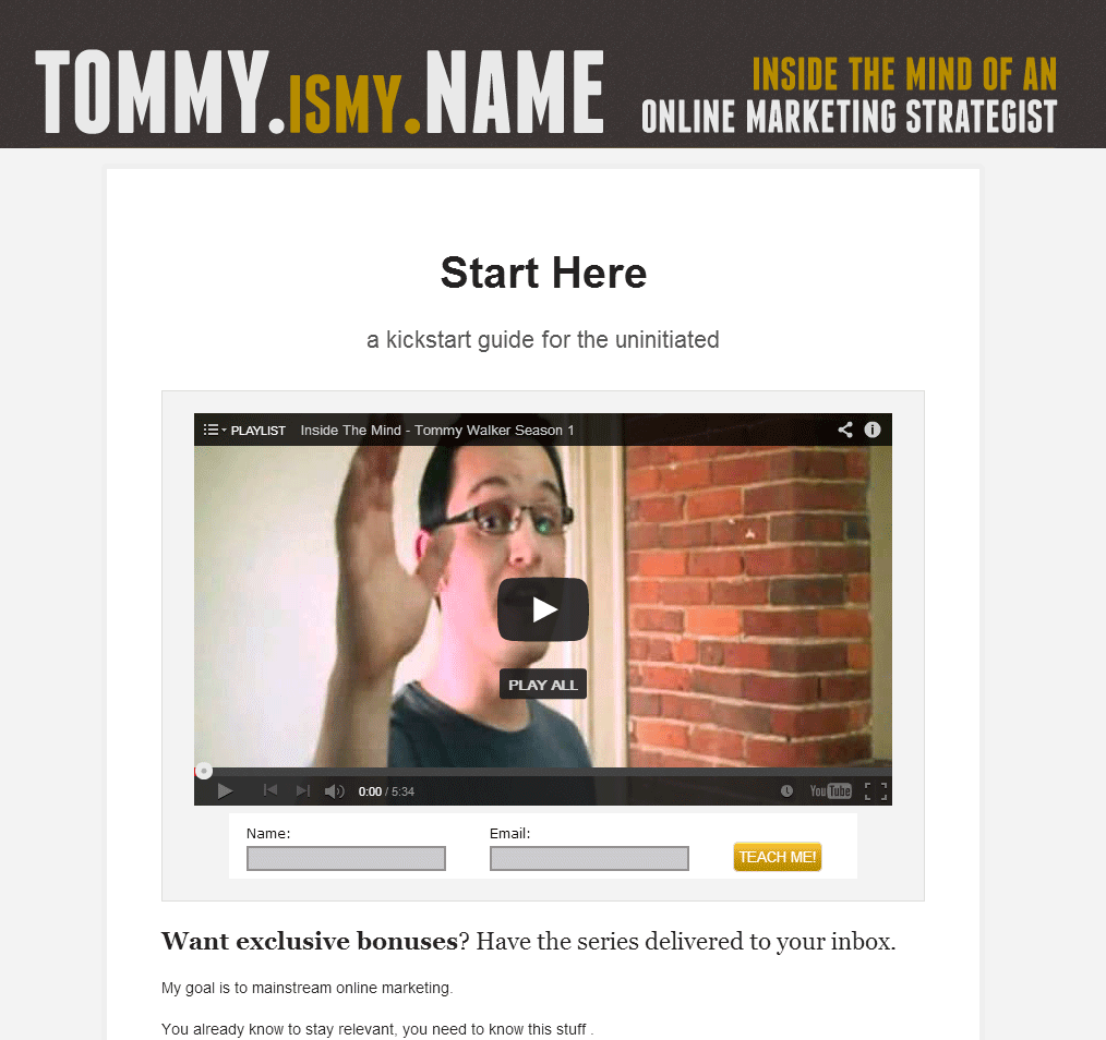
How to organize:
A “Start from this page” type of landing page is often included in the navigation so that new visitors can easily find it, no matter which page of your site they are on.
Landing itself usually contains a greeting inscription or description, telling people the most interesting things about your site and business, mentioning important things that they can learn about.
Some, as in the example above, post a welcome video .
After the welcome word, it is important to point out to new visitors to the site the most relevant information and pages for them. Should they subscribe to your newsletter and free offers? Do you have blog posts that are most interesting to visitors who have visited your site for the first time? Should they read the questions and answers section?
Post links to relevant pages and do not forget to create strong call-to-action, so that your visitors know what to do next.
4. Landing for the transition to it from the page in the social network
When you find something interesting on Twitter and click on the link, where do you go?
Most often you get to the main page of the company's website. That, in general, is not bad in itself. But not perfect .
The main page is not the best place to send any traffic to it; the more customized the experience, the better.
When I clicked on the ProBlogger link in his Twitter account, I got here:
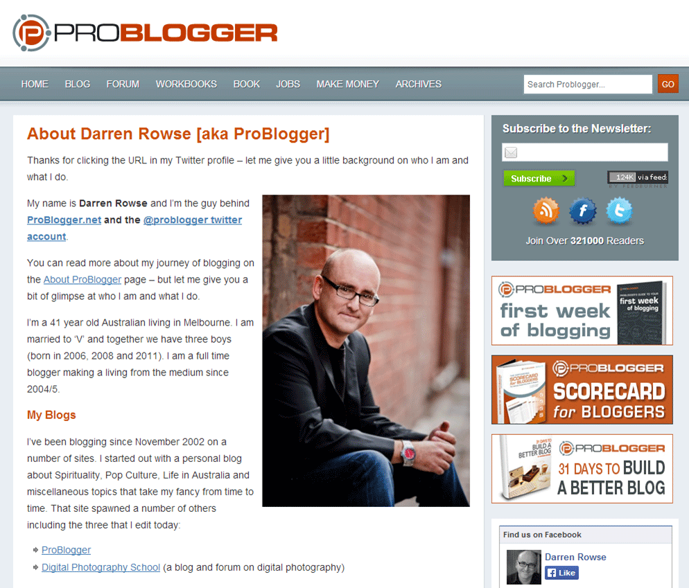
This page creates a rather personal feeling. She thanks me for the transition from Twitter-account and tells me the information that I most likely need (his biography, what he writes about, how to contact him).
How to organize:
If someone is following you on the social network, you want to use this interest to you to build a long-term relationship with the subscriber. Give him the information he is looking for, and then post a relevant call to action (ask to leave mail for distribution, subscribe to a blog or contact you in some other way)
5. Landing for the transition from the comment
Comments work well for you and your site. But perhaps the most useful is the traffic that they can send in the direction you want.
But, if you do not send this traffic to the necessary pages, you lose almost all of your benefits (for example, you miss new recipients of your mailing list).
If you are like many subscribers, in your comments you post a link to the main page of your site.
The main page of your site is absolutely not a suitable place for such visitors.
You created a good impulse by writing a valuable comment that your users liked (if they didn’t like it, they wouldn’t follow your link). You need to develop this impulse and use it to build an even closer connection with the user - do not kill him by sending the user to the main page of your site, where they have to decide for themselves whether you have anything to offer them.
Use customized landing pages for comment transitions to transfer the communication from someone else’s main blog to your own website, such as in thelaunchcoach.com example:
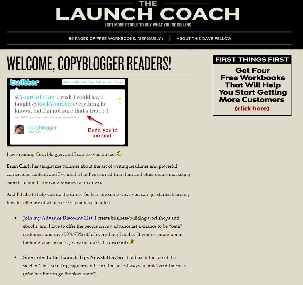
How to organize:
The most important thing for your landing page, which is referenced from the commentary, is to maintain the appropriate attitude for your readers. It is necessary that your page leaves a feeling that fully corresponds to what your visitor has just read on the blog for which you left a comment.
The example above does an excellent job of welcoming visitors, using the name of the blog from which they switched to landing, and transferring the conversation from the mentioned blog (and comment topics) to other things his website offers, such as his maximum discount mailing list. (Another example of the landing page, which is linked from the comment, you will find by the call-to-action link in my biography under this post).
6. Thanksgiving Landing
One of the major missed opportunities on your site is a page of thanks.
This is the page to which the user is redirected after registering on your site, registering for an event (for example, a webinar), or buying your product.
A thank you page usually consists of ... well, thankful words. And nothing more.
When you find yourself on a similar page, there is literally nothing more to do on it, except to leave it. This is a huge loss of part of your most valuable and targeted traffic!
Anyone who is gratefully on your page has already shown some interest in what you are offering. At this particular moment, he is highly valued by your business, and this is the best moment to develop your relationship a little.
Look at the thanksgiving landing of the Daily Egg, to which I was redirected after subscribing to their newsletter.
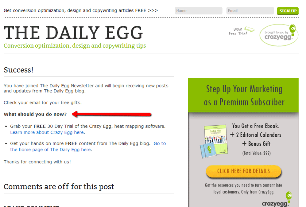
Pay attention to the small section entitled “What do you do now?” It offers new subscribers an easy and encouraging way to become even more loyal to the company.
They capitalize on the momentum of the new subscriber, making an additional offer.
How to organize:
In the case of our example of Daily Egg, the additional offer was 2 other free features. It is important that your additional offers match the actions that led the visitor to the thanks page.
Accordingly, if I have just subscribed to their free newsletter, Daily Egg offered me some additional free options (one of which - the free test period of their product - may in the future convert the user into a paying customer).
The thank-you landing page on which the user falls after the purchase must contain an offer of another product with a special discount. Or, for example, a proposal to share information about your free webinar on social networks.
Additional ideas: ask to complete a short survey , leave a review, read the most popular posts on your blog or subscribe to you on social networks.
7. Landing for unsubscribe
Just imagine: someone unsubscribes from your newsletter! It is unpleasant.
But, as in a relationship, termination can often be canceled at a certain stage. But not if you turn your back on your former subscribers, leaving them alone with a common, indifferent farewell page.
Have you ever viewed a page that your users get after unsubscribing?
Most email distribution services (such as Aweber and MailChimp ) use generic templates for such pages, to which users are automatically sent after unsubscribing. But you can change them to your customized page, and you should do it! And that's why:
When someone unsubscribes from your newsletter, they may not want to hear about you anymore. But it’s much more likely that your content and your business still interests them. So offer them other opportunities.
Look at the landing page for unsubscribing from HubSpot, where they ask the unsubscribers about the second chance in the form of a subscription in social networks:
How to organize:
Perhaps getting weekly news from you is too intrusive for them. Perhaps they will be much more satisfied, receiving only your special offers?
Perhaps your content is simply not relevant for them at the moment to earn a place in the clogged Inbox. Perhaps it would be enough for them to subscribe to you on Twitter or Google+?
Acknowledge their desire to break ties, but show them how important their attention is to you. Provide them with simple and quick opportunities to build a convenient interaction with your brand, without leaving you forever. And, of course, always offer a clear and easy way to completely unsubscribe from your newsletter for those who definitely decided to refuse you.
The most important thing to remember:
Landings are agents for drawing attention to one thing . They allow you to achieve one, strictly defined goal - whether it is selling something, attracting a new subscriber, distributing information about a brand, or something completely different.
For optimal ROI, you need to link any opportunity to generate traffic with a separate landing page.
For, really, why should you send someone to the main page of your site, if you can provide him with a warm, optimized for the conversion, reception that will lead to the development of your business?
About the author: Sonya Jobson helps small business owners and entrepreneurs achieve incredible results on the Internet through content marketing. Get her free weekly business training and effective marketing tips for even more success in developing your own business.
As you know, landing pages are an ideal tool for drawing the attention of one of the target traffic segments to a single target action . But most sites seriously under-use landings as a tool to convert daily traffic into leads, subscribers, fans, and (even more involved) customers.
The problem is:
')
On most sites there are “leaks”, or zones, where the most obvious next visitor action on the site is “leave the site”. For you, this is not the best course of events, since in most cases in these areas there is still an opportunity to lure the visitor further.
The solution to this problem is a dedicated landing page for each type of traffic. These Landings will appeal directly to each type of visitors to your site — whether they come from social media, Google, product pages, a blog post, or from somewhere else — and offer them a customized next step that will keep them involved in your website and business.
We have identified 7 types of landing pages, which you can use to make your site more catchy:
1. Landings for the collection of e-mail base
Did you know that one of the most effective places to place a form with an e-mail address request is not the main page of your site, not the sidebar or your blog? (Although the request forms for e-mail addresses in these places are also useful).
The most efficient place to put these forms is the dedicated landing page.
Landing to collect e-mail addresses allows you to explain to your users the benefits of providing you with their contact information.
This means that you can concentrate all the attention of the site visitor on the registration and, by eliminating any unnecessary distractions (for example, navigation) , you will force him to make a choice - to register or to miss the opportunity offered.
Here is an example of a working landing page for collecting an e-mail database (from LKRSocialMedia.com ):
How to organize:
Making an effective landing page for collecting e-mail databases is quite simple.
Start with an attractive headline — descriptions of the benefits you are going to offer.
Then you want to give details: what will people receive in exchange for their e-mail? Will they receive a weekly newsletter (as in the example above)? Or maybe you offer to download some free content, for example, an e-book or an industry review?
If you offer to download free content, make a special picture for it (“digital packaging”) to give the page a special visual appeal.
And finally, the most important part is your registration form.
For best results, your form should be short and simple. The fewer fields you include in the form, the usually higher the conversion of your site *. It is also important to give a strong call-to-action to your “Register” button - try to come up with something different from “Subscribe”. Try other options instead, such as: “Get a free e-book right now” or “Send me materials.”
* There are cases when a more detailed form of subscription increases your conversion, so it is very important to test everything.
2. Landing - website content guide
Inbound marketing, like any regular online marketing now, is content.
If you run a blog / video blog or create free info products for your target audience, you can get even more benefit from your content by organizing a guide on it on a separate landing page.
Think about it: your blog is a great place to post your posts, and sometimes it has a special option to search for specific topics of interest to the reader. But a large amount of your interesting content from the past may have become a little dusty due to the lack of attention to it.
You can easily “cure” this problem and provide your visitors with an upscale tour of your best posts by creating landings to structure content by topic.
Here is an example of a content landing page from FirepoleMarketing.com that structures all their content by gamification:
How to organize:
This is probably one of the simplest types of landing.
Determine which topics you want to draw attention to, then create a landing page for each of them. Give a brief description of the topic, and then post links to each post / video / content to download on this topic.
That's all. Now promote your content landings by posting them on your website, on social networks and email-newsletters.
3. Landing "Start from this page"
Your website solves many problems of your business: it tells people about your brand, allows them to contact you, provides information, sells your products and services, etc. Therefore, when a visitor gets to your site for the first time, he has a lot of ways in which he can go.
But the path that he chooses is not always the best. He can get on information that he is not interested in, or get on an offer that is not relevant to him (for now).
But what if you create a customized experience for visitors coming to you for the first time? An experience that will give them an optimal first impression of you, and allow them to find all the necessary information and links and get the most out of their first visit.
Landing like “Start from this page” allows you to do all this.
How to organize:
A “Start from this page” type of landing page is often included in the navigation so that new visitors can easily find it, no matter which page of your site they are on.
Landing itself usually contains a greeting inscription or description, telling people the most interesting things about your site and business, mentioning important things that they can learn about.
Some, as in the example above, post a welcome video .
After the welcome word, it is important to point out to new visitors to the site the most relevant information and pages for them. Should they subscribe to your newsletter and free offers? Do you have blog posts that are most interesting to visitors who have visited your site for the first time? Should they read the questions and answers section?
Post links to relevant pages and do not forget to create strong call-to-action, so that your visitors know what to do next.
4. Landing for the transition to it from the page in the social network
When you find something interesting on Twitter and click on the link, where do you go?
Most often you get to the main page of the company's website. That, in general, is not bad in itself. But not perfect .
The main page is not the best place to send any traffic to it; the more customized the experience, the better.
When I clicked on the ProBlogger link in his Twitter account, I got here:
This page creates a rather personal feeling. She thanks me for the transition from Twitter-account and tells me the information that I most likely need (his biography, what he writes about, how to contact him).
How to organize:
If someone is following you on the social network, you want to use this interest to you to build a long-term relationship with the subscriber. Give him the information he is looking for, and then post a relevant call to action (ask to leave mail for distribution, subscribe to a blog or contact you in some other way)
5. Landing for the transition from the comment
Comments work well for you and your site. But perhaps the most useful is the traffic that they can send in the direction you want.
But, if you do not send this traffic to the necessary pages, you lose almost all of your benefits (for example, you miss new recipients of your mailing list).
If you are like many subscribers, in your comments you post a link to the main page of your site.
The main page of your site is absolutely not a suitable place for such visitors.
You created a good impulse by writing a valuable comment that your users liked (if they didn’t like it, they wouldn’t follow your link). You need to develop this impulse and use it to build an even closer connection with the user - do not kill him by sending the user to the main page of your site, where they have to decide for themselves whether you have anything to offer them.
Use customized landing pages for comment transitions to transfer the communication from someone else’s main blog to your own website, such as in thelaunchcoach.com example:
How to organize:
The most important thing for your landing page, which is referenced from the commentary, is to maintain the appropriate attitude for your readers. It is necessary that your page leaves a feeling that fully corresponds to what your visitor has just read on the blog for which you left a comment.
The example above does an excellent job of welcoming visitors, using the name of the blog from which they switched to landing, and transferring the conversation from the mentioned blog (and comment topics) to other things his website offers, such as his maximum discount mailing list. (Another example of the landing page, which is linked from the comment, you will find by the call-to-action link in my biography under this post).
6. Thanksgiving Landing
One of the major missed opportunities on your site is a page of thanks.
This is the page to which the user is redirected after registering on your site, registering for an event (for example, a webinar), or buying your product.
A thank you page usually consists of ... well, thankful words. And nothing more.
When you find yourself on a similar page, there is literally nothing more to do on it, except to leave it. This is a huge loss of part of your most valuable and targeted traffic!
Anyone who is gratefully on your page has already shown some interest in what you are offering. At this particular moment, he is highly valued by your business, and this is the best moment to develop your relationship a little.
Look at the thanksgiving landing of the Daily Egg, to which I was redirected after subscribing to their newsletter.
Pay attention to the small section entitled “What do you do now?” It offers new subscribers an easy and encouraging way to become even more loyal to the company.
They capitalize on the momentum of the new subscriber, making an additional offer.
How to organize:
In the case of our example of Daily Egg, the additional offer was 2 other free features. It is important that your additional offers match the actions that led the visitor to the thanks page.
Accordingly, if I have just subscribed to their free newsletter, Daily Egg offered me some additional free options (one of which - the free test period of their product - may in the future convert the user into a paying customer).
The thank-you landing page on which the user falls after the purchase must contain an offer of another product with a special discount. Or, for example, a proposal to share information about your free webinar on social networks.
Additional ideas: ask to complete a short survey , leave a review, read the most popular posts on your blog or subscribe to you on social networks.
7. Landing for unsubscribe
Just imagine: someone unsubscribes from your newsletter! It is unpleasant.
But, as in a relationship, termination can often be canceled at a certain stage. But not if you turn your back on your former subscribers, leaving them alone with a common, indifferent farewell page.
Have you ever viewed a page that your users get after unsubscribing?
Most email distribution services (such as Aweber and MailChimp ) use generic templates for such pages, to which users are automatically sent after unsubscribing. But you can change them to your customized page, and you should do it! And that's why:
When someone unsubscribes from your newsletter, they may not want to hear about you anymore. But it’s much more likely that your content and your business still interests them. So offer them other opportunities.
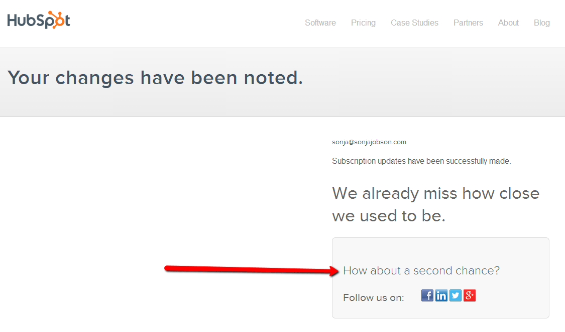
Look at the landing page for unsubscribing from HubSpot, where they ask the unsubscribers about the second chance in the form of a subscription in social networks:
How to organize:
Perhaps getting weekly news from you is too intrusive for them. Perhaps they will be much more satisfied, receiving only your special offers?
Perhaps your content is simply not relevant for them at the moment to earn a place in the clogged Inbox. Perhaps it would be enough for them to subscribe to you on Twitter or Google+?
Acknowledge their desire to break ties, but show them how important their attention is to you. Provide them with simple and quick opportunities to build a convenient interaction with your brand, without leaving you forever. And, of course, always offer a clear and easy way to completely unsubscribe from your newsletter for those who definitely decided to refuse you.
The most important thing to remember:
Landings are agents for drawing attention to one thing . They allow you to achieve one, strictly defined goal - whether it is selling something, attracting a new subscriber, distributing information about a brand, or something completely different.
For optimal ROI, you need to link any opportunity to generate traffic with a separate landing page.
For, really, why should you send someone to the main page of your site, if you can provide him with a warm, optimized for the conversion, reception that will lead to the development of your business?
About the author: Sonya Jobson helps small business owners and entrepreneurs achieve incredible results on the Internet through content marketing. Get her free weekly business training and effective marketing tips for even more success in developing your own business.
Source: https://habr.com/ru/post/283950/
All Articles