The importance of organizing feedback on the example of IRON.IO
Creative director and creator of the company Anton & Irene, Anton presents his list, which helps to improve the design.
This list is a guide that I have been composing for myself for a long time - it allows me to find a balance between the two extremes that I encounter every day, as a designer.
Sometimes I get too carried away and concentrate only on small details, not looking at the project from a bird's-eye view, and sometimes the other way around - I think only about the project as a whole and don’t pay enough attention to important details.
')
These 10 steps allow me to stick to a course in several projects at the same time and make the design process more rational as a whole.
01. Understand the project
Before you start working on a design, you need to understand what this project really is, what its function is and what the end user should get from it. Do not allow design to dominate the functionality.
Often, designers are “attacking” the project, not understanding and not seeing the goal. Of course, as a result, they can achieve the goal, but only by following a longer route - one that implies a large number of changes. Understanding - that is, practically representing the end result in your head - will make the process more reasonable. The final design may surprise you.
02. Correctly form your ideas.
Do not underestimate the power of the presentation, both internal and for the client. For the designer, a clear and concise formulation of ideas eliminates most of the questions and discussions, saving time for immediate work. The client will immediately feel that you have everything under control, and will trust your opinion more.
Submit your work step by step. Show the individual items first. Explain the meaning and working principle of each of them. Then show the "skeleton" of the site and the main user interactions. Put it all together: practically put the whole project in front of the client in pieces. Finally, show the whole page with all the elements.

When I worked at Fantasy Interactive (Fi), designers rarely sent a design picture to a client. Instead, we recorded short videos.
At the end of the day or before submitting an order, designers opened their work files in Photoshop and recorded 10-minute demo videos, talking about how everything would work, turning the layers on and off to show various interactions, and showing how they would work. separate drop-down menus, and how the navigation will unfold - up to simulating some transitions, creating several element frames, moving them left and right, and creating a blur effect in motion.
03. Think over the frame
Regardless of whether you are designing for a website, a mobile application or a TV, think about the framework and the main user interaction before you take on the project. Think about how the user interacts with the device, how much space you have for design, how the user will move from one view to another, and how navigation will be used.
Even if you are creating a design for a site, take an example from the applications: perhaps your site could consist of only five templates, instead of 20, and the rest of the information will appear dynamically with the help of departing elements, interactive mailboxes, etc.
All of these elements are part of the design framework (or UX). Experiment first on them, and only then begin to make the design of each individual element, imagining what the final result will be.
04. Continue to consider work exciting
Regardless of how passionate you are at the beginning of a project, losing enthusiasm is pretty easy, especially if the work drags on for several months and implies constant change.
In projects like this, it is very important to highlight areas that usually nobody pays attention to, and experiment on them, keeping the balance with the usual work on parts of the site that require more attention.
If you are tired of working on your homepage, go ahead and come up with the most innovative “Terms of Service”. This may seem a silly example, but in fact innovation is just as important as good design. Believe it or not, such innovative ideas often become the “most important” sections of the site, even if the client does not notice them first.
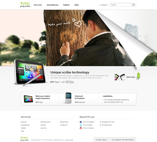
Part of the product page on HTC. Lovely modest innovations like this often become the "chip" of the entire site.
Let's look at a real example. We have been trying to make the HTC homepage for quite a while. We complied with all the requirements for the product, but each time everything turned out too simple. She lacked one little detail that would make her special.
At the same time, we worked on an interactive wizard that would help people choose the right HTC phone. The problem was that the master included a large number of components and seriously overloaded the page. It distracted us from the real problems.
As a solution, we created a reversible paper sticker that the user could pull and open the wizard for. This functionality - pull / unscrew the paper - turned out so neat that it could be quickly inserted anywhere on the site, including the home page.
05. Work on individual pixels
The right idea is only half the work. The rest is a solid design. Therefore, most projects with a good idea can not be meaningful, since these ideas are poorly implemented.

Since leading brands have set the bar rather high, most users can easily distinguish between low-quality and high-quality design. They are unlikely to show individual pixels that spoil everything, but they will definitely remember the overall look and impression.
So try to make the design perfect until the last pixel. Work on the smallest details, even if you think that no one will notice them. It is these small details that will help your design stand out.
This list is a guide that I have been composing for myself for a long time - it allows me to find a balance between the two extremes that I encounter every day, as a designer.
Sometimes I get too carried away and concentrate only on small details, not looking at the project from a bird's-eye view, and sometimes the other way around - I think only about the project as a whole and don’t pay enough attention to important details.
')
These 10 steps allow me to stick to a course in several projects at the same time and make the design process more rational as a whole.
01. Understand the project
Before you start working on a design, you need to understand what this project really is, what its function is and what the end user should get from it. Do not allow design to dominate the functionality.
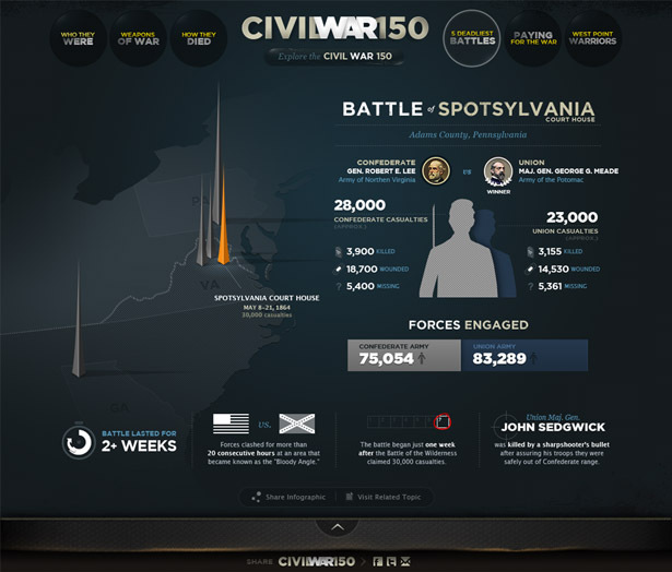
Creating the “Civil War 150” website for the History channel, it was important to understand what information the user should get from the interaction experience to make it visually interesting, easy to learn, and not overload the user with arbitrary facts.
Often, designers are “attacking” the project, not understanding and not seeing the goal. Of course, as a result, they can achieve the goal, but only by following a longer route - one that implies a large number of changes. Understanding - that is, practically representing the end result in your head - will make the process more reasonable. The final design may surprise you.
02. Correctly form your ideas.
Do not underestimate the power of the presentation, both internal and for the client. For the designer, a clear and concise formulation of ideas eliminates most of the questions and discussions, saving time for immediate work. The client will immediately feel that you have everything under control, and will trust your opinion more.
Submit your work step by step. Show the individual items first. Explain the meaning and working principle of each of them. Then show the "skeleton" of the site and the main user interactions. Put it all together: practically put the whole project in front of the client in pieces. Finally, show the whole page with all the elements.
Sketches for the site "HTC Sense". Fi recorded a video of the screen to explain to the client the basic idea that underlies the story.
When I worked at Fantasy Interactive (Fi), designers rarely sent a design picture to a client. Instead, we recorded short videos.
At the end of the day or before submitting an order, designers opened their work files in Photoshop and recorded 10-minute demo videos, talking about how everything would work, turning the layers on and off to show various interactions, and showing how they would work. separate drop-down menus, and how the navigation will unfold - up to simulating some transitions, creating several element frames, moving them left and right, and creating a blur effect in motion.
03. Think over the frame
Regardless of whether you are designing for a website, a mobile application or a TV, think about the framework and the main user interaction before you take on the project. Think about how the user interacts with the device, how much space you have for design, how the user will move from one view to another, and how navigation will be used.
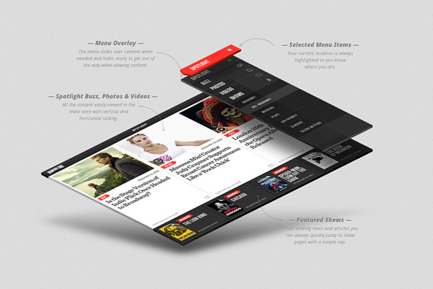
Always consider how users will interact with the site: the frame of the home page and the navigation of the Broadway.com iPad app
Even if you are creating a design for a site, take an example from the applications: perhaps your site could consist of only five templates, instead of 20, and the rest of the information will appear dynamically with the help of departing elements, interactive mailboxes, etc.
All of these elements are part of the design framework (or UX). Experiment first on them, and only then begin to make the design of each individual element, imagining what the final result will be.
04. Continue to consider work exciting
Regardless of how passionate you are at the beginning of a project, losing enthusiasm is pretty easy, especially if the work drags on for several months and implies constant change.
In projects like this, it is very important to highlight areas that usually nobody pays attention to, and experiment on them, keeping the balance with the usual work on parts of the site that require more attention.
If you are tired of working on your homepage, go ahead and come up with the most innovative “Terms of Service”. This may seem a silly example, but in fact innovation is just as important as good design. Believe it or not, such innovative ideas often become the “most important” sections of the site, even if the client does not notice them first.
Part of the product page on HTC. Lovely modest innovations like this often become the "chip" of the entire site.
Let's look at a real example. We have been trying to make the HTC homepage for quite a while. We complied with all the requirements for the product, but each time everything turned out too simple. She lacked one little detail that would make her special.
At the same time, we worked on an interactive wizard that would help people choose the right HTC phone. The problem was that the master included a large number of components and seriously overloaded the page. It distracted us from the real problems.
As a solution, we created a reversible paper sticker that the user could pull and open the wizard for. This functionality - pull / unscrew the paper - turned out so neat that it could be quickly inserted anywhere on the site, including the home page.
05. Work on individual pixels
The right idea is only half the work. The rest is a solid design. Therefore, most projects with a good idea can not be meaningful, since these ideas are poorly implemented.
“Lick” your design to the last pixel: users notice every detail, even if subconsciously
Since leading brands have set the bar rather high, most users can easily distinguish between low-quality and high-quality design. They are unlikely to show individual pixels that spoil everything, but they will definitely remember the overall look and impression.
So try to make the design perfect until the last pixel. Work on the smallest details, even if you think that no one will notice them. It is these small details that will help your design stand out.
Useful Paysto solutions for Megamind readers:
→ Get paid by credit card right now. Without a site, PI and LLC.
→ Accept payments from companies via the Internet. Without a site, PI and LLC.
→ Acceptance of payments from companies for your site. With document circulation and exchange of originals.
→ Automation of sales and service transactions with legal entities. Without intermediary in the calculations.
→ Accept payments from companies via the Internet. Without a site, PI and LLC.
→ Acceptance of payments from companies for your site. With document circulation and exchange of originals.
→ Automation of sales and service transactions with legal entities. Without intermediary in the calculations.
Source: https://habr.com/ru/post/283920/
All Articles