21 welcome letters: inspiration for your email marketing

Welcome letters are the super heroes of the life cycle of email marketing. Deceptively soft, they are sometimes underestimated, but they are extremely important.
The success of your subsequent work with the flow of e-mail depends largely on first impressions. The welcome letter should encourage action, be informative and clear. That is why we pay so much attention to this topic, it’s not for nothing that they say that we don’t have a second chance to make a first impression . The examples in this article cover a wide range of approaches (from different business areas). Some may be great for your product and service, others may not. Testing, however, is always very useful.
Purpose of welcome letters
')
It is important to understand that in the case of welcome letters, the statistics of discovery and clicks are not so important. Of course, you will try to make the message subject and its text have the maximum effect, but the real purpose of the welcome letters is to advance the user through your registration process. The next step, depending on the software you use, blog, store, etc. may include filling out a profile, downloading something, reading a document, or something else. Whatever the next step, it must give the user something necessary.
The statistics that are important here are the conversion rate. How many recipients did the step you asked them to take?
Without forgetting this, let's look at examples.
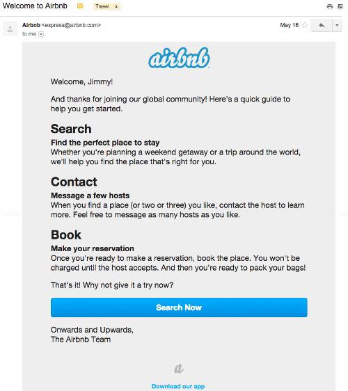
1. Airbnb
Uncertainty kills conversion. New users want to know how your product or service works, before jumping into the water from the tower. This letter from Airbnb helps them relieve tension by offering a description of the booking process. After that, instead of asking users to “Book now,” the letter encourages them to “Look now.” Search does not commit to anything and this call does not cause resistance.
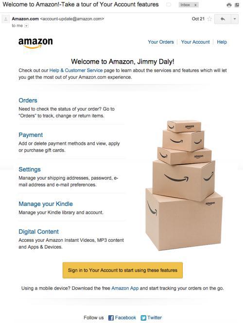
2. Amazon
Amazon is a huge company. Yes, of course, she is mainly engaged in selling goods online, but their welcome letter should tell users about other things. For example, much of the attention in this letter is paid to digital content, perhaps because these products are more lucrative than physical ones.
Think strategically, creating a call to action in your welcome letter. Instead of directing customers to popular products or content, direct them to the very products that give you maximum profit and conversion.
3. Basecamp
The sole purpose of this Basecamp welcome letter is to encourage the user to subscribe. They are sure that the product will sell itself. This letter is a bridge from incoming emails to the application. If you have a great product, you don't need anything else.
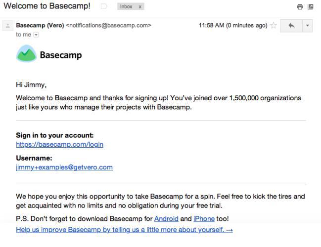
In this letter, they mention that 1.5 million organizations use Basecamp. This is a huge number and a wonderful example of social confirmation.
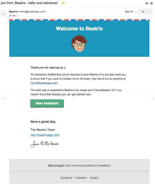
4. Beatrix
The emphasis on immediate action is what makes this Beatrix welcome letter effective. A brief introduction turns to a call to action: create a “New Assistant”.
Creating an assistant is what makes this program useful for the client. The sooner this happens, the sooner the user of the free trial will become a paying customer.
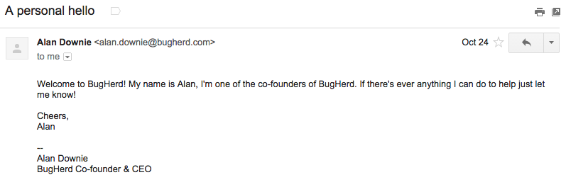
5. BugHerd
Now this company is known under the brand Macropod. The letter from the founder, Alan Douri, is simple and personal. It sets a certain tone, letting the user know what kind of experience he can expect from using the product. This way, at first glance, may seem counterintuitive to common sense, but it is one of the best ways of branding for new customers - because of how they feel when reading this letter ... as a person, an individual, and not just a faceless "user ".
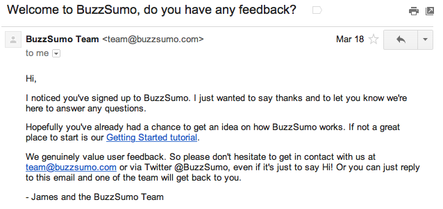
6. Buzzsumo
Buzzsumo takes a similar approach by sending a welcome letter in plain text format. The difference, however, is that Buzzsumo puts emphasis on getting product reviews. They offer several ways to do this, which is key to the conversion to achieve a specific goal.
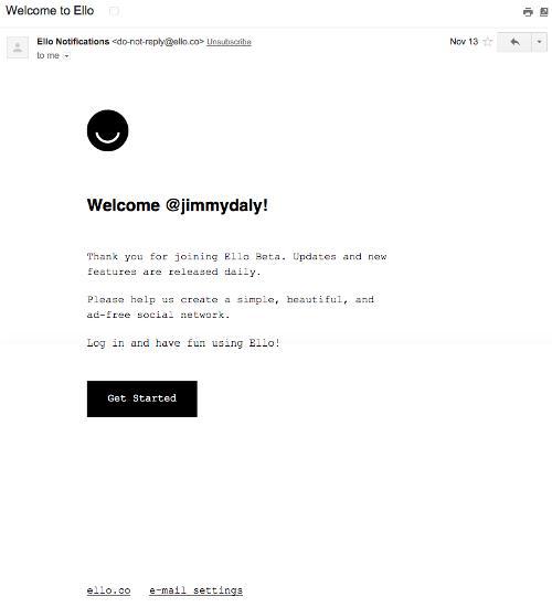
7. Ello
The welcome letter from Ello perfectly matches their branding. Unique font, lots of white space and a bit of text. The impression of the message is the same as on the site. The welcome letter perfectly builds the bridge between clients and the company.
8. Fab
In the welcome letter from Fab a lot of content, but they manage to cope with the task through excellent appearance - the design is simply beautiful - and the use of cheerful tone.
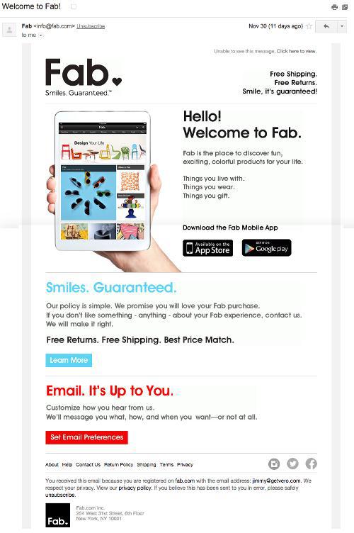
See what words they use:
• “Discover the fun, colorful products!”
• “Smiles. Guaranteed! ”
• “We promise you will love your Fab purchase!”
In general, this is a pleasant impression and the letter gives several ways to start using the site directly from the text of the letter.
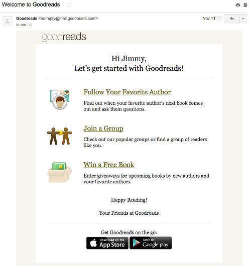
9. Goodreads
Formula 1-2-3 is great for welcome letters. Just as in the example letter from Airbnb above, Goodreads shows how easy it is to start using the site. The formula 1-2-3 is understandable for readers and, if properly applied, helps remove doubts about the use of a new product.
10. iDoneThis
This is perhaps the most functional welcome letter I have ever seen. IDoneThis users receive a daily message that looks exactly like this. The answer with the tasks that you have already done adds “done” to your calendar. A welcome letter explains how everything works, and gives you the opportunity to try to do it right away.

11. Import.io
If you need users to download something, it is very important that they do it as soon as possible. Without loading your product is useless for them.

This letter could put more stress on the download, but in general, we like how it is divided into sections with instructions on how to complete each part of the task.
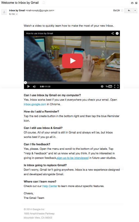
12. Inbox by Gmail
Considering the fact that Inbox is a new concept for many users, Gmail uses the “frequently asked questions” approach in its welcome letter. It is possible that some users still do not fully understand how everything works. Together with 6 questions and answers, the video clearly shows how the product works, and users are eager to try it.
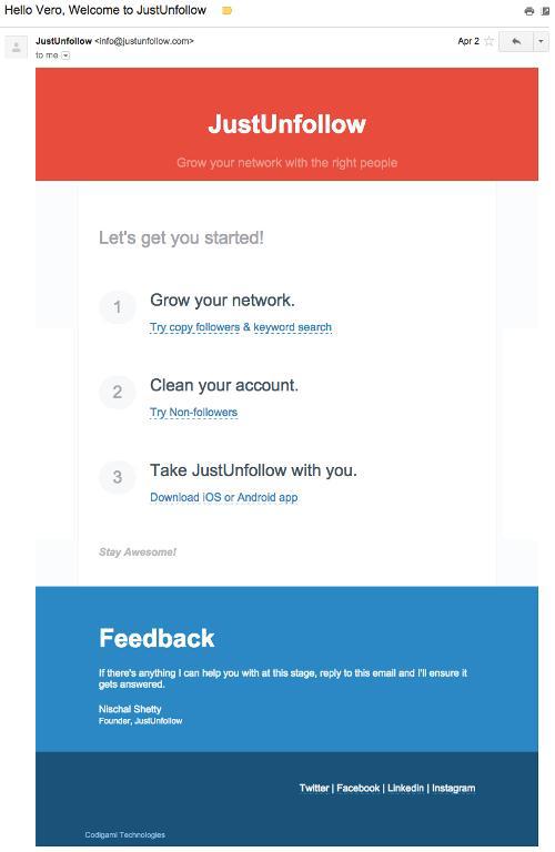
13. JustUnfollow
The 1-2-3 approach is in the simplest format. JustUnfollow uses as few words as possible in order to describe what users need to do, and provides the necessary links to the right places in the application. Often, the less said, the more useful - and in this case it is true.
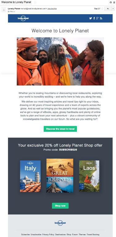
14. Lonely Planet
The first example of using coupon strategy with code. This is a popular and easy way to push new customers to action. Lonely Planet does a good job of this by making the intro paragraph interesting and immediately turning to a call for immediate participation in the promotion, offering a coupon.
15. Squarespace
Just like in the Basecamp example, Squarespace is sure that their product will be able to sell itself. Their welcome letter focuses on the fact that new users are logged in, and the mention of support services at the end is a kind of safety net for users who are afraid of starting the process.

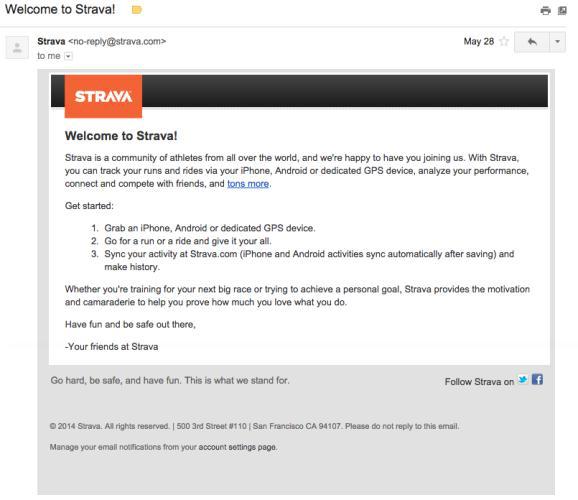
16. Strava
Another example of the popular 1-2-3 method. This letter from Strava perfectly copes with the task, explaining what this application is doing and why customers should use it. But at the same time, the letter does not give a strong enough call to action. For example, a button that prompts users to record their first workout or log in could make this email almost perfect.
17. SumAll
As already mentioned, you need to understand what it will be useful for your users to move them in the right direction, and build loyalty. For SumAll, the key to success is to join other services so that you can start collecting data. Contrasting colors and strong text make the call to action very effective.

18. SumDay
This welcome letter is surprisingly similar to SumAll, and similarly encourages new users to take immediate action to benefit from the product.
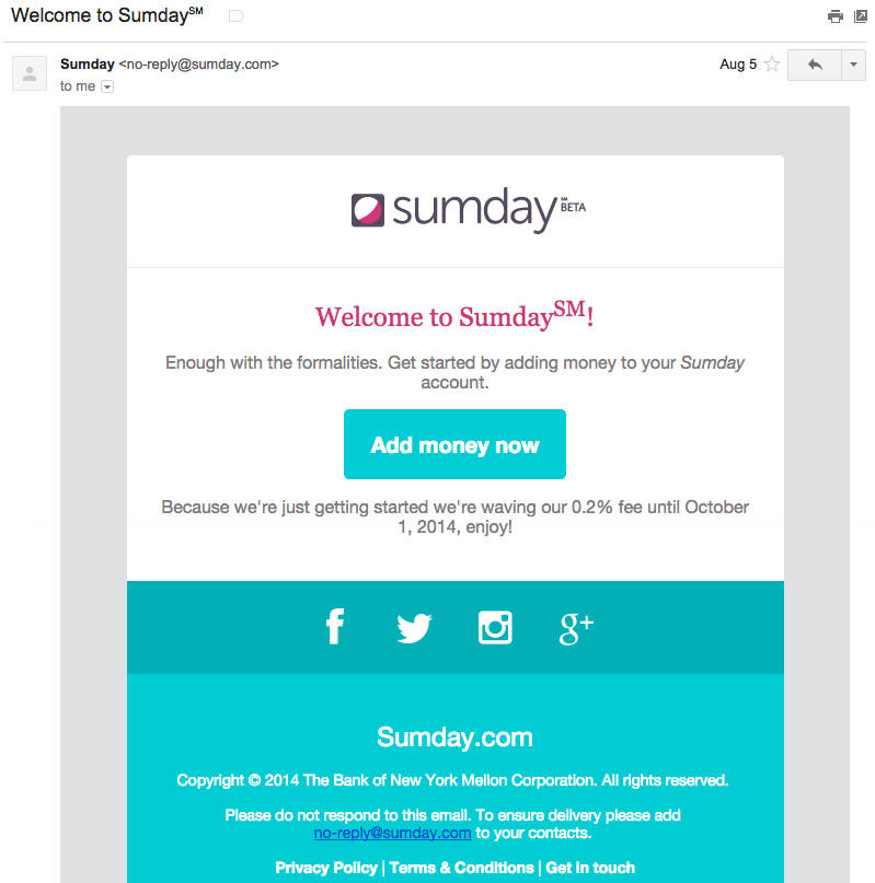
Without replenishing the balance of this service is useless. Therefore, the elimination of the initial payment works as a coupon so that the client can immediately start using the site.
19. Target
For some reason, huge companies often think that they need to have huge letters. Not at all. In fact, new customers are better off sending short, actionable messages.

This welcome letter from Target is too long, but it achieves several goals at once:
1. Uses a positive, vigorous text.
2. Offers discounts in exchange for immediate action.
3. Contains a picture of a dog (any pretext to use a picture with a dog, cat, koala bear or newborn child - always works).
20. Vero
Warning: this letter was written by the author of the article, but at the same time, he is absolutely sure that it is successful.
People receive this letter when they subscribe to our e-mail vacation course. The purpose of this letter is for people to tell their friends about the company.
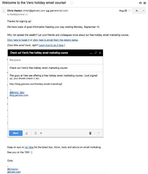
So, the task of the letter is to make their task as easy as possible. For this, we used Noah Kagan's Samuel L. Jackson e-mail hack, which you can read more about here .
21. Zapier
This letter welcomes users of the free Zapier plan. And it means that their free trial has ended.
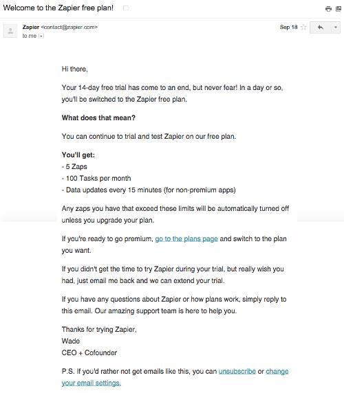
The letter got into this list because it transforms what could be the end of the client cycle to the beginning of something new and interesting. If you can turn a negative event into a positive one, use it.
Source: https://habr.com/ru/post/283820/
All Articles