5 amazing lessons on conversion rate optimization (real life examples)

Conversion rate optimization is not only a favorite topic of the authors of the CrazyEgg blog, but also a method by which you can get more value from the flow of users on the pages of your website. The best way to learn how to optimize is to learn from those who have already done it. Below are a number of tips to optimize your conversion rate, as well as fresh optimization techniques used by various companies. You will see that sometimes you can achieve truly amazing results.
1. Make your site design more convenient to increase the number of people accessing it from mobile devices.
We have previously said that user-friendly website design plays an important role in providing comfortable navigation for users of mobile devices. When the site is focused primarily on mobile device users, other users are usually able to navigate the site more efficiently. However, the most important thing is that in this case, users are beginning to more and more actively access the site from other devices. Below is an example of the impact of the introduction of user-friendly design on the Philadelphia Orthodontists website published by Website Optimization.
')
In April 2013, the resource had a regular static design. However, company owners have noticed that the site is becoming increasingly popular among users of mobile devices. A new site was created on the WordPress platform (unlike the old version that worked on the Dreamweaver platform), and then we evaluated what the impact of the launch of the new version of the site was on traffic. Statistics show that:
- In one month after the launch of the new version, the number of mobile device users increased by 24%, and the total traffic of users of mobile devices and tablets increased by 21%.
- A year and a half after launch, the above figures were already 70% and 56%, respectively.
The launch of a more convenient version of the site also meant that users began to spend more time on the site. The session duration among users of mobile devices increased by 80%, and among users of all types of devices - by 39%. Probably, the attractiveness of the site has grown and by reducing the page load time.
2. Do not focus on "free"
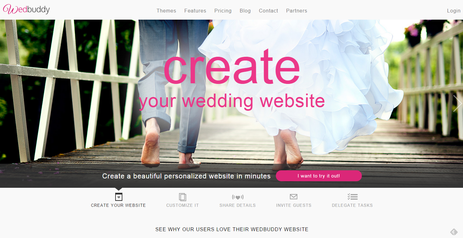
Promotions and gifts - this is one of the most popular marketing tools, however, the following example shows that this method does not always allow you to get the maximum conversion rate. The Devesh Design website presents the case of the WedBuddy company, which offers users to create their own wedding website using a free two-week trial version of the program.
On the original site of the company “WedBuddy” there were three links to a free trial program, as well as a long list of its advantages, but the conversion rate still did not match what was desired. According to Devesh Design, the reason was as follows: the information on the main page of the site emphasized that ultimately users would have to pay for the program, and this eliminated the effect of this commercial move.
On the updated page of the site, the accents were shifted: the page itself was shorter, and the word “free” was removed from the announcement of the trial version of the program. Instead, the main page emphasized that using the program to create sites can be very fast, and that visitors can try to use such a program.
As a result, the number of clicks on the trial version increased by 139%, and the number of subscriptions to the program - by 73%.
This example showed that underlining the benefits of the program and inviting to use it play a more important role than information about the cost of the service.
3. Reduce the number of people leaving the site using the window that appears when you exit the site
Users leave the site for various reasons - from the inability to find the required information to a low page loading speed. The situation may become even more aggravated if you offer a new service with which consumers are not yet familiar.
The site “Rooster” published a case about the company “YourMechanic”, which for a long time tried to assess how much the proposed repair of mobile phones would be in demand - a service that many have never used.
The task was to attract users to get acquainted with the price list. To reduce the number of users who left the site without viewing the price list, Rooster specialists placed a pop-up window on the site that appeared at the moment when the user closed the site. The window emphasized that you can get the price list very easily and quickly: in just 73 seconds. Also in the window was an encouraging orange button with an inscription “Get price list right now”.
Result: 7, 16% of those who were about to leave the site, eventually downloaded the price list. This proved how important it is sometimes to give users a second chance to accept your offer.
4. Make the site navigation convenient to interest users.
All conversion optimization tips say that navigation plays a huge role in the number of link clicks. The following example proves that this is true.
Harvard Business Services wanted to attract more users to acquire equity creation services in Delaware. However, when the owners of the company analyzed the navigation features of their site, it turned out that the conversion rate did not match the required one. The "Visual Website Optimizer" test allowed the company to develop several innovations to increase the conversion rate.
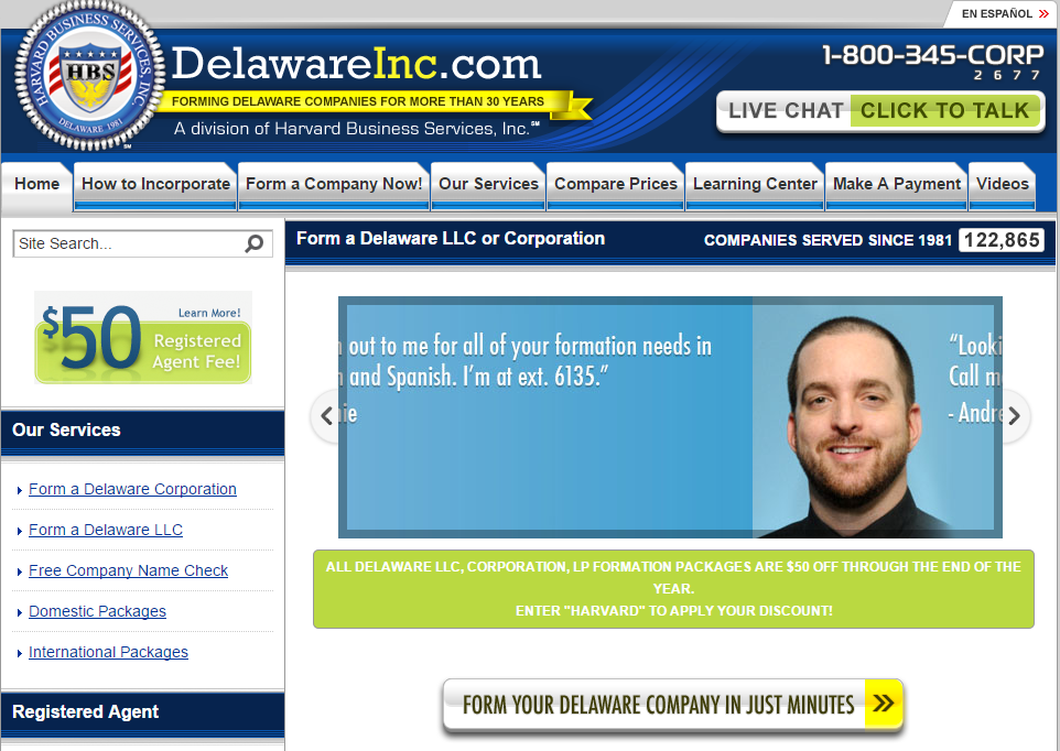
One of these innovations was the replacement of the inscriptions on the key buttons on the site. In particular, the Compare button was replaced with Compare Prices, since the price was a big competitive advantage of this company. Other changes included:
- Replacing the “Start Now” button with the “Create Company” button, which emphasizes the specific action that the company was waiting for from the users of the site.
- Adding the button "How to create a company" instead of the old link in the sidebar.
- Reducing the total number of buttons on the site.
Simplified navigation has borne fruit. During the A / B test, the following were identified:
The number of visits to the “How to create a company” page increased by 382%.
The number of page visits with price comparisons increased by 66%.
The number of completed orders increased by 15%.
The analysis carried out with the help of the “Visual Website Optimizer” showed how important it is to provide customers with information before they make a purchase, and to make the options on the website clear and encouraging to action.
5. Publish customer histories and use rich wording for buttons.
Mentioning past customer stories plays a huge role in marketing, but is it really worth using to optimize your conversion rate? Yes, it is worth it, especially if you share the right story.
Among the clients of the company “Adept Marketing” was a non-profit organization that wanted to improve its website dedicated to collecting donations. When entering the old page of the organization, users could not always understand what was going on and what was the purpose of this organization. In other words, the old page didn’t use such a technique as mentioning customer stories, and the site couldn’t inspire visitors to get an idea of the organization. Adept Marketing solved this problem by adding a few innovations to the page. The page has become shorter, more free space has appeared on it. In addition, specialists at Adept Marketing did the following:
- Added at the top of the page a clear description of the purpose of collecting donations.
- Placed the history of the issue, accompanied by its relevant photos.
- Placed a call for donation in two different places.
- They included a scale of progress so that people could see that their donation contributed to the common cause.
Such measures had a positive impact on existing sponsors, who had already planned to make a donation, and on new potential sponsors, who wanted to learn more about this issue. The fundraising page has become more popular than ever. For 10 hours, a non-profit organization was able to collect $ 31 thousand, which even exceeded the required amount.
The combination of a convincing story, several pushing buttons and a large supply of information led to an increase in conversion rate.
Now you
All of the above methods allowed the companies that applied them to achieve good results. They can help increase your conversion rate on your site. Just remember that it is very important to test these methods to see if they work for the users of your site.
Have you applied any of these methods to your own marketing activities? Which of them turned out to be the most effective for your company?
Source: https://habr.com/ru/post/283768/
All Articles