Interfaces in the real world: we design the most hellish interface
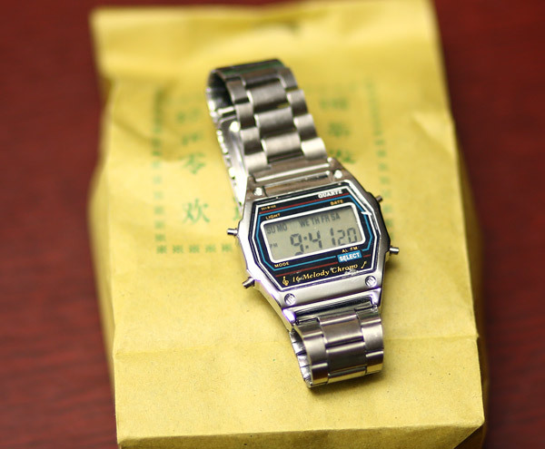
Until last week, the multicookers for me were always the absolute champion of interface bumps. One of them, the three of us (including the system architect) tried to turn on 6 minutes, until the hostess arrived. But no, this record was also broken. This small device, familiar to most people in our country, took 25 fucking minutes from me to set the time. Meet the champion in cognitive resistance:

I'll tell you what blood it cost me. Well, immediately - the second champion, but this time on the friendliness of the engineering interface:
')

Let's start with the fact that we try to further deteriorate the interface of the clock above.
So, you have a clock with four buttons. You need to implement the setting of time, timer, alarm clock and something else like separate alarm clocks by day, selection of melodies and other features.

Let's try to make the most hellish interface in the world. In this formulation of the problem, we must begin by creating as many modes as possible in which the buttons behave differently. Unfortunately, here the platform throws us the first restriction - the upper right button is responsible for the backlight, and it can be used in hardware only for this. Alas, for the combinations there are only 3 buttons. That is, one button works exactly as it should. Heck. But let's not get upset, this failure is the only one on our way.
Now we will try to take the norms and start denying them. An important rule of good interface is the predictability of the result. So, the more modes for our watches, and the more differently the buttons behave in different ways, the better! The plan is this: let the user go crazy and break all the settings that have already been made, trying to translate time into the right time zone!
No, of course, there is an internal logic there, and I even managed to more or less understand it - but it took about 5 minutes to complete the experiments, because you need to repeat the action 2-3 times to understand that this combination makes it, and not something else with side effects. Plus, some combinations are not fundamentally tested - hello, alarm at 4:30 am.
In theory, this could stop, but let's go on the path of Microsoft. Why do only single clicks when there are still so many great ideas like double clicking? Depending on the model, there are long three-second presses on this watch for complete happiness.
But this is not enough to drive the user crazy. Let's add a register key function to each button! Double and triple simultaneous presses are exactly what we need on the watch. Opens a huge scope for quick combinations.
In theory, this is all that was supposed to be in the basic set, and as a result, you could set up hours of 10-15 minutes, but not 25. Where did the others go? Very simple. The fact is that the watch on the photo is a Chinese copy, not the original. And the Chinese added what their more European counterparts forgot. Specifically - weak buttons, which are sometimes pressed in the sleeve themselves (I twice rolled through the bushes and twice knocked down time, which the original would not have happened), plus a couple of debugging modes, from which you can exit only with a certain chord on the buttons. And woe to those who accidentally go there thanks to all the same bushes.
I wore a watch for two days and remembered it for the rest of my life. A quick googling suggested that I was not the only one who stumbled across incredible adventures with them. Here is a popular way to set the exact time:

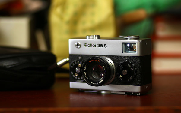
Now let's look at the second hero, the film camera Rollei 35S. This is the most compact professional film camera. It is called professional because it gives an excellent picture and is not buggy, I do not see other reasons. Initially, this series was developed specifically for the traveling English aristocracy who wants to shoot. In general, if Rollei is opened, there will be a feeling like looking at an expensive mechanical watch.

The first thing that catches your eye in this thing is the two disks on the front panel. Normal manufacturers did not do this, and since then such a solution has been met perhaps several more times.
Obviously, the engineers tried to fit the camera into the minimum dimensions, with the main factors of size being the film unit and the lens. Everything else was seen as a waste of space. At the same time, the priority was clearly about the fact that the camera should be controlled almost in the dark and so that without errors.

See the numbers on the disks on the side, on the ribs? This is the main display, because the user looks at the camera from above most of the time and sees exactly the edge of the disk. The left dial is the diaphragm control (extended from the lens), the right dial is the shutter speed. A memo on the photosensitivity of the film is installed on the front of the right disk (it is installed once when changing the film and fixedly fixed), on the right there is a memo on the type of film. This is a concern that I lacked in the same Kiev-60 for many years. And she could save a couple of films for sure. And in the instructions for one of the first Soviet mass cameras Fotokor-1, by the way, that’s what it says - you need photoblocks and a pencil. Do not forget.
So, the disks are exactly under the fingers, and, thanks to the obvious clicks, the control is very easy. And the clicks are hard and clear on the control of the diaphragm, and soft and quieter to control the shutter speed. It is impossible to confuse even at night. Considering that cameras of this class are used for very fast filming, this is just insane. Even on modern cameras showing these parameters directly in the optical viewfinder, I will not restrain myself and look at the figures. On Rollee never needed.
Then look at this box:

Here and hook for the finger, and aftermath, and a good indication. Most importantly, one of the common human mistakes is to re-lock the shutter when rewinding a film. Notice that the raised rewind flag excludes movement of the lever above the cocking gate. Just a physical limitation, just as obvious as a double solid 40 centimeters high. Usually, on the cameras of that time, it is simply drawn or marked in the instructions.
Let's take a look at the example of physical blocking, but made it softer. In the container of toothpicks there is a hole through which they crawl out. One must always know which side it is from.

Pay attention to plastic pimpochka in the middle of a slightly rounded upper surface. This design can stand upside down, but it will turn out obliquely and unstable. But as it should, a hole up - always smooth, because the bottom is even and without projections. Naturally, she wants to put only correctly. This is an example of a recommendation, not an error insurance.
Let's go back to Rolleu. Now look here:

Focusing wheel without frills - familiar on the lens itself from the front
The orange measure in the center of the exposure meter scale is the ex-pair I set on the front discs and taking into account the ISO / DIN memo amendment. If you have ever used the built-in light meters of other cameras from the same historical period, then you are starting to quietly drag on how it was done correctly. The white arrow is the current luminous flux (though not TTL, so the filter error remains). In the orange measure and in the extreme side, slots are made to prevent the arrow from hiding behind them - another little miracle that the quality metal in our cells always lacked (but here it should be noted that our metal was in the defense industry, but here the creators did not have material restrictions).
The shutter button is made exactly under the index finger and at the same time close to the center - when you press the camera, it is much harder to shake the camera than when you are at the side.

Downstairs is also incredibly beautiful and comfortable. There is also a hot shoe under the flash, located somewhat suddenly. By the way, I have repeatedly put modern Canon flashes there, and there were no jambs - the backward compatibility is a miracle as it has been well preserved over the centuries.
And finally - in this camera the lens retracts inside the case, almost resting on the film (for transportation). At the same time, readiness for shooting is about a second.
The lesson is simple - each object does one thing, no modal modes, the state of the camera is always clearly visible, what is inside the film, which frame, which exposure, how much light, where we shoot. Everything that cannot be done now is physically blocked.
In general, after comparing it becomes clear that there is still room for growth for hours. As a rationalization proposal, I would add a different behavior of the buttons in the combinations MODE + SELECT and SELECT + MODE (now the order is not important at the same time pressing) and would introduce three-second chord presses.
In addition to the unpredictability of the result, it would be worthwhile to work with the errors of the human input subsystem - it is worth adding a triple click, to separate the three-second and five-second presses (with a diametrically opposite result). To the heap to complicate the learning curve - to hell all the signatures, in the instruction - the numbering of the buttons instead of the names. And finally, you should definitely make special sequences like in Mortal Kombat. It would be cool, seriously.
Yes! Please tell us what was your coolest and most terrible in terms of circulation in the real world.
And here is the first , second and third interface parsing from the real world.

I'll tell you what blood it cost me. Well, immediately - the second champion, but this time on the friendliness of the engineering interface:
')

Let's start with the fact that we try to further deteriorate the interface of the clock above.
Hell
So, you have a clock with four buttons. You need to implement the setting of time, timer, alarm clock and something else like separate alarm clocks by day, selection of melodies and other features.

Let's try to make the most hellish interface in the world. In this formulation of the problem, we must begin by creating as many modes as possible in which the buttons behave differently. Unfortunately, here the platform throws us the first restriction - the upper right button is responsible for the backlight, and it can be used in hardware only for this. Alas, for the combinations there are only 3 buttons. That is, one button works exactly as it should. Heck. But let's not get upset, this failure is the only one on our way.
Now we will try to take the norms and start denying them. An important rule of good interface is the predictability of the result. So, the more modes for our watches, and the more differently the buttons behave in different ways, the better! The plan is this: let the user go crazy and break all the settings that have already been made, trying to translate time into the right time zone!
No, of course, there is an internal logic there, and I even managed to more or less understand it - but it took about 5 minutes to complete the experiments, because you need to repeat the action 2-3 times to understand that this combination makes it, and not something else with side effects. Plus, some combinations are not fundamentally tested - hello, alarm at 4:30 am.
In theory, this could stop, but let's go on the path of Microsoft. Why do only single clicks when there are still so many great ideas like double clicking? Depending on the model, there are long three-second presses on this watch for complete happiness.
But this is not enough to drive the user crazy. Let's add a register key function to each button! Double and triple simultaneous presses are exactly what we need on the watch. Opens a huge scope for quick combinations.
In theory, this is all that was supposed to be in the basic set, and as a result, you could set up hours of 10-15 minutes, but not 25. Where did the others go? Very simple. The fact is that the watch on the photo is a Chinese copy, not the original. And the Chinese added what their more European counterparts forgot. Specifically - weak buttons, which are sometimes pressed in the sleeve themselves (I twice rolled through the bushes and twice knocked down time, which the original would not have happened), plus a couple of debugging modes, from which you can exit only with a certain chord on the buttons. And woe to those who accidentally go there thanks to all the same bushes.
I wore a watch for two days and remembered it for the rest of my life. A quick googling suggested that I was not the only one who stumbled across incredible adventures with them. Here is a popular way to set the exact time:

Paradise
Now let's look at the second hero, the film camera Rollei 35S. This is the most compact professional film camera. It is called professional because it gives an excellent picture and is not buggy, I do not see other reasons. Initially, this series was developed specifically for the traveling English aristocracy who wants to shoot. In general, if Rollei is opened, there will be a feeling like looking at an expensive mechanical watch.

The first thing that catches your eye in this thing is the two disks on the front panel. Normal manufacturers did not do this, and since then such a solution has been met perhaps several more times.
Obviously, the engineers tried to fit the camera into the minimum dimensions, with the main factors of size being the film unit and the lens. Everything else was seen as a waste of space. At the same time, the priority was clearly about the fact that the camera should be controlled almost in the dark and so that without errors.

See the numbers on the disks on the side, on the ribs? This is the main display, because the user looks at the camera from above most of the time and sees exactly the edge of the disk. The left dial is the diaphragm control (extended from the lens), the right dial is the shutter speed. A memo on the photosensitivity of the film is installed on the front of the right disk (it is installed once when changing the film and fixedly fixed), on the right there is a memo on the type of film. This is a concern that I lacked in the same Kiev-60 for many years. And she could save a couple of films for sure. And in the instructions for one of the first Soviet mass cameras Fotokor-1, by the way, that’s what it says - you need photoblocks and a pencil. Do not forget.
So, the disks are exactly under the fingers, and, thanks to the obvious clicks, the control is very easy. And the clicks are hard and clear on the control of the diaphragm, and soft and quieter to control the shutter speed. It is impossible to confuse even at night. Considering that cameras of this class are used for very fast filming, this is just insane. Even on modern cameras showing these parameters directly in the optical viewfinder, I will not restrain myself and look at the figures. On Rollee never needed.
Then look at this box:

Here and hook for the finger, and aftermath, and a good indication. Most importantly, one of the common human mistakes is to re-lock the shutter when rewinding a film. Notice that the raised rewind flag excludes movement of the lever above the cocking gate. Just a physical limitation, just as obvious as a double solid 40 centimeters high. Usually, on the cameras of that time, it is simply drawn or marked in the instructions.
Let's take a look at the example of physical blocking, but made it softer. In the container of toothpicks there is a hole through which they crawl out. One must always know which side it is from.

Pay attention to plastic pimpochka in the middle of a slightly rounded upper surface. This design can stand upside down, but it will turn out obliquely and unstable. But as it should, a hole up - always smooth, because the bottom is even and without projections. Naturally, she wants to put only correctly. This is an example of a recommendation, not an error insurance.
Let's go back to Rolleu. Now look here:

Focusing wheel without frills - familiar on the lens itself from the front
The orange measure in the center of the exposure meter scale is the ex-pair I set on the front discs and taking into account the ISO / DIN memo amendment. If you have ever used the built-in light meters of other cameras from the same historical period, then you are starting to quietly drag on how it was done correctly. The white arrow is the current luminous flux (though not TTL, so the filter error remains). In the orange measure and in the extreme side, slots are made to prevent the arrow from hiding behind them - another little miracle that the quality metal in our cells always lacked (but here it should be noted that our metal was in the defense industry, but here the creators did not have material restrictions).
The shutter button is made exactly under the index finger and at the same time close to the center - when you press the camera, it is much harder to shake the camera than when you are at the side.

Downstairs is also incredibly beautiful and comfortable. There is also a hot shoe under the flash, located somewhat suddenly. By the way, I have repeatedly put modern Canon flashes there, and there were no jambs - the backward compatibility is a miracle as it has been well preserved over the centuries.
And finally - in this camera the lens retracts inside the case, almost resting on the film (for transportation). At the same time, readiness for shooting is about a second.
The lesson is simple - each object does one thing, no modal modes, the state of the camera is always clearly visible, what is inside the film, which frame, which exposure, how much light, where we shoot. Everything that cannot be done now is physically blocked.
Some more improvements to the clock
In general, after comparing it becomes clear that there is still room for growth for hours. As a rationalization proposal, I would add a different behavior of the buttons in the combinations MODE + SELECT and SELECT + MODE (now the order is not important at the same time pressing) and would introduce three-second chord presses.
In addition to the unpredictability of the result, it would be worthwhile to work with the errors of the human input subsystem - it is worth adding a triple click, to separate the three-second and five-second presses (with a diametrically opposite result). To the heap to complicate the learning curve - to hell all the signatures, in the instruction - the numbering of the buttons instead of the names. And finally, you should definitely make special sequences like in Mortal Kombat. It would be cool, seriously.
Yes! Please tell us what was your coolest and most terrible in terms of circulation in the real world.
And here is the first , second and third interface parsing from the real world.
Source: https://habr.com/ru/post/283530/
All Articles