How to design a mailing list that is not annoying: 10 simple tips
In our blog, we write a lot about creating emails and working with e-mail. We have already discussed the complexity of the fight against spam , the future of email, the protection of postal correspondence , and also considered the reasons why users unsubscribe from mailings.
Today we will continue the topic and talk about newsletter design. Creative Market Expert Laura Busche (Laura Busche) wrote a guide to designing mailings that will not annoy recipients. We present to your attention an adapted translation of this note.
')
A recent study by the American organization Principal Financial Group has shown that 40% of modern Internet users still prefer to receive information from various companies, be they retail stores, financial institutions, health centers, or insurance companies by email.
The MarketingSherpa organization detected an even more pronounced trend: according to the results of its research, the vast majority of adults in the US ( 72% ) prefer to communicate with companies via e-mail. The same study showed that 86% of adult users would like to receive letters with commercial offers on a monthly basis, and 61% - on a weekly basis.
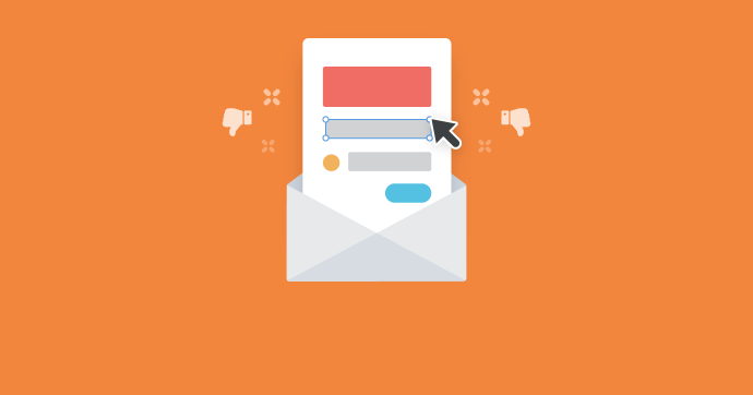
It is not surprising that companies pay so much attention to creating mailing lists. However, most of them are terrible - however, this can be corrected if you follow some simple tips.
01. Need to apply responsive design
This rule may seem obvious. However, only 34% of marketing professionals in the United States believe that their emails are really optimized for viewing on mobile devices.
Adaptive design does not mean that the image should “scale” properly when resizing the browser window - few of the users really need it. But the letter must adequately look on the screens of smartphones and tablets, which are used by most of the subscribers of the mailing list. Most of the platforms for creating mailings (like Pechkin) have preview functions.
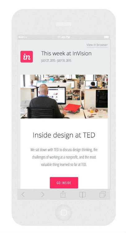
In the example below, you can see how a responsive letter from Invision is displayed on the smartphone screen:
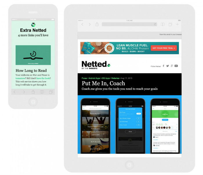
Netted is a daily newsletter from the Webbys team. Their letters are conveniently viewed from both smartphones and tablets. The following is what this email looks like on iPhone5 and iPad in portrait mode.
02. Accents must be placed correctly.
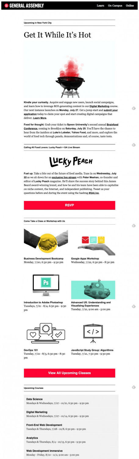
People browse letters fluently, which means they need to help subscribers see important message elements without any extra effort. Typography should be chosen to indicate different elements of the content of the letter, highlighting the most important points in a different font or changing the size or color of the typed text. The General Assembly’s weekly digest is a great example of properly placed accents.
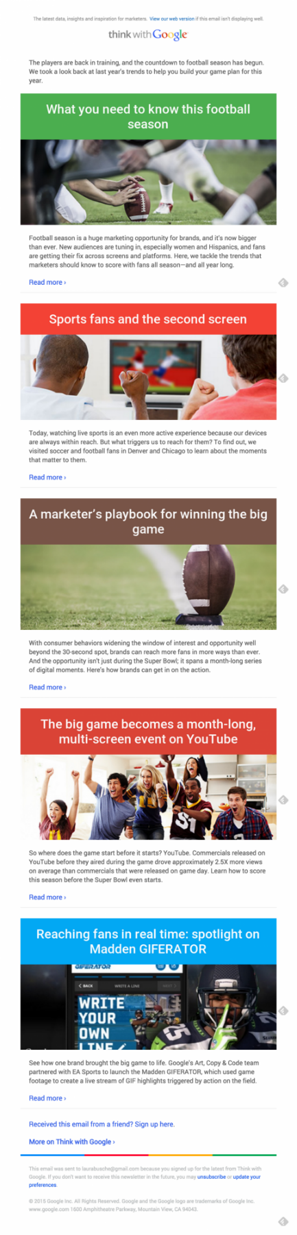
Recipients of the letter can immediately see the main headings and subheadings to find the information of interest. In its newsletter called Think With Google, the corporation shares with marketers useful information, tips and ideas for inspiration. In this example, article headings are highlighted in different colors. This simple technique allows subscribers to reduce the time spent reading letters:
At the same time, one should not forget about plain-text versions of letters . Despite the apparent limitations of the toolkit when working with them, you can also create a structure in which headers, calls to action, etc. will be clearly highlighted.
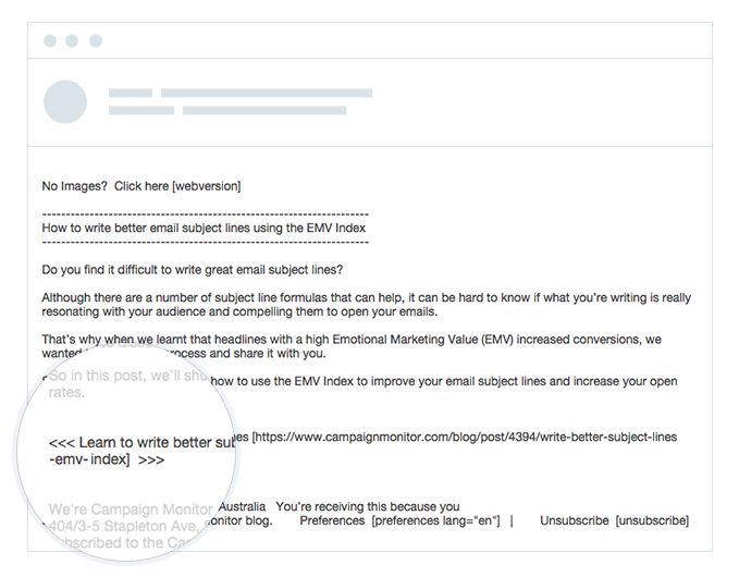
03. Subjects of letters are very important.
Many people in creative professions mistakenly believe that the whole essence of the design is to add bright colors and catchy graphics to the content of the site or letter. This belief is very far from the truth. Design (or design) is a holistic discipline that offers thoughtful solutions to our problems. “Design is not how the product looks and perceived. Design is how it works, ”said Steve Jobs. And the effectiveness of an e-mail is largely determined by its topic.
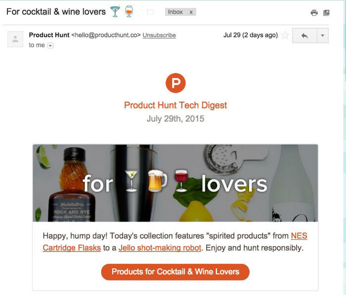
Nowadays, even in email, there are a certain number of ways to diversify the subject line of a letter — you should conduct your own research to find out how using emoji, reducing the length of phrases or speaking style affect communication. For example, The Product Hunt company very successfully uses Emodzhi in the headers of letters sent every day.
Keep is an online community of “trendsetters” who, in their newsletter, talk about the latest trends in the world of fashion, home decor and design. The letters from the Keep team are characterized by a conversational style that sets them apart from other letters in your inbox:

Keep We will dress you up. Welcome.
Keep What are we going to watch today?
Keep Today only shopping and sushi delivery.
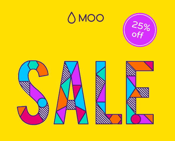
04. Sometimes it’s worth breaking the rules
As a rule, the only way to attract the attention of the consumer in a huge flow of information is to create something radical, unexpected and catchy. This GIF animation from Moo helps to win the subscriber’s location.
You can go even further - earlier in our blog we wrote about how to create background HTML5 video for email messages.
In order to profitably distinguish an email among a variety of uniform commercial offers, it can be made more personal. Writer and artist Austin Kleon (Austin Kleon) often adds handwritten messages to his newsletter, with the result that his subscriber number is steadily increasing. Is there something more personal than a handwritten letter?

05. Testing required
There is no universal formula for creating a mailing list that all potential subscribers will like. Each audience is unique in its preferences and needs, so the only effective way to optimize the design is testing. Millennials, for example, prefer minimalist fonts, while people aged 45-60 years (the so-called Baby Boomer generation in the USA) pay attention to a larger size? Here are some tests that will help you experiment with the design of emails:
- A / B testing allows you to check how effective alternative writing topics, text, or design elements are. Such a function should be in any popular email creation platform.
- The squint test (squint test) helps to make sure that the most important information in the letter is striking. More details about this testing can be found here .
- 5 second test. With this service , in just 5 seconds you can test the design of the letter. In fact, you, its creator, simply asks the respondents what information from the letter they memorized in 5 seconds. Respondents may be friends, future customers or colleagues.
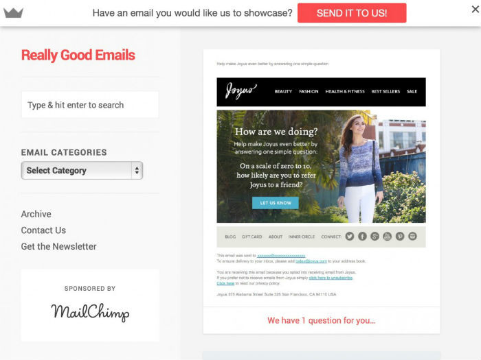
06. You need to constantly look for inspiration.
One of the most effective ways to improve your skills in something is to learn from the best. Sites like Really Good Emails and Mailchimp's inspiration page can work wonders with visual perception. Other great sources of inspiration include HTML Email Gallery and HTML Email Designs , where you can find email patterns and create your own based on them. Given that advanced techniques change every day, it is very important to always stay abreast of the latest trends.
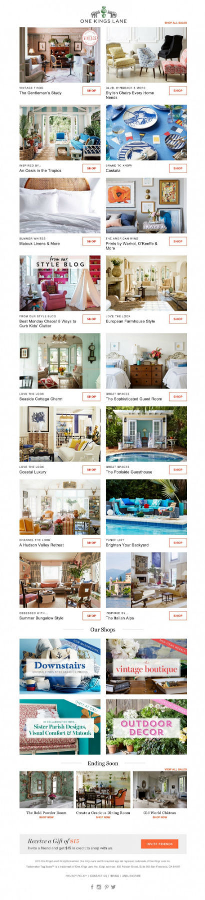
07. “Know the power of visualization”
In some cases, readable emails with illustrations may be very popular with subscribers. Online store home decor One Kings Lane sends subscribers a selection of photos of the interior with verified headings.
08. Structure is important for content.
The markup of the letter should be comfortable for reading it. Spaces and a clear division of text into blocks improve the perception of the content of the letter. When working on a template, you should make sure that these three sections are clearly demarcated:
- Headline
- Content
- Call to action
A newsletter from Surveymonkey is a great example of the proper structuring of content:

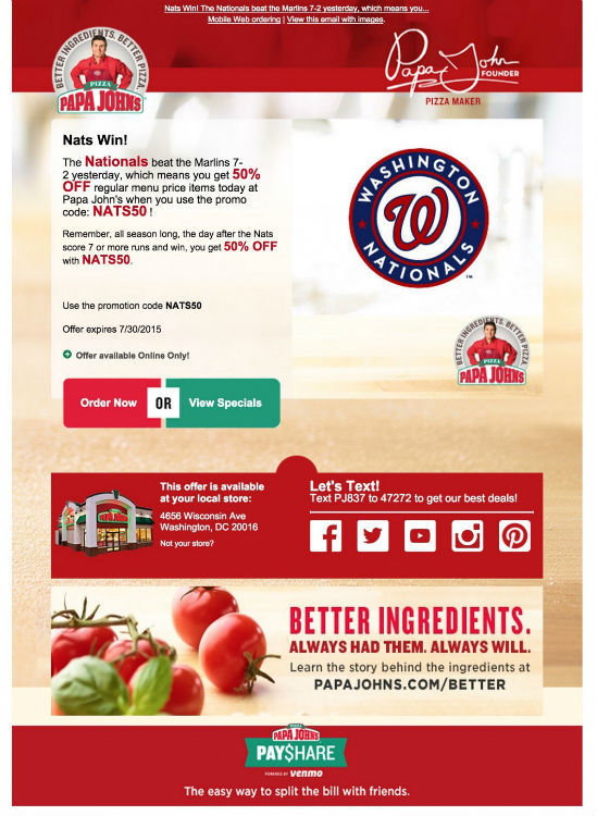
09. Call to action need to highlight
What is the ultimate goal of email? Does the company that sent it want to encourage its subscribers to perform some specific action? If so, then she should make sure that the call-to-action button stands out against the background and attracts the attention of the recipient of the letter.
Email marketers from 8Seconds suggest using testing to find out which is more advantageous to use in your mailing list - CTA buttons or simple links. Nevertheless, many experts advise to give preference to buttons rather than links, since they “more strongly induce the reader to action”.
In this email from Papa John's pizzeria chain, customers are attracted to two call-to-action buttons at once. Subscribers are invited to “Make an order” or “View special dishes”:
10. It is important to keep abreast of the latest news and approaches.
For the most efficient use of the e-mailing platform, you should subscribe to her blog - this will allow you to quickly find out about the emergence of new tools and features.
In addition, you should always analyze new tools and services, as well as get acquainted with the experience of other companies. To facilitate this task, we have compiled several useful collections:
Source: https://habr.com/ru/post/283388/
All Articles