Yandex Font - Yandex Sans
April 23, 2016 at Ya.Subbotnik for designers, we announced our own Yandex Sans font. We worked on it for two and a half years and are very happy to finally share the result. In this post I will talk about why we have conceived all this, how the work was done, what happened as a result and what will happen next. The post is written based on our story on Subbotnik.
Why bother thinking about the font at all?
Immediately I will apologize to the designers who are reading this post, as I will talk in some places about things that are obvious to us. There are a lot of nondesigners among readers, so I'll start from afar.
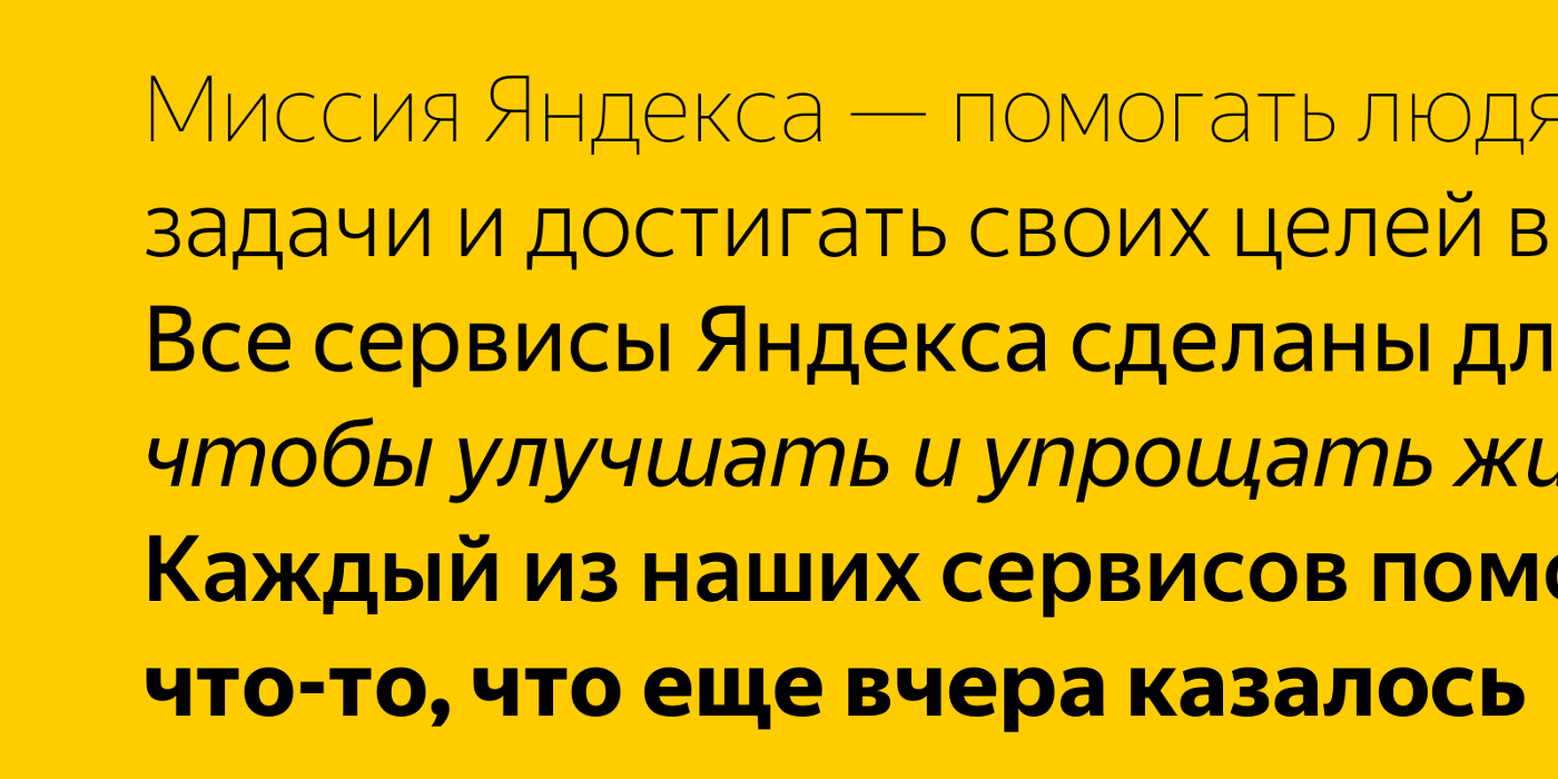
Font is one of the basic “voices” of graphic design, along with color, form, etc. Font influences how information perceived by it is typed. In John Maeda, in his lecture at TED, I saw a very visual way to demonstrate this. This is a story about form and content. Let's take some content and try, fixing it, change shape . Let our content be the well-known motto of Yandex - “there is everything”.
')
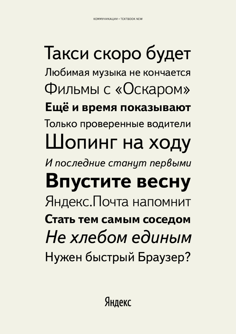
This is how it looks, typed by Bukvarna headset - the font that we use for communication:
That is what Yandex usually says. This is our message, uttered by our own voice.
* * *
And what if we used such a font for the same content?

Agree, it looks unconvincing. Hardly read. Too design. There are designers, hipsters and smoothies. But not all.
* * *
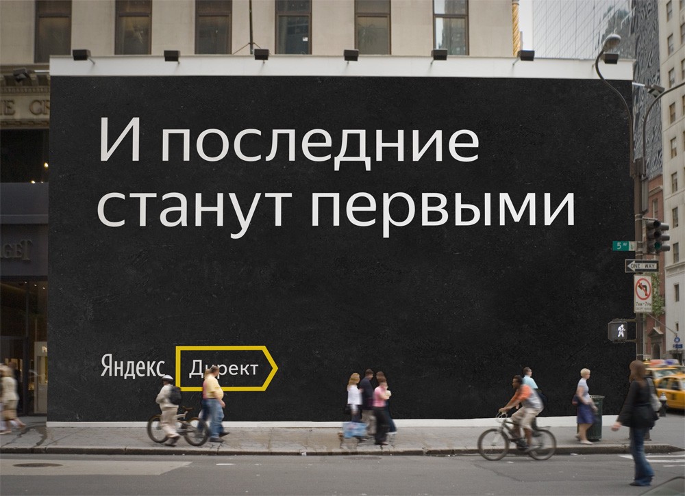
This is already a serious statement. This could be suitable for sales in "Auchan" or in "From hand to hand." Fly, buy!
* * *
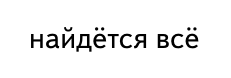
And if so?
This is some kind of lurkomore, and maybe even the bottom of the Internet. There are all the jokes, for free, without SMS.
* * *

This option is more like a wedding invitation. Or maybe on the menu in an expensive restaurant. There are all oysters, truffles and champagne.
* * *
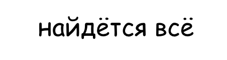
But you can and like this:
I think this is something like a gas station with a store. There is everything: omyvayka, keys with jacks, and you can eat inexpensively.
It turns out that the same content, enclosed in a different form, can convey a completely different meaning. That is why the task of choosing the right font is very important. The font should correctly emphasize the content, help it open without distorting.
What does Yandex say now?
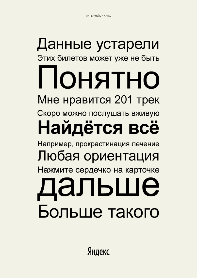
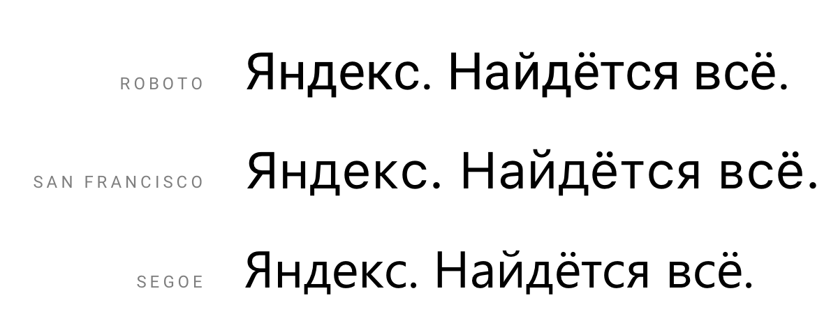
Taras Sharov, the head of the prototyping group for new products and one of the authors of the program of our School of Design , wrote down phrases for a month that somehow caught him in our products and communications. The result was a very clear selection of our language, our style and our voice. For example, typical representatives of our interface phrases typed by Arial:
By the way, Vlad Golovach said that, in his opinion, it is correct to call this font Ariel in Russian, since it was originally named in tune with the character of Shakespeare's The Tempest. But for the time being, with your permission, I will continue to write Arial.
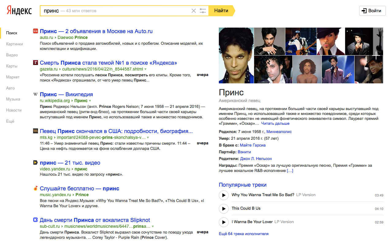
In general, Arial should be well known to the reader. And yes, it is this font that we use in our web interfaces today:
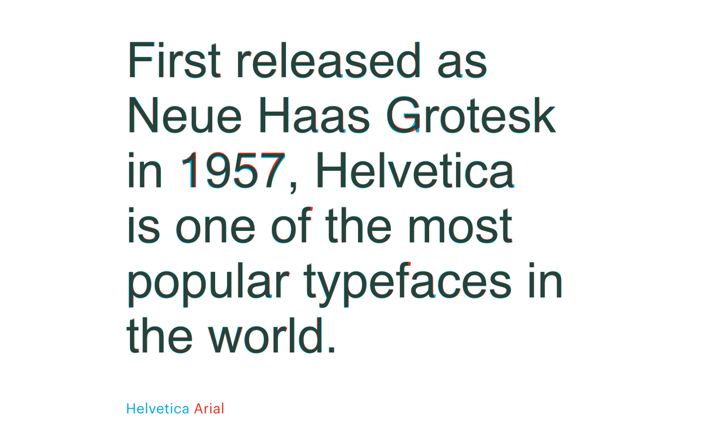
Why precisely Arial? Designers should be well aware of its history. Arial is based on the proportions and patterns of the letters Helvetica, one of the most famous and even iconic fonts of the 20th century. Helvetica appeared in 1957 under the name Neue Haas Grotesk. If for some reason you missed the movie Helvetica, be sure to watch at least this trailer (or better the whole movie, of course):
This is a headset that can be seen at almost any time, almost anywhere in the world. It is based on the visual language of countless brands. In short, a living classic.
When Microsoft in the 80s chose the font for their Windows operating system, for some reason they decided not to pay for the Helvetica license, and instead asked Monotype to make their own version of this headset for them. This is how Arial appeared - “Helvetica for the poor” according to the apt expression of one of our type designers. I will not delve into the comparison of Arial and Helvetica here. Anyone can easily make sure that they are really very close :
Slide of Christian Schwartz shows overlap of Arial and Helvetica
The undeniable advantage of Arial is its distribution area - it is preinstalled in almost every computer - and a huge set of characters containing letters of all imaginable alphabets and, in general, almost everything that you can think of: for example, the ruble sign. Otherwise, designers have always had a lot of questions to Arial:
- The proportions and pattern of letters in some places raise questions - especially in Cyrillic, many letters of which look frankly strange.
- There are no variations in saturation (i.e. the thickness of the lines of letters). Only normal and fat (separately there is still Arial Black). For modern interfaces this is not enough, we need different degrees of saturation, light thin outlines, bold, etc.
- Poor readability in small pins. Because of the closed pattern of letters in sizes below 12px, the characters begin to "stick together" and readability suffers. In Yandex web interfaces, we type the smallest inscriptions with an open Verdana, devoid of this drawback.
In addition to web interfaces, there are mobile interfaces. Yandex applications work on different platforms, which means that in part of the font we inherit the visual language of the platform:
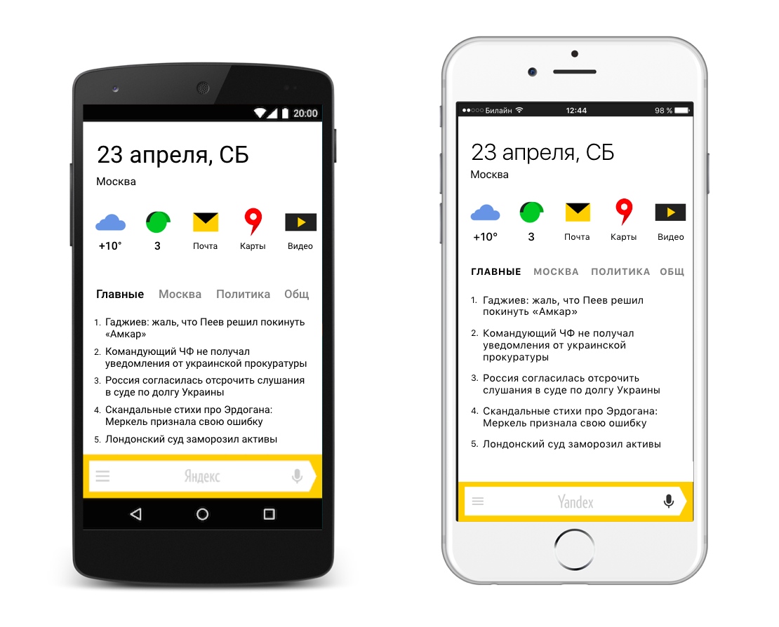
On Android, our “voice” turns out to be a rather cold-tech-engineering font of Roboto, in iOS the most neutral is San Francisco, in Windows it is the characteristic Segoe, to which Cyrillic alphabet there are many questions.
* * *
And how do Yandex advertising communications sound? The selection of Taras again shows the characteristic:
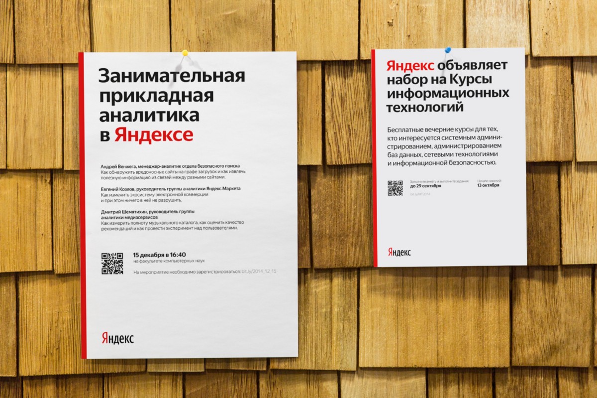
This is a Textbook New, also known as the Bukvarnaya headset, first developed in the USSR in 1958 by Elena Tsaregorodtseva at the Poligrafmash Scientific and Production Association for recruiting - indeed - primers and school textbooks. A kind font familiar to everyone whose childhood was spent in the Soviet (and a little post-Soviet) space. Own, dear. But somewhat strange for a modern high-tech company in the 21st century.
With this set of fonts we lived until the present moment, however, we felt its limitations for a long time. We felt that we were:
- insufficiently expressive and technical capabilities of Arial and Textbook;
- I want to have a voice in the world of other platforms.
All this has led to reflections on what should be the font of Yandex.
What should be the font of Yandex
We formulated the requirements for our font:
1. Font must have its own face, different from competitors
Competitors are, first of all, Roboto, San Francisco, Segoe - fonts of Google, Apple and Microsoft interfaces, respectively.
2. And at the same time be calm, neutral, not too characteristic
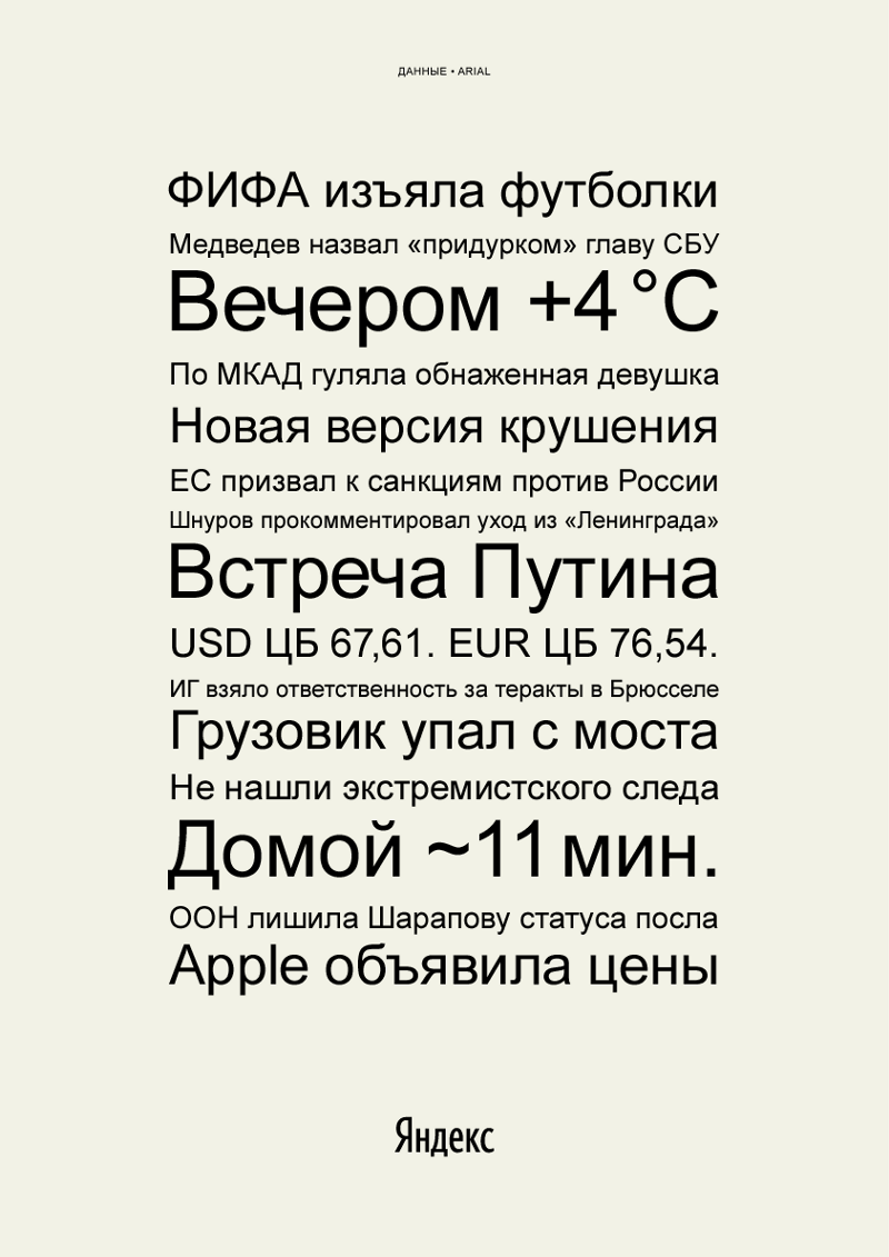
I'll tell you about neutrality in more detail. In addition to the interface and communication texts mentioned above, the main use of the font in Yandex products is to transmit information, news, data. Here are vivid examples of texts from this category:
One of our most important values has always been the lack of editorial policy. News is selected by algorithms, without human intervention. We are a mirror of the Internet, we reflect what is happening, without adding our own assessment, position or any kind of distortion. From this point of view, it is very important that the font also does not add any additional meanings, it is extremely neutral.
Curiously, this requirement is in some sense contrary to the previous one. We had to find a balance between maximum expressiveness and maximum neutrality.
3. Expressing our values
Neutrality is neutral, but there should be some face on the font. If you try to describe what emotions can be embedded in the font, we usually formulate something like this list:
- open,
- modern,
- smart,
- neutral,
- local,
- technological, but with a human face.
The last point is especially close to me. Although we are a modern high-tech company, our products have always been characterized by warmth and humanity. We are definitely not a soulless robot android.
4. Made primarily for Cyrillic dialing
As you know, most of the fonts are first created for the Latin, and only later they draw a Cyrillic version. Sometimes it turns out to be done more successfully, sometimes less. For us it was immediately very important that Yandex speak Russian without an accent. With regard to the font, this means that the Cyrillic alphabet should be created simultaneously with the Latin alphabet or even earlier.
And of course, the font should have all the symbols and letters we need that are used in the countries where we work: Russia, Ukraine, Belarus, Kazakhstan, Turkey, etc., a ruble sign, etc.
5. Very well readable, legible and applicable in all modern environments.
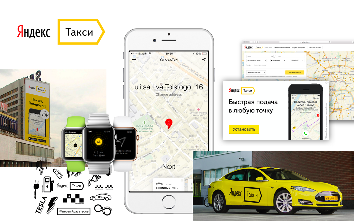
Yandex interfaces and communications are found in a wide variety of environments. Here, for example, some environments in which typography is found in Yandex. Taxi (this is far from a complete selection):
6. Matching the main metrics and proportions with Arial
This is a technical requirement important for web interfaces. When replacing the font from Arial to ours, the page layout should not disperse. It is also important that the font does not lose to Arial in capacity (that is, the number of characters in a line of medium width) so that the information in a block of text of a given size (for example, in the search results) is not less.
7. Having several degrees of saturation
That is, the thickness of the lines:
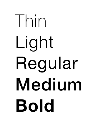
Now, even for web interfaces, there is just not enough “fat” and “non-fat”, we need gradations.
You could search for a ready-made font that would satisfy all these requirements. But then the voice of our brand would not be unique. And we would have to pay a lot for licenses, given the size of the audience of our products and the range of applications. We decided to order our own font.
Team
We needed a type designer with experience working on large markup systems. He was supposed to be Russian-speaking or to cooperate closely with the Russian-speaking designer.
Ira Voloshin, who started the project in Yandex, turned to Ilya Ruderman , who, in turn, recommended to connect Christian Schwartz .
As a result, we were very lucky to work on the font with Ilya and Christian with his Commercial Type studio.
* * *

Christian Schwartz in the world of font design is a real world superstar. He collaborated with the Font Bureau (they generally have a star cast, including, for example, Matthew Carter, the author of Verdana and Georgia fonts), and worked with Eric Shpikermann. Among his works are fonts for the American Esquire, Deutsche Bahn and a huge markup system for the British newspaper The Guardian, which received international awards. Christian was awarded the London Design Museum Award and was listed by Wallpaper magazine in the list of "40 Most Influential Designers Under 40".
* * *

Ilya Ruderman is one of the most famous Russian font designers, a teacher at the British Higher School of Design . Ilya studied font design at the Royal Academy of Arts in The Hague, and later many Russian font designers learned from him. Worked on markup systems for Posters and many other customers. What is very important, Ilya has been cooperating with Schwarz for a long time, together they have already made more than one font.
* * *
In a team with Christian and Ilya, Miguel Reyes worked as a lead designer, the designer of the New York office of the Commercial Type, who, like Ilya, studied font design in Holland.
Mark Record was engaged in Hinting and typewriting.
We were very lucky that we managed to assemble such a star team for the project.
From the Yandex side, a lot of great people worked on different types at different stages. The project began Irina Voloshina. More than actively participated Taras Sharov, whom I mentioned in this post, Danil kovchiy Kovchiy and Sergey Fedorov, Stas plkv Polyakov, Ivan Semus Semenov, Andrei karmatsky Karmatsky, Misha Milnikov, Roma Iskandarov, Andrei Los, Nastya Larkina, Serezha 3apa3a Tomilov, Nikita Brovikov, Dima Sereda, Sasha Volodin and many, many others. An infinite number of times an infinite number of designers sent edits, comments and suggestions. I would very much like to thank everyone, and I’m very afraid of someone to forget, so I will not list everyone.
How to work on the font
I will tell here very, very briefly and only about the main milestones of the work. For two and a half years, there was a lot of things, and the post, it seems, is already too long. Ilya and Christian in the near future are going to write their posts, in which there will certainly be more details about the process.
After studying the brief and a large number of layouts of our interfaces and communications, the designers suggested two areas with the conditional names Flat and Round.
Flat - more contrast and sharper, characteristic:
Round - more friendly and soft:
After trying on interface and communication mockups, as well as after comparative tests, the undisputed winner was Round.
The font, however, still looked rather "prickly", so in the following versions the endings of the strokes were softened:

<img src = " cdn-images-1.medium.com/max
 /800/1*XWqkkUy888GRSMI2NsgD_Q.png "alt =" image "/>
From the very beginning we had two versions of the font in our work: Text and Display:
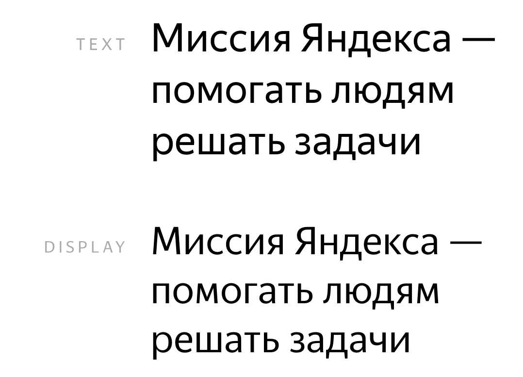
After seeing the word Display, you might think that this version is designed for screens, but it is not. In typography, Text is used for the main set, small pins, and Display - for large, for example, for headings. You can see that the letters Display more characteristic, frilly.
In italics, we went through a large number of variations of individual characters. For a long time they could not choose the form of the letters r, d, e, i, i, t, c, h, w, i, f . In the end, after countless samples, they stopped at this option:
The font was tested again and again, but still seemed to us not soft enough and kind. He certainly looked modern, but he lacked the warmth and humanity inherent, for example, Bukvarnoy. Having tried a large number of variations in proportions and endings of strokes, we got a kinder version, which was taken as a basis:
In parallel, all the time there was an endless amount of technical work, the selection of kerning pairs, hinting, work on several styles:
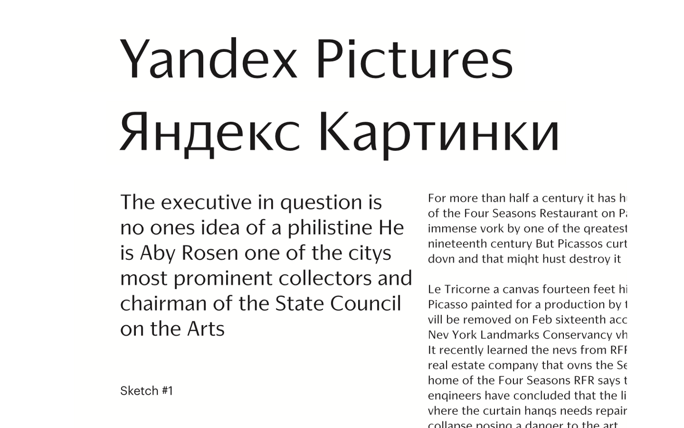
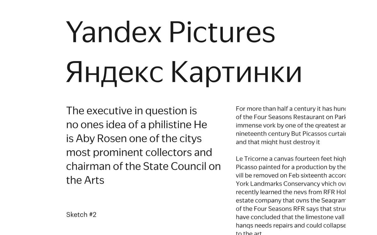
What happened as a result
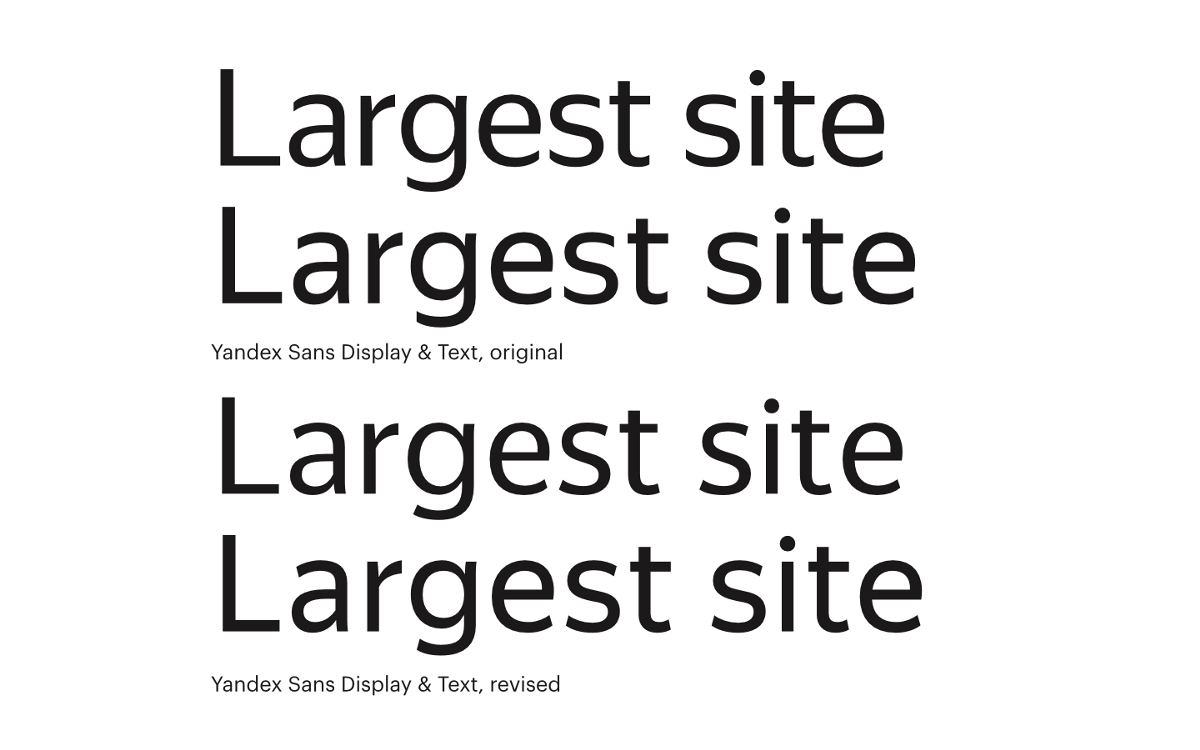
The final (today) version of the Yandex Sans font looks like this:
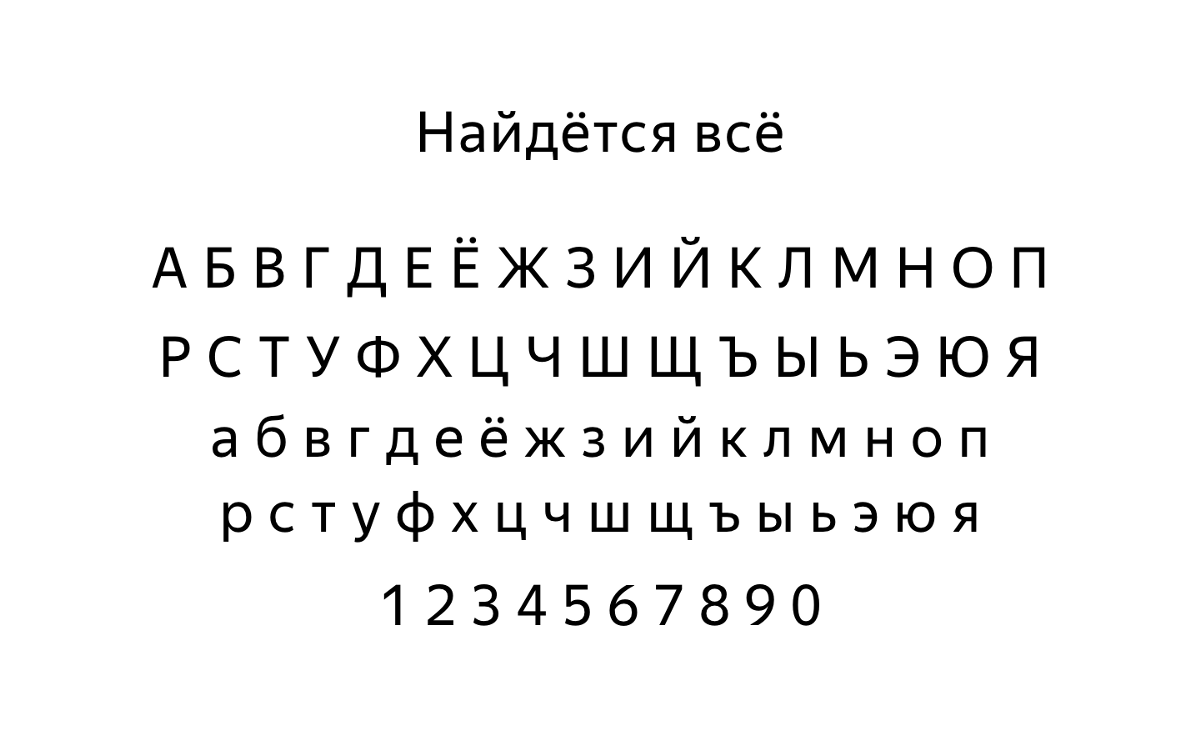
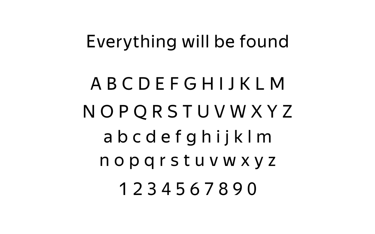
It seems to me that we managed to solve the main task - to make a modern neutral font that is different from the main competitors and rather accurately conveys the image of Yandex and the “voice” of our brand.
And this is how the font fitting in the natural environment looks like:
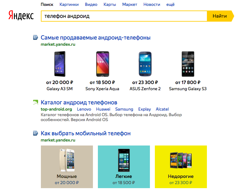
Yandex Sans in the search results layout. The author - Danya Kovchy
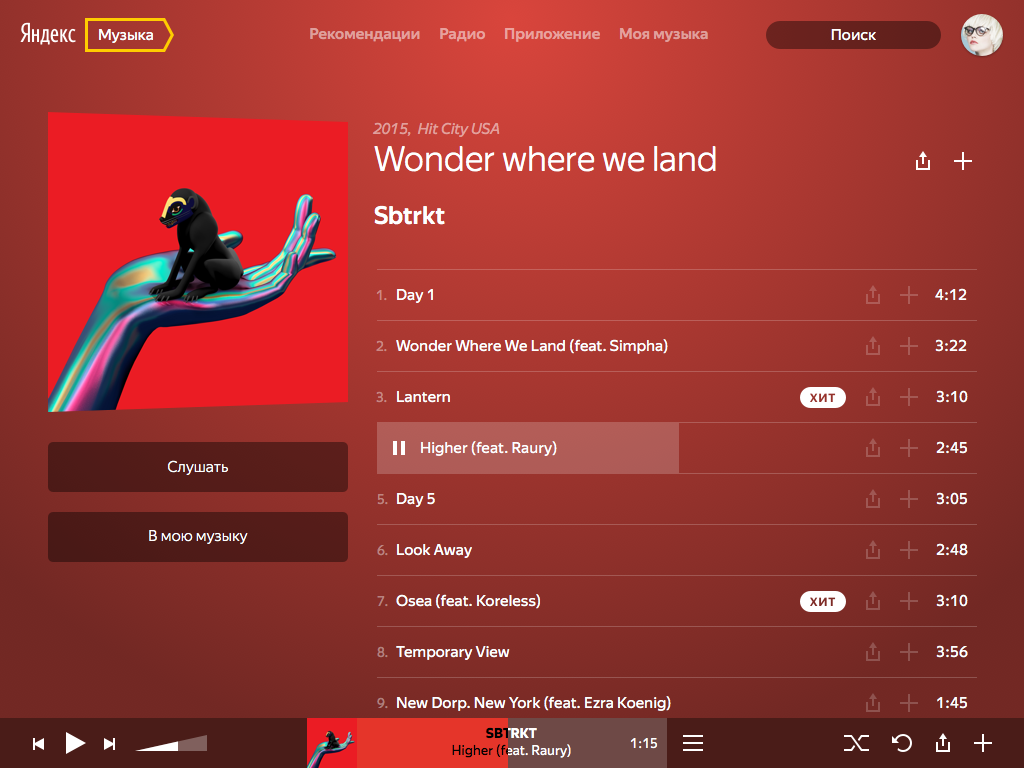
Yandex.Music interface concept with a new font. The author - Danya Kovchy
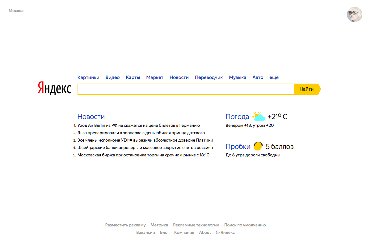
The concept of the main page of Yandex with a new font. The author - Danya Kovchy


Right now we are already using a new font in the interface of our Launcher on Android and on the Company page:
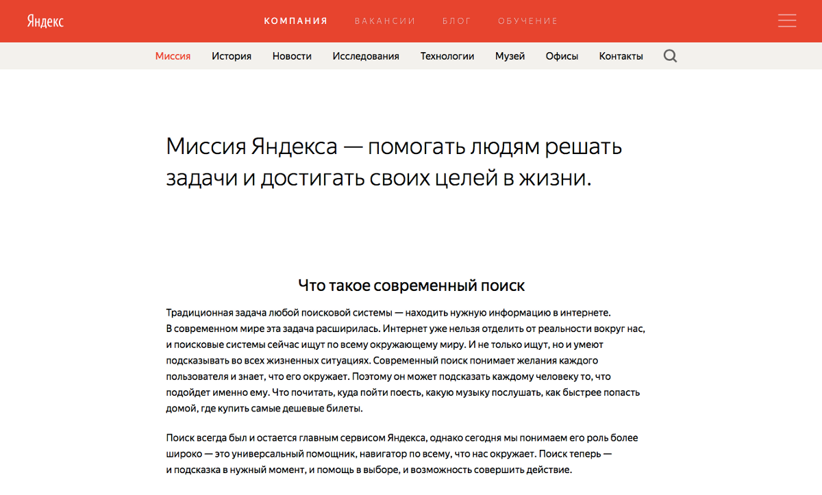
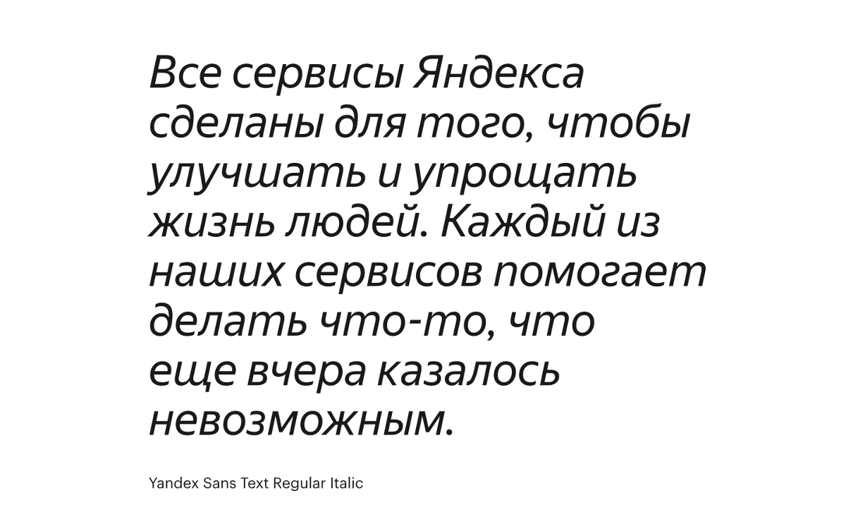
Now, Yandex’s mission and company history can be read with our “voice” - our new font.
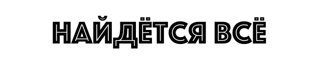
And here are the examples of phrases from the beginning of the post, typed by Yandex Sans:
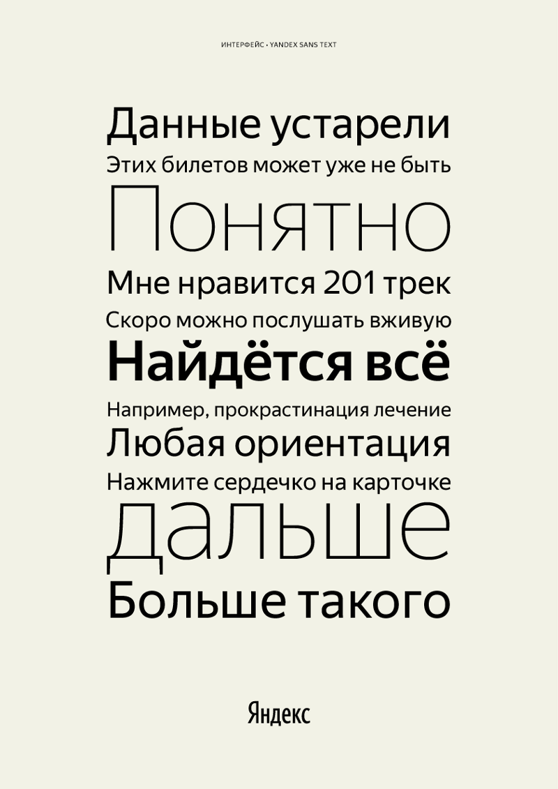

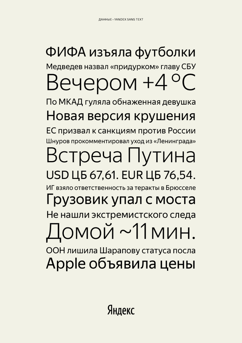
It also shows that the font manages to be quite recognizable and distinctive, while remaining neutral at the same time and without adding additional meaning to the text without distorting the source material.
What's next
Many people ask if we plan to put a new font in open access. Now we are not planning this. Yandex Sans is the voice of our brand, the same as the Yandex logo. Therefore, it will be used only in our products and communications. Apple and Google distribute their fonts openly so that iOS and Android application developers can use them. We have no such task right now, so we don’t plan to give the font out.
Ahead we have the most interesting. As you know, with the launch of the product work on it is just beginning. We have yet to truly test Yandex Sans in products. And if in communications it will start to appear very soon, then on the main page of Yandex or in the search results Yandex Sans is definitely not worth waiting for in the near future. However, a start has been made, and this, I think, is the most important thing.
Source: https://habr.com/ru/post/282534/
All Articles