Qt Quick Controls 2 - have been waiting for the promised three years
 This is exactly how much has passed since Qt Quick 2 was released and a new development strategy was announced aimed at supporting mobile platforms.
The technology was growing up, the developers were treating children's diseases, but for complete happiness there were three things missing:
- Proper scaling on high DPI screens
- Smartphone-Specific Components
- Flexible styling of available components
The scaling was solved quite simply: we calculate the pixel density, write it to the global constant, and multiply all the dimensions by the necessary coefficient.
')
The lack of components was also easy, but time consuming: with bicycles . It should be noted that in recent times several decent user sets have appeared, under Android , Material , iOS . It's still a mystery to me why Digia, with all its focus on mobile phones, released the first version of the controls for desktop platforms, where widgets feel good.
A year and a half ago, a standard style imitating Android 4.x appeared - this did not save the situation. Styling in Qt Quick Controls 1 is not flexible enough, in general, again bicycles, since they are written quite simply, and almost everything needed is already written in the previous paragraph.
In general, up to 5.6 * there was sadness, and now there is a holiday on our street
* In Qt 5.6, new controls are presented as a technology preview under the name Qt Labs Controls, they will fully launch in the upcoming release of 5.7, which they promise in June.
Everything changed drastically, the guys took and rewrote all the components from scratch. Added missing, such as Navigation Drawer, Tabs view, Picker etc. Scaling on High DPI screens was also rewritten.
It was
For example, this is how the button worked before:

Button structure in Qt Quick Controls 1
It is written in QML, one can see Loaders mountain, timers, some things are needed only for specific items such as a drop-down menu of a button or tooltips. Let's face it, this functionality is used on mobile and embedded devices a little less than never, and resources are spent constantly.
It became

Button structure in Qt Quick Controls 2
Cool, right? The API remains almost the same, the event capture was carried out in C ++, some stylization classes were thrown out, instead of them you can insert anything as a background and an inscription. Due to this, resource consumption is dramatically reduced, stylization flexibility is increased.

Comparison of component creation times
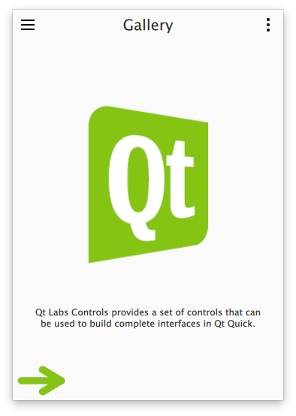
The gallery application runs almost instantly, which is good.
Stylization
Today, Material styles for Android and Universal for Windows Phone are available from the box. More precisely, we can use any style on any platform, they are just close to their relatives. To change the style, just restart the application. You can copy the style folder and make your own based on it. You can make your own, for this purpose, a library of component templates has been written, in which each component already has an API, internal states, but no elements to display.
Button from the default style:
import QtQuick 2.6 import Qt.labs.templates 1.0 as T T.Button { id: control implicitWidth: Math.max(background ? background.implicitWidth : 0, label ? label.implicitWidth + leftPadding + rightPadding : 0) implicitHeight: Math.max(background ? background.implicitHeight : 0, label ? label.implicitHeight + topPadding + bottomPadding : 0) baselineOffset: label ? label.y + label.baselineOffset : 0 padding: 6 leftPadding: 8 rightPadding: 8 label: Text { x: control.leftPadding y: control.topPadding width: control.availableWidth height: control.availableHeight text: control.text font: control.font opacity: enabled || highlighted ? 1 : 0.3 color: control.highlighted ? "#ffffff" : (control.pressed ? "#26282a" : "#353637") horizontalAlignment: Text.AlignHCenter verticalAlignment: Text.AlignVCenter elide: Text.ElideRight } background: Rectangle { implicitWidth: 100 implicitHeight: 40 opacity: enabled ? 1 : 0.3 color: control.pressed ? (control.highlighted ? "#585a5c" : "#e4e4e4") : (control.highlighted ? "#353637" : "#f6f6f6") border.color: control.pressed ? "#26282a" : "#353637" } } A good video with a more detailed explanation:
Presentation from Qt World Summit 2015
Of the minuses, you can remember:
- Style for iOS so far only in the plans
- Styles for desktop operating systems are available only in Qt Quick Controls 1 (remain in delivery)
- Tables and tree structures are also only in Qt Quick Controls 1
Sources:
Table of Contents: doc.qt.io/qt-5/qtlabscontrols-index.html
Information on control templates: doc.qt.io/qt-5/qtlabstemplates-index.html
Sources, you can see examples of styles: github.com/qtproject/qtquickcontrols2
Differences and Porting Tips : doc.qt.io/qt-5/qtlabscontrols-differences.html
Standard example-gallery of controls: doc.qt.io/qt-5/qtlabscontrols-gallery-example.html
Source: https://habr.com/ru/post/282505/
All Articles