Yandex has developed a corporate font

At the conference “J.Subbotnik for Designers”, Yandex company presented its own font called Yandex Sans. This universal font will now be used in Yandex services and applications. How widely it will be used, the company has not yet decided.
The reasons for developing your own font "Yandex" explained in the presentation . First, competitors also have their own fonts, so I want to "have my voice." Designers said that they lack the capabilities of Arial and Textbook. Secondly, it saves finances: it is wiser to invest in your font than pay for licenses.
The basic principles that are taken into account when developing a new font.
')
The font should be:
- Having their face
- Calm, neutral
- Expressing our values
- Immediately made for Cyrillic
- Applicable in all environments
- Having a degree of saturation
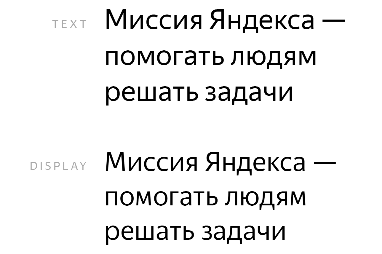
- Matching metrics with Arial
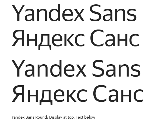
So came Yandex Sans.


 To design the font hired one of the most famous font designers in the world, Christian Schwartz (Christian Schwartz).
 Together with him worked one of the most famous Russian specialists in this field - Ilya Ruderman, he has long collaborated with Schwartz, made font systems for Afisha and many other publications, teaches at the British Higher School of Design.
The developers have tried to correct the shortcomings of the usual Arial, which has a bad Cyrillic alphabet and not always the letters have the optimal outlines: “Many of its proportions, shapes and details are strange”. In addition, Arial is "hopeless in terms of branding."
On the other hand, the Textbook is not bad, but a bit old-fashioned and not suitable for use in interfaces.
After the redesign of yandex.ru with a new font, the best readability and a cleaner look of the page are immediately noticeable.
Old design

New design

At the same time developed new icons.


In the presentation, Christian Schwartz and Ilya Ruderman tell how they optimized the font. For example, made less aggressive ends in Yandex Sans Round.

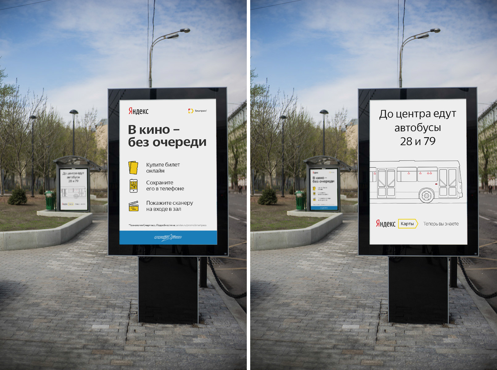
Now everyone from millions of Yandex users can evaluate the work of designers, and not only they, because new fonts are even used in outdoor advertising.
“Yandex Sans font, on the one hand, meets all technical requirements - it is well read, legible and suitable for use in any environment, be it a web, a smartphone, a clock or outdoor advertising. On the other hand, it expresses our values: openness, manufacturability with a human face. It is modern, neutral and recognizable enough, ” said Konstantin Gorsky, head of the design department at Yandex. “Font testing is still coming, so it’s too early to talk about how widely we will use it.”


UPD. Post on the official Yandex blog
Source: https://habr.com/ru/post/282471/
All Articles