Free selection of 40 CSS effects
The post contains a selection of various effects and animations CSS, which can be useful in the work, and also eliminate the need to constantly resort to JavaScript. Perhaps the examples are not the newest and unusual, but in my opinion, useful.
This clock is created using one of the main CSS3 tools - rotate and with the connection of the jQuery library.
')
More classic, analog clocks. They are created using webkit transition and transform CSS properties. But in order to match the current time, you need JavaScript.
Rotation and movement around the sides of the cube will be performed using the standard up, down, left and right keys. The 3D figure itself is built using webkit-perspective, -webkit-transform and -webkit-transition.

There are already several 3D cubes using CSS3 and directly the transform and transition properties. Hovering a cube makes it move aside, revealing text that is on the other side of the shape.
The effect of the “accordion menu” on pure CSS, where clicking on each of the lines opens an additional window in the body of the list itself. Own animation in WebKit based browsers.
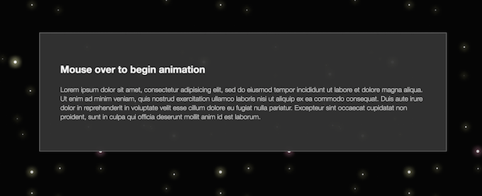
This is an animated automatic parallax scrolling using CSS transitions based on WebKit. When you hover over a text box, the stars in the background begin to move smoothly to the side. It creates the effect of flight.
The cult film "The Matrix" - one of the best fantastic motion pictures. The example shows how to recreate about the same amazing animation (black screen with running numbers) in CSS3.

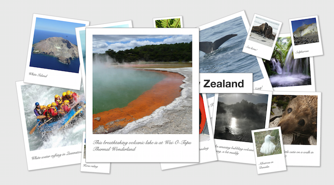
This example provides a detailed description of creating animated photos based on CSS3 commands. When you click on the image, it is enlarged and brought to the fore.
In this example, the pictures simply increase when you hover. Uncomplicated, but sometimes very useful effect.
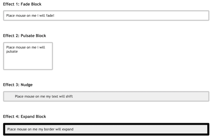
As an alternative to JavaScript, there are seven effects on CSS3 suggested in the post: various blocks that rotate, disappear, exit, grow, etc.
The post describes how to create a rotating plate. Rotation speed can be adjusted directly on the screen.
Vinyl slip effects are created using CSS3 and HTML transitions. This animation animates the web page, adds originality to the standard album cover, etc.

When you hover the cursor over the image, it can move to the side, spin, decrease, from square to round, to become blurry ... In short, the pictures will change their properties in every way.
When you click on the triangle, it starts to rotate.

Whole outer space fit into CSS. It is an example of the imposition of rotating layers (more noticeable when reducing the image scale in the browser).
The interesting effect of CSS, with which Diego Velasquez's Meninas, a famous painting, begins to appear three-dimensional.
At the bottom of the screen is a set of basic icons of Mac OS X, which increase when hovering. The effect makes the site dynamic.
CSS3 effects and Drop-In Modals properties will help in creating quick, animated and easy modal modal windows.

The transformation changes the appearance of the element in the browser. Shown on the example of a rocket that “flies” from one end of the screen to the other. Move, rotate, etc. tools can be used.

The color clock is based on jQuery and CSS3. A similar effect will have to happen in the context of waiting for the completion of any competition, voting, and the like.
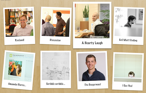
This is a great gallery that allows you to sort and decompose images in a selective order. For interactivity, the gallery uses jQuery, jQuery UI and jQuery plugin FancyBox. Lightbox supports the name and description of pictures, groups them and automatically aligns the slides in a row.
Increase thumbnail previews. Thus, when you click the menu increases proportionally.
This example is a dynamic set of cards using HTML and CSS3 functions.
The pull-out menu from the example is created by combining CSS3 and jQuery. When you hover on the picture a pop-up window appears with the text.
In the example, hovering the mouse over the tab headings is followed by changing the list below.
The example shows how to create a Fisheye menu using CSS and SVG animation. As an added bonus, a demo SVG is used in the IMG tag.

This type provides a very convenient navigation through the main menu, thanks to the use of CSS3 transitions.

Famous captions from Star Wars. To run them will be enough HTML and CSS.
Again, hovering icons.

There are several options for demonstration.
In the first example, to ensure a frame shift, you must click on the image. Each click is one movement. Frames are repeated, a certain obsession is created.
In the second example, to change the frame is enough to hold the cursor over the image. Accordingly, the speed of the animation will depend on the speed of movement of the mouse.
Once again, Star Wars - this AT-AT moving walker is made using CSS3.
When you click on a row, the table is expanded.
When you hover the sections change color and slide out.

Indicative selection of a variety of formations of effects. Just click on the keys "magic", "swap", etc. to demonstrate the effect.
Animation progress bar on CSS.

The example shows how to create a salute from circles on jQuery and CSS.
The example shows how to create an animated on / off button with CSS.
An example of an original multi-colored CSS loading animation.

40. Drop-down menu
Another simple and nice CSS drop-down menu.

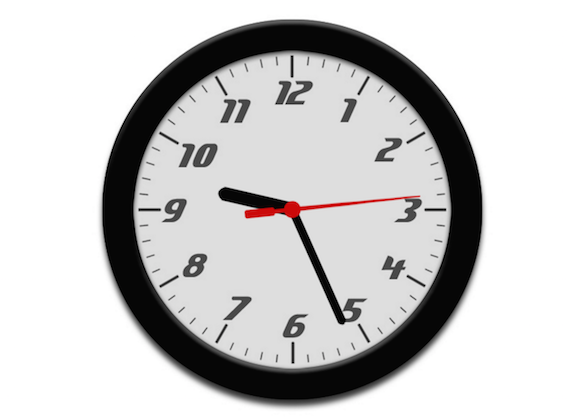
1. CSS3 Clock with jQuery
This clock is created using one of the main CSS3 tools - rotate and with the connection of the jQuery library.
')
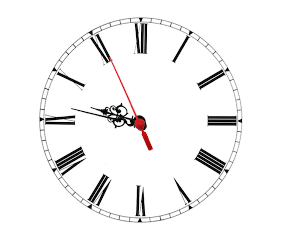
2. Analog CSS Clock
More classic, analog clocks. They are created using webkit transition and transform CSS properties. But in order to match the current time, you need JavaScript.
3. Rotating 3D cube
Rotation and movement around the sides of the cube will be performed using the standard up, down, left and right keys. The 3D figure itself is built using webkit-perspective, -webkit-transform and -webkit-transition.
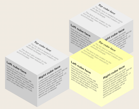
4. Several retractable 3D cubes
There are already several 3D cubes using CSS3 and directly the transform and transition properties. Hovering a cube makes it move aside, revealing text that is on the other side of the shape.
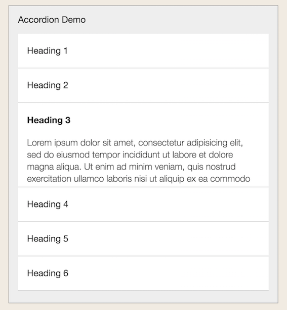
5. Accordion menu
The effect of the “accordion menu” on pure CSS, where clicking on each of the lines opens an additional window in the body of the list itself. Own animation in WebKit based browsers.
6. Parallax scrolling on CSS
This is an animated automatic parallax scrolling using CSS transitions based on WebKit. When you hover over a text box, the stars in the background begin to move smoothly to the side. It creates the effect of flight.
7. Matrix
The cult film "The Matrix" - one of the best fantastic motion pictures. The example shows how to recreate about the same amazing animation (black screen with running numbers) in CSS3.
8. Dynamic Palaroids
This example provides a detailed description of creating animated photos based on CSS3 commands. When you click on the image, it is enlarged and brought to the fore.
9. Image scaling
In this example, the pictures simply increase when you hover. Uncomplicated, but sometimes very useful effect.
10. JavaScript Effects on CSS3
As an alternative to JavaScript, there are seven effects on CSS3 suggested in the post: various blocks that rotate, disappear, exit, grow, etc.
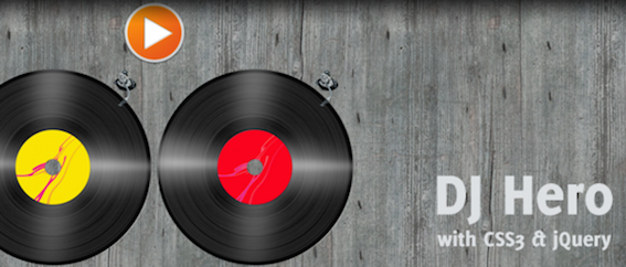
11. Virtual Records DJ Hero
The post describes how to create a rotating plate. Rotation speed can be adjusted directly on the screen.
12. Sliding vinyl
Vinyl slip effects are created using CSS3 and HTML transitions. This animation animates the web page, adds originality to the standard album cover, etc.
13. Effects when you hover on the picture
When you hover the cursor over the image, it can move to the side, spin, decrease, from square to round, to become blurry ... In short, the pictures will change their properties in every way.
14. Rotating triangle
When you click on the triangle, it starts to rotate.
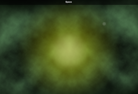
15. Cosmos
Whole outer space fit into CSS. It is an example of the imposition of rotating layers (more noticeable when reducing the image scale in the browser).
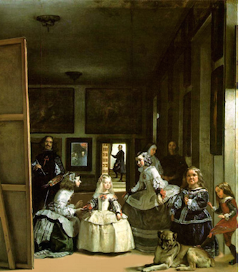
16. "Menin" in 3D
The interesting effect of CSS, with which Diego Velasquez's Meninas, a famous painting, begins to appear three-dimensional.
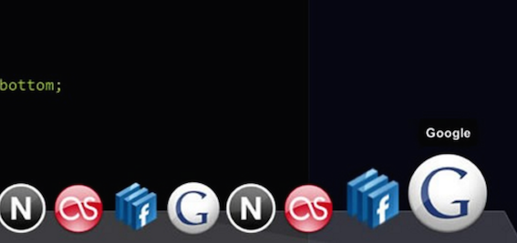
17. CSS for Mac OS X
At the bottom of the screen is a set of basic icons of Mac OS X, which increase when hovering. The effect makes the site dynamic.
18. Drop-In Modals
CSS3 effects and Drop-In Modals properties will help in creating quick, animated and easy modal modal windows.
19. Animation of objects
The transformation changes the appearance of the element in the browser. Shown on the example of a rocket that “flies” from one end of the screen to the other. Move, rotate, etc. tools can be used.
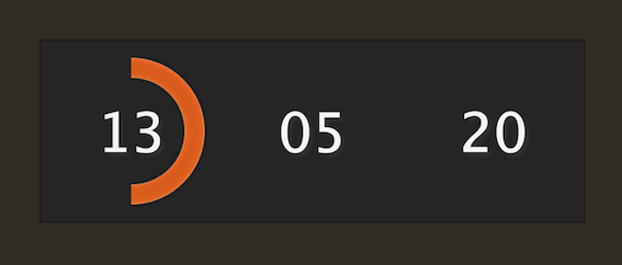
20. Colored clock
The color clock is based on jQuery and CSS3. A similar effect will have to happen in the context of waiting for the completion of any competition, voting, and the like.
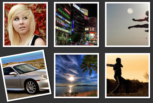
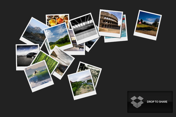
21. Geler Lightbox on jQuery and CSS3
This is a great gallery that allows you to sort and decompose images in a selective order. For interactivity, the gallery uses jQuery, jQuery UI and jQuery plugin FancyBox. Lightbox supports the name and description of pictures, groups them and automatically aligns the slides in a row.
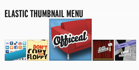
22. "Elastic" previews
Increase thumbnail previews. Thus, when you click the menu increases proportionally.
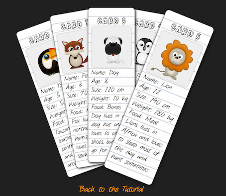
23. Dynamic cards
This example is a dynamic set of cards using HTML and CSS3 functions.
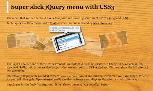
24. Retractable jQuery menu
The pull-out menu from the example is created by combining CSS3 and jQuery. When you hover on the picture a pop-up window appears with the text.
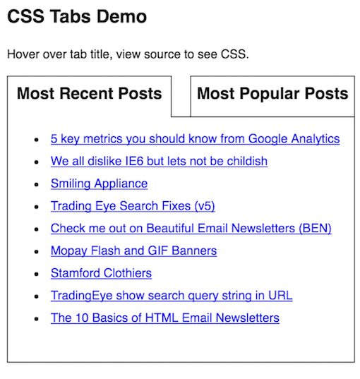
25. CSS tabs
In the example, hovering the mouse over the tab headings is followed by changing the list below.
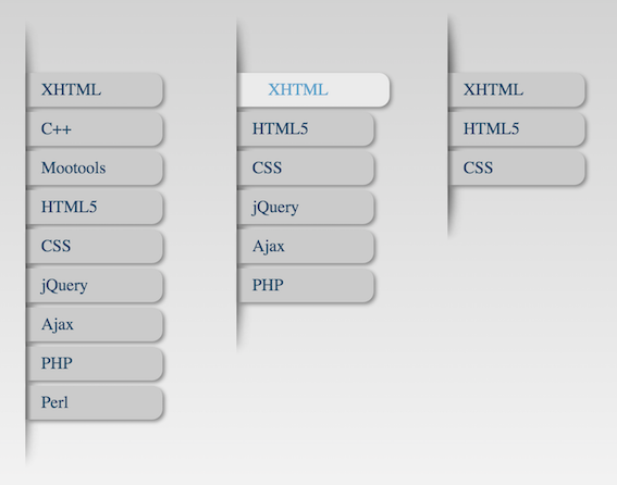
26. Fisheye menu
The example shows how to create a Fisheye menu using CSS and SVG animation. As an added bonus, a demo SVG is used in the IMG tag.
27. Drop-down menu
This type provides a very convenient navigation through the main menu, thanks to the use of CSS3 transitions.
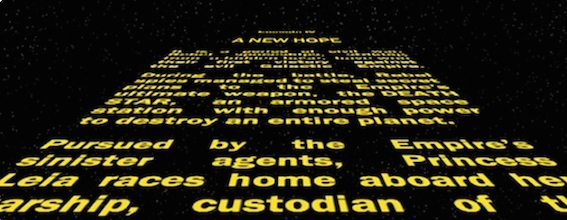
28. Titles from Star Wars
Famous captions from Star Wars. To run them will be enough HTML and CSS.
29. More CSS Fisheye Effects
Again, hovering icons.
30. Animation of the type "frame by frame"
There are several options for demonstration.
In the first example, to ensure a frame shift, you must click on the image. Each click is one movement. Frames are repeated, a certain obsession is created.
In the second example, to change the frame is enough to hold the cursor over the image. Accordingly, the speed of the animation will depend on the speed of movement of the mouse.
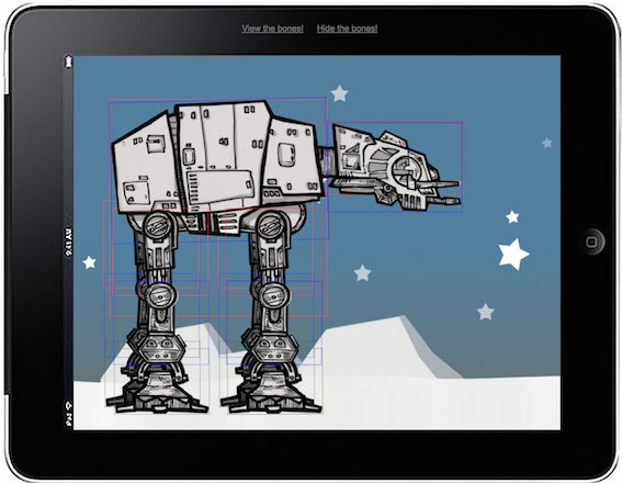
31. Imperial AT-AT Walker
Once again, Star Wars - this AT-AT moving walker is made using CSS3.
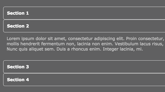
32. Another CSS accordion
When you click on a row, the table is expanded.
33. Simple pull-down menu
When you hover the sections change color and slide out.
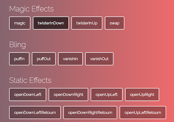
34. Magical animation effects in CSS
Indicative selection of a variety of formations of effects. Just click on the keys "magic", "swap", etc. to demonstrate the effect.
35. Bookmarks menu
36. Progress Bar
Animation progress bar on CSS.
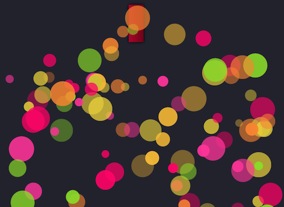
37. Salute CSS
The example shows how to create a salute from circles on jQuery and CSS.
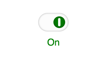
38. On / Off Switch
The example shows how to create an animated on / off button with CSS.
39. Color Download
An example of an original multi-colored CSS loading animation.
40. Drop-down menu
Another simple and nice CSS drop-down menu.
Source: https://habr.com/ru/post/282461/
All Articles