9 secrets of online payments. Part 4: the correct payment form - the key to successful payment
 The payment form is the final step when making an online payment, and nothing should prevent the buyer from taking this step. In the new release of the series “9 secrets of online payments” we will tell you what the payment form should be on a commercial site, so that nothing could prevent a client from making a successful payment.
Billing page is critical. This is the “end station” for customers shopping on your site. This is the place where the user enters the data of his bank card and makes the final decision to part with the money earned "by sweat and blood." Here the site visitor becomes a client who brings money to the company.
Based on seven years of experience in the e-commerce market and based on the experience of hundreds of customers, specialists from our company PayOnline , which organizes online payments, identified seven key points to which every online store owner accepting online bank card payments should pay attention .
Part 1. Setting up 3D Secure
Part 2. Recurring payments
Part 3. Payment selection page
Part 4. Payment Form
Part 5. Mobile payments
Part 6. Payment in one click
Part 7. Fraud monitoring system
Part 8. Returns and how to avoid them.
Part 9. Payment service settings for the type of business
')
1. Trust and security
The page with the payment form must be generated individually for each payment. User data must be reliably protected from intruders and transferred to the acquiring bank in encrypted form using the TLS (Transport Layer Security) cryptographic protocol. Security of payment must be confirmed by a PCI DSS security certificate (Payment Card Industry Data Security Standard). And most importantly - the payer must be aware that his money is safe. Whenever the customer’s payment and personal information is involved in the checkout process, do not forget to demonstrate all the precautions taken by you and your payment partner to ensure their safety.
In a survey conducted by Econsultancy, it was found that 58% of respondents interrupted order processing because of concerns about the safety of payments. Use the services of only those payment providers that have a TLS (Transport Layer Security) certificate. The certificate is used to securely connect and encrypt bank card information. In addition, the processing of payments on your site must meet the standards of the PCI Security Standards Board (PCI SSC). The PCI DSS certificate confirms that payment processing is carried out in accordance with international security standards established for companies that store, transmit, process payment data.
Be sure to show users the icons of the PCI DSS certificate, Verified By VISA, MasterCard Secure Code, etc., as shown below using the example of the payment form for the liters online store.

2. Get rid of distractions
The payment page is the last step that the customer takes on your website, and in our era of clip thinking and total lack of concentration, it is necessary to eliminate all factors that can distract the customer from completing the purchase. This means that you should not place any promotional materials on the checkout and payment page under any circumstances.
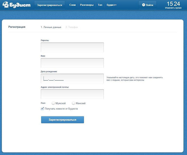
At this stage, the main goal is to accurately “bring” the client before making the payment. An example is the registration page in the “Buddhist” service. The service gives users attention to the form by removing the top menu from this page and leaving only the most necessary motivating information. Each field is accompanied by a hint - why the service needs certain data.
3. Request only the really necessary information.
Nothing is more harmful to conversion than having to fill out a form with information that is not needed to complete a purchase. And a long list of fields to fill in becomes an obstacle course for payers, which only hinders it. Payment should not look to the payer as a kilometer run with barriers. For your customers, the payment process is a sprint, and you must help the customer run it quickly and effortlessly.
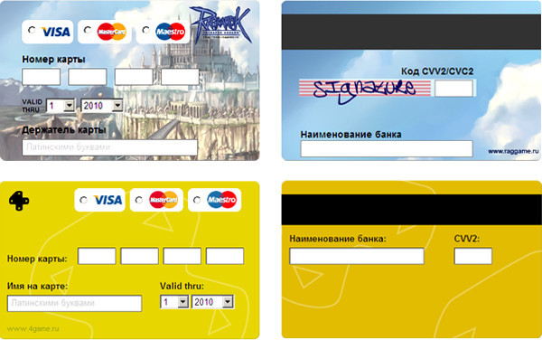
According to Forrester, 11% of users refused to buy just because they did not want to register or they were asked for too much information. The task of simplifying the process and minimizing the amount of required data is handled by a payment form made in the form of a bank card. Even an inexperienced payer will be able to intuitively guess how to fill in which field.
If you critically need any additional information, make sure that you have explained to the client why you are requesting it.
4. Allow customers to easily correct their mistakes.
Everyone understands that people tend to make mistakes. Sometimes they skip the zip code entry field or forget to insert the “@” in the email address. Your task is to point out the error and help the user correct it.
On some sites, an error message appears at the top of the page, but people do not understand that they have to “scroll” all the way to the top in order to understand what went wrong. Ideally, an error message should appear in the area where the error occurred.
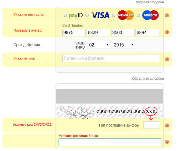
Another useful hint: it is much easier for people to proceed with payment in case of an error, if you automatically save all the correctly entered information on the form. So the user will need to re-enter the data only in the field where the error was made. In the illustration below, you will see that the standard PayOnline payment form does not delete the data that has already been entered, and the error messages that contain their description are clearly highlighted in red.
There is nothing more annoying to the user, especially if he fills out a long form than re-entering all the data. According to a study prepared by Invesp, the problem of losing customers due to incorrect display of error messages when filling out forms is among the top ten “conversion killers” during payment.
5. Allow customers to pay for purchases without registering.
Do I need to force the user to remember another login and password? Hardly. You should not create another obstacle to the client's payment. Forcing users to register an account on your site is too intrusive, especially for those who make a purchase for the first time. Mandatory registration is another one of the winners of the conversion killer rating.
A usability study conducted by Smashing Magazine showed that the main reason for users not like registering accounts is the expectation of unwanted spam. The study also notes that many customers do not understand why they have to register with an online store in order to buy something, while in offline stores no one needs to register with them when buying. Another disadvantage of registration is that it adds several additional fields to fill out, which delays the process of placing an order and adversely affects the conversion. To make life easier for clients and increase the likelihood of a favorable outcome, it is necessary to minimize the client’s time to place an order and request only the minimum amount of information required.
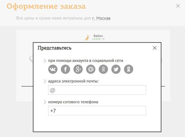

For example, the online store “Bayon” does not require a “registration” from the client, he asks him to introduce himself. And for this, he offers the client to choose the most convenient way to meet him - using a social network, phone or e-mail. In addition, the registration form consists of only two fields, which can not fail to please the client.
6. Do not "redirect" buyers
You have spent a lot of effort to attract customers to your site. Why send them to another site for payment? If you can’t control the design of the payment page of a third-party service, your customers may feel that it is not paying the company from which it buys the product or service.
Today, commercial sites have the opportunity to integrate the payment form directly on the page of your site using Iframe technology. This allows you to reduce customer distrust to a minimum, not scaring them with unexpected redirects and “reassuring” the identity of the registration page and form of payment. This is how we implemented the integration of the payment form on the payment page of our client, Avito Ad Exchange.

Ordering and payment are the last things your customers do when they buy, which is why you need the customer to see your company name on these pages.
7. Stick to the same style.
From the point of view of branding, you should make all the elements of your website as visually identical as possible. This means that you must use the same colors, fonts, design elements. These requirements apply to the design of your payment instrument selection page and the payment page, as well as to other pages on your site.
By observing the visual identity of all elements of the site, you can also increase your brand awareness among buyers. Of course, payment service providers are ready to provide you with ready-made payment pages created to maximize conversion into payments. But if you have the resources for this, you should take care to adapt the form to the unique style of your online store. And given the diversity of types of online fraud and horror stories associated with it, it is not surprising that users are skeptical about the difference in the design of the payment page and the design of the website of the online store on which they made the purchase.
To avoid misunderstandings and fears on the part of buyers, use an identical design to design all the pages on your site, especially the checkout and payment pages, as MTT did. It should be noted that changing the design of the payment page does not affect its security, only the “cover” changes.

In this example, you can observe a visual identity in which the payment page fully corresponds to the design of the site, even with respect to the characteristic design elements, including fonts, colors, “buttons”, forms, and even a company character.
Convenience and security - these are the basic requirements that users place on the payment page. In the next part of the cycle “9 secrets of online payments,” we will tell you what opportunities mobile e-commerce players offer and what you need to know in order not to lose potential customers from the fastest growing segment. And if you want to customize the reception of online payments on the site or in a mobile application, feel free to contact us , our experts will advise you on any questions.
Source: https://habr.com/ru/post/281659/
All Articles