Create 3D CSS effects on hover using jQuery
This article describes how using jQuery to create 3D CSS effects on hover.
Here you can see , and here - Download
')
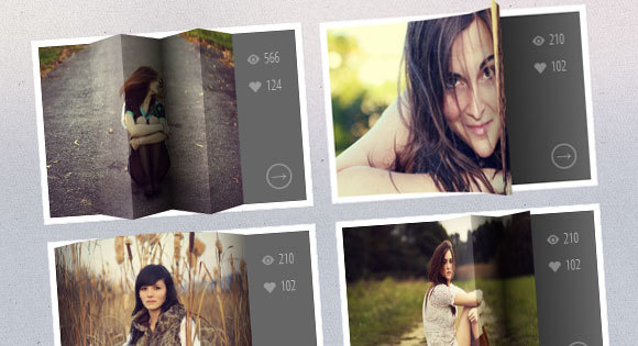
The examples below use thumbnails that, when you hover the cursor, will display certain CSS information. Thanks to jQuery when hovering over images, they appear coiled or folded. For these effects CSS 3D transforms will be used.
This will be the markup for the reduced structure:
Each miniature is in a container. You need to create a structure for each section from the view container using JavaScript:
Each part will have a corresponding image and since there is a nested structure, the effect can be controlled. In addition, the overlay will be added, which will give the effect more realism.
The javascript function will look like this:
Now we are going to set up the common styles.
We define the style for the thumbnail container and add a perspective:
To some parts, add 3D transitions:
The part of the description that opens when you shift the image will have the following style:
Elements of span and links:
For the icon in front of the span elements used font Fontello. Before adding the data-icon attribute to the span, for output we use the pseudo-class : before
Everything, except the first part, should move to the right (remember about the nested structure):
Next, set the appropriate background positions for each part of the background image:
In overlays, the default will be opacity 0. Add a transition and change the CSS opacity when hovering:
Fix the position and add z-index to the image. Also add a transition for browsers that do not support 3D conversions:
If the browser does not support 3D properties, you should download the additional fallback.css style sheet, with the following content:
This will cause the image to move left when you hover over. Let's look at an example.
For this example, you need to create a folding effect. Therefore, we will correct the value of perspective and transitions for all containers:
The second, third, fourth and fifth parts will be moved and rotated in 3D, creating a bend effect:
Add gradients to overlays for greater realism:
In some details, the thumbnails will also have a background CSS gradient (for modeling the shadow of the images):
Images courtesy of Angelo González , with the appropriate Creative Commons Attribution 2.0 Generic (CC BY 2.0) License .
Here you can see , and here - Download
')
The examples below use thumbnails that, when you hover the cursor, will display certain CSS information. Thanks to jQuery when hovering over images, they appear coiled or folded. For these effects CSS 3D transforms will be used.
HTML markup
This will be the markup for the reduced structure:
<div id="grid" class="main"> <div class="view"> <div class="view-back"> <span data-icon="A">566</span> <span data-icon="B">124</span> <a href="http://www.flickr.com/photos/ag2r/5439506585/in/photostream">→</a> </div> <img src="images/1.jpg" /> </div> <div class="view"> <!-- ... --> </div> <!-- ... --> </div> Each miniature is in a container. You need to create a structure for each section from the view container using JavaScript:
<div class="view"> <div class="view-back"> <!-- ... --> </div> <div class="slice s1" style="background-image: url(images/1.jpg); "> <span class="overlay"></span> <div class="slice s2" style="background-image: url(images/1.jpg); "> <span class="overlay"></span> <div class="slice s3" style="background-image: url(images/1.jpg); "> <span class="overlay"></span> <div class="slice s4" style="background-image: url(images/1.jpg); "> <span class="overlay"></span> <div class="slice s5" style="background-image: url(images/1.jpg); "> <span class="overlay"></span> </div><!-- /s5 --> </div><!-- /s4 --> </div><!-- /s3 --> </div><!-- /s2 --> </div><!-- /s1 --> </div><!-- /view --> Each part will have a corresponding image and since there is a nested structure, the effect can be controlled. In addition, the overlay will be added, which will give the effect more realism.
The javascript function will look like this:
$.fn.hoverfold = function( args ) { this.each( function() { $( this ).children( '.view' ).each( function() { var $item = $( this ), img = $item.children( 'img' ).attr( 'src' ), struct = '<div class="slice s1">'; struct +='<div class="slice s2">'; struct +='<div class="slice s3">'; struct +='<div class="slice s4">'; struct +='<div class="slice s5">'; struct +='</div>'; struct +='</div>'; struct +='</div>'; struct +='</div>'; struct +='</div>'; var $struct = $( struct ); $item.find( 'img' ).remove().end().append( $struct ).find( 'div.slice' ).css( 'background-image', 'url(' + img + ')' ).prepend( $( '<span class="overlay" ></span>' ) ); } ); }); }; Now we are going to set up the common styles.
CSS
We define the style for the thumbnail container and add a perspective:
.view { width: 316px; height: 216px; margin: 10px; float: left; position: relative; border: 8px solid #fff; box-shadow: 1px 1px 2px rgba(0,0,0,0.05); background: #333; perspective: 500px; } To some parts, add 3D transitions:
.view .slice{ width: 60px; height: 100%; z-index: 100; transform-style: preserve-3d; transform-origin: left center; transition: transform 150ms ease-in-out; } The part of the description that opens when you shift the image will have the following style:
.view div.view-back{ width: 50%; height: 100%; position: absolute; right: 0; background: #666; z-index: 0; } Elements of span and links:
.view-back span { display: block; float: right; padding: 5px 20px 5px; width: 100%; text-align: right; font-size: 16px; color: rgba(255,255,255,0.6); } .view-back span:first-child { padding-top: 20px; } .view-back a { display: bock; font-size: 18px; color: rgba(255,255,255,0.4); position: absolute; right: 15px; bottom: 15px; border: 2px solid rgba(255,255,255,0.3); border-radius: 50%; width: 30px; height: 30px; line-height: 22px; text-align: center; font-weight: 700; } .view-back a:hover { color: #fff; border-color: #fff; } For the icon in front of the span elements used font Fontello. Before adding the data-icon attribute to the span, for output we use the pseudo-class : before
.view-back span[data-icon]:before { content: attr(data-icon); font-family: 'icons'; color: #aaa; color: rgba(255,255,255,0.2); text-shadow: 0 0 1px rgba(255,255,255,0.2); padding-right: 5px; } Everything, except the first part, should move to the right (remember about the nested structure):
.view .s2, .view .s3, .view .s4, .view .s5 { transform: translateX(60px); } Next, set the appropriate background positions for each part of the background image:
.view .s1 { background-position: 0px 0px; } .view .s2 { background-position: -60px 0px; } .view .s3 { background-position: -120px 0px; } .view .s4 { background-position: -180px 0px; } .view .s5 { background-position: -240px 0px; } In overlays, the default will be opacity 0. Add a transition and change the CSS opacity when hovering:
.view .overlay { width: 60px; height: 100%; opacity: 0; position: absolute; transition: opacity 150ms ease-in-out; } .view:hover .overlay { opacity: 1; } Fix the position and add z-index to the image. Also add a transition for browsers that do not support 3D conversions:
.view img { position: absolute; z-index: 0; transition: left 0.3s ease-in-out; } If the browser does not support 3D properties, you should download the additional fallback.css style sheet, with the following content:
.view { overflow: hidden; } .view:hover img { left: -85px; } .view div.view-back { background: #666; } This will cause the image to move left when you hover over. Let's look at an example.
Example
For this example, you need to create a folding effect. Therefore, we will correct the value of perspective and transitions for all containers:
.view { perspective: 1050px; } .view div { transition: all 0.3s ease-in-out; } The second, third, fourth and fifth parts will be moved and rotated in 3D, creating a bend effect:
.view:hover .s2{ transform: translate3d(59px,0,0) rotate3d(0,1,0,-45deg); } .view:hover .s3, .view:hover .s5{ transform: translate3d(59px,0,0) rotate3d(0,1,0,90deg); } .view:hover .s4{ transform: translate3d(59px,0,0) rotate3d(0,1,0,-90deg); } Add gradients to overlays for greater realism:
.view .s2 > .overlay { background: linear-gradient(right, rgba(0,0,0,0.05) 0%,rgba(0,0,0,0) 100%); } .view .s3 > .overlay { background: linear-gradient(left, rgba(255,255,255,0) 0%, rgba(255, 255, 255, 0.2) 100%); } .view .s4 > .overlay { background: linear-gradient(right, rgba(0,0,0,0.6) 0%,rgba(0,0,0,0.2) 100%); } .view .s5 > .overlay { background: linear-gradient(left, rgba(0,0,0,0.8) 0%,rgba(0,0,0,0) 100%); } In some details, the thumbnails will also have a background CSS gradient (for modeling the shadow of the images):
.view div.view-back{ background: linear-gradient(left, #0a0a0a 0%,#666666 100%); } Images courtesy of Angelo González , with the appropriate Creative Commons Attribution 2.0 Generic (CC BY 2.0) License .
Source: https://habr.com/ru/post/281609/
All Articles