Interfaces: How not to do the option of unsubscribing from the email-list

In our blog, we write a lot about creating emails and working with e-mail. We have already discussed the complexity of the fight against spam , the future of email, the protection of postal correspondence , and also considered the reasons why users unsubscribe from mailings.
Today we will develop this topic and talk about how the process of unsubscribing from the newsletter should be implemented, so as not to cause negative subscribers and, if possible, reduce the number of those who do leave.
')
What is the problem
Email marketers and companies should be well aware of the existence of a “Mark as spam” button in email clients and of negative consequences for the sender's reputation in the event that the recipients click it. In the same Gmail there is a function that allows users to unsubscribe from mailings in one click. And although it can do as much harm to senders of letters as a button for filtering spam.
Despite the presence of these features and the annoyance of customers when receiving unsolicited messages, the process of refusing to send e-mails of many companies is often implemented in the form of a quest that is extremely difficult to pass.
What should be the process of unsubscribing
Christopher Ratcliff (Christopher Ratcliff) in more detail reveals this topic in his article . A good example is the opt-out process on the Pizza Express pizza delivery website. Perhaps this is not an ideal way, but it allows the client to unsubscribe from the newsletter without any problems.
The letter contains a link that allows you to unsubscribe. Please note that it is located at the very top of the page. It is not striking, but at least it is not written in small print and is not hidden underneath.

To complete the process of unsubscribe, simply click on the link and make another click. If desired, users can leave their feedback and suggestions in the comments box.
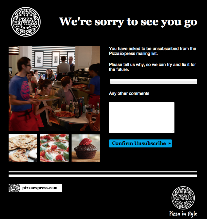
In fact, the whole process consists of two clicks, the client does not need to enter additional data or perform tedious actions.
The process of unsubscribing from the site Junction is even easier. It is enough to make one click:
If you don’t want people to send your spam messages or unsubscribe from your mailing via Gmail, try to make your own service to cancel the subscription as simple as possible. The companies that will be discussed later would also be worth knowing about it.
There is an opinion that by complicating the process of unsubscribing, you can keep a large number of subscribers. This is not true. Frustrated customers will simply find other ways to stop seeing the letters you send them.
Email Verification
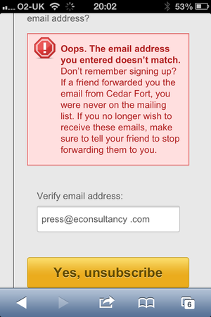
The process of confirming an email address, especially on a mobile phone, is annoying to users. On a small screen and just clicking on the link is not always easy, and even few people will want to confirm the address.

The situation is even more complicated if the recipient uses two or more email addresses and is not sure which one of them sent the newsletter to. Then he will also get an annoying error message:
Unnecessary extra steps
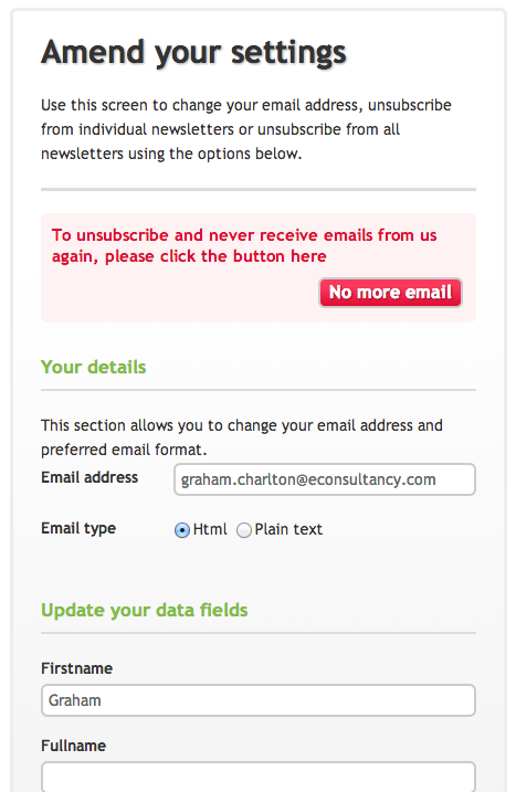
On the website of the Chiquitos restaurant chain, the process of refusing to receive the newsletter was originally to consist of two clicks, like on the Pizza Express website:

However, the company adds an unnecessary additional action, offering the opportunity to update personal data, which no one asked for.
The need to press buttons
It makes no sense. Do the creators of the newsletter believe that if you force users to press additional buttons to unsubscribe, they will change their mind?
The pop-up messages that the user is forced to respond to further aggravate the situation:
Ambiguous wording
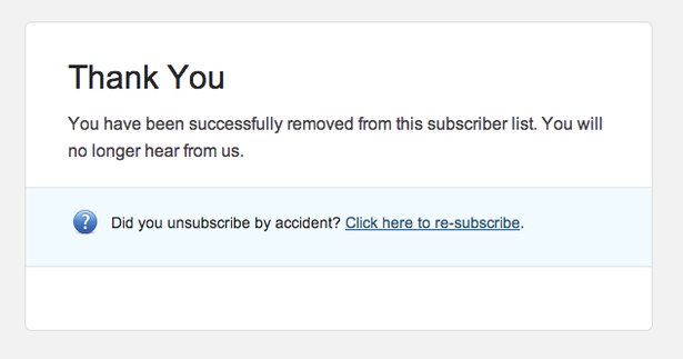
On some sites, users who want to unsubscribe do not even say exactly whether they will do it - very often you can see phrases like “we received your request to remove from the mailing list” . It is not difficult to inform customers that they were unsubscribed from the mailing list, so why use such ambiguous phrases?
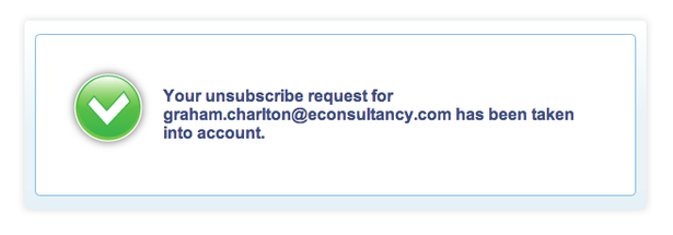
Your request to remove the address graham.charlton@econsultancy.com from the mailing list is accepted.
Poorly selected color combinations
The text on the opt-out form typed in white text on a black background, such as on the Blinkbox site, is very difficult to read:

The need to send a written removal request
It seems that we live in the Middle Ages. To unsubscribe from Pizza Hut, users need to send an email that is processed within two weeks. Moreover, by sending such a letter, you will not receive notification of its receipt. And the address of the recipient looks too suspicious, which gives users unnecessary cause for concern.

Too much action
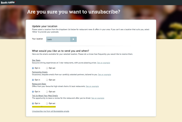
The Bookatable service provides users with the ability to unsubscribe from all emails, but this is probably the most inconspicuous option on the page that is located at the very bottom. This means that you are forced to refuse to receive four different types of letters.
If the user has found a button to refuse to receive the newsletter and clicked on it, then he makes it quite clear that he wants to unsubscribe. Providing users the opportunity to leave feedback is a great idea, but in no case should this process be mandatory or time consuming.
In the examples above, companies create too many barriers for users, perhaps hoping to keep them. However, I believe that the more complicated the process of unsubscribing, the more likely it is that your emails will be sent to spam.
If the subscriber does not want to lose
In principle, marketers who do not really want to lose the email-mailing subscribers that are so hard to acquire are easy to understand. However, as mentioned above, all this does not justify incorrect behavior and attempts to trick the address in its database. You can also increase the chances of saving the subscriber using much more adequate methods.
An example is the approach of the European retailer of clothes and footwear Zalando. This company not only shows a link to unsubscribe from its mailing list at the very beginning of each letter (it does not stand out, but you don’t need to search for it for half an hour), but it also uses another interesting move.
When a user registers on the site, they sign up for the daily mailing of the best offers. Not everyone may be interested, so some want to unsubscribe from it.
Here is the whole process in steps:

- The first thing Zalando does when you click the "Unsubscribe" button is to offer a weekly newsletter instead of a daily one. This is a very convincing argument - the number of letters received by the user in this case is reduced by 86%.
- In addition, the user can block the newsletter on certain days - perhaps he is too busy on Monday, and on weekends he is not up to emails.
- Another interesting option is for those users who are not sure that they want to permanently unsubscribe, there is an option to suspend distribution for a certain period (from 1 to 30 days).
- And finally, the very option to opt out of receiving mailings. The standard drop-down list of sad reasons is complemented by a message about the chances of taking advantage of the offers of which fashion brands the user will lose if he unsubscribes from the newsletter.
Other materials about mailing lists in Pechkin's blog:
Source: https://habr.com/ru/post/281503/
All Articles