Social inequality and salaries of officials
By the will of fate, the data on wages, bonuses and overtime of many civil servants of one large port city, from the mayor to the pool guard, fell into my hands. Without losing a minute, I rushed to dig into the numbers. There is nothing more interesting than looking at other people's salaries, especially when you can justify yourself by doing Data Science!
As soon as the first bouts of jealousy were over , I realized that there is information in dataset not only about major managers, but also about ordinary employees from the lowest level. It turns out that using these data one can personally observe the main patterns in the distribution of income in the real world. Taking this opportunity, I invite all the sofa economists in an exciting tour of the world of luxury salaries and stingy statistics!
Today we will talk about average and median wages, the Gini social inequality index, the relationship between rich and poor (Rich / Poor index), the insurmountable income gap (Matthew effect) and career growth.
')

Immediately I will reveal the main intrigue - what is this data and where did I get it from. This is real information about the wages of municipal employees of the city of San Francisco ( pictured ) in California, USA. In dataset present the real names, positions, salaries, bonuses, overtime and bonuses of some (possibly all) employees for 4 years - from 2011 to 2014 inclusive. The data is not very clean and not quite standardized, but you can work with them. All this was kindly provided by the state administration within the framework of the project Transparent California . All amounts are in dollars per year, before taxes.
I will deliberately skip the steps of studying and preparing the data, as well as the code for plotting the graphs. Those interested can learn all this in github . There Python, Jupyter, Pandas and Seaborn. So let's get started.
In dataset there are not only basic incomes of employees, but also various allowances. In order not to delve into the little things, we will consider only the basic income and total income, taking into account all allowances and premiums.
Here is the distribution of the basic income of employees for 4 years:
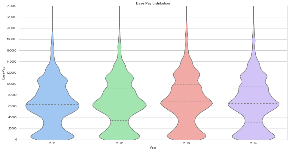
These four ... GHM ... "carrots" symbolize the distribution of income for 4 years. On the Y axis - the amount of income, on the X axis - the probability density of income distribution. Cross dashed lines are quartiles of 25%, 50% (median) and 75% of the distribution. Several seals are clearly visible - around $ 5,000, $ 65,000, $ 110,000 and $ 170,000. This is how employee classes look like - temporary workers, line personnel, highly qualified specialists and top management. It seems that the “carrot” is slowly going up, which can mean both a growing level of wealth and inflation.
Now look at the distribution of total employee income:
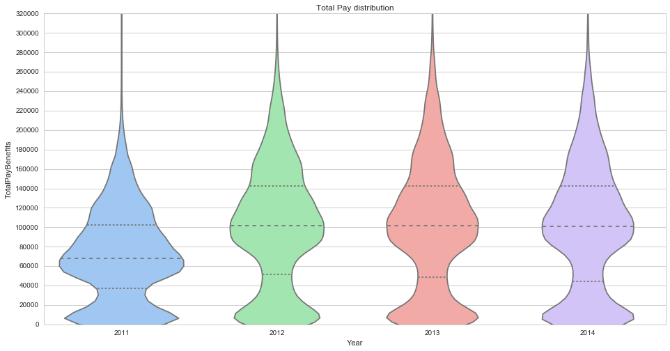
Data for 2011 is very different from the following. It turned out that we have no data on awards for this year. In general, the data for 2011 is formatted differently, which greatly complicates their use. In addition, this year the elected government was replaced, because of which the salaries of people in elected positions were not calculated for the full year.
In the remaining years, we see that the premium layer “smoothed out” the “carrot” of distribution, practically eliminating the clear division of employees into classes. That is, taking into account the premiums, a good line specialist earns comparable to a non-stressed expert.
San Francisco is an expensive city. The official minimum wage is about $ 20,000 per year, the subjective living wage - from $ 40,000 per year. It is not clear where such a large number of people with a salary lower than the minimum wage is from? The answer lies in the Status attribute - FT (Full-time) and PT (Part-time), i.e. In the sample there are not only staff members, but also part-time workers, incl. one-time side jobs. The Status flag is only for 2014.
Here is the distribution of total revenues with the division into full-time and freelance employees:

As can be seen, the staff member’s median income is about $ 130,000 per year.
At the same time, let us answer the question to which many disputes on the Internet are devoted - how the average and median wages are related. There is an opinion that the average salary is much higher than the median due to the income of top management.
Check if this is:

In the upper figure, you see an attempt to adjust the salary distribution to a normal one. The highest value of the density of distribution corresponds to the average salary, which is $ 90.000. The lower figure shows the quartiles of the salary distribution, the middle line inside the rectangle is the median salary, and it is $ 85,000. As we see, indeed, the average salary is higher than the median, but by no means significant.
The most exciting in salaries is the question of their fair distribution (from each according to his abilities, to each according to his work?) . Wise ancestors left us with numerical metrics of income distribution inequality. The most popular are the Gini index and the R / P index. Let's talk about them in more detail.
The Gini index is a statistical measure of the degree of stratification of a quantity. In economics, it is commonly used to measure income stratification. The Gini index is calculated as the percentage ratio of the area between the Lorenz curve and the diagonal y = x (green area) to the area of the entire triangle below the diagonal (blue + green area):

The indicator is measured from 0 to 100, where 0 is complete equality (all is blue), and 100 is all income for one person (all is green). For example , Gini of Russia - 42.0, the USA - 45.0, Germany - 27.0, China - 47.3. Sweden has the smallest Gini in Sweden - 23.0, the largest in African banana monarchies, where it can rise above 60.
The figure above shows the Lorenz curve for the income of full-time employees. The Gini index for them is 18.9, which indicates a practically communist leveling. You can interpret it this way - if you managed to get into full-time employees of the San Francisco City Hall, your salary will not offend you. And so it is possible - if you work in the city hall, your career ladder is not high.
Another interesting indicator of stratification is the ratio of the income of the rich to the income of the poor. Let's look at the dark blue “triangle” in the picture above. Its width is 20%, which is 20% of the richest people. The height of the dark blue triangle - 31%. This means that 20% of the richest people account for 31% of total income. Now pay attention to the red triangle. Its width is 20% (of the poorest people), and its height is 12% (of income), i.e. 20% of the poorest people account for 12% of total income. The Rich / Poor 20 index reflects the ratio of incomes of the richest 20% to the poorest 20% of society. For staff members of the San Francisco Municipality, the R / P 20 is 2.5. It can be interpreted as the height of the height of the ceiling on a career or social ladder.
Now for comparison, look at the Lorenz curve for freelancers:

We see a striking difference from the previous graph. The arc of the Lorenz curve has bent far down, the green area has increased in size. A rich triangle occupies almost half the height, and a poor triangle is almost invisible. The Gini index is 53.6, and the R / P 20 is 45. This roughly corresponds to the poor countries of South America, with pronounced stratification into wealthy capitalists and rustic muchos.
The wisdom of generations says that " to everyone who has it will be given and multiplied, and from the one who has it will be taken away even that which he has ." In other words, the gap between the poor and the rich is constantly increasing. Proto-sociologists have observed this funny phenomenon for millennia, and recently its awareness has become available to the masses . From the effect of Matthew , as economists call it, the conclusion follows that the only way to increase one’s wealth and leave a legacy to one’s children is to belong to the top of society. This hypothesis is very unpleasant to realize, and it would be nice if it turned out to be false. So let's refute it!
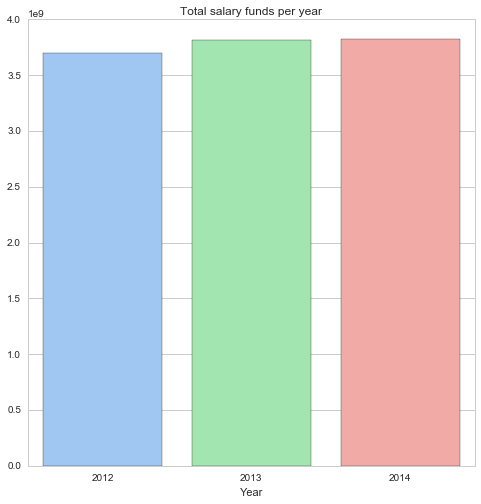
In the figure below you can see the total amount of the wage fund of the municipality of San Francisco for 3 years. It grew from $ 3.70 billion in 2012 to $ 3.82 billion in 2014, showing an increase of + 3.2% of the total.
Now let's build graphs of the average income of the highest and lowest deciles (10% of the largest and smallest salaries). As can be seen, the average income in the highest decile increased by + 3.0%, while the income in the lowest decile dropped significantly by -12.6%.

This means not only that the Matthew effect exists, but also that it is extremely strong and easily noticeable with the naked eye. It can be assumed that this explains the steady growth of the Gini index in the United States over the past 30 years.
It should be noted that due to the lack of full-time / part-time markup in the early years, we estimated decile incomes on a mixed sample of staff members and freelancers. This could make significant adjustments to the result, so I’m not sure about it - the gap size looks too implausible.
Since we are talking about career growth, let's check - is it there, or is it fantastic? Since there is no desire to understand the hierarchy of US officials, we will assume that career growth comes down to salary growth. There are names and surnames of people in dataset, and they are expectedly repeated from year to year.
Let's look at the income of the same people in 2012 and 2014, calculate the percentage growth and build the distribution of growth in terms of one year:
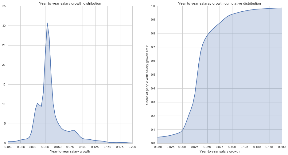
On the left is a graph of the probability density of income growth, on the right a graph of the distribution function of income growth. First, it can be seen that the income growth of 20% of employees lies in the range from 0 to 2%, which roughly covers inflation. The most widespread income growth is from 2% to 5%, it is observed in 50% of cases, this is the fashion of the career growth rate. Further, approximately 15% of people were able to achieve growth of 5-10%, this growth rate can be considered high. And no more than 5% of people showed outstanding income growth of more than 10% yoy. It is also worth noting that 10% of employees showed a negative income growth, i.e. their salaries decreased year by year.
Note that in order to build this graph, I had to impose coarse filters on the sample in order to cut off the “long tail” formed by people who moved from one-time contract soldiers to the state, thereby increasing their income from the municipality 50-100 times. These filters could significantly affect the distribution.
It turned out that using the example of even such a small world as the municipality of the city of San Francisco, one can study the sociological and economic patterns.
We can point out the following theses:
However, this is just one sector of the economy and only in one very atypical city. I do not recommend making far-reaching conclusions on the basis of this article about economic statistics in the United States and, especially, in the world at large.
Today we will talk about average and median wages, the Gini social inequality index, the relationship between rich and poor (Rich / Poor index), the insurmountable income gap (Matthew effect) and career growth.
')
Immediately I will reveal the main intrigue - what is this data and where did I get it from. This is real information about the wages of municipal employees of the city of San Francisco ( pictured ) in California, USA. In dataset present the real names, positions, salaries, bonuses, overtime and bonuses of some (possibly all) employees for 4 years - from 2011 to 2014 inclusive. The data is not very clean and not quite standardized, but you can work with them. All this was kindly provided by the state administration within the framework of the project Transparent California . All amounts are in dollars per year, before taxes.
I will deliberately skip the steps of studying and preparing the data, as well as the code for plotting the graphs. Those interested can learn all this in github . There Python, Jupyter, Pandas and Seaborn. So let's get started.
Payroll distribution
In dataset there are not only basic incomes of employees, but also various allowances. In order not to delve into the little things, we will consider only the basic income and total income, taking into account all allowances and premiums.
Here is the distribution of the basic income of employees for 4 years:
These four ... GHM ... "carrots" symbolize the distribution of income for 4 years. On the Y axis - the amount of income, on the X axis - the probability density of income distribution. Cross dashed lines are quartiles of 25%, 50% (median) and 75% of the distribution. Several seals are clearly visible - around $ 5,000, $ 65,000, $ 110,000 and $ 170,000. This is how employee classes look like - temporary workers, line personnel, highly qualified specialists and top management. It seems that the “carrot” is slowly going up, which can mean both a growing level of wealth and inflation.
Now look at the distribution of total employee income:
Data for 2011 is very different from the following. It turned out that we have no data on awards for this year. In general, the data for 2011 is formatted differently, which greatly complicates their use. In addition, this year the elected government was replaced, because of which the salaries of people in elected positions were not calculated for the full year.
In the remaining years, we see that the premium layer “smoothed out” the “carrot” of distribution, practically eliminating the clear division of employees into classes. That is, taking into account the premiums, a good line specialist earns comparable to a non-stressed expert.
San Francisco is an expensive city. The official minimum wage is about $ 20,000 per year, the subjective living wage - from $ 40,000 per year. It is not clear where such a large number of people with a salary lower than the minimum wage is from? The answer lies in the Status attribute - FT (Full-time) and PT (Part-time), i.e. In the sample there are not only staff members, but also part-time workers, incl. one-time side jobs. The Status flag is only for 2014.
Here is the distribution of total revenues with the division into full-time and freelance employees:
As can be seen, the staff member’s median income is about $ 130,000 per year.
At the same time, let us answer the question to which many disputes on the Internet are devoted - how the average and median wages are related. There is an opinion that the average salary is much higher than the median due to the income of top management.
Check if this is:
In the upper figure, you see an attempt to adjust the salary distribution to a normal one. The highest value of the density of distribution corresponds to the average salary, which is $ 90.000. The lower figure shows the quartiles of the salary distribution, the middle line inside the rectangle is the median salary, and it is $ 85,000. As we see, indeed, the average salary is higher than the median, but by no means significant.
Social inequality
The most exciting in salaries is the question of their fair distribution (from each according to his abilities, to each according to his work?) . Wise ancestors left us with numerical metrics of income distribution inequality. The most popular are the Gini index and the R / P index. Let's talk about them in more detail.
The Gini index is a statistical measure of the degree of stratification of a quantity. In economics, it is commonly used to measure income stratification. The Gini index is calculated as the percentage ratio of the area between the Lorenz curve and the diagonal y = x (green area) to the area of the entire triangle below the diagonal (blue + green area):
The indicator is measured from 0 to 100, where 0 is complete equality (all is blue), and 100 is all income for one person (all is green). For example , Gini of Russia - 42.0, the USA - 45.0, Germany - 27.0, China - 47.3. Sweden has the smallest Gini in Sweden - 23.0, the largest in African banana monarchies, where it can rise above 60.
The figure above shows the Lorenz curve for the income of full-time employees. The Gini index for them is 18.9, which indicates a practically communist leveling. You can interpret it this way - if you managed to get into full-time employees of the San Francisco City Hall, your salary will not offend you. And so it is possible - if you work in the city hall, your career ladder is not high.
Another interesting indicator of stratification is the ratio of the income of the rich to the income of the poor. Let's look at the dark blue “triangle” in the picture above. Its width is 20%, which is 20% of the richest people. The height of the dark blue triangle - 31%. This means that 20% of the richest people account for 31% of total income. Now pay attention to the red triangle. Its width is 20% (of the poorest people), and its height is 12% (of income), i.e. 20% of the poorest people account for 12% of total income. The Rich / Poor 20 index reflects the ratio of incomes of the richest 20% to the poorest 20% of society. For staff members of the San Francisco Municipality, the R / P 20 is 2.5. It can be interpreted as the height of the height of the ceiling on a career or social ladder.
Now for comparison, look at the Lorenz curve for freelancers:
We see a striking difference from the previous graph. The arc of the Lorenz curve has bent far down, the green area has increased in size. A rich triangle occupies almost half the height, and a poor triangle is almost invisible. The Gini index is 53.6, and the R / P 20 is 45. This roughly corresponds to the poor countries of South America, with pronounced stratification into wealthy capitalists and rustic muchos.
Matthew effect
The wisdom of generations says that " to everyone who has it will be given and multiplied, and from the one who has it will be taken away even that which he has ." In other words, the gap between the poor and the rich is constantly increasing. Proto-sociologists have observed this funny phenomenon for millennia, and recently its awareness has become available to the masses . From the effect of Matthew , as economists call it, the conclusion follows that the only way to increase one’s wealth and leave a legacy to one’s children is to belong to the top of society. This hypothesis is very unpleasant to realize, and it would be nice if it turned out to be false. So let's refute it!
In the figure below you can see the total amount of the wage fund of the municipality of San Francisco for 3 years. It grew from $ 3.70 billion in 2012 to $ 3.82 billion in 2014, showing an increase of + 3.2% of the total.
Now let's build graphs of the average income of the highest and lowest deciles (10% of the largest and smallest salaries). As can be seen, the average income in the highest decile increased by + 3.0%, while the income in the lowest decile dropped significantly by -12.6%.
This means not only that the Matthew effect exists, but also that it is extremely strong and easily noticeable with the naked eye. It can be assumed that this explains the steady growth of the Gini index in the United States over the past 30 years.
It should be noted that due to the lack of full-time / part-time markup in the early years, we estimated decile incomes on a mixed sample of staff members and freelancers. This could make significant adjustments to the result, so I’m not sure about it - the gap size looks too implausible.
Career growth
Since we are talking about career growth, let's check - is it there, or is it fantastic? Since there is no desire to understand the hierarchy of US officials, we will assume that career growth comes down to salary growth. There are names and surnames of people in dataset, and they are expectedly repeated from year to year.
Let's look at the income of the same people in 2012 and 2014, calculate the percentage growth and build the distribution of growth in terms of one year:
On the left is a graph of the probability density of income growth, on the right a graph of the distribution function of income growth. First, it can be seen that the income growth of 20% of employees lies in the range from 0 to 2%, which roughly covers inflation. The most widespread income growth is from 2% to 5%, it is observed in 50% of cases, this is the fashion of the career growth rate. Further, approximately 15% of people were able to achieve growth of 5-10%, this growth rate can be considered high. And no more than 5% of people showed outstanding income growth of more than 10% yoy. It is also worth noting that 10% of employees showed a negative income growth, i.e. their salaries decreased year by year.
Note that in order to build this graph, I had to impose coarse filters on the sample in order to cut off the “long tail” formed by people who moved from one-time contract soldiers to the state, thereby increasing their income from the municipality 50-100 times. These filters could significantly affect the distribution.
Conclusion
It turned out that using the example of even such a small world as the municipality of the city of San Francisco, one can study the sociological and economic patterns.
We can point out the following theses:
- salaries in the municipality are very boring
- a good specialist can earn no less than a mediocre manager
- the median wage is not much different from the average
- income gap between rich and poor widens
- even in a calm civil service there are opportunities for career growth
However, this is just one sector of the economy and only in one very atypical city. I do not recommend making far-reaching conclusions on the basis of this article about economic statistics in the United States and, especially, in the world at large.
Source: https://habr.com/ru/post/281422/
All Articles