An almost complete guide to flexbox (without the flexbox itself)
Unfortunately, not everyone has a browser / device that supports flexbox. This manual is in the form of a cheat sheet, which offers alternatives of backward compatibility for flexbox properties.
Although some of the CSS in this tutorial may seem obvious, I’m going to challenge flexbox and also propose simple solutions to problems that arose before it became popular.
')
1. flex-direction
row
Displays elements horizontally.
.item { display: inline-block; } 
Link to a live example.
row-reverse
Displays elements horizontally in reverse order.
.container { direction: rtl; } .item { display: inline-block; } 
Link to a live example.
column
Displays items vertically
.item { display: block; } 
Link to a live example.
column-reverse
Displays items vertically in reverse order.
.container, .item { transform: scaleY(-1); -ms-transform: scaleY(-1); -webkit-transform: scaleY(-1); } .item { display: block; } 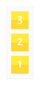
Link to a live example.
2. flex-wrap
nowrap
Narrowing elements to prevent transfer
.container { display: table; } .item { display: table-cell; } 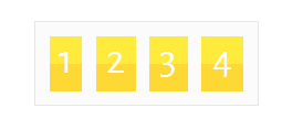
Link to a live example.
wrap
Moves items to another line when their total width is greater than the width of the container.
.item { display: inline-block; } 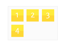
Link to a live example.
flex-start
Aligns the elements horizontally at the beginning of the container.
.item { display: inline-block; } 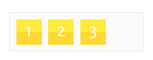
Link to a live example.
flex-end
Aligns the elements horizontally at the end of the container.
.container { text-align: right; } .item { display: inline-block; } 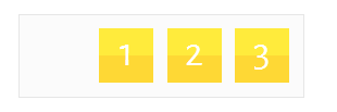
Link to a live example.
center
Aligns the elements horizontally in the center of the container.
.container { text-align: center; } .item { display: inline-block; } 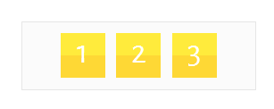
Link to a live example.
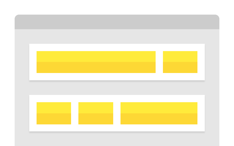
space-between
Distributes the equal space between the elements, forcing the extreme elements to press against the edges of the container
.container { text-align: justify; } .container:after { content: ''; display: inline-block; width: 100%; } .item { display: inline-block; } 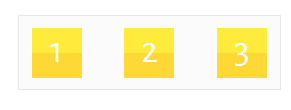
Link to a live example.
Note: this method only works with uncompressed HTML and requires a fixed height on the container.
space-around
Equally distributes the space between the elements
.container { display: table; } .item { display: table-cell; text-align: center; } 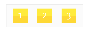
Link to a live example.
4. align-items
flex-start
Aligns items vertically at the beginning of the container.
.item { display: table-cell; } 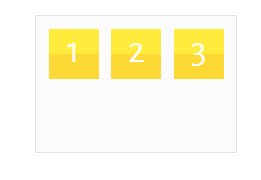
Link to a live example.
flex-end
Aligns items vertically at the end of the container.
.container { display: table; } .item { display: table-cell; vertical-align: bottom; } 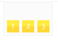
Link to a live example.
center
Aligns items vertically in the center of the container.
.container { display: table; } .item { display: table-cell; vertical-align: middle; } 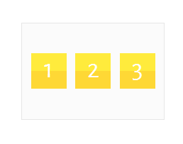
Link to a live example.
stretch
Stretches items vertically from start to end of container
.item { display: inline-block; height: 100%; } 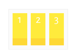
Link to a live example.
5. align-content
flex-start
Aligns items vertically at the beginning of the container.
.item { display: inline-block; } 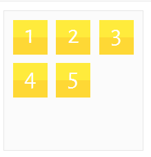
Link to a live example.
flex-end
Aligns items vertically at the end of the container.
.container { display: table-cell; vertical-align: bottom; } .item { display: inline-block; } 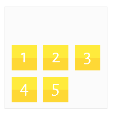
Link to a live example.
center
Aligns items vertically in the center of the container.
.container { display: table-cell; vertical-align: middle; } .item { display: inline-block; } 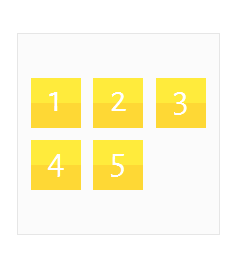
Link to a live example.
6. flex items
flex-grow
Stretch the element to fill the remaining space.
.container { display: table; } .item { display: table-cell; } .item.grow { width: 100%; } 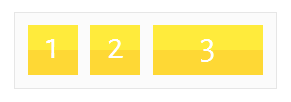
Link to a live example.
flex-shrink
Narrows the element, and other elements fill the remaining space.
.container { display: table; } .item { display: table-cell; } .item.shrink { width: 1px; } 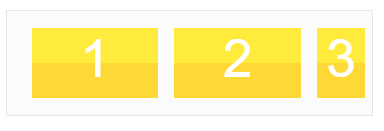
Link to a live example.
align-self
Aligns the element vertically (below in this example)
.container { display: table; } .item { display: table-cell; } .item.bottom { vertical-align: bottom; } 
Link to a live example.
Source: https://habr.com/ru/post/281254/
All Articles