Archiving as a work of art
As we were looking for a way to interestingly and clearly explain why the new ability to archive files to the cloud is convenient and practical.
Our person is a professional of the world, ayti of forty-fifty years old, who helps to solve various problems with technology to those who call him “you are a computer programmer!”.
')
A technically savvy person is not lost in modern technologies and is ready to try new things. But this generally does not guarantee that such people will fully understand how good your product is. A person does not buy your product, but “a better version of himself”, which he hopes to get as a result. You need to help them get to know your product fully, even if it seems to you - the creators - to be simple and intuitive.
If you already have a successful product that is sold and has loyal fans, this does not mean that it will always be so. The product should not only develop technically, but also become easier to use. About how we made it easier True Image for Windows can be read here .
Helping a person to master a product is more difficult than it seems. In digital form - emails on a specific schedule and help directly in the product itself. If a person buys a boxed version, then his services include printed manuals and telephone support.
I will tell only about how we were looking for a way to help the user navigate inside Acronis True Image for OS X.
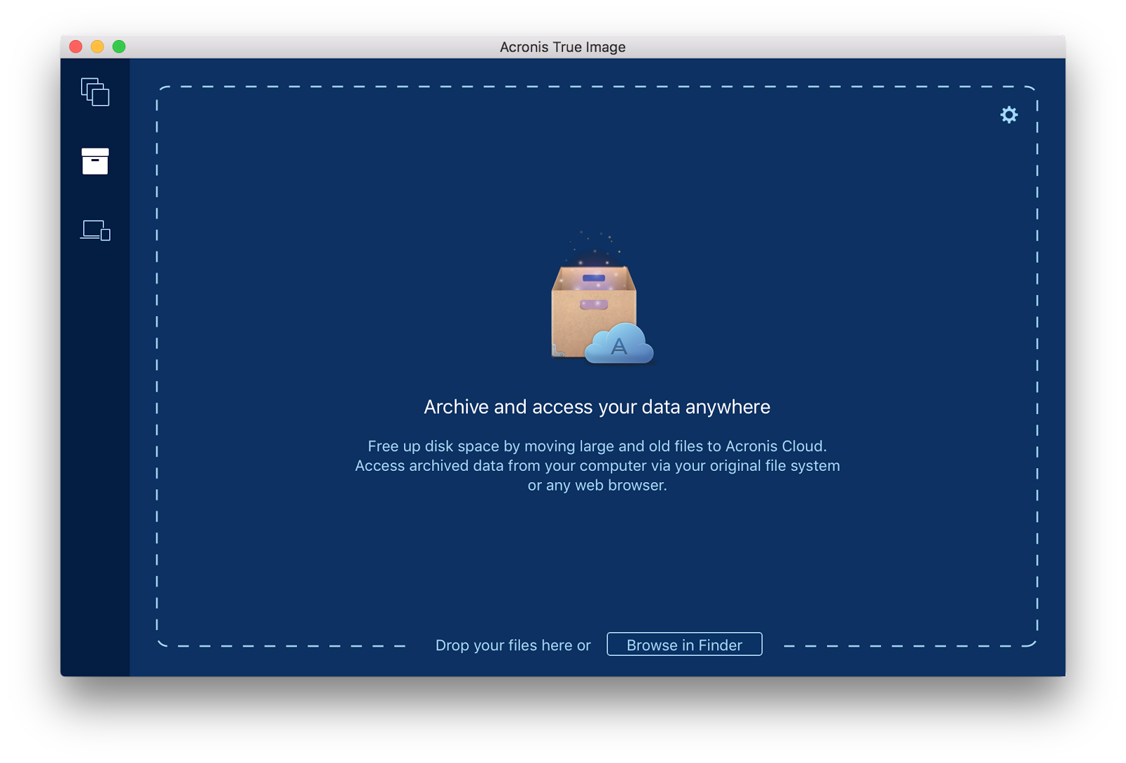
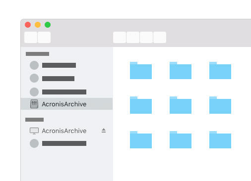
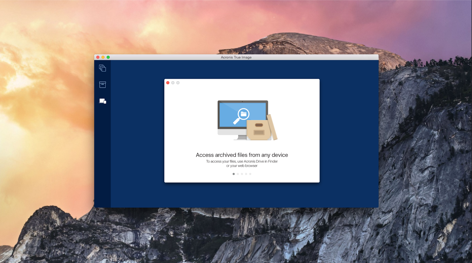
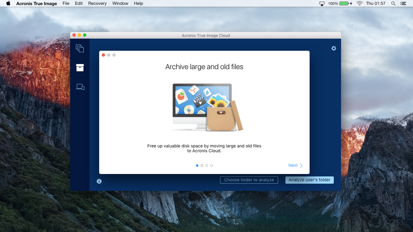
Last year, Acronis True Image introduced a new, useful feature for Acronis Cloud subscribers - archiving files to the cloud. It works from the user side simply: dragging files to the application window with the mouse, or pressing a button and selecting everything in the usual Finder window that takes up disk space and is used quite rarely. This is what the archiving tab now looks like:
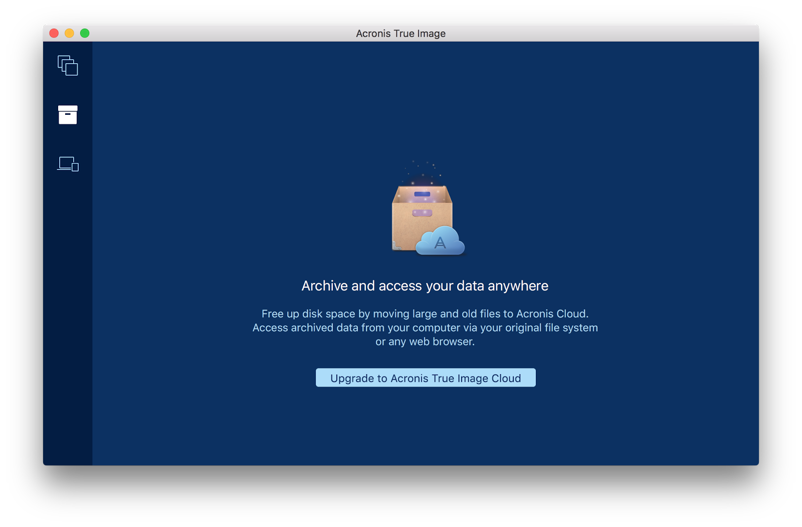
If the user does not have a subscription to Acronis Cloud, then he sees a very similar stub:
It seems elementary: I threw in the files and sent the whole pack to the unlimited cloud. After a couple of years I wanted to review the video from the wedding - I went to Acronis Cloud, downloaded and looked. Impressions and important files safe. And available at almost any time, and the free disk space is full.
But in fact, not everything is as simple as it seemed. Initially, we ran into a short tour of archiving on the Windows version, so the harvest from the mistakes we sowed had already been gathered.
It turned out that a pleasant version with abstract illustrations does not help us at all to understand how people can benefit from archiving. Exactly, as well as not all hearts got through the tour. It was then that began the dense work on the bugs.
The essence
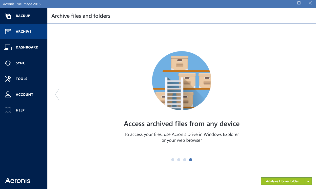
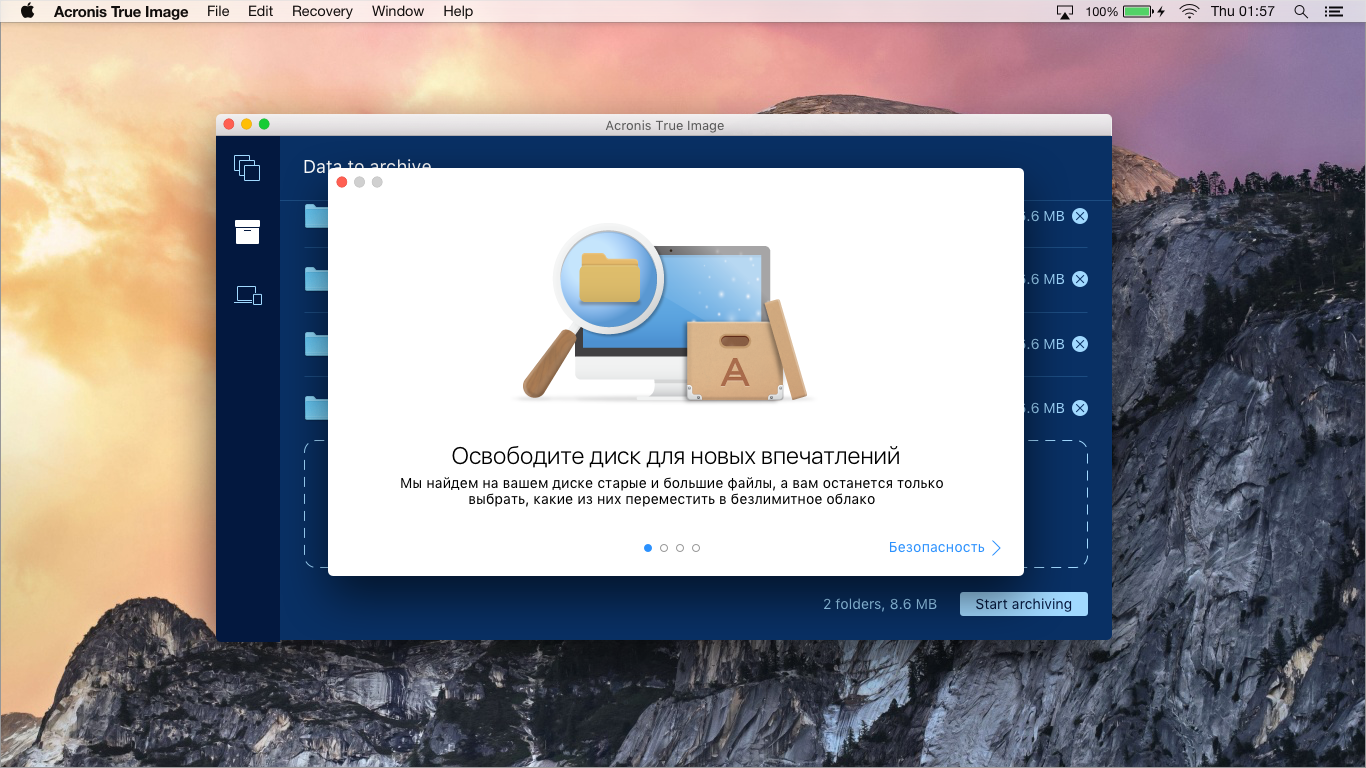
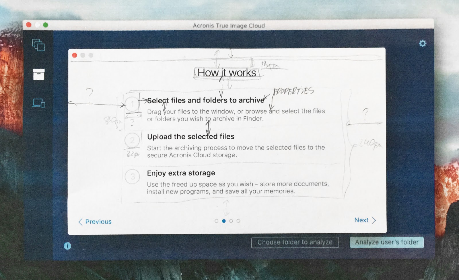
We are looking for what problems the user is experiencing and how to help him with their solution. The very first draft of the solution fit on a piece of shabby reality:
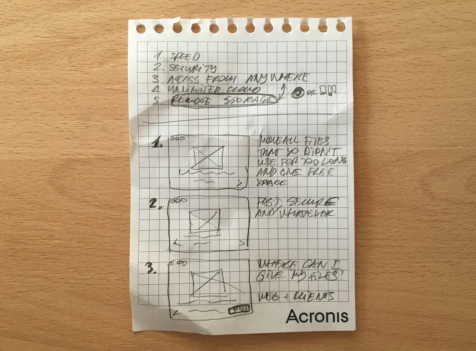
The discussion in Basecamp turned out so long that the plug-ins for taking screenshots of web pages crashed under my attempts to make a screenshot for the article. So you have to take my word for it. In general, we agreed on the opinion that with each new slide we will provide more and more details, focusing on the four main slides:
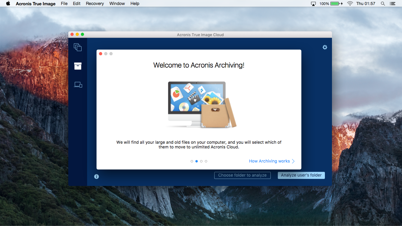
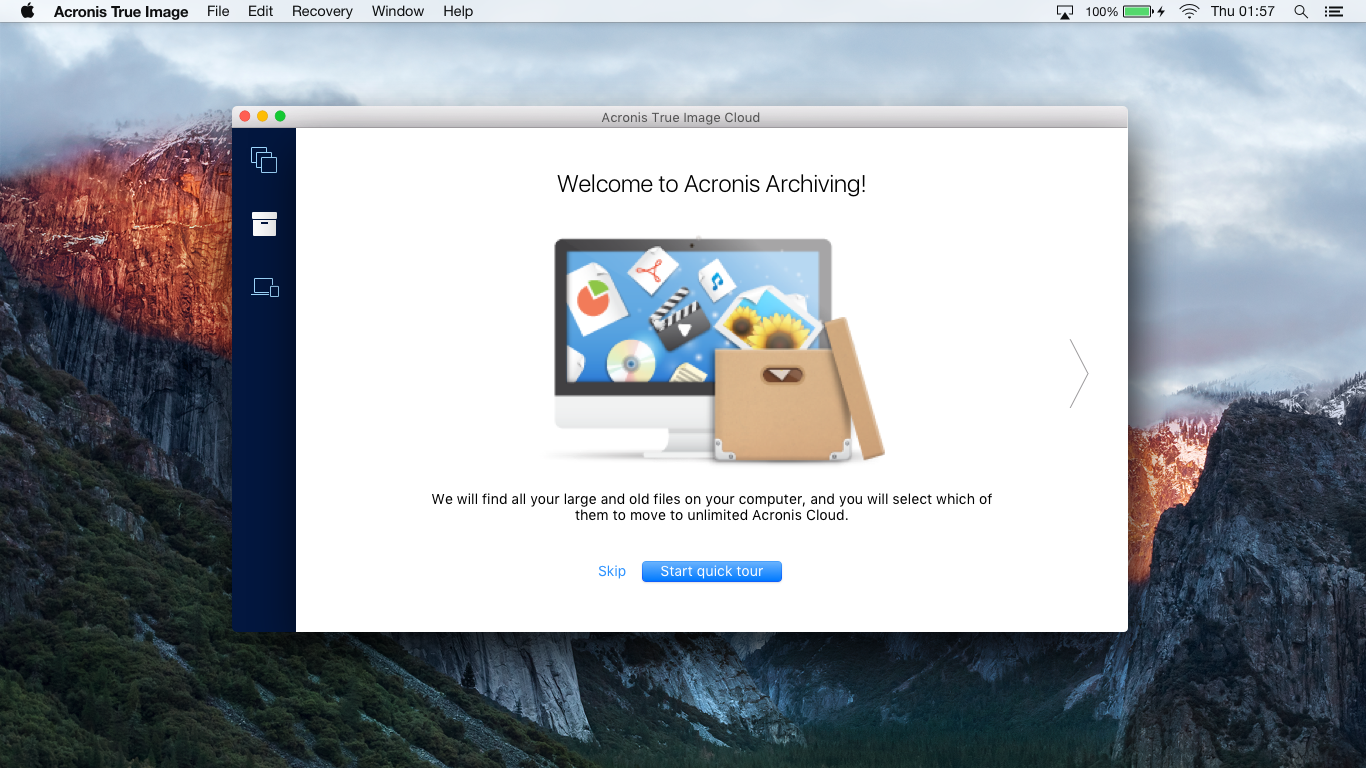
1. Greeting the user and a brief description of what archiving is. Someone already there will be enough information, and he may decide to use the application further, closing the tour. And someone wants to learn more, and will go to study the following steps.
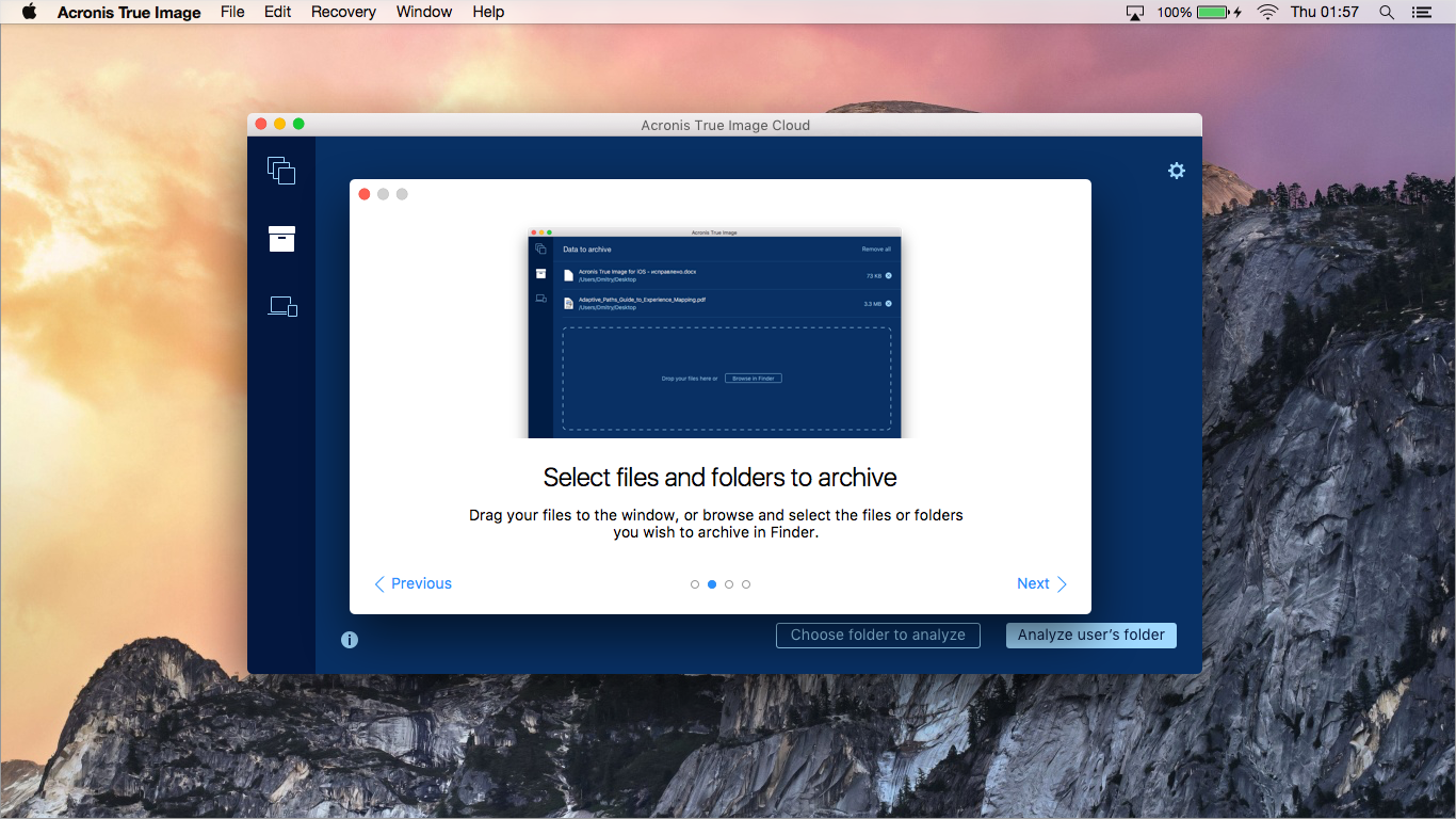
2. Step-by-step instruction about the work of archiving . There is already a detailed information about the three simple steps. Choose files in a convenient way; let the application move your files to the cloud, freeing up space on your hard drive; use the free disk space for new impressions.
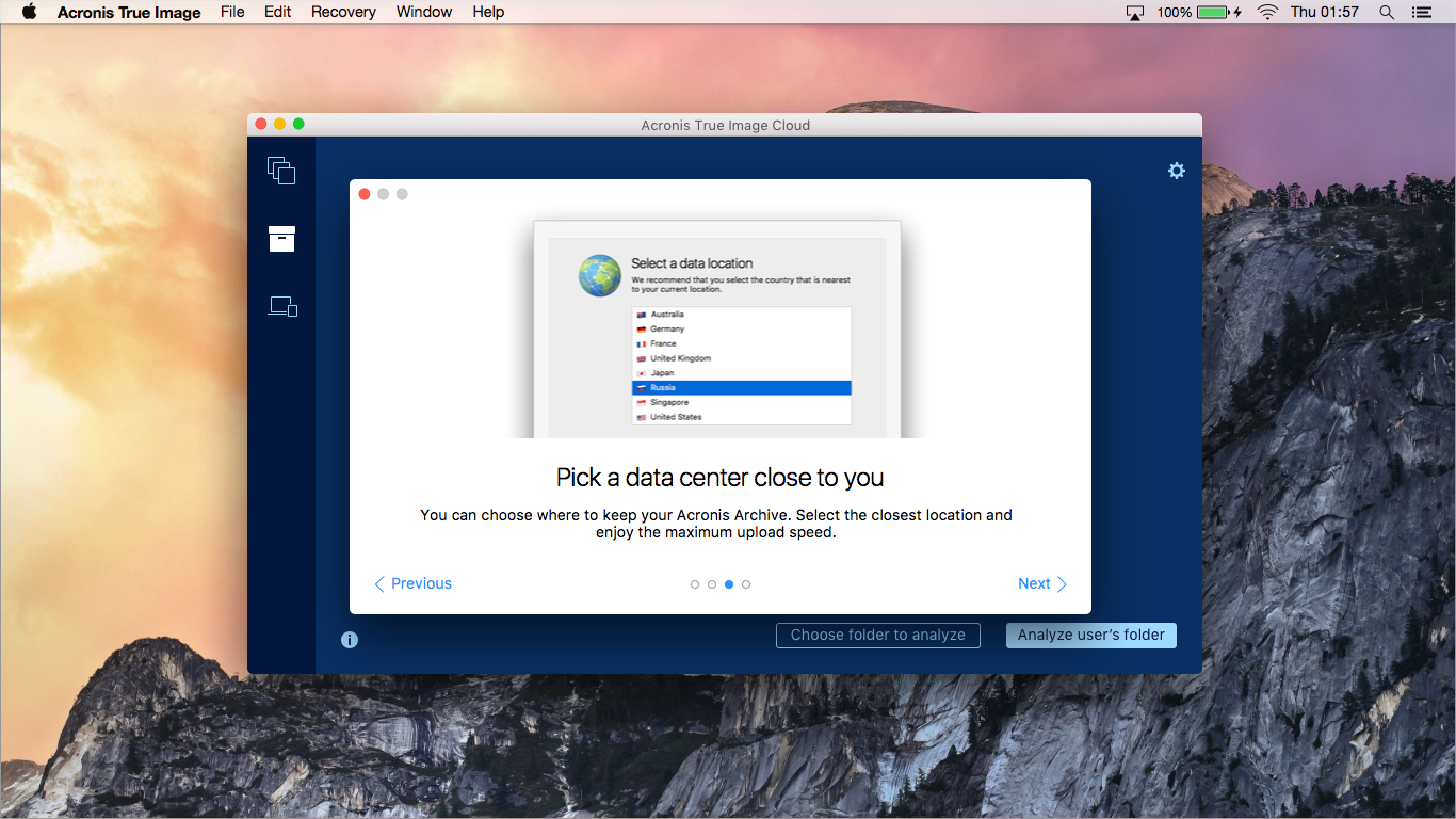
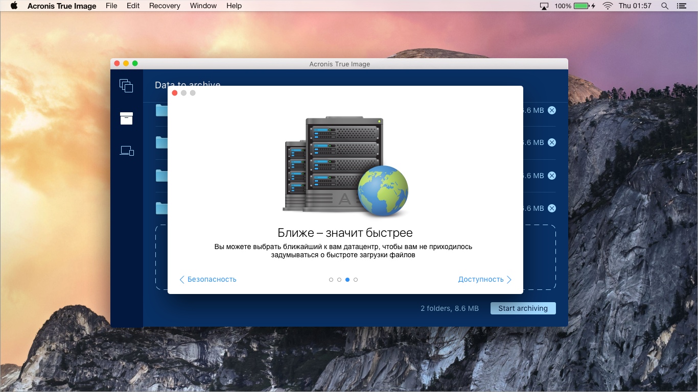
3. Choosing a data center. If you, for example, live in Germany, and you have a slow Internet, then the servers located within the country will allow you to quickly save and upload the data you need. If by law your data should be located within the country of residence, choose a server located in the country.
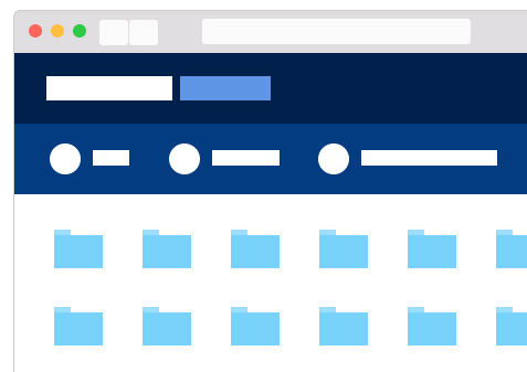
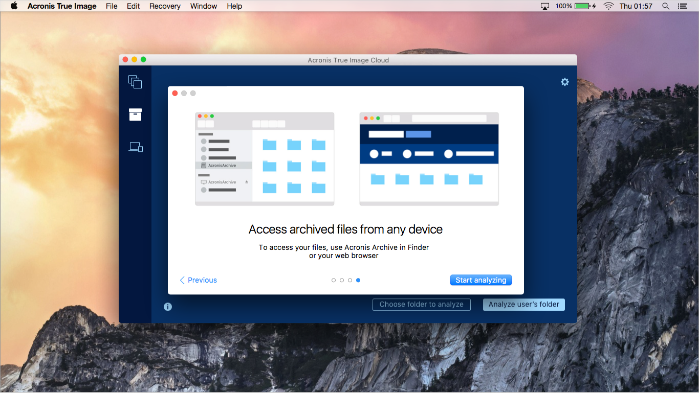
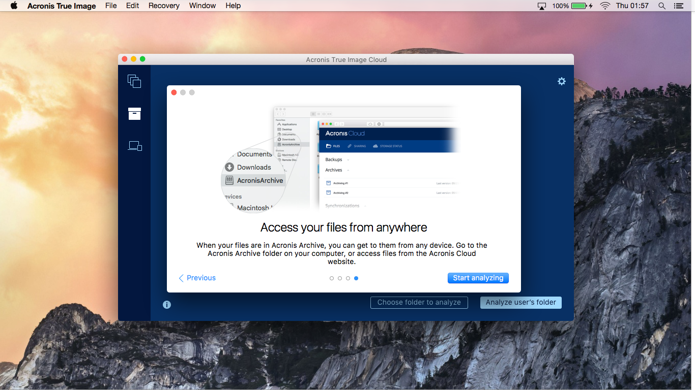
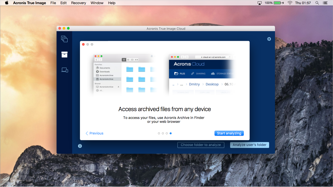
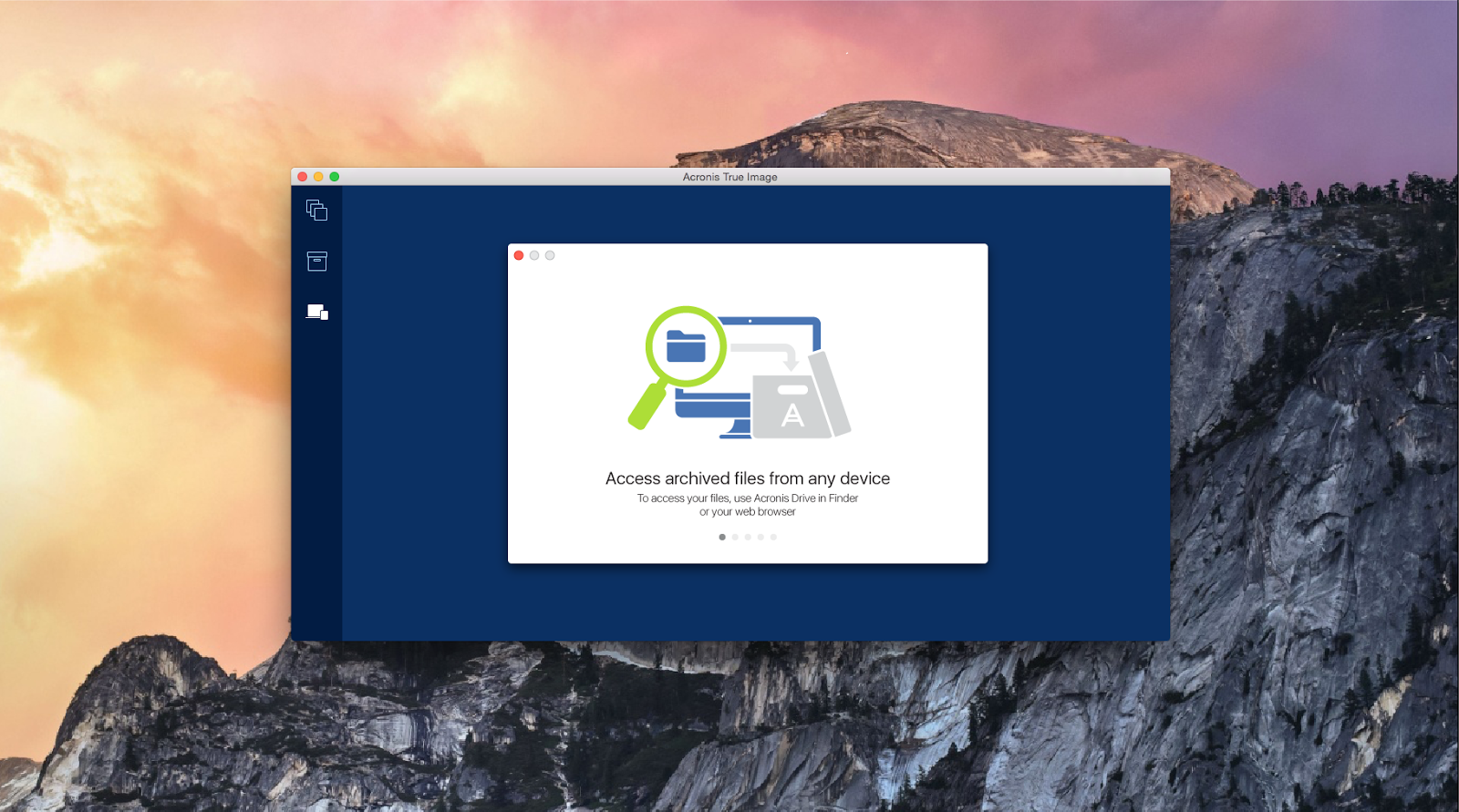
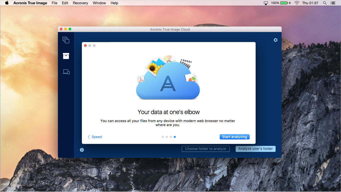
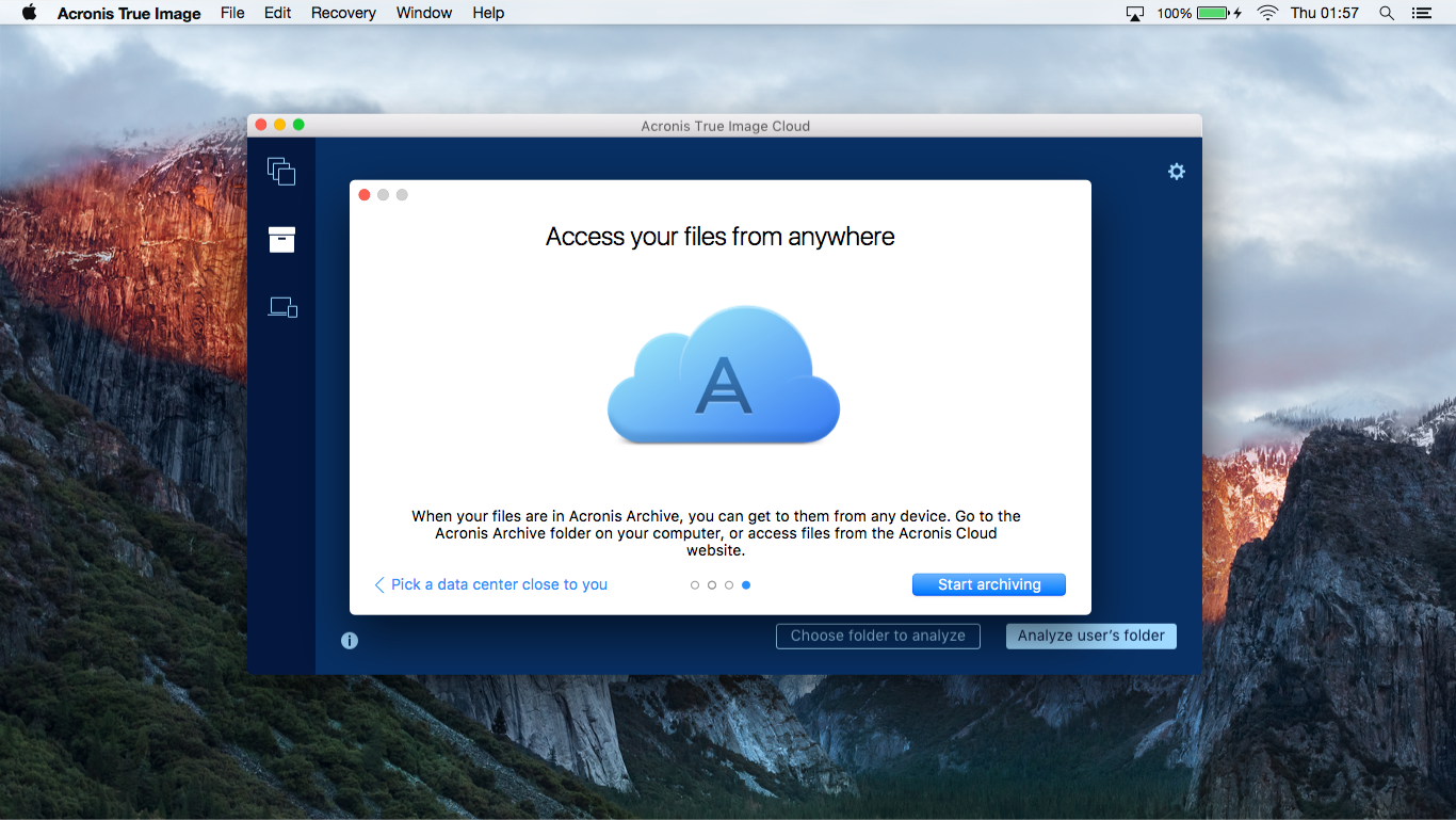
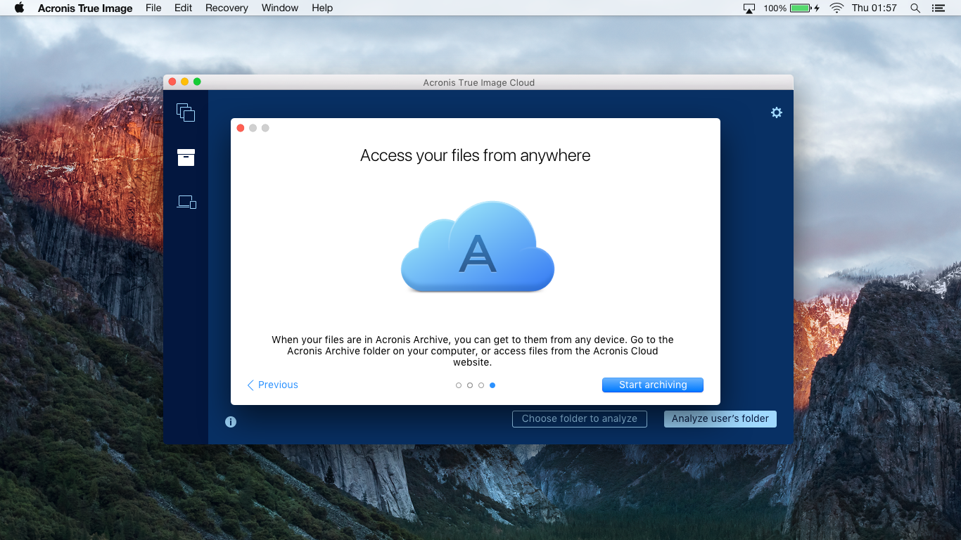
4. Easy file access. You want - use a disk mounted in the system, you want - open the browser from any device. You can upload the desired file regardless of the device on which you use the browser, as long as it is up-to-date.
Registration
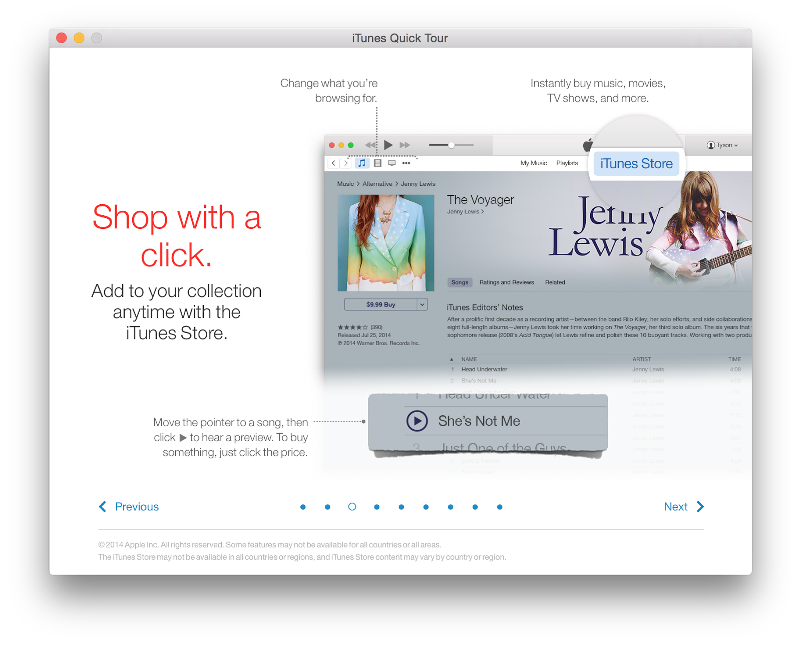
Since the company's policy is the maximum native in the Mac application, we began the search for style in the standard for OS X applications. This is one of the pages of the iTunes tour:
And this is what the Safari start page looks like when it is first launched:
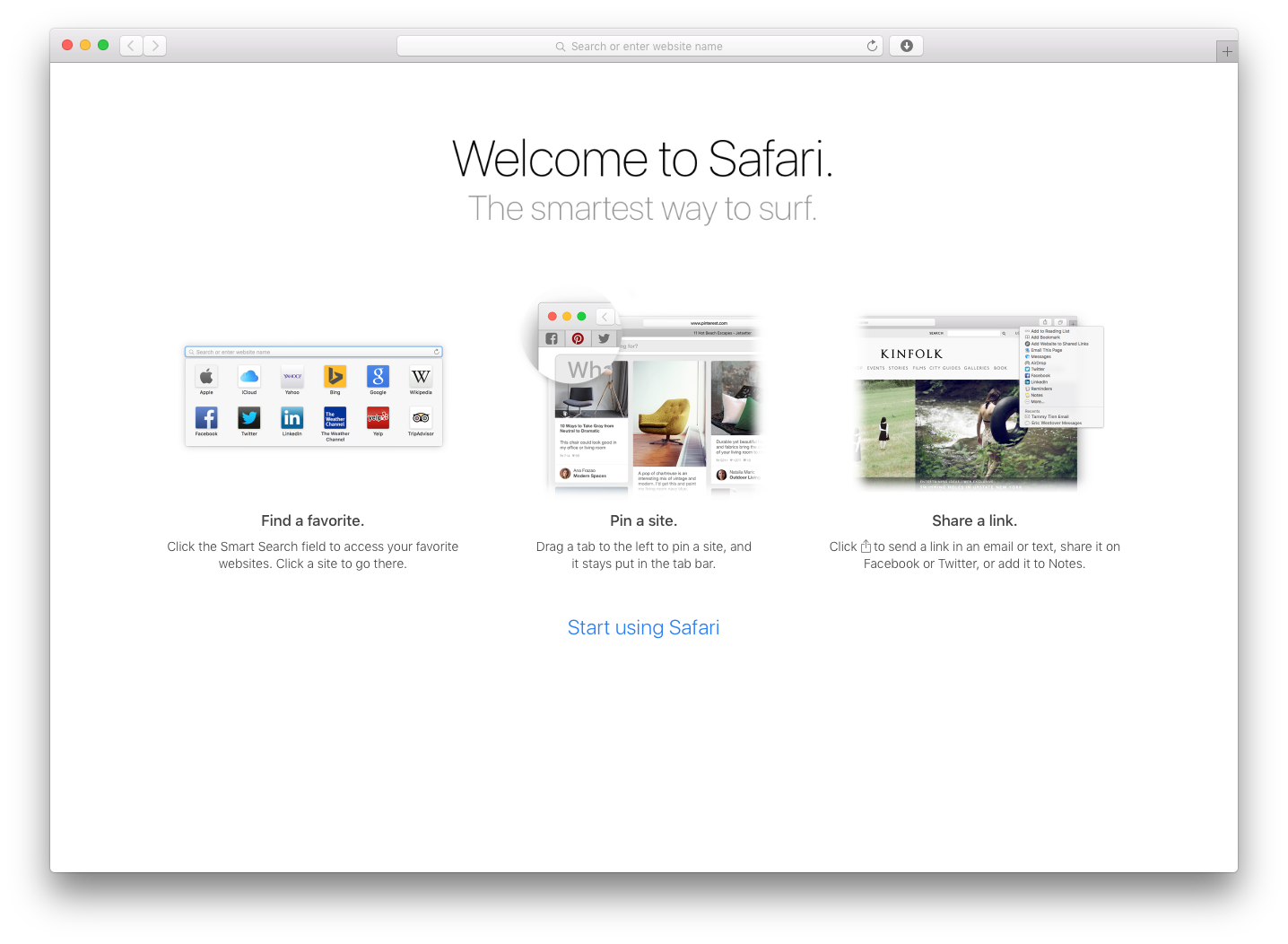
The advantages of this approach are that the user learns in conditions as close to reality as possible on the screenshots of the product itself. And to understand the product itself after such a tour will be much easier for him. But in our case there are more minuses.
First, it will be necessary to redraw the tour, even with minimal changes to the interface that lit up on the tour. For example, if the iTunes team decides to display its chosen avatar instead of the user's icon, then a large amount of tedious work awaits them. It is necessary to replace all screenshots where there is an old icon with new smart ones, on which there is already an avatar. This is one of the examples of how expensive it is to change something in the interface for a rather long-running product.
Secondly, the problem of accounting for all possible sizes of text blocks in the localization. This is such an extensive topic that it will be discussed a little later.
Approach using real interface
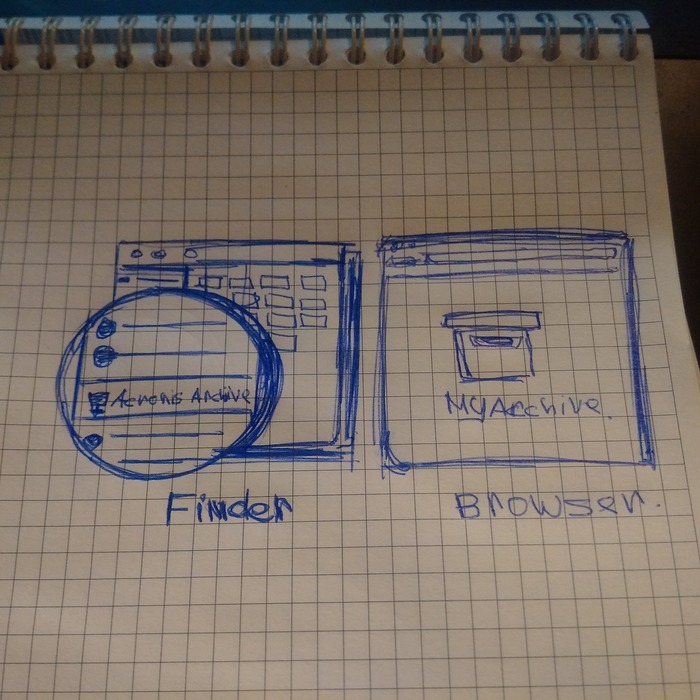
Although we knew about the problems that would have to face, but still decided to brazenly try to get around them, reducing the number of elements in the screenshots that will have to be localized. The task was simplified by the fact that the appearance of Safari and Finder rarely changes, which means it will not be so expensive to support such screenshots on the tour. For the sample, the pen selected the most difficult slide - about access to files. That is why we are talking only about Safari and Finder.
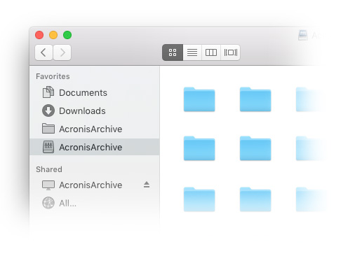
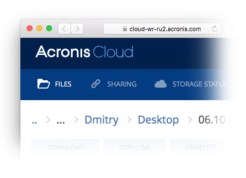
The essence of the slide is simple: a disk with archived files is mounted in OS X as a normal network drive. And through the browser you can get your files almost anywhere in the world.
Schematic approach
The notes storage application updated in OS X El Capitan welcomes the user with rather abstract illustrations:
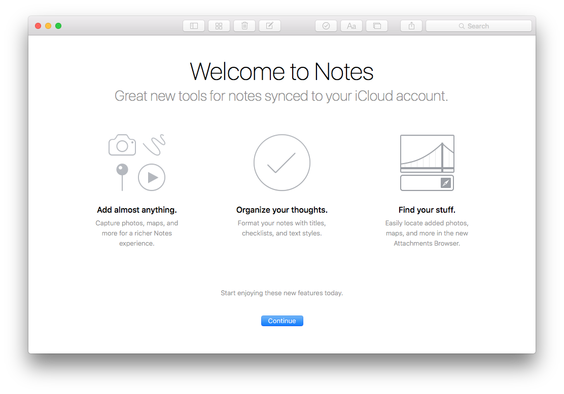
Notes use both icons taken from the interface and abstract images.
We decided to make an option combining schematics and screenshots of the real interface:
Fitting:
Neither fish nor fowl. Put in a bucket and try a different approach.
Approach with real screenshots of the interface without sketchiness
iTunes with Safari could? Have been able to. So we can try to find a solution within this approach.
Quickly throw the essence of the slide about access:
We try:
Enter on Wednesday:
And further:
On other slides:
No, it is impossible to deceive themselves. Newest OS X La Polkovnique released? Be kind, redraw your screenshots! Updated the icons in the sidebar of the application? Well, you know what to do. Therefore, we are looking further.
An approach with high-quality, but not very abstract illustrations.
Delicious, juicy and eye-catching approach, and therefore quite common. We begin to look for the desired level of abstraction, immediately writing out to the future interface and flirting with the text:
Detail:
Already close, we rush further:
Here it is!

We take to work and try on the style to other slides:

Fair remarks appear that such subtle and playful verbal traction is completely useless. We need more about the essence and further from abstraction:
We try to abandon a separate window, rearrange the elements and make a tour integrated into the archiving tab itself.
It turns ugly and uncomfortable. We refuse.
We have decided on illustrations, now we are starting to hone an equally important element - the text. And here the need to think about the localization of the product comes onto the scene.
Localization
Acronis True Image is used in 145 countries around the world, it "speaks" in 15 languages. Forgot about it? Get ready for the fact that technical writers will cut to the living, crumbling interface you already love. An excellent limiting factor to appreciate every word. Approximately, as a limit of 140 characters on Twitter.
Example. The capacious English-speaking team “Back up” turns into a “Backup”, widespread as the notorious Russian soul. This also happens often in Portuguese or German.
Therefore, once again having passed the ritual circle “make - check - think”, we came to a simple decision. Reliable, like a Kalashnikov machine, the “Next” and “Previous” link buttons perfectly solve our problems. We bring into consciousness all the links at each step of the tour, starting with the slide about access to files.
The results of the design are transmitted by a set of artifacts:
1. Common layouts
These are standard screenshots where the product is inscribed on Wednesday. In the case of archiving, this is the application interface in the OS X desktop environment.
2. Technical layouts
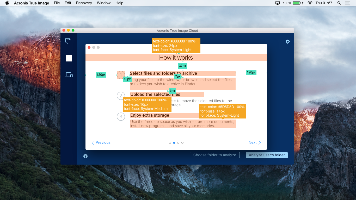
The same general layouts from the first paragraph. Only in them we additionally indicate all the parameters of the elements, their location and dependence on each other. It happens that we start with a printed version of the layout, where the developer indicates what data he needs.
The next step is to generate a layout in Sketch, where there is a description of all the elements and how they will be friends. Here the reins in the hands of the popular Sketch Measure plugin. Thanks to him, almost no need to draw "hands" when creating technical layouts and it remains only to figure out where to put so much time saved.
Detailed layouts (like in the picture before kata) help developers build an interface that is close to what they want. After that, together we bring to mind what was baked in the test assembly.
Friends and constantly communicate with developers is extremely important. You will not only be able to quickly polish the result of putting mockups into life, but also learn to understand what technical limitations are facing the developers (and you). And if you know the rules, you can already think of how clever ways you can get around them without losing quality and performance.
3. User path
We collect all the accumulated layouts into visual diagrams of user flow, analyzing the user's main path. We are trying to find out all the "turns" that can distract the user from the main stream: the suddenly collapsed Internet, the lack of a subscription and other similar obstacles.
Specifically, in this case such a diagram was not created because of the linearity of the flow: a person either sees the whole tour or not. The behavior of the interface in cases other than the main one was obtained in plain text.
Start from scratch. Draw with pencil, make mindmaps and wireframes.
Do not be afraid to experiment and look for new solutions. Without stuffing bumps on the error, experience will not get.
Never think that you know your user as yourself. Test hypotheses, try approaches, look for what will work in your case.
Supply all design developments with technical layouts and description of negative scenarios. Juicy season with thoughtful user flow with real layouts as steps. You will be mentally embraced by everything if you teach yourself to perform the entire ritual all the time even before you receive a similar comment:
Thank!

But why?
Our person is a professional of the world, ayti of forty-fifty years old, who helps to solve various problems with technology to those who call him “you are a computer programmer!”.
')
A technically savvy person is not lost in modern technologies and is ready to try new things. But this generally does not guarantee that such people will fully understand how good your product is. A person does not buy your product, but “a better version of himself”, which he hopes to get as a result. You need to help them get to know your product fully, even if it seems to you - the creators - to be simple and intuitive.
If you already have a successful product that is sold and has loyal fans, this does not mean that it will always be so. The product should not only develop technically, but also become easier to use. About how we made it easier True Image for Windows can be read here .
Starting point
Helping a person to master a product is more difficult than it seems. In digital form - emails on a specific schedule and help directly in the product itself. If a person buys a boxed version, then his services include printed manuals and telephone support.
I will tell only about how we were looking for a way to help the user navigate inside Acronis True Image for OS X.
Last year, Acronis True Image introduced a new, useful feature for Acronis Cloud subscribers - archiving files to the cloud. It works from the user side simply: dragging files to the application window with the mouse, or pressing a button and selecting everything in the usual Finder window that takes up disk space and is used quite rarely. This is what the archiving tab now looks like:
If the user does not have a subscription to Acronis Cloud, then he sees a very similar stub:
It seems elementary: I threw in the files and sent the whole pack to the unlimited cloud. After a couple of years I wanted to review the video from the wedding - I went to Acronis Cloud, downloaded and looked. Impressions and important files safe. And available at almost any time, and the free disk space is full.
But in fact, not everything is as simple as it seemed. Initially, we ran into a short tour of archiving on the Windows version, so the harvest from the mistakes we sowed had already been gathered.
It turned out that a pleasant version with abstract illustrations does not help us at all to understand how people can benefit from archiving. Exactly, as well as not all hearts got through the tour. It was then that began the dense work on the bugs.
Dig, Shura, dig!
The essence
We are looking for what problems the user is experiencing and how to help him with their solution. The very first draft of the solution fit on a piece of shabby reality:
The discussion in Basecamp turned out so long that the plug-ins for taking screenshots of web pages crashed under my attempts to make a screenshot for the article. So you have to take my word for it. In general, we agreed on the opinion that with each new slide we will provide more and more details, focusing on the four main slides:
1. Greeting the user and a brief description of what archiving is. Someone already there will be enough information, and he may decide to use the application further, closing the tour. And someone wants to learn more, and will go to study the following steps.
2. Step-by-step instruction about the work of archiving . There is already a detailed information about the three simple steps. Choose files in a convenient way; let the application move your files to the cloud, freeing up space on your hard drive; use the free disk space for new impressions.
3. Choosing a data center. If you, for example, live in Germany, and you have a slow Internet, then the servers located within the country will allow you to quickly save and upload the data you need. If by law your data should be located within the country of residence, choose a server located in the country.
4. Easy file access. You want - use a disk mounted in the system, you want - open the browser from any device. You can upload the desired file regardless of the device on which you use the browser, as long as it is up-to-date.
Registration
Since the company's policy is the maximum native in the Mac application, we began the search for style in the standard for OS X applications. This is one of the pages of the iTunes tour:
And this is what the Safari start page looks like when it is first launched:
The advantages of this approach are that the user learns in conditions as close to reality as possible on the screenshots of the product itself. And to understand the product itself after such a tour will be much easier for him. But in our case there are more minuses.
First, it will be necessary to redraw the tour, even with minimal changes to the interface that lit up on the tour. For example, if the iTunes team decides to display its chosen avatar instead of the user's icon, then a large amount of tedious work awaits them. It is necessary to replace all screenshots where there is an old icon with new smart ones, on which there is already an avatar. This is one of the examples of how expensive it is to change something in the interface for a rather long-running product.
Secondly, the problem of accounting for all possible sizes of text blocks in the localization. This is such an extensive topic that it will be discussed a little later.
Approach using real interface
Although we knew about the problems that would have to face, but still decided to brazenly try to get around them, reducing the number of elements in the screenshots that will have to be localized. The task was simplified by the fact that the appearance of Safari and Finder rarely changes, which means it will not be so expensive to support such screenshots on the tour. For the sample, the pen selected the most difficult slide - about access to files. That is why we are talking only about Safari and Finder.
The essence of the slide is simple: a disk with archived files is mounted in OS X as a normal network drive. And through the browser you can get your files almost anywhere in the world.
Schematic approach
The notes storage application updated in OS X El Capitan welcomes the user with rather abstract illustrations:
Notes use both icons taken from the interface and abstract images.
We decided to make an option combining schematics and screenshots of the real interface:
Fitting:
Neither fish nor fowl. Put in a bucket and try a different approach.
Approach with real screenshots of the interface without sketchiness
iTunes with Safari could? Have been able to. So we can try to find a solution within this approach.
Quickly throw the essence of the slide about access:
We try:
Enter on Wednesday:
And further:
On other slides:
No, it is impossible to deceive themselves. Newest OS X La Polkovnique released? Be kind, redraw your screenshots! Updated the icons in the sidebar of the application? Well, you know what to do. Therefore, we are looking further.
An approach with high-quality, but not very abstract illustrations.
Delicious, juicy and eye-catching approach, and therefore quite common. We begin to look for the desired level of abstraction, immediately writing out to the future interface and flirting with the text:
Detail:
Already close, we rush further:
Here it is!
We take to work and try on the style to other slides:
Fair remarks appear that such subtle and playful verbal traction is completely useless. We need more about the essence and further from abstraction:
We try to abandon a separate window, rearrange the elements and make a tour integrated into the archiving tab itself.
It turns ugly and uncomfortable. We refuse.
We have decided on illustrations, now we are starting to hone an equally important element - the text. And here the need to think about the localization of the product comes onto the scene.
Localization
Acronis True Image is used in 145 countries around the world, it "speaks" in 15 languages. Forgot about it? Get ready for the fact that technical writers will cut to the living, crumbling interface you already love. An excellent limiting factor to appreciate every word. Approximately, as a limit of 140 characters on Twitter.
Example. The capacious English-speaking team “Back up” turns into a “Backup”, widespread as the notorious Russian soul. This also happens often in Portuguese or German.
Therefore, once again having passed the ritual circle “make - check - think”, we came to a simple decision. Reliable, like a Kalashnikov machine, the “Next” and “Previous” link buttons perfectly solve our problems. We bring into consciousness all the links at each step of the tour, starting with the slide about access to files.
Work results
The results of the design are transmitted by a set of artifacts:
1. Common layouts
These are standard screenshots where the product is inscribed on Wednesday. In the case of archiving, this is the application interface in the OS X desktop environment.
2. Technical layouts
The same general layouts from the first paragraph. Only in them we additionally indicate all the parameters of the elements, their location and dependence on each other. It happens that we start with a printed version of the layout, where the developer indicates what data he needs.
The next step is to generate a layout in Sketch, where there is a description of all the elements and how they will be friends. Here the reins in the hands of the popular Sketch Measure plugin. Thanks to him, almost no need to draw "hands" when creating technical layouts and it remains only to figure out where to put so much time saved.
Detailed layouts (like in the picture before kata) help developers build an interface that is close to what they want. After that, together we bring to mind what was baked in the test assembly.
Friends and constantly communicate with developers is extremely important. You will not only be able to quickly polish the result of putting mockups into life, but also learn to understand what technical limitations are facing the developers (and you). And if you know the rules, you can already think of how clever ways you can get around them without losing quality and performance.
3. User path
We collect all the accumulated layouts into visual diagrams of user flow, analyzing the user's main path. We are trying to find out all the "turns" that can distract the user from the main stream: the suddenly collapsed Internet, the lack of a subscription and other similar obstacles.
Specifically, in this case such a diagram was not created because of the linearity of the flow: a person either sees the whole tour or not. The behavior of the interface in cases other than the main one was obtained in plain text.
Little about morality
Start from scratch. Draw with pencil, make mindmaps and wireframes.
Do not be afraid to experiment and look for new solutions. Without stuffing bumps on the error, experience will not get.
Never think that you know your user as yourself. Test hypotheses, try approaches, look for what will work in your case.
Supply all design developments with technical layouts and description of negative scenarios. Juicy season with thoughtful user flow with real layouts as steps. You will be mentally embraced by everything if you teach yourself to perform the entire ritual all the time even before you receive a similar comment:
Thank!
Source: https://habr.com/ru/post/280842/
All Articles