Product Design Digest March 2016
For six years now I have been publishing regular reviews of fresh articles on the topic of interfaces, new tools and collections of patterns, interesting cases and historical stories. From the tapes of several hundred thematic subscriptions, approximately 5% of the worthwhile publications are selected that are interesting to share. Previous materials: April 2010-February 2016 .

Baymard Institute Studies
')
5 Essential UX Rules for Dialog Design
Nikita Babich gives advice on the design of dialogues and popups. Pros, cons, pitfalls.
Interface Animation
Onboarding
Designing Social Interfaces
Last summer, O'Reilly released the second edition of Christian Crumlish and Erin Malone's Designing Social Interfaces. UXMatters publishes Chapter 8 of it, which examines the patterns that users share content .
Design smart notifications
A little about the life of notifications, so that they do not spoil the lives of users, and help them in solving problems.
Presidential Election 2016 - The Best UI
Chris Calabrese from Cooper examines US presidential candidate sites from a design point of view. An interesting comparison of the parameters, useful, including those who collect donations.
Material design
Android TV

Apple iOS 9
How To Make A Physiology-Friendly Application For The iPad
Ksenia Sternina published the results of the study of physical limitations when working with a tablet in the form of an article. According to the results, we managed to create a safe zone map for the iPad Air 2.
Hierarchy of Trust - The 5 Experiential Levels of Website Commitment
Several levels of trust in the site that need to be considered for building quality user experience. By and large, the question is: what level of trust can we and / or should we expect in the first, second, etc. contact with the user? The article is not indisputable, but raises an important question.

How To Design Happiness
A discussion by designers Lippincott, Disney and SoulCycle about how products can make users happier. The examples are mostly offline, but apply to interfaces.
When US Air Force Discovered
An excerpt from the book Todd Rose "The End of Average", which tells about the mythicalness of the average user. The author cites two stories - the USAF and the competition of female beauty. In both cases, no one person met the averaged characteristics. Translation .
Dyslexia
Interface Ethics
Design Methods - Toolkit Design Method Toolkit for multidisciplinary design research
mediaLABamsterdam collected a handbook on methods and practices of collaboration, research, prototyping and other stages of design projects. They are classified by task, time cost and complexity of preparation.

 Donna Lichaw - The User's Journey
Rosenfeld Media is preparing to release a book by Donna Lichaw “The User's Journey”, dedicated to working out ways for the user to interact with the product. UXMatters publishes chapter 7 of it , and UXBooth - an interview with the author .
Practical Service Design - Guides, Resources, And Community
Erik Flowers from Intuit and Megan Miller from Stanford have launched Practical Service Design with tutorials and service design templates. Manual itself and the template for Omnigraffle .
Customer Journey Map
Architect Everywhere
A powerful article on information architecture from Jorge Arango. He refers to the physical architecture and tries to apply its three roles (structuring, creating habitat and achieving strategic goals) to interfaces and digital products in general.
Content strategy
Design Thinking versus Visual Thinking - What's the Difference?
Xplane recalls that the design mindset didn’t converge with light. And give explanations to the two approaches, which are often mixed.
UXPressia
Printerest
Pinterest does not allow for comfortable printing of images, which makes the assembled mindboards less useful - it is often convenient to hang examples on the walls. Tim Diacon has written a Challenge Printerest extension that solves the problem.
All Talk and No Buttons - The Conversational UI
A great design memo for messengers from Matty Mariansky, one of the creators of the Meekan bot planner. It describes the whole process of working on such interfaces and their main limitations. It is clearly seen that they are not suitable for all tasks and such things familiar to graphical interfaces as validation or working under several scenarios turn into a big headache for the user and the designer. The second part .
Adobe Experience Design CC
Adobe Comet is now called Experience Design CC and is available in preview mode on the official website. So far, however, only for the Mac, and without many key features.
Publications about him:
Lingo
The Noun Project develops its concept - they want to help designers in the organization of a whole visual language, going beyond the icons. The application is called Lingo and helps to organize work on its elements - icons, colors, illustrations, photos.

Craft by InVision LABS
Apparently, InVision is going full speed ahead to create its own full-featured tool for designers, not limited to prototyping from a bunch of static screens, which will easily become the third largest product to Sketch and Adobe (or even overtake one of them). In just one month after the announcement, he managed to outgrow this status and promise a lot of interesting things.

In addition to a dozen features announced , the company bought three tools for designers (Macaw, Relay and Silver Flows) and showed the second version of Craft , which is becoming a full-fledged prototyping tool in Sketch. Given the very raw state in which Adobe released the beta version of Comet the same day, a promising product greatly disappointed the community and Craft had a head start. In general, the year promises to be wildly interesting.
Interaction density
Interesting thoughts about the team Bjango "interaction density" in different interfaces. Classic operating systems are mouse controlled and interface elements can be relatively small. In addition, they have hot keys, context menus and a bunch of other solutions that allow you to fit more possibilities on the existing screen. At the same time, most of these things are not in mobile OSs, and even the requirements for a minimally comfortable area of depression are higher. The article is a cool comparative table for different devices.
The grid cms
The first sites on The Grid CMS appeared and this is a very sad sight:
Many more examples have been excavated at Reddit, and the extremely low quality of technical implementation is noted at Designer News. The video of working with the publisher's interface shows very specific interface solutions . Anyone who was skeptical about this product and the idea that designers will be replaced by robots, can drink champagne.
Another bunch of examples:
Sketch 3.6 and beta 3.7
Sketch 3.6 came out, which among other things fixes work with text. How it is built now ( in Russian ). At the end of the month, a beta version of Sketch 3.7 appeared with reworked symbols, which now support nesting and convenient editing of copies. A small gif of how this works .
Other Sketch News:
Designer's Guide to DPI and PPI
An updated article on how to adapt the designer to a huge number of devices with different resolutions.
Principle
Adobe After Effects
Flinto
Mailing letters
PixelKit - A happy place for your team's designs.
PixelKit, another service for the system discussion of design layouts within teams. Collects comments from different sources (mail, instant messengers), supports versioning of layouts, synchronizes with cloud storages.
Photoshop plugins and effects
Pixate
Zeplin
Sketch sheets
Another collection of paper design templates is also quite large.
Affinity designer
Publishing Tools
Mockingbird - Website wireframes
The service has been updated, it has become even more pleasant to work. One project is free.
Motif - Generate beautiful clicks
Motif stub image generator for use in OpenGraph - the correct previews will be pulled up on social networks.
UsabilitySquare
Service UsabilitySquare allows you to receive feedback on their prototypes and layouts from other interface specialists. Upload a picture, ask a question, get the opinions of colleagues in the shop. While the activity is not very big, but the format is interesting.
So your boss doesn't believe in user research.
Laura Martini gives advice on how to sell management the need for user research. In the article there are golden words about the importance of speaking in the language of business, because the same accountants do not say that they earn from their work experience in Excel.
Excuses, Excuses! Why Companies Do Not Conduct User Research
Jim Ross refutes another pack of myths, this time about why you can do without user research.
Google Accessibility Scanner
Google has released the Accessibility Scanner app for Android. It shows problem areas in the application and generates a report with screenshots. A few words about his work .
Google is hitting the road "literally" for user feedback
Google launched an interesting user research initiative. They organized a mobile UX-lab, which comes to the users themselves.
Keeping Yourself Out Of The Story - Controlling Experimenter Effects
Philip Hodgson of Userfocus describes in sufficiently capacious ways how to deal with the effect of an observer when a user researcher influences a respondent with his behavior.
The Interview Survey: Getting the Accuracy of Interviewing Thousands of Users
Dmitry Khanin talks about combining interviews and polls with subsequent ranking of the problems found.
When words are not enough
Daria Plutecka suggests using a psychoanalytic projection method in order to get a clearer user opinion.
Zarget - New Age A / B Testing and Heatmap Software
Zarget, another tool for studying click maps and performing A / B testing.
How to Handle Multiple Comparisons
Jeff Sauro tells you how to deal with false and false-negative positives when doing user research.
Houdini - Maybe Your Most Exciting Development In CSS You've Never Heard Of
Philip Walton talks about the (possibly) near future CSS - the Houdini initiative, which allows polyfiles to be used in the same way as JavaScript. Now, many advanced CSS features like shapes and layer blending functions cannot be used in practice, and workarounds are catastrophic for browser performance. Houdini will expand the W3C standards. However, in the comments ironic that in order not to wait 10 years before the appearance of CSS properties in all browsers, you will have to wait 10 years before the introduction of Houdini.

Live guidelines and component systems
Web typography is broken. Here's how we can fix it
Tom Bredin-Gray gives a detailed analysis of the problem of building interparagraph indents and vertical rhythm in CSS. He released the MegaType library , which makes the text on the web predictable.
See the Pen of the MegaType demo by Thomas Bredin-Gray ( @tbredin ) on CodePen .
Zell Liew answers him and tries to figure out if it is critical to keep the vertical rhythm up to the pixel. True, the examples lack the classic good-quality media sites. Other web typography materials:
Work with SVG
Paintcode
Dirty Tricks From The Dark Corners Of Front-End
Fresh presentation of Vitaly Friedman, in which he collected a huge pile of useful scripts and hacks. Some more new scripts:
Bootstrap and Foundation
Web Animation Past, Present, and Future
An overview of the current state of web animation from Rachel Nabors. She brings two services to test the functionality of certain functions in the browser - Are we animated yet? and WAAPI Browser Support Test , as caniuse.com is often mistaken. Continuing the theme:
CSS Shapes
Framer
Layer Modes
Webflow
Versioning design files
Flexbox
Sympli
Is The Net Promoter Score A Percentage?
Jeff Sauro is trying to figure out whether NPS is measured in percentages or simply absolute numbers. In various publications and cases, he is mentioned in different ways. One of the key articles in raising interest in metrics uses percentages, but in general, the essence does not change.
Modernization Nimax 2015
The most powerful series of articles on the restructuring of the St. Petersburg design studio Nimax. Elena Ogordnikova came to the company last year, amid the crisis, and did a great job of stabilizing first, and then resuming growth. Rarely do they talk in such detail about the inner kitchen of big changes. The second part .

PepsiCo's Chief Design Officer
Interview with Mauro Porcini, PepsiCo Chief Design Officer about how a company changes itself with design. Although we are talking about things that are far from digital products, everything he says sounds very close to the problems of our industry. Design strategy, design culture, innovation and much more - very cool.
In the same issue of HBR, there was an interview with Indra Nooyi , the CEO of the company, where there are a lot of details on the other side. How she came to understand that the company needs a new approach to design.
How To Use Your Startup Into A Learning Machine
Dmitry Koltunov tells how the organization of the book club helped his startup Alice to develop employees and solve the problems facing the company.
How to Modernize User Experience
The Tandem Seven website has a Leah Buley report for Forrester, in which she talks about a modern approach to building UX in the company. In appearance, not a pirate.
Building a design culture
Five Best Practices for Becoming a Data-Driven Design Organization, part 2
Michelle Bacigalupi continues to describe the implementation of a systematic approach to working with user research and analytics in some well-known, but not called, conference call service.
Apologists of rationality against customer-oriented Old Believers
Translation of comics showing software development methodologies in the form of various car repair shops.
How to hire designers
Team paper
Project management service for designers. For subscribers digest opened access to the beta version . Authors are interested in reviews and criticism.
Analytics Academy
At the end of last year, the Segment service team launched an analytics school. It describes key aspects, processes and tools in a very simple language. New articles are being laid out, now one and a half sections are available. Some materials:
Google Analytics 360 - Enterprise Analytics For Your Marketing
Google combined its marketing analytics tools with Analytics 360 Suite. It includes web analytics, A / B testing, visualization of complex data and relationships, the ability to connect third-party data sources and work with advertising campaigns .

Editorial CMS
Redesign Cases
Design for Action
Tim Brown talks about how IDEO shifts its focus to more complex and large-scale projects using the example of a school initiative in Peru.
The Rise and Fall of Nokia - How One Inventor
Very interesting interview with Christian Kraft, one of the first Nokia interface designers. He has a huge number of interface patents and solutions that are used now. And he started in those times when screens only appeared in the phones, which meant he had to invent everything from scratch.

How The Shopping Cart Shaped Our Buying Habits
, , . , e-commerce.
Photoshop
Design in Tech Report 2016
John Maeda KPCB Design in Tech 2016. , . - -, . , . .
Project phoebe
An interesting concept of "mutational design" from Liam Spradlin. It describes the ideology of the interface, which adapts to the user, using his contextual data. There are two big articles, code and community .

Microsoft HoloLens
The virtual reality
Trends in the media
Algorithmic design
Car Interfaces
Interfaces to the cinema
Design and Science
Joichi Ito's interesting material on antidisciplinary research as the next step after interdisciplinary. He describes the concept of Neri Oxman, in which design, art, science and engineering are closely interrelated and give a new understanding of each other. One of the strongest articles on the topic of modern design philosophy.

Helping designers with creative block
Simple motivational advice for designers in case the idea has stalled.
May 1st Reboot - An international event for designers & makers
The new site of the once popular initiative # May1Reboot - on this day there will be mass launches of site redesigns. One of the main initiators of its revival is Tobias van Schneider.
Readymag Design School
Google IxD Exercise
Balraj Chana laid out his test task for the role of mobile designer in Google.
Product Designers
Why is modern design so much the same?
100 layouts in 100 days
Working sketches
Shopping design studios by large companies
Sessions AMA
Interaction16
The first materials from the conference Interaction16, which was held March 2-4 in Helsinki.
Fresh links can also be tracked in the Facebook group of the same name or received once a month by mail . Thanks to everyone who also publishes links in it, especially Gennady Dragun, Pavel Skripkin, Dmitry Podluzhny, Anton Artyomov, Denis Efremov, Alexey Kopylov, Taras Brizitsky and Yevgeny Sokolov. More and more materials in reviews appear thanks to them.
Subscribe to the newsletter ! A letter arrives once a month.

Patterns and Best Practices
Baymard Institute Studies
- Christian Holst on how to show multipage output in the large and mobile web . Page-by-page navigation is not recommended, it is better to use a combination of autoload and the “show more” button.
- Christian Holst examines the mobile version of the online store B & H Photo , which according to their research turned out to be one of the best.
- Christian Holst on the importance of avoiding unnecessary use of categories and relying more on filters .
')
5 Essential UX Rules for Dialog Design
Nikita Babich gives advice on the design of dialogues and popups. Pros, cons, pitfalls.
Interface Animation
- Mark Di Sciullo on the system work on interface animation . There is nothing new in the main messages, but there is a useful infographic-crib in the article.
- Appealing, another collection of animations .
- Stripe Dashboard for iOS .
Onboarding
- Samuel Hiluck advises working with mailing lists as part of general onboarding .
- Matt Le parses the new user training system in the Clash Royale game .
Designing Social Interfaces
Last summer, O'Reilly released the second edition of Christian Crumlish and Erin Malone's Designing Social Interfaces. UXMatters publishes Chapter 8 of it, which examines the patterns that users share content .
Design smart notifications
A little about the life of notifications, so that they do not spoil the lives of users, and help them in solving problems.
Presidential Election 2016 - The Best UI
Chris Calabrese from Cooper examines US presidential candidate sites from a design point of view. An interesting comparison of the parameters, useful, including those who collect donations.
Guidelines for platforms and companies
Material design
- Common sense triumphed and the bottom action panel became part of the official guidelines (for tablets, it turns into a column on the left). The screens of the phones are growing and dragging your finger upwards, where the controls on Android have always been located, it became physically painful. Differentiation from iOS at such a price did not justify itself. However, its potential conflict with FAB is almost not registered (there is a scheme at the end of the page), and the selected element with a signature (with the rest without it) looks debatable.
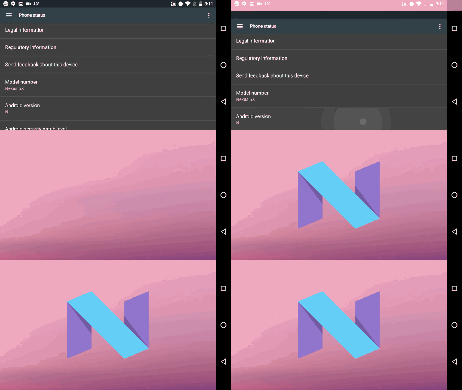
- Review of upcoming changes in the next version of Android N. There will be a two-window a la Windows 8, night mode (welcome back, Holo UI!), More information on the lock screen. In the notification panel, the principle of grouping and displaying notifications ( parsing ) is changing, and the possibilities for quick actions right from here will improve. The notifications themselves will pop up in both iOS and Windows Phone, including advanced actions. Official documentation and another analysis of the updated notification panel in Android N.
- But this is completely unexpected - in Android N there will be a classic multi-window like in desktop OS, and not just a split on the panel .
- Fantasy Interactive posted a stack of photos of the workflow over Material Design . They helped Google to try on the guidelines for the web.
- Very interesting interview with Rob Giampietro and Amber Bravo about the design philosophy of Google . They talk about material design, the SPAN conference, and the desire to support art and design in the same way that IBM and Olivetti did in the middle of the 20th century.

Android TV

Apple iOS 9
Understanding the user
How To Make A Physiology-Friendly Application For The iPad
Ksenia Sternina published the results of the study of physical limitations when working with a tablet in the form of an article. According to the results, we managed to create a safe zone map for the iPad Air 2.
Hierarchy of Trust - The 5 Experiential Levels of Website Commitment
Several levels of trust in the site that need to be considered for building quality user experience. By and large, the question is: what level of trust can we and / or should we expect in the first, second, etc. contact with the user? The article is not indisputable, but raises an important question.

How To Design Happiness
A discussion by designers Lippincott, Disney and SoulCycle about how products can make users happier. The examples are mostly offline, but apply to interfaces.
When US Air Force Discovered
An excerpt from the book Todd Rose "The End of Average", which tells about the mythicalness of the average user. The author cites two stories - the USAF and the competition of female beauty. In both cases, no one person met the averaged characteristics. Translation .
Dyslexia
Interface Ethics
Information architecture, conceptual design, content strategy
Design Methods - Toolkit Design Method Toolkit for multidisciplinary design research
mediaLABamsterdam collected a handbook on methods and practices of collaboration, research, prototyping and other stages of design projects. They are classified by task, time cost and complexity of preparation.

 Donna Lichaw - The User's Journey
Rosenfeld Media is preparing to release a book by Donna Lichaw “The User's Journey”, dedicated to working out ways for the user to interact with the product. UXMatters publishes chapter 7 of it , and UXBooth - an interview with the author .
Practical Service Design - Guides, Resources, And Community
Erik Flowers from Intuit and Megan Miller from Stanford have launched Practical Service Design with tutorials and service design templates. Manual itself and the template for Omnigraffle .
Customer Journey Map
- James Kalbach describes the difference between customer journey map, experience map and service blueprint . Although in the end it says that the accuracy of following the terms is not so important if you have solved your task.
Architect Everywhere
A powerful article on information architecture from Jorge Arango. He refers to the physical architecture and tries to apply its three roles (structuring, creating habitat and achieving strategic goals) to interfaces and digital products in general.
Content strategy
Design Thinking versus Visual Thinking - What's the Difference?
Xplane recalls that the design mindset didn’t converge with light. And give explanations to the two approaches, which are often mixed.
UXPressia
Printerest
Pinterest does not allow for comfortable printing of images, which makes the assembled mindboards less useful - it is often convenient to hang examples on the walls. Tim Diacon has written a Challenge Printerest extension that solves the problem.
Design and design of interface screens
All Talk and No Buttons - The Conversational UI
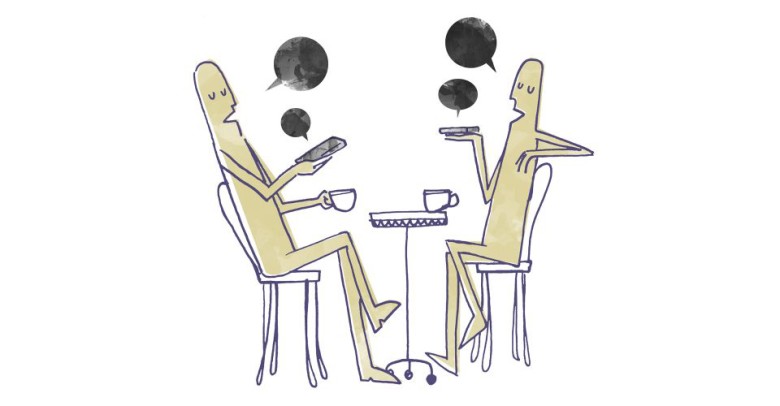
A great design memo for messengers from Matty Mariansky, one of the creators of the Meekan bot planner. It describes the whole process of working on such interfaces and their main limitations. It is clearly seen that they are not suitable for all tasks and such things familiar to graphical interfaces as validation or working under several scenarios turn into a big headache for the user and the designer. The second part .

Adobe Experience Design CC
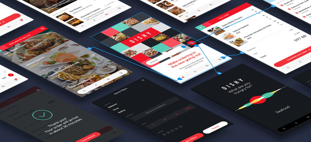
Adobe Comet is now called Experience Design CC and is available in preview mode on the official website. So far, however, only for the Mac, and without many key features.

Publications about him:
- About Adobe Experience Design CC .
- AMA with the product team .
- An extensive interview with Tom Krcha, one of the authors of the Comet idea, about the current state and plans for the product .
Lingo
The Noun Project develops its concept - they want to help designers in the organization of a whole visual language, going beyond the icons. The application is called Lingo and helps to organize work on its elements - icons, colors, illustrations, photos.

Craft by InVision LABS
Apparently, InVision is going full speed ahead to create its own full-featured tool for designers, not limited to prototyping from a bunch of static screens, which will easily become the third largest product to Sketch and Adobe (or even overtake one of them). In just one month after the announcement, he managed to outgrow this status and promise a lot of interesting things.

In addition to a dozen features announced , the company bought three tools for designers (Macaw, Relay and Silver Flows) and showed the second version of Craft , which is becoming a full-fledged prototyping tool in Sketch. Given the very raw state in which Adobe released the beta version of Comet the same day, a promising product greatly disappointed the community and Craft had a head start. In general, the year promises to be wildly interesting.
- Craft added the ability to synchronize styles when multiple people work . A guideline is generated in which all common styles are graphically represented. And what is the coolest - you can immediately combine several similar styles into one (for example, if an extra gray appears) and this will be applied to the layouts themselves. How it works .
- An article about maintaining style guides in Sketch using the Craft plugin .
Interaction density
Interesting thoughts about the team Bjango "interaction density" in different interfaces. Classic operating systems are mouse controlled and interface elements can be relatively small. In addition, they have hot keys, context menus and a bunch of other solutions that allow you to fit more possibilities on the existing screen. At the same time, most of these things are not in mobile OSs, and even the requirements for a minimally comfortable area of depression are higher. The article is a cool comparative table for different devices.
The grid cms
The first sites on The Grid CMS appeared and this is a very sad sight:
Many more examples have been excavated at Reddit, and the extremely low quality of technical implementation is noted at Designer News. The video of working with the publisher's interface shows very specific interface solutions . Anyone who was skeptical about this product and the idea that designers will be replaced by robots, can drink champagne.
Another bunch of examples:
- skypnt.com
- meredithpetrickphotography.com
- www.kimhalliday.com
- rii.no
- jawn.net
- urbanweird.com
- mayday.agency
- augmentl.io
- walkthetalknv.com
- yapazu.com
- apex.vision
- www.mindfulness-borders.net
Sketch 3.6 and beta 3.7
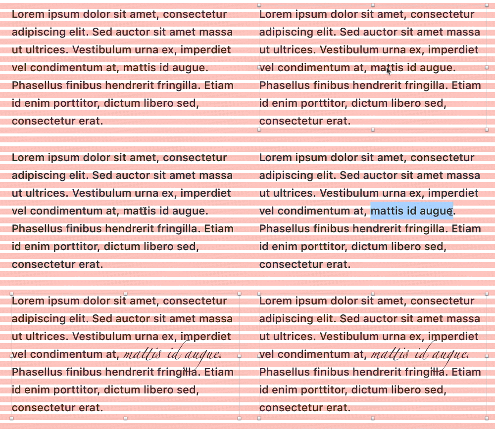
Sketch 3.6 came out, which among other things fixes work with text. How it is built now ( in Russian ). At the end of the month, a beta version of Sketch 3.7 appeared with reworked symbols, which now support nesting and convenient editing of copies. A small gif of how this works .

Other Sketch News:
- Component libraries for Keynote appeared in Sketch .
- AnimateMate plugin for creating animation right in Sketch . The idea is interesting, but everything looks quite schizophrenic.
- Plugin for fast navigation on artboards .
- Stickers on the keyboard with sketch keys .
- Mira allows you to view designs on Anrdoid and iOS devices .
- Qordoba plugin to localize layouts . How does it work .
Designer's Guide to DPI and PPI
An updated article on how to adapt the designer to a huge number of devices with different resolutions.
Principle
- Principle Repo collects prototypes made from the tool . You can dig into the source for learning.
- Principle 1.1 is released, allowing you to import layouts from Sketch .
Adobe After Effects
Flinto
Mailing letters
- Zurb made a simple service to check the length of the message header on different devices .
- The Foundation for Emails 2 framework from Zurb has been released . Announcement .
PixelKit - A happy place for your team's designs.
PixelKit, another service for the system discussion of design layouts within teams. Collects comments from different sources (mail, instant messengers), supports versioning of layouts, synchronizes with cloud storages.
Photoshop plugins and effects
Pixate
- Interview with Andrew Holt, founder of Pixate . About what is happening with the product inside Google and what are their plans.
Zeplin
Sketch sheets
Another collection of paper design templates is also quite large.
Affinity designer
Publishing Tools
Mockingbird - Website wireframes
The service has been updated, it has become even more pleasant to work. One project is free.
Motif - Generate beautiful clicks
Motif stub image generator for use in OpenGraph - the correct previews will be pulled up on social networks.
User research and testing, analytics
UsabilitySquare
Service UsabilitySquare allows you to receive feedback on their prototypes and layouts from other interface specialists. Upload a picture, ask a question, get the opinions of colleagues in the shop. While the activity is not very big, but the format is interesting.
So your boss doesn't believe in user research.
Laura Martini gives advice on how to sell management the need for user research. In the article there are golden words about the importance of speaking in the language of business, because the same accountants do not say that they earn from their work experience in Excel.
Excuses, Excuses! Why Companies Do Not Conduct User Research
Jim Ross refutes another pack of myths, this time about why you can do without user research.
Google Accessibility Scanner
Google has released the Accessibility Scanner app for Android. It shows problem areas in the application and generates a report with screenshots. A few words about his work .
Google is hitting the road "literally" for user feedback
Google launched an interesting user research initiative. They organized a mobile UX-lab, which comes to the users themselves.
Keeping Yourself Out Of The Story - Controlling Experimenter Effects
Philip Hodgson of Userfocus describes in sufficiently capacious ways how to deal with the effect of an observer when a user researcher influences a respondent with his behavior.
The Interview Survey: Getting the Accuracy of Interviewing Thousands of Users
Dmitry Khanin talks about combining interviews and polls with subsequent ranking of the problems found.
When words are not enough
Daria Plutecka suggests using a psychoanalytic projection method in order to get a clearer user opinion.
Zarget - New Age A / B Testing and Heatmap Software
Zarget, another tool for studying click maps and performing A / B testing.
How to Handle Multiple Comparisons
Jeff Sauro tells you how to deal with false and false-negative positives when doing user research.
Visual programming and browser design
Houdini - Maybe Your Most Exciting Development In CSS You've Never Heard Of
Philip Walton talks about the (possibly) near future CSS - the Houdini initiative, which allows polyfiles to be used in the same way as JavaScript. Now, many advanced CSS features like shapes and layer blending functions cannot be used in practice, and workarounds are catastrophic for browser performance. Houdini will expand the W3C standards. However, in the comments ironic that in order not to wait 10 years before the appearance of CSS properties in all browsers, you will have to wait 10 years before the introduction of Houdini.

Live guidelines and component systems
- Simon Taggart describes Big Commerce's approach to describing variables in design systems .
- Jina Bolton is hosting the first Clarity conference on contemporary design systems . It will be March 31-April 1 in San Francisco.
- Salesforce introduced in the company a new role of the chief engineer of the design system (Design Systems Ops, by analogy with DevOps). His task is to translate ideas from a design language to a development language.
- Presentation of Anton Vinogradov on the architecture of the design system of Alfa-Bank . A component library is available on GitHub. Video performance .
- All right, now live guidelines become quite mainstream - even Nielsen / Norman Group wrote about them . We are waiting for a series of trainings and inclusion in the basic courses.
- GE design system for managing Internet of things. Built on the basis of Polymer .
- Live guidelines for Canon hosting company Rackspace .
- Alla Kholmatova talks about building the design system of the British educational company FutureLearn .
- Nathan Curtis published a checklist for teams starting to work on their design system . He helps to choose areas of work and assign responsibilities to the team.
- Live guidelines for the British edition of The Times . How the design system of The Times was made .
Web typography is broken. Here's how we can fix it
Tom Bredin-Gray gives a detailed analysis of the problem of building interparagraph indents and vertical rhythm in CSS. He released the MegaType library , which makes the text on the web predictable.
See the Pen of the MegaType demo by Thomas Bredin-Gray ( @tbredin ) on CodePen .
Zell Liew answers him and tries to figure out if it is critical to keep the vertical rhythm up to the pixel. True, the examples lack the classic good-quality media sites. Other web typography materials:
- Zell Liew continues his series of articles on adaptive typography and shows how to combine the dimensions of the viewport and em / rem .
- Robin Rendle is trying to write a new typography manifesto to continue the ideas of Jan Chihold, taking into account the features of the web . Very interesting systemic thoughts.
- Zach Leatherman talks about modern techniques for optimizing web font downloads .
- Gutenberg CSS framework for web typography .
- Library footnote.js to create footnotes to the text on the web .
Work with SVG
- Site-manuals on working with SVG translated into Russian .
- Viget tips on exporting graphics from Illustrator to SVG .
- The best article on the topic of SVG-animation . Emanuele Sabetta examines in detail all the approaches to its creation, tools, libraries and that's it.
- Memo Florens Verschelde for designers on export to SVG .
Paintcode
- The creators of the tool launched a plugin for Sketch, which allows you to get code in Swift or Objective-C . Clumsy, but sufficient to pick the prototype alive.
Dirty Tricks From The Dark Corners Of Front-End
Fresh presentation of Vitaly Friedman, in which he collected a huge pile of useful scripts and hacks. Some more new scripts:
- A large collection of animations of burger icons .
- Discrete photo slider on CSS .
- Interesting animation of particles inside a word .
- Drums on SVG .
- The script allows on the fly to crop the photo to the desired size .
- Animation of ink stain on CSS .
Bootstrap and Foundation
- Another design theme in the spirit of Material Design for Bootstrap .
- Comparing Bootstrap 4 and Foundation 6 . Although Bootstrap is still in beta, the author says that the Foundation is out raw and you can compare them in this state.
Web Animation Past, Present, and Future
An overview of the current state of web animation from Rachel Nabors. She brings two services to test the functionality of certain functions in the browser - Are we animated yet? and WAAPI Browser Support Test , as caniuse.com is often mistaken. Continuing the theme:
- Spirit.js library for CSS animations . Patrick Brouwer about working on her .
CSS Shapes
Framer
- David Lee on how to make content in prototypes more realistic using arrays . For those who understand at least a little in programming, this is not news, but since the tool is designed for designers, for many it will be new.
- Russian-language blog about Framer by Anton Kartashov.
- As a design team, Facebook uses Framer .
Layer Modes
Webflow
Versioning design files
Flexbox
Sympli
Metrics and ROI
Is The Net Promoter Score A Percentage?
Jeff Sauro is trying to figure out whether NPS is measured in percentages or simply absolute numbers. In various publications and cases, he is mentioned in different ways. One of the key articles in raising interest in metrics uses percentages, but in general, the essence does not change.
UX strategy and management
Modernization Nimax 2015
The most powerful series of articles on the restructuring of the St. Petersburg design studio Nimax. Elena Ogordnikova came to the company last year, amid the crisis, and did a great job of stabilizing first, and then resuming growth. Rarely do they talk in such detail about the inner kitchen of big changes. The second part .

PepsiCo's Chief Design Officer
Interview with Mauro Porcini, PepsiCo Chief Design Officer about how a company changes itself with design. Although we are talking about things that are far from digital products, everything he says sounds very close to the problems of our industry. Design strategy, design culture, innovation and much more - very cool.
In the same issue of HBR, there was an interview with Indra Nooyi , the CEO of the company, where there are a lot of details on the other side. How she came to understand that the company needs a new approach to design.
How To Use Your Startup Into A Learning Machine
Dmitry Koltunov tells how the organization of the book club helped his startup Alice to develop employees and solve the problems facing the company.
How to Modernize User Experience
The Tandem Seven website has a Leah Buley report for Forrester, in which she talks about a modern approach to building UX in the company. In appearance, not a pirate.
Building a design culture
- Emmet Connolly, director of product design Intercom, tells how the design team in the company .
- Jake Knapp from Google Ventures talks about how the design partner team works . He refers to an interesting feedback format within the working group consisting of fully autonomous specialists.
- Interview with Geoff Teehan . The personal part repeats what was in recent articles , but there are interesting details about the structure of design teams on Facebook. He leads three groups - news feed, advertising in it and the general interface team.
- On the eve of his speech at the MX Conference 2016, Bob Baxley talks about the experience of managing designers .
- The design team GOV.uk has launched a design training program for all civil servants . It is a powerful tool for spreading the right outlook in organizations.
- How does the Open Table design team work ?
- How does the Instacart design team work ?
Five Best Practices for Becoming a Data-Driven Design Organization, part 2
Michelle Bacigalupi continues to describe the implementation of a systematic approach to working with user research and analytics in some well-known, but not called, conference call service.
Apologists of rationality against customer-oriented Old Believers
Translation of comics showing software development methodologies in the form of various car repair shops.
How to hire designers
Team paper
Project management service for designers. For subscribers digest opened access to the beta version . Authors are interested in reviews and criticism.
Product management and analytics
Analytics Academy
At the end of last year, the Segment service team launched an analytics school. It describes key aspects, processes and tools in a very simple language. New articles are being laid out, now one and a half sections are available. Some materials:
Google Analytics 360 - Enterprise Analytics For Your Marketing
Google combined its marketing analytics tools with Analytics 360 Suite. It includes web analytics, A / B testing, visualization of complex data and relationships, the ability to connect third-party data sources and work with advertising campaigns .

Cases
Editorial CMS
Redesign Cases
- Salesforce describes the iteration of work on forms in their products . The decision logic is well described.
- The story of the redesign of the largest tool for filing tax returns TurboTax .
Design for Action
Tim Brown talks about how IDEO shifts its focus to more complex and large-scale projects using the example of a school initiative in Peru.
Story
The Rise and Fall of Nokia - How One Inventor
Very interesting interview with Christian Kraft, one of the first Nokia interface designers. He has a huge number of interface patents and solutions that are used now. And he started in those times when screens only appeared in the phones, which meant he had to invent everything from scratch.

How The Shopping Cart Shaped Our Buying Habits
, , . , e-commerce.
Photoshop
- PSD , .
Trends
Design in Tech Report 2016
John Maeda KPCB Design in Tech 2016. , . - -, . , . .
- Tomaž Štolfa examines the history of command line interfaces and GUI, shifting a sober look at the direction of the development of instant messengers . The article examines good hybrid solutions at the interface of textual and graphical interfaces.
- Meydad Marzan offers an interesting way to analyze chat interfaces for success . This is a “independence / parasitic” and “simple / complex scenario” gradation - only simple scenarios that parasitize other products have guaranteed success.
Project phoebe
An interesting concept of "mutational design" from Liam Spradlin. It describes the ideology of the interface, which adapts to the user, using his contextual data. There are two big articles, code and community .

Microsoft HoloLens
The virtual reality
- The title is yellowish, but the problem is correct - there are two technicals to make the picture in virtual reality more real and less “cradling” . Now manufacturers have chosen the one that is more comfortable for the male physiology.
- Studio Artefact thought on the topic of how to make virtual reality helmets less asocial . 10 concepts and ideas on this topic.
- Tessa Chung has put together a virtual reality experiment for the Autoblog site . She describes the process of working on it step by step.
- Initiative Google VR View, facilitates the embedding of images and video 360 on the site .
Trends in the media
- On the opportunities and limitations that generates a general mobilization for publishers . Very informative and meaningful article.
- How does the work with analytics in Buzzfeed , which is famous for its effective work with many channels. Translation .
- AOL launched the Alpha Experimental Lab for their news sites . They try to work with virtual reality, messengers, video, smart TVs and other platforms.
Algorithmic design
- Mark Rolston's sensible thoughts on exactly which parts of the design work can replace algorithms .
- This is where the real magic is. Netflix cuts characters for posters, overlays texts and makes automatic experiments with all of this .
Car Interfaces
- Fast Co Design is a very clever story about how UX Parrish Hanna, head of design for Ford, works and where it moves .
- Very interesting rethinking of cars from Bentley for the era of autonomous cars . First, the very approach to the interior, which is more like an expensive hotel room. Secondly, the holographic butler.
Interfaces to the cinema
For general and professional development
Design and Science
Joichi Ito's interesting material on antidisciplinary research as the next step after interdisciplinary. He describes the concept of Neri Oxman, in which design, art, science and engineering are closely interrelated and give a new understanding of each other. One of the strongest articles on the topic of modern design philosophy.

Helping designers with creative block
Simple motivational advice for designers in case the idea has stalled.
May 1st Reboot - An international event for designers & makers
The new site of the once popular initiative # May1Reboot - on this day there will be mass launches of site redesigns. One of the main initiators of its revival is Tobias van Schneider.
Readymag Design School
Google IxD Exercise
Balraj Chana laid out his test task for the role of mobile designer in Google.
Product Designers
- Google launches a very important initiative for the profession - an educational program for product designers together with the American The Savannah College of Art and Design . They repackaged existing college courses and collected from them a modern and sought-after format.
- Christina Wodtke gives her opinion on the myths about food designers . Including that experience cannot be designed.
- The most powerful manifesto of the modern designer from Julie Zhuo from Facebook .
Why is modern design so much the same?
- Good irony on the same sites - the author asks which of the two typical sites are you drawing now?
- Yaron Schoen well argues the opposite point of view - the uniformity of the design is good for the user, because the use of standard patterns makes it easier to work with products.
100 layouts in 100 days
Working sketches
People and companies in the industry
Shopping design studios by large companies
- Another major consultant, Capgemini (180 thousand employees) bought Fahrenheit 212, an innovative design studio, in February . The company will continue to work under its brand, as well as Fjord. The meaning is the same as for the others - for designers these are new opportunities for solving problems, for a consultant this is a new expertise. Announcement on the website of the buyer .
Sessions AMA
Conference proceedings
Interaction16
The first materials from the conference Interaction16, which was held March 2-4 in Helsinki.
Fresh links can also be tracked in the Facebook group of the same name or received once a month by mail . Thanks to everyone who also publishes links in it, especially Gennady Dragun, Pavel Skripkin, Dmitry Podluzhny, Anton Artyomov, Denis Efremov, Alexey Kopylov, Taras Brizitsky and Yevgeny Sokolov. More and more materials in reviews appear thanks to them.
Subscribe to the newsletter ! A letter arrives once a month.
Source: https://habr.com/ru/post/280794/
All Articles