How to make Parallax multi-layered illustration on CSS & JavaScript
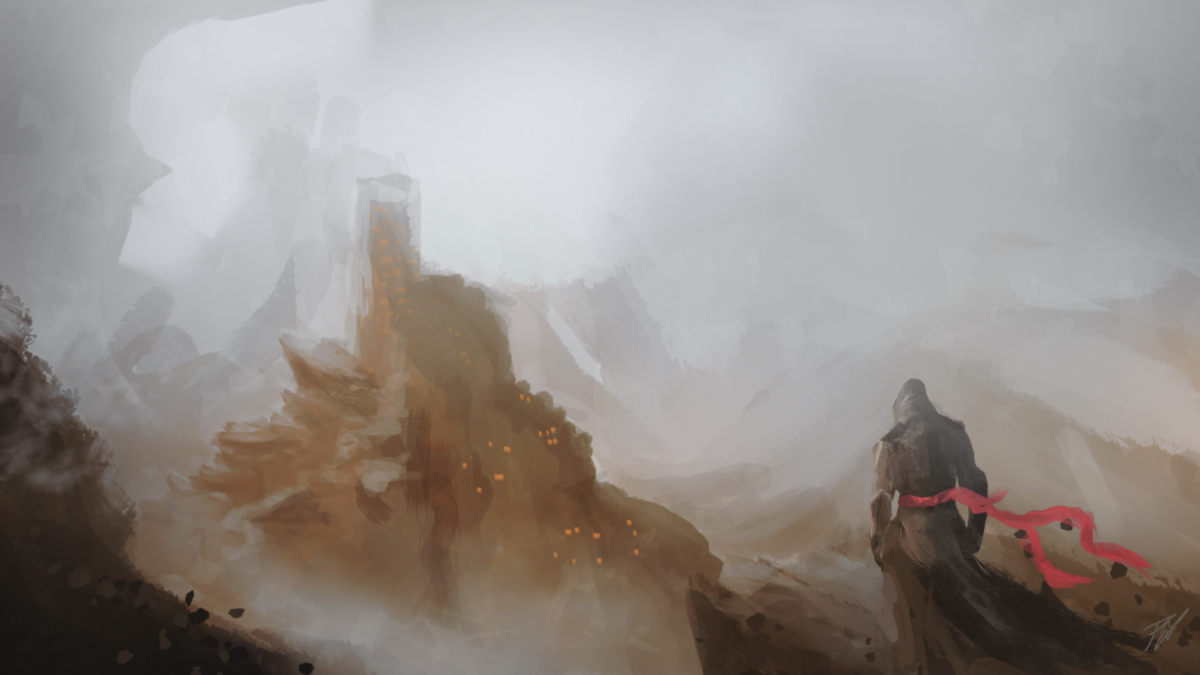
Figure used for parallax effect. By Patryk Zabielski
Hi friends, I will show you how to create a simple layered illustration with the depth that goes to the content. We will use a method that requires only css and pure JS (coffeescript) (No jQuery!).
This lesson is for beginners, with basic knowledge of JS and CSS, so I will explain most of the things and refer to external sources.
')
→ Final Demo
We will prepare an illustration
Let's start by cutting the illustration into layers. The best course of events will be what you yourself painted or you have access to the source file with all the layers.
If not, then do not worry, we will deal with this.
I will work with the picture I painted last year. If you do not have the opportunity to create your own, we can download my source before we begin.

Visualized concept of layers in 3D space
We need to divide the picture into several png files with a transparent background, which will give us the opportunity to create a sense of depth.
The layers in the background will move slower than those in the front, which will give us the effect of depth.
Another thing that will give us the best transition to the next section is to draw at the bottom of the picture a line of the same color as the background of the page. I added an inconspicuous line in the foreground at the bottom of the picture.

In the picture on the right there is an inconspicuous line that will give us the best transition to the next section.
Let's start the code
Preparation
What you need:
- Fresh project in Codepen (If you want to follow the code below, do not forget to change HTML to HAML, CSS to SCSS and JS to Coffeescript, in Codepen settings)
- Basic knowledge of HAML & Sass (SCSS)
- Basic understanding of Javascript and Coffeescript (If you are still bad with this - I recommend “Javascript & jQuery” by Jon Duckett ) If you do not want to work with Coffeescript, then you can automatically convert it to JS and paste the code snippets below to get clean Js
- Your illustration / photo divided into several png layers
Let's start with the HTML structure. We will make the parent container and give it the ID 'hero'. Then we add some divs, with the class 'layer' and a data-type attribute with the value 'parallax'.
#hero .layer{“data-type” => “parallax”} .layer{“data-type” => “parallax”} .layer{“data-type” => “parallax”} .layer{“data-type” => “parallax”} .layer{“data-type” => “parallax”} Add basic styles. Let's start with #hero. I set the height of the illustration 800px
#hero { height: 800px; overflow: hidden; position: relative; } Now let's move on to styling a repeating layer class. Each of them will have the same height, like #hero and positioning, and we will add position: fixed
.layer { background-position: bottom center; background-size: auto; background-repeat: no-repeat; width: 100%; height: 800px; position: fixed; z-index: -1; } The next thing we want to do is add the pictures that we prepared before. We will create some more classes, one for each layer. Then add a link to the image inside the background-image property.
.layer-01 { background-image: url(' '); } .layer-02 { background-image: url(' '); } // .. Do not forget to update the HTML and assign the classes to the desired div in our order, the first layer is the background, the following layers will overlay each other
#hero .layer.layer-01{“data-type” => “parallax”} .layer.layer-02{“data-type” => “parallax”} .layer.layer-03{“data-type” => “parallax”} .layer.layer-04{“data-type” => “parallax”} .layer.layer-05{“data-type” => “parallax”} Javascript time
Add a method that will check if the user has started scrolling down the page.
window.addEventListener 'scroll', (event) The EventTarget.addEventListener () method registers a listener on the EventTarget . The event target can be an element in the document, the document itself, a Window object, or any object that supports events (such as XMLHttpRequest )
Let's save the number of pixels that are scrolled vertically from the beginning of the page into the variable topDistance . To do this, we will use the pageYOffset property .
window.addEventListener 'scroll', (event) -> topDistance = @pageYOffset After that, we will select all layers in our illustration and save them to the layers variable. To do this, we will use the querySelectorAll method and the data attribute inside the HTML elements that we set before.
window.addEventListener 'scroll', (event) -> topDistance = @pageYOffset layers = document.querySelectorAll("[data-type='parallax']") The next thing we do is loop through all the layers and apply the transform property to each of them. But before this, we will specify one more thing inside our HTML file, the data-depth attribute. It will give us the ability to control how fast the element will move, let's not go deep into the values, we will come back to this later.
#hero .layer.layer-01{“data-type” => “parallax”, "data-depth" => "0.10"} .layer.layer-02{“data-type” => “parallax”, "data-depth" => "0.20"} .layer.layer-03{“data-type” => “parallax”, "data-depth" => "0.50"} .layer.layer-04{“data-type” => “parallax”, "data-depth" => "0.80"} .layer.layer-05{“data-type” => “parallax”, "data-depth" => "1.00"} To go through all the elements, we will use a for loop. We begin our cycle by creating a variable where we will store our layers. Then we take the value from the data-depth attribute that we specified inside our HTML. Next, we calculate the movement of the layers by multiplying the scroll distance from the beginning of the page by the value of the data-depth attribute of the layer. An element with a value of 1.0 will move normally with the rest of the page, you can perceive it as an element with parallax turned off.
The last thing we do is update the final motion value for the transform translate3d parameter of the layer, to do this we will use the style property along with all the vendor prefixes for the transform .
To make the code more readable and DRY , we will save the translate3d parameter to the translate3d variable.
for layer in layers depth = layer.getAttribute('data-depth') movement = -(topDistance * depth) translate3d = 'translate3d(0, ' + movement + 'px, 0)' layer.style['-webkit-transform'] = translate3d layer.style['-moz-transform'] = translate3d layer.style['-ms-transform'] = translate3d layer.style['-o-transform'] = translate3d layer.style.transform = translate3d Now when we have specified the data-depth = "1.00" the element will move along with the page as a normal element without the parallax effect. All values less than 100 will have the parallax effect.
Telephones
For phones we will disable the parallax version and replace it with a static image in order to maintain performance. To do this, create a new div below our div #hero, with id hero-mobile and apply display: none to it along with the background and height parameters.
#hero-mobile { display: none; background: url("https://s3-us-west-2.amazonaws.com/s.cdpn.io/272781/full_illustration.png") no-repeat center bottom / cover; height: 320px; } To show it instead of parallax, we will use media query and apply the display: none parameter to the desktop version, overriding our display: none on display: block for # hero-mobile.
@media all and (max-width: 640px) { #hero { display: none; } #hero-mobile { display: block; } } Final code
Source: https://habr.com/ru/post/280738/
All Articles