How you can use responsive web components today

A couple of years ago I first heard about web components (Web Components). At first I was really interested in it, but as soon as the hype around them subsided, they immediately flew out of my head. But as it turned out, an interesting movement has recently passed and the support for this technology has grown significantly. Responsive web components, in particular, are designed to simplify our approach to responsive design. How promising it sounds!
Here are four points that any developer should read before using this technology:
- Technology support;
- Cross-browser work;
- Ability to adapt to the specific project environment;
- Modular approach.
In this article we will look at each of these points separately ...
* This article is translated for informational purposes only and does not impose the use of web components on you, since the support of this technology still leaves much to be desired.
What are web components?
In fact, this is the technology from the W3 specification, which makes it possible to create your own HTML elements. In the event that you literally have not heard anything about it, it is advisable to read this article , as some terms that I will use require at least a basic understanding.
')
Why do I want to use them?
A good example of when you might want to use web components is the task where you need to create a user interface that does not natively exist in the browser — such elements as the color selector, carousel, accordion, and auto-completion field. It can be used as an alternative to the same components that you use from project to project, by lazily customizing them in advance for the requirements of the current one. These are things like social buttons, subscription forms, or notifications. Using web components, you can link markup, styles, and scripts into one sealed module and use an HTML tag (like <color-picker> </ color-picker>) to refer to it. This is pretty familiar if you have already used Angular directives or React components, but the advantage here is that this approach is native to the browser and the “agnostic” of the frameworks.
Web components allow you to create a UI element once and then use it anywhere. This is ideal for projects such as a lively stylistic reference book (or styleguide), where you want to create a library with a single source of truth for each of the components (where each component falls under its own unique rule of behavior and display). This approach implies a shorter, minimalist code, as well as the presence of ready-made UI components, links to which you or your team can easily add to the current interface.
Another great advantage of using web components is the ability to package your module and share it with other developers / site owners. In fact, the user only needs to add an import statement to his website:
<link rel="import" href="http://url.com/subscribe-form.html"> And then use the custom element tag that is defined for this web component. So a user can add as many custom web components to his website as he wants. For example, for a subscription form, you can use the tag - <subscribe-form> </ subscribe-form> , thus placing it in one or several places on the page. Of course, before you do this, you must make sure that the web component you have created is quite flexible and will work adequately among a variety of devices and screen sizes.
Moving from theory to practice
I believe that the best way to explain something is to show it with an example. So further my story will be in the description of work with the above mentioned form of subscription. It is an excellent example of a user interface that does not vary much between different sites and implementations.
For example, take the form I created earlier:
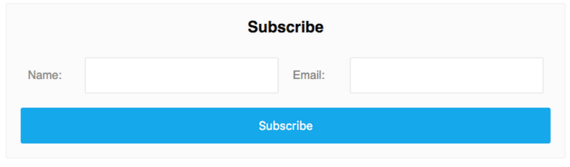
Inside this template, I created some basic markup for the form:
<ul class="form"> <li class="form__item"> <label for="name">Name:</label> <input id="name" name="name" type="text"> </li> <li class="form__item"> <label for="name">Email:</label> <input id="name" name="name" type="text"> </li> </ul> My markup and styles are hidden inside the web component using the features provided by the Shadow DOM specification . This method organizes some kind of encapsulation, which gives me the opportunity to use the label and input selectors freely, without fear of the influence on them of the styles of the parent website.
For clarity and brevity, I will not describe the writing of styles, except those that I used to display the markup. I used a combination of float: left and display: table properties to implement this interface and avoid crashing at any width.
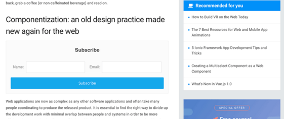
.form__item { display: table; float: left; width: 50%; } label { display: table-cell; width: auto; } input { display: table-cell; width: 100%; } In the course of the lesson, I will use screenshots to demonstrate the work we have done:
Now we are ready, let's look at some techniques to achieve adaptability.
Media requests
The classic approach that we all know and love also works well in responsive web components. You can use media queries inside your template in case you want to create any default control points. On the other hand, you can use “hooks” (for example, creating classes) and applying them to the parent container, thus leaving the user to make their own decisions. In our case, all we need is to create a control point, reaching which we cancel the float property for the child elements and set them to 100% width.
@media (max-width: 30em) { .form__item { float: none; width: 100%; } } 
However, media queries here will not be enough.
I am satisfied with the created subscription form, it works great in the main body of the page, but what happens if the author of the site wants to put it in the sidebar? Suddenly my form will become compressed, and it doesn't seem like you can use it.
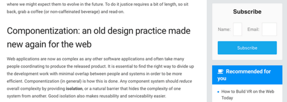
This happens because the web component does not see its borders - it has no idea about the context.
But stop! Isn't the whole point of web components so that you can paste them into any place on the site where they will just work? Well, it is obvious that the web component we created earlier will not do this, but there are several methods that we can use to achieve this goal.
Flexbox hack
If you are planning to use web components in your project and are ready to sacrifice support for older browsers (such as IE9, etc.), then a little Flexbox magic will do you no harm. This is an excellent solution, which, moreover, does not require the use of JavaScript at all.
Again, the code below contains only the styles that I used to display the markup.
.form { display: flex; flex-wrap: wrap; } .form__item { align-items: center; display: flex; flex: 1 0 320px; flex-wrap: wrap; max-width: 100%; } label { flex: 1 0 90px; } input { flex: 1 0 230px; width: 100%; } By setting the parent container display: flex and flex-wrap: wrap , the child .form__item lined up one block at a time, but we still need to define a few rules so that if the container gets too small, the children jumped one under the other.
Inside the .form__item we used a brief description of the property - flex: 1 0 320px , which can be expanded as: flex-grow: 1 , flex-shrink: 0 , flex-basis: 320px . By setting flex-wrap: wrap , we determined that the width of our element would not be less than specified at 320px, while specifying the flex property, we allowed our element to grow and occupy the remaining free space in the string.
I used the same approach for input and label elements. Their total flex value will be 320px, which implies that they will be adequately displayed at smaller container sizes.
Let's see what the changes we made led to:

Much better! However, this is not the only way to solve this problem, there are countless of them.
Requests matching web elements
The idea of using queries that match certain elements is what allows you to emulate the functionality of media queries at the web element level — which is very convenient when creating responsive web components. Simply put, imagine if you had the opportunity to write something similar to this in your css:
.form__item[max-width~="30em"] { /* Styles here */ } This is very close to what we can do using this technology. Pretty promising, isn't it?
However, in avoiding infinite loops, this technology is not natively available in the browser. But for these purposes there are quite interesting plugins.
In my example, I used the CSS Element Queries , created by a man named Marc J Schmidt . This plugin is a really good implementation of the solution to this problem. There are also the following similar projects:
In essence, these plugins use JavaScript to determine the width of the web element and add the corresponding attribute to it, thereby allowing the definition of new corresponding styles to the element through CSS.
.form__item[max-width~="30em"] { float: none; width: 100%; } Using a combination of one of these plugins with a small CSS code snippet, we achieved the same result as using flexbox.
Attributes
One of the amazing things that we can offer to the consumer of our responsive web component is the attribute API for this element. For example, you could set an attribute called layout that defines the dimensions of a component in a given context: “small” or “large”. And then it can be used as follows:
<subscribe-form layout="small"></subscribe-form> Thus, we create a hook that defines additional CSS properties.
In the Shadow DOM specification, the container containing the element is defined as : host . An example would look like this:
:host { display: block; } :host([layout = "small"]) .form__item { float: none; width: 100%; } :host([layout = "large"]) .form__item { display: table; float: left; width: 50%; } This will enable the consumer, writing not complicated JavaScript, to switch between the sizes that you have provided him. This means that instead of including additional JavaScript code inside your web component, you leave the possibility for the developer to customize your component independently to the requirements of his current project.
Conclusion
The approaches mentioned above can be used to create any web user interface, but they are especially good at creating responsive web components.
If you have not tried using web components yet, I strongly recommend that you do this. Unfortunately, all the features of this technology are still available only in Chrome and Opera, but other browser manufacturers are not idle, and widespread support for this technology is not far off.
Source: https://habr.com/ru/post/280636/
All Articles