15 steps to improve usability

Meet on clothes, escorted by the mind. This old adage says, among other things, the importance of a first impression. This is true not only for people, but also for software products - websites and mobile applications. One of the most important moments of the formation of the attractiveness of the network project is the convenience of its use - usability. And when a person first becomes acquainted with some website or application, first impressions often determine whether he will return to this product again and again. In other words, usability is one of the key properties of the site that form (or destroy) the audience. Let's look at some common and often overlooked scenarios of user behavior, as well as ways to improve usability at the most important stages of interaction with your website or mobile application.
Clear and informed interaction
1. Choose font sizes
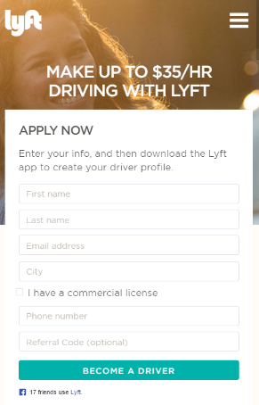
People are increasingly surfing the net using mobile devices, and for some sites the mobile version has become mainstream. And this dictates its own requirements for font size, because the screens of smartphones and tablets are much smaller than regular monitors and laptops. The proliferation of responsive design has played a large role in drawing attention to the font issue.
Often, site creators concentrate on the ease of use of buttons, icons, tabs, and other objects that need to be clicked. And about the convenience of clicking on text hyperlinks recall few. Therefore, always conduct "live" tests of the comfort of clicking fingers on hyperlinks.
')
2. Write informative error messages.
Many ignore the selection of formulations for error messages, considering them to be something secondary. Developers usually know how to avoid wrong actions in their products, and therefore rarely encounter such messages.
But real users can not boast of this.
If the user is not well aware of what to do after the occurrence of the error message, then he may even throw your product. Therefore, the message text can be playful, but at a minimum it should help users quickly figure out the cause and avoid further disruptions.
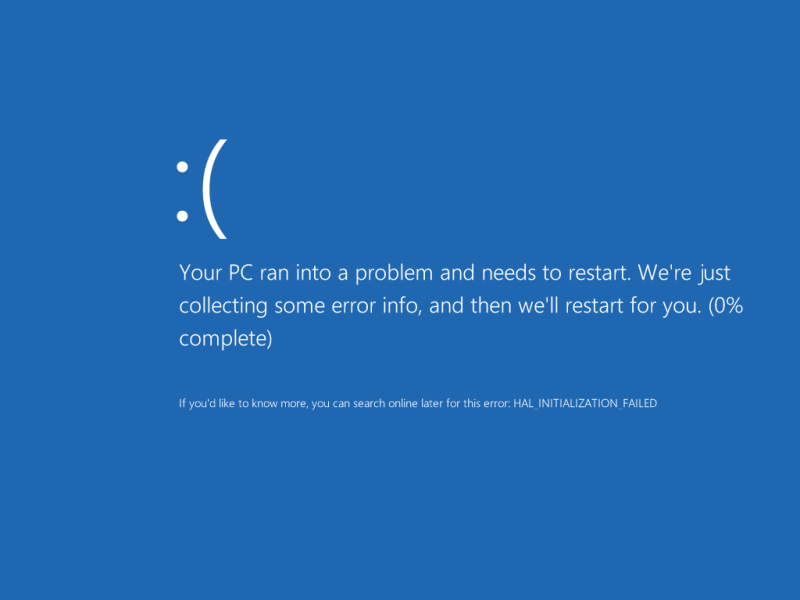
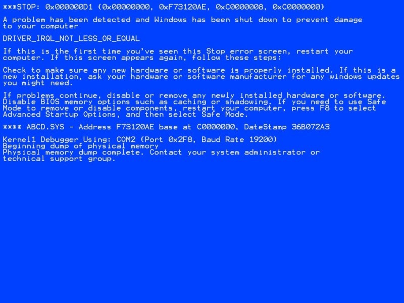
Try to avoid specialized terms, write messages in a public, understandable language. No need to dump the user information that he can not use. If desired, even verification errors can be rephrased to make them sound friendlier. Compare two versions of the same screen from one popular operating system:
Convenience entry form
3. Simplify password requirements

Today it is customary to require users to create complex passwords. But this should be done positively, with encouraging help, and not in the form of an insurmountable harsh condition. Many input forms look very nice, but they are completely inconvenient. Although the convenience of this interface element can have a decisive impact on the success of the entire product. Unsuccessful decisions can alienate users already at the stage of entering the login-password, or during the ordering process. Therefore, it is necessary to pay close attention to the usability of forms.
For example, historically, the selection fields (select box) are difficult to stylize. In most cases, developers try to hide standard objects and clone them into more suitable DOM elements. In this case, the data from the "clones" are transmitted to the input of the original elements.
You need to spend a lot of time just to be able to manage the design of the usual drop-down menu. But is it worth it? We must not forget that mobile users very quickly get used to the appearance and behavior of standard interface elements used in their operating systems.
For example, Windows Mobile users expect that when selecting a drop-down menu, the list of options opens to full screen, separately from the field itself. While Android users expect to see a modal window. And if for the sake of your design ideas you do not meet these expectations, then users may not appreciate your decisions at all. Most likely, it will be harder for them to work with your product, which will negatively affect their impressions. In other words, changing the design of the standard elements will create more problems than you solve.
4. Use the correct input form.
Many advise to use data formatting in input fields. For example, if you add
input[type="email"], input[type="tel"] , then the layout automatically switches when you type. However, it looks strange and does not help at all, but hinders in filling out the form.If you have several input fields, then it is better to assign them one type of data. It is much easier for the user when the same layout is used when entering, and jumping from letters to numbers and back only brings additional confusion.
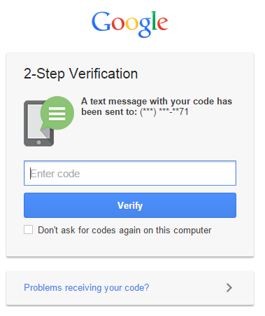
It is advisable to use different types of input in HTML 5 only when the fields on the screen are as small as possible. A two-factor Google authentication is a good example: there is only one field in which you can enter only numbers. It will be very appropriate to automatically switch to the digital layout.
But in more complex forms, such “helpfulness” and “initiative” of the keyboard can be annoying, because it forces the user to mentally switch, increases cognitive load. Especially when moving from letters to numbers, and vice versa:
5. Direct a vivid and memorable first use experience.
If a novice from the first seconds will be disappointed with your site or application, then this is akin to the rudeness of the host when meeting guests. No matter how tasty the treats, the meeting will be hopelessly spoiled.
A developer can easily lose sight of some scenarios of the initial use of his product. For example, it is difficult to call an intuitively full screen full of icons or sections. You can soften the first use experience, for example, with the help of helpful hints and warning messages that can be easily turned off.
6. The devil is in the details.
All sorts of little things can play a big role in facilitating the development of your product. For example, the usual standard cursor in the first input field allows you to quickly and painlessly dive into the interface. Ideally, the user should navigate through the site or application on “autopilot”.
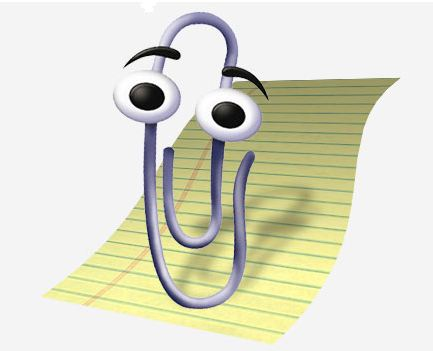
Lack of new users experience with your product is expressed in the fact that some functions can cause serious difficulties. Remember the Clip from Microsoft Office, which suddenly got out and offered its help, which was more annoying.
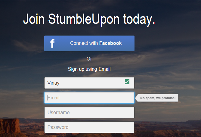
Directing a successful first-time experience is like walking a rope — it's very difficult to do everything right, but if you succeed, it is more than rewarded by user recognition. For example, the Stumbleupon project very successfully teaches beginners their basic abilities.


A good solution would be to embed the learning process in the normal procedure for using the product. For example, when archiving letters in an email application, you can display the message “Did you know that you can start archiving using Ctrl + K?”. This approach allows you to train users much softer compared to traditional lessons in the "review of the entire application" style.
7. Microcopy should not be used retroactively.
“Microcopying” refers to all the small instructions and confirmations used in applications.
- “Do not worry, we will not allow leakage of your postal address”
- “No credit card required for payment”
Microcopy is an ideal tool for building trust and improving the experience of use. Also, with their help, you can very effectively train users who are not too confident working with your product.
For example, binding a bank card or providing email for many users is a rather controversial point. And if you do not represent a certain time-tested, respected brand, then people will always be wary of providing you with such information. Microcopies can help with user doubts.
8. Always provide context.
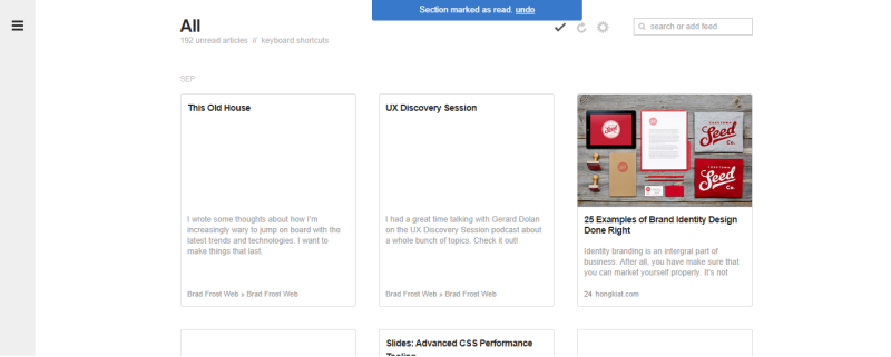
Users hate lack of context. Given the kind of information flow they constantly have to cope with, people try to abstract from everything superfluous on the screen and focus on specific things. When endless scrolling came into vogue, many sites ran into one problem: once the user had mistakenly clicked somewhere, the current position was reset. This is especially unpleasant in cases where a person has scrolled through the contents of the site very far down. After five scrolling screens, a random click can cause irritation.
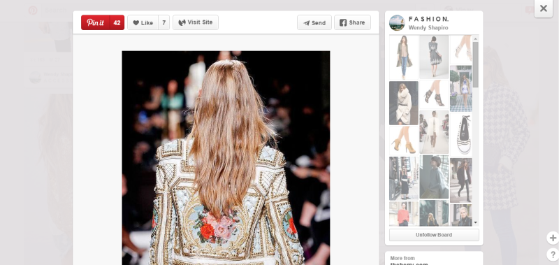
Most sites today solve this problem with the help of modals (modal) and other schemes characteristic of single-page applications. For example, in Pinterest when clicking on a tile, it’s not a new page that opens, but a modal. This allows you to study the details of a particular entry without losing the current position and not waiting for the new page to load.
In the Facebook mobile application, the same approach is used: if you click on a photo in an album, it will load in a full-screen mode. It looks almost as if a new page has opened, but when you click the Back button, you are neatly returned to context.
Today's extremely popular material design has taken the use of animation to provide context to a new level. Clicking on an object launches an animated overflow from the current page to the loaded information about the object. This clearly shows the logical relationship, where it comes from and where the user will return.
Although it would be even better if a similar animation was displayed upon return. A good example is working with notifications on stackoverflow. When you click on the message, you get to the appropriate page, and you are transferred immediately to the desired content. Very useful, but they went even further, and implemented a return to context with the help of unobtrusive animation. It gently but effectively directs the user's attention exactly where it should be, helping to filter the visual "noise" on the screen.
9. Atomic actions
It is often easier for users to perform an action if all other elements not associated with it are obscured or masked. This solution helps to reduce cognitive load and simplify the work with the interface.
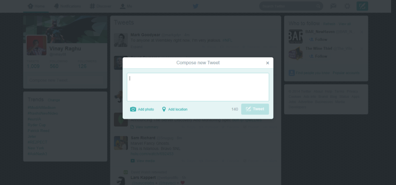
One of the remarkable examples: the modal window “compose new tweet” on Twitter, which is a module for performing one of the most important actions in this application. After all, Twitter will die if people stop tweeting. As you can see, everything here is aimed at ensuring that the user can concentrate on writing the text, without being distracted by anything superfluous.
This approach works most effectively when performing atomic actions. In this case, you can provide everything you need to perform an action within the framework of the same modal.
10. Error messages
It is also very important to provide context to users. With the help of error messages, you can immediately select specific input fields that you need to pay attention to.
Sometimes error messages are so confusing that they do not help the user to solve the problem. Always try to immediately visually tell you exactly where the user should solve the difficulty.
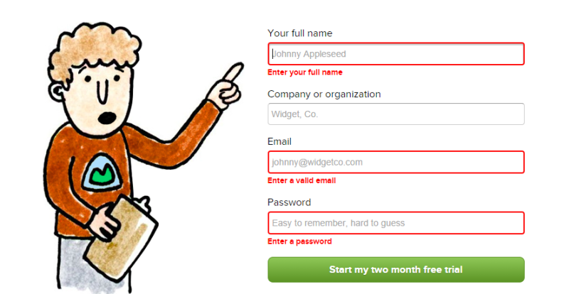
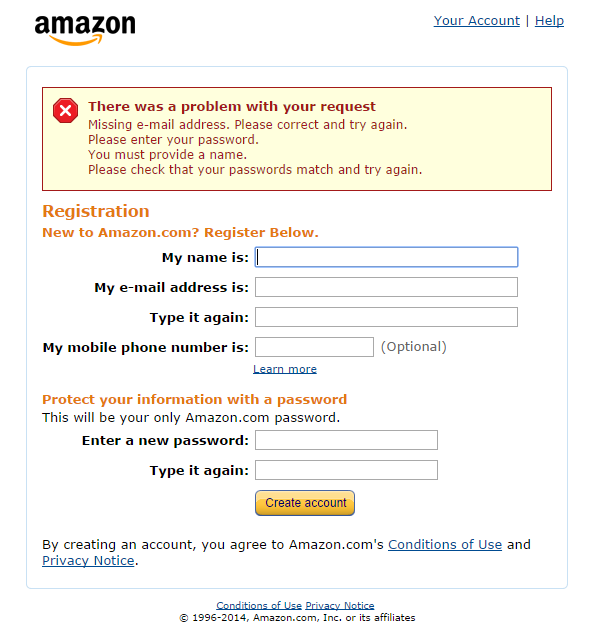
Above is the Basecamp registration form, in which not only the required fields are highlighted, but also a text hint for filling is given. Probably, you think that if there are only two or three fields in the form, then everything is so obvious that the user does not need help. However, even in this case, it is recommended to focus people's attention on problem areas, this is much more useful than simply throwing out a list of errors to them, as is done in Amazon:
11. Focusing notifications in one place
Thanks to the distribution of one-page applications, we are able to unify all kinds of user notifications. The border between native and web applications is becoming increasingly blurred. When an application needs to interact with a user, it's much easier to send all messages to a particular place, rather than post them in context. Although there are exceptions to this rule. A good example of a notification repository is the Gmail inbox. A module for organizing Growl notifications will not allow the user to overlook an important message.
In Feedly, notifications are always located in the middle of the page header. This teaches the user to always look for important messages in this zone, even while performing some actions and leaving the original context. Here is a handy feature for moving to the next article, when the user marks the current article as read.
In Feedly, all notifications are global and are always displayed in the same place. In this case, the links and the list of necessary actions are clearly separated from the text context.
12. Avoid deadlock
Modals are a convenient thing, but you should not use them to block user actions, not allowing them to work with the application until it performs something in the modal. Such deadlock conditions leave no choice but to cancel the current operation. In some rare cases this may be necessary, but it is recommended to avoid such situations by all means.
13. Give the user control
A carousel with no navigation buttons leaves the user with very little control. This outdated approach provides far from the best user experience due to too many variables. Especially bad if you place the carousel at the top of the page: it is very likely that this will be the first thing that the user will encounter in your application. And the inability to control these elements sets a bad tone in your relationship.
It is best to follow a simple rule of thumb: only respond to explicit user actions. If you do not know exactly what he wants, then give him control.
14. Avoid scattering attention.
Warnings from javascript are distracting. A person has to switch from a page to notifications that need attention. Therefore, use them only when absolutely necessary, and in other cases use softer alternatives .
Users, especially mobile, do not like to suddenly change the contents of the screen. This should be resorted to only in response to explicit user actions. For example, Twitter and Facebook feeds are updated forcibly. Otherwise, it would be an unpleasant situation when you read the message, but at this time the background process updates the tape and throws out to you a bunch of new messages that bury what you read before. It's like a gust of wind pulling a newspaper out of your hands.

Fortunately, Twitter delicately informs the user about new messages and waits for the user to give the command to download. That is, a person completely controls the change in the contents of the screen and is not confused.
15. Break big tasks into smaller operations.
No one likes filling out a full page form. Therefore, various sections of settings, registration forms and profiles will benefit from a logical division into smaller blocks. Use for this cards, sections, tabs, side panels. A person will be easier to perceive the need for multiple fillings, even if there are several logical blocks on one page.
The division into logical blocks subjectively simplifies the task of setting up and filling in numerous fields, and prevents the appearance of unpleasant work. This is especially important for mobile applications and site versions.
For example, Facebook has been honing the grouping of privacy settings for several years to make it easier to configure them. But once it was so nontrivial task that many simply did not touch these settings. After their division into sections, the proportion of users who work with these pages and not avoid them has increased.
Another good example of breaking up a large task into logical blocks is the checkout process. For many web applications, this procedure becomes a critical point, an indicator of project success. When ordering is divided into stages, when they pass, users have a feeling of progress, progress, even if not everything goes like clockwork.
Also, the division into logical blocks facilitates the detection and solution of problems that arise. After all, no one wants to deal with a message like "Could you please fix the following four points?"
If you force the user to fill in all the fields or configure the settings on a single, difficultly organized page, then you fold the eggs into one basket. Any error will prevent all other data from being sent.
The same can be said about donation forms, especially in mobile projects. You probably want the user to think: “Wow, how simple everything is” instead of “Yes, it takes time.” Improving usability forms directly affects the profitability of the project.
* * *
Most of the aforementioned moments are fairly simple when considered separately. But if you work with it every day, then the eye is often washed up. Therefore, it is important to be able to step back, abstract and look at your child through the eyes of a “new user”.
Source: https://habr.com/ru/post/280514/
All Articles