Palantir: arms trade and the spread of the pandemic
As data in the hands of intelligence analysts Palantir are transformed from unstructured to structured.
Together with Edison, we continue to investigate the capabilities of the Palantir system.
Palantir is a private American company , the fourth largest by capitalization (after Uber, Xiaomi and Airbnb) in the world in the world (data for the beginning of 2016). The main customers are the CIA, the military, the CDC, and large financial institutions.
')
In my opinion, somehow, the founding fathers of information technology, Vanivar Bush (“As We May Think”) , Douglas Engelbart (“The Mother of All Demos”) and Joseph Liclader (“Intergalactic computer network” and “ The symbiosis of man and computer ") , about which I wrote a little earlier.
Under the cut - two cases (2010).
(For help with the translation, thanks to Vorsin Alexey)
00:00 This presentation will show how Palantir, by applying analysis, turns unstructured data into structured data. For this purpose, reports on the global network of arms dealers will be used.
00:10 We will show how territorial, temporal, social, and some other analyzes can answer intelligence questions about this network.
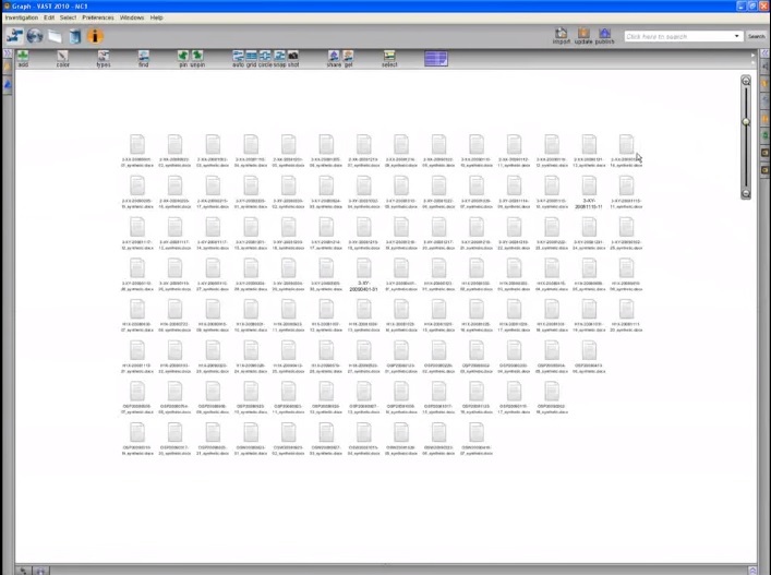
00:17 These icons on the graph represent about a hundred reports from our investigation.
00:25 “Text Cloud” (textcloud) will help us identify keywords from these reports.
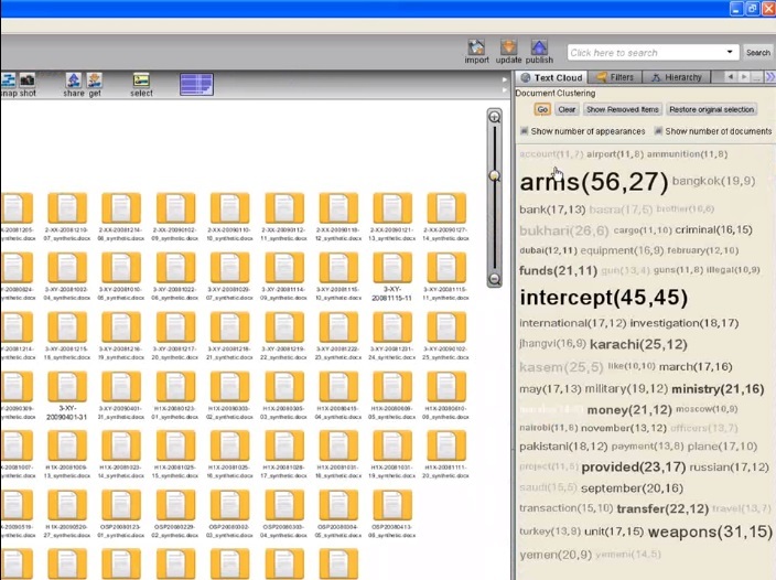
00:28 Some terms appear: gun, barrel, buy, Karachi, Pakistan, and so on - which suggests that this network is connected to the Middle East and South Asia.
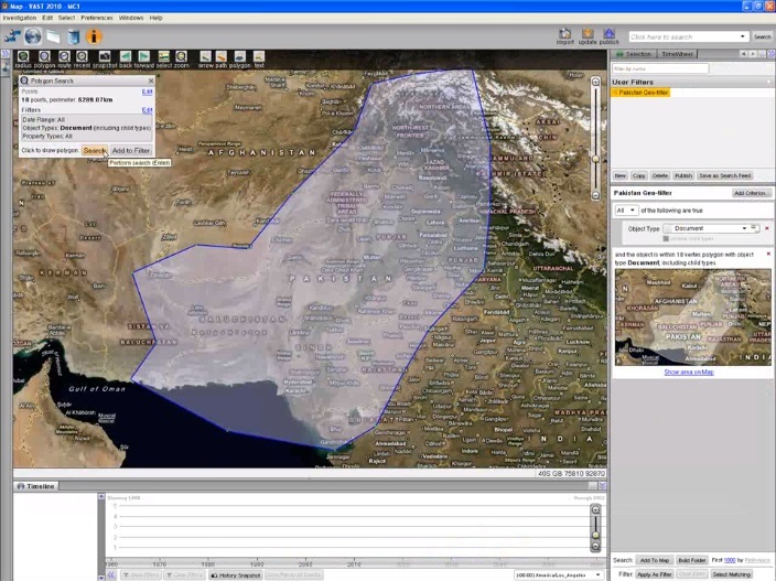
00:37 Let's transfer these documents to the card.
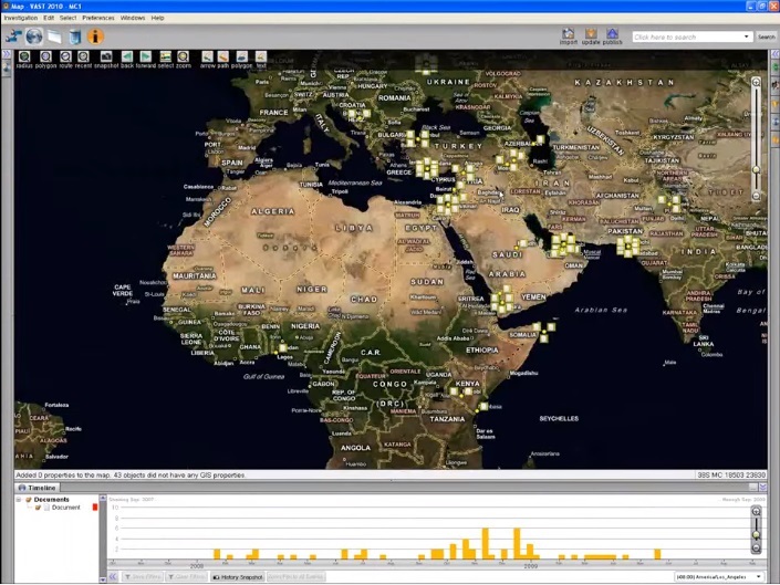
00:42 Documents were distributed according to the geographical names indicated in them. We can also use the Timeline here to view the location of documents by creation date.
00:50 Now let's clear the map and look for documents from Pakistan, one of the most popular text cloud results.
00:57 This search brings a number of documents, let's see them through the browser.
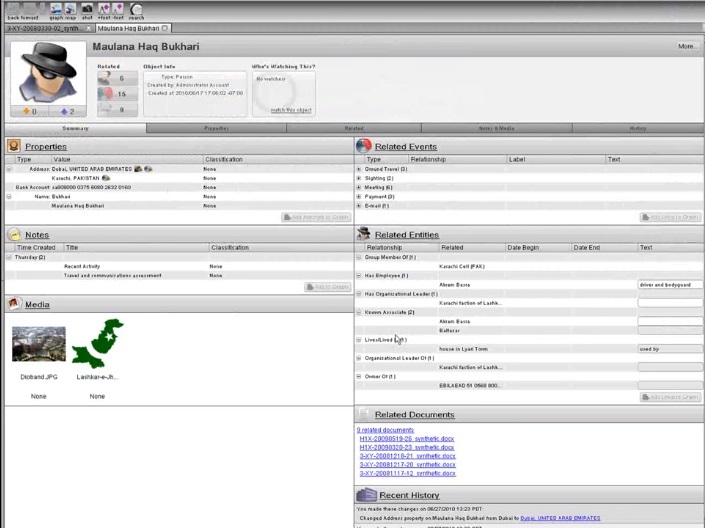
01:01 In the browser, an analyst can structure information by assigning tags to it. Let's highlight Malona Hag Bukhari.
01:10 Palantir automatically searches for objects that are already in the database, we can also create a new object, and select special properties for it to assign the tag appropriately.
01:19 The blue line below the text shows an entity to which we just assigned a tag.
01:23 Double clicking on a tag opens a complete file of the object, its properties, associated media files, the history of the object and a list of all data sources.
01:35 To create links between objects with tags in the text, we simply drag one onto another, and then select the resulting connection with special properties.
01:45 In a fully tagged document, color and lines indicate links to existing entities, events, and relationships.
01:51 Now let's add the data we structured in the documents related to Pakistan to the graph.
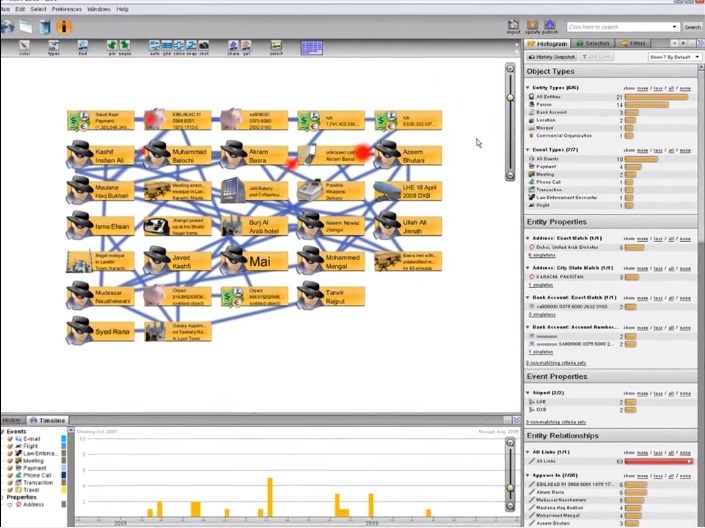
01:57 On the graph, the analyst uses various tools to analyze data.
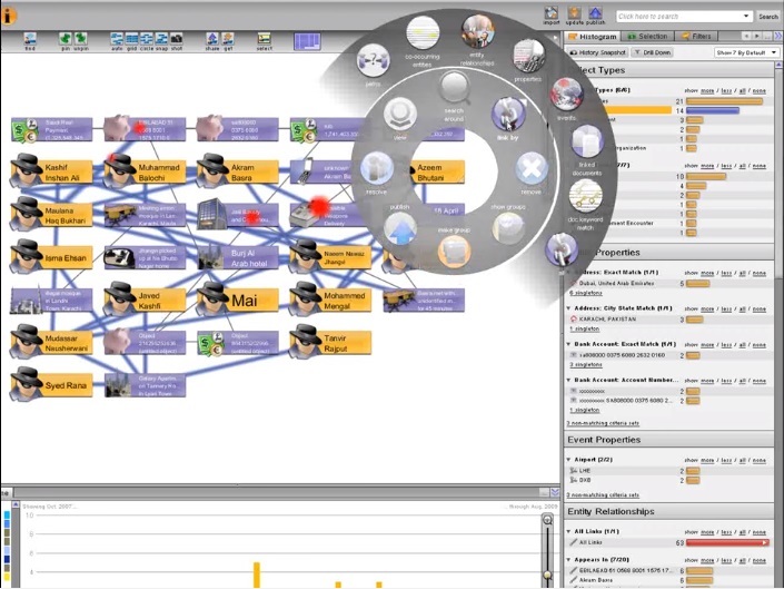
02:00 Here entities and events from Pakistan tags. Using the histogram, we filled the graph with people, and the analyst can now use the tool for finding relationships between entities that can manifest from documents tagged by other analysts from our company.
02:17 After constructing a graph of key entities and events of the Pakistani network, we can use the timeline to understand the temporal aspects of network activity, which include flights, meetings, payments, and the like.
02:30 The analyst can also share the graph with other analysts of the company, here we can see shared graphs from Pakistan, Latin America and Dubai.
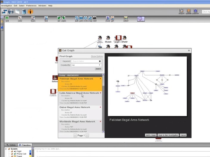
02:40 Let's look at the graph of the world network of arms dealers, which includes the entities and connections from all the tags of documents assigned by our team.
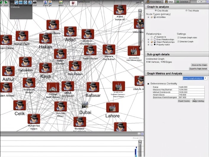
02:49 We use a social networking assistant to identify key points for future investigations on our worldwide network.
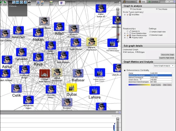
02:56 Let's add a highlight color. Now we see that Dubai, Bukhari, and Dombrowski are important intersection points on this network.
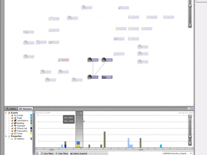
03:03 By dragging all this onto the map, we can see all network activity geographically and in time if we use the Timeline.
03:10 It gives a broad look at when and where each cell acts.
03:15 For example, the UAE plays an important role, many of our goals met here in April.
03:21 By structuring data from unstructured reports and using Palantir data analysis tools to achieve a goal, our team has made a clear display of the arms trade network in several countries and indicated the place where the network managers negotiated.
Hospitalization records: Characteristics of the spread of the pandemic.
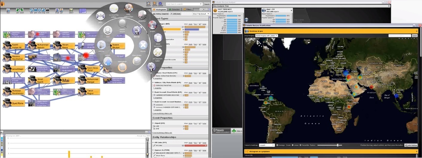
00:00 This presentation will show how we use the Horizon analysis at Palantir to analyze the spread of the virus during a national pandemic.
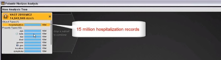
00:05 Horizon is designed for analyzing large amounts of data and will now be used to quickly visualize and analyze fifteen million records of hospital visits and three hundred and fifty-seven thousand death records. Baseline data was divided by symptoms and entered into the system.
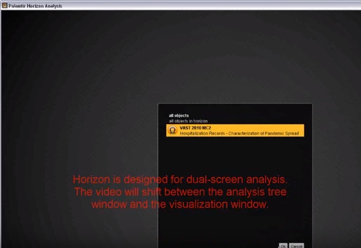
It is written: "Horizon" is designed for analysis on two screens. The video will switch between the analysis tree window and the visualization window.
00:20 Please note that the time to process requests is not included in the video.
00:23 Let's start by looking at a few basic histograms to get a general view of the data.
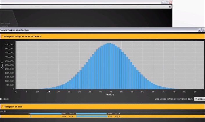
00:27 This is a bar chart of hospitalization by age, which gives an almost perfect distribution chart with a peak at forty-four years.
00:33 This is not normal, as we expected more visits to the hospital before the age of forty, based on data on the typical distribution by age and state of health.
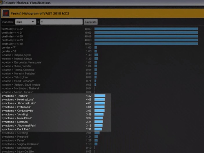
0:43 Now we use a batch histogram of visits to the hospital for patients who later died to determine the symptoms that most often led to death.
00:53 Tremor and hearing loss, as an example of the symptoms associated with death.
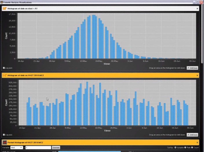
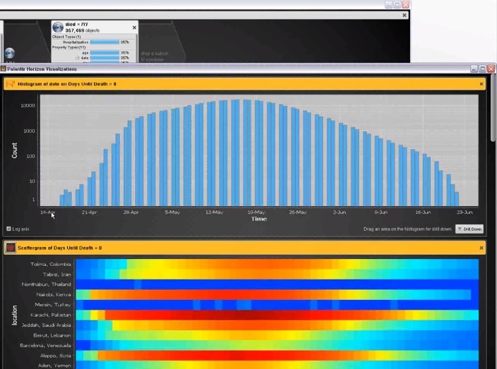
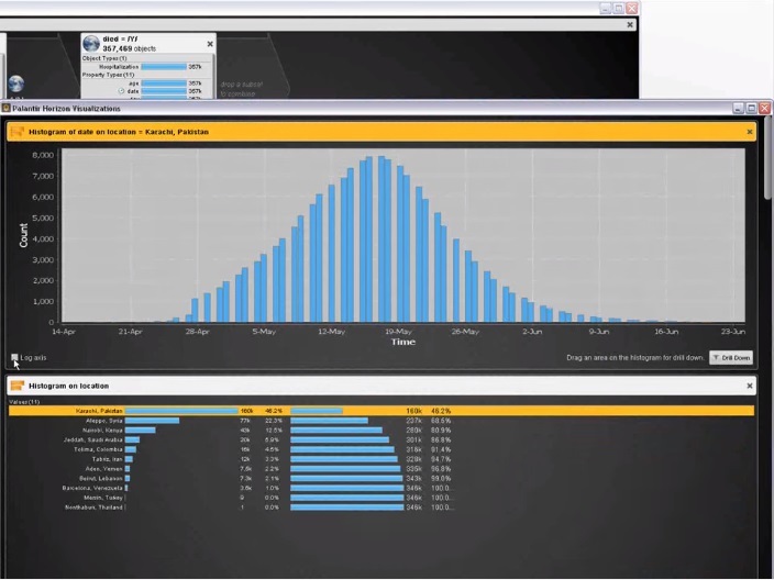
00:56 To investigate the temporal patterns of the disease, create a histogram of visits to the hospital by day, filter by death, and create another histogram of deaths by dates.
01:12 There is a slight increase in the number of hits in May, and at the same time the number of deaths has increased.
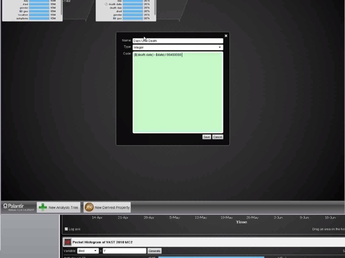
01:22 In order to identify the temporary patterns of the disease, it will be useful to know how much time elapsed between the time of hospitalization and death.
01:29 We can do this by adding a new property that finds the difference between the date of death and the date of treatment.
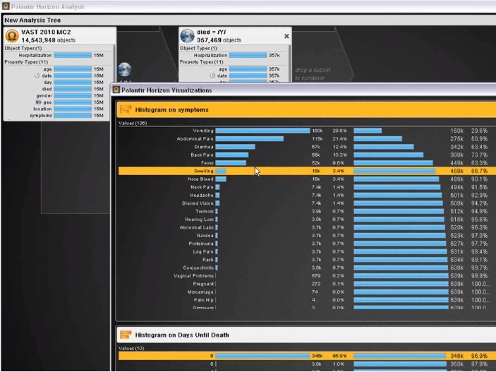
01:38 We can now create a histogram with this new property. It shows that almost all deaths occurred on the eighth day after hospitalization, which, hypothetically, could be a characteristic of a pandemic virus.
01:51 By focusing on these deaths, we can create a histogram of the most common symptoms.
01:58 Vomiting and abdominal pain are the most popular results.
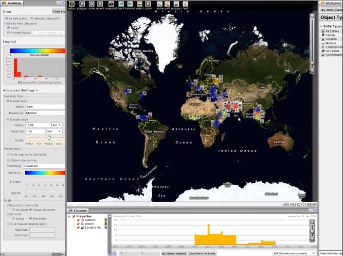
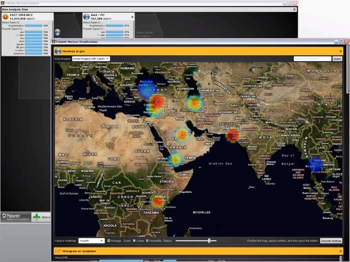
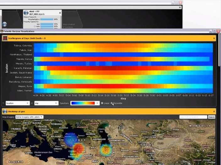
02:05 Let's use a heat map to see which geographic areas have the most fatal outcomes.
02:12 In Pakistan, there are many deaths, while in Thailand and Turkey there are relatively few.
02:20 Let's create a scattergram of days and places, which will give an idea of the intensity of the disease over time.
02:34 We can see that the number of deaths in Thailand and Turkey is constantly low, while in other places the death rate peaks and decreases.
02:45 By comparing the resulting graph with the histogram of the distribution of deaths by dates, we can understand when the pandemic began.
02:57 With this new subset, we can create a new scatterplot for hospitalization to see how the disease has spread over time across the locality.
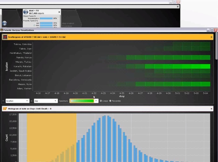
03:07 We see that Kenya, Pakistan and Syria are the countries with the earliest outbreaks of the disease.
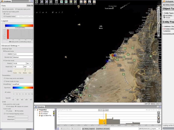
03:15 For more accurate information about the distribution of the disease in time and place, we can refer to the data on deaths in each territory.
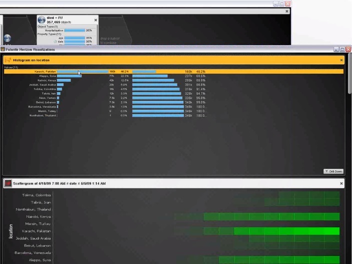
03:25 By selecting data for Pakistan, for example, we can create a histogram of hospitalizations by date from a subset of patients who we suspect have died from a pandemic.
03:38 Using the Palantir Horizon, we were able to quickly import, analyze and visualize pandemic data, identify anomalies and characterize the nature and development over time of this disease.
More about Palantir:
Together with the company Edison we continue the spring marathon of publications.
I will try to get to the primary sources of IT-technologies, to understand how they thought and what concepts were in the minds of the pioneers, what they dreamed about, how they saw the world of the future. Why did you think “computer”, “network”, “hypertext”, “intelligence amplifiers”, “collective problem solving system”, what meaning did they put into these concepts, what tools they wanted to achieve a result.
I hope that these materials will serve as an inspiration for those who are wondering how to go “from Zero to Unit” (to create something that had never happened before). I would like IT and “programming” to stop being just “coding for the sake of dough”, and recall that they were conceived as a lever to change themethods of warfare, education, a way of working together, thinking and communication, as an attempt to solve world problems and answer facing humanity. Something like this.
0 March. Seymour papert
March 1. Xerox alto
March 2, "Call Jake." NIC and RFC history
March 3, Grace "Grandma COBOL" Hopper
March 4 Margaret Hamilton: "Guys, I'll send you to the moon"
March 5, Hedy Lamarr. And in the movie naked to play and torpedo the bullet into the enemy
March 7 Gorgeous Six: girls who had a thermonuclear explosion calculated
March 8, "Video Games, I'm your father!"
March 9th Happy Birthday to Jeff Raskin
March 14 Joseph "Lick" Liclider: "Intergalactic computer network" and "Symbiosis of man and computer"
March 15 Vanivar Bush: “How We Can Think” (As We May Think)
March 16th Happy birthday, Richard Stallman
March 21 Douglas Engelbart: "The Mother of All Demos". Part 1
Together with Edison, we continue to investigate the capabilities of the Palantir system.
Palantir is a private American company , the fourth largest by capitalization (after Uber, Xiaomi and Airbnb) in the world in the world (data for the beginning of 2016). The main customers are the CIA, the military, the CDC, and large financial institutions.
')
In my opinion, somehow, the founding fathers of information technology, Vanivar Bush (“As We May Think”) , Douglas Engelbart (“The Mother of All Demos”) and Joseph Liclader (“Intergalactic computer network” and “ The symbiosis of man and computer ") , about which I wrote a little earlier.
Under the cut - two cases (2010).
- The first is an analysis of the spread of the virus during a national pandemic based on fifteen million records of hospital visits and three hundred and fifty-seven thousand death records.
- The second is an analysis of hundreds of reports from the investigation on the global network of arms dealers.
(For help with the translation, thanks to Vorsin Alexey)
VAST 2010 Challenge, Pt. one
00:00 This presentation will show how Palantir, by applying analysis, turns unstructured data into structured data. For this purpose, reports on the global network of arms dealers will be used.
00:10 We will show how territorial, temporal, social, and some other analyzes can answer intelligence questions about this network.
00:17 These icons on the graph represent about a hundred reports from our investigation.
00:25 “Text Cloud” (textcloud) will help us identify keywords from these reports.
00:28 Some terms appear: gun, barrel, buy, Karachi, Pakistan, and so on - which suggests that this network is connected to the Middle East and South Asia.
00:37 Let's transfer these documents to the card.
00:42 Documents were distributed according to the geographical names indicated in them. We can also use the Timeline here to view the location of documents by creation date.
00:50 Now let's clear the map and look for documents from Pakistan, one of the most popular text cloud results.
00:57 This search brings a number of documents, let's see them through the browser.
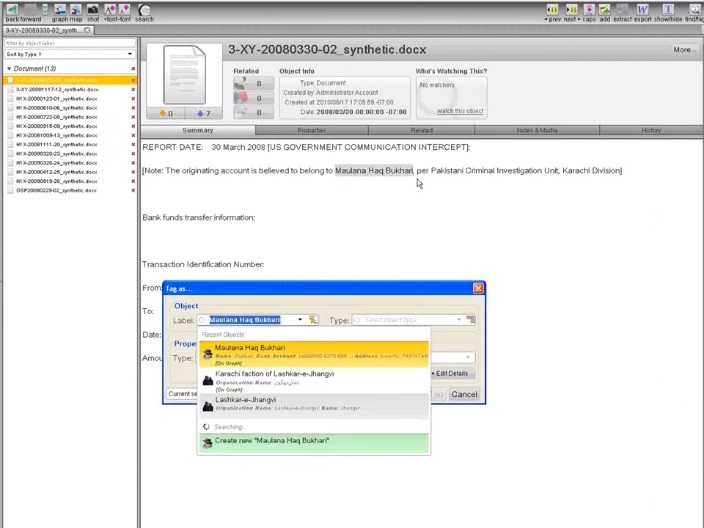
01:01 In the browser, an analyst can structure information by assigning tags to it. Let's highlight Malona Hag Bukhari.
01:10 Palantir automatically searches for objects that are already in the database, we can also create a new object, and select special properties for it to assign the tag appropriately.
01:19 The blue line below the text shows an entity to which we just assigned a tag.
01:23 Double clicking on a tag opens a complete file of the object, its properties, associated media files, the history of the object and a list of all data sources.
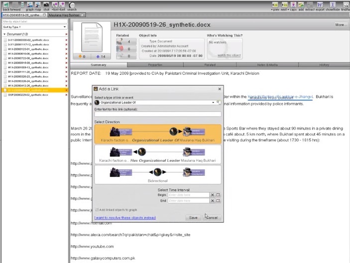
01:35 To create links between objects with tags in the text, we simply drag one onto another, and then select the resulting connection with special properties.
01:45 In a fully tagged document, color and lines indicate links to existing entities, events, and relationships.
01:51 Now let's add the data we structured in the documents related to Pakistan to the graph.
01:57 On the graph, the analyst uses various tools to analyze data.
02:00 Here entities and events from Pakistan tags. Using the histogram, we filled the graph with people, and the analyst can now use the tool for finding relationships between entities that can manifest from documents tagged by other analysts from our company.
02:17 After constructing a graph of key entities and events of the Pakistani network, we can use the timeline to understand the temporal aspects of network activity, which include flights, meetings, payments, and the like.
02:30 The analyst can also share the graph with other analysts of the company, here we can see shared graphs from Pakistan, Latin America and Dubai.
02:40 Let's look at the graph of the world network of arms dealers, which includes the entities and connections from all the tags of documents assigned by our team.
02:49 We use a social networking assistant to identify key points for future investigations on our worldwide network.
02:56 Let's add a highlight color. Now we see that Dubai, Bukhari, and Dombrowski are important intersection points on this network.
03:03 By dragging all this onto the map, we can see all network activity geographically and in time if we use the Timeline.
03:10 It gives a broad look at when and where each cell acts.
03:15 For example, the UAE plays an important role, many of our goals met here in April.
03:21 By structuring data from unstructured reports and using Palantir data analysis tools to achieve a goal, our team has made a clear display of the arms trade network in several countries and indicated the place where the network managers negotiated.
VAST 2010 Challenge, Pt. 2
Hospitalization records: Characteristics of the spread of the pandemic.
00:00 This presentation will show how we use the Horizon analysis at Palantir to analyze the spread of the virus during a national pandemic.
00:05 Horizon is designed for analyzing large amounts of data and will now be used to quickly visualize and analyze fifteen million records of hospital visits and three hundred and fifty-seven thousand death records. Baseline data was divided by symptoms and entered into the system.
It is written: "Horizon" is designed for analysis on two screens. The video will switch between the analysis tree window and the visualization window.
00:20 Please note that the time to process requests is not included in the video.
00:23 Let's start by looking at a few basic histograms to get a general view of the data.
00:27 This is a bar chart of hospitalization by age, which gives an almost perfect distribution chart with a peak at forty-four years.
00:33 This is not normal, as we expected more visits to the hospital before the age of forty, based on data on the typical distribution by age and state of health.
0:43 Now we use a batch histogram of visits to the hospital for patients who later died to determine the symptoms that most often led to death.
00:53 Tremor and hearing loss, as an example of the symptoms associated with death.
00:56 To investigate the temporal patterns of the disease, create a histogram of visits to the hospital by day, filter by death, and create another histogram of deaths by dates.
01:12 There is a slight increase in the number of hits in May, and at the same time the number of deaths has increased.
01:22 In order to identify the temporary patterns of the disease, it will be useful to know how much time elapsed between the time of hospitalization and death.
01:29 We can do this by adding a new property that finds the difference between the date of death and the date of treatment.
01:38 We can now create a histogram with this new property. It shows that almost all deaths occurred on the eighth day after hospitalization, which, hypothetically, could be a characteristic of a pandemic virus.
01:51 By focusing on these deaths, we can create a histogram of the most common symptoms.
01:58 Vomiting and abdominal pain are the most popular results.
02:05 Let's use a heat map to see which geographic areas have the most fatal outcomes.
02:12 In Pakistan, there are many deaths, while in Thailand and Turkey there are relatively few.
02:20 Let's create a scattergram of days and places, which will give an idea of the intensity of the disease over time.
02:34 We can see that the number of deaths in Thailand and Turkey is constantly low, while in other places the death rate peaks and decreases.
02:45 By comparing the resulting graph with the histogram of the distribution of deaths by dates, we can understand when the pandemic began.
02:57 With this new subset, we can create a new scatterplot for hospitalization to see how the disease has spread over time across the locality.
03:07 We see that Kenya, Pakistan and Syria are the countries with the earliest outbreaks of the disease.
03:15 For more accurate information about the distribution of the disease in time and place, we can refer to the data on deaths in each territory.
03:25 By selecting data for Pakistan, for example, we can create a histogram of hospitalizations by date from a subset of patients who we suspect have died from a pandemic.
03:38 Using the Palantir Horizon, we were able to quickly import, analyze and visualize pandemic data, identify anomalies and characterize the nature and development over time of this disease.
More about Palantir:
- Palantir and money laundering
- Palantir, PayPal Mafia, special services, world government
- Palantir 101. What is allowed to ordinary mortals to know about the second most abrupt private company in Silicon Valley
Together with the company Edison we continue the spring marathon of publications.
I will try to get to the primary sources of IT-technologies, to understand how they thought and what concepts were in the minds of the pioneers, what they dreamed about, how they saw the world of the future. Why did you think “computer”, “network”, “hypertext”, “intelligence amplifiers”, “collective problem solving system”, what meaning did they put into these concepts, what tools they wanted to achieve a result.
I hope that these materials will serve as an inspiration for those who are wondering how to go “from Zero to Unit” (to create something that had never happened before). I would like IT and “programming” to stop being just “coding for the sake of dough”, and recall that they were conceived as a lever to change the
0 March. Seymour papert
March 1. Xerox alto
March 2, "Call Jake." NIC and RFC history
March 3, Grace "Grandma COBOL" Hopper
March 4 Margaret Hamilton: "Guys, I'll send you to the moon"
March 5, Hedy Lamarr. And in the movie naked to play and torpedo the bullet into the enemy
March 7 Gorgeous Six: girls who had a thermonuclear explosion calculated
March 8, "Video Games, I'm your father!"
March 9th Happy Birthday to Jeff Raskin
March 14 Joseph "Lick" Liclider: "Intergalactic computer network" and "Symbiosis of man and computer"
March 15 Vanivar Bush: “How We Can Think” (As We May Think)
March 16th Happy birthday, Richard Stallman
March 21 Douglas Engelbart: "The Mother of All Demos". Part 1
Source: https://habr.com/ru/post/280444/
All Articles