Tips, libraries and additional materials on CSS-animation
Introduction
It was a deep night. Moonlight penetrated through the wooden windows into the dark room. He did not adequately illuminate my wooden table with a laptop, notepad, and blue pen. So I reached out my hand to the desk lamp and turned it on.
A text file was opened on the computer with a list of articles and libraries about web development. He is constantly updated with new data.
')
Turning it off,
... From that day on, the thought stuck in my head: "
In it, you will learn what is css-animation, what libraries exist (css / js), get a list of ready-made solutions from other sites and learn about the new technology of web-animation.
So let's get started.
CSS animation
CSS animation is an emerald of web technologies for revitalizing your sites. With it, you can create beautiful and smooth transitions (color change, resizing, and so on) for objects without using JavaScript.
It consists of CSS-Transitions and CSS-Animations.
Transitions allows you to control the speed of animation when changing css-properties.
Animations provides the ability to create more complex animations with several intermediate transitions.
When creating effects, CSS-Transforms and content pseudo-elements (pseudo-elements) are often used.
Transforms makes it possible to scale, rotate, shift and tilt the DOM element.
Content pseudo-elements after and before allow you to add content (via css) before and after an element without changing html.
I will not describe in detail each element of CSS Transitions, CSS-Animations, CSS-Transforms and content pseudo-elements, because there are articles on the Internet that perfectly reveal them :
- About CSS Transitions from Javascript.ru ;
- About CSS Transitions in the Mozilla documentation ;
- About CSS Animations in the Mozilla documentation ;
- About css-animation in Frontender ;
- About CSS-Animations by SmashingMagazine in English ;
- Css-animation on html5book ;
- About CSS-Transform from CSS-tricks in English ;
- About the CSS Transform in the Mozilla documentation in English ;
- About CSS Transform on Habré ;
- About pseudo-elements on Habré ;
Browser Support:
Wrappers for creating cross-browser CSS-Animations (key-frames):
- jQuery.Keyframes ;
- Your options in the comments.
CSS Animation Tips
! Try to use animation only to improve the interaction between the user and the interface.
Interface animations should be used only to improve communication between the program and the user. Insert only because it is beautiful or unusual, should not be. It is necessary to think about everything well in advance.
Sometimes you open the block with the search, and there the field, title and button are animated in different ways at different speeds. Like a cartoon in the interface. This creates discomfort and inconvenience.
In addition, when using a large number of animations, the browser may start to slow down, even if it processes them separately in the GPU.
! If possible, use productive css-properties for animation
When css-properties are changed, the browser goes through 4 stages of displaying the DOM: recalculate style , layout , paint , composite .
Calculation of styles (recalculate style) - analyzes all CSS rules and calculations of the final style for each DOM element.
Layout recalculation (layout) - determining the position of elements on the screen, their sizes and other primary data.
Drawing (paint) - output all the visual parts of the elements (color, text size, font, image, shadow, and so on).
Composition (composite) - all traced elements are assembled into a single composition.
Calculation of styles, recalculation of the layout (layout) and drawing (paint) consume much more resources than composite (layout).
For example, for the css-property " transform: translate " an additional, invisible layer is created in which all changes occur. It is processed at the layout stage (in an invisible additional layer without shifting neighboring elements) and is executed in the GPU , and not in the CPU. Through the use of a GPU, changes occur smoothly without delay. You can see this in the video .
Using the GPU instead of the CPU during the animation is especially effective on phones and tablets where the resources of the central process are limited.
Some css-properties go through 4 stages of display, others through one or two. It is necessary to know them and correctly apply them in animation. For example, when changing the "Height" of a DOM object, the browser will have to go through recalculate style, layout, paint and composite, because it can move other elements of the page, which means that for each of them you also need to recalculate the position sizes and other parameters.
Try to use only those css-properties that will pass through the layout or Paint + Composite :
- transform: rotate;
- transform: scale;
- transform: translate;
- opacity;
- color.
Materials on the topic:
- Css properties with mapping steps ;
- Often used css-properties ;
- Accelerated Chrome Rendering
- How to make animation more productive ;
- Pro productive visualization from Google ;
- Test animation with left and translateX ;
- About hardware acceleration from Yandex on Habré ;
- About GPU Accelerated Compositing in Chrome .
! Use will-change to optimize animation wisely
Relatively recently appeared css-property - will-change . With it, you can tell the browser that a particular property will change and its calculations must be optimized before the animation begins.
Will-change takes the following values:
- auto - default browser actions / resets force optimization;
- scroll-position - waiting for the animation / change of the scroll bar of a specific element;
- contents - expects animation / change in the content of a specific element;
- custom-ident - comma-separated list of css-properties.
If you write:
.text { will-change: opacity; -webkit-transition: opactiy 0.5s ease; -moz-transition: opactiy 0.5s ease; -o-transition: opactiy 0.5s ease; transition: opactiy 0.5s ease; } .text:hover { opacity:0.6; } That browser will try to optimize the animation for the ".text" in advance.
Some web developers experimentally found that it will be better to insert will-change not immediately, but instantly before the start of the animation, and after completion - to delete, since the optimization takes part of the RAM. If this is not done, the site will take up additional memory, even if 99% of the time this animation is not used. Such an addition and removal of will-change is done using javascript.
It’s worth considering that if there are elements on the site that often cause animation, then it’s logical for them to specify will-change right in styles.
Browser support:
- Chrome 36+;
- Firefox 36+;
- Opera 26+;
- Android 36+;
- Safari, IE, iOS - no (for March 22).
Articles for review:
- All about will-change from OperaDev ;
- About will-change in the Mozilla documentation ;
- About will-change in CSS-tricks ;
- Standard description will-change .
! Properly select the speed of the animation
When implementing various kinds of effects in the user interface, it is necessary to select the correct execution speed. For example, dialog boxes during opening should seem to flow, slowly and smoothly, and when closing close quickly (after the task is completed, users want to quickly close the pop-up window). On average, the animation should not be longer than 500 ms.
! Build reads and updates into packages
So you can not do:
var b1=document.getElementById('box1'); var b2=document.getElementById('box2'); var b3=document.getElementById('box3'); var b2W=b2.offsetWidth; b2.style.left=b2W+'px'; var b3W=b3.offsetWidth; b3.style.left=b3W+'px'; b1.style.left='0'; And so it is necessary:
var b1=document.getElementById('box1'); var b2=document.getElementById('box2'); var b3=document.getElementById('box3'); var b2W=b2.offsetWidth; var b3W=b3.offsetWidth; b2.style.left=b2W+'px'; b3.style.left=b3W+'px'; b1.style.left='0'; Why?
If you read past tips, you learned that when displaying data on the screen, the browser goes through 4 stages of display: style calculation, layout calculation, drawing and layout.
In a bad example, a forced recalculation of the layout occurs twice in the lines " var b3W = b3.offsetWidth; " and " var b3W = b3.offsetWidth; ", because the css property (left) was changed before. Without recalculation, the browser simply will not be able to accurately determine the “offsetWidth”, because there is a possibility that the new value of the css property will affect it.
Please group read and update operations!
Additional material:
- About recalculation of models ;
- Practical CSS tips ;
- An old but useful note about rendering in the browser .
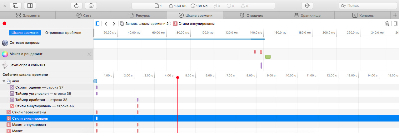
! Check animation using browser developer tools
Strange, but for all this time I did not come across material about animation testing in the browser. But this topic is worthy of a separate article.
Using the developer tools in browsers, you can find resource-intensive animation operations that should be corrected. So test the animation with them!
In this tip, I will briefly describe the capabilities of several browsers for animation testing.
Google chrome

Chrome is best suited for debugging animations. In the Timeline developer tools tab there is:
- Timeline with display operations;
- Graphic copies of the site (screenshots) for each step;
- Detailed list of display stages;
- Total work time at each step;
- Detailed description of each stage;
- Profiling the drawing process;
- And other minor features.
In the Google Chrome debug information, you will learn which operations need to be optimized and which work well. His tips contain links to articles on remediation. In other browsers have not seen this.
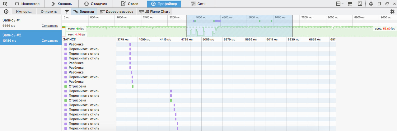
Safari
In Safari, animation is rated through the Timeline tab of the Layout and Rendering section.
On the top block with the timeline you will be able to find out when a particular stage in the display of the site appeared. In the lower block will see the order of their execution. In the subsection "Drawing Frames" get more detailed information about each stage.
In Safari, laying out the animation seemed to me a little informative. There are no tips for improving it, unlike Google Chrome.
Mozilla firefox
For testing animation, it is the least suitable. There is a timeline with all the steps in the animation and block their order. Detailed information on the stages is not available.
Firefox is more suitable for testing the html parsing process and site operation (performed garbage collector operations, html / xml parsing, CC Graph reduction, and so on).
! Use the requestAnimationFrame function
Previously, when creating animations on js, setInterval / setTimeout was used. They set the repetition interval (1000ms / 60 (fps) = 16.7ms ideally) and started the effects. This solution had many flaws:
- If the page is in an inactive tab, it will still work and waste computer resources;
- The function requires the screen to be redrawn at the same time that the computer requires it. Therefore, the device / PC has to use additional resources to synchronize the animation with the screen refresh rate;
- An animation can be twitched, since js is single-threaded and at the moment the animation should occur, another operation can be performed.
Fortunately, technology does not stand still. To solve these problems, the function requestAnimationFrame was invented. Its advantages:
- In the inactive tabs, the animation stops to save computer resources (memory, CPU, GPU, and battery consumption);
- The speed of drawing (repaint) adjusts to the refresh rate of the screen and is executed only when the computer is ready for it;
- Reduces FPS under heavy loads to save battery and computer resources;
- All animations are combined into one browser redrawing (rather than performing separately) - this reduces resource consumption and speeds up the display.
Negative aspects of the new solution:
- Different browsers use different APIs (solved via polyfill);
- It is difficult to control FPS animations (only with the help of crutches);
- Not all browsers support new technology, which is why the old versions use the same setInterval (IE10 +);
- All calculations must be done for 16.7 mc (this may not be enough).
Additional material:
- About requestAnimationFrame on Habré ;
- Pros and cons of requestAnimationFrame ;
- How to use requestAnimationFrame ;
- About requestAnimationFrame from Mozilla ;
- About requestAnimationFrame from Google Chrome Developer ;
- About problems requestAnimationFrame in Chrome from Google ;
- Pro requestAnimationFrame in MSDN Microsoft ;
- Polyfill requestAnimationFrame .
! Choose a library type (css or js) based on the task
Each type of library has advantages and disadvantages. They should be considered when choosing.
The advantages of css-libraries:
- Conveniently develop simple animations;
- Some properties are immediately executed in the GPU;
- No need to make the site js-code.
Disadvantages of css libraries:
- Difficult to create and maintain complex animations;
- Insufficient control over the animation process and its appearance (for example, to enable when clicked or to stop at a specific second of execution).
Advantages of js libraries:
- You can create an animation of any complexity;
- There are animation control mechanisms (enable / disable, stop for a specific second, and so on);
- In some cases, applicable not only to css, but also to SVG and canvas;
- Sometimes faster css-libraries;
- Various easing function (with 2 or more curve points).
Disadvantages of js libraries:
- Increases the size of the site;
- Excess for simple animations;
- Difficult to learn.
It is worth remembering about the third type. You can write the animation yourself or copy the appropriate part of the source code from the finished library.
We now turn to the study of css and js libraries.
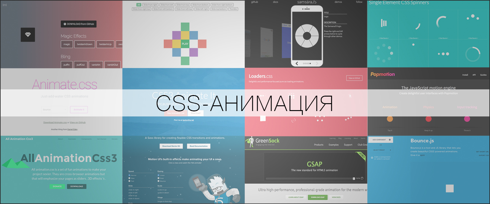
CSS libraries
With the help of special css-libraries, you can quickly create a simple animation:
- Rebound;
- Shaking;
- Swing;
- Jelly;
- Slow disappearance / appearance;
- Flip;
- Turn;
- Slip;
- other.
Animation is connected via classes using javascript or manually. Consider existing libraries.
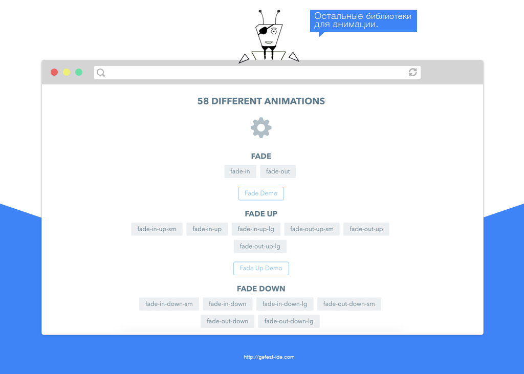
Animate.css

Library with 75 effects . Exists since 2011. Until 2013-14, provided online effects designer. Later, the developers removed it and made a build-generator using Gulp.js. All effects use @keyframes.
It is convenient to use on selling pages.
The creators of the library divided the effects into 14 categories:
Website: Animate.css .
Animate.css
Library with 75 effects . Exists since 2011. Until 2013-14, provided online effects designer. Later, the developers removed it and made a build-generator using Gulp.js. All effects use @keyframes.
It is convenient to use on selling pages.
The creators of the library divided the effects into 14 categories:
- Attention Seekers;
- Bouncing Entrances;
- Bouncing Exits;
- Fading Entrances;
- Fading Exits;
- Flippers;
- Lightspeed;
- Rotating Entrances;
- Rotating Exits;
- Sliding Entrances;
- Sliding Exits;
- Zoom Entrances;
- Zoom Exits;
- Specials.
Website: Animate.css .
Effeckt.css
Effeckt.css appeared in 2013. With it, you can quickly create a beautiful animation for the appearance of a dialog box, switching tabs, adding elements and much more.
He breaks up the effects not by type and style, like others, but by a specific purpose:
Effeckt.css is written in SCSS and most of its effects do not use @keyframes, so its code is lighter than others.
Website: Effeckt.css .
Effeckt.css
Effeckt.css appeared in 2013. With it, you can quickly create a beautiful animation for the appearance of a dialog box, switching tabs, adding elements and much more.
He breaks up the effects not by type and style, like others, but by a specific purpose:
- 34 effects for dialog boxes;
- 23 effects for the appearance of an information block near a specific element;
- 20 effects to overlay any data on the buttons (icons, text, etc.);
- 8 effects of the appearance / disappearance of the elements of the list;
- 8 effects scrolling list items;
- 27 effects of appearance / disappearance of the navigation panel (mobile panel);
- 15 page transition effects;
- 18 effects of additional information in the card with images (or, for example, for a gallery of pictures);
- 4 simple tips;
- 4 effects for switches;
- 7 effects for tabs.
Effeckt.css is written in SCSS and most of its effects do not use @keyframes, so its code is lighter than others.
Website: Effeckt.css .
Hover.css
Library for creating effects that will work when you hover the mouse over an item. It is convenient to use for buttons.
The animation is divided into the following categories:
Hover.css is written in less, scss and css.
Website: Hover.css .
Hover.css
Library for creating effects that will work when you hover the mouse over an item. It is convenient to use for buttons.
The animation is divided into the following categories:
- 27 effects of 2D transformation;
- 18 effects of changing the background element;
- 27 effects for an element with text and icon;
- 18 effects Border transitions;
- 7 shadow effects;
- 8 effects of the appearance of a triangle (as in the tooltip);
- 4 corner bending effect.
Hover.css is written in less, scss and css.
Website: Hover.css .
Magic animations
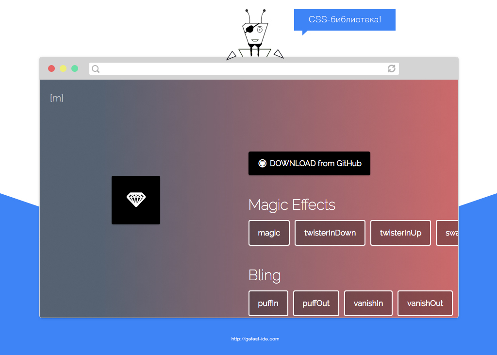
Based on Animate.css. Unlike other libraries, it has many unusual effects:
Website: Magic animations .
Magic animations
Based on Animate.css. Unlike other libraries, it has many unusual effects:
- Magical;
- Bling;
- Static effects;
- 3D perspectives;
- 3D turns;
- Slide;
- With complex movement;
- With the effect of the explosion;
- Spatial;
- other.
Website: Magic animations .
Awesome

Awesome is a set of 89 effects from a Ukrainian developer, written in pure css. They are divided into 12 categories:
It is convenient to use on the selling pages.
Website: Awesome .
Article developer about the library .
Awesome
Awesome is a set of 89 effects from a Ukrainian developer, written in pure css. They are divided into 12 categories:
- Fade;
- Slide;
- Bounce;
- Roll;
- Rotbo;
- Flip;
- Rotate;
- Turn;
- Back;
- Push;
- Clip;
- Else.
It is convenient to use on the selling pages.
Website: Awesome .
Article developer about the library .
Repaintless

A library with a small size to create beautiful animation. The code is written in scss. Provides 11 pre-made effects :
Site: Repaintless .
Repaintless
A library with a small size to create beautiful animation. The code is written in scss. Provides 11 pre-made effects :
- Slide from right;
- Slide from left;
- Slide from top;
- Slide from bottom;
- Slide from right bottom;
- Slide from right top;
- Slide from left bottom;
- Slide from left top;
- Slide left right;
- Slide top bottom.
Site: Repaintless .
All-animation

Library with 36 ready-made effects and a set of simple UI-components. His animations are divided into 8 categories:
Written on css.
Website: All-animation .
All-animation
Library with 36 ready-made effects and a set of simple UI-components. His animations are divided into 8 categories:
- Bounce;
- Perspective;
- Fading Entrances;
- Rotate;
- Agreccives;
- Legend;
- Portrait.
Written on css.
Website: All-animation .
Reboundgen

Animation library of 27 ready-made effects . Built on Rebound.js from facebook .
Allows you to generate css-animation with the help of json-object and the script reboundGet.js. This is convenient, because you can create your own effects with the help of a script, and then only connect css without js to the site.
Because of the ready-made css effects and the generation mechanism, I decided to include the library not in the javascript list, but in the css.
Website: Reboundgen .
Reboundgen
Animation library of 27 ready-made effects . Built on Rebound.js from facebook .
Allows you to generate css-animation with the help of json-object and the script reboundGet.js. This is convenient, because you can create your own effects with the help of a script, and then only connect css without js to the site.
Because of the ready-made css effects and the generation mechanism, I decided to include the library not in the javascript list, but in the css.
Website: Reboundgen .
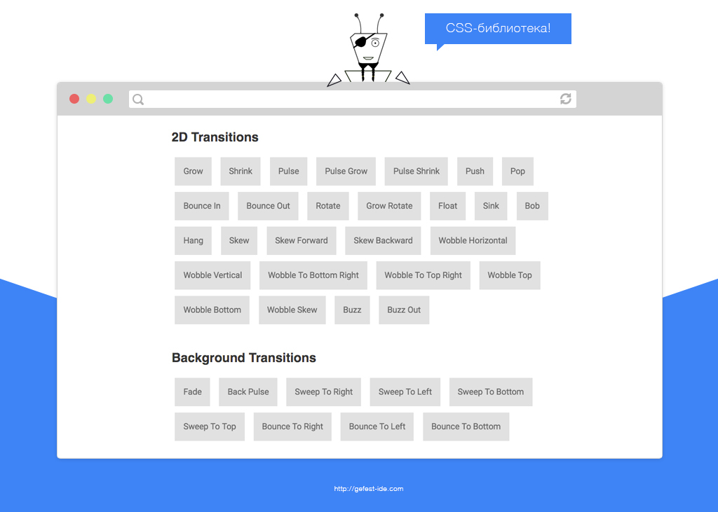
Morphodynamics

Morphodynamics is a library for creating beautiful effects. Provides 47 animation options .
All effects are divided into 6 groups:
It has 16 ready themes for styling. The library is well suited for creating animations for buttons, menus, and product card headers.
The original code is written in less.
Website: Morphodynamics .
Morphodynamics
Morphodynamics is a library for creating beautiful effects. Provides 47 animation options .
All effects are divided into 6 groups:
- Miscellaneous;
- Background;
- Border Transitions;
- Shadow Transitions;
- 2D Transforms;
- Bubbles.
It has 16 ready themes for styling. The library is well suited for creating animations for buttons, menus, and product card headers.
The original code is written in less.
Website: Morphodynamics .
Css3animateit
A simple library for creating animations.
It has 37 pre-made effects :
Written in less.
Website: Css3animateit .
Css3animateit
A simple library for creating animations.
It has 37 pre-made effects :
- Bounce;
- growIn;
- FadeIn;
- Shake;
- RotateIn;
- RollIn;
- Wiggle;
- Other...
Written in less.
Website: Css3animateit .
CSS3 Animation Cheat Sheet
A small library with 16 pre-made effects for animation:
Despite a small number of effects, they fully satisfy the need for animation in the development of single-page.
Like many libraries, it uses CSS3 @keyframes.
Website: CSS3 Animation Cheat Sheet .
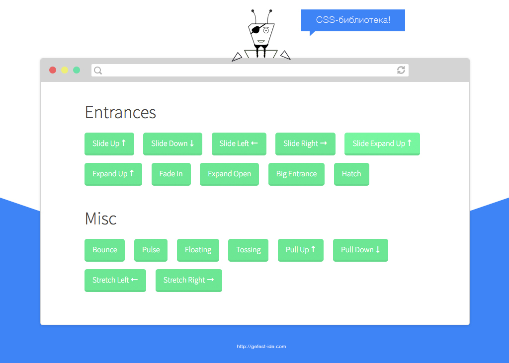
CSS3 Animation Cheat Sheet
A small library with 16 pre-made effects for animation:
- SlideUp;
- Slide Down;
- Slide Left;
- Slide Right;
- Slide Expand Up;
- Expand Up;
- Fade In;
- Expand Open;
- Big Entrance;
- Hatch;
- Other...
Despite a small number of effects, they fully satisfy the need for animation in the development of single-page.
Like many libraries, it uses CSS3 @keyframes.
Website: CSS3 Animation Cheat Sheet .
Tuesday

JS libraries
As you know, css is a declarative language. All his animation is linear and does not change depending on the situation. Therefore, on pure css it is impossible to make a normal animation logic.
Javascript libraries extend the capabilities and remove the limitations of css solutions. Using them, you can create an animation depending on the states (one effect is over, another has started; the user pressed a button, something appeared, and so on).
Thanks to js-solutions, you can say exactly where the object will be moved to the 3rd second. In css, this cannot be achieved, since all steps are determined by percentages, not seconds. You can only roughly know where the object will be moved. If the client wants to change the animation, you will have to recount everything again (when creating the correspondences between the percentage and the possible second), and this is an additional waste of time.
Css-animation does not always work faster js-solutions (even when the calculations take place in the GPU). This is described in the article from Css-trick (lost link, looking for).
Existing libraries can be divided according to the type of application (standard animation and highly specialized) and their complexity (simple and complex).
Simple:
Transformicons
Twenty beautifully animated elements, divided into 8 groups:
Effects are configured using attributes and js-functions. There is an online-builder.
Website: Transformicons .
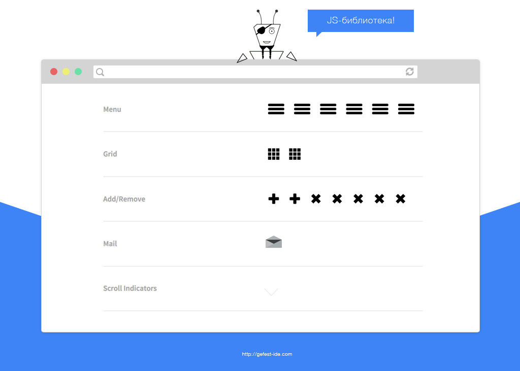
Transformicons
Twenty beautifully animated elements, divided into 8 groups:
- Menu;
- Grid;
- Add / remove;
- Mail;
- Scroll indicators;
- Forms;
- Video;
- Loaders.
Effects are configured using attributes and js-functions. There is an online-builder.
Website: Transformicons .
Snabbt.js
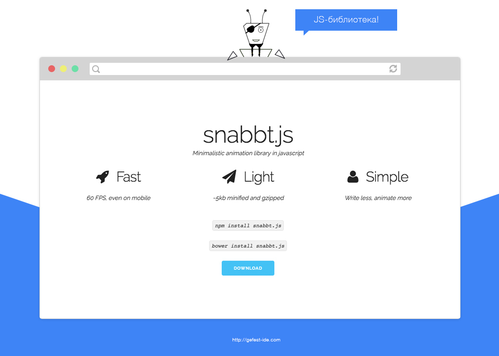
Library to create animation. It has a simple and clear API. It takes only 5kb . Use 3dmatrix. Stated 60 FPS . You can make several animations in a row through a chain of function calls (as in jQuery).
Allows you to change the position, width, height and transparency of elements. With the library, you can rotate, zoom in and out objects.
It has 5 easing functions:
Allows you to set temporary functions through mathematical js-expressions.
Website: Snabbt.js .
Snabbt.js
Library to create animation. It has a simple and clear API. It takes only 5kb . Use 3dmatrix. Stated 60 FPS . You can make several animations in a row through a chain of function calls (as in jQuery).
Allows you to change the position, width, height and transparency of elements. With the library, you can rotate, zoom in and out objects.
It has 5 easing functions:
- linear (default);
- ease;
- easeIn;
- easeOut;
- spring.
Allows you to set temporary functions through mathematical js-expressions.
Website: Snabbt.js .
Move.js

Another library without dependencies. With it, you can do not only a productive transformation, but also a change in the standard properties of objects (background color, border size, and so on). It weighs 13-14 kb.
Supports 30 easing functions:
You can also define your temporary function through Cubic-bezier.
Website: Move.js.
Move.js
Another library without dependencies. With it, you can do not only a productive transformation, but also a change in the standard properties of objects (background color, border size, and so on). It weighs 13-14 kb.
Supports 30 easing functions:
- in;
- out;
- in-out;
- snap;
- linear;
- ease-in-quad;
- ease-in-cubic;
- ease-in-quart;
- ease-in-quint;
- ease-in-sine;
- ease-out-quad;
- ease-out-cubic;
- ease-out-quart;
- ease-out-quint;
- ease-out-sine;
- and so on...
You can also define your temporary function through Cubic-bezier.
Website: Move.js.
Animo.js

Developed in 2013, a library for creating animation. Used as a plugin for jQuery 2+. It is a wrapper for Animate.css.
When calling a plugin it is indicated:
Animo.js weighs 7.2 kb.
Website: Animo.js .
Animo.js
Developed in 2013, a library for creating animation. Used as a plugin for jQuery 2+. It is a wrapper for Animate.css.
When calling a plugin it is indicated:
- Animation (you can have several);
- Animation time;
- The number of repetitions (once, twice or infinitely);
- Callback function, called after the completion of the animation (in it you can again turn to Animo.js);
- Unique properties for specific effects (degree of rotation, blur strength, and so on);
- Timing function.
Animo.js weighs 7.2 kb.
Website: Animo.js .
Ani.js
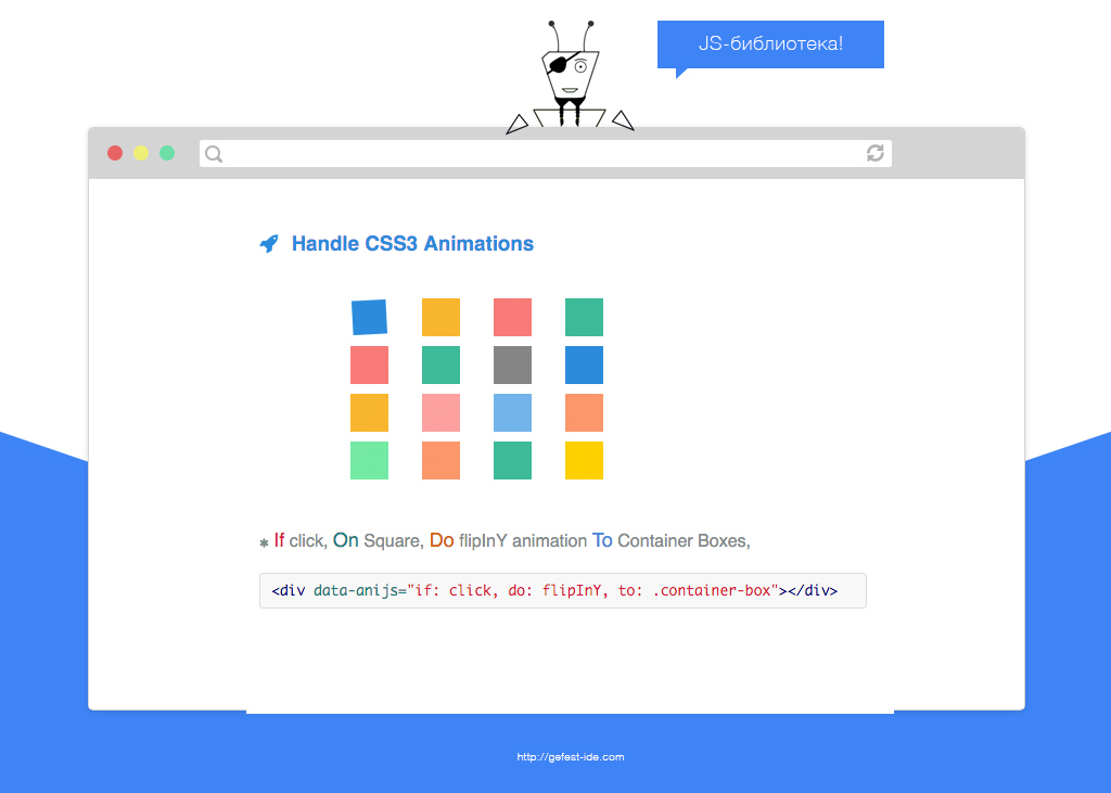
Library with an unusual way to use. Instead of the standard specification of classes or javascript function calls, you need to prescribe a data attribute (data-anijs) and add something like this to it:
if: click, on: h1, do: pulse animated, to: h2
Where ( link to library language ):
In one element you can specify several conditions at once.
Its effects are divided into 15 categories :
There are 70 effects in the library . Thanks to their online-builder (http://anicollection.imtqy.com/) you can select the necessary effects and generate your version of AniJS.
Website: Ani.js.
Ani.js
Library with an unusual way to use. Instead of the standard specification of classes or javascript function calls, you need to prescribe a data attribute (data-anijs) and add something like this to it:
if: click, on: h1, do: pulse animated, to: h2
Where ( link to library language ):
- if - any event;
- on - the object to which the animation will be applied;
- do - effect (several);
- to - object on which the event will be triggered (on and to can have different or the same value).
In one element you can specify several conditions at once.
Its effects are divided into 15 categories :
- attention_seekers;
- bouncing_entrances;
- bouncing_exits;
- fading_entrances;
- fading_exits;
- flippers;
- lightspeed;
- rotating;
- rotating_entrances;
- rotating_exits;
- specials;
- zooming_entrances;
- zooming_exits;
- sliding_entrances;
- sliding_exits.
There are 70 effects in the library . Thanks to their online-builder (http://anicollection.imtqy.com/) you can select the necessary effects and generate your version of AniJS.
Website: Ani.js.
Velocity
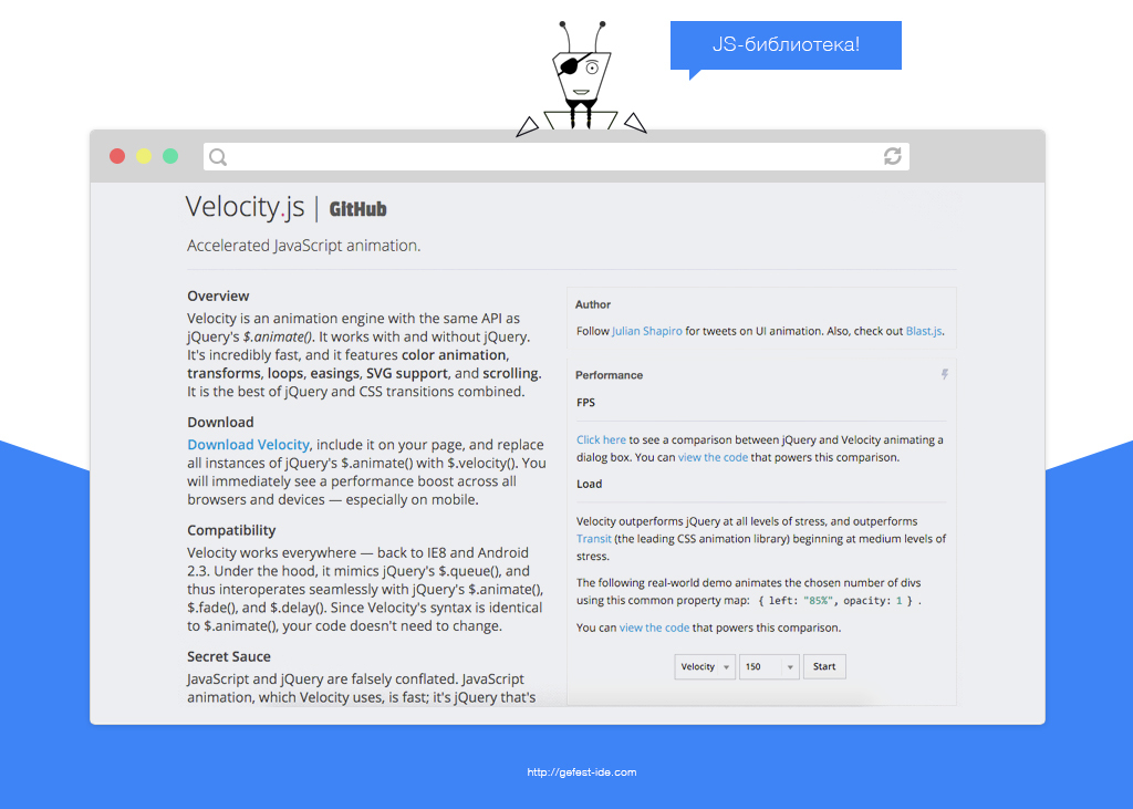
Library for creating productive animation effects. You can use it as a jQuery plugin. Supports ie8 + and modern browsers on computers, phones and tablets.
It allows you to create effective animations because:
As in other libraries, when using it, a list of css-properties and settings is specified (runtime, easing and callback function, animation looping, and so on).
Additional Information:
Website: Velocity .
Velocity
Library for creating productive animation effects. You can use it as a jQuery plugin. Supports ie8 + and modern browsers on computers, phones and tablets.
It allows you to create effective animations because:
- Automatically collects read and write operations into packages;
- Applies requestAnimationFrame;
- Uses productive css-properties and the best methods for caching the final values of the animation.
As in other libraries, when using it, a list of css-properties and settings is specified (runtime, easing and callback function, animation looping, and so on).
Additional Information:
Website: Velocity .
Animatic.js
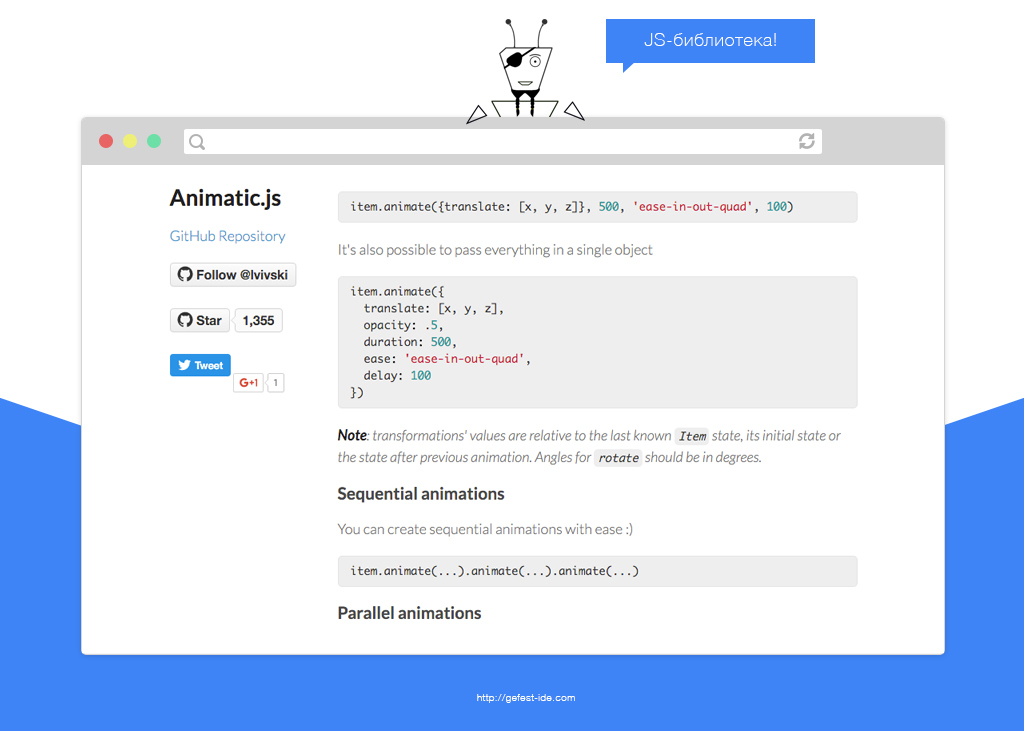
A small library for creating animation (7 kb). Supports Chrome, Safari, Firefox, Internet Explorer 10 and mobile browsers. For effects, only opacity and 2D / 3D transformation are used, as this is one of the most productive css properties.
During the application you must specify:
To simulate real physics, you will need to use additional parameters.
Animo.js : , .
: Animatic.js .
Animatic.js
A small library for creating animation (7 kb). Supports Chrome, Safari, Firefox, Internet Explorer 10 and mobile browsers. For effects, only opacity and 2D / 3D transformation are used, as this is one of the most productive css properties.
During the application you must specify:
- Effect (translate, rotate, scale and opacity);
- Lead time;
- Easing function (25 types);
- The delay.
To simulate real physics, you will need to use additional parameters.
Animo.js : , .
: Animatic.js .
Transitjs

Zurb Motion-UI
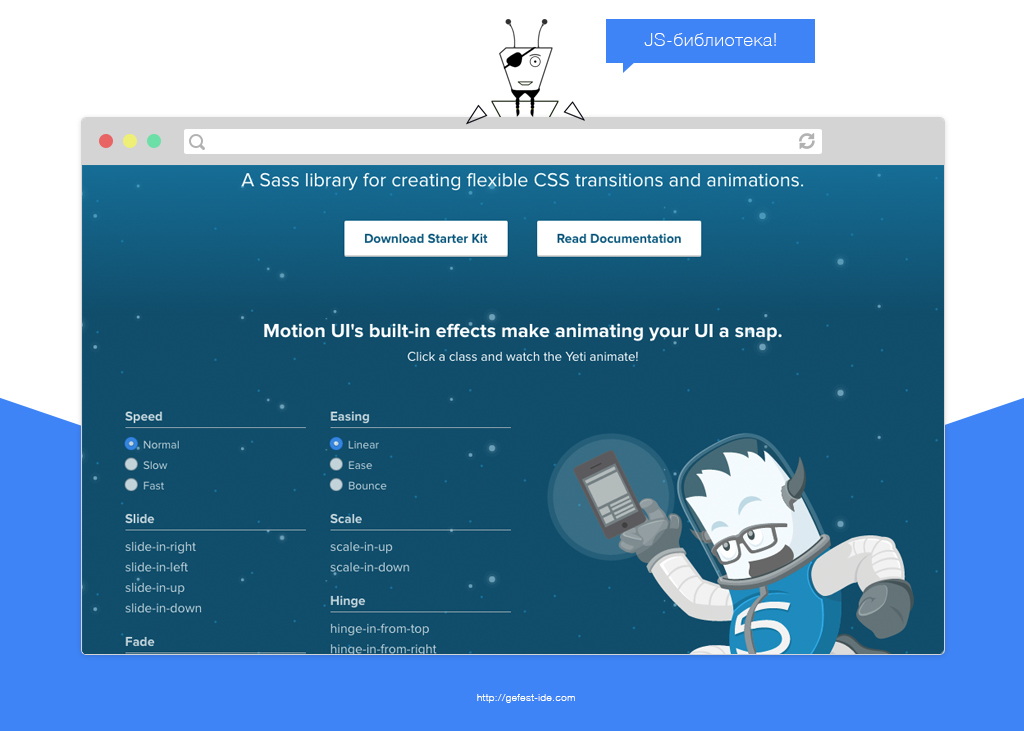
css- «Foundation».
5 :
3 (normal, slow, fast) 3- easing- (linear, ease, bounce). css- js-.
: Zurb Motion-UI .
Zurb Motion-UI
css- «Foundation».
5 :
- Slide;
- Scale;
- Hinge;
- Fade;
- Spin.
3 (normal, slow, fast) 3- easing- (linear, ease, bounce). css- js-.
: Zurb Motion-UI .
AnimatePlus

(2.8 kb) css/svg .
15 css-:
:
: AnimatePlus .
AnimatePlus
(2.8 kb) css/svg .
15 css-:
- translateX, translateY, translateZ;
- scale, scaleX, scaleY, scaleZ;
- rotate, rotateX, rotateY, rotateZ;
- skewX, skewY;
- opacity;
- perspective.
:
- el — ;
- duration — ;
- delay — ;
- easing — (29 );
- loop — ;
- direction — (normal, reverse, alternate);
- begin — ;
- complite — .
: AnimatePlus .
Difficult:
GreenSock

SamsaraJs
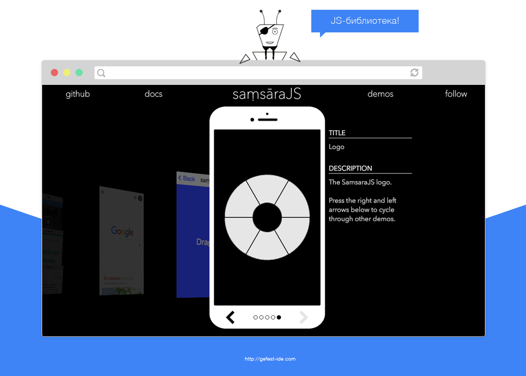
, javascript. .
:
Transitionables 9 easing ( ):
: samsarajs.org/docs/getting-started.html .
: SamsaraJs .
SamsaraJs
, javascript. .
:
- Samsara.DOM.Surface — ;
- Samsara.DOM.Context — , Surface;
- Samsara.Core.Transitionable — () Surface- ;
- Samsara.Core.Transform — css-transform (, Transitionable);
- MouseInput — ;
- TouchInput — ;
- ScrollInput — scroll-;
- PinchInput — ;
- RotateInput — ;
- ScaleInput — / .
Transitionables 9 easing ( ):
- linear;
- easeIn;
- easeOut;
- easeInOut;
- easeOutBounce;
- easeInCubic;
- easeOutCubic;
- easeInOutCubic;
- easeOutWall.
: samsarajs.org/docs/getting-started.html .
: SamsaraJs .
Popmotion
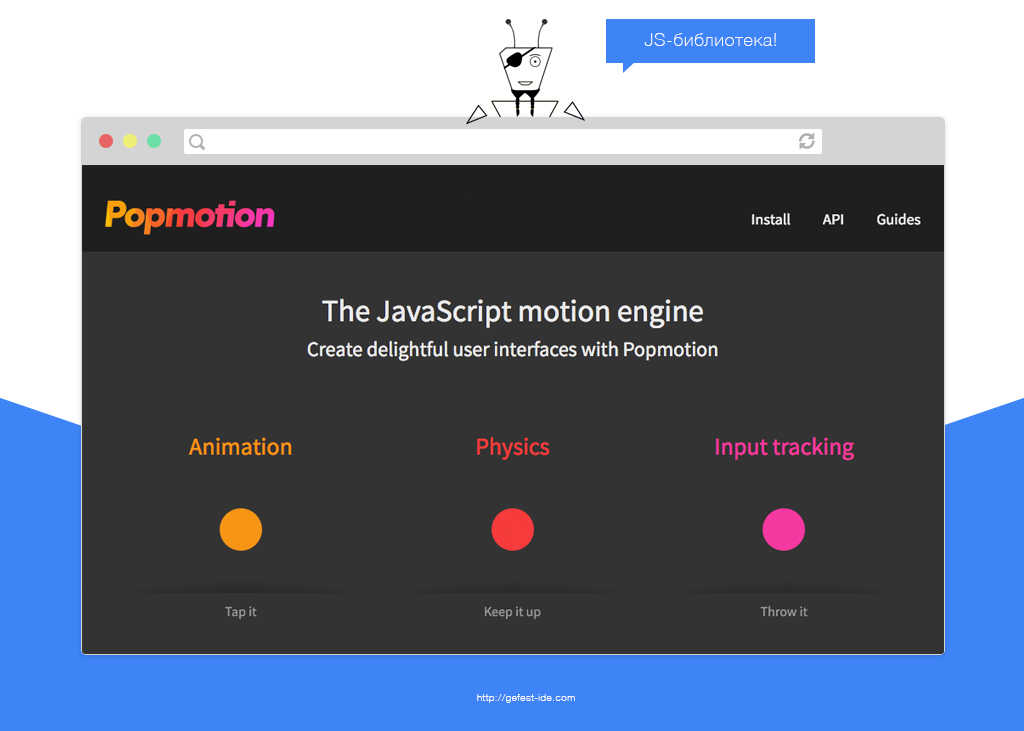
Popmotion — .
5 :
Standart:
Actions:
Roles:
Primitives:
Plugins:
Popmotion, Velocity, TweenLite TweenMax.https .
: Popmotion .
Popmotion
Popmotion — .
5 :
- Standart;
- Actions;
- Roles;
- Primitives;
- Plugins.
Standart:
- ui — ;
- Actor — ;
- Iterator — ;
- Sequence — ;
- calc — .
Actions:
- Simulate — ;
- Track — ;
- Tween — (Actor).
Roles:
- css — css-;
- attr — ;
- svg — svg ;
- drawPath — svg .
Primitives:
- Action — (Tween/Simulate/Track) (Actor);
- Easing — ;
- Input — Actor, ;
- Process — ;
- Role — (Actor) (css, attr ).
Plugins:
- Scroll To — DOM-.
Popmotion, Velocity, TweenLite TweenMax.https .
: Popmotion .
Mo.js

Shiftty.js

Animation Generators
When developing websites and web applications, standard solutions are not always enough. Therefore, some programmers have developed for themselves and colleagues in the shop special tools for the rapid creation of animation.
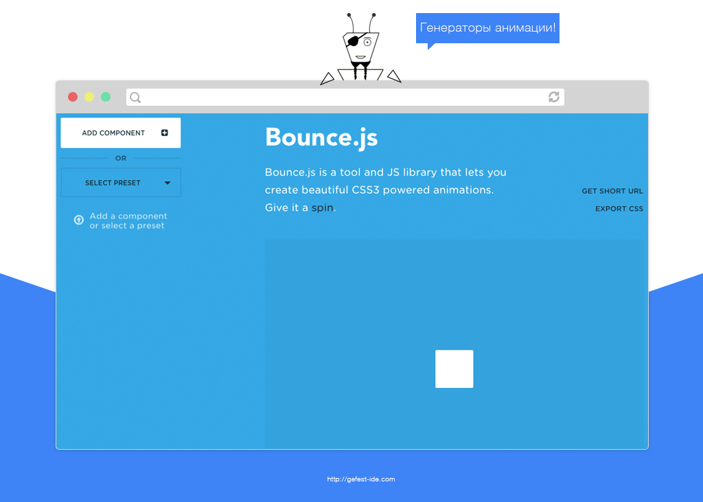
Bounce.js
The online service "Bounce.js" allows programmers to create elegant animations. In it, using the “Add component” button, you can add any number of controlled effects with the following settings:
- Type (scale, translate, rotate, skew);
- Easing (bounse, sway, hard bounse, hard sway,);
- Duration;
- Delay;
- Bounces;
- Individual parameters.
Created animations can be exported to css.
Css-animate
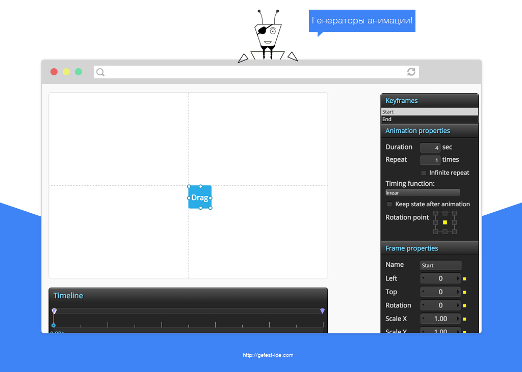
Convenient web application for creating animations. Provides a coordinate axis with an object to be animated, a timeline, and a panel for adding intermediate states. There are both general settings and settings for each stage of the animation (keyframes).
Css-code created animations can be obtained with and without prefixes.
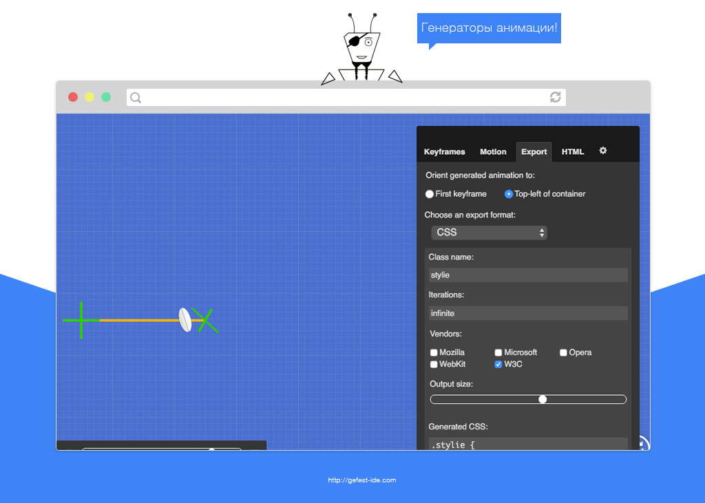
Stylie and Mantra
Allow you to transform the object in a short period of time. The created animation can be exported to css (with and without prefixes) or rekapi.
Supports the following properties:
- Opacity;
- Rotate;
- Scale;
- Skew;
- Translate.
It seemed to me not convenient and not understandable.
Libraries for special cases
On the Internet there are many narrowly focused solutions that do not fall into the standard structure “Simple and complex”. It is them that we consider in this section of the article.
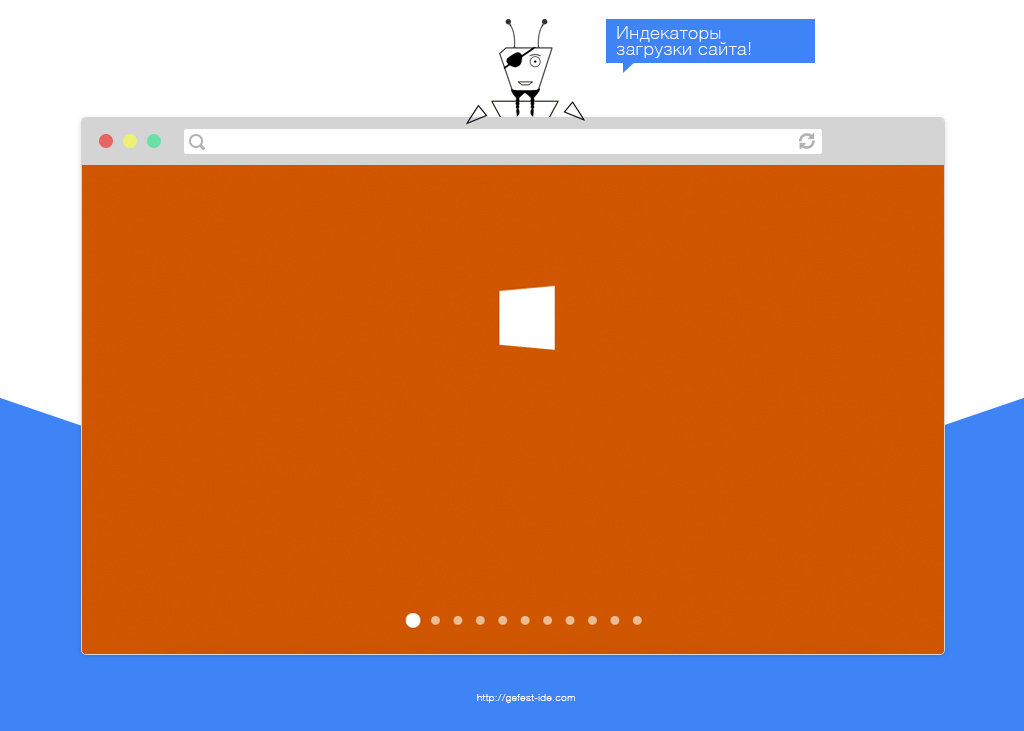
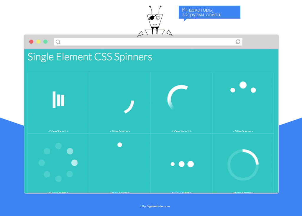
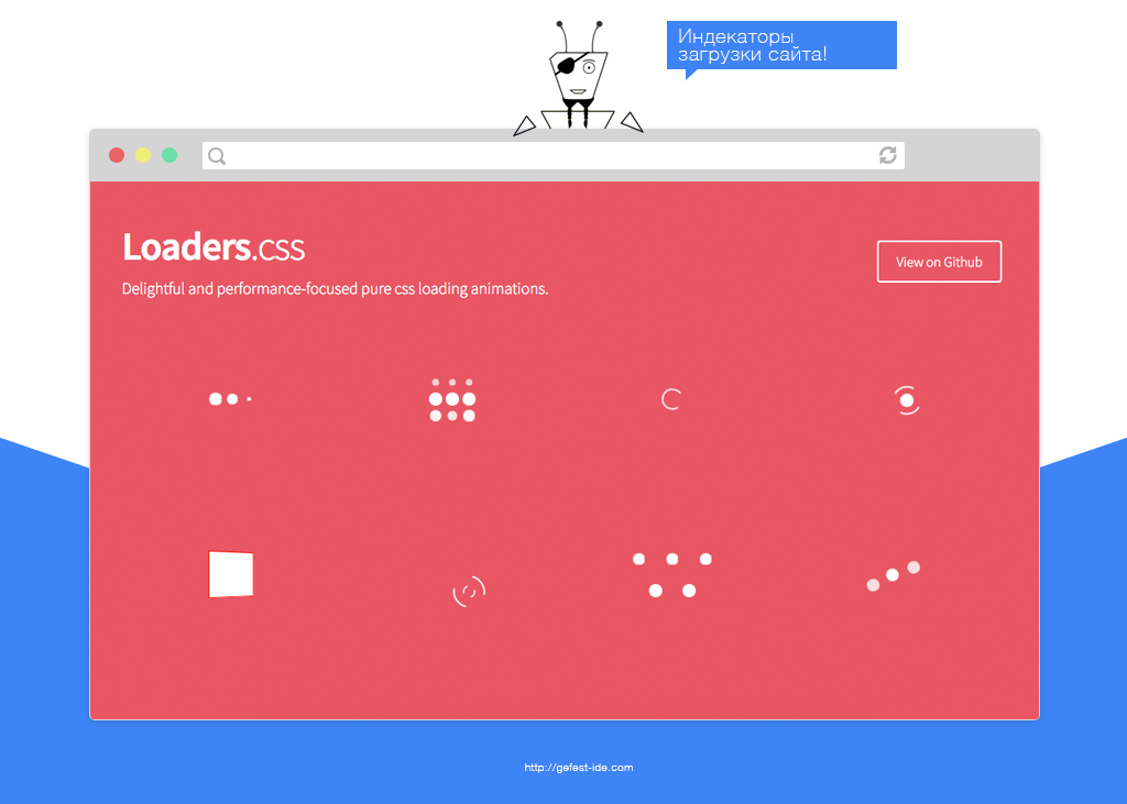
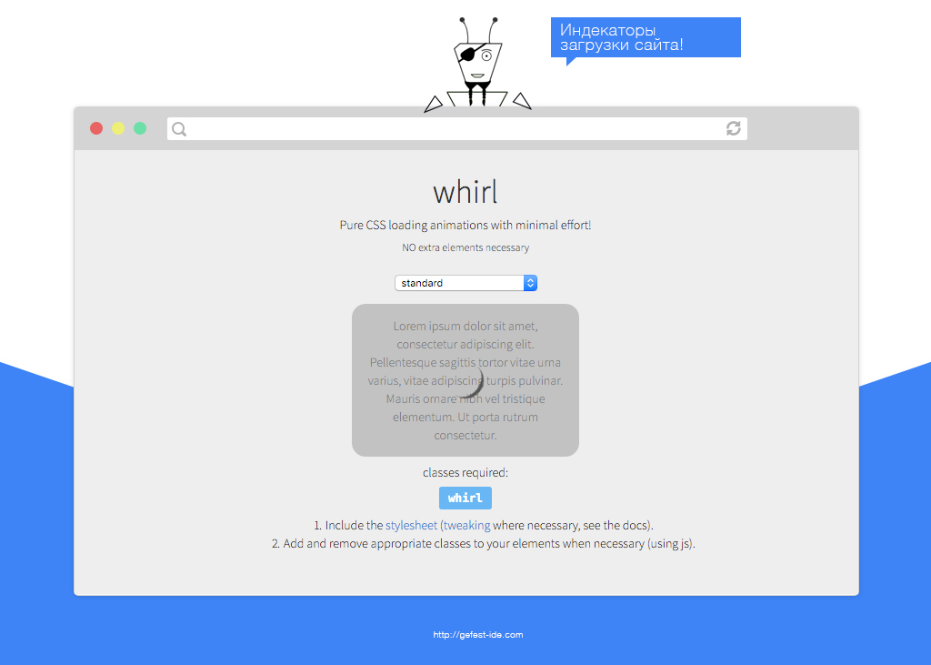
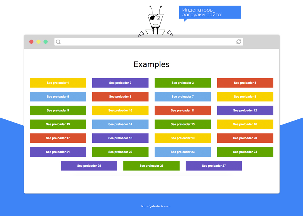
Libraries for creating site loading indicators
Css-loaders
Preloaders
Shelleylowe css-animations

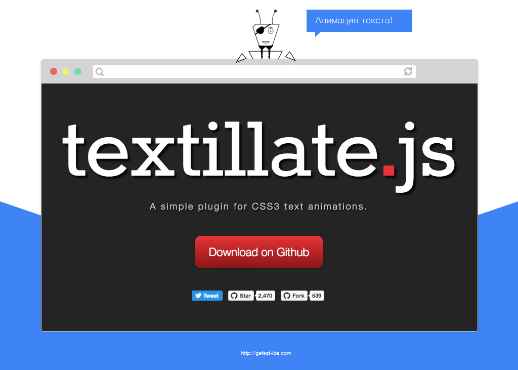
Text animation
Textillate
Rest


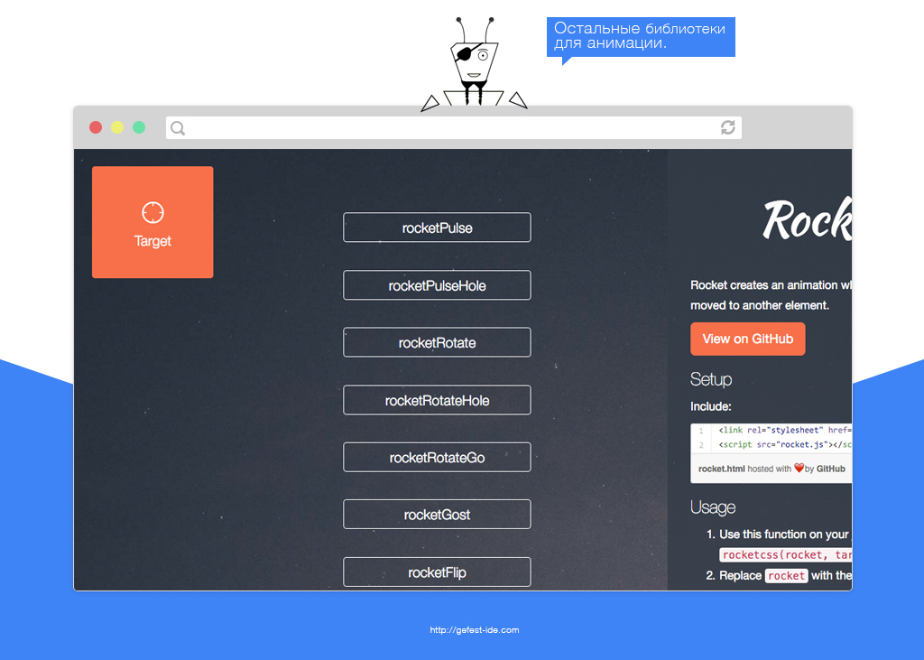
Rocket css
. -, .
Rocket CSS 8 :
: Rocket CSS .
Rocket CSS
. -, .
Rocket CSS 8 :
- rocketPulse;
- rocketPulseHole;
- rocketRotate;
- rocketRotateHole;
- rocketRotateGo;
- rocketGost;
- rocketFlip;
- rocketCircle.
: Rocket CSS .
CSS3 Transitions with custom easing functions

javascript . hardware-acceleration.
.
: CSS3 Transitions with custom easing functions .
CSS3 Transitions with custom easing functions
javascript . hardware-acceleration.
.
: CSS3 Transitions with custom easing functions .
Dynamics.js

Animsition
jQuery . data- js.
10 :
:
.
: Animsition .
Animsition
jQuery . data- js.
10 :
- Fade;
- Fade up;
- Fade down;
- Fade left;
- Fade right;
- Rotate;
- Flip X;
- Flip Y;
- Overlay;
- Zoom.
:
- IE10+;
- Safari;
- Chrome;
- Firefox.
.
: Animsition .
Future web animation
Flew of the year. Animation filled with new features and capabilities. And everything seems to be fine, but something is missing ...
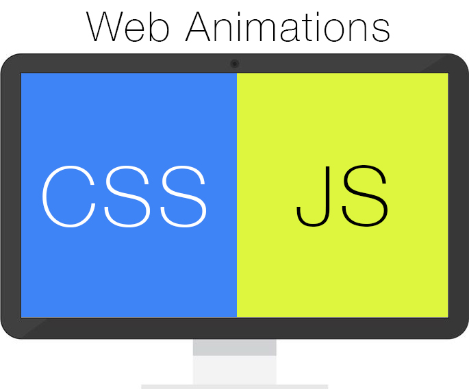
And there is not enough balance between the declarative (css) and the imperative (js) solution, which " Web Animations " successfully creates.
It combines their positive aspects:
- Work in a separate thread (as in css);
- Full control over the animation (as in js);
- Convenient mechanism for creating animation (css);
- Synchronize the browser display process with the computer screen update (requestAnimationFrame in js).
Unfortunately, while it is supported only in several browsers:
- Firefox 43+;
- Chrome 45+;
- Opera 35+;
- Android browser 47+;
- Chrome for android 49+.
For others, there is a polyfill (from IE10 +) .
Web animations has the following syntax:
element.animate([ {cssProperty: value0}, {cssProperty: value1}, {cssProperty: value2}, //... ], { direction: nameDirection, // , 'normal', 'reverse', .. iterations: iterationCount, // ( ) delay: delayValue, // duration: timeInMs, // easing: nameEaseFunction, //'linear', , .. fill: nameFill //'forwards', 'backwards', 'both', 'none', 'auto' }); Those who used css-animation, immediately see in it a familiar picture. First, css-properties are specified, which will be changed (like keyframe in css). Then the animation settings. When created, it will return an AnimationPlayer object, which has several useful properties and methods.
AnimationPlayer properties:
- currentTime — ( );
- playbackRate — ( );
- playState — (idle, pending, running, paused, finished);
- startTime — , ( ).
AnimationPlayer:
- finish — ( );
- pause — ;
- play — ;
- reverse — .
Using the GroupEffect and keyframeEffects objects, you can synchronize the animation of several elements on the page at once. SequenceEffect also allows you to combine many animations (like GroupEffect), but allows you to play them non-simultaneously. All this simplifies the work. After all, with the help of css, we would have to select the amount of delay for each element so that the previous animation could complete (imagine a sequence of 8 animations and you need to change the execution time in one of them, everything will have to be recalculated).
On April 9, 2015, the specification for another interesting technology for animation came out. It allows you to create the movement of objects along the path, where the coordinates are set through a specialcss-property motion-path (it can be used in standard css-animation and in web-animations). Points are indicated by SVG contours.
In Web animations , many specifications have not yet been established, and some have not even been implemented. But time does not stand still and soon it will be supported by most modern browsers.
Materials on Web Animations:
- Specification of web-animations in Mozilla ;
- Support for web-animations browsers ;
- State of animation in 2014 ;
- Specification of technology for creating the trajectory of the movement of objects ;
- Polyfil web-animations ;
- A series of articles about web-animations ;
- Specification web-animations ;
- web-animations ;
- css js ;
- web-animations ;
Conclusion
When I started writing an article about css-animation, I thought that I would manage in a couple of days, but it turned out that I have a lot of materials on it ... Therefore, in Word, there were 30 pages without pictures . I did not divide it into separate articles, since the integrity of the narration will be broken. Yes, and it is convenient when everything is in one place.
I advise you to read all the additional materials in the article. Because so you better understand the css-animation. I hope you will like it.
Parallel to writing articles and creating a cloud-based IDE mr. Gefest, we are leading a group about web development in VKontakte . We rigidly filter every published information so that the library / material is as useful as possible for you from a practical point of view. Therefore, I invite you to us. The more subscribers there are, the more we will publish useful libraries and materials (we spend a lot of time searching and filtering new materials and want to share them with a lot of web developers).
Mistakes and errors in the text, please send in a personal.
Materials not included in the sections of the article
- Links about the animation ;
- Creating css-animation in 15 minutes ;
- Pro animation performance from Google ;
- About slowing down in complex layouts from Google ;
- Controlling css-animation with javascript ;
- Using events css-animation on javascript ;
- About the performance of css-animation in Russian ;
- easing functions .
Source: https://habr.com/ru/post/280370/
All Articles