“Satellite / Maps” in a new style
Recently we have updated the style of the map service of the Sputnik portal. And we want to tell you how we worked on the update, what we experimented with and what we finally came to. A multiscale web map combines various functions in itself, each of which could be performed by a separate paper map — it is a topographical, travel, tourist, and basis for various portal services. Therefore, the creation of a web map style is a continuous search for a universal solution for displaying objects, which would make it possible to apply the map equally successfully for various user tasks.
The continuous change of the cardostil is primarily due to the fact that the devices on which users look at the maps are constantly changing, the resolution of the screens increases, which allows or even requires maximally detailed maps. It is also necessary to take into account some of the features of multi-scale web maps that are not typical of analog cards. First, web maps are a collection of small images or tiles. Since in the case of Sputnik / Maps tiles are raster, all objects and signatures on them will be static, their position will not change as the map is scrolled, and if any name is supplanted, it will not appear no matter how much we move around the map. And, secondly, where will the web maps be used: on the desktop or in a mobile application? The mobile phone screen has a small coverage, which allows using several icons and well-chosen fills to highlight the main objects and create a beautiful picture. But the user of the mobile application may not suspect that the same style that works well in the city on a small screen, in the countryside or on the big screen will be unreadable, while the user of the maps on the PC, where Satellite is mainly used / Maps, be sure to see it.
Therefore, the goal that we set for ourselves is to achieve a convenient, correct, unambiguous display of reality on the screen, regardless of whether we are looking at the country, the capital of the state, or a remote village.

')
Initially, when developing the style of Sputnik maps, we wanted to show the maximum allowable number of objects on the ground for each scale (as it is implemented in topographic and scientific reference maps). However, over time, in the process of modifying the style, we subjected the map to an ever-increasing generalization (generalization), combining classifications and leaving only what we considered the most important. At the same time, we worked with the color of polygonal and linear objects, which became more contrasting, which also increased the readability of the map. And specially for the Sputnik cartostile we developed a system of conventional signs. We want to tell you about these three aspects. Go!

About generalization
When generalizing objects for one or another level of scaling, it is important to understand what to focus on, which is the main thing for each of them. First you need to determine what spatial coverage corresponds to each scale level. This will help remove excess and focus on the main thing.
The Satellite / Maps style consists of 2 large blocks: for scale levels 3–8 (the so-called “Style to the World”) and 9–19 (“Basic Style”). These styles are developed separately, because in the first case we use the generalized Vector data of Natural Earth and the Globcover raster substrate, and in the second case - the OpenStreetMap (OSM) data. At the scale levels 7-8, there is some confusion of sources, since these scales are transitional. If we talk about artistic means and ways of display, the latest update of the style in Sputnik / Maps refers specifically to the “Basic Style”. "Style on the world" will be updated later and deserves a separate story. At the same time, both generalization principles were developed for both styles.
The minimum scale level on Satellite / Maps is 3, at which the user sees the largest countries. For all states, it is important to show the capital, so they appear on the 5th scale level, and on 6 - the largest cities.

At 7-8 levels of scaling, the main role is played by the roads, since on this scale it is more important to focus not only on the regions and localities located in them, but rather on the connections between them. The accuracy of the Natural Earth data, which we use on a smaller scale together with the Globcover raster substrate, is not enough for this, therefore, starting from level 7 of scaling, data from OSM are added, primarily for roads and borders of states and regions.

Starting from the 9th scale level, we almost completely switch to OSM data. At levels 9 - 12, the user wants to see the main highways, see what is around his city: airports, settlements, forests, find his area in the city, the largest residential and industrial districts. These scale levels are very general. At level 11, first, only stations and the largest parks are shown, then large railway stations and some POIs (points of interest) appear, referring not to transport, but to landmarks — monasteries, squares, parks, and fortresses. Thus, we offer the user places to walk in the city, see the most interesting and evaluate how far these objects are from its current location, city center and from each other.

With the enlargement of the scale, the user's attention shifts from the area to the street, and then to the house. 13 and 14 scale levels are also quite generalized, there are few new POIs. Due to this, large streets, transport facilities, gas stations, a subway appear, the type of land use is clearly visible - residential area, industrial zones, green areas, hospital areas, educational institutions, sports centers. Starting from the 15th level of scaling, we are showing individual houses on the map, which by this point already want to see the user. But the POI at this level is still a bit (so as not to overload the map with unnecessary details). But the largest hotels, theaters, shopping centers are already visible, which helps the user navigate within the area. At the next scale level, spatial coverage narrows down to a quarter, and the emphasis is finally shifted to houses, their numbers, bus stops and new POIs appear.

At the 17th scale level, the user is interested to see the nearest infrastructure objects. And we can show them, because with the enlargement of the scale on the map, there is more room for new POIs. There are restaurants and cafes, while only in the form of icons (signatures will be only on the next, level 18). Signed bus stops, objects of religion, banks. And at the maximum, 19 level of scaling, you can see very small objects - trees, urns, benches, zebras, speed bumps, etc.

About land use types ( http://wiki.openstreetmap.org/wiki/RU:Key:landuse )
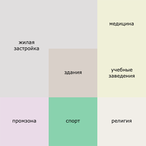
To improve readability, we abandoned some types of neighborhoods, for example, we combined commercial and residential neighborhoods and began to show them in one color. At the same time, the buildings of shopping centers have retained a “commercial” fill and stand out well on the map. In separate colors, we have shown industrial zones, educational campuses, territories of hospitals, sports complexes, castles and fortresses, temples and monasteries. Buildings that are located in these quarters are painted in the appropriate color. Compared with previous versions of the style, buildings at 15-16 zoom levels remain flat, at 17 a small volume appears, and at 18-19 the size depends on the number of floors or height.

So on the general scheme, the colors of land use types that we use in the style of Satellite / Maps look like (the basis for the scheme was taken here ).

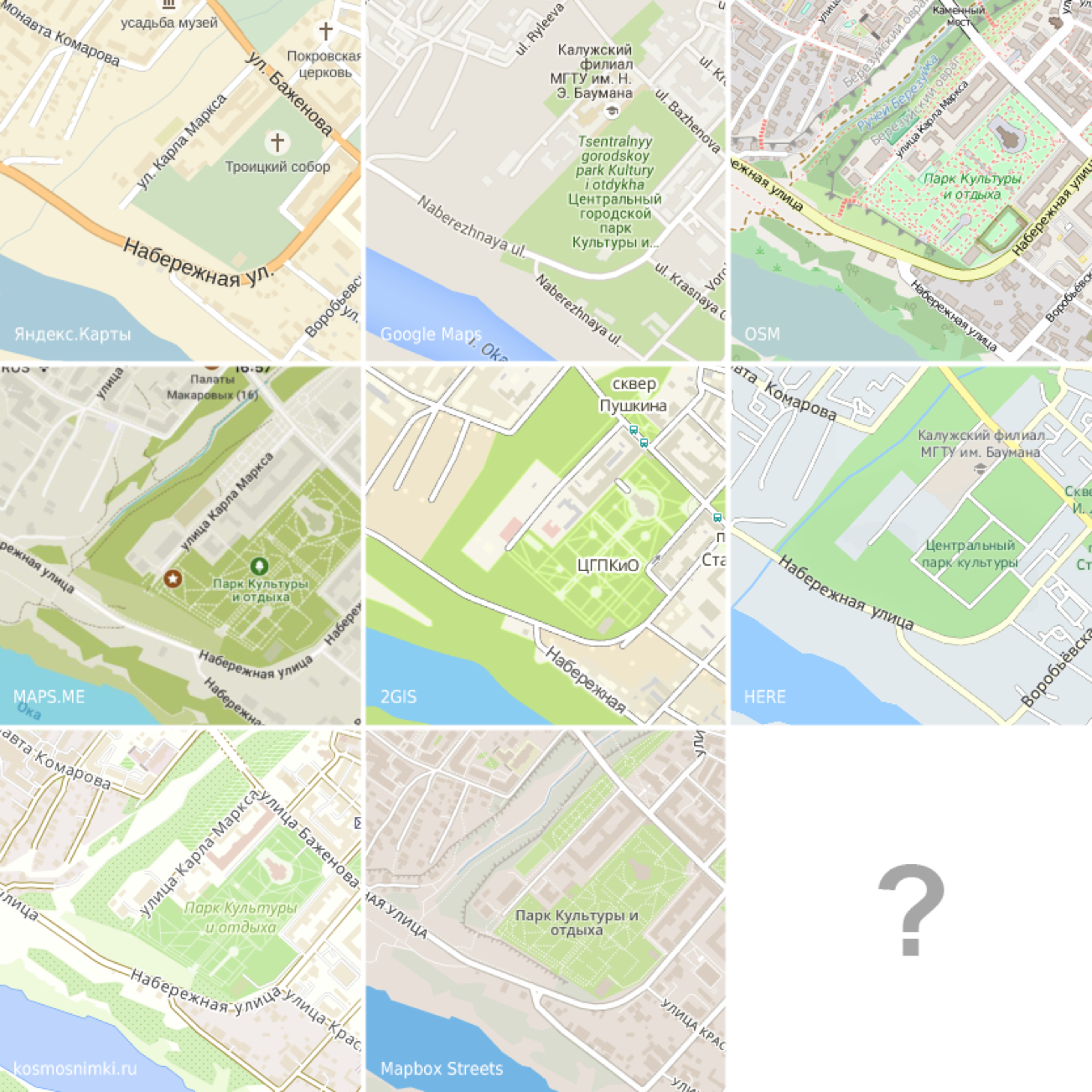
But the main colors in comparison with other maps at two zoom levels - 12 (coverage - urban district) and 15 (when buildings appear and the focus shifts to the area of the city). Patterns that occupy the largest area on each of the above scales have been added to the template (the sizes of the patterns are chosen arbitrarily). Hereinafter, we compare those maps for which OSM data (Satellite / Maps, OpenStreetMap, MAPS.ME , Mapbox Streets ) and those for which other sources are used ( Yandex.Maps , Google Maps , 2GIS , HERE ) are used. In this case, this is correct, because we want to compare exactly the style, and not the data itself. First, consider the patterns for level 12 scaling:
It can be seen that, in general, the shades are similar - the water is blue, the vegetation is green, and to display the types of land use, several different approaches are used. On some maps, different types of land use are shown in one color: for MAPS.ME, this is one color for all 4 types, for Google Maps - for 3 types (except for the ground itself - substrates). In the Mapbox Streets style, different shades are used, but very close to each other. A fundamentally different approach is used on the OSM map, when each type of land use has its own unique color, which also ensures high recognition of this style. It should be noted that often the same color is used to display the substrate (land) and agricultural areas that are not allocated to a separate type of land use (Yandex.Maps, HERE, 2GIS). On Sputnik / Maps, we tried to combine both approaches - we wanted to show all types of land use and at the same time make the map not look colorful. For agricultural land, we even used a special pattern.
Now we will enlarge the scale and compare the colors that are used to highlight urban areas:
All maps show a separate color for buildings, which in most cases are darker than residential areas. 2GIS, Google Maps and HERE use lighter colors to display houses. Most often, a separate color (grayscale) on all maps is allocated to the industrial zone (except Google Maps and Mapbox Streets). As at the 12 scale level, on a larger scale, we can distinguish those styles in which each type of land use is shown by its own color, and those in which these types are combined. On Yandex.Maps, most types of land use are shown in the same way as residential buildings, with well-recognized sand color, Google Maps — gray, Mapbox Streets — light brown. On 2GIS maps, the residential area is highlighted in a separate color, but other types of land use are colored the same. The maximum number of colors to display highlighted land use types is used on OSM, HERE, and Satellite / Maps. At the same time, the map does not look variegated, since the polygons are painted in dull colors, and the buildings located inside different types of land use are painted in the corresponding colors and do not contrast with their background.
About roads
To improve the readability of the map, all roads are now shown in three colors (and not five, as before): motorway (highway) and trunk (federal roads and transit routes) - orange, primary (regional roads and main streets) - yellow, secondary (inter-municipal roads and main streets of urban areas) and others - white.
To make the comparison more visual, we prepared a template that clearly shows how the color of roads has changed and the number of displayed categories has decreased (on the left is the new Satellite / Maps style, on the right is the old one).

The creation of this template was preceded by preliminary work:

Of course, for other cards, we also wanted to make such patterns. They correspond to level 15 scaling, when all roads are drawn, even small ones. Fill pattern corresponds to the color, which shows the residential area on each of the cards.
Separately, there is a MapBox, which for its style Streets uses a white fill of roads:

It is seen that for most of the maps the use of 3 gradations is characteristic, the dominance of orange tones in the designation of the main roads and the white color for the secondary ones. The exceptions are OpenStreetMap and HERE, which use more gradations (5 and 4, respectively) and shades of pink to denote the main roads.
About badges
Icons for Satellite / Maps have been designed in pixel art. This allowed them to be tied to the pixel grid so that regardless of the zoom level and location inside the raster tile, the icon always remains clear and does not blur. We show social orientation icons in brown, leisure and others in gray. We also distinguish such classes of icons as transportation (dark gray), sports (blue) and natural objects, which are indicated by different colors: parks - green, waterfalls - blue, etc. Brown badges appear earlier, starting at level 11. In the light of recent trends, we also placed our badges on translucent plates, although for a long time we “held out” and showed them without any substrate, like on top-maps.
Take 5 POI categories (cafe, museum, bank, bus stop and subway station) and see how they are displayed on different maps:
For comparison, the 18 scale level was chosen, since this is the largest scale found on all maps. Immediately, we note that the style of Mapbox Streets is significantly different, since it is not focused on showing POI. As for the rest, basically all sets of icons meet similar requirements and fit perfectly into their style. In addition to OSM, icons on dies are predominantly used in all other styles. Some of them are monochrome and transparent (Satellite / Maps, Yandex.Maps), others are given without transparency and in different colors (MAPS.ME, HERE). Also, on all maps, icons for transport are displayed in a separate category, which are shown either on a plate of a different shape, color or without it at all. Sometimes some categories are missing, for example, on 2GIS maps, there is no badge for banks, and Yandex.Maps do not differentiate between cafes and restaurants that are shown with one icon, but in general, semantic differences are minor and do not affect the perception of one or another set of icons. Some POIs, such as bus stops on Yandex.Maps, Google Maps and 2GIS are given without a signature, but it appears on click (Yandex.Maps) or when you hover (Google Maps, 2GIS).
About metro
About metro icons will tell separately. When developing a card style, you always want to combine the information content and aesthetic appeal: a correctly found balance will make the card as user-friendly as possible. And of course a good card is distinguished by the attention to detail. The desire to make our map just such and led to the idea of creating custom icons for various metros of the world.
We have replaced the usual black and white icons with the letter “M” with the traditional symbols of local subways for more than three dozen cities around the world. Practically all metros of Russia and the post-Soviet countries were covered, as well as some subways and suburban train systems in Europe, Asia, America and even Australia. Moreover, it is not only the capital or major cities, for example, the metro (as well as RER - the system of high-speed commuter transport) of Paris, the Helsinki, Minsk, Hong Kong or Sydney metro, but also some small metros, such as the metro of the Italian city of Catania.

For metro cities of Russia and the post-Soviet space, we made vector lines that are freely available .

The most interesting cases are when one station can relate to both aboveground and underground transport at the same time, or when trains of several lines stop at it. For example, in London, in addition to the underground (London Underground), we showed the Dockland Light Tube (DLR) as well as the National Rail Station with special icons, separately marking the London Overground stops. In addition, we made several options for the combined icons for all cases of sharing stations.


We plan to continue to draw icons for the world’s metro, especially since the OSM base is constantly updated. At the same time, if you use a special icon, the station has to be “raked” by the management company, for example, the Moscow Metro State Unitary Enterprise, or the common name of the network, for example, London Underground, which correspond to the tags respectively operator = or network = . And then there are frequent situations when these tags are not placed uniformly or not at all. In this case, we put them down manually, as it was done, for example, for the network of high-speed transport in New York, Madrid metro, Stockholm and others.
What else is interesting?
As for the names of geographical objects and their signatures on the map, which we try to show, first of all, for the Russian-speaking user, i.e. in Russian.At 3 to 6 levels of scaling, inclusive, all the signatures of geographical objects are given in Russian. Starting from level 7, objects can be signed in one or two languages, and several approaches are used here:
- in countries with the Cyrillic alphabet, the names are given in this spelling and are not duplicated in other languages;
- in countries with a non-Cyrillic alphabet, if there is a Russian translation, Russian is first given, and then the name is in the local language (or up to 9 scale levels for large cities - in English, since in this case the names are taken from the Natural Earth database, in which several other principles of naming than in the OSM database);
- if there is no Russian analogue, along with the local name, for example, for countries with hieroglyphic (Japan, Korea) or type of binding letters (Georgia), we give the English version. If there is no English equivalent, then the name is signed only in the local language.
All this multi-level structure allows you to make the maximum possible selection of names in Russian or English languages around the world. In addition, if the name of the road in any city other than the local language is duplicated in Russian or English, the road on the map is signed by the original and the translation. This principle also applies to signatures of objects of health, education and culture, as well as green areas.


Another direction of our work is to display on the map objects of a barrier-free environment for people with disabilities. Such objects include stairs, ramps, railings, and pedestrian crossings. And we are pleased that there is clearly a positive trend in the development of mapping of such objects. In addition, we highlight on the maps public toilets, information points. Particular attention is paid to green areas in cities - parks, estates, picnic places, as well as specially protected natural areas.

Since the place on the map is limited, we try to show objects not only by their significance, but also depending on the season or individual events. So, in the winter we update the data and at higher levels of scaling we show tire fittings, ski centers and resorts, skating rinks and winter sports grounds, and also draw ski trails, which are often shown in summer as walking or cycling paths. From April to November, we focus the user's attention on such objects as bicycle parking, bicycle and boat rental centers, beaches, and outdoor pools. By the Night of the museums, we updated the information and added to the OSM data on the set of interesting objects in Moscow and St. Petersburg.
We also strive to attract users to participate in cartographic meetings that Sputnik holds. Especially for them, we are preparing a “pie”, that is, printed bypass maps of the map, made in a special black and white cartostile, with areas for mapping. We are always open to feedback from users and publish information on major changes in style in the Russian-language branch of the OpenStreetMap community forum .
The continuous change of the cardostil is primarily due to the fact that the devices on which users look at the maps are constantly changing, the resolution of the screens increases, which allows or even requires maximally detailed maps. It is also necessary to take into account some of the features of multi-scale web maps that are not typical of analog cards. First, web maps are a collection of small images or tiles. Since in the case of Sputnik / Maps tiles are raster, all objects and signatures on them will be static, their position will not change as the map is scrolled, and if any name is supplanted, it will not appear no matter how much we move around the map. And, secondly, where will the web maps be used: on the desktop or in a mobile application? The mobile phone screen has a small coverage, which allows using several icons and well-chosen fills to highlight the main objects and create a beautiful picture. But the user of the mobile application may not suspect that the same style that works well in the city on a small screen, in the countryside or on the big screen will be unreadable, while the user of the maps on the PC, where Satellite is mainly used / Maps, be sure to see it.
Therefore, the goal that we set for ourselves is to achieve a convenient, correct, unambiguous display of reality on the screen, regardless of whether we are looking at the country, the capital of the state, or a remote village.
')
Initially, when developing the style of Sputnik maps, we wanted to show the maximum allowable number of objects on the ground for each scale (as it is implemented in topographic and scientific reference maps). However, over time, in the process of modifying the style, we subjected the map to an ever-increasing generalization (generalization), combining classifications and leaving only what we considered the most important. At the same time, we worked with the color of polygonal and linear objects, which became more contrasting, which also increased the readability of the map. And specially for the Sputnik cartostile we developed a system of conventional signs. We want to tell you about these three aspects. Go!
About generalization
When generalizing objects for one or another level of scaling, it is important to understand what to focus on, which is the main thing for each of them. First you need to determine what spatial coverage corresponds to each scale level. This will help remove excess and focus on the main thing.
| Scale level | Scale | Coverage |
|---|---|---|
| 3 | 1:73 957 194 | the whole world |
| four | 1:36 978 597 | continent |
| 5 - 6 | 1:18 489 298 - 1: 9 244 649 | country |
| 7 - 8 | 1: 4,622,325 - 1: 2,311,162 | administrative units of the first order |
| 9 - 10 | 1: 1 155 581 - 1: 577 791 | administrative units 2 order |
| eleven | 1: 288,895 | Big City |
| 12 | 1: 144,448 | urban district |
| 13 - 15 | 1:72 224 - 1:18 056 | city districts |
| 16 - 17 | 1: 9 028 - 1: 4 514 | quarters |
| 18 | 1: 2,257 | yard |
| nineteen | 1: 1,128 | house |
The Satellite / Maps style consists of 2 large blocks: for scale levels 3–8 (the so-called “Style to the World”) and 9–19 (“Basic Style”). These styles are developed separately, because in the first case we use the generalized Vector data of Natural Earth and the Globcover raster substrate, and in the second case - the OpenStreetMap (OSM) data. At the scale levels 7-8, there is some confusion of sources, since these scales are transitional. If we talk about artistic means and ways of display, the latest update of the style in Sputnik / Maps refers specifically to the “Basic Style”. "Style on the world" will be updated later and deserves a separate story. At the same time, both generalization principles were developed for both styles.
The minimum scale level on Satellite / Maps is 3, at which the user sees the largest countries. For all states, it is important to show the capital, so they appear on the 5th scale level, and on 6 - the largest cities.
At 7-8 levels of scaling, the main role is played by the roads, since on this scale it is more important to focus not only on the regions and localities located in them, but rather on the connections between them. The accuracy of the Natural Earth data, which we use on a smaller scale together with the Globcover raster substrate, is not enough for this, therefore, starting from level 7 of scaling, data from OSM are added, primarily for roads and borders of states and regions.
Starting from the 9th scale level, we almost completely switch to OSM data. At levels 9 - 12, the user wants to see the main highways, see what is around his city: airports, settlements, forests, find his area in the city, the largest residential and industrial districts. These scale levels are very general. At level 11, first, only stations and the largest parks are shown, then large railway stations and some POIs (points of interest) appear, referring not to transport, but to landmarks — monasteries, squares, parks, and fortresses. Thus, we offer the user places to walk in the city, see the most interesting and evaluate how far these objects are from its current location, city center and from each other.
With the enlargement of the scale, the user's attention shifts from the area to the street, and then to the house. 13 and 14 scale levels are also quite generalized, there are few new POIs. Due to this, large streets, transport facilities, gas stations, a subway appear, the type of land use is clearly visible - residential area, industrial zones, green areas, hospital areas, educational institutions, sports centers. Starting from the 15th level of scaling, we are showing individual houses on the map, which by this point already want to see the user. But the POI at this level is still a bit (so as not to overload the map with unnecessary details). But the largest hotels, theaters, shopping centers are already visible, which helps the user navigate within the area. At the next scale level, spatial coverage narrows down to a quarter, and the emphasis is finally shifted to houses, their numbers, bus stops and new POIs appear.
At the 17th scale level, the user is interested to see the nearest infrastructure objects. And we can show them, because with the enlargement of the scale on the map, there is more room for new POIs. There are restaurants and cafes, while only in the form of icons (signatures will be only on the next, level 18). Signed bus stops, objects of religion, banks. And at the maximum, 19 level of scaling, you can see very small objects - trees, urns, benches, zebras, speed bumps, etc.
About land use types ( http://wiki.openstreetmap.org/wiki/RU:Key:landuse )
To improve readability, we abandoned some types of neighborhoods, for example, we combined commercial and residential neighborhoods and began to show them in one color. At the same time, the buildings of shopping centers have retained a “commercial” fill and stand out well on the map. In separate colors, we have shown industrial zones, educational campuses, territories of hospitals, sports complexes, castles and fortresses, temples and monasteries. Buildings that are located in these quarters are painted in the appropriate color. Compared with previous versions of the style, buildings at 15-16 zoom levels remain flat, at 17 a small volume appears, and at 18-19 the size depends on the number of floors or height.
So on the general scheme, the colors of land use types that we use in the style of Satellite / Maps look like (the basis for the scheme was taken here ).
But the main colors in comparison with other maps at two zoom levels - 12 (coverage - urban district) and 15 (when buildings appear and the focus shifts to the area of the city). Patterns that occupy the largest area on each of the above scales have been added to the template (the sizes of the patterns are chosen arbitrarily). Hereinafter, we compare those maps for which OSM data (Satellite / Maps, OpenStreetMap, MAPS.ME , Mapbox Streets ) and those for which other sources are used ( Yandex.Maps , Google Maps , 2GIS , HERE ) are used. In this case, this is correct, because we want to compare exactly the style, and not the data itself. First, consider the patterns for level 12 scaling:
| 1. Satellite / Cards | 2. 2GIS |
|---|---|
 |  |
| 3. Google Maps | 4. Yandex.Maps: |
|---|---|
 |  |
| 5.OSM | 6. HERE |
|---|---|
 |  |
| 7. MAPS.ME | 8. Mapbox Streets |
|---|---|
 |  |
It can be seen that, in general, the shades are similar - the water is blue, the vegetation is green, and to display the types of land use, several different approaches are used. On some maps, different types of land use are shown in one color: for MAPS.ME, this is one color for all 4 types, for Google Maps - for 3 types (except for the ground itself - substrates). In the Mapbox Streets style, different shades are used, but very close to each other. A fundamentally different approach is used on the OSM map, when each type of land use has its own unique color, which also ensures high recognition of this style. It should be noted that often the same color is used to display the substrate (land) and agricultural areas that are not allocated to a separate type of land use (Yandex.Maps, HERE, 2GIS). On Sputnik / Maps, we tried to combine both approaches - we wanted to show all types of land use and at the same time make the map not look colorful. For agricultural land, we even used a special pattern.
Now we will enlarge the scale and compare the colors that are used to highlight urban areas:
| 1. Satellite / Cards | 2. 2GIS |
|---|---|
 |  |
| 3. Google Maps | 4. Yandex.Maps: |
|---|---|
 |  |
| 5.OSM | 6. HERE |
|---|---|
 |  |
| 7. MAPS.ME | 8. Mapbox Streets |
|---|---|
 |  |
All maps show a separate color for buildings, which in most cases are darker than residential areas. 2GIS, Google Maps and HERE use lighter colors to display houses. Most often, a separate color (grayscale) on all maps is allocated to the industrial zone (except Google Maps and Mapbox Streets). As at the 12 scale level, on a larger scale, we can distinguish those styles in which each type of land use is shown by its own color, and those in which these types are combined. On Yandex.Maps, most types of land use are shown in the same way as residential buildings, with well-recognized sand color, Google Maps — gray, Mapbox Streets — light brown. On 2GIS maps, the residential area is highlighted in a separate color, but other types of land use are colored the same. The maximum number of colors to display highlighted land use types is used on OSM, HERE, and Satellite / Maps. At the same time, the map does not look variegated, since the polygons are painted in dull colors, and the buildings located inside different types of land use are painted in the corresponding colors and do not contrast with their background.
About roads
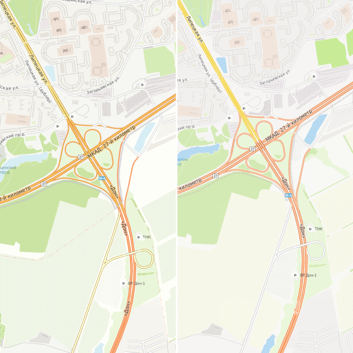
To improve the readability of the map, all roads are now shown in three colors (and not five, as before): motorway (highway) and trunk (federal roads and transit routes) - orange, primary (regional roads and main streets) - yellow, secondary (inter-municipal roads and main streets of urban areas) and others - white.
To make the comparison more visual, we prepared a template that clearly shows how the color of roads has changed and the number of displayed categories has decreased (on the left is the new Satellite / Maps style, on the right is the old one).
The creation of this template was preceded by preliminary work:
Of course, for other cards, we also wanted to make such patterns. They correspond to level 15 scaling, when all roads are drawn, even small ones. Fill pattern corresponds to the color, which shows the residential area on each of the cards.
| 1.OSM | 2. HERE |
|---|---|
 |  |
| 3. Google Maps | 4. Yandex.Maps |
|---|---|
 |  |
| 5.2GIS | 6. MAPS.ME |
|---|---|
 |  |
It is seen that for most of the maps the use of 3 gradations is characteristic, the dominance of orange tones in the designation of the main roads and the white color for the secondary ones. The exceptions are OpenStreetMap and HERE, which use more gradations (5 and 4, respectively) and shades of pink to denote the main roads.
About badges
Icons for Satellite / Maps have been designed in pixel art. This allowed them to be tied to the pixel grid so that regardless of the zoom level and location inside the raster tile, the icon always remains clear and does not blur. We show social orientation icons in brown, leisure and others in gray. We also distinguish such classes of icons as transportation (dark gray), sports (blue) and natural objects, which are indicated by different colors: parks - green, waterfalls - blue, etc. Brown badges appear earlier, starting at level 11. In the light of recent trends, we also placed our badges on translucent plates, although for a long time we “held out” and showed them without any substrate, like on top-maps.
 |  |
|---|
 |  |
|---|
Take 5 POI categories (cafe, museum, bank, bus stop and subway station) and see how they are displayed on different maps:
| Cafe | The museum | Bank | Bus stop | Underground | |
|---|---|---|---|---|---|
| Satellite / Maps |  |  |  | 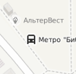 |  |
| Google maps |  |  |  |  |  |
| Yandex maps | 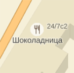 |  |  |  |  |
| 2GIS |  |  | not |  |  |
| MAPS.ME |  |  |  |  |  |
| Openstreetmap |  |  |  | 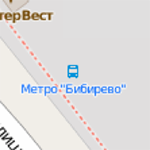 |  |
| HERE |  |  |  |  |  |
| Mapbox | not |  | not | not |  |
For comparison, the 18 scale level was chosen, since this is the largest scale found on all maps. Immediately, we note that the style of Mapbox Streets is significantly different, since it is not focused on showing POI. As for the rest, basically all sets of icons meet similar requirements and fit perfectly into their style. In addition to OSM, icons on dies are predominantly used in all other styles. Some of them are monochrome and transparent (Satellite / Maps, Yandex.Maps), others are given without transparency and in different colors (MAPS.ME, HERE). Also, on all maps, icons for transport are displayed in a separate category, which are shown either on a plate of a different shape, color or without it at all. Sometimes some categories are missing, for example, on 2GIS maps, there is no badge for banks, and Yandex.Maps do not differentiate between cafes and restaurants that are shown with one icon, but in general, semantic differences are minor and do not affect the perception of one or another set of icons. Some POIs, such as bus stops on Yandex.Maps, Google Maps and 2GIS are given without a signature, but it appears on click (Yandex.Maps) or when you hover (Google Maps, 2GIS).
About metro
About metro icons will tell separately. When developing a card style, you always want to combine the information content and aesthetic appeal: a correctly found balance will make the card as user-friendly as possible. And of course a good card is distinguished by the attention to detail. The desire to make our map just such and led to the idea of creating custom icons for various metros of the world.
We have replaced the usual black and white icons with the letter “M” with the traditional symbols of local subways for more than three dozen cities around the world. Practically all metros of Russia and the post-Soviet countries were covered, as well as some subways and suburban train systems in Europe, Asia, America and even Australia. Moreover, it is not only the capital or major cities, for example, the metro (as well as RER - the system of high-speed commuter transport) of Paris, the Helsinki, Minsk, Hong Kong or Sydney metro, but also some small metros, such as the metro of the Italian city of Catania.
For metro cities of Russia and the post-Soviet space, we made vector lines that are freely available .
The most interesting cases are when one station can relate to both aboveground and underground transport at the same time, or when trains of several lines stop at it. For example, in London, in addition to the underground (London Underground), we showed the Dockland Light Tube (DLR) as well as the National Rail Station with special icons, separately marking the London Overground stops. In addition, we made several options for the combined icons for all cases of sharing stations.
We plan to continue to draw icons for the world’s metro, especially since the OSM base is constantly updated. At the same time, if you use a special icon, the station has to be “raked” by the management company, for example, the Moscow Metro State Unitary Enterprise, or the common name of the network, for example, London Underground, which correspond to the tags respectively operator = or network = . And then there are frequent situations when these tags are not placed uniformly or not at all. In this case, we put them down manually, as it was done, for example, for the network of high-speed transport in New York, Madrid metro, Stockholm and others.
What else is interesting?
As for the names of geographical objects and their signatures on the map, which we try to show, first of all, for the Russian-speaking user, i.e. in Russian.At 3 to 6 levels of scaling, inclusive, all the signatures of geographical objects are given in Russian. Starting from level 7, objects can be signed in one or two languages, and several approaches are used here:
- in countries with the Cyrillic alphabet, the names are given in this spelling and are not duplicated in other languages;
- in countries with a non-Cyrillic alphabet, if there is a Russian translation, Russian is first given, and then the name is in the local language (or up to 9 scale levels for large cities - in English, since in this case the names are taken from the Natural Earth database, in which several other principles of naming than in the OSM database);
- if there is no Russian analogue, along with the local name, for example, for countries with hieroglyphic (Japan, Korea) or type of binding letters (Georgia), we give the English version. If there is no English equivalent, then the name is signed only in the local language.
All this multi-level structure allows you to make the maximum possible selection of names in Russian or English languages around the world. In addition, if the name of the road in any city other than the local language is duplicated in Russian or English, the road on the map is signed by the original and the translation. This principle also applies to signatures of objects of health, education and culture, as well as green areas.
Another direction of our work is to display on the map objects of a barrier-free environment for people with disabilities. Such objects include stairs, ramps, railings, and pedestrian crossings. And we are pleased that there is clearly a positive trend in the development of mapping of such objects. In addition, we highlight on the maps public toilets, information points. Particular attention is paid to green areas in cities - parks, estates, picnic places, as well as specially protected natural areas.
Since the place on the map is limited, we try to show objects not only by their significance, but also depending on the season or individual events. So, in the winter we update the data and at higher levels of scaling we show tire fittings, ski centers and resorts, skating rinks and winter sports grounds, and also draw ski trails, which are often shown in summer as walking or cycling paths. From April to November, we focus the user's attention on such objects as bicycle parking, bicycle and boat rental centers, beaches, and outdoor pools. By the Night of the museums, we updated the information and added to the OSM data on the set of interesting objects in Moscow and St. Petersburg.
We also strive to attract users to participate in cartographic meetings that Sputnik holds. Especially for them, we are preparing a “pie”, that is, printed bypass maps of the map, made in a special black and white cartostile, with areas for mapping. We are always open to feedback from users and publish information on major changes in style in the Russian-language branch of the OpenStreetMap community forum .
Source: https://habr.com/ru/post/280159/
All Articles