REM vs EM - Great Controversy

I present to your attention the translation of a sufficiently large and voluminous article about the eternal dispute, which units of measure to use in layout: em 's or rem ' s. In which cases it is necessary to use some units, and in which others. You will find a lot of code, examples and their explanations.
Welcome to the world of typography and relative units of measurement =)
************
')
One of the most effective typography methods on the web is using relative units of measure rem and em.
The question is what to use? The dispute between the followers of rem and em, who are trying to prove that it is necessary to use "their" units, has been going on for a long time.
In this article I will take the liberty to make a comparison between rem and em. You will learn what rem is and what em is, and how to use them to build modular components.
What is EM?
Wikipedia tells us:
em - in typography, the relative unit of length equal to the size of the current font
This statement does not make sense on the web, since we do not use point-size. But it makes sense if we replace the point size with a font size (font-size).
This means that: 1em = 20px in the case when the css-selector has a font-size rule: 20px;
h1 { font-size: 20px } /* 1em = 20px */ p { font-size: 16px } /* 1em = 16px */ The em unit can be used to set font sizes. In fact, using relative values like em, for font-size, is good practice .
h1 { font-size: 2em } /* ?! */ What is actually h1 font-size?
We will have to look at the parent element to calculate the font size of this h1. Suppose that the parent element is html, and its font-size is set to 16px.
Following this, we can see that the calculated value of h1 is 32px, or 2 * 16px.
html { font-size: 16px } h1 { font-size: 2em } /* 16px * 2 = 32px */ In fact, it’s a bad idea to set the font size for html in pixels (px), since we thereby override the user's browser settings.
Instead, you can select percentages as the font-size value, or simply do not specify it in html.
Note: the font-size will be set to 100% if you have not specified it yourself.
html { font-size: 100% } /* , 16px*/ For most users (and browsers), a font size of 100% will by default produce 16px until they change it in the settings of your browser. Although rarely anyone doing this.
Okay, what's next? Let's go back to em.
Em is also used to set values for other properties , in addition to the font-size. margin and padding are two of those properties that are measured in em'ah.
This is where most people get confused with em values.
Consider the following code. What will be the margin-bottom value for both elements: h1 and p? (Assume that the font-size of the html element is set to 100%)
h1 { font-size: 2em; /* 1em = 16px */ margin-bottom: 1em; /* 1em = 32px */ } p { font-size: 1em; /* 1em = 16px */ margin-bottom: 1em; /* 1em = 16px */ } Are you surprised that the margin-bottom value set to 1em is different in both cases?
This phenomenon is explained by the fact that 1em is equal to the font size (font-size) of its element. Since the font-size of the h1 element was set to 2em, other properties of this h1 (the same margin-bottom) will already be repelled by the new font-size value. That is, for them 1em will be equal to 32px.
People are confused by the fact that 1em can take on different values in different parts of the code. This can confuse you specifically if you have just started to deal with em.
These are these em. Well, we go further. Ahead of us are rem'y.
What is REM?
Rem is the root em (Root Em). It is designed to alleviate the computational problems that many sometimes face.
This is a typography unit equal to the root (base) font-size value. This means that 1rem will always be equal to the font-size value, which was defined in html.
Consider the same code as above, but we will use rem already. How will margin-bottom change now?
h1 { font-size: 2rem; margin-bottom: 1rem; /* 1rem = 16px */ } p { font-size: 1rem; margin-bottom: 1rem; /* 1rem = 16px */ } As you can see, 1rem will always take a value equal to 16px, and it doesn't matter where you apply it (until you change the font-size of the html element)
There is a dependency. It is easy to understand.
Such rem'y. Not so hard to understand how they work, knowing how em work, do you agree?
Now, let's get down to the most delicious part of the article. So rem or em?
REMs or EMs?
This is a very controversial issue.
Some developers completely avoid using rem, arguing that using these units of measure makes their components less modular. Other developers use them for everything, preferring the simplicity that they provide.
Oddly enough, but I still fell into the trap, using em'y and rem'y in my work at different stages of development. I was delighted with how em'y helped me in creating modular components, but I hated all the difficulties that they brought into my code. I also liked how with the help of rem all calculations were much easier, but I was infuriated by the hacks that I had to write to make my components modular.
It turns out that em and rem have both strengths and weaknesses. And they need to be used in different ways, depending on the circumstances.
How? I have two simple rules :
- Set the values in em if the properties are scaled relative to the font-size;
- In all other cases, set the values to rem.
It became a little easier? Well, let's consider writing a simple component (let it be the title), using both em's and rem's, and you will see these two rules in action.
Use only REMs to create a header element.
Let's say you have an h2 header element that looks like this:

Hello! I am the headline!
Header styles should be similar to the following if you specify everything in rem:
.header { font-size: 1rem; padding: 0.5rem 0.75rem; background: #7F7CFF; } Everything goes according to plan.
Next, let's create a bigger heading, because elements of different sizes can be placed on the same page.
When we do this, let's try to inherit as many styles as possible.
The markup for our second headline will look something like this:
<a href="#" class="header header--large">!</a> The CSS will be:
.header { font-size: 1rem; padding: 0.5rem 0.75rem; background: #7F7CFF; } .header--large { font-size: 2rem; } Unfortunately, our code did not look better. Too little free space between the edges of our .header - large element and the header text itself.

Not enough space between the edges and the text of our big headline.
If you insist on using only rem, then the only way to solve this problem is to redefine padding in .header - large:
.header { font-size: 1rem; padding: 0.5rem 0.75rem; background: #7F7CFF; } .header--large { font-size: 2rem; padding: 1rem 1.5rem; } 
Well, now breathing has become more free!
Did you notice anything? The font-size of the element .header is large twice that of the element .header. As a result, the padding of the .header - large element is also twice as large as that of the .header element.
What happens if we have more headings of various sizes, or if the headings should change in size? You already understand how specifying property values in rem can cause duplication and super complex code.
We can simplify our code in such a way that we don’t have to redefine the padding on the .header - large element, if we’re not afraid to use ems and rems together.
.header { font-size: 1rem; padding: 0.5em 0.75em; background: #7F7CFF; } .header--large { font-size: 2rem; } As you can see, ems can be incredibly useful if you have properties that need to be scaled along with the font size of the element. This is where the first rule comes from.
Next, let's see what happens if you use only ems in your header.
Use only EMs to create a header element.
The code for implementing the header on em'a is not much different from the code on rem'ah, which we have already met. All we need is to replace rems with ems:
.header { font-size: 1em; padding: 0.5em 0.75em; background: #7F7CFF; } .header--large { font-size: 2em; } Both .header and .header - large will look just like their counterparts on rem'ah.
Exactly what is needed?
Nah!
It is highly unlikely that your site will contain only one title element and nothing else. Need to consider how it interacts with other elements.
As a rule, these elements come before or after the heading, like this:

Headers have different links with other elements.
The markup for this block will be as follows:
<div class="header header--large"></div> <p> </p> <p> </p> <div class="header"></div> <p> </p> We will also add margin-right and margin-left for paragraphs:
p { margin-left: 0.75em; margin-right: 0.75em; } 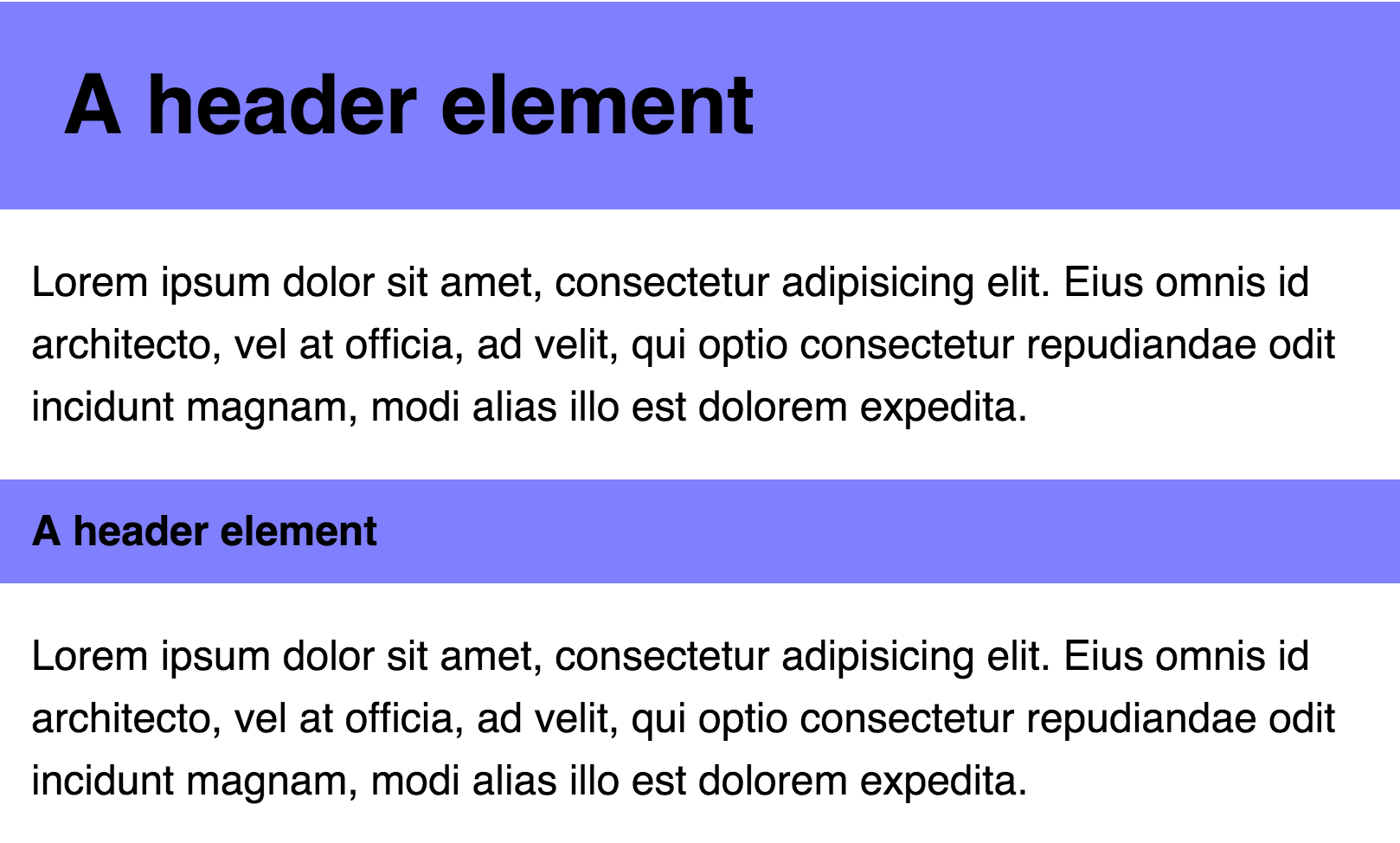
Oh, her, the padding of the first heading is not aligned with the text of the paragraph
Nooooooo! :(
padding on the left and right of the .header element - large is too big!
If you insist on using only ems, then the only way to solve this problem is to override the padding-left and padding-right properties of the .header - large:
.header { font-size: 1em; padding: 0.5em 0.75em; /* */ } .header--large { font-size: 2em; padding-left: 0.375em; padding-right: 0.375em; margin: 0.75em 0; } 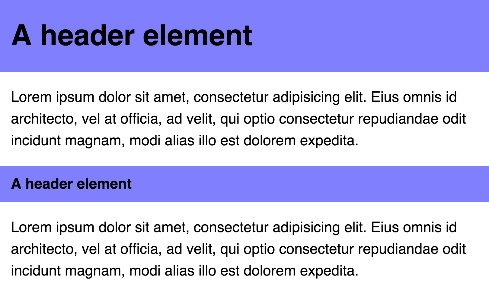
Now everything looks right!
Did you notice anything? The font-size of the element .header is large twice that of the element .header. However, the padding-left and padding-right of the .header element is twice as small as the padding-left and padding-right of the .header element!
As in the previous case, we can simplify our code if we agree to use together em'y and rem'y. In particular, we’ll use rem for the padding-left and padding-right, and em for the padding-top and padding-bottom.
.header { padding: 0.5em 0.75rem; font-size: 1em; background: #7F7CFF; } .header--large { font-size: 2em; } As you can see, ems can be incredibly useful if you have properties that need to be scaled along with the font size of the element. However, you will encounter problems if you need to change the values of the properties relative to the root (original) font-size value.
It became more clear how rem and em work together in one component, agree?
Now, let's go up a notch and see how the heading and paragraph interact with the grid.
Components on the grid
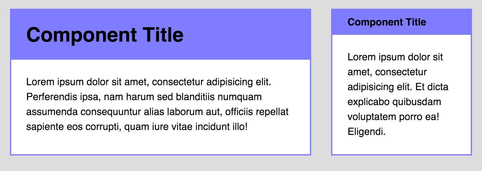
Before we continue, let's combine our heading and paragraphs into a single component:
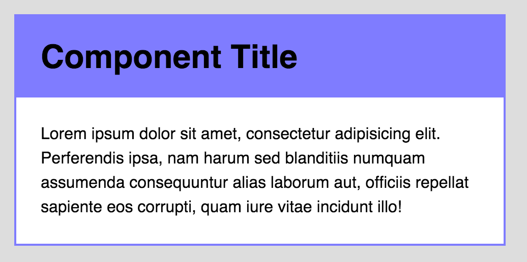
<div class="component"> <div class="component__header"></div> <p> </p> </div> Here are the basic styles for our component:
.component { background: white; border: 2px solid #7F7CFF; } .component__header { font-size: 2em; padding: 0.5em 1.5rem; background: #7F7CFF; margin: 0; } .component p { padding-left: 1.5rem; padding-right: 1.5rem; margin: 1.5rem 0; } So far so good. Here we see everything that we have already met before.
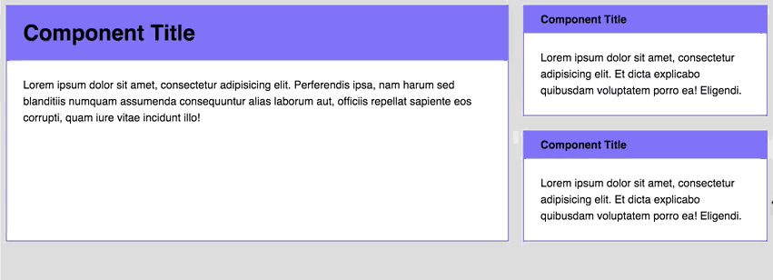
Go ahead. This component can be anywhere on our site. For example:
- In the content part;
- In sidebar;
- In any part of our grid;
- ...
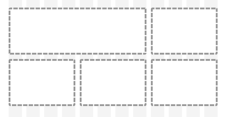
Likely places where our component can be located
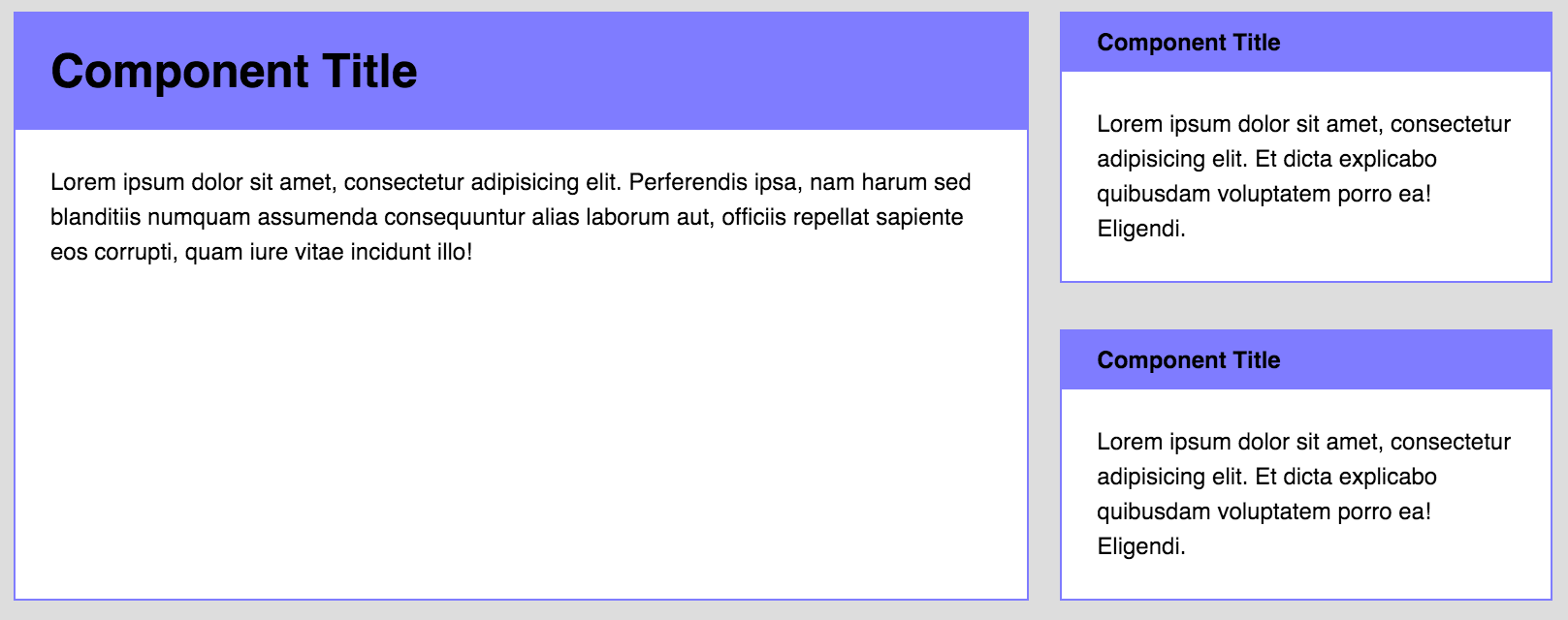
The title of our component should become smaller in size (i.e., its font-size should decrease) if the component is located in a narrow part of the site, for example, in the sidebar.
The title element on the grid
There is an option how to do this. We can modify the class of our component. The markup will now look like this:
<div class="component component--small"> <!-- --> </div> Well, the style:
.component--small .component__header { font-size: 1em; } Now for the component styles. Here the same rules apply:
- Set the values in em if the properties are scaled relative to the font-size;
- In all other cases, set the values to rem.
As is the case with the header element, you can determine for which properties it will be necessary to set dimensions in em'ah. This will need to be done for those properties that directly interact with the rest of the page elements. There are two ways to think about how best to build our component:
- The properties of all internal elements are scaled along with the font-size value of the component;
- The properties of only some internal elements are scaled along with the font-size value of the component.
Let's consider both cases, go through each of the paths, and you will understand what I had in mind.
The first way. The properties of all internal elements are scaled along with the font-size value of the component.
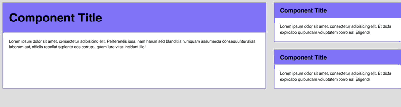
Let's start with an example to see what a component looks like:
Notice how the font-size, margin, and padding of all elements inside a component change at the same time?
If your component behaves in the same way when resizing, then you need to specify all dimensions in em. That is, the code becomes:
.component { background: white; border: 2px solid #7F7CFF; } .component__header { font-size: 2em; padding: 0.5em 0.75em; /* em */ background: #7F7CFF; margin: 0; } .component p { padding-left: 1.5em; /* em */ padding-right: 1.5em; /* em */ margin: 1.5em 0; /* em */ } // .component--small .component__header { font-size: 1em; padding-left: 1.5em; /* padding em' */ padding-right: 1.5em; /* padding em' */ } Then, in order for the resizing to work, you need to change the font-size property of the component.
.component { // @media (min-width: 800px) { font-size: 1.5em; } } So far so good.
Let us now complicate our example a little.
Imagine that you have a grid like this. The vertical and horizontal indents on all devices must remain the same (from an aesthetic point of view, this will be correct).

Same padding on the 1 + 2 view grid
The markup for this grid is as follows:
<div class="grid"> <div class="grid-item"> <div class="component"> <!-- --> </div> </div> <div class="grid-item"> <div class="component component--small"> <!-- A --> </div> <div class="component component--small"> <!-- B --> </div> </div> </div> I set the spacing between the grid elements to 2em, given that the base font-size is 16px. In other words, the calculated width of each gap is 32px.
The task is as follows: to separate the small components A and B by indentation 32px. To begin with, we can try to set the margin-top to component B, equal to 2em.
.component { /* */ @media (min-width: 800px) { font-size: 1.25em; } } .component + .component { margin-top: 2em; } Unfortunately, the result is not happy. The margin between the small components A and B is larger than the width of the vertical gap when the viewport is more than 800px.
The space between the small blocks A and B is not the same as the vertical space with viewport> 800px
Boouu :(
This is because the font-size of the component is 1.5em (or 24px), when the visible area becomes more than 800px. At the moment when the font-size becomes 24px, the calculated value of 2em becomes 48px, which differs from 32px, which we were trying to get.
Rrrrrr! (╯ ° □ °) ╯︵ ┻━┻
What a blessing that we can solve this problem by simply replacing the units with rem. After all, we know that the width of the gap varies depending on the basic font-size.
.component + .component { margin-top: 2rem; } 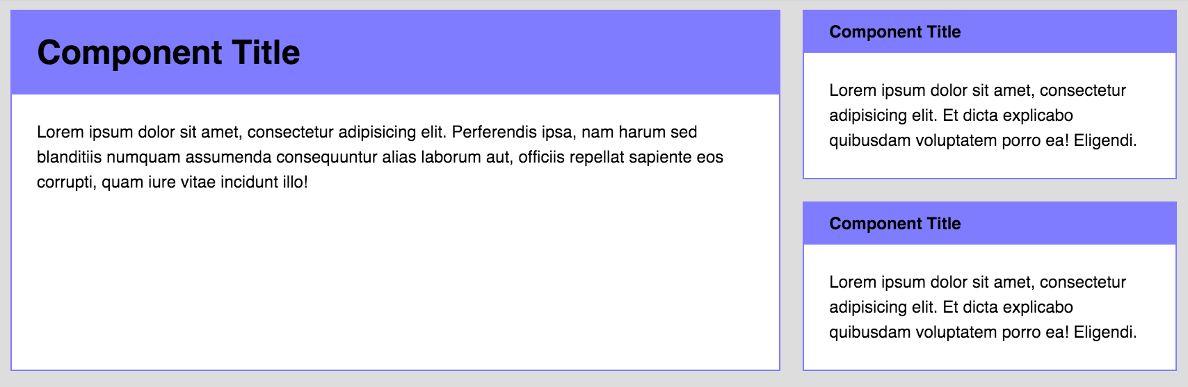
The vertical indent is now horizontal!
TA-dah! The problem is solved :) Here's an example for Codepen , you can play around with the code.
Note: You will have to use Flexbox to build such a grid. I will not explain how I built it, since it is beyond the scope of the article. I advise you to read this article if you want to learn more about the Flexbox.
Yes, by the way, I did not invent this technique. Chris Coyier wrote about this a year ago (he is a genius!).
Anyway, ready to move on? If yes, go to the second case. If not, feel free to leave comments, and I will try to explain it to you in some other way.
The second path. The properties of only some internal elements are scaled along with the font-size value of the component.
The first case is easy to explain. The disadvantage, however, is that you have to stick to your modular grid ( Approx. Lane: what it is, you can read here ), vertical rhythms ( Approx. Lane: what it is, you can read it here ) and you should be sure that all components are the same size at the same time (especially when you make responsive websites).
Sometimes you want to change a small area of the component without changing the dimensions of the rest.
For example, you need to change the font-size of the headers with a larger viewport.
Only headers change in size when the visible area changes.
Let's describe the styles of this example, based on the styles we have described above:
.component { background: white; border: 2px solid #7F7CFF; } .component__header { font-size: 2em; padding: 0.5em 1.5rem; background: #7F7CFF; margin: 0; } .component p { padding-left: 1.5rem; padding-right: 1.5rem; margin: 1.5rem 0; } .component--small .component__header { font-size: 1em; } As soon as the font-size of the header changes, on the border of the visible area at 1200px, we can safely use rem as the unit of measure for each property (except for the padding-top and padding-bottom of the header)
.component { background: white; border: 2px solid #7F7CFF; } .component__header { font-size: 2rem; /* rem */ padding: 0.5em 1.5rem; /* rem */ background: #7F7CFF; } .component p { padding-left: 1.5rem; /* rem */ padding-right: 1.5rem; /* rem */ margin: 1.5rem 0; /* rem */ } .component--small .component__header { font-size: 1rem; /* rem */ } After that you can change the font size in the header on different viewports by simply adding media in them:
.component__header { font-size: 2rem; @media (min-width: 1200px) { font-size: 3rem } } .component--small .component__header { font-size: 1rem; @media (min-width: 1200px) { font-size: 1.5rem } } TA-dah! Notice that when we resize the browser window, only the font-size of the header changes? This is how you should act in the second case :)
One more thing
Since it is recommended to use only a few typography sizes, I often abstract the font-size property from a component. Thus, I can be sure that my typography will remain the same in all components.
h2 { font-size: 2rem; @media (min-width: 1200px) { font-size: 3rem } } h3 { font-size: 1rem; @media (min-width: 1200px) { font-size: 1.5rem } } .component__header { @extend h2; } .component--small .component__header { @extend h3; } That's all with the second case. Here's an example for Codepen , you can play around with the code.
I already anticipate your question, so first I will answer it: What method should you use?
I will say that everything depends on the design.
Personally, I use the second more often than the first, as I prefer to abstract typography into a separate file.
Let's sum up
What to use, rem or em? I think this question is not entirely correct. Both rem and em have their strengths and weaknesses, and they can be used together - it will help you in writing simple, modular components!
Now about you! Whose side will you take in this dispute? I would love to read in the comments below what you think about this :)
Source: https://habr.com/ru/post/280125/
All Articles