Review of design books
Hello! We have new design books.
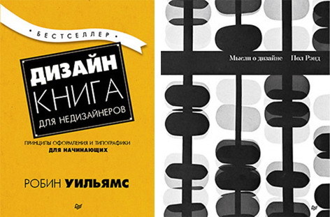
Design. A book for non-designers. 4th ed.
This book is written for those who want to do design, but has no experience or relevant education. I do not mean only those who are engaged in the design of packages or booklets, I am talking about assistants whose bosses are instructed to issue newsletters; about volunteers in the church, providing information to parishioners; about the owners of small firms that produce their own advertising products; about students who understand that well-designed work often means a higher grade; about professionals who recognize that an attractive presentation is more respectful; about teachers who know that students better assimilate information that is well laid out; about the statisticians who understand that the numbers can be ordered in such a way that they do not feel sleepy, etc.
This book is for those who do not have time to study design and typography, but who want to learn how to make their pages look better. Well, this book confirms the old truth as the world: knowledge is power. Most people who look at a poorly designed page will say that they don’t like it, but they don’t know what to do to fix it. In the book I will give four basic concepts that guide almost all the authors of well-designed works. The concepts are clear and specific. Having mastered them, you can understand whether they apply to your pages or not. If you do not know what is the matter, then how to fix it? Having identified the problem, you can find a solution.
This book will not replace the four years of study in the school of design. I'm not saying that after reading it, you will automatically become a brilliant designer. But I guarantee that you will never again look at the pages, as before. I guarantee that if you follow these basic principles, your work will look more professional, whole and interesting. And you will feel that your opportunities have become wider.
With a smile,
The introduction provides a general explanation of the four basic principles, each of which is discussed in detail in subsequent chapters. But first I will tell a little story, thanks to which I realized how important the ability to give names is, since the names of these principles are the key to their understanding.
Epiphany under the Judah tree
Many years ago I received a tree book for Christmas. I stayed with my parents and, after all the gifts were open, I decided to find out which trees are growing nearby. Beforehand, I looked through the book and noticed that the Iudino tree was first described, since its identification required only two signs. The Judah tree looked quite bizarre, and, looking at its image, I said to myself: “Oh, we don’t have such trees in Northern California. What a strange tree. I would recognize him if I had seen before. ”
So, I took the book and went outside. My parents' house is in a back alley, there are six more houses there. In the front gardens of four of them, Judah trees grew. I lived on this street for thirteen years and never noticed these trees. I walked around the block — it must have been when all the residents were engaged in gardening plots; there was a sale in the nursery, because at least 80% of the houses in the front gardens were growing Judah trees. And I have not noticed any of them before! As soon as I found out the name of this tree and its distinctive features, I began to see it everywhere. This is the main idea: if you can name something, then you realize it. You have authority over it. You control it.
Now you will learn the names of several design principles. And you will gain power over your pages.
Headsets: Times New Roman Regular, Bold
Headsets: Brandon Grotesque Black, Regular, Light Italic
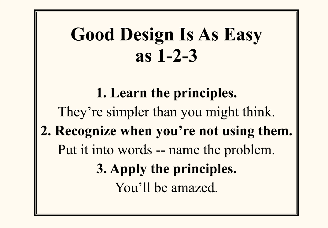
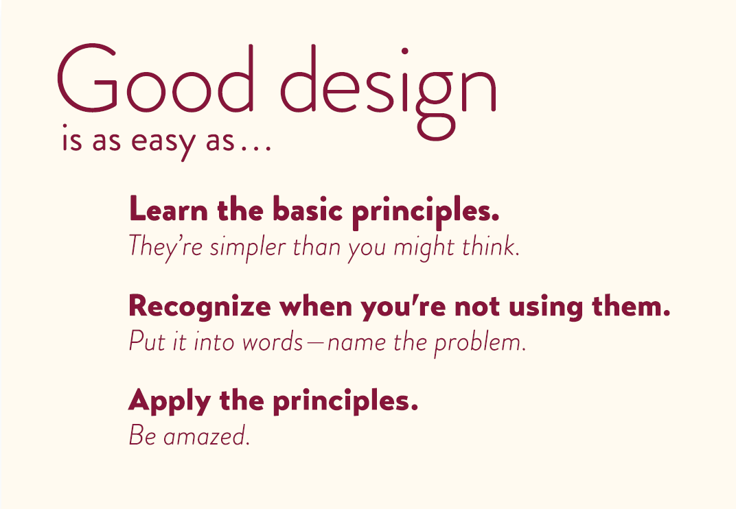
Skill Training: Identify at least five changes that made it possible to more clearly present the information in the second sample.
Next, I give a brief overview of the basic principles of design. They are visible in any well-designed work. I will consider each principle separately, but remember that they are interrelated. And you rarely have to use only one of them.
Contrast
The essence of contrast is to avoid elements that are the same. If the elements (font, color, size, line thickness, shape, negative space, etc.) are not the same, then make them different. Contrast is most important for attracting attention (makes the reader look at the page) and allows you to more clearly present the information.
Reiteration
Repeat visual design elements throughout the work. You can duplicate colors, shapes, textures, spatial relationships, line widths, fonts, sizes, graphic concepts. This reinforces the integrity of the perception of the material.
Alignment
Nothing should be placed on the page arbitrarily. Each element must have some kind of visual connection with another element on the page. It gives it a neat appearance.
Proximity
Related items should be tightly grouped. When several elements are found together, they turn into one visual element. It helps to organize information structurally.
Hmm ...
When extracting these four principles from the vast labyrinth of design theory, I thought that there must be a suitable acronym for these conceptual ideas that will help us remember them. Well, there is a memorable, but rather inappropriate acronym CRAP (contrast - “contrast”, repetition - “repetition”, alignment - “alignment”, proximity - “proximity”). Now this acronym can be found on the Internet, but its primary source is this book.
Headset: Transat Text Standard
More information about the book can be found on the publisher's website.
Table of contents
Excerpt
Thoughts on design
When in 1947, Paul Rand began writing a book, later called “Thoughts on Design,” he was 33 years old. A designer from Brooklyn, generally self-taught, had already become a sensation. Appointed as senior art director at William H. Weintraub & Co just six years ago, he revolutionized the clichéd and conservative world of Madison Avenue, bringing incredible clarity into European modernism and endowing it with a profound meaning. Rand's autograph appeared on the covers of books, posters and in advertising.
He was young. His logos for IBM, ABC and Westinghouse, which we see in the next editions of the book, until the future. As well as his presence in the hall of fame of the Art Directors Club, his position at the Yale School of Art and the Medal of the American Institute of Graphic Arts and other awards that show that he had become the greatest designer of the country at the time of his passing from life in 1996. Probably,
33 years is not enough for writing a book, but not for Rand.
Paul Rand has repeatedly pointed out that he doubted himself as a writer. But it was his passion for the subject that made him so successful. At his core job on Madison Avenue, he learned the art of saying more, saying less. Therefore, the book “Thoughts on Design” is simple, almost like a children's book: short and clear sentences, lively and colorful illustrations. It seems that this is just a catalog, illustrated with examples from the designer's portfolio. But in fact, “Thoughts on Design” is a manifesto, a call to arms, a clear definition of what makes a design good. Perhaps it’s better not to say what Rand did in an elegant free verse - the epigraph to the chapter “Beauty and Functionality”, the most quoted passage of the book. No matter what goals are achieved through graphic design, this is “bad design if it is inappropriate.”
László Mohy-Nagy called Paul Rand “an idealist and a realist who speaks the language of a poet and a businessman.” This balance between passion and practicality can not be better expressed in the book "Thoughts on Design", the idea of which is relevant today. We are lucky that present and future designers have this new edition.
Michael Birut, New York,
2014
Graphic design,
which satisfies aesthetic needs,
meets the laws of the form
and exists within a two-dimensional space;
which speaks with sans serif marks
and geometry;
which abstracts, transforms, translates,
turns, increases, repeats, reflects,
groups and regroups, -
bad design
if it is inappropriate.
Graphic design,
which reveals the symmetry of Vitruvius,
Hamburg’s dynamic symmetry,
the asymmetry of Mondrian;
which is good as gestalt;
which is born by intuition or computer
invented or created thanks to the coordinate system, -
bad design
if he is not
communication tool
and does not serve its purpose.
Visual communication of any kind, argumentative or informational - starting with banners and ending with birth announcements of children - should be considered as the embodiment of form and functionality (a synthesis of beauty and good). In advertising, text, visual image and print are understood as a kind of living entity, where each element is associated with another, is in harmony with the whole and is necessary for the realization of the idea. Like the juggler, the designer demonstrates his skills by handling these ingredients in the space provided. Whether this space takes the form of advertising, periodicals, books, letterheads, packaging, industrial products, signage or TV announcements - the criteria are the same.
It is constantly confirmed that the separation of the form from the function, the idea from the execution, most likely will not allow producing an object,
with aesthetic value. Similarly, it was found that a system that perceives aesthetics as something insignificant, isolates the artist from his work, divides work and personality, creates something by the committee, ruins the creative process, and in the long run will devalue not only the product, but also its creator.
John Dewey, commenting on the relationship between elegant and functional (that is, technological) art, notes: “Unfortunately, the truth is that many, or even most, of the texts and objects produced today for everyday life are not really aesthetic. And the reasons for this truth are far from the correlation "beauty" - "function". The product will always lack aesthetics if there are obstacles for the act of production to become an experience in which the creature lives and which gives it life through satisfaction. No matter how suitable the thing is for specific and limited purposes, it will not be highly functional to make a direct and generous contribution to the development and enrichment of our life. ”
The aesthetic requirements that Dewey speaks of, it seems to me, can be illustrated with the life of a shaker sect. Their beliefs provide fertile soil on which beauty and functionality can grow. Their spiritual quest found expression in the design of fabrics, furniture and utensils with great aesthetic value. These things are the manifesto of the simple life of these people, their asceticism, restraint, and anguish towards handicraft, their sense of proportion, space, and order.
Ideally, beauty and functionality are reproducible. In the past, beauty was rarely the ultimate goal. The magnificent stained glass windows of Chartres were no less utilitarian than the Parthenon or the Pyramid of Cheops. The facade decor of the majestic Gothic temples called to go inside, the window "roses" created a religious mood among the visitors inside the building. Interpreted in the light of our experience,
this philosophy continues to dominate.

Parthenon, Athens,
447–432 BC e.
More information about the book can be found on the publisher's website.
Table of contents
Excerpt
For Habrozhiteley a 20% discount on the coupon - Design
Design. A book for non-designers. 4th ed.
By: Robin Williams
Designers and non-designers all over the world have been using the fundamental principles laid down by Robin Williams for two decades. Get acquainted with the fully updated full-color fourth edition of “Design. A book for non-designers. In this book you will find: four secrets that will be useful in any design project; principles of working with color; design styles; Sharpening design with fonts; design options for brochures, flyers, letters, advertisements.
')
Thoughts on design
Author (s): P. Rand
Paul Rand's design essay is the oldest and most famous in the world. For the first time the book was published in the 1970s, and the main ideas presented by the author are absolutely relevant today! Therefore, reprinted again in 2014, it immediately became a world bestseller. This classic work will be interesting and useful both to students of art faculties, and professional designers.
Design. A book for non-designers. 4th ed.
Who is this book for?
This book is written for those who want to do design, but has no experience or relevant education. I do not mean only those who are engaged in the design of packages or booklets, I am talking about assistants whose bosses are instructed to issue newsletters; about volunteers in the church, providing information to parishioners; about the owners of small firms that produce their own advertising products; about students who understand that well-designed work often means a higher grade; about professionals who recognize that an attractive presentation is more respectful; about teachers who know that students better assimilate information that is well laid out; about the statisticians who understand that the numbers can be ordered in such a way that they do not feel sleepy, etc.
This book is for those who do not have time to study design and typography, but who want to learn how to make their pages look better. Well, this book confirms the old truth as the world: knowledge is power. Most people who look at a poorly designed page will say that they don’t like it, but they don’t know what to do to fix it. In the book I will give four basic concepts that guide almost all the authors of well-designed works. The concepts are clear and specific. Having mastered them, you can understand whether they apply to your pages or not. If you do not know what is the matter, then how to fix it? Having identified the problem, you can find a solution.
This book will not replace the four years of study in the school of design. I'm not saying that after reading it, you will automatically become a brilliant designer. But I guarantee that you will never again look at the pages, as before. I guarantee that if you follow these basic principles, your work will look more professional, whole and interesting. And you will feel that your opportunities have become wider.
With a smile,
Introduction
The introduction provides a general explanation of the four basic principles, each of which is discussed in detail in subsequent chapters. But first I will tell a little story, thanks to which I realized how important the ability to give names is, since the names of these principles are the key to their understanding.
Epiphany under the Judah tree
Many years ago I received a tree book for Christmas. I stayed with my parents and, after all the gifts were open, I decided to find out which trees are growing nearby. Beforehand, I looked through the book and noticed that the Iudino tree was first described, since its identification required only two signs. The Judah tree looked quite bizarre, and, looking at its image, I said to myself: “Oh, we don’t have such trees in Northern California. What a strange tree. I would recognize him if I had seen before. ”
So, I took the book and went outside. My parents' house is in a back alley, there are six more houses there. In the front gardens of four of them, Judah trees grew. I lived on this street for thirteen years and never noticed these trees. I walked around the block — it must have been when all the residents were engaged in gardening plots; there was a sale in the nursery, because at least 80% of the houses in the front gardens were growing Judah trees. And I have not noticed any of them before! As soon as I found out the name of this tree and its distinctive features, I began to see it everywhere. This is the main idea: if you can name something, then you realize it. You have authority over it. You control it.
Now you will learn the names of several design principles. And you will gain power over your pages.
Headsets: Times New Roman Regular, Bold
Headsets: Brandon Grotesque Black, Regular, Light Italic
Skill Training: Identify at least five changes that made it possible to more clearly present the information in the second sample.
Four basic principles
Next, I give a brief overview of the basic principles of design. They are visible in any well-designed work. I will consider each principle separately, but remember that they are interrelated. And you rarely have to use only one of them.
Contrast
The essence of contrast is to avoid elements that are the same. If the elements (font, color, size, line thickness, shape, negative space, etc.) are not the same, then make them different. Contrast is most important for attracting attention (makes the reader look at the page) and allows you to more clearly present the information.
Reiteration
Repeat visual design elements throughout the work. You can duplicate colors, shapes, textures, spatial relationships, line widths, fonts, sizes, graphic concepts. This reinforces the integrity of the perception of the material.
Alignment
Nothing should be placed on the page arbitrarily. Each element must have some kind of visual connection with another element on the page. It gives it a neat appearance.
Proximity
Related items should be tightly grouped. When several elements are found together, they turn into one visual element. It helps to organize information structurally.
Hmm ...
When extracting these four principles from the vast labyrinth of design theory, I thought that there must be a suitable acronym for these conceptual ideas that will help us remember them. Well, there is a memorable, but rather inappropriate acronym CRAP (contrast - “contrast”, repetition - “repetition”, alignment - “alignment”, proximity - “proximity”). Now this acronym can be found on the Internet, but its primary source is this book.
Headset: Transat Text Standard
More information about the book can be found on the publisher's website.
Table of contents
Excerpt
Thoughts on design
Preface to the new edition
When in 1947, Paul Rand began writing a book, later called “Thoughts on Design,” he was 33 years old. A designer from Brooklyn, generally self-taught, had already become a sensation. Appointed as senior art director at William H. Weintraub & Co just six years ago, he revolutionized the clichéd and conservative world of Madison Avenue, bringing incredible clarity into European modernism and endowing it with a profound meaning. Rand's autograph appeared on the covers of books, posters and in advertising.
He was young. His logos for IBM, ABC and Westinghouse, which we see in the next editions of the book, until the future. As well as his presence in the hall of fame of the Art Directors Club, his position at the Yale School of Art and the Medal of the American Institute of Graphic Arts and other awards that show that he had become the greatest designer of the country at the time of his passing from life in 1996. Probably,
33 years is not enough for writing a book, but not for Rand.
Paul Rand has repeatedly pointed out that he doubted himself as a writer. But it was his passion for the subject that made him so successful. At his core job on Madison Avenue, he learned the art of saying more, saying less. Therefore, the book “Thoughts on Design” is simple, almost like a children's book: short and clear sentences, lively and colorful illustrations. It seems that this is just a catalog, illustrated with examples from the designer's portfolio. But in fact, “Thoughts on Design” is a manifesto, a call to arms, a clear definition of what makes a design good. Perhaps it’s better not to say what Rand did in an elegant free verse - the epigraph to the chapter “Beauty and Functionality”, the most quoted passage of the book. No matter what goals are achieved through graphic design, this is “bad design if it is inappropriate.”
László Mohy-Nagy called Paul Rand “an idealist and a realist who speaks the language of a poet and a businessman.” This balance between passion and practicality can not be better expressed in the book "Thoughts on Design", the idea of which is relevant today. We are lucky that present and future designers have this new edition.
Michael Birut, New York,
2014
Beauty and functionality
Graphic design,
which satisfies aesthetic needs,
meets the laws of the form
and exists within a two-dimensional space;
which speaks with sans serif marks
and geometry;
which abstracts, transforms, translates,
turns, increases, repeats, reflects,
groups and regroups, -
bad design
if it is inappropriate.
Graphic design,
which reveals the symmetry of Vitruvius,
Hamburg’s dynamic symmetry,
the asymmetry of Mondrian;
which is good as gestalt;
which is born by intuition or computer
invented or created thanks to the coordinate system, -
bad design
if he is not
communication tool
and does not serve its purpose.
Visual communication of any kind, argumentative or informational - starting with banners and ending with birth announcements of children - should be considered as the embodiment of form and functionality (a synthesis of beauty and good). In advertising, text, visual image and print are understood as a kind of living entity, where each element is associated with another, is in harmony with the whole and is necessary for the realization of the idea. Like the juggler, the designer demonstrates his skills by handling these ingredients in the space provided. Whether this space takes the form of advertising, periodicals, books, letterheads, packaging, industrial products, signage or TV announcements - the criteria are the same.
It is constantly confirmed that the separation of the form from the function, the idea from the execution, most likely will not allow producing an object,
with aesthetic value. Similarly, it was found that a system that perceives aesthetics as something insignificant, isolates the artist from his work, divides work and personality, creates something by the committee, ruins the creative process, and in the long run will devalue not only the product, but also its creator.
John Dewey, commenting on the relationship between elegant and functional (that is, technological) art, notes: “Unfortunately, the truth is that many, or even most, of the texts and objects produced today for everyday life are not really aesthetic. And the reasons for this truth are far from the correlation "beauty" - "function". The product will always lack aesthetics if there are obstacles for the act of production to become an experience in which the creature lives and which gives it life through satisfaction. No matter how suitable the thing is for specific and limited purposes, it will not be highly functional to make a direct and generous contribution to the development and enrichment of our life. ”
The aesthetic requirements that Dewey speaks of, it seems to me, can be illustrated with the life of a shaker sect. Their beliefs provide fertile soil on which beauty and functionality can grow. Their spiritual quest found expression in the design of fabrics, furniture and utensils with great aesthetic value. These things are the manifesto of the simple life of these people, their asceticism, restraint, and anguish towards handicraft, their sense of proportion, space, and order.
Ideally, beauty and functionality are reproducible. In the past, beauty was rarely the ultimate goal. The magnificent stained glass windows of Chartres were no less utilitarian than the Parthenon or the Pyramid of Cheops. The facade decor of the majestic Gothic temples called to go inside, the window "roses" created a religious mood among the visitors inside the building. Interpreted in the light of our experience,
this philosophy continues to dominate.
Parthenon, Athens,
447–432 BC e.
More information about the book can be found on the publisher's website.
Table of contents
Excerpt
For Habrozhiteley a 20% discount on the coupon - Design
Source: https://habr.com/ru/post/279859/
All Articles