Case design: Coral Order e-commerce website
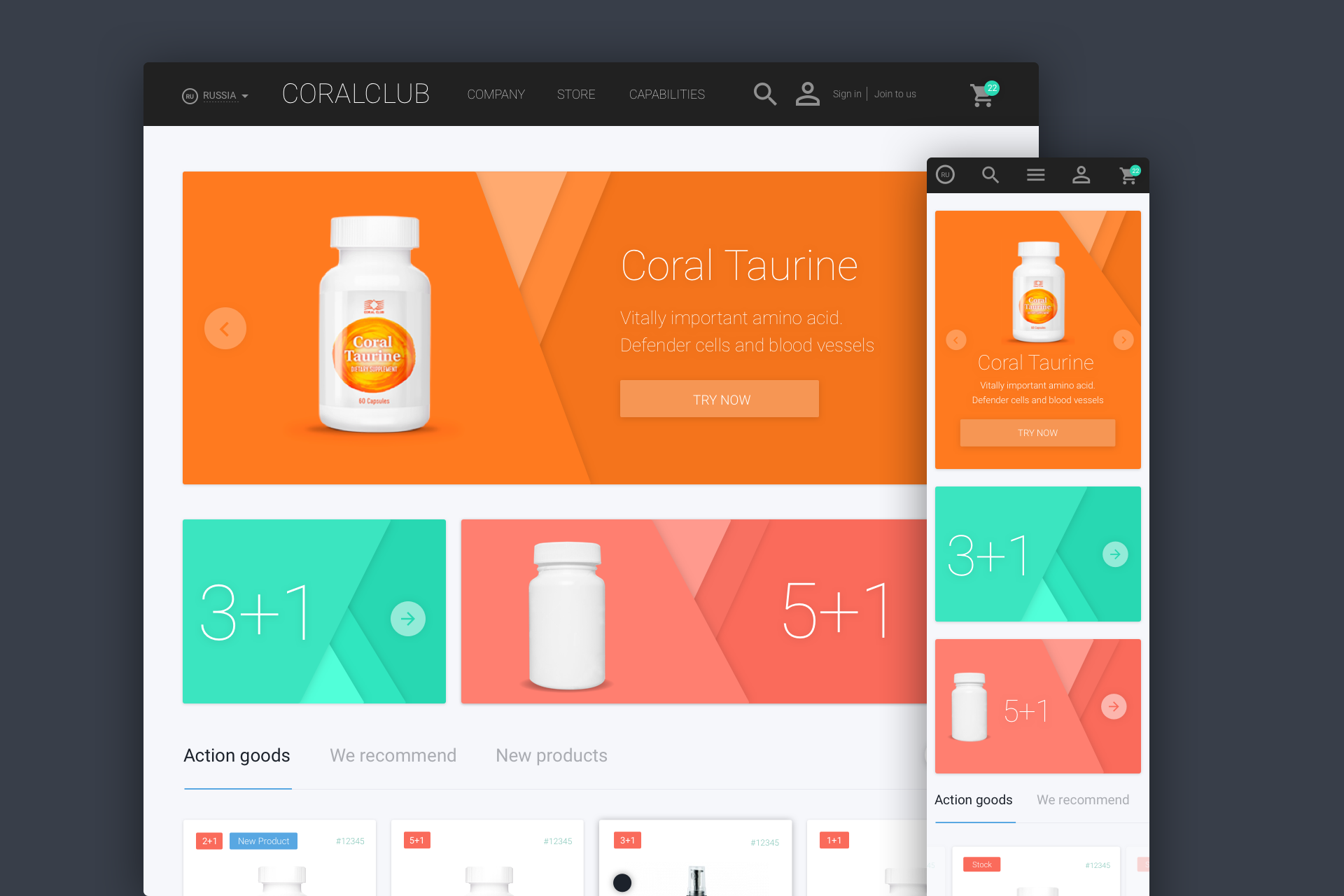
Start
A couple of months ago, we were approached by a regular customer to whom we have already made several successful projects. He needed to redesign his main project.
The decision to redesign the online store and change the design concept was due to the fact that the site does not meet current web standards and does not solve the tasks assigned to it. Also, the site was previously closed, but it was decided to make it public.
')
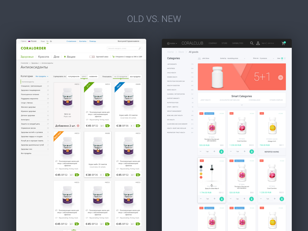 Compare old store with new
about the project
Coral Club is an offline club of people who use products of this brand. Initially, the site was intended only for owners of the offline club. A little later, the concept changed and it became a full-fledged online store.
Now the online store sells products for health, beauty and home. For the most part, the store's assortment is all sorts of dietary supplements and vitamins that help you feel better.
Study
We had an unusually short research stage, because the customer has an entire army of developers, marketers and designers who monitor the site around the clock and know all its problems and shortcomings.
We were kindly provided with comprehensive data on the project, such as:
- main problems of the current site version
- webcam metrics
- social survey data among clients
- feedback site from regular users
- links to competitors' sites
- detailed brief with wishes from the customer
It remained to examine the data and make a product that solves all the problems by answering the requirements set for it.
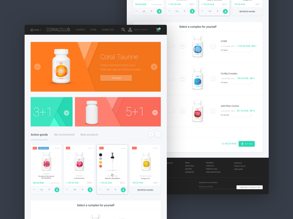 First shot on dribbble
Main problems
1. The site does not sell
After the site was given public access, the customer using metrics and call center revealed that users who did not come on the recommendation did not buy anything.
2. For users, the product itself is not clear.
New users who came to the site through the search did not understand the specifics of the product and what they need to buy.
3. Goods are bought only according to recommendations.
It turned out that those users who buy the product, select it exclusively on the recommendations. Users actually bought the goods offline, and the site serves as a platform only for processing the product selected in advance. It was a great discovery for the customer himself, because he thought that some of the users still buy goods online.
4. The site is not adaptive
Almost 40% of site users visit it from mobile devices.
Task
- Make users buy products on the site without recommendations
- Make products as clear as possible for all users.
- Make more emphasis on the product.
- Increase the amount of goods in the average check
- Make the design responsive for mobile devices
- Make the design easy to customize.
Details
During negotiations with the customer, it was unanimously decided to make a design in Material. This decision was justified by the fact that Google has detailed guides on which in the future it will be easier to maintain and improve the store. Material is easy to adapt and it has a lot of source materials, in the form of icons, colors, fonts, scripts and source code.
Based on 3 key pages of the site, we will tell you in more detail about the features of this project. All pages of the project can be viewed at the link to dribbble.
Complex for yourself
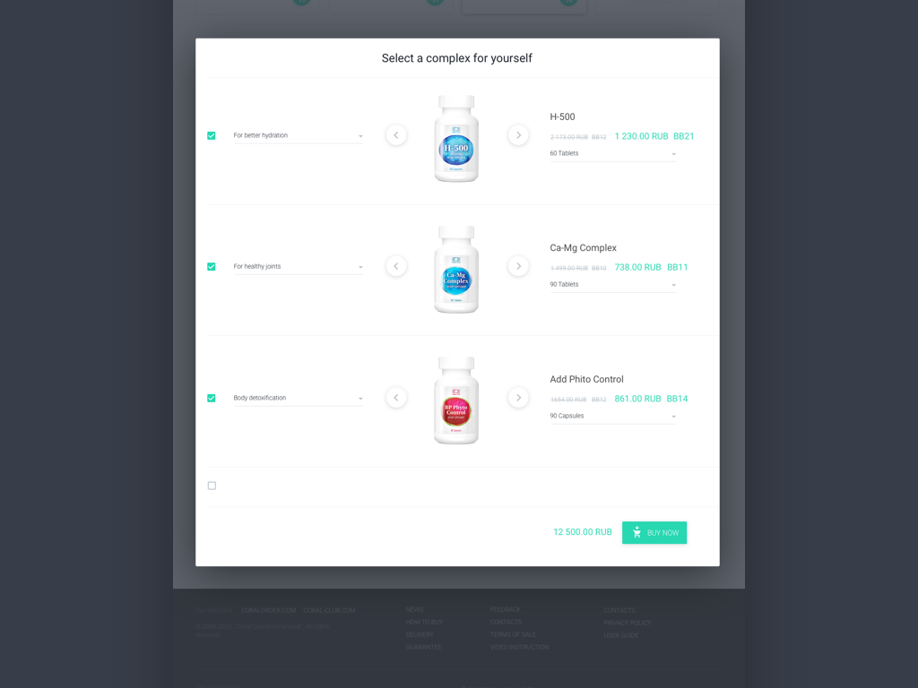 Image of the complex for yourself
Since new users have little idea about the product, we have prepared a whole list of solutions that will help these people to better navigate the site.
One of such decisions was to make a block on the main page and product page with pre-selected complexes that will help you figure out the type of product you need and quickly make a purchase.
Main navigation
One of the main tasks was to hide and simplify navigation, since it occupied a lot of useful space on the current site.
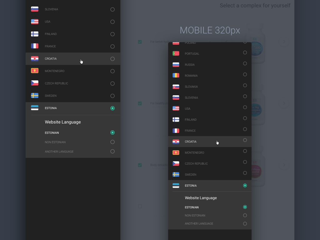 Country and language selection menu
The first problem that had to be solved was that the Coral Club has branches in 35 countries of the world and all users use the same site. Also it was necessary to take into account that in each country they can speak in several languages. That is, it was necessary to make a selector for 35 countries in which you can select the page and language and have quick access to it to change parameters.
 Main menu of the site
Another problem was that with a small number of products, there are many categories on the site. The customer was going to expand the range, which also had to be considered.
For untrained users The menu included “Smart Categories” which, as far as possible, made it easier to navigate the site.
 Basket menu on the site
We decided to test the scenario in which you can view and change the number of products on any page.
Product information
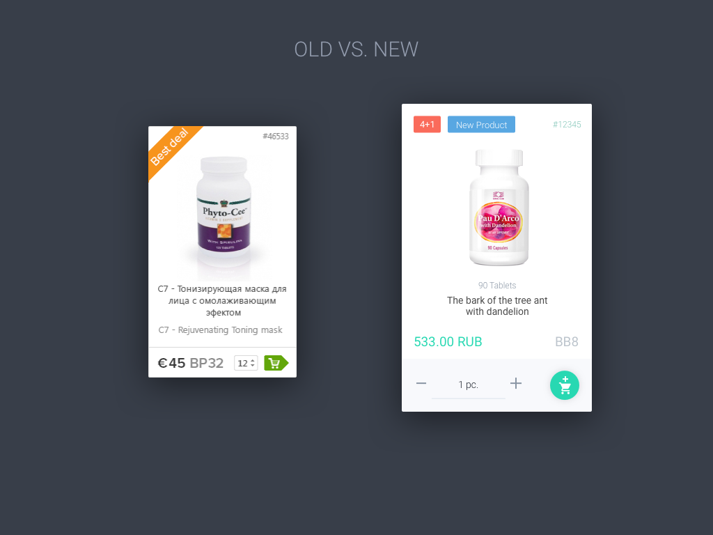 Product Card Image
Compared with the previous version in our opinion, we managed to add more information and not lose in the information content and general view :)
In the new card, you can now enter several tags, also appeared the dosage for drugs. While the structure and number of blocks on one page remained the same, there is more air in the new card and it is easier to read.
 Product page on the site
In the product card, we tried to make the information more accessible and understandable for untrained users. Also, do not forget about the complex order :)
Adaptability
 Part of responsive pages
 One of the most important factors to make the design responsive, since almost half of the users access the site from mobile devices. The design was made to be made under a minimum width of 320px. During the development of adaptive pages, we managed to make the functionality the same as in the web version.
Conclusion
After the store concept was made, we sent all the materials to the customer. After confirming the design, the next step was cooperation with the development department. Now we help the development department to implement our design, answer their questions, and also act as testers for the front end parts, look for bugs and send them to the bug list.
The next step will be testing the customer a new design on the users. Since product design always implies improvements, we always think about how to improve the product and offer new ideas for the project.
PS Before preparing this case, we collected and studied more than 30 cases and tried to make it interesting for you. We prepared it for a long time and wanted to hear your feedback in the comments or in any form convenient for you.
Source: https://habr.com/ru/post/279779/
All Articles