"Favorite smartphone chemist technologist" or the unification of the desktop of your gadget
Hello again, Habr. Today I want to put on a white bathrobe, put on an elegant pince-nez and act as an experimental engineer who will mix unusual components in order to create a new “sauce” under which you can serve you an old favorite dish - your smartphone.
Actually, initially I planned to describe a non-standard approach to the implementation of the interface of one project that did not go beyond the scope of the concept. However, in the end it turned out that I swung at the great, constant and unshakable - the concept of the desktop in mobile devices.
By the way, if you use Figma , I recommend paying attention to our ready-made design systems . They help freelancers complete more orders per month, programmers can create beautiful applications on their own, and the Timlids run sprints faster using ready-made design systems for teamwork.
')
And if you have a serious project, our team is ready to deploy a design system within the organization based on our developments and tailor it to specific tasks using Figma. Web / desktop, and any mobile. We are also familiar with React / React Native. Write to T: @kamushken
Preamble
Once, in the hidden subfolders of my working folder, I came across several screenshots of a half-year old. It was quite “fresh” for me and to this day the approach to the development of the interface disturbing my mind, when I took the concept of the periodic table of Mendeleev as a basis!

(for those who forgot)
Then, being in some kind of breathtaking creative impulse, I “pulled” Mendeleev's invention on the interface concept, which had to quickly solve one specific problem: between which Microsoft Lync servers there was a lag that led to a deterioration in the quality of communication or led to a cliff.
If you don’t go deep into the technical details (in fact, I’m not going to risk trying, for I’m surely lying), then for the above product there are several types of servers: SQL, Mediadion, FrontEnd and Edge. All of them are cleverly woven together to provide the service of internal corporate audio / video calls and chat.
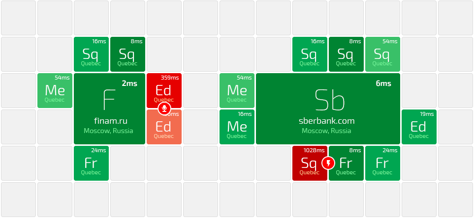
For the visual basis, I took a square grid, on which the life of individual organizations pulsed, the servers of which were monitored.

Each organization occupied its space on the grid. For each of them there could be a different number of servers of a certain type, which “stuck” in order, each in its own way:

(For example, SQL servers were always on the top face, all mediation always went on the left side, etc.)
In the upper right corner, the ping to the server was displayed. Moreover, a more intense green color spoke of a good response and became faded as it grew. The conditional gradation was as follows:

In the case of lags, the cells of problem servers became alarmingly red. Between them there was a circular indicator with an icon that described the type of problem. In addition, the circular indicator seemed to “close” the cells also showing between which servers there were problems:

Of course, the problem could arise between servers that were located on different sides of the organization block. Then one could temporarily “jump over” to another:
(Jumped over and shows a “break in connection” between SQL and FrontEnd)
All this could safely scale and thus the state map was presented for all organizations that are under observation:


Theoretically, two goals were achieved: A - the problem was solved, B - a stylish “wrapper” was drawn, which is easier to sell. It is a pity, but on this the story of a particular product will have to stop. Project management in those distant days later switched to other tasks and goals, and the concept did not go beyond it.
It’s not even so interesting to describe a concept where no further interaction has been thought out ... I’d specifically come off then :) But it’s more interesting to move closer to the point ...
Ambula (it turns out there is no such word, but there is a plot): tables
Let's go back to where it all began - to the table. Once the first tabular processor was invented (it is also a spreadsheet) and after the world has never been the same. It turned out (!) That, in addition to the convenience of calculations, the information ordered in specified tables in a tabular form is much better and more conveniently perceived. Aligned content along the Y axis is much more convenient to perceive, because The eye predetermines the location of the information that it expects to see, based on previous experience (visually, we went down from the cell above, for example). It is impossible not to cite as an example the popularity of cards in our days. Actually, this was my plan - to proceed further to them ...
Cards
Cards are tightly embedded in the interfaces, and therefore in our daily life. Many studies have been written on the topic of cards, presentations have been made, and many different justifications have been invented. I would draw a parallel between the table here: the cards allow you to organize and submit information so well, how well the tables did it:

Relatively speaking, by scrolling cards on the screen of your mobile phone, you can interpret this as movement within the framework of only one column in a spreadsheet. Our vision moves from top to bottom and visually we expect to see in the new card the same type of information as in the previous one and their location will coincide. Again, this is a reference to previous experience.
As a result, we get this kind of evolution of the table on the screens of our gadgets:

At the beginning of this article, I promised you a new “sauce”. I will not deceive you. So…
Favorite Smartphone Technologist
It's time to go back to the periodic table. She was mentioned for a reason. In fact, the sauce is probably not new, I could be bluffing. Somewhere earlier on the Internet, I met attempts to project a periodic table on a smartphone's desktop. But I never came across a competent essay about why this kind of solves the problem. Below I want to “develop” this idea a little. I hope it will be curious, for slyly speaking, all of you will become participants in this experiment.
Let's imagine that we want to follow the example of Google. This monster is trying to unify the design, systematizing knowledge about it under the name of material. And we want to unify the look of the desktop of your phone. Google used to be tired of different types of buttons, fonts, forms, their behavior, etc.
And we were suddenly tired of the colorful, colorful and sometimes meaningless icons and logos, which we are constantly forced to memorize.
Then it would look something like this:

(Here is the first stage of the experiment: you can quickly, for example, Whatsapp find?)
A bit boring, isn't it? Well, exactly as boring as iOS7 came out, after a gradient-convex iOS6 (I mean total flat-isation). Then the consumer also roared at every corner, that this was a disaster. But in fact all quietly accustomed. And now there is no doubt - the step was taken in the right direction!
However, since the advent of the first PC Xerox Alto, we still see icons on the desktop. And the same iOS7 in this regard did not bring anything new, like its subsequent versions. Too great a risk! Well, do not interfere with the work properly working technology.
Fine! In order to go further than other designers who came up with this idea, I will allow myself to arrange applications by subject in different colors. System leave white, and social, instant messengers, navigation, etc. let's paint by individual color:

(For example, now you know that all mail applications are colored orange. How quickly can you find the Yandex.mail icon? Faster than the previous time?)
But you do not hold! :) Obviously, this is a little fantastic case. In fact, we will not initially have such an order until we ourselves impose it. Often the categories are a complete hodgepodge:

(Can you find Google Maps now, knowing that all navigation and maps are colored pink? How much time did it take from you?)
A regular pattern break happens to us when on the iPhone we delete the app at the top of the screen. Instead of leaving us a blank field, the system shifts all the icons for us, like tag, and fills the gap.
This shift next time is likely to cause trouble finding the right application. After all, initially we associate it with a specific place on the desktop and memorize it, and only then we focus on the icon and signature. For example, we deleted LinkedIn at the top:

(But if you remember from the previous example that all of the map applications are pink, can you also quickly find a displaced Google.Maps?)
Instead of conclusion
But this is at least an encroachment on a sacred and unreasonable risk, leading to irreversible consequences. Without fail, research is needed. But I feel like those UX-specialists who predict the fall of icons and the triumph of inscriptions in the near future, quietly nod their heads. Personally, I choose a neutral position! Are potential duplicate letters so scary? Will there be enough distinct shades of color for different categories of applications? One thing is for sure - the unification of the desktop leads to balance and possible boredom in Google.Play and the AppStore. Now no one can take the lead by drawing only the icon better than yours! Fair Play ...
Source: https://habr.com/ru/post/279723/
All Articles