Is there a visible border on the web?

Oh, this boundary of the visible area. The curse of many UX designers when negotiating with their clients. The subject of satire, mocking websites . Well, in fact, just a few .
Dumb stories
The idea of the boundary of the visible area ( hereinafter referred to as GVO ) came to the web from the printing industry (the first alarm bell). That is, it is a relic of the past. Newspapers were, how to say, limited when they were printed and sold. The idea was that it was extremely important to place large headlines and an image in the most visible area — at the top of the page. This was done in order to attract readers. And voila - a new trend was born.
At the dawn of the birth of the web, we brought this trend with us. Dealing with a new environment for us, using the experience of the past, we tried to make good designs.
')
So is there a gvo on the web?
Let's keep it clean, there is always an area on the page that we see first when the site loads ( Approx. Lane: the so-called “first screen” ), this is the border of the visible area. However, in the current web so much is mixed up that it is very difficult to concentrate all the key moments on this very “first screen”.
Many devices and responsive design
There are many screen sizes and resolutions ... and this only makes things worse. And therefore, a responsive design appeared. It allows us to create flexible web layouts that adapt to the resolution and screen size of the device on which they are viewed. The lack of a fixed width and size of the site does not mean that the GWO is now becoming inappropriate.

At whereisthefold.com you can visually see the various “GVOs” by specifying the URL you are interested in.
We are currently designing designs in an environment where the GVO is located in different places (the second alarm bell), depending on how the visitor gets to the site, that is, what device he will use when viewing the site. There are tools that can demonstrate this. Analytics tools can give an idea of which devices most often visitors come to your site.
Here is a chart of the statistics of the resolutions of Internet users for the beginning of 2016.
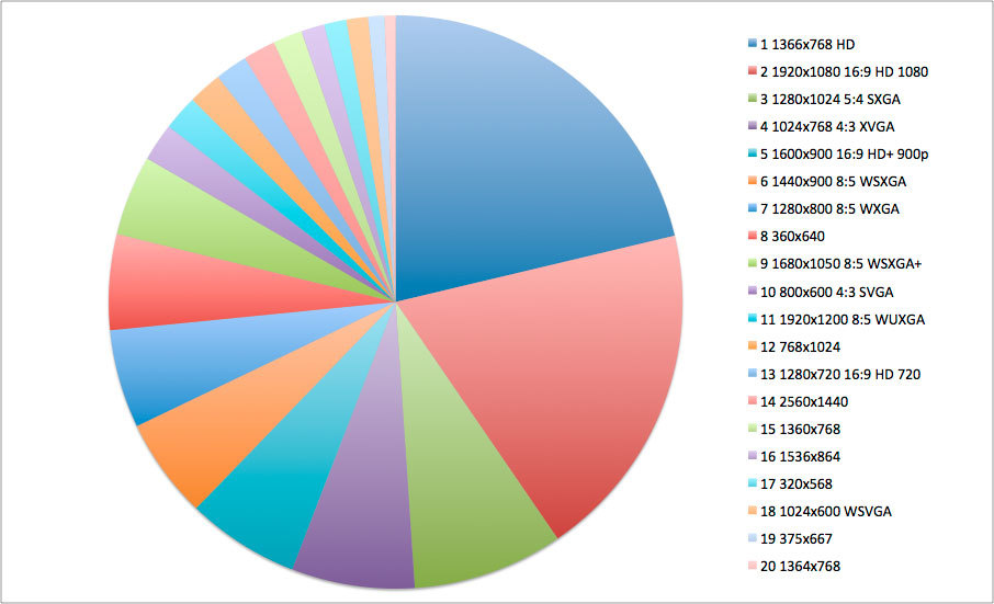
It is generated from the data of the TOP-20 screen resolution for the specified period. You can see the statistics here screenresolution.org
The fact is that the situation is changing very quickly. There are more and more new devices with different resolutions and screen sizes, and the share of mobile browsing is constantly increasing.
What do UX developers do?
The good news is that none of the above is important. The position of the GVO is variable. What is crucial for a good UX is to provide a compelling and easy-to-use interface that will allow the user to do (get) what he came to the site for and help the site owner achieve their business goals.
People will scroll if they realize that in this case they will find the necessary information, and if they are convinced that this will be enough for them. Now that we are intimately familiar with the web and how it works, we understand that page scrolling is common. A single eye-tracking study found a hotspot above the scroll bar. This means that people watch and evaluate how long a web page can be.
How can I design, given the scroll?
This site uses an illustrative element on the page that prompts the user to scroll the page.
One common solution, in particular for one page of the site, would be to position the down arrow, or any other indication that the user should scroll. Such solutions are always interactive and start scrolling when they are clicked or tapped. They provide evidence that something else is below. However, it is worth noting that, ideally, you should not rely on such solutions to ensure scrolling. If you have to convey to the person that he needs to scroll the page, this may indicate that the design does not provide him with sufficient reason to do so.
Most of the "heavy" or news sites do a good job, cutting off the content, thereby enticing the user to scroll and providing an understanding that there is something interesting below.
Another approach is to trim the content, create some kind of visual teaser, followed by something else after scrolling. It should be obvious to the user that there is much more content on the page than he sees in front of him. In one usability testing, I witnessed a negative effect that arose from the use of 'false floors'. In this particular case, these are block horizontal lines that separate the pages. Users thought they saw everything on the page and did not scroll further. There is an easy way to avoid this. You just need to make the content look out from the bottom of the screen.
Calls for action in the web world
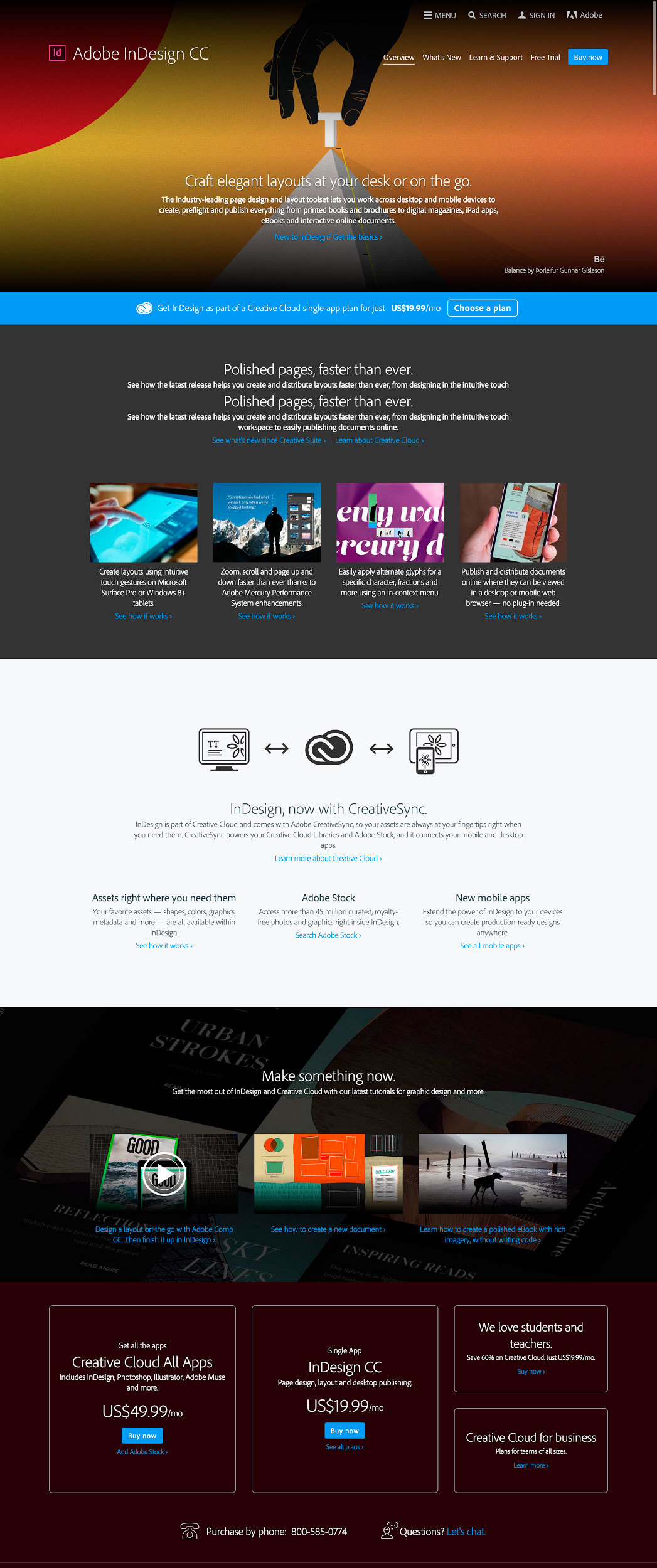
The Adobe InDesign CC product home page has placed the CTA ( lane: call to action ) in several places: in the top menu, for users who are ready to buy the product right now; and at the end of the page, for users who first want to read product information. Please note that calls to action are located throughout the scroll.
The key problem that occurs in people is that CTA buttons, such as “buy now”, “subscribe” or “sign up”, lose their effectiveness if they are located “above the border of the visible area”. When there is a site conversion at stake, it is necessary to make sure that the CTA buttons are always within the visibility of the user. The key point that experts have identified regarding the location of the CTA is that such buttons should be located (appear) in the place where the user is supposed to decide to perform a particular action. The hierarchy, design and content of the page should be structured in such a way that the user is ready to decide to “buy”, “subscribe” or “sign up” and proceed to the next step. To collect information on behaviors, accessibility, and various users in general, key CTAs should be located in several strategic locations at once.
We trust in the borders of the visible region ...
As the growth in the number of devices continues, and we see a wider use of divided screens, it is becoming more and more difficult to explain how much information needs to be shown to the user on the “first screen”. The good news is that a good UX has no time frame. The hierarchy of the site, its purity and obviousness will provide support for the fact that the user will continue to scroll through the pages as he used to do so in order to get what he came to the site for. In addition, it is worth remembering that not everyone uses the web purely visually - people can access information through the "reading mode" or only using the keyboard, which only emphasizes the importance of the visual border of the visible area even more. In all these cases, the UX-oriented user must be sure that he will receive exactly what he needs.
Source: https://habr.com/ru/post/279705/
All Articles