Simpson's Paradox and Little Pandas
What is the article about?
In this article I want to consider one of the most well-known examples of the Simpson paradox, along the way, telling a little about MultiIndex in Pandas.
First things first.
Simpson's paradox is a counterintuitive phenomenon in Statistics, when we see a certain dependence in each of the data groups, but when these groups are merged, the dependence disappears or becomes opposite. For example, if you look at the change in the average earnings of women of 25 years and older, working full time, between 2000 and 2012 with different levels of education, we will get the following figures (all calculations were adjusted for inflation):
- Less than 9th grade -3.7%
- 9th-12th but didn't finish -6.7%
- High school graduate -3.3%
- Some college but no degree -3.7%
- Associate's degree -10.0%
- Bachelor's degree or more -2.7%
According to these figures, it can be concluded that the earnings of women over 12 years have declined. However, in fact, the average earnings of women with full-time employment grew by 2.8% (for more information about this example, read here ).
')
One of the most well-known examples of the Simpson paradox is the case of gender discrimination in admission to the University of California Berkeley. We will consider it further.
UC Berkeley case
general Statistics
Consider the percentage of admission to the university among men and women (the initial data can be found on the wiki , all the code is on github'e ).
import pandas as pd flat_df = pd.read_csv('berkeley_case.csv', sep = ';') total_stats = pd.pivot_table(flat_df, aggfunc = sum, index = 'gender', columns = 'param', values = 'number') total_stats['perc_admitted'] = map(round_2digits, 100*total_stats.accepted/total_stats.applied) 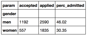
We see that 46% of the men who have applied and only 30% of women have acted. 16% of points is a big enough difference and it is unlikely that this is just a random deviation. In this regard, in 1976, a lawsuit was filed against Berkeley for sexual discrimination.
However, we dig in the data a little deeper and look at the percentage of accepted men and women by faculty.
Share received by faculty
This is where MultiIndex or hierarchical indexes in Pandas come in handy. Hierarchical indices are quite useful functionality, which allows you to present in a tabular form data of higher dimensions and avoid cycles (in my opinion, the Pandas code without cycles looks more organic, but this, of course, tastes). The easiest way to create a DataFrame with hierarchical indexes is to use the pivot_table function (similar to pivot tables in Excel).
df = pd.pivot_table(flat_df, index = 'faculty', values = 'number', columns = ['gender', 'param']) 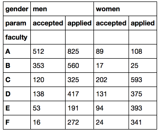
DataFrame with a hierarchical index can be filtered in various ways (you can read more in the documentation )
df['men']['accepted'] # df df['men'] # (level = 0) # , accepted idx = pd.IndexSlice df.loc[idx[:], idx[:, 'accepted']] Let's also calculate the total number of applicants and university applicants and add a 'total' slice to the original DataFrame.
df_total = (df['men'] + df['women']).T # dataframe df_total['gender'] = 'total' df_total.set_index('gender', append = True, inplace = True) # df_total = df_total.reorder_levels(['gender', 'param']).T # df = pd.concat([df, df_total], axis = 1) # df 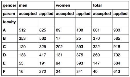
Now we can easily calculate the percentage of enrollment among men, women and in general.
df_inv = df.reorder_levels(['param', 'gender'], axis = 1).sort_index(level = 0, axis = 1) # admitted_perc = (100*df_inv.accepted/df_inv.applied) admitted_perc[['total', 'men', 'women']].plot(kind = 'bar', title = 'Percentage of admitted to UC Berkeley') 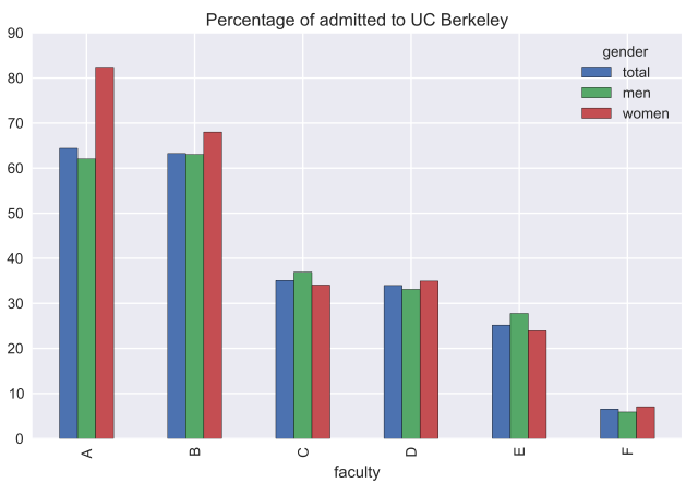
As it turned out, in most faculties the percentage of admitted women is higher than among men (for Faculty A, the difference is about 20% in favor of women). In faculties C and E, the proportion of admitted women is less, but not significant. Thus, the hypothesis of gender discrimination of women is not confirmed. In order to understand this paradox, let us consider which departments the men and women applied for.
Faculty popularity among men and women
We calculate the distribution of applications of men and women in different faculties and compare it with the average percentage received by this faculty.
gender_faculty_applications = pd.pivot_table(flat_df[flat_df.param == 'applied'], index = 'faculty', values = 'number', columns = 'gender') gender_faculty_applications = gender_faculty_applications.apply(lambda x: 100*x/gender_faculty_applications.sum(), axis = 1) gender_faculty_applications.columns += '_faculty_share' faculty_stats = admitted_perc[['total']].join(gender_faculty_applications) faculty_stats.columns = ['total_perc_admitted', 'men_faculty_share', 'women_faculty_share'] faculty_stats.plot(kind = 'bar', title = 'Statistics on UC Berkeley faculties') 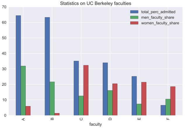
Here is an explanation for the paradox: the majority of men (over 50%) applied for faculties A and B with a high percentage of admissions, while the majority of women decided to enroll in more "complex" faculties.
In custody
We considered an example of the Simpson paradox and figured out why it is impossible to transfer the conclusions about separate groups of objects to the unification of these groups.
In addition, we got acquainted with the hierarchical indices in Pandas, which in some cases allow us to avoid cycles and simplify working with multidimensional data.
For those interested, I also advise you to look at this article : you can find interactive visualizations in it explaining the Simpson paradox.
Source: https://habr.com/ru/post/279665/
All Articles