MCMC-sampling for those who studied, but did not understand
Talking about probabilistic programming and Bayesian statistics, I usually do not pay much attention to how, in fact, probabilistic inference is performed, considering it as a kind of “black box”. The beauty of probabilistic programming is that, in fact, in order to build models, it is not necessary to understand exactly how the conclusion is drawn. But this knowledge is certainly very useful.

Once I talked about a new Bayesian model to a person who did not particularly understand the subject, but really wanted to understand everything. He asked me something that I usually don’t touch. “Thomas,” he said, “and how, in fact, is probabilistic inference performed? How do these mysterious samples come from a posteriori probability? ”
Then I could say: “Everything is very simple. The MCMC generates samples from the a posteriori probability distribution, creating a reversible Markov chain, the equilibrium distribution of which is the target a posteriori distribution. Questions?
The explanation is correct, but how much benefit does it have for the uninitiated? What annoys me most is how they teach mathematics and statistics that nobody ever talks about the intuitive ideas that underlie all kinds of concepts. And these ideas are usually pretty simple. From such occupations you can take out three-storey mathematical formulas, but not an understanding of how everything works. I was taught that way, and I wanted to understand. For countless hours I was hitting my head against the mathematical walls, before the moment of the next epiphany came, before the next “Eureka!” Broke from my lips. After I managed to figure out what was previously difficult, it turned out to be surprisingly simple. What used to be scary with a jumble of mathematical signs became a useful tool.
')
This material is an attempt to provide an intuitive explanation of MCMC sampling (in particular, the Metropolis algorithm ). We will use code examples instead of formulas or mathematical calculations. Ultimately, one cannot do without formulas, but personally I think that it is best to start with examples and achieve an intuitive understanding of the issue before moving on to the language of mathematics.
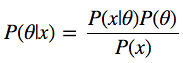
Let's look at the Bayes formula:
We have P (θ | x) - what we are interested in, namely, the a posteriori probability, or the probability distribution of the parameters of the model θ, calculated after taking the x data taken from the observations into account. In order to get what we need, we need to multiply the a priori probability P (θ), that is, what we think about θ before conducting the experiments, before receiving the data, and the likelihood function P (x | θ), that is - what we think about how data is distributed. Numerator fraction is very easy to find.
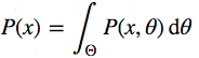
Now let's look at the denominator P (x), which is also called evidence, that is, evidence that the x data was generated by this model. You can calculate it by integrating all possible values of the parameters:
This is the main complexity of the Bayes formula. It looks quite innocent itself, but even for a slightly non-trivial model, the posterior probability is not calculated in a finite number of steps.
Here you can say: “Well, if it is not directly solved, can we take the path of approximation? For example, if we could somehow get samples of the data from this very posterior probability, they could be approximated by the Monte Carlo method. but also invert it, so this approach is even more difficult.
Continuing the reflections, one can state: "Ok, then let's construct a Markov chain, the equilibrium distribution of which coincides with our a posteriori distribution." I, of course, joke. Most people do not say so, very much it sounds crazy. If it is impossible to calculate directly, it is also impossible to take samples from the distribution, then building a Markov chain with the above-mentioned properties is a very difficult task.
And here we are waiting for an amazing discovery. This is actually very easy to do. There is a whole class of algorithms for solving such problems: the Monte Carlo methods in Markov Chains ( Markov Chain Monte Carlo , MCMC). The essence of these algorithms is the creation of a Markov chain for performing Monte-Carlo approximation.
First we import the necessary modules. The code blocks marked as “Listing” can be inserted into Jupyter Notebook and, as you read the material, try it out. See the full source here .
Now we will generate the data. These will be 100 points normally distributed around zero. Our goal is to estimate the posterior distribution of the mean mu (assuming we know that the standard deviation is 1).
Now we will build a histogram.

Histogram of observable data
Now we need to describe the model. We consider a simple case, so we assume that the data is distributed normally, that is, the likelihood function of the model is also normally distributed. As you must know, the normal distribution has two parameters — it is the mean (μ) μ and the standard deviation σ. For simplicity, we assume that we know that σ = 1. We want to derive the a posteriori probability for μ. For each desired parameter, it is necessary to select an a priori probability distribution. For simplicity, assume that the normal distribution is the prior distribution for μ. Thus, in the language of statistics, the model will look like this:
What is especially convenient is that for this model, in fact, it is possible to calculate the posterior probability distribution analytically. The fact is that for a normal likelihood function with a known standard deviation, the normal a priori probability distribution for mu is a conjugate a priori distribution. That is, our a posteriori distribution will follow the same distribution as the a priori distribution. In summary, we know that the posterior distribution for μ is also normal. In Wikipedia, it is easy to find a method for calculating the parameters for the a posteriori distribution. A mathematical description of this can be found here .

Analytical posterior distribution found
Here we are interested in what we are interested in, that is, the probability distribution for μ values after taking into account the available data, taking into account a priori information. Suppose, however, that the prior distribution is not conjugate and we cannot solve the problem, so to speak, manually. In practice, this is usually the case.
Now let's talk about sampling. First, you need to find the initial position of the parameter (you can choose it randomly). Let's set it arbitrarily like this:
Then it is proposed to move, "jump" from this position to some other place (this already applies to Markov's chains). This new position can be chosen and "at random", and guided by some deep considerations. The sampler in the Metropolis algorithm is as simple as five kopecks: it selects a sample from a normal distribution with a center in the current mu value ( mu_current variable) with a certain standard deviation ( proposal_width ) that determines the width of the range from which the proposed values are selected. Here we use scipy.stats.norm . It must be said that the above normal distribution has nothing to do with what is used in the model.
The next step is to assess whether a suitable location has been selected for the transition. If the obtained normal distribution with the proposed mu explains the data better than the previous mu , then in the chosen direction, it is certainly worth moving. But what does “data explain better”? We define this concept by calculating the probability of the data, taking into account the likelihood function (normal) with the proposed values of the parameters (proposed by mu and sigma , the value of which is fixed and equal to 1). The calculations here are simple. It is enough to calculate the probability for each data point using the scipy.stats.normal (mu, sigma) .pdf (data) command and then multiply the individual probabilities, that is, to find the value of the likelihood function. Usually in this case, use the logarithmic probability distribution, but here we omit it.
Up to this point, we, in fact, used the ascent to the top algorithm, which only suggests moving in random directions and adopts a new position only if mu_proposal has a higher likelihood level than mu_cu rrent. In the end, we come to the variant mu = 0 (or to a value close to this), from where there will be nowhere to move. However, we want to get a posterior distribution, so we must sometimes agree to move in another direction. The main secret here is that by dividing p_proposal by p_current , we get the probability of accepting an offer.
It can be noted that if p_proposal is greater than p_current , the resulting probability will be greater than 1, and we definitely will accept such a proposal. However, if p_current is more than p_proposal , say, twice, the transition chance will be 50% already:
This simple procedure gives us samples from the posterior distribution.
Let us look back and note that the introduction into the system of the probability of accepting the proposed transition position is the reason why all this works and allows us to avoid integration. This is clearly seen when calculating the level of acceptance of a sentence for a normalized a posteriori distribution and observe how it relates to the level of acceptance of a sentence for a non-normalized posterior distribution (say, μ0 is the current position, and μ is the proposed new position):

If this is explained, then, by dividing the a posteriori probability that turned out for the proposed parameter to the one calculated for the current parameter, we get rid of the already annoying P (x), which we are not able to calculate. It can be intuitively understood that we divide the full posterior probability distribution in one position by the same in another position (quite a normal operation). Thus, we visit areas with a higher level of a posteriori probability distribution relatively more often than areas with a low level.
Putting the above together.
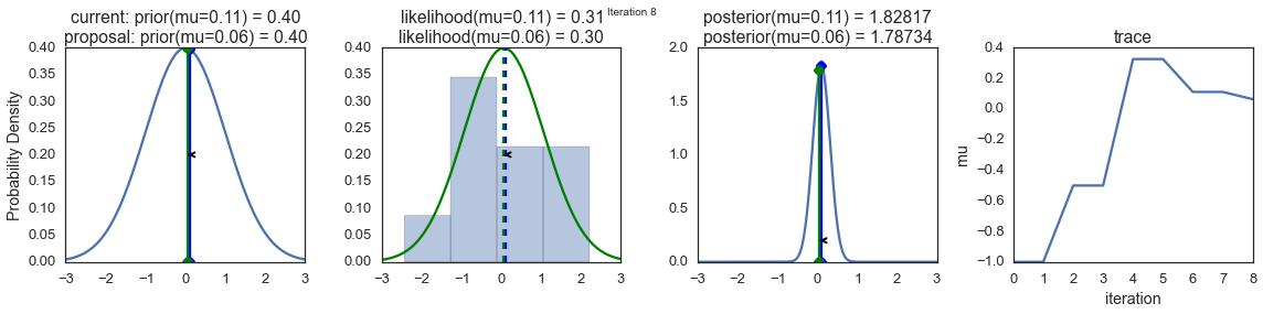
In order to visualize the sampling process, we draw graphs of some calculated values. Each row of images represents a single pass of the Metropolis sampler.
The first column shows the prior probability distribution, that is, our assumptions about μ before getting acquainted with the data. As you can see, this distribution does not change, we just show here the proposals of the new value μ. Vertical blue lines are current μ. And the proposed μ is displayed in either green or red (these are, respectively, accepted and rejected sentences).
In the second column, the likelihood function and what we use to evaluate how well the model explains the data. Here you can see that the graph changes in accordance with the proposed μ. A blue histogram is also displayed there - the data itself. The solid line is displayed either in green or in red - this is the graph of the likelihood function with mu proposed in the current step. It is intuitively clear that the stronger the likelihood function overlaps with a graphical display of data, the better the model explains the data and the higher the resulting probability. The dotted line of the same color is the proposed mu , the dotted blue line is the current mu .
The third column is the a posteriori probability distribution. The normalized a posteriori distribution is shown here, but, as we explained above, you can simply multiply the previous value for the current and proposed μ by the value of the likelihood function for two μ in order to get the non-normalized values of the posterior distribution (which we use for real calculations), and divide one by the other in order to get the probability of accepting the proposed value.
The fourth column presents the trace of the sample, that is, the values of μ, the samples obtained on the basis of the model. Here we show each sample, regardless of whether it was accepted or rejected (in this case, the line does not change).
Pay attention that we always move to relatively more likely values of μ (in terms of the density of their posterior probability distribution) and only sometimes to relatively less likely values of μ. For example, as in iteration # 1 (numbers of iterations can be seen in the upper part of each row of images in the center.


MCMC Visualization
The remarkable feature of MCMC is that in order to get the desired result, the process described above just needs to be repeated for a long time. Samples generated in this way are taken from the a posteriori probability distribution of the model under study. There is a rigorous mathematical proof that ensures that this is exactly what will happen, but here I don’t want to go into such details.
In order to get an idea of what kind of data the system produces, let's generate a large number of samples and present them graphically.

Visualization of 15,000 samples
This is commonly referred to as a sample trace. Now, in order to obtain an approximate value of the posterior probability distribution (strictly speaking, this is what we need), it is sufficient to construct a histogram of this data. It is important to remember that although the data obtained is similar to the ones we were sampling to fit the model, these are two different data sets.
The graph below reflects our understanding of what mu should be. In this case, it turned out that he also demonstrates a normal distribution, but for another model he could have a completely different form than the graph of the likelihood function or a priori probability distribution.

Analytical and estimated a posteriori probability distributions
As you can see, following the above method, we obtained samples from the same probability distribution that was obtained analytically.
Above, we set the interval from which the proposed values are selected to be 0.5. It is this value that turned out to be very successful. In general, the width of the range should not be too small, otherwise the sampling will be ineffective, since it will take too much time to study the parameter space and the model will show typical behavior for random walk.
Here, for example, what we got by setting the proposal_width parameter to 0.01.

Result of using too small a range.
Too long a spacing will not work either - the values proposed for the transition will be constantly rejected. This is what happens if you set the proposal_width to 3.

Result of using too much range
However, pay attention to the fact that we here continue to take samples from the target a posteriori distribution, as guaranteed by mathematical proof. But this approach is less effective.

Small and large stride size
Using a large number of iterations, what we have, in the end, will look like a real a posteriori distribution. The main thing is that we need the samples to be independent of each other. In this case, this is obviously not the case. In order to evaluate the effectiveness of our sampler, you can use the autocorrelation index. That is, find out how sample i correlates with sample i-1 , i-2 , and so on.

Autocorrelation for small, medium and large step sizes
Obviously, I would like to have an intelligent way to automatically determine the appropriate step size. One of the most commonly used methods is to adjust the interval from which values are selected so that approximately 50% of the sentences are discarded. Interestingly, other MCMC algorithms, like the Monte-Carlo Hybrid Method (Hamiltonian Monte Carlo) are very similar to the one we talked about. Their main feature is that they behave "smarter" when they put forward proposals for the next "jump."
It is now easy to imagine that we could add the sigma parameter for the standard deviation and follow the same procedure for the second parameter. In this case, the sentences for mu and sigma would be generated, but the logic of the algorithm would hardly change. Or we could take data from very different probability distributions, such as the binomial one, and, continuing to use the same algorithm, we would get the correct a posteriori probability distribution. It’s just great, it’s one of the huge benefits of probabilistic programming: it’s enough to determine the desired model and allow MCMC to do Bayesian output.
For example, the model below can be very easily described using PyMC3. Also, in this example, we use the Metropolis sampler (with an automatically adjustable width of the range from which the proposed values are taken) and see that the results are almost identical. You can experiment with this, change the distribution, for example. In the PyMC3 documentation you can find more complex examples and information on how this all works.
The results of the various samplers
Hopefully, we were able to convey to you the essence of MCMC, the Metropolis sampler, the probabilistic conclusion, and now you have an intuitive understanding of all this. So, you are ready to read the materials on this issue, saturated with mathematical formulas. , , .
Once I talked about a new Bayesian model to a person who did not particularly understand the subject, but really wanted to understand everything. He asked me something that I usually don’t touch. “Thomas,” he said, “and how, in fact, is probabilistic inference performed? How do these mysterious samples come from a posteriori probability? ”
Then I could say: “Everything is very simple. The MCMC generates samples from the a posteriori probability distribution, creating a reversible Markov chain, the equilibrium distribution of which is the target a posteriori distribution. Questions?
The explanation is correct, but how much benefit does it have for the uninitiated? What annoys me most is how they teach mathematics and statistics that nobody ever talks about the intuitive ideas that underlie all kinds of concepts. And these ideas are usually pretty simple. From such occupations you can take out three-storey mathematical formulas, but not an understanding of how everything works. I was taught that way, and I wanted to understand. For countless hours I was hitting my head against the mathematical walls, before the moment of the next epiphany came, before the next “Eureka!” Broke from my lips. After I managed to figure out what was previously difficult, it turned out to be surprisingly simple. What used to be scary with a jumble of mathematical signs became a useful tool.
')
This material is an attempt to provide an intuitive explanation of MCMC sampling (in particular, the Metropolis algorithm ). We will use code examples instead of formulas or mathematical calculations. Ultimately, one cannot do without formulas, but personally I think that it is best to start with examples and achieve an intuitive understanding of the issue before moving on to the language of mathematics.
The problem and its non-intuitive solution
Let's look at the Bayes formula:
We have P (θ | x) - what we are interested in, namely, the a posteriori probability, or the probability distribution of the parameters of the model θ, calculated after taking the x data taken from the observations into account. In order to get what we need, we need to multiply the a priori probability P (θ), that is, what we think about θ before conducting the experiments, before receiving the data, and the likelihood function P (x | θ), that is - what we think about how data is distributed. Numerator fraction is very easy to find.
Now let's look at the denominator P (x), which is also called evidence, that is, evidence that the x data was generated by this model. You can calculate it by integrating all possible values of the parameters:
This is the main complexity of the Bayes formula. It looks quite innocent itself, but even for a slightly non-trivial model, the posterior probability is not calculated in a finite number of steps.
Here you can say: “Well, if it is not directly solved, can we take the path of approximation? For example, if we could somehow get samples of the data from this very posterior probability, they could be approximated by the Monte Carlo method. but also invert it, so this approach is even more difficult.
Continuing the reflections, one can state: "Ok, then let's construct a Markov chain, the equilibrium distribution of which coincides with our a posteriori distribution." I, of course, joke. Most people do not say so, very much it sounds crazy. If it is impossible to calculate directly, it is also impossible to take samples from the distribution, then building a Markov chain with the above-mentioned properties is a very difficult task.
And here we are waiting for an amazing discovery. This is actually very easy to do. There is a whole class of algorithms for solving such problems: the Monte Carlo methods in Markov Chains ( Markov Chain Monte Carlo , MCMC). The essence of these algorithms is the creation of a Markov chain for performing Monte-Carlo approximation.
Formulation of the problem
First we import the necessary modules. The code blocks marked as “Listing” can be inserted into Jupyter Notebook and, as you read the material, try it out. See the full source here .
▍ Listing 1
%matplotlib inline import numpy as np import scipy as sp import pandas as pd import matplotlib.pyplot as plt import seaborn as sns from scipy.stats import norm sns.set_style('white') sns.set_context('talk') np.random.seed(123) Now we will generate the data. These will be 100 points normally distributed around zero. Our goal is to estimate the posterior distribution of the mean mu (assuming we know that the standard deviation is 1).
▍ Listing 2
data = np.random.randn(20) Now we will build a histogram.
▍ Listing 3
ax = plt.subplot() sns.distplot(data, kde=False, ax=ax) _ = ax.set(title='Histogram of observed data', xlabel='x', ylabel='# observations'); Histogram of observable data
Now we need to describe the model. We consider a simple case, so we assume that the data is distributed normally, that is, the likelihood function of the model is also normally distributed. As you must know, the normal distribution has two parameters — it is the mean (μ) μ and the standard deviation σ. For simplicity, we assume that we know that σ = 1. We want to derive the a posteriori probability for μ. For each desired parameter, it is necessary to select an a priori probability distribution. For simplicity, assume that the normal distribution is the prior distribution for μ. Thus, in the language of statistics, the model will look like this:
μ∼Normal(0,1) x|μ∼Normal(x;μ,1) What is especially convenient is that for this model, in fact, it is possible to calculate the posterior probability distribution analytically. The fact is that for a normal likelihood function with a known standard deviation, the normal a priori probability distribution for mu is a conjugate a priori distribution. That is, our a posteriori distribution will follow the same distribution as the a priori distribution. In summary, we know that the posterior distribution for μ is also normal. In Wikipedia, it is easy to find a method for calculating the parameters for the a posteriori distribution. A mathematical description of this can be found here .
▍ Listing 4
def calc_posterior_analytical(data, x, mu_0, sigma_0): sigma = 1. n = len(data) mu_post = (mu_0 / sigma_0**2 + data.sum() / sigma**2) / (1. / sigma_0**2 + n / sigma**2) sigma_post = (1. / sigma_0**2 + n / sigma**2)**-1 return norm(mu_post, np.sqrt(sigma_post)).pdf(x) ax = plt.subplot() x = np.linspace(-1, 1, 500) posterior_analytical = calc_posterior_analytical(data, x, 0., 1.) ax.plot(x, posterior_analytical) ax.set(xlabel='mu', ylabel='belief', title='Analytical posterior'); sns.despine() Analytical posterior distribution found
Here we are interested in what we are interested in, that is, the probability distribution for μ values after taking into account the available data, taking into account a priori information. Suppose, however, that the prior distribution is not conjugate and we cannot solve the problem, so to speak, manually. In practice, this is usually the case.
Code, as a way to understand the essence of MCMC-sampling
Now let's talk about sampling. First, you need to find the initial position of the parameter (you can choose it randomly). Let's set it arbitrarily like this:
mu_current = 1. Then it is proposed to move, "jump" from this position to some other place (this already applies to Markov's chains). This new position can be chosen and "at random", and guided by some deep considerations. The sampler in the Metropolis algorithm is as simple as five kopecks: it selects a sample from a normal distribution with a center in the current mu value ( mu_current variable) with a certain standard deviation ( proposal_width ) that determines the width of the range from which the proposed values are selected. Here we use scipy.stats.norm . It must be said that the above normal distribution has nothing to do with what is used in the model.
proposal = norm(mu_current, proposal_width).rvs() The next step is to assess whether a suitable location has been selected for the transition. If the obtained normal distribution with the proposed mu explains the data better than the previous mu , then in the chosen direction, it is certainly worth moving. But what does “data explain better”? We define this concept by calculating the probability of the data, taking into account the likelihood function (normal) with the proposed values of the parameters (proposed by mu and sigma , the value of which is fixed and equal to 1). The calculations here are simple. It is enough to calculate the probability for each data point using the scipy.stats.normal (mu, sigma) .pdf (data) command and then multiply the individual probabilities, that is, to find the value of the likelihood function. Usually in this case, use the logarithmic probability distribution, but here we omit it.
likelihood_current = norm(mu_current, 1).pdf(data).prod() likelihood_proposal = norm(mu_proposal, 1).pdf(data).prod() # mu prior_current = norm(mu_prior_mu, mu_prior_sd).pdf(mu_current) prior_proposal = norm(mu_prior_mu, mu_prior_sd).pdf(mu_proposal) # p_current = likelihood_current * prior_current p_proposal = likelihood_proposal * prior_proposal Up to this point, we, in fact, used the ascent to the top algorithm, which only suggests moving in random directions and adopts a new position only if mu_proposal has a higher likelihood level than mu_cu rrent. In the end, we come to the variant mu = 0 (or to a value close to this), from where there will be nowhere to move. However, we want to get a posterior distribution, so we must sometimes agree to move in another direction. The main secret here is that by dividing p_proposal by p_current , we get the probability of accepting an offer.
p_accept = p_proposal / p_current It can be noted that if p_proposal is greater than p_current , the resulting probability will be greater than 1, and we definitely will accept such a proposal. However, if p_current is more than p_proposal , say, twice, the transition chance will be 50% already:
accept = np.random.rand() < p_accept if accept: # cur_pos = proposal This simple procedure gives us samples from the posterior distribution.
Why is this all about?
Let us look back and note that the introduction into the system of the probability of accepting the proposed transition position is the reason why all this works and allows us to avoid integration. This is clearly seen when calculating the level of acceptance of a sentence for a normalized a posteriori distribution and observe how it relates to the level of acceptance of a sentence for a non-normalized posterior distribution (say, μ0 is the current position, and μ is the proposed new position):
If this is explained, then, by dividing the a posteriori probability that turned out for the proposed parameter to the one calculated for the current parameter, we get rid of the already annoying P (x), which we are not able to calculate. It can be intuitively understood that we divide the full posterior probability distribution in one position by the same in another position (quite a normal operation). Thus, we visit areas with a higher level of a posteriori probability distribution relatively more often than areas with a low level.
Fold the full picture
Putting the above together.
▍ Listing 5
def sampler(data, samples=4, mu_init=.5, proposal_width=.5, plot=False, mu_prior_mu=0, mu_prior_sd=1.): mu_current = mu_init posterior = [mu_current] for i in range(samples): # mu_proposal = norm(mu_current, proposal_width).rvs() # , likelihood_current = norm(mu_current, 1).pdf(data).prod() likelihood_proposal = norm(mu_proposal, 1).pdf(data).prod() # mu prior_current = norm(mu_prior_mu, mu_prior_sd).pdf(mu_current) prior_proposal = norm(mu_prior_mu, mu_prior_sd).pdf(mu_proposal) p_current = likelihood_current * prior_current p_proposal = likelihood_proposal * prior_proposal # ? p_accept = p_proposal / p_current # , accept = np.random.rand() < p_accept if plot: plot_proposal(mu_current, mu_proposal, mu_prior_mu, mu_prior_sd, data, accept, posterior, i) if accept: # mu_current = mu_proposal posterior.append(mu_current) return posterior # def plot_proposal(mu_current, mu_proposal, mu_prior_mu, mu_prior_sd, data, accepted, trace, i): from copy import copy trace = copy(trace) fig, (ax1, ax2, ax3, ax4) = plt.subplots(ncols=4, figsize=(16, 4)) fig.suptitle('Iteration %i' % (i + 1)) x = np.linspace(-3, 3, 5000) color = 'g' if accepted else 'r' # prior_current = norm(mu_prior_mu, mu_prior_sd).pdf(mu_current) prior_proposal = norm(mu_prior_mu, mu_prior_sd).pdf(mu_proposal) prior = norm(mu_prior_mu, mu_prior_sd).pdf(x) ax1.plot(x, prior) ax1.plot([mu_current] * 2, [0, prior_current], marker='o', color='b') ax1.plot([mu_proposal] * 2, [0, prior_proposal], marker='o', color=color) ax1.annotate("", xy=(mu_proposal, 0.2), xytext=(mu_current, 0.2), arrowprops=dict(arrowstyle="->", lw=2.)) ax1.set(ylabel='Probability Density', title='current: prior(mu=%.2f) = %.2f\nproposal: prior(mu=%.2f) = %.2f' % (mu_current, prior_current, mu_proposal, prior_proposal)) # likelihood_current = norm(mu_current, 1).pdf(data).prod() likelihood_proposal = norm(mu_proposal, 1).pdf(data).prod() y = norm(loc=mu_proposal, scale=1).pdf(x) sns.distplot(data, kde=False, norm_hist=True, ax=ax2) ax2.plot(x, y, color=color) ax2.axvline(mu_current, color='b', linestyle='--', label='mu_current') ax2.axvline(mu_proposal, color=color, linestyle='--', label='mu_proposal') #ax2.title('Proposal {}'.format('accepted' if accepted else 'rejected')) ax2.annotate("", xy=(mu_proposal, 0.2), xytext=(mu_current, 0.2), arrowprops=dict(arrowstyle="->", lw=2.)) ax2.set(title='likelihood(mu=%.2f) = %.2f\nlikelihood(mu=%.2f) = %.2f' % (mu_current, 1e14*likelihood_current, mu_proposal, 1e14*likelihood_proposal)) # posterior_analytical = calc_posterior_analytical(data, x, mu_prior_mu, mu_prior_sd) ax3.plot(x, posterior_analytical) posterior_current = calc_posterior_analytical(data, mu_current, mu_prior_mu, mu_prior_sd) posterior_proposal = calc_posterior_analytical(data, mu_proposal, mu_prior_mu, mu_prior_sd) ax3.plot([mu_current] * 2, [0, posterior_current], marker='o', color='b') ax3.plot([mu_proposal] * 2, [0, posterior_proposal], marker='o', color=color) ax3.annotate("", xy=(mu_proposal, 0.2), xytext=(mu_current, 0.2), arrowprops=dict(arrowstyle="->", lw=2.)) #x3.set(title=r'prior x likelihood $\propto$ posterior') ax3.set(title='posterior(mu=%.2f) = %.5f\nposterior(mu=%.2f) = %.5f' % (mu_current, posterior_current, mu_proposal, posterior_proposal)) if accepted: trace.append(mu_proposal) else: trace.append(mu_current) ax4.plot(trace) ax4.set(xlabel='iteration', ylabel='mu', title='trace') plt.tight_layout() #plt.legend() MCMC Visualization
In order to visualize the sampling process, we draw graphs of some calculated values. Each row of images represents a single pass of the Metropolis sampler.
The first column shows the prior probability distribution, that is, our assumptions about μ before getting acquainted with the data. As you can see, this distribution does not change, we just show here the proposals of the new value μ. Vertical blue lines are current μ. And the proposed μ is displayed in either green or red (these are, respectively, accepted and rejected sentences).
In the second column, the likelihood function and what we use to evaluate how well the model explains the data. Here you can see that the graph changes in accordance with the proposed μ. A blue histogram is also displayed there - the data itself. The solid line is displayed either in green or in red - this is the graph of the likelihood function with mu proposed in the current step. It is intuitively clear that the stronger the likelihood function overlaps with a graphical display of data, the better the model explains the data and the higher the resulting probability. The dotted line of the same color is the proposed mu , the dotted blue line is the current mu .
The third column is the a posteriori probability distribution. The normalized a posteriori distribution is shown here, but, as we explained above, you can simply multiply the previous value for the current and proposed μ by the value of the likelihood function for two μ in order to get the non-normalized values of the posterior distribution (which we use for real calculations), and divide one by the other in order to get the probability of accepting the proposed value.
The fourth column presents the trace of the sample, that is, the values of μ, the samples obtained on the basis of the model. Here we show each sample, regardless of whether it was accepted or rejected (in this case, the line does not change).
Pay attention that we always move to relatively more likely values of μ (in terms of the density of their posterior probability distribution) and only sometimes to relatively less likely values of μ. For example, as in iteration # 1 (numbers of iterations can be seen in the upper part of each row of images in the center.
▍ Listing 6
np.random.seed(123) sampler(data, samples=8, mu_init=-1., plot=True); MCMC Visualization
The remarkable feature of MCMC is that in order to get the desired result, the process described above just needs to be repeated for a long time. Samples generated in this way are taken from the a posteriori probability distribution of the model under study. There is a rigorous mathematical proof that ensures that this is exactly what will happen, but here I don’t want to go into such details.
In order to get an idea of what kind of data the system produces, let's generate a large number of samples and present them graphically.
▍ Listing 7
posterior = sampler(data, samples=15000, mu_init=1.) fig, ax = plt.subplots() ax.plot(posterior) _ = ax.set(xlabel='sample', ylabel='mu'); Visualization of 15,000 samples
This is commonly referred to as a sample trace. Now, in order to obtain an approximate value of the posterior probability distribution (strictly speaking, this is what we need), it is sufficient to construct a histogram of this data. It is important to remember that although the data obtained is similar to the ones we were sampling to fit the model, these are two different data sets.
The graph below reflects our understanding of what mu should be. In this case, it turned out that he also demonstrates a normal distribution, but for another model he could have a completely different form than the graph of the likelihood function or a priori probability distribution.
▍ Listing 8
ax = plt.subplot() sns.distplot(posterior[500:], ax=ax, label='estimated posterior') x = np.linspace(-.5, .5, 500) post = calc_posterior_analytical(data, x, 0, 1) ax.plot(x, post, 'g', label='analytic posterior') _ = ax.set(xlabel='mu', ylabel='belief'); ax.legend(); Analytical and estimated a posteriori probability distributions
As you can see, following the above method, we obtained samples from the same probability distribution that was obtained analytically.
The width of the range for sampling the proposed values
Above, we set the interval from which the proposed values are selected to be 0.5. It is this value that turned out to be very successful. In general, the width of the range should not be too small, otherwise the sampling will be ineffective, since it will take too much time to study the parameter space and the model will show typical behavior for random walk.
Here, for example, what we got by setting the proposal_width parameter to 0.01.
▍ Listing 9
posterior_small = sampler(data, samples=5000, mu_init=1., proposal_width=.01) fig, ax = plt.subplots() ax.plot(posterior_small); _ = ax.set(xlabel='sample', ylabel='mu'); Result of using too small a range.
Too long a spacing will not work either - the values proposed for the transition will be constantly rejected. This is what happens if you set the proposal_width to 3.
▍ Listing 10
posterior_large = sampler(data, samples=5000, mu_init=1., proposal_width=3.) fig, ax = plt.subplots() ax.plot(posterior_large); plt.xlabel('sample'); plt.ylabel('mu'); _ = ax.set(xlabel='sample', ylabel='mu'); Result of using too much range
However, pay attention to the fact that we here continue to take samples from the target a posteriori distribution, as guaranteed by mathematical proof. But this approach is less effective.
▍ Listing 11
sns.distplot(posterior_small[1000:], label='Small step size') sns.distplot(posterior_large[1000:], label='Large step size'); _ = plt.legend(); Small and large stride size
Using a large number of iterations, what we have, in the end, will look like a real a posteriori distribution. The main thing is that we need the samples to be independent of each other. In this case, this is obviously not the case. In order to evaluate the effectiveness of our sampler, you can use the autocorrelation index. That is, find out how sample i correlates with sample i-1 , i-2 , and so on.
▍ Listing 12
from pymc3.stats import autocorr lags = np.arange(1, 100) fig, ax = plt.subplots() ax.plot(lags, [autocorr(posterior_large, l) for l in lags], label='large step size') ax.plot(lags, [autocorr(posterior_small, l) for l in lags], label='small step size') ax.plot(lags, [autocorr(posterior, l) for l in lags], label='medium step size') ax.legend(loc=0) _ = ax.set(xlabel='lag', ylabel='autocorrelation', ylim=(-.1, 1)) Autocorrelation for small, medium and large step sizes
Obviously, I would like to have an intelligent way to automatically determine the appropriate step size. One of the most commonly used methods is to adjust the interval from which values are selected so that approximately 50% of the sentences are discarded. Interestingly, other MCMC algorithms, like the Monte-Carlo Hybrid Method (Hamiltonian Monte Carlo) are very similar to the one we talked about. Their main feature is that they behave "smarter" when they put forward proposals for the next "jump."
Go to the more complex models.
It is now easy to imagine that we could add the sigma parameter for the standard deviation and follow the same procedure for the second parameter. In this case, the sentences for mu and sigma would be generated, but the logic of the algorithm would hardly change. Or we could take data from very different probability distributions, such as the binomial one, and, continuing to use the same algorithm, we would get the correct a posteriori probability distribution. It’s just great, it’s one of the huge benefits of probabilistic programming: it’s enough to determine the desired model and allow MCMC to do Bayesian output.
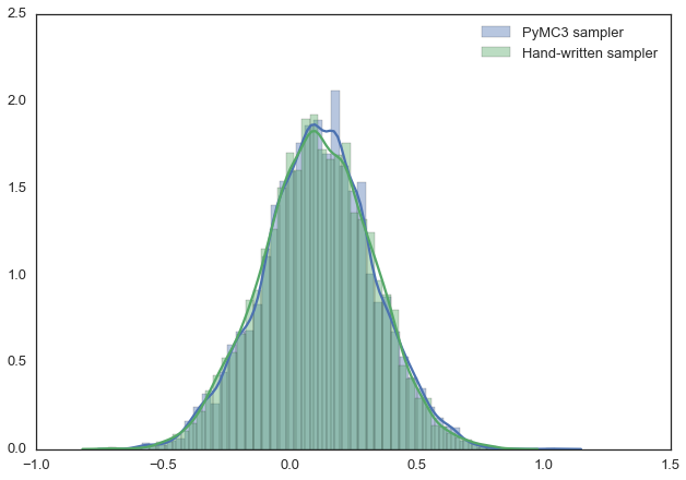
For example, the model below can be very easily described using PyMC3. Also, in this example, we use the Metropolis sampler (with an automatically adjustable width of the range from which the proposed values are taken) and see that the results are almost identical. You can experiment with this, change the distribution, for example. In the PyMC3 documentation you can find more complex examples and information on how this all works.
▍ Listing 13
import pymc3 as pm with pm.Model(): mu = pm.Normal('mu', 0, 1) sigma = 1. returns = pm.Normal('returns', mu=mu, sd=sigma, observed=data) step = pm.Metropolis() trace = pm.sample(15000, step) sns.distplot(trace[2000:]['mu'], label='PyMC3 sampler'); sns.distplot(posterior[500:], label='Hand-written sampler'); plt.legend(); The results of the various samplers
Let's sum up
Hopefully, we were able to convey to you the essence of MCMC, the Metropolis sampler, the probabilistic conclusion, and now you have an intuitive understanding of all this. So, you are ready to read the materials on this issue, saturated with mathematical formulas. , , .
, ? :)
Source: https://habr.com/ru/post/279545/
All Articles