No one wants to use your product.
Every morning, designers wake up to work with pleasure on their products, whether it be digital or material projects, with the inner confidence that people will want to use their products and thus there will be an explosive growth.
Perhaps this is a small generalization; nevertheless, as designers, we strive for a natural desire for each project we work with - so that it is as best as possible, innovative, and most importantly - unique.
')

Here is a little revelation. People don't really get into the details using your product. Any time the user spends interacting with the interface, twisting the knobs, pulling the toggle switches, or pressing the buttons is lost time. Rather, people are more interested in the end result and in achieving this result in the fastest, least annoying and most effective way. And these are two fundamentally different concepts — use versus result — that ultimately distinguish good product design from poor design, or on a smaller scale, a good feature from a bad one.
I still find a lot of products today, whether digital or material - being very complex and crammed with features . Shouldn't we, as a designer, instead, look to reduce the complexity for users as much as possible or as much as the technology allows, making it so that our product is implemented more invisibly into their daily life and routine? I feel that we simply do not do this, and it is more disturbing that we are still not learning from the past.
If we postpone 15-20 years ago, web design meant only visual design. Older readers will remember the days of the 2advanced studio and other blockbuster sites. They were fancy websites, with amazing flash-animation and carefully made pictures and details. If we looked at these websites today through a filter of modern UX design, we could definitely say that there was less experience then desire.
Advertising was less than desired.
Would anyone want to stare at the bootloader today for 5 minutes before getting to the site? Perhaps if they are desperate to buy tickets for a concert — otherwise, the answer will always be definitely no. There were even preloaders to downloaders, because the downloaders were so complicated! Such websites were essentially created to delight, they were an object of art, and the real user benefit in the form of the result was secondary, if that.
Perhaps, in those days, we didn’t know anything better because we, people, are rarely interested in something from other areas, and we are terribly transferring knowledge gained in one area to another. There were no courses or best practices available for the web, but after a while, with the development of digital design (covering interaction, design, interface, and animation design), we came to understand that the less time a user spends on the site - especially if it is then the tool or service is all the better.
Who would have thought in the first days of Google search that Google would want to speed up the search process by milliseconds so that the user could leave Google as soon as possible. Google was among the first digital companies that embodied or simply borrowed knowledge from other industries at the same time, the fact that time spent on interaction with the product as such is lost time, and that the shortest way to the result is the best way to design a product.
If you think about it, do you really want to work on warming your food or do you just want the food to be hot? That is why microwaves can be found in almost every modern kitchen, they saved us from the maximum possible amount of work on heating food . Of course, quite a lot of manufacturers have not yet realized this and produce their microwaves too complex, with too many buttons and settings.
An ordinary manufacturer still thinks that users stand in front of their microwaves and think for a few minutes - what fine tuning to set and then press a series of buttons to launch their detailed warm-up plan. In reality, everyone needs only two settings - power and time. Honestly, in most cases, people only need time setting. A typical scenario - when you throw a plate of food in the microwave, set the time and everything.
The company "August Smart Lock" is on this path. In August, they realized that users do not want to manually lock and unlock the door . What users really want is for their home to close when they leave and automatically open when they approach the door. (Lyrical digression: Actually, this is not all that users want. Users want security that can potentially be solved other than blocking the door, but we will not dive into the details of this.)
Dealing with the security question, do people really want to enter a password to unlock their phone, or just want the phone to be accessible only to them (and other people from the white list), while remaining locked to everyone else? That is why the presentation of the Apple Touch ID was such an important event, it ultimately provided a reliable and convenient way to lock the phone, eliminating all the difficulties of unlocking it. Using Touch ID gives you the feeling that the phone is not locked at all - as soon as you press the home button so that the phone wakes up, the phone will unlock.
This difference in approach — creating features versus creating results — can be found in a variety of products today, both digital and material. The main reason why products are great is that they provide unloading users and help them make decisions. If you inspect these products outside, you would think that their manufacturers did not want people to use them, on closer inspection, people use them, but in a seamless way, getting all the same benefits.
You may be familiar with the thermostat Nest Thermostat. What makes them great is that they learn from the habits and patterns of people living in the house — so transparently that users are completely excluded from this process. Sooner or later, they forget that they have a thermostat , as there is always an optimal temperature in their house.

We all like Dropbox. But do we really use it? Dropbox long ago imagined that people do not want to synchronize files between different devices, but, on the contrary, they want to manage and synchronize from the same available source . But even before the appearance of Dropbox, we could do all these syncs on our own: With ftp, we upload files to the server, go to the second computer and download files from the server, and so on. But why spend such an effort to keep files in sync? Most users do not want this; they just want their files to be synchronized.
At the dawn of Google search, the procedure was as follows: click on the search field, start typing, press Enter, and only then we get the search result. Moreover, the order of the search results had a simple logic, on the first page strange results were displayed. Many will recall how you had to look at the first few pages of search results. Good lord
However, as soon as technology and design allowed, Google began to eliminate all non-essential components. As of today, the autofocus of the cursor is on the input field , and the search results start to show as soon as you enter the first character using Google’s all-powerful computer brain, which provides the most relevant output. Hot keys also help to quickly follow the links. By pressing Tab you can switch to the mode when you can control the arrow from the keyboard and pressing Enter will open the active link.
Google search provides answers to many questions directly on the search results page. It is already widely known that this is an excellent calculator, it has evolved over time and provides more frequently used information and answers.

For example, you are looking for a company address, work time, calculate a currency rate, exchange quotes, or something else. As a result, it is often not necessary to go to another page unless more detailed information is required.

A good example of a government site is GOV.UK, which provides key information for each section at the very top of the page , freeing visitors from having to search for key information in large blocks of text. This site has taken a step forward by placing key information in the description of meta tags, making it available immediately on the search results page.

Amazon also impresses with the Dash button. The Dash button has an excellent design that frees the user from having to interact directly with the Amazon site at all. A button that buys from the Amazon site, in which one particular product is hard-wired.
During a rather simple setup process, done using a phone via a bluetooth connection, the user specifies a particular brand product that is attached to the button indicating the size, taste, color, and so on, depends on the available options for the specific item. Once configured, clicking on the button automatically starts a chain of commands , which results in goods delivered to the customer. All the magic happens behind the scenes.
Dash Button - Consumer's Dream!
Moreover, when Amazon gets delivery by drones, the delivered product will be delivered to the destination in a matter of minutes.
And I know you are thinking about the following: Amazon Sensor will share with Amazon Teleport - a detector in the house that will detect when the toilet paper is over, the result will be immediate replenishment. People do not want them to go to the store, walk between the shelves, stand in line, talk to the cashier, go back and then run to the toilet with a red face. All users want their toilet paper to always be in their home.
Apple realized that most users don’t want to make an effort by constantly checking when an application needs to be updated. And now updates occur automatically while the computer is sleeping or not in use, meaning that the user will return and detect the new version and launch with little or no involvement on his part.

In this place, I could smash water in a mortar, but in strong contrast with Apple, consider how Adobe handles updates to its Flash player. With each update, the Mac user must download the new DMG file, manually launch its installer and restart the browser. This is a painful process that forces the user to participate. Is it "so much" nowadays, asking that the program be updated automatically all the time to the latest version?

You probably understand what I'm doing. As mentioned - this is an obvious barrier. Users do not always want to create an account, usually they just want to enter the site. No one wants to go through the annoying process of driving in emails or worse — username (when faced with “Sorry, username is busy”, ..., “Sorry, username2 is also busy”), password (“Sorry, your password must contain one capital letter, one uppercase and one digit "), blood type, mother's maiden name, and in the end to confirm your email. No one wants to use the registration form.
Users just want to get something without messing around with the interface.
Removing the interface as much as possible is quite an old concept. Books have been written about it, discussions are the same, and strong designers such as Oliver Reichenstein are repeated again and again. People such as Luke Wroblewski suggest that we use this paradigm to go too far as a demonstration of getting closer to a interfaceless solution , Apple Watch is the latest version of the operating system for smartphones, which forces users to remember intricate ways to navigate the interface with various gestures.
Yes, designers sometimes go too far, sacrificing comfort for aesthetics and harmony. However, when the design (in the sense of “how the thing works”) is fully completed, the cuts benefit the user.
Some people still do not seem to understand this concept of reducing and removing each design element. This brings us to the point where production workers (not so much users as people who work on the Internet) begin to feel that all websites start to look the same.
Headlines are made to look the same. The look works because users immediately understand what is happening: the logo on the left, the login form on the right, maybe there is a search. This is standardized because it causes fewer actions, fewer forces to “use” the website, and this allows users to get the result they need.
All websites of the same type are the same - all online stores are the same, all blogs are the same, all news sites, all portfolios. The user recognizes patterns that are good because they allow them to complete their tasks faster. They don't need to worry about where things are. They simply consume the content, instead of trying to unravel cryptic patterns, unreadable fonts, or clever ways to interact.
We made the registration form the same because they work: email, password, and a button. Or, even more simplified - just click on one button to log in via Facebook, Google or Twitter.
We made the pictures in the same way , because it works: large, clean photos, with the ability to zoom in for viewing details. We show smiling happy people, because psychologists tell us that people react to it. We show high-quality photos of the resting places, because travelers are attracted to such views. They convert better.
We made a big “call to action” with ultra-readable text , because people don't want to search for these buttons, they just want to complete their task. We dwell on typography, carefully select the font size and indents, for one single purpose - to minimize time and enhance the visual impression of the brand. We do this because users don't want to read, they just want content.
We know what the past looked like, what the present looks like, and what do we have for designers? I think that the interfaces will be further minimized, and nonsense will happen and the information will float to the surface, not as it was with the Nest thermostat and Google Now. Fresh milk will be delivered to your door as soon as the last bottle ends. Applications will be updated on their own, instead of manually updating. Phones will be magically charged continuously, instead of manually charging.
Maps will automatically pave the route bypassing traffic jams. Information will become available depending on the context of the user. Be made available according to the environment. Registration forms will not bother people. Let's hope that the passwords disappear altogether, will be replaced by the same reliable fingerprint reading or something even better. (Another prediction: Apple integrates Touch IDs into trackpads on their laptops. Not this year, not next year, but soon, Apple will finally send the password to the warehouse and eliminate the suffering associated with it.)
Understand that your product is a necessary evil . Understand that it would be better for the user if your product did not exist at all, but he would still get the result in some magical way.
Expand and modify known patterns only when absolutely necessary and only if it really makes it easier for the user to achieve his goals. Inventing hot water, for the sake of invention, does not make sense. (I know that this is just chatter, but in fact we have to reinvent the wheel. If we didn’t re-invent the wheel, we would have a stone wheel. Hot water does not need to be reinvented.)
Soon the time will come when you yourself or your competitor will create a better version of your product , and this product will leave a smaller mark on the lives of users, offering better benefits.
We have to add both a small complexity and a technically possible user to get a result. Suppose that we were instructed to redesign the process of delivery to work. Guided by our basic principles, we must begin by assuming that people do not want change, they just want everything to be the way it should be.
Perhaps this is a small generalization; nevertheless, as designers, we strive for a natural desire for each project we work with - so that it is as best as possible, innovative, and most importantly - unique.
Oh, my friend, my product will be stunning! It will be filled with functionality, options and settings. People will use it every day and love to use it!
- Designer
')
Here is a little revelation. People don't really get into the details using your product. Any time the user spends interacting with the interface, twisting the knobs, pulling the toggle switches, or pressing the buttons is lost time. Rather, people are more interested in the end result and in achieving this result in the fastest, least annoying and most effective way. And these are two fundamentally different concepts — use versus result — that ultimately distinguish good product design from poor design, or on a smaller scale, a good feature from a bad one.
I still find a lot of products today, whether digital or material - being very complex and crammed with features . Shouldn't we, as a designer, instead, look to reduce the complexity for users as much as possible or as much as the technology allows, making it so that our product is implemented more invisibly into their daily life and routine? I feel that we simply do not do this, and it is more disturbing that we are still not learning from the past.
The beginning of the web design era
If we postpone 15-20 years ago, web design meant only visual design. Older readers will remember the days of the 2advanced studio and other blockbuster sites. They were fancy websites, with amazing flash-animation and carefully made pictures and details. If we looked at these websites today through a filter of modern UX design, we could definitely say that there was less experience then desire.
Advertising was less than desired.
Would anyone want to stare at the bootloader today for 5 minutes before getting to the site? Perhaps if they are desperate to buy tickets for a concert — otherwise, the answer will always be definitely no. There were even preloaders to downloaders, because the downloaders were so complicated! Such websites were essentially created to delight, they were an object of art, and the real user benefit in the form of the result was secondary, if that.
Perhaps, in those days, we didn’t know anything better because we, people, are rarely interested in something from other areas, and we are terribly transferring knowledge gained in one area to another. There were no courses or best practices available for the web, but after a while, with the development of digital design (covering interaction, design, interface, and animation design), we came to understand that the less time a user spends on the site - especially if it is then the tool or service is all the better.
Who would have thought in the first days of Google search that Google would want to speed up the search process by milliseconds so that the user could leave Google as soon as possible. Google was among the first digital companies that embodied or simply borrowed knowledge from other industries at the same time, the fact that time spent on interaction with the product as such is lost time, and that the shortest way to the result is the best way to design a product.
Isolation of the result
If you think about it, do you really want to work on warming your food or do you just want the food to be hot? That is why microwaves can be found in almost every modern kitchen, they saved us from the maximum possible amount of work on heating food . Of course, quite a lot of manufacturers have not yet realized this and produce their microwaves too complex, with too many buttons and settings.
An ordinary manufacturer still thinks that users stand in front of their microwaves and think for a few minutes - what fine tuning to set and then press a series of buttons to launch their detailed warm-up plan. In reality, everyone needs only two settings - power and time. Honestly, in most cases, people only need time setting. A typical scenario - when you throw a plate of food in the microwave, set the time and everything.
The company "August Smart Lock" is on this path. In August, they realized that users do not want to manually lock and unlock the door . What users really want is for their home to close when they leave and automatically open when they approach the door. (Lyrical digression: Actually, this is not all that users want. Users want security that can potentially be solved other than blocking the door, but we will not dive into the details of this.)
Dealing with the security question, do people really want to enter a password to unlock their phone, or just want the phone to be accessible only to them (and other people from the white list), while remaining locked to everyone else? That is why the presentation of the Apple Touch ID was such an important event, it ultimately provided a reliable and convenient way to lock the phone, eliminating all the difficulties of unlocking it. Using Touch ID gives you the feeling that the phone is not locked at all - as soon as you press the home button so that the phone wakes up, the phone will unlock.
Excellent design solutions
This difference in approach — creating features versus creating results — can be found in a variety of products today, both digital and material. The main reason why products are great is that they provide unloading users and help them make decisions. If you inspect these products outside, you would think that their manufacturers did not want people to use them, on closer inspection, people use them, but in a seamless way, getting all the same benefits.
Nest Thermostat
You may be familiar with the thermostat Nest Thermostat. What makes them great is that they learn from the habits and patterns of people living in the house — so transparently that users are completely excluded from this process. Sooner or later, they forget that they have a thermostat , as there is always an optimal temperature in their house.
Dropbox
We all like Dropbox. But do we really use it? Dropbox long ago imagined that people do not want to synchronize files between different devices, but, on the contrary, they want to manage and synchronize from the same available source . But even before the appearance of Dropbox, we could do all these syncs on our own: With ftp, we upload files to the server, go to the second computer and download files from the server, and so on. But why spend such an effort to keep files in sync? Most users do not want this; they just want their files to be synchronized.
Google search form
At the dawn of Google search, the procedure was as follows: click on the search field, start typing, press Enter, and only then we get the search result. Moreover, the order of the search results had a simple logic, on the first page strange results were displayed. Many will recall how you had to look at the first few pages of search results. Good lord
However, as soon as technology and design allowed, Google began to eliminate all non-essential components. As of today, the autofocus of the cursor is on the input field , and the search results start to show as soon as you enter the first character using Google’s all-powerful computer brain, which provides the most relevant output. Hot keys also help to quickly follow the links. By pressing Tab you can switch to the mode when you can control the arrow from the keyboard and pressing Enter will open the active link.
Google search results
Google search provides answers to many questions directly on the search results page. It is already widely known that this is an excellent calculator, it has evolved over time and provides more frequently used information and answers.
For example, you are looking for a company address, work time, calculate a currency rate, exchange quotes, or something else. As a result, it is often not necessary to go to another page unless more detailed information is required.
GOV.UK website pages
A good example of a government site is GOV.UK, which provides key information for each section at the very top of the page , freeing visitors from having to search for key information in large blocks of text. This site has taken a step forward by placing key information in the description of meta tags, making it available immediately on the search results page.
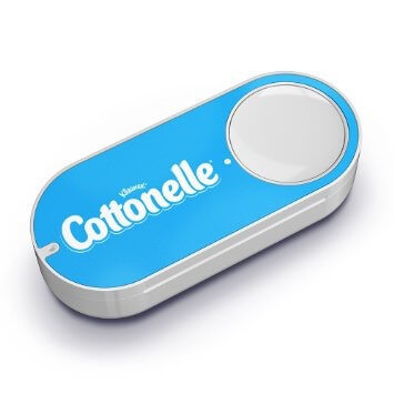
Amazon's Dash Button
Amazon also impresses with the Dash button. The Dash button has an excellent design that frees the user from having to interact directly with the Amazon site at all. A button that buys from the Amazon site, in which one particular product is hard-wired.
During a rather simple setup process, done using a phone via a bluetooth connection, the user specifies a particular brand product that is attached to the button indicating the size, taste, color, and so on, depends on the available options for the specific item. Once configured, clicking on the button automatically starts a chain of commands , which results in goods delivered to the customer. All the magic happens behind the scenes.
Dash Button - Consumer's Dream!
Moreover, when Amazon gets delivery by drones, the delivered product will be delivered to the destination in a matter of minutes.
And I know you are thinking about the following: Amazon Sensor will share with Amazon Teleport - a detector in the house that will detect when the toilet paper is over, the result will be immediate replenishment. People do not want them to go to the store, walk between the shelves, stand in line, talk to the cashier, go back and then run to the toilet with a red face. All users want their toilet paper to always be in their home.
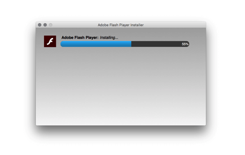
App Store Updates
Apple realized that most users don’t want to make an effort by constantly checking when an application needs to be updated. And now updates occur automatically while the computer is sleeping or not in use, meaning that the user will return and detect the new version and launch with little or no involvement on his part.
In this place, I could smash water in a mortar, but in strong contrast with Apple, consider how Adobe handles updates to its Flash player. With each update, the Mac user must download the new DMG file, manually launch its installer and restart the browser. This is a painful process that forces the user to participate. Is it "so much" nowadays, asking that the program be updated automatically all the time to the latest version?
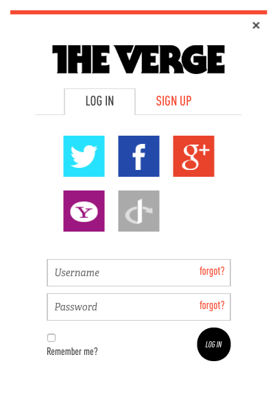
User authentication like Facebook Connect
You probably understand what I'm doing. As mentioned - this is an obvious barrier. Users do not always want to create an account, usually they just want to enter the site. No one wants to go through the annoying process of driving in emails or worse — username (when faced with “Sorry, username is busy”, ..., “Sorry, username2 is also busy”), password (“Sorry, your password must contain one capital letter, one uppercase and one digit "), blood type, mother's maiden name, and in the end to confirm your email. No one wants to use the registration form.
Users just want to get something without messing around with the interface.
Decrease and Disposal of the Interface
Removing the interface as much as possible is quite an old concept. Books have been written about it, discussions are the same, and strong designers such as Oliver Reichenstein are repeated again and again. People such as Luke Wroblewski suggest that we use this paradigm to go too far as a demonstration of getting closer to a interfaceless solution , Apple Watch is the latest version of the operating system for smartphones, which forces users to remember intricate ways to navigate the interface with various gestures.
Yes, designers sometimes go too far, sacrificing comfort for aesthetics and harmony. However, when the design (in the sense of “how the thing works”) is fully completed, the cuts benefit the user.
Some people still do not seem to understand this concept of reducing and removing each design element. This brings us to the point where production workers (not so much users as people who work on the Internet) begin to feel that all websites start to look the same.
Headlines are made to look the same. The look works because users immediately understand what is happening: the logo on the left, the login form on the right, maybe there is a search. This is standardized because it causes fewer actions, fewer forces to “use” the website, and this allows users to get the result they need.
All websites of the same type are the same - all online stores are the same, all blogs are the same, all news sites, all portfolios. The user recognizes patterns that are good because they allow them to complete their tasks faster. They don't need to worry about where things are. They simply consume the content, instead of trying to unravel cryptic patterns, unreadable fonts, or clever ways to interact.
We made the registration form the same because they work: email, password, and a button. Or, even more simplified - just click on one button to log in via Facebook, Google or Twitter.
We made the pictures in the same way , because it works: large, clean photos, with the ability to zoom in for viewing details. We show smiling happy people, because psychologists tell us that people react to it. We show high-quality photos of the resting places, because travelers are attracted to such views. They convert better.
We made a big “call to action” with ultra-readable text , because people don't want to search for these buttons, they just want to complete their task. We dwell on typography, carefully select the font size and indents, for one single purpose - to minimize time and enhance the visual impression of the brand. We do this because users don't want to read, they just want content.
What awaits us in the future?
We know what the past looked like, what the present looks like, and what do we have for designers? I think that the interfaces will be further minimized, and nonsense will happen and the information will float to the surface, not as it was with the Nest thermostat and Google Now. Fresh milk will be delivered to your door as soon as the last bottle ends. Applications will be updated on their own, instead of manually updating. Phones will be magically charged continuously, instead of manually charging.
Maps will automatically pave the route bypassing traffic jams. Information will become available depending on the context of the user. Be made available according to the environment. Registration forms will not bother people. Let's hope that the passwords disappear altogether, will be replaced by the same reliable fingerprint reading or something even better. (Another prediction: Apple integrates Touch IDs into trackpads on their laptops. Not this year, not next year, but soon, Apple will finally send the password to the warehouse and eliminate the suffering associated with it.)
- We will design the process, not the screens.
- We will design systems, not individual parts.
- We will design less “use”, and more getting results.
what can you do
Remember that your product is a hindrance
Understand that your product is a necessary evil . Understand that it would be better for the user if your product did not exist at all, but he would still get the result in some magical way.
Use known patterns
Expand and modify known patterns only when absolutely necessary and only if it really makes it easier for the user to achieve his goals. Inventing hot water, for the sake of invention, does not make sense. (I know that this is just chatter, but in fact we have to reinvent the wheel. If we didn’t re-invent the wheel, we would have a stone wheel. Hot water does not need to be reinvented.)
Don't fall for your product
Soon the time will come when you yourself or your competitor will create a better version of your product , and this product will leave a smaller mark on the lives of users, offering better benefits.
We work in the opposite direction
We have to add both a small complexity and a technically possible user to get a result. Suppose that we were instructed to redesign the process of delivery to work. Guided by our basic principles, we must begin by assuming that people do not want change, they just want everything to be the way it should be.
- Following in the opposite direction, teleportation should be the ideal method to solve the question of time and waste in moving. Because teleportation has "small" technical limitations at the moment, we need to leave some difficulties for the user.
- User. Let's look at the complexity of the car. But we note that we consider only the box itself - an empty shell, meaning - without any difficulties for the user. The difficulty is on our side (designers and engineers) and we need to automate the movement of the car and create a solution for ordering the machine and telling it where to deliver the user. The law of conservation of complexity states, like the law of conservation of energy, that it cannot be destroyed, it can be moved and distributed. (In the meantime, Tesla has updated its cars with autopilot function.)
- At the time of this writing, fully automated cars without a driver are still not available to the average buyer, unfortunately. The problems are more legal than technical. So we have to introduce a piece of complexity called “driver” . Note that the driver is no longer a user. The complexity of driving is now transferred from the user, and the proposed “solution” handles the order process, the choice of destination and the handling of all other logistics tasks that accompany this process, such as payment.
- If we remove the platform that allows other people to interact as a driver (“taxi” platform), we will move the complexity of driving to the user. This is a tremendous challenge because it requires the user to have a lot of licenses and a lot of knowledge.
Presenting the last level of complexity, the user will have to know not only how to drive and drive with a car, but also to be a good mechanic as well. In addition, the car itself is not very user-friendly and requires constant care to keep working. Hello, Mr. Ford, glad to see you.
Source: https://habr.com/ru/post/279261/
All Articles