Charts and other usefulness for UWP applications

I was surprised that there was not a single publication about the XAML Toolkit at Habré and therefore decided to fill this gap. Despite the fact that the project is now in a freezing stage, its utility does not diminish from this. It was created for Windows 8.x applications, but was later ported under UWP. This open-source project is a personal project of the Filip Skakun developer.
The controls from this toolkit are a good alternative to paid controls from Syncfusion and Telerik.
Under the cut about how you can do all sorts of interesting things with a hammer and such and such a toolkit.
I’ll start with a small diagramming manual for UWP applications.
As for diagrams, this control was ported by Mahmoud Moussa to the Xaml Toolkit from the Silverlight Toolkit.
')
Charts
So, create a universal Windows application project.
Find and install WinRTXamlToolkit.Controls.DataVisualisation.UWP in NuGet .
After installing the NuGet package, it is already possible to add code for the controls contained in the toolkit into the XAML code. But for convenience, you can add a list of items to the item panel. Let's do it like this.
Open the panel of elements (if it is not open). Go to the "View" menu and select "Toolbox".
Now create a new tab and name it XAML Toolkit (or as you like):
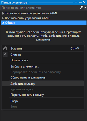
Open the newly created tab. There is no control in it yet. Calling the context menu click "Select elements":

In the window that opens, go to the tab "Universal Windows Components":
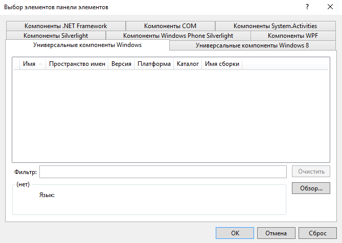
If it turned out to be empty (as in my case), then click the "Browse" button and open the directory a la
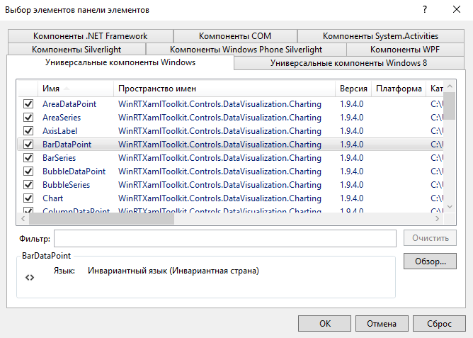
C: \ Users \ username \ .nuget \ packages \ WinRTXamlToolkit.Controls.DataVisualization.UWP \ 1.9.4
Select the WinRTXamlToolkit.Controls.DataVisualization.dll file.
We’ll get something like this:
By clicking "OK" we will be able to use additional controls in our project. They can be dragged to XAML code from the toolbox. After dragging an item into the page, the link will be automatically added to the XAML header:
xmlns:Charting="using:WinRTXamlToolkit.Controls.DataVisualization.Charting" And in the C # code you need to add:
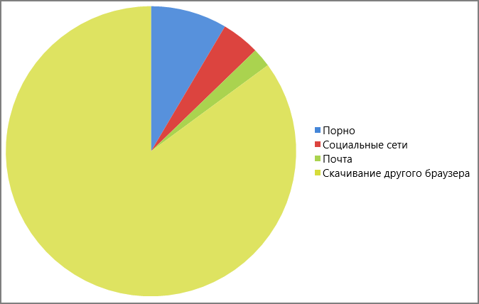
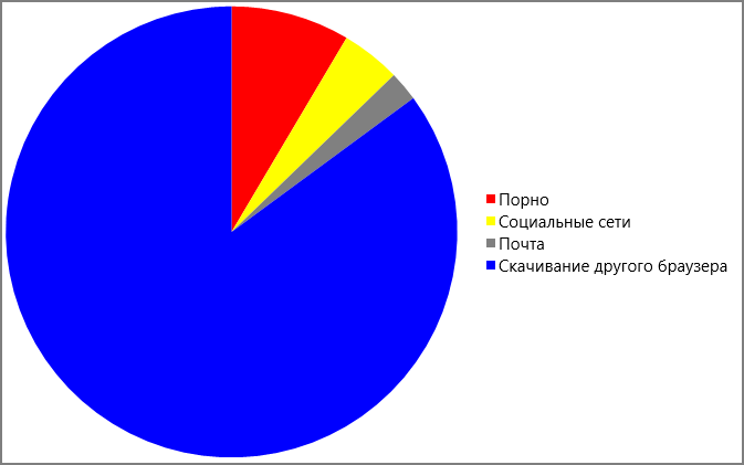
using WinRTXamlToolkit.Controls.DataVisualization.Charting; For example, let's create a diagram of the target usage of Internet Explorer.
Add a class to our project that will contain the data structure of the diagram:
public class ChartData { public string DataName { get; set; } public int DataValue { get; set; } } Names I chose arbitrarily.
Now we add in the XAML control which will contain as data the fields of our newly created class:
<Charting:Chart x:Name="PieChart" Width="700" Height="500"> <Charting:PieSeries Title=" IE" Margin="0" IndependentValuePath="DataName" DependentValuePath="DataValue" IsSelectionEnabled="True"/> </Charting:Chart> And you can create data in the code-behind and link it to our diagram:
List<ChartData> ChartInfo = new List<ChartData>(); ChartInfo.Add(new ChartData() { DataName = "", DataValue = 20 }); ChartInfo.Add(new ChartData() { DataName = " ", DataValue = 10 }); ChartInfo.Add(new ChartData() { DataName = "", DataValue = 5 }); ChartInfo.Add(new ChartData() { DataName = " ", DataValue = 200 }); (PieChart.Series[0] as PieSeries).ItemsSource = ChartInfo; As a result, we get the following diagram:
If you do not like colors (for example, any bright color cuts the eyes), then you can change them. To do this, add a nested Chart.Palette element and fill the nested dictionary collection with the necessary styles (the number of dictionaries must match the amount of data). Changing the XAML to the following:
<Charting:Chart x:Name="PieChart" Width="700" Height="500"> <Charting:PieSeries Title=" IE" Margin="0" IndependentValuePath="DataName" DependentValuePath="DataValue" IsSelectionEnabled="True"/> <Charting:Chart.Palette> <Charting:ResourceDictionaryCollection> <ResourceDictionary> <Style x:Key="DataPointStyle" TargetType="Control"> <Setter Property="Background" Value="Red" /> </Style> </ResourceDictionary> <ResourceDictionary> <Style x:Key="DataPointStyle" TargetType="Control"> <Setter Property="Background" Value="Yellow" /> </Style> </ResourceDictionary> <ResourceDictionary> <Style x:Key="DataPointStyle" TargetType="Control"> <Setter Property="Background" Value="Gray" /> </Style> </ResourceDictionary> <ResourceDictionary> <Style x:Key="DataPointStyle" TargetType="Control"> <Setter Property="Background" Value="Blue" /> </Style> </ResourceDictionary> </Charting:ResourceDictionaryCollection> </Charting:Chart.Palette> </Charting:Chart> we will receive:
It is possible to create various types of diagrams.
For example, ColumnChart:
<Charting:Chart x:Name="ColumnChart" Width="700" Height="500"> <Charting:ColumnSeries Title=" " Margin="0" IndependentValuePath="DataName" DependentValuePath="DataValue" IsSelectionEnabled="True"/> </Charting:Chart> 
Or similar to her BarChart:
<Charting:Chart x:Name="BarChart" Width="700" Height="500"> <Charting:BarSeries Title=" " Margin="0" IndependentValuePath="DataName" DependentValuePath="DataValue" IsSelectionEnabled="True"/> </Charting:Chart> 
In addition, you can create a linear:
<Charting:Chart x:Name="LineChart" Width="700" Height="350"> <Charting:LineSeries Title=" " Margin="0" IndependentValuePath="DataName" DependentValuePath="DataValue" IsSelectionEnabled="True"/> </Charting:Chart> 
Or bubble:
<Charting:Chart x:Name="BubbleChart" Width="700" Height="350"> <Charting:BubbleSeries Title=" " Margin="0" IndependentValuePath="DataName" DependentValuePath="DataValue" IsSelectionEnabled="True"/> </Charting:Chart> 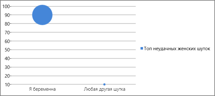
Similar article in English:
Using Graphs and Charts in Windows Store Apps - Boredom Challenge Day 11 .
It creates an application under Windows 8.x, but there are practically no differences from UWP.
Other Utility
If by adding WinRTXamlToolkit.Controls.DataVisualisation.UWP to the application, we were able to use diagrams, then by adding WinRTXamlToolkit.UWP in the same way, we will be able to use various interesting controls.
A good video describing the features of the XAML Toolkit (in English):
I will do a small overview of some useful controls.
In the header page XAML should be added link a la:
xmlns:Controls="using:WinRTXamlToolkit.Controls" A simple but useful control that allows you to set a hint in the text field.

<Controls:WatermarkTextBox WatermarkText=" " Width="200" /> Funny countdown counter
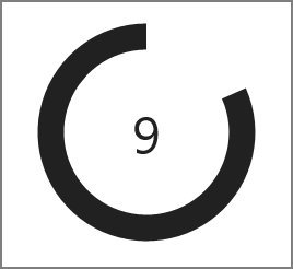
<Controls:CountdownControl Width="200" Height="200" /> Say, if you start it when you start the page, the code will be something like this:
protected async override void OnNavigatedTo(NavigationEventArgs e) { countC.CountdownComplete += CountC_CountdownComplete; await countC.StartCountdownAsync(10); // 10 } protected override void OnNavigatingFrom(NavigatingCancelEventArgs e) { countC.CountdownComplete -= CountC_CountdownComplete; } private void CountC_CountdownComplete(object sender, RoutedEventArgs e) { countC.Visibility = Visibility.Collapsed; } If you want, you can create such a counter yourself using the following controls, or you can display any information in a visual form:

<Controls:PieSlice StartAngle="20" EndAngle="280" Fill="Green" Radius="100" /> <Controls:RingSlice StartAngle="0" EndAngle="220" Fill="Pink" Radius="100" InnerRadius="75" /> With the help of the next control, the TextBlock will be displayed, but not simple, but with the effect of flying out one by one letters. You can not bother with the animation and do not use Blend.

<Controls:CascadingTextBlock Text=" " StartDelay="3000" /> Often the necessary control is a numeric field in which the values are increased by the "+" and "-" buttons:
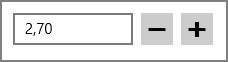
<Controls:NumericUpDown Width="200" Minimum="0" Maximum="100" SmallChange="0.1" LargeChange="10" /> And I also noticed the TreeView control:
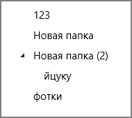
<Controls:TreeView> <Controls:TreeViewItem Header="123" /> <Controls:TreeViewItem Header=" " /> <Controls:TreeViewItem Header=" (2)"> <Controls:TreeViewItem Header="" /> </Controls:TreeViewItem> <Controls:TreeViewItem Header="" /> </Controls:TreeView> You can use the ColorPicker to choose a color, but it didn’t work for me as I would like. In addition, it is possible to use the HueRingPicker to select the H color shaping tone by HLS.
Not all controls from the XAML Toolkit are equally useful. Some features can be implemented independently using standard UWP tools, and some controls from the toolkit have completely lost their relevance with the release of the universal platform. For example, the functions of the InputDialog control from the XAML Toolkit, migrated to the standard ContentDialog control. Instead of the Webkrowser Toolkit, you can use the UWP web browser.
AutoCompleteTextBox became a UWP-shny AutoSuggestBox. UWP has CalendarDatePicker, TimePicker and DatePicker, which means Calendar Control for Windows 10 from the XAML Toolkit is now out of work.
In addition to obsolete items, the tulkite contains many items that, to my regret, were abandoned in UWP. Take, for example, layout elements. Such as DockPanel, WrapPanel and UniformGrid.
Elements of the XAML Toolkit, can be a good help in rapid development, and if you wish, you can also look at the source code to implement your counterpart.
A complete list of controls contained in the Xaml Toolkit with a brief description can be found on the project's GitHub page .
Source: https://habr.com/ru/post/278805/
All Articles