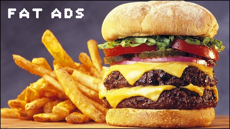
Crisis obesity sites
Translator's note: visit under the cut of this post means large amounts of consumed traffic. And this is ironic, given the topic raised. But everything immediately falls into place, if you remember that in the original it was a performance last November in Sydney, which was almost an hour long. Reading the post takes much less time. In the form of video (1280 × 720) speech takes two gigabytes. The post takes only 12 MiB. Viewing on wide monitors is recommended.
Before the beginning of the tirade, I would like to draw attention to the fact that great sites come in all shapes and sizes. And I'm not going to be ashamed of anyone here for the number of bits used, the amount of resources used, and so on. I love big juicy image galleries, I like huge experiments on JavaScript, I watch online videos in high resolution, like all of you. I think this is great.
')
The speech is not about that. I would like to talk about this public health crisis, this obesity sites. Great designers who think about the web like me or even more, for some reason make pages that get bigger. It will be a question of text-based sites, which for some incomprehensible reasons become more and more every year.
In this speech, I will give examples, because otherwise it would have turned out too abstract. And not for the sake of shaming anyone, except for a few big companies that I criticize for breaking the web. But I understand the individuals who work on these projects under pressure and coercion.
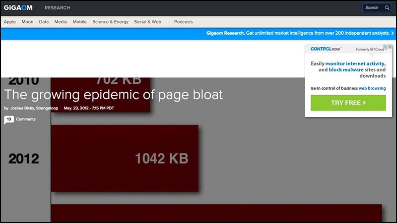 What is the obesity crisis sites? Here is the 2012 article from the Gigaom website, “The Growing Epidemic of Blowing Up Pages . She warns that the average page size is over a megabyte. The article itself has a size of 1.8 megabytes.
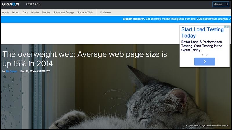 Here is almost the same article " Web with excess weight " from the same site from 2014, two years later. The article warns that the average page size is close to 2 megabytes.
The article itself has a size of 3 megabytes.
If this trend continues, articles with warnings about page sizes will be released over 5 megabytes by 2020.
The problem with choosing a specific size threshold is that this causes anomalies to become the norm 1 . What is considered to be a terribly bloated website today becomes tomorrow a typical page, and next year it will be an elegant, elegant design.
I would suggest fixing the size to something more permanent.
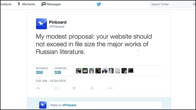 I repeat the suggestion that was made on Twitter : your website, if it is textual (like an article), should not exceed the main works of Russian literature in the file size.
This is a very generous measure. I could choose the French, where the novels are subtle. But I chose a Russian with its reputation for being heavy - big bricks of solid prose.
For example, in " Oblomov " 2 Goncharova title hero of the first hundred pages out of bed.
 If you open this tweet in a browser, you will see a 900 KB page.
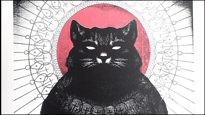
This is almost 100k more than the full text of The Master and Margarita , filled with the mystery and comedy of Bulgakov’s novel about the Devil, which is visited in Moscow with his retinue (including a huge cat!) During the Great Terror of 1937. The novel is interrupted by a parallel narration about the life of Pontius Pilate, Jesus Christ, and the faithful but unreliable apostle Matthew.
On one tweet.
This is a great book, and you should read it. This is a great tweet, and you’ve already read it. All I want to say is that they should not be the same size.
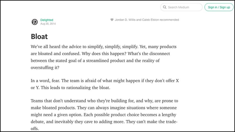 Or consider this article for 400 words on Medium. There is such a sentence:
“Teams that do not understand for whom and for what they create are prone to writing bloated products.”
The Medium team made it so that this bit of genius requires 1.2 megabytes.
 This is longer than the size of “ Crime and Punishment ”, Dostoevsky’s psychological thriller about a student who has been impoverished, who is filling his head with thoughts of Napoleon and forcing himself to kill an elderly usurer.
Tried to blame, so confused by his crime that he even forgot to take the money, Raskolnikov gets involved in a cat-and-mouse game with a cunning investigator, and then finds atonement in the incredible love of a holy prostitute.
Dostoevsky wrote all this in the light of a candle, by hand, with a pen, damn it.
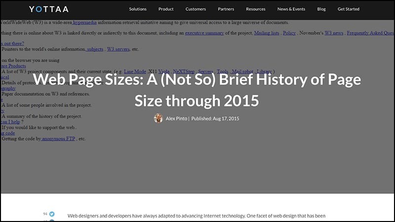 Here is a recent article, “ (Not so much) a brief history of puffiness on the web .”
It repeats the usual reasons why a blow-up is bad, but also includes this phrase: “heavy pages are often slow, and slow pages mean unlucky users.”
This quote could remind the famous line that opens the novel " Anna Karenina ":
 “All happy families are alike, each unhappy family is unhappy in its own way.”
 But not such a brief story of bloating on the web is much longer than Anna Karenina. The comparison is wrong, the novel lasts only 1.8 MB.
The real book to compare with is War and Peace , about 3 MB. This is Tolstoy’s reflection on the topic of whether certain people define the great events of history, or whether we are still sailing along an irresistible course of historical inevitability.
 Here's an article from the Yorkshire Evening Post, a typical representative of thousands of small-town news sites. She does not explore the relationship between time and personal will:
“ The hospital in Leeds apologizes for mixed curries and crumbles ” 3 .
 This painful story about mixing two dishes on a plate in a hospital could almost come from the pen of Marcel Proust, for whom soaking a piece of tea cake in tea was the starting point for an expanding spiral of vivid memories, 9 volumes and 3 megabytes of handwritten prose later crowned in the understanding that time and memory is only a deception of the senses.
Only the scripts in the article about curry and crumble are longer than “In Search of Lost Time”. The size of the whole article is almost 40 MB.
I have a suggestion that browsers show this weight somehow. Maybe they would fall, and then they would have to be raised because of the weight of the pages. So would have some kind of understanding of the enormity. This would work especially well on mobile devices: the parties could explode.
 I can continue in this spirit. And I will do it, because I like it!
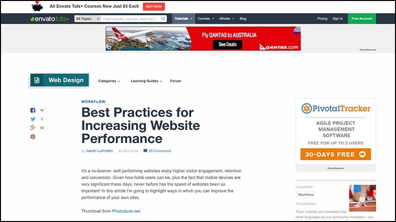
Here is an article on " Best Practices for Improving Online Productivity ." One simple method is to not make a 3.1 MB page.
The article mentions that Google was able to increase user involvement in Google Maps by reducing the page from 100 KB to 80 KB. Do you remember the times when Google Maps, the most advanced web application in that era, was thirty-five times smaller than a modern news article?
 Obesity on the web can take strange forms. For example, Tim Kadlek perfectly writes and speaks on the topic of performance. His personal website is a small model of thrift. Tim knows a lot about how to reduce bloating.
But slides from his recent performance talk are only available on a 9-megabyte page or in a 14-megabyte PDF.
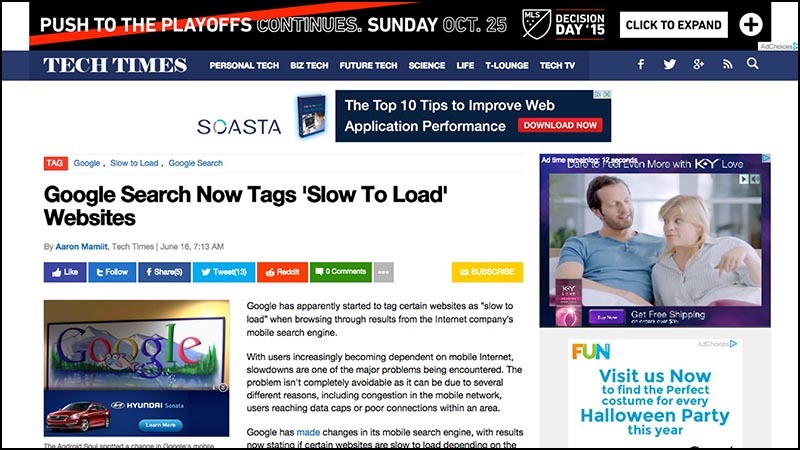 Let me finish with the great TechTimes article, which warns that Google is going to mark large pages with a special “slow” badge in issuing mobile search.
The article somehow manages to reach a size of 18 megabytes, including (in the preview I measured) a 3-megabyte video from KY Jelly, an “intimate lubricant.”
Today, you need a lot of intimate lubricant to roam the unfiltered web.
What kind of nonsense is happening?
 Everyone recognizes the problem. Similar pages are terrible on a laptop (my fan drove all three weeks that I was preparing a speech), and on mobile devices it is generally hell. And the publishers are taking action.
In May 2015, Facebook announced Instant Articles , a special format for news articles created for almost instant uploading to Facebook feed.
Facebook made this ad on a 6.8 megabyte page occupied by a portrait photo of some guy. It doesn't even work on Facebook, it’s just National Geographic photo editor.
Below on the page you can see a 41 MB video, the only way to learn about the project. In the video, the editor praises the most interesting uselessness of the new format, such as resizing photos around the rotation of the device. This means that if the phone does not hold smoothly, the photos will float like in a documentary by Ken Burns 4 .
 Facebook has also launched internet.org , an attempt to expand Internet access. The emotional page includes stories from people from various developing countries about what Internet access means to them.
Well, you know what will happen next. I left a tab with Internet.org and left for lunch, and when I returned, I discovered that she transferred more than a quarter of a gigabyte of data.
 But Maciej, you say. Couldn't this Earth be a giant 16 MB video file on which the planet rotates? But the way it is.
This is Facebook's message to the world: “The Internet is slow. Sit and rotate. ”
And a bad channel is not a third-world-specific problem! I’ve already done enough in Australia and I know that in rural areas in Tasmania and Queensland, vendors treat WiFi as a 100-year-old brandy.
You can buy as much as you want, but it costs a fortune and is given in tiny portions. And after the third or fourth portion, they look at you with surprise.
Even in places with good connectivity like Sydney, we encountered problems when the network signal is weak, the battery sits down, and you need to load some huge piece of the site with video and scripts and get an important piece of information from there like a restaurant's address.
 I have a simple solution: designers who do a puergu-like level of that Facebook page deserve capital punishment.
They need to be forced to use Apple's puck until the end of their career. [The listeners howled in horror.] If the years do not allow us to remember, then this is an ideal round mouse. It was impossible to figure out where the button was without looking at the mouse.
 Google has launched a competitor for Instant Articles, called Accelerated Mobile Pages . AMP is a special subset of HTML created for speed on mobile devices.
Why not give plain HTML without unnecessary bullshit? The question remained unanswered.
The AMP project is on display, open source, all sorts of different publishers are involved. Due to an oversupply of love for the mobile web, Google voluntarily took up hosting infrastructure. Especially for those parts that follow the user.
 Jeremy Keith showed me that the AMP description page is technically infinite in size. If you open it in Chrome, it will continue to endlessly download the same carousel from the video. In the image, this can be seen in the Morsean-like series of download lines, showing the relentless downloading of 3.4 megabytes of video over and over again.
Even if you open a page in Safari, where the merry-go-round is broken, the page still has time to go away 4 megabytes.
These comically large main pages of projects to speed up the web - the equivalent of watching a video about the exercises, where the speaker just stands and eats cookies.
The world's largest technology companies cannot make fast and lightweight tiny text-based websites for mobile devices describing their future flagship page-swelling products.
I can not imagine a stronger recognition of the defeat.
 Google AMP technical manager responded to us on Twitter . He admitted to having a blowup. He explained that there were resource constraints at Google, and the project had to be outsourced.
It made a deep emotional impression on me. I did not think that Google is in a quandary. We talk so much that Google is spoiling the web, and they can't afford to make a one-page website about a flagship product. Therefore, I scraped deep into the heart of compassion and spent a few hours of personal time doing my own static version of the AMP website .
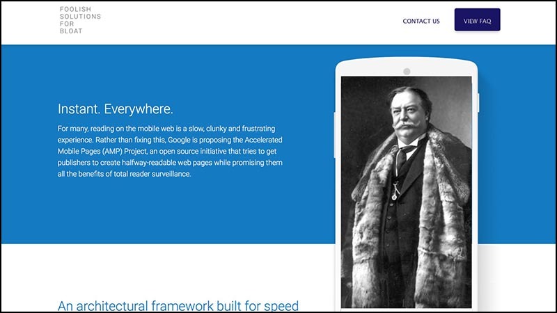 I began by replacing the merry-go-rounds with the images in the photograph by William Howard Taft 5 , who was America’s largest mass president and a dreadfully respectable fellow.
It seems to me, it has become noticeably better without undue animations of the original page.
 Cutting out trash 6 For the rest of the afternoon, I managed to cut the page size from the original 4 MB + ∞ to half a megabyte. This is eight times less than in the original. This is not a very strong achievement, I am sure you can get better.
I suggested my changes to Google for free, but apparently, resource limitations are so strong that there is no time even to copy.
 This project inspired the Taft test :
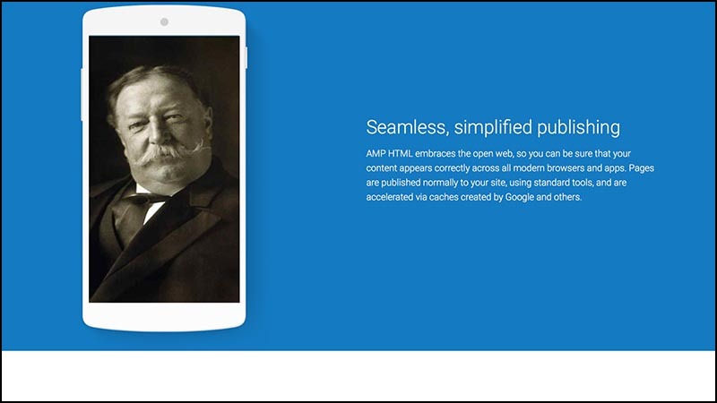
Does page design improve if you replace each image with photos of William Howard Taft?
If so, then, probably, these pictures are not very much and mean something to the design. At least leave Taffeta there! You just admitted that he looks better there. It is pleasant to look at him: whether it is a mustache, or a fur coat, but it looks friendly.
 I am amazed at the belief that the page size of a compact design should be higher than that of a regular trash page. I want to share a simple secret of two steps to improve the performance of any site.
You gave out what users need. Why something else that is not necessary by definition? Be courageous in minimalism.
 To draw a parallel with the famous motivating speech 7 I could rewrite the sites that I showed at the beginning of the speech with the materials you have, and make them load faster than a second. In two hours.
And can you? You can?
Sure you can! It is not hard! We knew how to make simple websites in 2002. This is not Greek fire, Damascus steel, or even some lost secret, which historians rave about.
But we are faced with pressure forcing sites to do more.
I bet that if you came to the client and showed “fish” for 200 kilobytes, you would be fired. Even if it would look nice and miraculously managed to contain all the necessary counters and junk of social media, which they demanded to deliver. Just now in my head this size does not fit.
 If you tried to lose weight, then you know these tricks with which people convince themselves that they are thinner than they really are. You can draw in the belly, wear a narrow shirt, stand on the desired part of the scale.
This happens with performance tests. To convince ourselves that our tight sites load quickly, we have shown a creative streak and invented new metrics.
Google has one of the most popular, called SpeedIndex . (Understand that Google is easy, because only they could arrogantly stick an integral sign into the definition without much thought.)
SpeedIndex says: what matters is how quickly the visible part of the site is rendered. It doesn't matter what else happens on the page. It does not matter that the connection channel is clogged, and the phone is hot. It doesn’t matter that the battery goes down. Everything is in order as long as that part of the page that we see in the browser window first is quickly rendered.
Of course, which part of the page will appear first, no matter if the page, after the download is complete, starts to show intermediate screen-closing advertising 8 . Or if you, like many other mobile users, start to immediately roll the page, catching non-optimized pieces with your pants down.
There is only one web performance metric: the time that elapsed between a click on a link and the last banner skipped .
All the rest is golimy nonsense.
 In discussions with web performance advocates, I sometimes feel like a hippie talking to an SUV owner about fuel consumption.
They have a sea of various techniques to improve consumption. Blow off the front left wheel a little to turn faster. Put a magnet on the fuel cap. Bend the side mirrors.
Most of the talk about web performance in a similar way is replete with technical details: compression, asynchronous loading, asset scheduling, HTTP request grouping, pipelined and minification.
 Everything overshadows a simple solution. If you need to go only to the shop on the corner, sit on the bike.
If you want to show only five sentences of text, use plain HTML. Yes damn, just give a text file. Then you will not need khaki compression, integral signs and complex Gantt diagrams, showing what is loaded in what order.
Browsers do very, very well show plain HTML.
The technology is there.
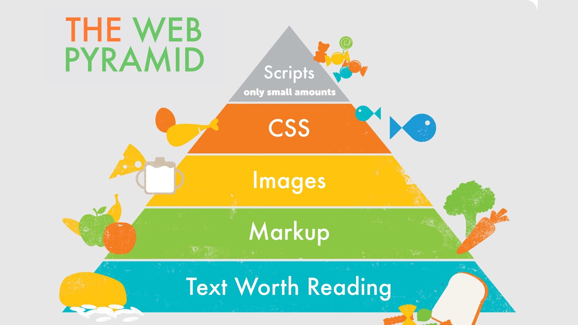
Dietitians used to adore the concept of the food pyramid. I think we need this for the web to remind ourselves how a healthy website should look like. Here is what I recommend for a balanced website in 2015:
Here’s what a web pyramid looks like in reality:
 Web designers! It is not entirely your fault. You invest your soul in creating a great site, honed to speed. You spend time developing the process of trying to anticipate the needs of the user and lay his way with rose petals.
Then, when the work is finished, the client makes the crap of the result of hard work with surveillance scripts and advertisements. You have no control over it. Its origin and content are solved at the moment when the page is loaded in the user's browser. Her whole goal is to break the design and distract the user from what he came to the site.
The user experience of your site is captured by hostile elements that are beyond the control of your will.
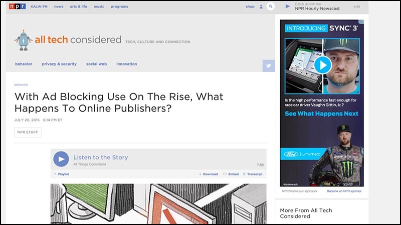 Here is a screenshot of the National Public Radio article that discusses the growing popularity of ad blockers . In a regular browser without add-ons, the page weighs 12.4 megabytes.
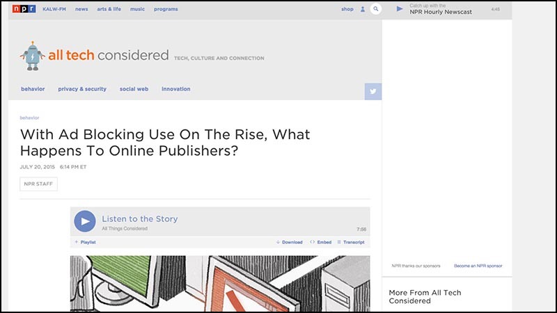 The same article with the included basic sharp advertising is 1.1 MB. Twelve times smaller. This is not a thrift pattern, but still the difference that only a plug-in creates.
If you look at what sticks out in an uncut version, it’s not just videos and banner ads, but files and script files. Each beacon beacon, activity tracker and social network widget for scrolling carries its own set of scripts that need to be obtained from a third-party server. Each request is returned with a handful of cookies.
More cookie-cookies - this is the last thing you need to obese website.
These scripts go god understand where. They are the perfect attack vector for delivering malware.
Advertisers will say that it should be so. But when talking with them you need to remember that they are professional liars. I do not want to offend. I speak about official duties. The job of the advertiser is to make something that you would not otherwise do. In conversations with web designers, the task of advertisers is to induce to think that the only correct way to display ads is to include a mountain of third-party garbage and surveillance.
Blowing up, the horrors of performance and safety, they convince, is the price for which readers cost for free content.
 I stumbled upon the "advertising campaign ecosystem" scheme. I like the schemes. They convey the greed of the advertising industry as simple numbers could not.
Here is an overview of the ecosystem in 2011, when there were 100 such companies.
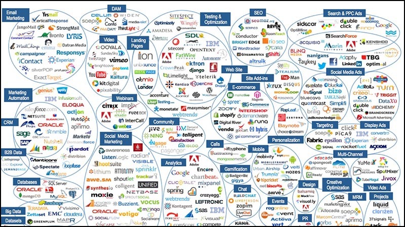 That's the way it was in 2012, when there were 350.
 By 2014, the Lord revealed more, and there were 947 of them.
 And in the current 2015 of these pieces 1876. They are all fighting for a small part of your online spending.
This growing industry is very complex - it seems to me, intentionally. When you need to understand a complex system, it is useful to look at the situation from a larger scale.
 For example, here is a diagram in German, which shows the energy budget of the Earth. When sunlight falls on water or leaves, all sorts of different complex things happen to it, but they can be completely ignored and just measure all the energy that comes and goes.
Let me make a similar sketch for the advertising bubble.
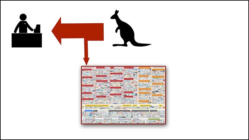
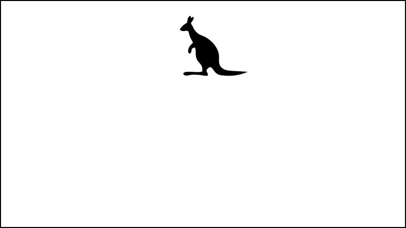 First there is a client. In a terribly wrong attempt to add the perception of someone else's culture, I presented the client in the form of a kangaroo.
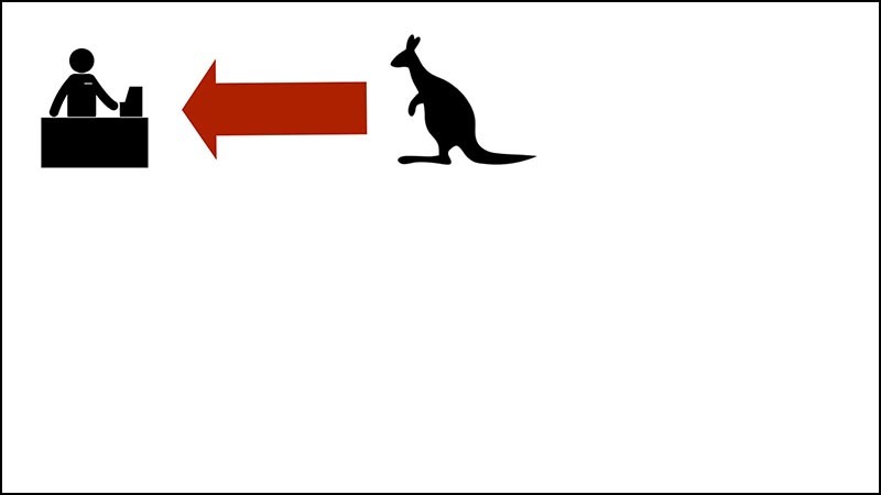 Customers give sellers money in exchange for goods and services. The red arrow here represents the flow to the money seller or, as you say in Australia, dollars.
 A piece of this money is rejected to pay for advertising. Imagine this as a small sales tax on everything you buy.
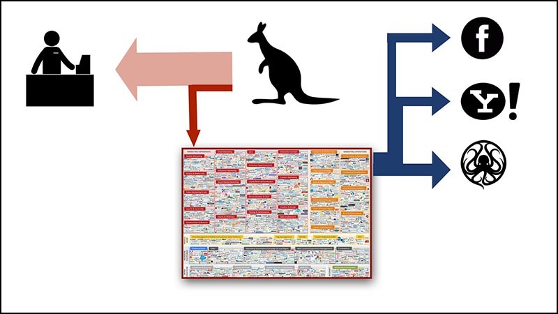 Money swirls around the world of advertising intermediaries as long as the flow does not settle in someone's pocket.
Now money flies into the pockets of such successful ad network operators as Facebook, Yahoo and Google.
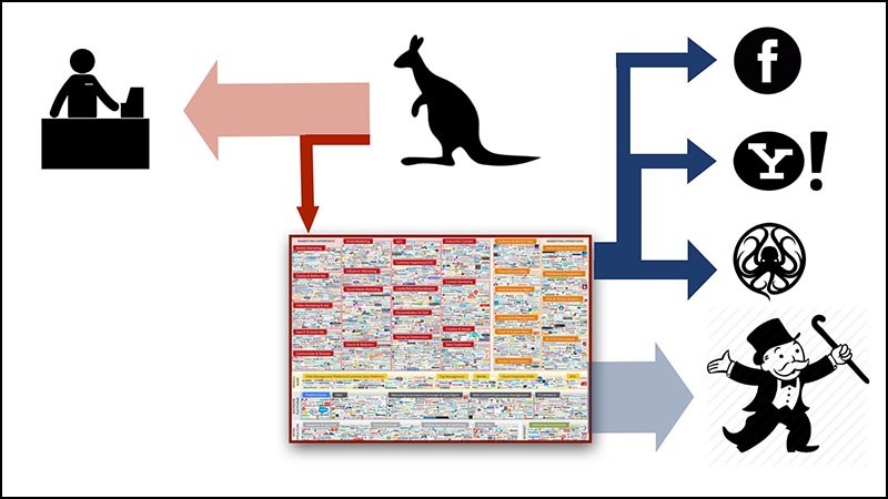
 Note that more money goes out of the system than it enters.
There is a limit to how much money advertising companies can get from just customers. Think about how much advertising you show, and compare with the number of purchases that you make during the same time period.
So thank good luck there are investors! Now they are filling the gap by pouring investments into this white-hot market. Investors hope that they will get to the company that will be the winner.
 However, at some stage, investors who voluntarily pour in money will want to be on the right side of the scheme. And they want to get more money than they have invested.
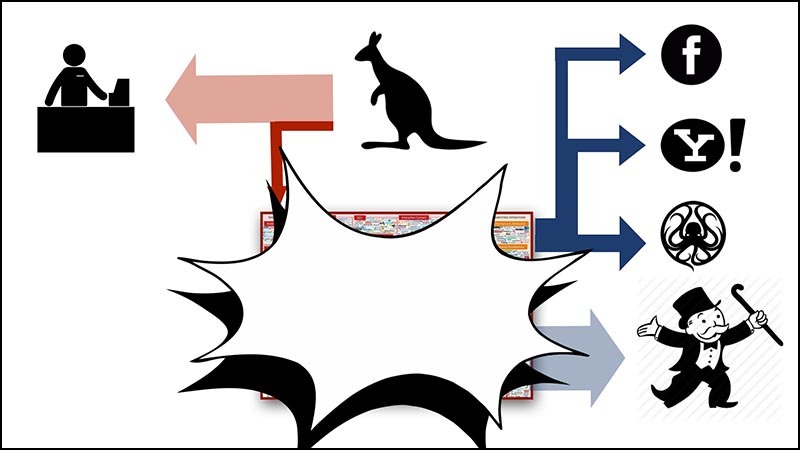 When this happens (and it seems to me that this is happening right now), something will have to be sacrificed.
Either buy more, or where most of our spending will go to advertising budgets ...
Or the bubble will burst.
 After the explosion of the bubble, the remaining advertising start-ups will become tight. The search will begin for ways to isolate themselves from the pack with the help of innovative forms of observation.
We will see a wave of associations, mergers, new aggressive forms of surveillance and the complete destruction of the remnants of online privacy. It's like a flock of live-born sharks in the abdomen of a mother-shark. All of them are fighting with each other for life, to become the one and only, which will be born.
That is why I suggested adjusting this industry to all hell. I believe that it is necessary to prohibit third-party tracking and third-party advertising targeting. Advertising will again become stupid. It will be issued by the site on which it appears.
 Today it is common practice to auction advertising space at page load. The advertisement itself (including all its scripts and shadowing structures) appears in the browser after the content elements appear in their places.
If you translate user experience into analogies, it’s like a sales agent who appears at a party after it starts, requires you to turn off the music and takes the table with Tupperware products 9 to torment guests. The atmosphere is killed in the bud.
 Imagine what downloadable server-side advertising would mean for designers. It would be clear how the pages would actually look. It would be possible to load assets in an adequate manner. Could not spread viruses. Huge animations would no longer fly into the page after loading, destroying the design and forcing users to hate the resource.
 Indeed, let's think wider. I'm not sure that publishers generally need ad support.
People forget about micropayments, ignore the fact that we already have a de facto, well-functioning micropayments system.
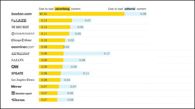
Here is a chart from the New York Times, which shows how much money is spent on loading pages using an American cellular network based on the data used. For example, loading a Boston.com advertising page at a typical fare costs thirty cents.
This is nothing more than a micropayment of a telecommunications company. And I'm sure this is more than what Boston.com gets from advertising hits on pages. Imagine that the sites would receive the money that is spent on advertising. They could completely remove the banners, but they would still get more than they do now.
We got into a stupid situation when advertising brings huge profits to telecom operators and advertising networks at the expense of everyone else.
 Advertisers will struggle with all their strength against attempts to force the use of the old model of stupid advertising. But there are no facts that stupid advertising is worse than smart.
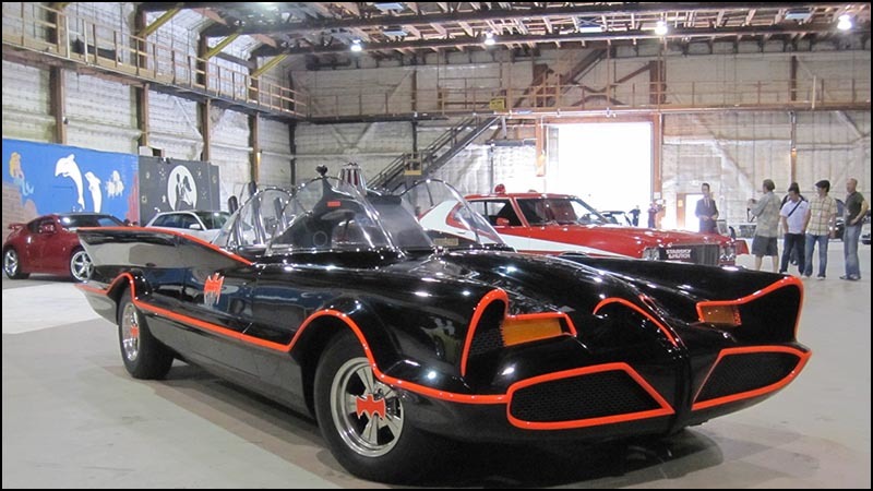
For years and years, poorly targeted advertising brought enough money for entire television studios, radio broadcasts and all other forms of entertainment. Stupid advertising bought Batmobile 10 . The money from the terribly targeted advertising was enough to make a TV show with huge venues, stylish costumes and Batmobile, and then show it on TV for free.
Hiring a couple of freelance journalists and a web designer costs far less than renting a sitcom. So why make it necessary to return to a successful financing model that does not violate privacy - is it unthinkable?
 Of course, advertisers will tell us how old television could be better with the camera on each TV.
But we have already heard enough of them.
 Stupid advertising means less advertising revenue, since a large proportion of advertising spending is spurred on with ridiculous promises about the possibilities of surveillance technology.
But the advertising market will still explode when the existing bubble burst. The only question is whether the publishers will want to go ahead and reap the benefits or disappear into nowhere, like everyone else.
 Let's talk about another case of web obesity.
Fat assets!
The problem has always existed, but with the increasing speed of advertising networks and the complexity of automating publisher technologies, it has become easier to accidentally publish huge files on the site.
 Examples!
Here's a hypocritical blogger who loves to scold others for bloated sites. [Here Maciej speaks about his own blog.] But at the same time, he has an absolutely inappropriate 3-megabyte picture at the beginning of his latest post .
It can be assumed that this is a typical case when the image was forgotten to be compressed. The error is difficult to notice if you do not work on a slow connection.
The increase in network speed increases this problem.
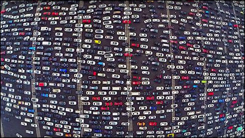 Here is a recent photo of traffic jams in China. On the road 50 lanes. Adding the 51st case will not help.
Similarly, adding bandwidth does not incline anyone to the idea of shoving less content onto pages.
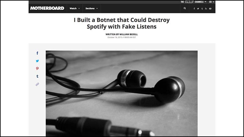 Consider this recent Vice article on botnets.
At the beginning of the article is a meaningless 3-megabyte photo of headphones. Page fails Taffeta test.
This is part of the unfortunate trend of fast communication channels, in which “hero images” (hero image) are placed in articles, the whole purpose of which is to create a space for scrolling.
In this case, blaming the author is useless. In the publishing tools, something that was responsible for reducing this huge picture did not work. There is a more important problem: fast communication channels provoke the inclusion of similar visual filler in the pages.
 We are increasingly relying on compression techniques, minimization, caching, and server configuration. At the same time, errors become more difficult to catch, they are more expensive.
Here is another example, interesting for two reasons. First, the quality of the original picture is terrible. The image looks like it was shot on a shoe, because it is a screenshot of the TV show.
 In any case, the picture is huge. If you download the site in Safari, the size of the image will be several megabytes. If you download to Chrome, you get 100 kilobytes, because Chrome supports the compression format on the fly, which is not in Safari.
With all these complicated optimization pipelines, it is difficult to understand whether we see the same as our audience.
 As a bonus, if you scroll down, then in the part of the page that web designers call chum, we will see a tiny GIF animation more than a megabyte in size.
This is a useless piece of clickbate, but it greatly affects the overall page weight.
 No one else's statics is as fat as Apple. The site is ridiculously bloated. I think this is a marketing device.
“These pictures on my android phone are loading very slowly. I can't wait to buy one of the Apple gadgets! ”
Look at the Apple website page, which explains iOS on iPad Pro . How many, 10 sentences?
 How do you think this page is huge?
Can you believe that it is larger than the entire memory of the legendary iMac (32 MB)?
 There is a place for Macintosh SE ... (5 MB).
 You can fit the contents of the entire main computer of the space shuttle.
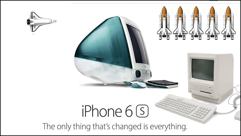 And not one, but the entire fleet of five space ships (5 MB).
 Fit all the works of Shakespeare (5 MB).
And a lot of free space. The page size is 51 megabytes.
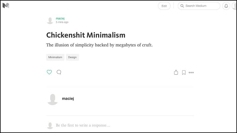 Apple pages illustrate what I call shitty minimalism. This is the dominant trend of design in the modern web.
I wrote an essay on this topic on Medium. Since this is a fifty-minute speech, let me read it out completely:
“Horseradish minimalism: the illusion of simplicity, supported by megabytes of garbage.”
 I have already mentioned how bloated Medium articles are. This is an essay from a single sentence - 1.6 MB.
I started to figure out why. This is not only a pointless 400k script. There is also this big footer image.
Since my article is so small, it is physically impossible to screw it up. But with the help of the developer tools I was able to see what was there. I don’t understand that there are some people in space suits with tablets and mobile phones in the picture. But she is there. Why why?
Its size is 900 kilobytes.
 Here's another example of fucking minimalism: the main page of the Google Contributor project.
This is a huge blue desert for 2 megabytes for some reason requires three mouse clicks to read the three sentences.
The last sentence will tell you that the program is not available here in Australia.
 Here is the home page of the Tatamagouche Brewing Company , some unfortunate brewery that I publicly make fun of. The only thing on the page is a delicious beer. To open the navigation, you have to lean on the hamburger icon.
The problem of a flabby interface will not be solved if you lean on hamburgers.
 Design studios love this invisible hamburger antipattern. Here is POLLEN 's 3MB homepage . I do not know whether the hamburger icon is visible from the back rows.
 The strongest example of a damn minimalist aesthetics that will be put into the museum is an overview of Apple Watch watches from The Verge.
How many of you ... do not even know if you can use the verb "read." How many of you tried to download this article in the browser? Please do not do this right now, otherwise you will bring down the Wi-Fi network of the conference.
The Verge Overview is a complete UI abomination that completely captures the scrolling mechanism in the browser. If you try to scroll through the article, strange things start to happen.
Interface elements fly out to the left.
Interface elements fly to the right.
The interface elements that you have not seen since the eighth grade suddenly begin to call in the middle of the night and ask how are you.
Very rarely the page actually scrolls.
Constantly and with all your might, your laptop turns the fan, trying not to die from overheating.
I tried to make a video as I scroll through the review of the Apple Watch from The Verge, but I failed. The video card of the recently released Apple laptop model literally could not handle the load.
 When the iPad came out, the designers were struck by some kind of brain parasite. Some are still not cured. Now everything should look like a touchscreen.
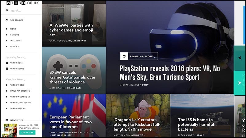
This is the British version of Wired magazine , another site that has declared war on the mechanics of scrolling. Designers suddenly had a thought “horizontally - now it’s vertically”. You can try to scroll, but instead the site will move to the right. Tiles of articles appear as huge screen-devouring tiles of garbage. All in these big tiles. Except, of course, the tiny navigation to the left.
 Another distinctive feature of the iPad chic is elegant infographics in an unreadable skinny white font on a bright background. This picture of the Baltimore local newspaper was taken from a full screen.
 Try to book a flight on the Virgin America airline website, and this column of buttons soaring into a sea of red will meet you.
Maybe the interface looks good on the phone, but on a big screen it looks scary.
 The "book" button sends to the vast expanses of input fields.
Pay attention to the distinctive features in the form of huge fonts, tiny fonts and very pale fonts.
 After selecting a destination, the site sends to this calendar widget.
It has equally huge buttons, but the only information I need - the price of the ticket on each of the days - appears in the form of microscopic text under the date.
In this design aesthetics, I am annoyed by the loss of information density. I am an adult who sits at the big screen with a mouse and a keyboard. I deserve more.
Not every interface should be created under the phone in the toilet.
 This is how PayPal looked like before.
I never prostrated in the mornings to thank God for the gift of sight, which gave me the opportunity to see the beauty of the old PayPal interface.
But he performed the task.
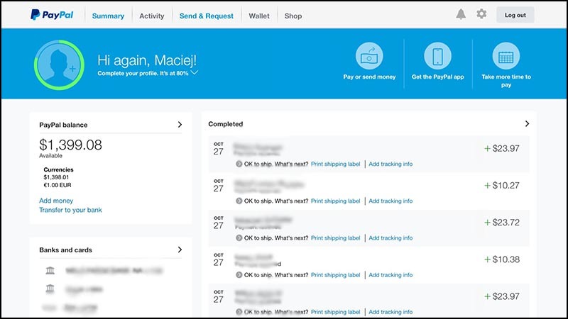 This is how PayPal looks like today.
The biggest element is the icon, which torments me with a reminder that I did not show PayPal how I look. Next to it there is a useless reminder “download the app”, and then a credit card offer.
You cannot control the sorting order, there are no filtering tools, and without scrolling, you can see far fewer records. Of course, the biggest drawback is the blurriness of the text, I can barely read it.
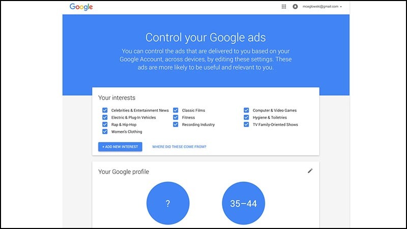 Here is a Google control panel that allows you to customize your “advertising preferences.” I went there to say that I was not interested in anything, and please leave me alone. After fifteen years of observing me, they were able to determine the age, but they could not understand that I was male.
She is likewise toy and bloated. It seems that we woke up in 2008 and at once found that our Lego figures suddenly turned into Duplo 11 . Sites that previously showed useful data resemble cartoons. The interface elements are large and thick. Any hints of complexity have been removed to some kind of sub-hamburger depths.
Sites sharpened on novice users on the touch-screen. All others are forced to suffer.
 Another example of blowing up the interface is the Docker home page. It consists of a faded text, divided by huge portions of emptiness.
To navigate through your graphic design, I don’t have to look for a sled dog’s team and dried venison.
 Hardest hit fell on the search page. Huge letters and fat buttons replaced the only thing needed - search results.
Here is a design in which there is only one result even on a high-resolution monitor.
 I did not want to, but I have to make a scolding of responsive design. I don’t know if this is obesity, and I don’t have a solution either.
Everyone understands that it is difficult to make a site that will look good on screens of all sizes. But the emphasis on size made us forget about the important difference in how users work with interface elements.
On the phone, a person pokes at a small screen with a meat stylus that is attached to his hand. In this scenario, it is logical to have large buttons. On the big screen, where there are hectares of space and an exquisitely accurate device for moving the cursor, the same interface is crazy. The problem is worsened by the release of the iPad Pro and the proliferation of the stylus Pencil. To notice the difference may not be possible. I have the impression that designers are just waiting for us all to stop using laptops.
Here is a typical recipe site, caught between two fires. I do not want to start a beating as he tries hard. But notice that some elements are tiny, some are huge. Half of the page speaks the dialect of the touch interface, and all this is difficult to understand and read.
The interface is at war with itself, because it does not know its width. A small font, a large text, a huge red "on" button, hearts of a large size, so that they can be tapped. And, of course, the hamburger icon, the obligation of which, it seems, is already enshrined in law.
 Here is the Forbes home page with the left-sided hamburger menu. It looks like a random video memory chunk, which for some reason was rendered into video output. I have no idea what is happening there, for some time I just stared.
There are up arrows, down arrows, a whole buffet of fonts, several sets of icons for the descaling of this important piece of information. There is a drop-down menu that has its own scrolling, and I don't even know what will happen if I scroll.
And upstairs there is a big savory piece of advertising sitting smugly, which has its own ideas about typography and markup. He sits and steals attention from everything else on the page.
So you can not live. We are not animals!
 Finally, I would like to touch our giant backends.
How can we expect slenderness from web interfaces if a bad example is set on the server side?
 I have a friend who makes a living by baking cookies. Like many other home bakers, she began with her own kitchen. She loaded her to the fullest, and soon everything at home was in flour, and the apartment became hot in the tropics.
At a certain moment, a friend realized that it was time to buy commercial baking equipment.
 A good cookie baking skill does not mean good skills in choosing professional restaurant equipment, negotiating prices and installation.
A home cook scares the need to buy an industrial stove, shelves for cooling and a production mixer. It is scary that now you need to buy ingredients in twenty-five kilo bags.
Even more scary hiring workers, renting space for the kitchen, obtaining certificates and licenses. One mistake - and the end of business.
 For years, the Internet has worked in a similar way. To host a small site could do with consumer servers. But now the project has become more popular, and suddenly the charming voice of the seller discusses with you by telephone contracts for equipment, communication channels and collocation racks.
It is easy to lose ground and make expensive mistakes.
 Everything has changed the Amazon Web Services project. They offered professional tools on request, hourly, scalable. Need a vault? Here are some. Cool equipment? Please, as long as you want.
It was not necessary to buy "iron", there was no dependence in the fact of its possession. For services, you had to pay a surcharge, but so managed to remove a lot of risks. Of course, it was still necessary to learn to use this. But the process actually turned out to be interesting.
 But there was always a catch. The burners on the plates were a bit small. Pens of pans were sometimes broken out at unexpected moments.
It is worth paying tribute to Amazon. The company warned about this from the very beginning and stated that it is necessary to create its own procedures taking into account refusals.
Some guaranteed could never refuse - say, refrigerators could never be defrosted. But there were cases when the doors of refrigerators could not be opened for several hours in a row. So when planning cooking, keep in mind. This is not the whims of Amazon, it is just the nature of distributed systems.
People began to move to the cloud, and this fact made me think on a large scale. It was necessary to think in several machines and accessibility zones, and this meant thoughts of redundancy and fault tolerance.
At the scale of all this is good, but for small sites - bust. To fry one egg, the whole kitchen of the restaurant is useless.
 And then the systems got bigger, and Amazon began offering more automation. They not only offered to rent huge stoves, but also a whole platoon of kitchen robots, which can be programmed for all sorts of similar tasks.
And again, programming robots turned out to be much more fun than performing kitchen operations yourself.
 In a lot of technology companies, finding good programmers is harder than finding money. Therefore, for them switching to highly automated services was logical.
For programmers, the cloud offered the opportunity to design distributed systems on dozens and hundreds of servers. And this is the beginning of a career. It's like getting the keys to the 747th Boeing right after graduating from the flight school.
 Most of the work on the sites routine. We connect the database to the template and see that no one slips on the power cord. The work is important, but hardly inspiring.
But automation on a large scale? This is cool and very difficult!
 It's like taking a few small business accountants and saying that now they will create an offshore company in the Seychelles to avoid taxes on a multi-billion dollar corporation.
Suddenly, they liven up, they feel freedom. They are right on top of Maslow's hierarchy of needs, self-actualizing on all pairs. They will not want to return.
 This is how programmers feel confused in the clouds. They love to play with like. And I am not an exception.
Difficulty for smart people is like attracting insects burning light. We cannot fight it, even if we know that it is destructive. Working with this is just awesome.
 As a result, most of the web has been terribly rebuilt. Some companies need technology to work on a large scale, and they develop them. Such technologies are in the hands of people who dream of working on this scale.
And say no to no one.
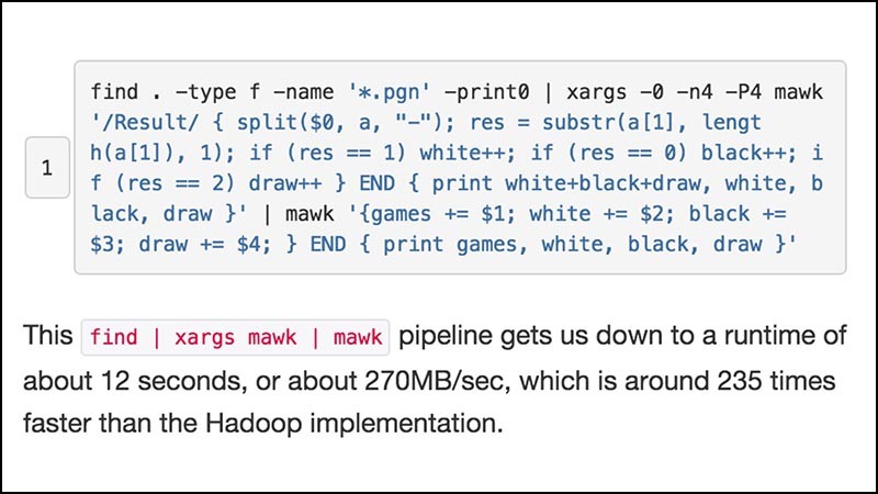 Adam Drake wrote an interesting post about analyzing 2 million chess games . Instead of using the Hadoop cluster, he simply screwed several Unix utilities on the laptop and got a 235-fold increase in performance over the big data approach.
The point is not that using Hadoop clusters are fools. And not that everything can be done on a laptop. The bottom line is that the intuition of many about what is a large system does not match the 2015 hardware.
You can do a lot of things terribly on a laptop or a tiny pizza box format blade, if you skip fifty layers of abstraction overhead.
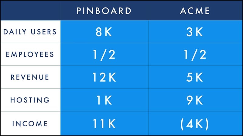 Let me give you my own concrete example. A competitor recently contacted me (let's call them ACME Bookmarking Co.), who was about to leave the bookmarking sector and sell the site.
Although ACME had a lot more traffic than mine, it turned out that they had two times less daily users. This calmed me down: a difficult task with the growth of a bookmark site is to work with users who save content.
We had the same number of employees. They had an intern who worked part of the day on the project. I was stupid, I traveled around the world and spoke at conferences. For example, half the full-time employee.
We had a similar income to the user. I receive $ 12,000 per month, they are $ 5,000.
But projects are deeply different in price. ACME hosts the AWS website, where at some point they paid $ 23,000 (!!) per month. Through titanic efforts, this figure was lowered to $ 9,000 per month.
I pay only a little over a thousand dollars a month for hosting on the basis of my own equipment. This number includes both the amortized iron value and the soda from the vending machine in the data center where I am located.
For me, bookmarks are a profitable business that allows you to be self-employed. For them, it's a $ 4,000 a month hole. I live well on the same stream of profit, which makes them sell user data to marketing companies and leave the segment.
The fact is that the assumptions about complexity will fix your expectations and limit the space of your attempts. If you think that a “real” site should live in the cloud and run on a dozen machines, a whole range of products that could otherwise make money will become unprofitable.
Similarly, if you think that you need multi-layer CMS and powerful custom JavaScript for running an online publishing business, the space of possible solutions that you try will be significantly narrowed.
Instead of trying to make re-built projects look simple, ask yourself why they cannot be simple.
 I don't want to be too hard on the clouds. Some of my best friends are in the clouds.
Rather, I would like to remind everyone that there is a lot of space below. Today, developers are working on too many layers to notice how powerful the technology has become. The problem is the opposite of the fairy tale about the princess and the pea.
It seems to happen with browsers. The basic technology is so good and fast that we were able to load it with a bunch of rubbish on top of it, and it still behaves well. There is a way to make the site stand out - find the courage to let the browser do what it is optimized for. Do not assume that all your frameworks and tools save time and money.
Unfortunately, complexity has reached such a status of pride. Developers brag about each other that they have a stack of technologies and share tips on how to manage it.
"Stack" is an analogue of the word "polyfill" 12 . Both terms are signs that you get a terribly overdeveloped structure.
 There are reasons to worry about this, not only because of aesthetics or efficiency.
Let me draw an analogy that will show the future of the web using computer games.
The first version of the web - Minecraft. It is an open world with simple objects that obey simple rules. The graphics are angular, but this is not the point, and nobody cares.
In this version, you are supposed to be an active participant, it is expected that you are creating a new one, and it is more fun to play if you cooperate with others. The rules of the game are simple, they impose few restrictions.
 Players create in Minecraft striking.
Here is a whole city of skyscrapers created with love.
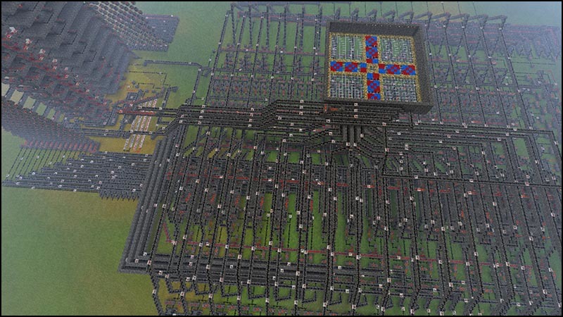 Here are some freaks made a full working processor of red stone. If you increase it to the desired degree, it will also be able to launch Minecraft - it stays in your head with difficulty.
 Another version of the web is Call of Duty. It is a highly polished game in which you want to participate, but not very much, with many breathtaking effects and diverse possibilities for buying content.
Creating a similar version of the web requires a large team of specialists. No one understands the whole picture of the work, but no one is required. Even if someone could hone all the technologies, the cost of development would have grown prohibitively.
The user experience in this version of the web is an accompaniment with the illusion of help under rather strict restrictions. There is an obvious way to go, and the obstacles do not allow to deviate. In addition to this, the game carries a slightly frightening imperialistic view of the world. The only way to refuse it is not to play.
Despite the excessive cost of development, the monotony is felt in everything. You are always in the same brown battle zone. At the cost of great efforts and skills, you can make small changes in such a game world. But the majority will play exactly the same as the publishers conceived. This is a passive form of entertainment with rare flashes of chiselling on the keys.
 Any step that makes it harder to create a website or edit a web page, makes it harder to learn how to write code by viewing the source code, promotes this consumer attitude towards the web.
I myself in 1999 studied HTML by viewing the source. I believe that it is necessary to involve as many people as possible in the web, to make tools that make participation easier. There is no obligation to become a full-fledged programmer. But you need to be able to learn from each other’s code without special lessons, so that if you need to look in and understand what is under the hood.
If we assume that the publication of articles requires a team of professionals, then this will become a self-fulfilling prophecy. Over-complicating the web means eliminating those opportunities that previously gave people the chance to learn on their own and surprise others with new, unexpected ideas.
 Here it is, the instructive part of the speech:
Let's save the web as a hypertext environment, which it is, the only one of its kind in the world. Let's not turn the web into another medium for consumption, as has happened in other examples.
Let's promise that with the growth of power and speed of computers and networks, the web should also become faster.
Let's not let the panicked dinosaurs of online publishers trample us when they run away from a meteor in a panic. Instead, let us hide in the holes and let nature do its due.
And most importantly, let's break the backbone of the world online surveillance circles that threaten not only our livelihood, but also freedom. Not only here, in Australia, but also in America, Europe, Great Britain, in any free country, where only ten years ago the idea of constant complete surveillance sounded like stupid science fiction.
 How to stop giant companies from Internet sterilization? Make their sites unnecessary. If the interesting happens somewhere else, we will be followed. We have already done this with AOL and Prodigy, we can do it again.
For the possibility of this, it is vital that many people can participate in the web. This means creating websites, not only small ones, so that the whole world can visit them, but small ones so that anyone can learn how to create their own.
Blowing up does not bother me because of inefficiency. Blowing up worries me because it makes the web difficult to access.
Preserving the simplicity of the web means preserving its charm.
Thank!
[A heavy flurry of applause.]
Translator's Notes:
 In the past, Maciej Ceglowski created and built a data store for Twitter, worked in the internal incubator of startups Yahoo and a number of other interesting companies. Tseglovski solved various tasks of working with advertising and creating web applications using LAMP servers, AJAX, sometimes resorting to Java, C ++ and other languages. He runs the Idle Words blog and is interested in the venture capital industry. Today, Tseglowski is engaged in a number of other personal projects and the Pinboard social bookmarking site . The latter gained popularity as a haunt of Delicious users sold by Yahoo to AVOS Systems.
Translation is very free by nature: it is a combination of speech itself and its shorter version as text .
1. The original statement uses the expression Defining Deviancy Down, which Senator Daniel Patrick Moynikhen entitled his article criticizing the normalization of public attitudes towards crime.
2. Hereinafter references are replaced by originals or translations in Russian.
3. Curry and crumble - Indian and British dishes, respectively. The essence of the conflict comes down to the fact that this is the main dish and dessert, and mixing them spoils the pleasure of the meal. Machey deliberately chose such a petty domestic problem for the contrast of comparison with sublime literature.
4. Ken Burns - American film director and producer of documentaries. Here we are talking about his characteristic style of work , which even got the name “ Ken Burns effect ”: in the narration, the frame goes through the photo, snatching the necessary details, moving away or approaching.
5. William Howard Taft - 27th President of the United States (1909–1913). In the presentation, two characteristics of this political figure are used: a huge body mass (varying from 115 to 160 kg) and the characteristic appearance in the photographs.
6. The word cruft is used in the original. This technical jargon word describes unnecessary hardware or software components. In the translation hereinafter, it corresponds to the word "garbage".
7. A reference to the speech of the hero of the film “Americans” / “Glengarry Glen Ross”, in which the experienced broker declares to his not very successful colleagues that he could achieve more with even the same resources.
8. In the original, a specific term is used - interstitial advertising (interstitial ads).
9. Tupperware - an American company that supplies items for the kitchen (plastic utensils, containers, and so on). Known practice of the scheme of "direct sales", when the distributor contacts with customers outside of retail outlets. For such purposes, “ Tupperware parties ” can be organized, but the appearance of a sales representative at small social events of other subjects is possible.
10. It is about the props of the mid-sixties, created on the basis of the concept car Lincoln Futura . Only the original without modifications cost 250 thousand dollars. Taking into account inflation, it is 2.2 million dollars in 2016.
11. DUPLO - figures from the company LEGO, intended for children under 5 years. In this regard, they are on each side twice the size of the classic LEGO bricks, so that the little child does not breathe them in and swallow them.
12. Polyfill - a code snippet designed to provide functionality in one browser, which is usually considered standard. For example, some HTML5 features in older versions of Internet Explorer have to be implemented via polyfill.
Before the beginning of the tirade, I would like to draw attention to the fact that great sites come in all shapes and sizes. And I'm not going to be ashamed of anyone here for the number of bits used, the amount of resources used, and so on. I love big juicy image galleries, I like huge experiments on JavaScript, I watch online videos in high resolution, like all of you. I think this is great.
')
The speech is not about that. I would like to talk about this public health crisis, this obesity sites. Great designers who think about the web like me or even more, for some reason make pages that get bigger. It will be a question of text-based sites, which for some incomprehensible reasons become more and more every year.
In this speech, I will give examples, because otherwise it would have turned out too abstract. And not for the sake of shaming anyone, except for a few big companies that I criticize for breaking the web. But I understand the individuals who work on these projects under pressure and coercion.
A crisis
What is the obesity crisis sites? Here is the 2012 article from the Gigaom website, “The Growing Epidemic of Blowing Up Pages . She warns that the average page size is over a megabyte. The article itself has a size of 1.8 megabytes. Here is almost the same article " Web with excess weight " from the same site from 2014, two years later. The article warns that the average page size is close to 2 megabytes.The article itself has a size of 3 megabytes.
If this trend continues, articles with warnings about page sizes will be released over 5 megabytes by 2020.
The problem with choosing a specific size threshold is that this causes anomalies to become the norm 1 . What is considered to be a terribly bloated website today becomes tomorrow a typical page, and next year it will be an elegant, elegant design.
I would suggest fixing the size to something more permanent.
I repeat the suggestion that was made on Twitter : your website, if it is textual (like an article), should not exceed the main works of Russian literature in the file size.This is a very generous measure. I could choose the French, where the novels are subtle. But I chose a Russian with its reputation for being heavy - big bricks of solid prose.
For example, in " Oblomov " 2 Goncharova title hero of the first hundred pages out of bed.
If you open this tweet in a browser, you will see a 900 KB page.This is almost 100k more than the full text of The Master and Margarita , filled with the mystery and comedy of Bulgakov’s novel about the Devil, which is visited in Moscow with his retinue (including a huge cat!) During the Great Terror of 1937. The novel is interrupted by a parallel narration about the life of Pontius Pilate, Jesus Christ, and the faithful but unreliable apostle Matthew.
On one tweet.
This is a great book, and you should read it. This is a great tweet, and you’ve already read it. All I want to say is that they should not be the same size.
Or consider this article for 400 words on Medium. There is such a sentence:“Teams that do not understand for whom and for what they create are prone to writing bloated products.”
The Medium team made it so that this bit of genius requires 1.2 megabytes.
This is longer than the size of “ Crime and Punishment ”, Dostoevsky’s psychological thriller about a student who has been impoverished, who is filling his head with thoughts of Napoleon and forcing himself to kill an elderly usurer.Tried to blame, so confused by his crime that he even forgot to take the money, Raskolnikov gets involved in a cat-and-mouse game with a cunning investigator, and then finds atonement in the incredible love of a holy prostitute.
Dostoevsky wrote all this in the light of a candle, by hand, with a pen, damn it.
Here is a recent article, “ (Not so much) a brief history of puffiness on the web .”It repeats the usual reasons why a blow-up is bad, but also includes this phrase: “heavy pages are often slow, and slow pages mean unlucky users.”
This quote could remind the famous line that opens the novel " Anna Karenina ":
“All happy families are alike, each unhappy family is unhappy in its own way.” But not such a brief story of bloating on the web is much longer than Anna Karenina. The comparison is wrong, the novel lasts only 1.8 MB.The real book to compare with is War and Peace , about 3 MB. This is Tolstoy’s reflection on the topic of whether certain people define the great events of history, or whether we are still sailing along an irresistible course of historical inevitability.
Here's an article from the Yorkshire Evening Post, a typical representative of thousands of small-town news sites. She does not explore the relationship between time and personal will:“ The hospital in Leeds apologizes for mixed curries and crumbles ” 3 .
This painful story about mixing two dishes on a plate in a hospital could almost come from the pen of Marcel Proust, for whom soaking a piece of tea cake in tea was the starting point for an expanding spiral of vivid memories, 9 volumes and 3 megabytes of handwritten prose later crowned in the understanding that time and memory is only a deception of the senses.Only the scripts in the article about curry and crumble are longer than “In Search of Lost Time”. The size of the whole article is almost 40 MB.
I have a suggestion that browsers show this weight somehow. Maybe they would fall, and then they would have to be raised because of the weight of the pages. So would have some kind of understanding of the enormity. This would work especially well on mobile devices: the parties could explode.
I can continue in this spirit. And I will do it, because I like it!Here is an article on " Best Practices for Improving Online Productivity ." One simple method is to not make a 3.1 MB page.
The article mentions that Google was able to increase user involvement in Google Maps by reducing the page from 100 KB to 80 KB. Do you remember the times when Google Maps, the most advanced web application in that era, was thirty-five times smaller than a modern news article?
Obesity on the web can take strange forms. For example, Tim Kadlek perfectly writes and speaks on the topic of performance. His personal website is a small model of thrift. Tim knows a lot about how to reduce bloating.But slides from his recent performance talk are only available on a 9-megabyte page or in a 14-megabyte PDF.
Let me finish with the great TechTimes article, which warns that Google is going to mark large pages with a special “slow” badge in issuing mobile search.The article somehow manages to reach a size of 18 megabytes, including (in the preview I measured) a 3-megabyte video from KY Jelly, an “intimate lubricant.”
Today, you need a lot of intimate lubricant to roam the unfiltered web.
What kind of nonsense is happening?
False decisions
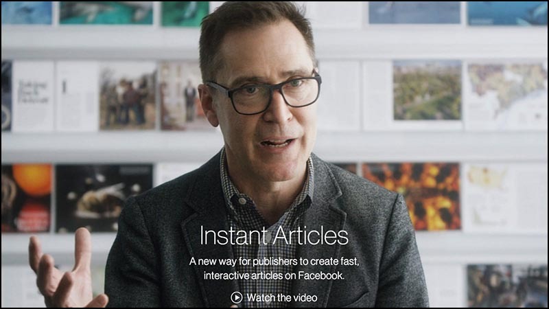
Everyone recognizes the problem. Similar pages are terrible on a laptop (my fan drove all three weeks that I was preparing a speech), and on mobile devices it is generally hell. And the publishers are taking action.In May 2015, Facebook announced Instant Articles , a special format for news articles created for almost instant uploading to Facebook feed.
Facebook made this ad on a 6.8 megabyte page occupied by a portrait photo of some guy. It doesn't even work on Facebook, it’s just National Geographic photo editor.
Below on the page you can see a 41 MB video, the only way to learn about the project. In the video, the editor praises the most interesting uselessness of the new format, such as resizing photos around the rotation of the device. This means that if the phone does not hold smoothly, the photos will float like in a documentary by Ken Burns 4 .
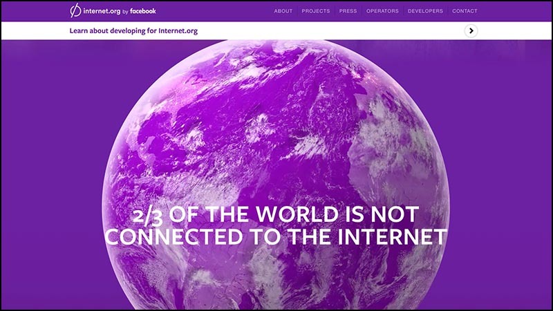
Facebook has also launched internet.org , an attempt to expand Internet access. The emotional page includes stories from people from various developing countries about what Internet access means to them.Well, you know what will happen next. I left a tab with Internet.org and left for lunch, and when I returned, I discovered that she transferred more than a quarter of a gigabyte of data.
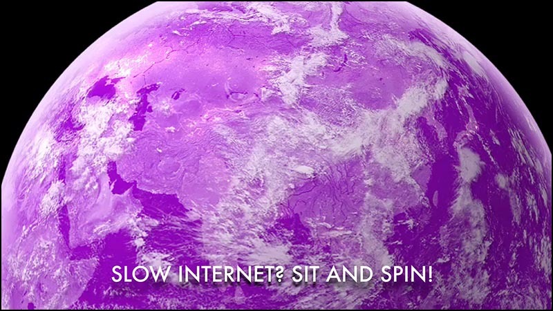
But Maciej, you say. Couldn't this Earth be a giant 16 MB video file on which the planet rotates? But the way it is.This is Facebook's message to the world: “The Internet is slow. Sit and rotate. ”
And a bad channel is not a third-world-specific problem! I’ve already done enough in Australia and I know that in rural areas in Tasmania and Queensland, vendors treat WiFi as a 100-year-old brandy.
You can buy as much as you want, but it costs a fortune and is given in tiny portions. And after the third or fourth portion, they look at you with surprise.
Even in places with good connectivity like Sydney, we encountered problems when the network signal is weak, the battery sits down, and you need to load some huge piece of the site with video and scripts and get an important piece of information from there like a restaurant's address.
I have a simple solution: designers who do a puergu-like level of that Facebook page deserve capital punishment.They need to be forced to use Apple's puck until the end of their career. [The listeners howled in horror.] If the years do not allow us to remember, then this is an ideal round mouse. It was impossible to figure out where the button was without looking at the mouse.
Google has launched a competitor for Instant Articles, called Accelerated Mobile Pages . AMP is a special subset of HTML created for speed on mobile devices.Why not give plain HTML without unnecessary bullshit? The question remained unanswered.
The AMP project is on display, open source, all sorts of different publishers are involved. Due to an oversupply of love for the mobile web, Google voluntarily took up hosting infrastructure. Especially for those parts that follow the user.
Jeremy Keith showed me that the AMP description page is technically infinite in size. If you open it in Chrome, it will continue to endlessly download the same carousel from the video. In the image, this can be seen in the Morsean-like series of download lines, showing the relentless downloading of 3.4 megabytes of video over and over again.Even if you open a page in Safari, where the merry-go-round is broken, the page still has time to go away 4 megabytes.
These comically large main pages of projects to speed up the web - the equivalent of watching a video about the exercises, where the speaker just stands and eats cookies.
The world's largest technology companies cannot make fast and lightweight tiny text-based websites for mobile devices describing their future flagship page-swelling products.
I can not imagine a stronger recognition of the defeat.
Google AMP technical manager responded to us on Twitter . He admitted to having a blowup. He explained that there were resource constraints at Google, and the project had to be outsourced.It made a deep emotional impression on me. I did not think that Google is in a quandary. We talk so much that Google is spoiling the web, and they can't afford to make a one-page website about a flagship product. Therefore, I scraped deep into the heart of compassion and spent a few hours of personal time doing my own static version of the AMP website .
I began by replacing the merry-go-rounds with the images in the photograph by William Howard Taft 5 , who was America’s largest mass president and a dreadfully respectable fellow.It seems to me, it has become noticeably better without undue animations of the original page.
Cutting out trash 6 For the rest of the afternoon, I managed to cut the page size from the original 4 MB + ∞ to half a megabyte. This is eight times less than in the original. This is not a very strong achievement, I am sure you can get better.I suggested my changes to Google for free, but apparently, resource limitations are so strong that there is no time even to copy.
This project inspired the Taft test :Does page design improve if you replace each image with photos of William Howard Taft?
If so, then, probably, these pictures are not very much and mean something to the design. At least leave Taffeta there! You just admitted that he looks better there. It is pleasant to look at him: whether it is a mustache, or a fur coat, but it looks friendly.
I am amazed at the belief that the page size of a compact design should be higher than that of a regular trash page. I want to share a simple secret of two steps to improve the performance of any site.- Send the most important page elements to the user. Make sure they are rendered first.
- Stop it.
You gave out what users need. Why something else that is not necessary by definition? Be courageous in minimalism.
To draw a parallel with the famous motivating speech 7 I could rewrite the sites that I showed at the beginning of the speech with the materials you have, and make them load faster than a second. In two hours.And can you? You can?
Sure you can! It is not hard! We knew how to make simple websites in 2002. This is not Greek fire, Damascus steel, or even some lost secret, which historians rave about.
But we are faced with pressure forcing sites to do more.
I bet that if you came to the client and showed “fish” for 200 kilobytes, you would be fired. Even if it would look nice and miraculously managed to contain all the necessary counters and junk of social media, which they demanded to deliver. Just now in my head this size does not fit.
If you tried to lose weight, then you know these tricks with which people convince themselves that they are thinner than they really are. You can draw in the belly, wear a narrow shirt, stand on the desired part of the scale.This happens with performance tests. To convince ourselves that our tight sites load quickly, we have shown a creative streak and invented new metrics.
Google has one of the most popular, called SpeedIndex . (Understand that Google is easy, because only they could arrogantly stick an integral sign into the definition without much thought.)
SpeedIndex says: what matters is how quickly the visible part of the site is rendered. It doesn't matter what else happens on the page. It does not matter that the connection channel is clogged, and the phone is hot. It doesn’t matter that the battery goes down. Everything is in order as long as that part of the page that we see in the browser window first is quickly rendered.
Of course, which part of the page will appear first, no matter if the page, after the download is complete, starts to show intermediate screen-closing advertising 8 . Or if you, like many other mobile users, start to immediately roll the page, catching non-optimized pieces with your pants down.
There is only one web performance metric: the time that elapsed between a click on a link and the last banner skipped .
All the rest is golimy nonsense.
In discussions with web performance advocates, I sometimes feel like a hippie talking to an SUV owner about fuel consumption.They have a sea of various techniques to improve consumption. Blow off the front left wheel a little to turn faster. Put a magnet on the fuel cap. Bend the side mirrors.
Most of the talk about web performance in a similar way is replete with technical details: compression, asynchronous loading, asset scheduling, HTTP request grouping, pipelined and minification.
Everything overshadows a simple solution. If you need to go only to the shop on the corner, sit on the bike.If you want to show only five sentences of text, use plain HTML. Yes damn, just give a text file. Then you will not need khaki compression, integral signs and complex Gantt diagrams, showing what is loaded in what order.
Browsers do very, very well show plain HTML.
The technology is there.
Dietitians used to adore the concept of the food pyramid. I think we need this for the web to remind ourselves how a healthy website should look like. Here is what I recommend for a balanced website in 2015:
- A solid base of text worthy of reading, formatted with a healthy portion of markup.
- A moderate number of images that illustrate and set the tone for the design. Do not abuse it - squeeze them well.
- Spoon CSS.
- And then very sparingly and only if necessary pinch JavaScript.
Here’s what a web pyramid looks like in reality:
- HTML base layer.
- A huge pile of unnecessary tripe.
- Upstairs, a whole sea of surveillance scripts.
Oily Advertising
Web designers! It is not entirely your fault. You invest your soul in creating a great site, honed to speed. You spend time developing the process of trying to anticipate the needs of the user and lay his way with rose petals.Then, when the work is finished, the client makes the crap of the result of hard work with surveillance scripts and advertisements. You have no control over it. Its origin and content are solved at the moment when the page is loaded in the user's browser. Her whole goal is to break the design and distract the user from what he came to the site.
The user experience of your site is captured by hostile elements that are beyond the control of your will.
Here is a screenshot of the National Public Radio article that discusses the growing popularity of ad blockers . In a regular browser without add-ons, the page weighs 12.4 megabytes. The same article with the included basic sharp advertising is 1.1 MB. Twelve times smaller. This is not a thrift pattern, but still the difference that only a plug-in creates.If you look at what sticks out in an uncut version, it’s not just videos and banner ads, but files and script files. Each beacon beacon, activity tracker and social network widget for scrolling carries its own set of scripts that need to be obtained from a third-party server. Each request is returned with a handful of cookies.
More cookie-cookies - this is the last thing you need to obese website.
These scripts go god understand where. They are the perfect attack vector for delivering malware.
Advertisers will say that it should be so. But when talking with them you need to remember that they are professional liars. I do not want to offend. I speak about official duties. The job of the advertiser is to make something that you would not otherwise do. In conversations with web designers, the task of advertisers is to induce to think that the only correct way to display ads is to include a mountain of third-party garbage and surveillance.
Blowing up, the horrors of performance and safety, they convince, is the price for which readers cost for free content.
I stumbled upon the "advertising campaign ecosystem" scheme. I like the schemes. They convey the greed of the advertising industry as simple numbers could not.Here is an overview of the ecosystem in 2011, when there were 100 such companies.
That's the way it was in 2012, when there were 350. By 2014, the Lord revealed more, and there were 947 of them. And in the current 2015 of these pieces 1876. They are all fighting for a small part of your online spending.This growing industry is very complex - it seems to me, intentionally. When you need to understand a complex system, it is useful to look at the situation from a larger scale.
For example, here is a diagram in German, which shows the energy budget of the Earth. When sunlight falls on water or leaves, all sorts of different complex things happen to it, but they can be completely ignored and just measure all the energy that comes and goes.Let me make a similar sketch for the advertising bubble.
First there is a client. In a terribly wrong attempt to add the perception of someone else's culture, I presented the client in the form of a kangaroo. Customers give sellers money in exchange for goods and services. The red arrow here represents the flow to the money seller or, as you say in Australia, dollars. A piece of this money is rejected to pay for advertising. Imagine this as a small sales tax on everything you buy. Money swirls around the world of advertising intermediaries as long as the flow does not settle in someone's pocket.Now money flies into the pockets of such successful ad network operators as Facebook, Yahoo and Google.
Note that more money goes out of the system than it enters.There is a limit to how much money advertising companies can get from just customers. Think about how much advertising you show, and compare with the number of purchases that you make during the same time period.
So thank good luck there are investors! Now they are filling the gap by pouring investments into this white-hot market. Investors hope that they will get to the company that will be the winner.
However, at some stage, investors who voluntarily pour in money will want to be on the right side of the scheme. And they want to get more money than they have invested. When this happens (and it seems to me that this is happening right now), something will have to be sacrificed.Either buy more, or where most of our spending will go to advertising budgets ...
Or the bubble will burst.
After the explosion of the bubble, the remaining advertising start-ups will become tight. The search will begin for ways to isolate themselves from the pack with the help of innovative forms of observation.We will see a wave of associations, mergers, new aggressive forms of surveillance and the complete destruction of the remnants of online privacy. It's like a flock of live-born sharks in the abdomen of a mother-shark. All of them are fighting with each other for life, to become the one and only, which will be born.
That is why I suggested adjusting this industry to all hell. I believe that it is necessary to prohibit third-party tracking and third-party advertising targeting. Advertising will again become stupid. It will be issued by the site on which it appears.
Today it is common practice to auction advertising space at page load. The advertisement itself (including all its scripts and shadowing structures) appears in the browser after the content elements appear in their places.If you translate user experience into analogies, it’s like a sales agent who appears at a party after it starts, requires you to turn off the music and takes the table with Tupperware products 9 to torment guests. The atmosphere is killed in the bud.
Imagine what downloadable server-side advertising would mean for designers. It would be clear how the pages would actually look. It would be possible to load assets in an adequate manner. Could not spread viruses. Huge animations would no longer fly into the page after loading, destroying the design and forcing users to hate the resource. Indeed, let's think wider. I'm not sure that publishers generally need ad support.People forget about micropayments, ignore the fact that we already have a de facto, well-functioning micropayments system.
Here is a chart from the New York Times, which shows how much money is spent on loading pages using an American cellular network based on the data used. For example, loading a Boston.com advertising page at a typical fare costs thirty cents.
This is nothing more than a micropayment of a telecommunications company. And I'm sure this is more than what Boston.com gets from advertising hits on pages. Imagine that the sites would receive the money that is spent on advertising. They could completely remove the banners, but they would still get more than they do now.
We got into a stupid situation when advertising brings huge profits to telecom operators and advertising networks at the expense of everyone else.
Advertisers will struggle with all their strength against attempts to force the use of the old model of stupid advertising. But there are no facts that stupid advertising is worse than smart.For years and years, poorly targeted advertising brought enough money for entire television studios, radio broadcasts and all other forms of entertainment. Stupid advertising bought Batmobile 10 . The money from the terribly targeted advertising was enough to make a TV show with huge venues, stylish costumes and Batmobile, and then show it on TV for free.
Hiring a couple of freelance journalists and a web designer costs far less than renting a sitcom. So why make it necessary to return to a successful financing model that does not violate privacy - is it unthinkable?
Of course, advertisers will tell us how old television could be better with the camera on each TV.But we have already heard enough of them.
Stupid advertising means less advertising revenue, since a large proportion of advertising spending is spurred on with ridiculous promises about the possibilities of surveillance technology.But the advertising market will still explode when the existing bubble burst. The only question is whether the publishers will want to go ahead and reap the benefits or disappear into nowhere, like everyone else.
Fat Assets
Let's talk about another case of web obesity.Fat assets!
The problem has always existed, but with the increasing speed of advertising networks and the complexity of automating publisher technologies, it has become easier to accidentally publish huge files on the site.
Examples!Here's a hypocritical blogger who loves to scold others for bloated sites. [Here Maciej speaks about his own blog.] But at the same time, he has an absolutely inappropriate 3-megabyte picture at the beginning of his latest post .
It can be assumed that this is a typical case when the image was forgotten to be compressed. The error is difficult to notice if you do not work on a slow connection.
The increase in network speed increases this problem.
Here is a recent photo of traffic jams in China. On the road 50 lanes. Adding the 51st case will not help.Similarly, adding bandwidth does not incline anyone to the idea of shoving less content onto pages.
Consider this recent Vice article on botnets.At the beginning of the article is a meaningless 3-megabyte photo of headphones. Page fails Taffeta test.
This is part of the unfortunate trend of fast communication channels, in which “hero images” (hero image) are placed in articles, the whole purpose of which is to create a space for scrolling.
In this case, blaming the author is useless. In the publishing tools, something that was responsible for reducing this huge picture did not work. There is a more important problem: fast communication channels provoke the inclusion of similar visual filler in the pages.
We are increasingly relying on compression techniques, minimization, caching, and server configuration. At the same time, errors become more difficult to catch, they are more expensive.Here is another example, interesting for two reasons. First, the quality of the original picture is terrible. The image looks like it was shot on a shoe, because it is a screenshot of the TV show.
In any case, the picture is huge. If you download the site in Safari, the size of the image will be several megabytes. If you download to Chrome, you get 100 kilobytes, because Chrome supports the compression format on the fly, which is not in Safari.With all these complicated optimization pipelines, it is difficult to understand whether we see the same as our audience.
As a bonus, if you scroll down, then in the part of the page that web designers call chum, we will see a tiny GIF animation more than a megabyte in size.This is a useless piece of clickbate, but it greatly affects the overall page weight.
No one else's statics is as fat as Apple. The site is ridiculously bloated. I think this is a marketing device.“These pictures on my android phone are loading very slowly. I can't wait to buy one of the Apple gadgets! ”
Look at the Apple website page, which explains iOS on iPad Pro . How many, 10 sentences?
How do you think this page is huge?Can you believe that it is larger than the entire memory of the legendary iMac (32 MB)?
There is a place for Macintosh SE ... (5 MB). You can fit the contents of the entire main computer of the space shuttle. And not one, but the entire fleet of five space ships (5 MB). Fit all the works of Shakespeare (5 MB).And a lot of free space. The page size is 51 megabytes.
Horseradish minimalism
Apple pages illustrate what I call shitty minimalism. This is the dominant trend of design in the modern web.I wrote an essay on this topic on Medium. Since this is a fifty-minute speech, let me read it out completely:
“Horseradish minimalism: the illusion of simplicity, supported by megabytes of garbage.”
I have already mentioned how bloated Medium articles are. This is an essay from a single sentence - 1.6 MB.I started to figure out why. This is not only a pointless 400k script. There is also this big footer image.
Since my article is so small, it is physically impossible to screw it up. But with the help of the developer tools I was able to see what was there. I don’t understand that there are some people in space suits with tablets and mobile phones in the picture. But she is there. Why why?
Its size is 900 kilobytes.
Here's another example of fucking minimalism: the main page of the Google Contributor project.This is a huge blue desert for 2 megabytes for some reason requires three mouse clicks to read the three sentences.
The last sentence will tell you that the program is not available here in Australia.
Here is the home page of the Tatamagouche Brewing Company , some unfortunate brewery that I publicly make fun of. The only thing on the page is a delicious beer. To open the navigation, you have to lean on the hamburger icon.The problem of a flabby interface will not be solved if you lean on hamburgers.
Design studios love this invisible hamburger antipattern. Here is POLLEN 's 3MB homepage . I do not know whether the hamburger icon is visible from the back rows. The strongest example of a damn minimalist aesthetics that will be put into the museum is an overview of Apple Watch watches from The Verge.How many of you ... do not even know if you can use the verb "read." How many of you tried to download this article in the browser? Please do not do this right now, otherwise you will bring down the Wi-Fi network of the conference.
The Verge Overview is a complete UI abomination that completely captures the scrolling mechanism in the browser. If you try to scroll through the article, strange things start to happen.
Interface elements fly out to the left.
Interface elements fly to the right.
The interface elements that you have not seen since the eighth grade suddenly begin to call in the middle of the night and ask how are you.
Very rarely the page actually scrolls.
Constantly and with all your might, your laptop turns the fan, trying not to die from overheating.
I tried to make a video as I scroll through the review of the Apple Watch from The Verge, but I failed. The video card of the recently released Apple laptop model literally could not handle the load.
Interface stretching
When the iPad came out, the designers were struck by some kind of brain parasite. Some are still not cured. Now everything should look like a touchscreen.This is the British version of Wired magazine , another site that has declared war on the mechanics of scrolling. Designers suddenly had a thought “horizontally - now it’s vertically”. You can try to scroll, but instead the site will move to the right. Tiles of articles appear as huge screen-devouring tiles of garbage. All in these big tiles. Except, of course, the tiny navigation to the left.
Another distinctive feature of the iPad chic is elegant infographics in an unreadable skinny white font on a bright background. This picture of the Baltimore local newspaper was taken from a full screen. Try to book a flight on the Virgin America airline website, and this column of buttons soaring into a sea of red will meet you.Maybe the interface looks good on the phone, but on a big screen it looks scary.
The "book" button sends to the vast expanses of input fields.Pay attention to the distinctive features in the form of huge fonts, tiny fonts and very pale fonts.
After selecting a destination, the site sends to this calendar widget.It has equally huge buttons, but the only information I need - the price of the ticket on each of the days - appears in the form of microscopic text under the date.
In this design aesthetics, I am annoyed by the loss of information density. I am an adult who sits at the big screen with a mouse and a keyboard. I deserve more.
Not every interface should be created under the phone in the toilet.
This is how PayPal looked like before.I never prostrated in the mornings to thank God for the gift of sight, which gave me the opportunity to see the beauty of the old PayPal interface.
But he performed the task.
This is how PayPal looks like today.The biggest element is the icon, which torments me with a reminder that I did not show PayPal how I look. Next to it there is a useless reminder “download the app”, and then a credit card offer.
You cannot control the sorting order, there are no filtering tools, and without scrolling, you can see far fewer records. Of course, the biggest drawback is the blurriness of the text, I can barely read it.
Here is a Google control panel that allows you to customize your “advertising preferences.” I went there to say that I was not interested in anything, and please leave me alone. After fifteen years of observing me, they were able to determine the age, but they could not understand that I was male.She is likewise toy and bloated. It seems that we woke up in 2008 and at once found that our Lego figures suddenly turned into Duplo 11 . Sites that previously showed useful data resemble cartoons. The interface elements are large and thick. Any hints of complexity have been removed to some kind of sub-hamburger depths.
Sites sharpened on novice users on the touch-screen. All others are forced to suffer.
Another example of blowing up the interface is the Docker home page. It consists of a faded text, divided by huge portions of emptiness.To navigate through your graphic design, I don’t have to look for a sled dog’s team and dried venison.
Hardest hit fell on the search page. Huge letters and fat buttons replaced the only thing needed - search results.Here is a design in which there is only one result even on a high-resolution monitor.
I did not want to, but I have to make a scolding of responsive design. I don’t know if this is obesity, and I don’t have a solution either.Everyone understands that it is difficult to make a site that will look good on screens of all sizes. But the emphasis on size made us forget about the important difference in how users work with interface elements.
On the phone, a person pokes at a small screen with a meat stylus that is attached to his hand. In this scenario, it is logical to have large buttons. On the big screen, where there are hectares of space and an exquisitely accurate device for moving the cursor, the same interface is crazy. The problem is worsened by the release of the iPad Pro and the proliferation of the stylus Pencil. To notice the difference may not be possible. I have the impression that designers are just waiting for us all to stop using laptops.
Here is a typical recipe site, caught between two fires. I do not want to start a beating as he tries hard. But notice that some elements are tiny, some are huge. Half of the page speaks the dialect of the touch interface, and all this is difficult to understand and read.
The interface is at war with itself, because it does not know its width. A small font, a large text, a huge red "on" button, hearts of a large size, so that they can be tapped. And, of course, the hamburger icon, the obligation of which, it seems, is already enshrined in law.
Here is the Forbes home page with the left-sided hamburger menu. It looks like a random video memory chunk, which for some reason was rendered into video output. I have no idea what is happening there, for some time I just stared.There are up arrows, down arrows, a whole buffet of fonts, several sets of icons for the descaling of this important piece of information. There is a drop-down menu that has its own scrolling, and I don't even know what will happen if I scroll.
And upstairs there is a big savory piece of advertising sitting smugly, which has its own ideas about typography and markup. He sits and steals attention from everything else on the page.
So you can not live. We are not animals!
Heavy clouds
Finally, I would like to touch our giant backends.How can we expect slenderness from web interfaces if a bad example is set on the server side?
I have a friend who makes a living by baking cookies. Like many other home bakers, she began with her own kitchen. She loaded her to the fullest, and soon everything at home was in flour, and the apartment became hot in the tropics.At a certain moment, a friend realized that it was time to buy commercial baking equipment.
A good cookie baking skill does not mean good skills in choosing professional restaurant equipment, negotiating prices and installation.A home cook scares the need to buy an industrial stove, shelves for cooling and a production mixer. It is scary that now you need to buy ingredients in twenty-five kilo bags.
Even more scary hiring workers, renting space for the kitchen, obtaining certificates and licenses. One mistake - and the end of business.
For years, the Internet has worked in a similar way. To host a small site could do with consumer servers. But now the project has become more popular, and suddenly the charming voice of the seller discusses with you by telephone contracts for equipment, communication channels and collocation racks.It is easy to lose ground and make expensive mistakes.
Everything has changed the Amazon Web Services project. They offered professional tools on request, hourly, scalable. Need a vault? Here are some. Cool equipment? Please, as long as you want.It was not necessary to buy "iron", there was no dependence in the fact of its possession. For services, you had to pay a surcharge, but so managed to remove a lot of risks. Of course, it was still necessary to learn to use this. But the process actually turned out to be interesting.
But there was always a catch. The burners on the plates were a bit small. Pens of pans were sometimes broken out at unexpected moments.It is worth paying tribute to Amazon. The company warned about this from the very beginning and stated that it is necessary to create its own procedures taking into account refusals.
Some guaranteed could never refuse - say, refrigerators could never be defrosted. But there were cases when the doors of refrigerators could not be opened for several hours in a row. So when planning cooking, keep in mind. This is not the whims of Amazon, it is just the nature of distributed systems.
People began to move to the cloud, and this fact made me think on a large scale. It was necessary to think in several machines and accessibility zones, and this meant thoughts of redundancy and fault tolerance.
At the scale of all this is good, but for small sites - bust. To fry one egg, the whole kitchen of the restaurant is useless.
And then the systems got bigger, and Amazon began offering more automation. They not only offered to rent huge stoves, but also a whole platoon of kitchen robots, which can be programmed for all sorts of similar tasks.And again, programming robots turned out to be much more fun than performing kitchen operations yourself.
In a lot of technology companies, finding good programmers is harder than finding money. Therefore, for them switching to highly automated services was logical.For programmers, the cloud offered the opportunity to design distributed systems on dozens and hundreds of servers. And this is the beginning of a career. It's like getting the keys to the 747th Boeing right after graduating from the flight school.
Most of the work on the sites routine. We connect the database to the template and see that no one slips on the power cord. The work is important, but hardly inspiring.But automation on a large scale? This is cool and very difficult!
It's like taking a few small business accountants and saying that now they will create an offshore company in the Seychelles to avoid taxes on a multi-billion dollar corporation.Suddenly, they liven up, they feel freedom. They are right on top of Maslow's hierarchy of needs, self-actualizing on all pairs. They will not want to return.
This is how programmers feel confused in the clouds. They love to play with like. And I am not an exception.Difficulty for smart people is like attracting insects burning light. We cannot fight it, even if we know that it is destructive. Working with this is just awesome.
As a result, most of the web has been terribly rebuilt. Some companies need technology to work on a large scale, and they develop them. Such technologies are in the hands of people who dream of working on this scale.And say no to no one.
Adam Drake wrote an interesting post about analyzing 2 million chess games . Instead of using the Hadoop cluster, he simply screwed several Unix utilities on the laptop and got a 235-fold increase in performance over the big data approach.The point is not that using Hadoop clusters are fools. And not that everything can be done on a laptop. The bottom line is that the intuition of many about what is a large system does not match the 2015 hardware.
You can do a lot of things terribly on a laptop or a tiny pizza box format blade, if you skip fifty layers of abstraction overhead.
Let me give you my own concrete example. A competitor recently contacted me (let's call them ACME Bookmarking Co.), who was about to leave the bookmarking sector and sell the site.Although ACME had a lot more traffic than mine, it turned out that they had two times less daily users. This calmed me down: a difficult task with the growth of a bookmark site is to work with users who save content.
We had the same number of employees. They had an intern who worked part of the day on the project. I was stupid, I traveled around the world and spoke at conferences. For example, half the full-time employee.
We had a similar income to the user. I receive $ 12,000 per month, they are $ 5,000.
But projects are deeply different in price. ACME hosts the AWS website, where at some point they paid $ 23,000 (!!) per month. Through titanic efforts, this figure was lowered to $ 9,000 per month.
I pay only a little over a thousand dollars a month for hosting on the basis of my own equipment. This number includes both the amortized iron value and the soda from the vending machine in the data center where I am located.
For me, bookmarks are a profitable business that allows you to be self-employed. For them, it's a $ 4,000 a month hole. I live well on the same stream of profit, which makes them sell user data to marketing companies and leave the segment.
The fact is that the assumptions about complexity will fix your expectations and limit the space of your attempts. If you think that a “real” site should live in the cloud and run on a dozen machines, a whole range of products that could otherwise make money will become unprofitable.
Similarly, if you think that you need multi-layer CMS and powerful custom JavaScript for running an online publishing business, the space of possible solutions that you try will be significantly narrowed.
Instead of trying to make re-built projects look simple, ask yourself why they cannot be simple.
I don't want to be too hard on the clouds. Some of my best friends are in the clouds.Rather, I would like to remind everyone that there is a lot of space below. Today, developers are working on too many layers to notice how powerful the technology has become. The problem is the opposite of the fairy tale about the princess and the pea.
It seems to happen with browsers. The basic technology is so good and fast that we were able to load it with a bunch of rubbish on top of it, and it still behaves well. There is a way to make the site stand out - find the courage to let the browser do what it is optimized for. Do not assume that all your frameworks and tools save time and money.
Unfortunately, complexity has reached such a status of pride. Developers brag about each other that they have a stack of technologies and share tips on how to manage it.
"Stack" is an analogue of the word "polyfill" 12 . Both terms are signs that you get a terribly overdeveloped structure.
Inspiring conclusion
There are reasons to worry about this, not only because of aesthetics or efficiency.Let me draw an analogy that will show the future of the web using computer games.
The first version of the web - Minecraft. It is an open world with simple objects that obey simple rules. The graphics are angular, but this is not the point, and nobody cares.
In this version, you are supposed to be an active participant, it is expected that you are creating a new one, and it is more fun to play if you cooperate with others. The rules of the game are simple, they impose few restrictions.
Players create in Minecraft striking.Here is a whole city of skyscrapers created with love.
Here are some freaks made a full working processor of red stone. If you increase it to the desired degree, it will also be able to launch Minecraft - it stays in your head with difficulty. Another version of the web is Call of Duty. It is a highly polished game in which you want to participate, but not very much, with many breathtaking effects and diverse possibilities for buying content.Creating a similar version of the web requires a large team of specialists. No one understands the whole picture of the work, but no one is required. Even if someone could hone all the technologies, the cost of development would have grown prohibitively.
The user experience in this version of the web is an accompaniment with the illusion of help under rather strict restrictions. There is an obvious way to go, and the obstacles do not allow to deviate. In addition to this, the game carries a slightly frightening imperialistic view of the world. The only way to refuse it is not to play.
Despite the excessive cost of development, the monotony is felt in everything. You are always in the same brown battle zone. At the cost of great efforts and skills, you can make small changes in such a game world. But the majority will play exactly the same as the publishers conceived. This is a passive form of entertainment with rare flashes of chiselling on the keys.
Any step that makes it harder to create a website or edit a web page, makes it harder to learn how to write code by viewing the source code, promotes this consumer attitude towards the web.I myself in 1999 studied HTML by viewing the source. I believe that it is necessary to involve as many people as possible in the web, to make tools that make participation easier. There is no obligation to become a full-fledged programmer. But you need to be able to learn from each other’s code without special lessons, so that if you need to look in and understand what is under the hood.
If we assume that the publication of articles requires a team of professionals, then this will become a self-fulfilling prophecy. Over-complicating the web means eliminating those opportunities that previously gave people the chance to learn on their own and surprise others with new, unexpected ideas.
Here it is, the instructive part of the speech:Let's save the web as a hypertext environment, which it is, the only one of its kind in the world. Let's not turn the web into another medium for consumption, as has happened in other examples.
Let's promise that with the growth of power and speed of computers and networks, the web should also become faster.
Let's not let the panicked dinosaurs of online publishers trample us when they run away from a meteor in a panic. Instead, let us hide in the holes and let nature do its due.
And most importantly, let's break the backbone of the world online surveillance circles that threaten not only our livelihood, but also freedom. Not only here, in Australia, but also in America, Europe, Great Britain, in any free country, where only ten years ago the idea of constant complete surveillance sounded like stupid science fiction.
How to stop giant companies from Internet sterilization? Make their sites unnecessary. If the interesting happens somewhere else, we will be followed. We have already done this with AOL and Prodigy, we can do it again.For the possibility of this, it is vital that many people can participate in the web. This means creating websites, not only small ones, so that the whole world can visit them, but small ones so that anyone can learn how to create their own.
Blowing up does not bother me because of inefficiency. Blowing up worries me because it makes the web difficult to access.
Preserving the simplicity of the web means preserving its charm.
Thank!
[A heavy flurry of applause.]
Translator's Notes:
In the past, Maciej Ceglowski created and built a data store for Twitter, worked in the internal incubator of startups Yahoo and a number of other interesting companies. Tseglovski solved various tasks of working with advertising and creating web applications using LAMP servers, AJAX, sometimes resorting to Java, C ++ and other languages. He runs the Idle Words blog and is interested in the venture capital industry. Today, Tseglowski is engaged in a number of other personal projects and the Pinboard social bookmarking site . The latter gained popularity as a haunt of Delicious users sold by Yahoo to AVOS Systems.Translation is very free by nature: it is a combination of speech itself and its shorter version as text .
1. The original statement uses the expression Defining Deviancy Down, which Senator Daniel Patrick Moynikhen entitled his article criticizing the normalization of public attitudes towards crime.
2. Hereinafter references are replaced by originals or translations in Russian.
3. Curry and crumble - Indian and British dishes, respectively. The essence of the conflict comes down to the fact that this is the main dish and dessert, and mixing them spoils the pleasure of the meal. Machey deliberately chose such a petty domestic problem for the contrast of comparison with sublime literature.
4. Ken Burns - American film director and producer of documentaries. Here we are talking about his characteristic style of work , which even got the name “ Ken Burns effect ”: in the narration, the frame goes through the photo, snatching the necessary details, moving away or approaching.
5. William Howard Taft - 27th President of the United States (1909–1913). In the presentation, two characteristics of this political figure are used: a huge body mass (varying from 115 to 160 kg) and the characteristic appearance in the photographs.
6. The word cruft is used in the original. This technical jargon word describes unnecessary hardware or software components. In the translation hereinafter, it corresponds to the word "garbage".
7. A reference to the speech of the hero of the film “Americans” / “Glengarry Glen Ross”, in which the experienced broker declares to his not very successful colleagues that he could achieve more with even the same resources.
8. In the original, a specific term is used - interstitial advertising (interstitial ads).
9. Tupperware - an American company that supplies items for the kitchen (plastic utensils, containers, and so on). Known practice of the scheme of "direct sales", when the distributor contacts with customers outside of retail outlets. For such purposes, “ Tupperware parties ” can be organized, but the appearance of a sales representative at small social events of other subjects is possible.
10. It is about the props of the mid-sixties, created on the basis of the concept car Lincoln Futura . Only the original without modifications cost 250 thousand dollars. Taking into account inflation, it is 2.2 million dollars in 2016.
11. DUPLO - figures from the company LEGO, intended for children under 5 years. In this regard, they are on each side twice the size of the classic LEGO bricks, so that the little child does not breathe them in and swallow them.
12. Polyfill - a code snippet designed to provide functionality in one browser, which is usually considered standard. For example, some HTML5 features in older versions of Internet Explorer have to be implemented via polyfill.
Source: https://habr.com/ru/post/278655/
All Articles